a true state – cut and paste and the art of collage (Edinburgh, summer 2019)

Francesca Woodman, Untitled (1977)

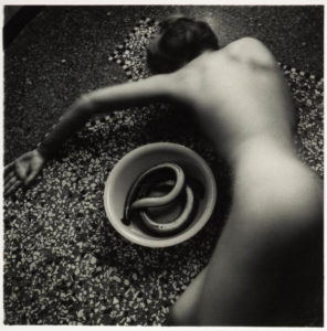
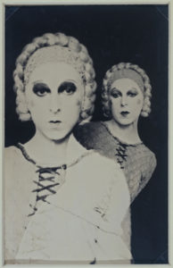
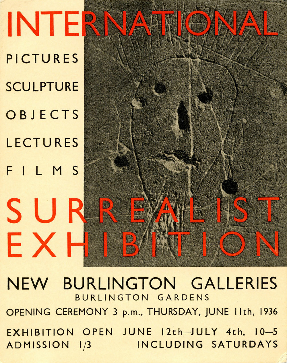
2019 has, in many ways, not been a good year so far. But this summer, the National Galleries of Scotland had (well, has; they are still on) three particularly outstanding exhibitions that brought a bit of light and intelligence to a period of more-than-usual stupidity. At the National Gallery itself, there was the excellent, eye opening and brain-frying Bridget Riley exhibition (closes 22nd September), at the National Portrait Gallery the superb Self Evidence (closes 20th October) in which Francesca Woodman’s tiny, intimate, self-enclosed photographs vibrate balefully in their little corner, overshadowing (for me) the also (but in an entirely different way) intimate and at times frankly challenging monumental works of Robert Mapplethorpe* and, to a lesser extent, the brilliant but (I guess appropriately) don’t-quite-fit-in Diane Arbus portraits of the lives of people marginalised and made invisible by mainstream culture.

*though the Mapplethorpe pictures were the ones that moved me the least, they did provide the priceless spectacle of parents hurrying their curious kids past the notorious 1978 Self Portrait With Whip. They had been warned!

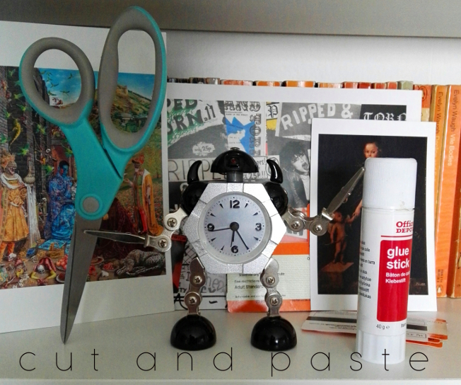
But for me, the highlight of the National Galleries’ summer programme is Cut and Paste: 400 years of Collage at Modern Two (closes 27th October).

Thanks to its inclusive definition of collage (which covers photomontage, traditional collage, plus bits of decoupage, pressed plant samples and even quilting) as well as its historical scope, the exhibition manages to be both focused and wide-ranging, and also (I found) surprisingly moving. What collage does, or at least amplifies – perhaps paradoxically given its use of found/ready-made materials – is that aspect of art that disappears most quickly in reproduction; the hand of the artist. This is art not only as a reflection/projection of culture but one that includes material culture itself.* There is, sometimes regardless of the picture/object, a poignant quality that comes from the materials used, in a way that doesn’t happen with paint, unless you are the kind of conservator who can isolate pigments used to specific periods (I’m not, unfortunately).

*I don’t think this is just pretentious bullshit; but you never know

Pablo Picasso, Bottle and Glass on a Table (1912)

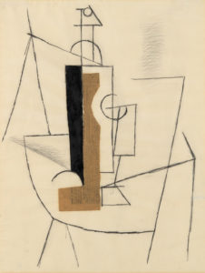
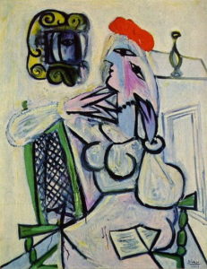
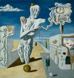
I’m getting ahead of myself here, but a seminal collage that makes an appearance in the exhibition, Pablo Picasso’s Bottle and Glass on a Table (1912) is a classic/typical Picasso cubist/spatial experiment, but the use of newspaper – a very specific, dateable piece of ephemera (from Le Journal, 3 December 1912) – gives the work, instantly and inherently, a dimension largely absent in conventional painting. The feeling that the collage is both artwork and artefact; literally as well as figuratively multi-layered, makes a case for collage as a distinct and special art form, a feeling echoed by the Scottish artist Eduardo Paolozzi (represented by some outstanding works in the exibition), for whom the form offered clarification, where formal art training raised problems and questions: “Unlike the world of school where the universe was systematised in a certain order, the reassembly of this disparate material reflected a true state, both autobiographic and dynamic.” (quoted in the exhibition catalogue,  p. 126)

So anyway; the exhibition is arranged chronologically, in the usual Modern Two layout; in various rooms, up the stairs, through the corridors etc, always I think a layout that makes for an engaging, surprising way of looking at art. Partly deliberately (there were too many people in the first room), I went around the exhibition in reverse chronological order and in retrospect that seems like a good decision. This meant that the exhibition opened with the Chapman Brothers’ The Disasters of Everyday Life (2017), a spectacular-looking wall-like object consisting of 80 of Goya’s horrific etchings, The Disasters of War, with of course added bits and pieces, sometimes powerful, sometimes deliberately absurd, I think (though I’d have to go through again the other way) it serves better as a kind of abstract for what is to follow than it would as a conclusion, where peering at a lot of small images might have seemed a bit anticlimactic.
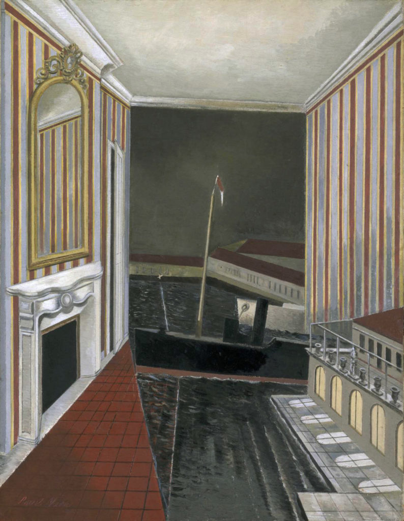
I’m not going to mention every picture in the show, though I can’t think of anything that doesn’t deserve a mention. The first thing to have a major impact for me was Lucy Williams’ 2015 Crescent House, as much a piece of model making as a collage, a strange, small scale (just under a metre long) recreation of a bit of postwar architecture, but simplified and made more colourful, giving it a feeling of harmony almost like a kind of 3D Mondrian.

Lucy Williams – Crescent House (2015)
Linder – Pretty Girl (1977)

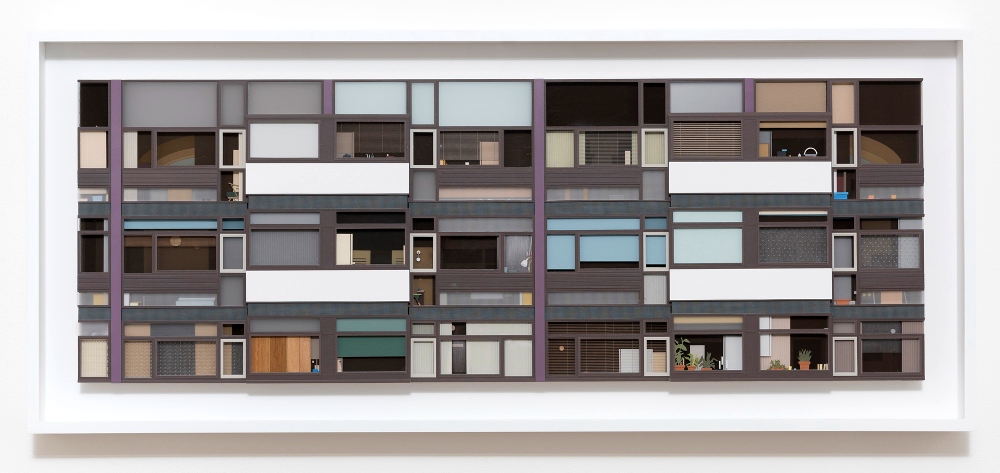
Crescent House captures something of the intended optimism of the postwar new town planning that’s most often associated now with neglect and urban decay. I don’t know if it’s a generational thing (Williams is around my age), but for me there was something powerfully bittersweet about the feeling of an abandoned, never-quite-attained future, heightened by the realness of the work as an object.

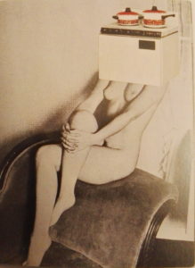
The aesthetic of Crescent House – though that is far lighter in tone – makes me think of the late 70s work of Linder (Sterling), another exhibition highlight. Although similar in its reference points to the pop art collages of Richard Hamilton a couple of decades before (sadly his iconic 1956 collage Just What Is It That Makes Today’s Homes So Different, So Appealing is not in the exhibition, though they do have a nice work by him, Desk from 1964), the feel of Linder’s work is far darker (it makes me think of the confrontational industrial work of Throbbing Gristle and COUM Transmissions around the same period) and the satire more pointed. Works like her Pretty Girl series(1977) exemplify a particular approach to collage. Using the detritus of everyday life; magazines, posters, advertising, it became a way of embodying in the art a criticism of the culture that it’s a reaction to as well as a product of. It’s a feminist criticism of the objectification of women that uses already depersonalised women (part of the problem) and merges them with actual ‘objects of desire’ from a patriarchal culture that above all else believes in commodification for its own benefit.

Craig W. Lowe, Bedroom Cupboard door covered with stickers, 1987-1997

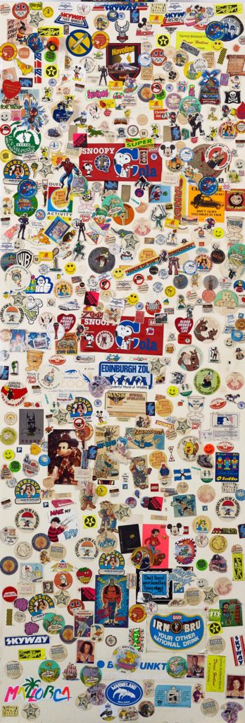
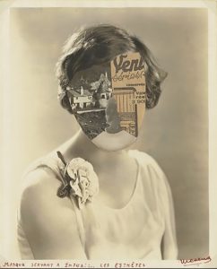
Thanks to the exhibition’s open-minded and inclusive approach, there are some unexpected revelations (but aren’t all revelations unexpected? I mean, that’s obvious). While Craig W. Lowe’s bedroom cupboard door covered in stickers c. 1987-1997) may appeal most as nostalgia, the inclusion of Jamie Reid‘s original Sex Pistols Never Mind The Bollocks cover collage (1977; copyrighted image so I’d better not share) opens realms of not-previously-considered information (at least to me) about one’s record collection. Firstly, the collage is black and white, and secondly, it isn’t just a picture or a ‘file’, it’s an actual thing. Like, presumably all album cover art (and book cover art etc) before the digital age, the NMTB cover in all its yellow and pink (or pink and green) glory, taken for granted forever, is not a picture, it’s a photograph of a picture. In its final form it’s been overlaid with colours, but that object there on the wall in Edinburgh is the thing itself. A strange feeling, like looking at the inscription on a ten pound note and considering that it is a representation of something, rather than ten actual pounds.

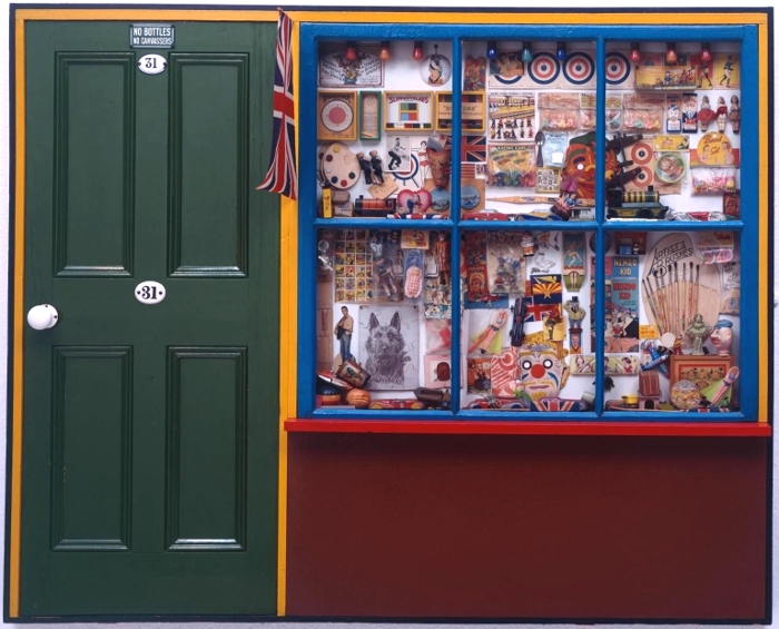
The Sex Pistols cover primes the viewer (at least the viewer going through the exhibition backwards) for the various bits of Peter Blake’s Sgt Pepper’s Lonely Hearts Club Band cover that are on show – and, great though they are (and I like Sgt Pepper quite a bit more than I like Never Mind The Bollocks), without that priming, the Beatles items wouldn’t have the same impact; perhaps because the cover itself is clearly a photograph of objects and cut-outs and seeing them is very cool but not really revelatory, the whole is too familiar and iconic to give the frisson of a moment captured. In fact, Blake’s superb, possibly slightly twee The Toy Shop (1962) is a far more vivid time capsule; clearly pointing to Sgt Pepper, its a conglomeration of bits and bobs familiar to children of the 60s – but also to children of later generations as belonging to the same family as the bits & bobs of their own youth (in my case, comics, football stickers, sweets, TV tie-in toys (He-Man et al), but also the odd antiquated throwbacks that still existed, like bows and arrows and balsa wood or polystyrene gliders which came with a weighted plastic propeller so they flew when thrown – do they still make those?). It’s hard to imagine that there will be a generation that can’t relate to The Toy Shop at all, however virtual entertainment becomes, kids will always like stickers.

Peter Blake – The Toy Shop (1962)

But Blake’s pop art nostalgia – powerful though that is – is one of the few purely positive and joyous post-war works in the show. More typical are the mischievous collage book covers made by Joe Orton and his partner and eventual murderer Kenneth Halliwell. These were put on library books and returned to the library – an act that eventually cost them a six month prison sentence – and they exemplify the sense of the significant, perhaps subversive and illogical accident that drew the surrealists to collage a few generations earlier.

Kenneth Halliwell & Joe Orton – collage on library book cover (c.1960-2)

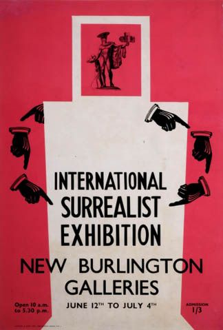
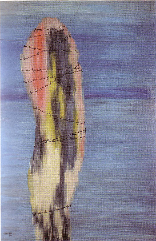
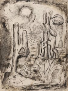
For the surrealists, collage was almost a manifestation of the galvanising quotation from Lautréamont’s Les Chants de Maldoror (1869) where a boy could be described as being “as beautiful as a chance meeting on a dissecting table of a sewing machine and an umbrella.” This aspect of surrealism is brilliantly captured in Max Ernst’s gothic ‘collage novels’ (one of the most exciting inclusions in the show is an unpublished picture from his 1934 collage novel Une semaine de bonté) as well as in beautiful works by Toyen and some of the collaborative exquisite corpse collages made by André Breton, Jacqueline Lamba and Yves Tanguy, where each artist could only see their own part of the work until it was complete. Again, what I hadn’t really anticipated was the difference it makes seeing these items in real life – for example, I had seen and liked (and own a postcard of) Roland Penrose’s untitled 1937 postcard collage, but seeing it, life size, and looking at the actual real postcards stuck to it, was a weirdly moving experience. But why? It’s something about the immediacy and associations of familiar things, the thought perhaps of Roland Penrose actually going into a newsagent and buying the postcards one day in 1937. Why that should be more moving than an artist using paint I don’t know, except that, like the scrapbooks owned by Tristan Tzara (very exciting to see) and the paper cutouts by Matisse (which until now I’ve never been a fan of) it brings the whole process of making art into an immediate, almost tangible one.

Roland Penrose – Untitled (1937)

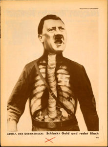
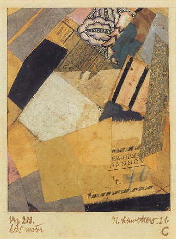
The work of the Dadaists (Hannah Höch was the main reason I wanted to see the show) is less self-consciously unconscious (well, that makes no sense) than the surrealist works, but the element of satire and sometimes bitter humour – especially in John Heartfield’s iconic anti-Nazi photomontages – make them the spiritual ancestors of the works of artists like Carolee Schneemann and Nancy Spero in the 1960s as well as Linder and even Terry Gilliam in the 70s. Highlights for me were the selection of works by Kurt Schwitters, whose own version of Dada, Merz, even had a collage-like genesis, the word itself apparently derived from a fragment of text relating to a banking firm (Kommerz und Privatbank). The fact that the word Merz also has echoes in the words schwerz (pain) and ausmerzen (to weed out or discard) adds to the sense that this was a movement (if you can call one person a movement) for which collage wasn’t an entertaining diversion, but a central idea. The cumulation of meanings and associations in works like Merz 229: Heet Water (1921) makes these small works with their train tickets, textiles, playing cards – pretty much anything that could be cut up and stuck down – powerfully evocative, as well as decorative in themselves.

John Heartfield – Adolf the Superman – swallows gold and spouts junk (1932)
Kurt Schwitters – Merz 229: Heet Water (1921)


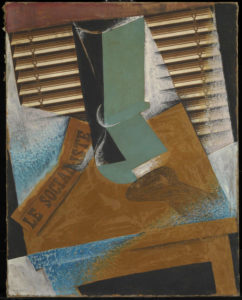
The section on the birth of modernist collage features a group of Picasso works including the the aforementioned Bottle and Glass on a Table, which form year zero of modernist collage, alongside works by peers including Braque (who may actually be the first modernist collage-maker) and Juan Gris (whose The Sunblind, 1914 is a highlight) and then the ripples spreading outwards from that explosive group of works, including the Russian constructivists and suprematists, the Italian Futurists and even the Bloomsbury group in the UK; I was very impressed to come across a painting by Vanessa Bell (Portrait of Molly MacCarthy, 1914-5) that didn’t immediately wilt into insignificance when surrounded by the big names of European modernism.

Juan Gris – The Sunblind (1914)

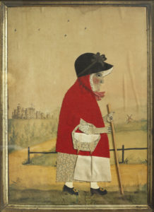
It seems obvious to say that collage is comparatively egalitarian insofar as you don’t need to be able to draw or paint to do it – and it’s true that works by generally non-visual artists like Breton and Joe Orton have a similar energy and atmosphere as those by more conventional artists, but it’s also noticeable that, pre-modernism, although the idea of collage existed and there was sometimes that same element of playfulness, the work is more notable for its skill and ingenuity – especially in the Victorian photomontages – than for any disruptive or ironic qualities. But collage being what it is, it’s here that the sense mentioned earlier of the collage as actual material culture comes into play again, sometimes – especially for me in the small character pieces by George Smart from the early 19th century – powerfully so. Somehow, these little watercolour paintings adorned with carefully cut out and arranged pieces of paper and fabric (irresistibly reminiscent to me of the ‘fuzzy felt’ sets I played with as a child) bring us closer to the artist than just paint on canvas would do.

This is perhaps art history as human interest and association rather than as aesthetics (this is especially true in the case of the Victorian scraps and scrapbooks, perhaps because the ready-made nature of the scraps themselves makes the objects feel less like the works of an artist and more like a hobby; nothing wrong with that, but as the sort of things you see in auctions and junk shops they have the aura of being ephemera, rather than using ephemera to make something else; a false distinction perhaps), but for me this exhibition brings those two aspects of art – the human/historical and the aesthetic/technical together in a deep and very satisfying way.

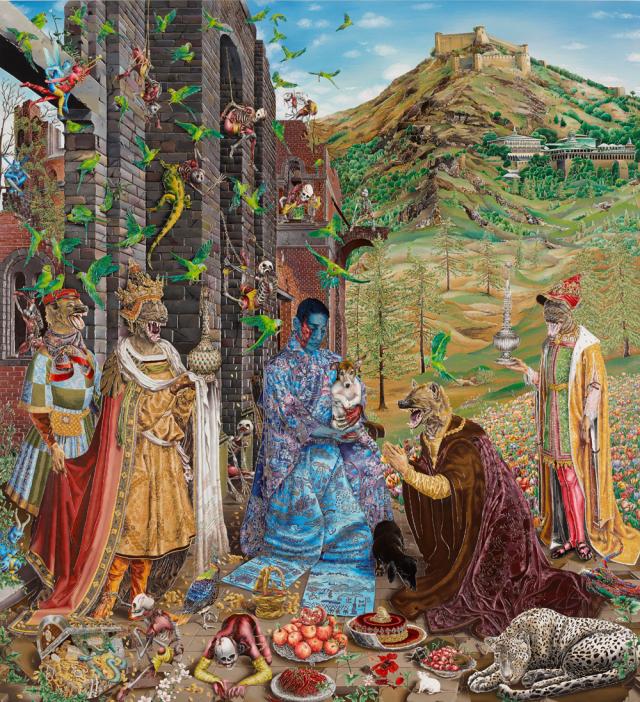
I have no real criticisms of the exhibition; it is thought provoking, beautiful to look at and put together with care and imagination. It might have been nice to have had something by some of the other artists most strongly associated with collage, like Romare Bearden and Wangechi Mutu; but if an exhibition leaves you wanting more that can’t be a bad thing.

***POSTSCRIPT***

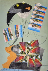
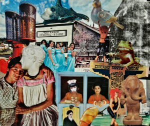
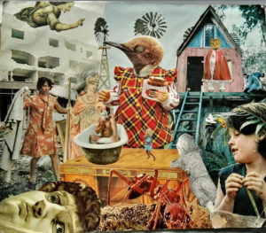
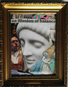
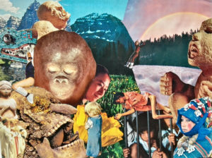
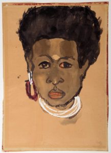
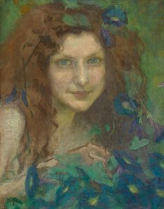
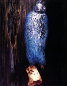
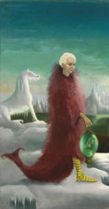
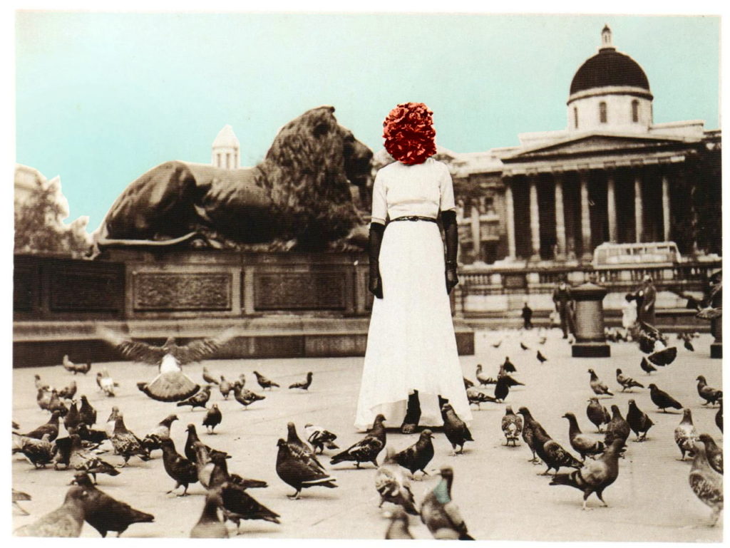
Since I mentioned the anyone-can-do-it aspect of collage, I might as well mention that I went through a phase, especially in my student days of making collages, and while they are nothing special, they do have a kind of diary-esque subtext which has only really become apparent over time. Since it’s my website and no-one can stop me, here are a couple of examples, plus a more recent one.

untitled collage, c. 1998?
untitled collage c. 1998-9


untitled collage, 2019
untitled collage, late 90s

A continuous chain of little inventions; art in Edinburgh summer 2018


Probably as much as I love any art movement, I love German Expressionism; most of all the artists of Die Brücke (I wrote at length about them here) and their (initially) optimistic quest to forge a new, forward-looking art which was distinctively German, drawing on native traditions (woodcuts, landscape etc), but also attempted to peel away the layers of staleness built up by decades, or even centuries of academicism, to reveal living art beneath. The art of Paula Modersohn-Becker, too, who was doing something similar in Worpeswede, is important to me too, but I also love the more anguished, personal kind of Expressionism that was reflected in the famous Expressionism of German silent cinema (see also Kirchner’s later works, and – not “German Expressionism” per se, but still German and expressionistic, early Dix and Grosz, Max Beckmann, Käthe Kollwitz).

Emil Nolde – Bay (1914)

So, even though Emil Nolde (1867-1956) is perhaps my least favourite of the major German Expressionist painters, and even though I had lots of qualms about it (see here), I was excited to see the Scottish National Gallery of Modern Art’s exhibition Colour Is Life. And it really is good.


In comparison with the much younger artists of Die Brücke, which he joined for a year in 1906* Nolde’s art is just as vivid, but less vibrant (if that makes sense); his colours tend towards the bilious and acidic and his style, though ‘free’, often seems – even in landscapes – more frenzied and less harmonious than the works of the rest of the group. His deeply felt religious paintings, especially – and there is a really remarkable group of them in the exhibition – have an intense, anguished, alienated quality that is more like Munch atmospherically than it is his German contemporaries. It’s among his figurative (but not religious) works that my favourite painting of the exhibition, an enigmatic and slightly double portrait (that I can’t find online), which is smoother in surface texture than the religious pictures and imbued with an oddly menacing atmosphere.

*at which point Nolde was 39 and the group’s founders were in their early to mid twenties

Emil Nolde – Paradise Lost (1921)

I’m glad to say that although I felt like the information at the exhibition tended to downplay his vociferous Nazism a little, it at least acknowledged it – and although it is nowhere explicit in his art, there are some uncomfortably anti-Semitic-caricature-like faces in his paintings of people, including in some of the religious works. But whether I would think that if I didn’t know he was (extremely) anti-Semitic, I can’t say. Interestingly, for an exhibition called Colour Is Life, by far the most powerful works to me were Nolde’s woodcuts (including arguably his most famous work, The Prophet of 1912), where his compositions are remarkable for their economy and stark intensity.

Emil Nolde – The Prophet (1912)

Interestingly (perhaps not coincidentally?) the majority of Nolde’s most impressive work seems to have been done by the mid-1920s, but there is also a selection of his ‘unpainted pictures’ in the exhibition. These are little watercolours, incredibly vivid in their colours, which were made in secret during the period when his work was condemned/forbidden by the Nazi government which Nolde had, however, not only welcomed, but effectively campaigned for since the early 30s. Incidentally, around the time that Nolde was signing the Aufrufs der Kulturscha (1934) which supported Hitler as Fuhrer and joining the National Socialist Association of Northern Schleswig, Ernst Ludwig Kirchner, one of the founders of Die Brücke, was writing “Here we have been hearing terrible rumours about torture of the Jews, but it’s all surely untrue…There is a war in the air. In the museums, the hard-won cultural achievements of the last 20 years are being destroyed, and yet the reason why we founded the Brücke was to encourage truly German art, made in Germany. And now it is supposed to be un-German. Dear God. It does upset me.”*

Head of a South Seas Islands woman (1914)

This was more than just the symptom of a generation gap between different artists; it’s at the heart of why Nolde’s art is, despite surface similarities, so different from that of the artists of Die Brücke; Expressionism is (obviously) about expressing; and yes, Kirchner and co expressed their anxieties, but their vision – at least at the time the group was at its most cohesive – was an optimistic one, accepting other influences as much as it rejected the status quo. To the 21st century, the way they were influenced by the art of other cultures, to simplify and brighten their own work can be uncomfortable; it has something of the ‘noble savage’ myth about it and their assumptions about the freedom and ‘naturalness’ of the tribal cultures whose work they studied in ethnographic museums were made from a viewpoint that now seems colonial and ignorant. But – the point of their own work is that it uses these forms and elements to describe something that is whole, natural and above all universal – the ‘otherness’ of the figures Nolde drew and painted on his trip to the South Seas (and even of his incredibly bold landscapes) just before WW1 is inescapable. His drawings of the people he encountered aren’t caricatures; they are brilliantly observed, but they are themselves ‘ethnographic’ in a way that Kirchner and co’s art strove not to be; Nolde is seeing and recording, not absorbing.

* Kirchner, quoted in Kirchner Museum Davos Biography Ernst Ludwig Kirchner by EW Kornfield, & CE Stauffer (1992)

Still; the Nazi government didn’t care about this distinction, and the exhibition text tells us that Nolde had more paintings shown in the condemnatory Entartete Kunst (‘degenerate art’) exhibition than any other artist, which would be a cause for some schadenfreude if not for the fact that, after petitioning the government (he was on civil if not familiar terms with charming people like Goebbels and Baldur von Schirach) he was informed in late 1941 that any work he undertook should be presented before government officials before any kind of public showing, which is of course harsh and limiting by any normal standards, but surprisingly mild compared to what they were doing to other artists. But, as Nolde must surely have realised, for all their cultural protectionism and promotion of what they considered to be artistically wholesome and correct ideas, the Nazis really weren’t interested in art as art at all.

Julie Wolfthorn – Witch of the Woods (1899)

For some not very pleasant perspective, since I can; Nolde was prevented from making a living from his art for a few years, and had works confiscated (which he did eventually get back however), meanwhile his contemporary, Julie Wolfthorn (only three years older than he was), whose figurative, traditional, slightly folkloric art has at least an equal right to be seen as definitively German (or, far more right, to the anti-modernist authorities of the time), was, as a Jew, too dangerous to exist, and was murdered in 1942, at the age of 78, by the regime which Nolde did his best to be accepted by.


So yes, a beautifully curated and mounted exhibition; but one which leaves a slightly bitter taste.

Toyen – Message of the Forest (1936)

So,  that’s what I paid to see (and it is absolutely worth the price of admission), but in fact the bitterness faded quickly; aside from owning a Kirchner painting that is for me everything that Nolde’s work isn’t, the National Gallery of Modern Art (Modern Two) hosts a permanent (and free) exhibition Surrealism and the Marvellous, which was already great, but has been enhanced hugely by the acquisition of Toyen’s superbly enigmatic The Message of the Forest (1939) and Leonora Carrington’s diminutive but haunting (and at the same time kind of funny) 1939 portrait of Max Ernst, Bird Superior (1939).


Leonora Carrington – Bird Superior (Portrait of Max Ernst), 1939

I could spend (and I think have spent) hours in this room; even longer now, as the archive adjoining it is hosting Club Dada: Berlin and Beyond, a really exciting collection of books, pamphlets, photos etc (and a small Max Ernst painting) that focuses mainly on Berlin Dada but also has some great items from the original Zurich group. Much as one wants to pore over these artefacts, I don’t even mind too much that the books etc are in glass cases since my German is minimal and I can’t read French at all.


Raqib Shaw – The Adoration (after Jan Gossaert), 2015/6 © the artist

Over in Modern One, I nearly didn’t look at the (also free) exhibition Raqib Shaw: Reinventing the Old Masters, partly because part of me doesn’t really want them to be reinvented, and because I didn’t know Shaw’s work, and also because it was up the stairs and I’d been walking around for hours. But I’m glad I did; what a fantastic show! I can’t imagine anyone not being impressed by Shaw’s work, even if it’s not their cup of tea. The paintings (too simple a description; his huge panels are painted in shimmering enamels, but embellished with a kind of cloisonné effect, incorporating jewels, glitter, all kinds of things) are brilliantly drawn and dazzling in their richness and detail (and a bit over the top, which is part of the charm). Although the compositions of the pictures in this exhibition are inspired by ‘old master’ paintings (one of which is one of my all-time favourite pictures, Lucas Cranach’s enigmatic Allegory of Melancholy (1528), displayed alongside Shaw’s painting), the familiarity only makes the extravagant fantasy of Shaw’s works all the more dreamlike and affecting.

Jan Gossart – The Adoration of the Kings (1510/15)

I think we (no, I don’t know who I mean by ‘we’) are used to seeing and accepting things like Biblical scenes or Greek myths presented through the filter of the Italian (or Northern) renaissance, and this is similar but different. With the old masters we (them again) see familiar (or what were once familiar) scenes  presented in a kind of fancy dress of anachronistic costumes/settings etc which were initially intended to heighten the relatable-to realism of the works, but which now add another layer of meaning and cultural baggage. With Shaw’s work, the ghosts of both the original meaning and the original treatment are seen as if through the eyes of someone from another, much more effervescent dimension. The dislocating, hallucinatory blend of familiar (and it isn’t just the source material that’s familiar; Shaw’s use of dazzling, opulent colours and ornate textures is, despite the fantastical elements, quintessentially Indian, to my western eyes anyway) and strange is exhilarating and strangely poignant.* To take my favourite picture; neither Cranach’s or Shaw’s Allegory of Melancholy is sombre exactly; but despite the centuries and world views that separate them, the same delicately wistful atmosphere pervades both pictures. It’s an impressive exhibition.

So, the moral of this is; go to the Scottish National Gallery of Modern Art in Edinburgh if you get the chance. Oh, and the National Gallery of non-modern art too – aside from having an incredible permanent collection, they currently have a Rembrandt – who doesn’t like Rembrandt? – exhibition and have put a fantastic Jenny Saville painting (Aleppo) among the old masters in a way that works amazingly well and was gathering crowds of (especially young) people when I was there.

*Perhaps an obscure (and certainly a geeky) comparison; looking at Raqib Shaw’s pictures reminded me of reading Brendan McCarthy & Pete Milligan’s similarly post modern/immersive/multicultural/hallucinogenic comic strip Rogan Gosh in the 2000AD spinoff Revolver.

Brendan McCarthy & Peter Milligan, Rogan Gosh (1990)


11 June 1936: The International Surrealist Exhibition

Sheila Legge, ‘the Surrealist Phantom’,  photograph by Claude Cahun

Thursday, June 11th, 1936. Ominous context; the previous week, Mussolini had authorised his troops to kill prisoners taken in the war that followed Italy’s invasion of Ethiopia. Shortly thereafter, Haile Selassie, Emperor in exile, would appeal to the League of Nations against the Fascists, but of the 57 member states, only a handful imposed sanctions against Italy, one of those being the Republic of Spain, which, within a month would itself be shattered by civil war. Earlier that spring, Hitler had goose-stepped his troops into the Rhineland in contravention of the Treaty of Versailles; in London itself the alarm caused by the organised marches of Oswald Moseley’s British Union of Fascists, would, by the end of the year, result in the Public Order Act, banning the wearing of political uniforms in any public place. On that Thursday though*, in Trafalgar Square on a hot, clammy morning (June 1936 was notable for unsettled and unseasonal weather) a young woman with a head apparently made of flowers stood among the pigeons; a dreamlike, haunting, alarming and perhaps ridiculous figure; for dreamlike, haunting, alarming but definitely ridiculous** times. Underneath the flowers and wedding dress was a human being, artist and poet Sheila Legge, but on that day, in combination with that costume and a few accessories (a raw pork chop and/or just a prosthetic leg, depending which account you believe) she was the surrealist phantom*** and drew crowds to the opening of the International Surrealist Exhibition at the New Burlington Galleries.

Claude Cahun – Self Portrait (1929)

* sadly, also the day that Robert E. Howard, creator of Conan the Barbarian committed suicide

**For the next few years, while the tension in UK and Europe inexorably rose, there was also a more than normal amount of paranormal activity, with both the International Institute for Psychical Research and its rival the Society for Psychical Research logging record numbers of hauntings and reports of poltergeist activity. Also, it’s worth remembering that in the 30s, Hitler had a ‘Charlie Chaplin moustache’, rather than the other way around

***  or rather, a surrealist phantom; also present, though not exhibiting in the show, was Claude Cahun, one of the most enigmatic figures of 20th century art, apparently taking photographs, one of which is presumably the image of Sheila Legge used above

The incongruity of the flower-headed apparition was an embodiment of the intention of the surrealists as initially laid out by André Breton (master of ceremonies at the opening of the London exhibition) in 1924:

“I believe in the future resolution of these two states, dream and reality, which are seemingly so contradictory, into a kind of absolute reality, a surreality.”

Manifesto of Surrealism (1924), translated by Richard Seaver & Helen R Lane in Manifestoes of Surrealism (Ann Arbor paperbacks, 972, p.14)

Yves Tanguy – I Am Waiting For You (1934)

For all of its apparent frivolity too, the flower-headed phantom was calculated to provoke a reaction beyond being simply an advertisement for an exhibition; its irrational beauty, Arcimboldo-meets-Dalí,  was manifestation as manifesto, remembering Breton’s railing against

“the hate of the marvellous which rages in certain men, this absurdity beneath which they try to bury it. Let us not mince words: the marvellous is always beautiful, anything marvellous is beautiful, in fact only the marvellous is beautiful”(ibid.)


Giorgio de Chirico, The Square (1913)

The exhibition offered the public many different kinds of marvellous; there were over 400 exhibits; paintings, sculptures, ‘surrealist objects’ as well as an array of ‘ethnographic’ items from diverse cultures around the world and ‘natural objects interpreted’. Around 60 artists were represented, including most of the ‘big names’ of European surrealism alongside a range of home grown British artists. It showed, too, that surrealism was always a broader church than its critics tended to give it credit for; less a style or set of styles (many of the artists represented were not necessarily surrealists per se) than a way of seeing, or a way of being, embodied in artworks as diverse as Giorgio de Chirico’s ominous dreamscapes, Hans/Jean Arp’s evocative wood reliefs, Constantin Brâncuși’s Vorticist-influenced sculptures and a generous selection of Picassos, from cubist masterpieces to his latest works, alongside iconic surrealist paintings by the group’s most prominent members and associates, including Dali, Max Ernst, Magritte, Miro and Klee.

Hans Arp – The Forest (1918)

The exhibition also included works by eleven female artists*; not a huge amount percentage-wise, but an extremely  significant proportion by the standards of the time; and among that ten were some of the most important artists of the era.

* Eileen Agar, Jacqueline B., Leonor Fini, Dora Maar, Maruja Mallo, Meret Oppenheim, Grace Pailthorpe (hailed by Breton as ‘the best and most truly surrealist’ of British artists), Toyen,  Sophie Taueber-Arp, Margaret Nash, Gala Dali, Sheila Legge

 The exhibition was hugely successful, with over 25, 000 visitors attending during its month-long run, and it fulfilled what surrealism could be, both to its adherents and to its critics; it was profound, it was disturbing; it was also at times very silly.  Notoriously, Dalí gave an inaudible speech while wearing a deep sea diving suit from which he had to be rescued, while Breton and Paul Éluard delivered more comprehensible lectures, volume-wise at least. In the original manifesto, Breton had written, “We really live by our fantasies when we give free rein to them” but that was in 1924; if surrealism had started out in part as an offshoot of Dada, a reaction to the horrors of World War One and the rationalist values of the 19th century that had led to it, the atmosphere of the 30s was (and was felt at the time to be) distinctively pre-war.

Pablo Picasso – Seated Woman in a Red Hat (1934)
Constantin Brâncuși – The Chimera (1918)

The Surrealist group of 1936 (that is, the main group among the many surrealist groups of 1936, as Breton’s regular fallings out with those close to him led to a series of splinter groups) was, explicitly, a political organisation. Some key original members, such as the ‘prophet of surrealism’ himself, Robert Desnos (of whom Breton said “Desnos speaks Surrealist at will”) were opposed to the aligning of the group with a left-wing political cause, but Desnos’ fate – arrested by the Gestapo, sent to Auschwitz, then Buchenwald before finally dying in Terezin concentration camp of typhoid in 1945 – showed that, for those without the financial means of Breton and Dalí, politics was not something one could easily avoid. But more than that, the nature of surrealism itself was incompatible with the totalitarianism that was marching across Europe:

“Among all the many misfortunes to which we are heir, it is only fair to admit that we are allowed the greatest degree of freedom of thought. It is up to us not to misuse it. To reduce the imagination to a state of slavery…is to betray all sense of absolute justice within oneself. Imagination alone offers me some intimation of what can be…” Manifesto of Surrealism (1924) p.4-5.

Reuben Mednikoff – The Stairway To Paradise (1936)


Dalí – perhaps not surprisingly, given his aristocratic background – was less comfortable than Breton with the politics of the far left, but although often portrayed as a simple narcissist (wrong; he was not simple), he was very aware of the psychology underlying the ideological dogmatising(?) of Europe, arguing in 1935 that the moral hunger left by the weakening of state religion had led a people “systematically cretinized by machinism” and “ideological disorder” towards Hitler and his vision of the Third Reich. (actually what he said is far more Dalí-esque and funny; Hitler’s followers…

seek in vain to bite into the senile and triumphant softness of the plump, atavistic, tender, militaristic, and territorial back of any Hitlerian nursemaid. [This]irrational hunger…is placed before a cultural dining table on which are found only . . . cold and insubstantial leftovers.” The Conquest of the Irrational, 1935)

the opening of the International Surrealist Exhibition; Dali in diving suit

As we have seen, Britain in 1936 was far from immune from ‘ideological disorder’ – but despite the fact that the British Union of Fascists was entrenched enough in society to be running an annual summer camp at Bognor Regis, the ideology was not all on the right. Breton, although vehemently Marxist, was not entirely comfortable with the polarising climate of the era, as his speech, The Political Position of Today’s Art given to the “Leftist Front” in Prague the year before the International Exhibition makes clear:

E.L.T. Mesens – Mask to be used for insulting Aesthetes (collage, 1929)

“These banners that have suddenly begun to flap over Europe, setting a common or social front, a single front or a red front over against a national front, the last battle formation of capitalism, are of a sort to imbue me more and more deeply with the idea that we live in an era in which man belongs to himself less than ever… [The Surrealists] find themselves in the face of a dilemma: either they must give up interpreting and expressing the world in the ways in which each of them finds the secret of within himself and himself alone – it is his very chance of enduring that is at stake – or they must give up collaborating on the practical plan of action for changing the world” April 1, 1935  Manifestoes of Surrealism, p.213

The same year however, perhaps more comfortable on his home turf in Paris, speaking to the Congress of Writers, Breton made it clear that he intended to have his cake and eat it;

“Transform the world,” Marx said; “change life,” Rimbaud said. These two watchwords are one for us.”

René Magritte – The Difficult Crossing (1926), shown in London


Considered leftist radicals by the right and as decadently bourgeois by the left, Surrealism was caught between two ideologies that both managed to miss the entire point of the movement. This was not a centrist organisation; it was radical, egalitarian and concerned above all with freedom, especially freedom of thought. Breton had written, “Our brains are dulled by the incurable mania of wanting to make the unknown known, classifiable.” (Manifesto of Surrealism p.9), but it was this ambiguity that troubled most of the opponents of Surrealism. The iconic Belgian surrealist René Magritte, who was represented by no less than 14 works in the exhibition,  shared Breton’s sentiments;

“People who grasp for symbolic meanings fail to grasp the inherent poetry and mystery of the image. No doubt they sense this mystery, but they wish to get rid of it. They are afraid. By asking ‘what does this mean?’ they express a wish that everything be understandable. But if one does not reject the mystery, one has quite a different response.  One asks other things.” (Magritte, Suzi Gablik, Thames & Hudson 1970, p.11)

Leonor Fini with her painting ‘Game of Legs’ which was exhibited at the London show

In fact, for all his aristocratic bearing (a quirk of personality rather than a representation of his actual background), Breton, with his touchstones of Marx, Freud and Rimbaud, was less elitist than the pro-Stalin communist intelligentsia of the British art world could be. The main criticism of upper class critics like Anthony Blunt (who, significantly, was covertly working as a spy for Stalin’s USSR at the time) was that Surrealism had no clear message and would therefore be difficult for the proletariat to understand, championing instead ‘Socialist Realism’ as the preferred avant garde art movement of the Communist Party.

This basic idea – ‘ordinary people won’t understand it’ – despite ignoring Breton & Magritte’s deliberate ambivalence towards ‘understanding’ – was still at the heart of critical attitudes to Surrealism as recently as Charles Harrison’s excellent English art and Modernism 1900-1939 (Yale University Press 1981). The division between the Surrealists (I really should decide when that word should and shouldn’t be capitalised) and the communist Artists’ International Association (AIA) is characterised by Harrison (p. 314-5) by the idea that the surrealists were reluctant to let go of the uniqueness of the artist and the artist’s vision; an idea which presupposes that the ‘proletariat’ is a kind of homogeneous mob which doesn’t share the individual uniqueness of artists. Breton, who was ultimately concerned with that uniqueness, never seems to have subscribed to the idea of the working classes as an unthinking and simple-minded mass. Indeed, his lifelong aim was to make an artist or poet of everyone.

But the idea of Surrealism as part controversialist nonsense, part artistic elitism persisted. Even Herbert Read – one of the pre-eminent art critics of the period, modernist, Marxist – despite being involved in the staging of the exhibition itself – tended to evaluate surrealism negatively in the revolutionary scheme of things, compared to pure abstraction, saying :

[Surrealism is]“a negative art… a destructive art; it follows that it has only a temporary role” whereas abstract art “has a positive function. It keeps inviolate, until such time as society will once more be ready to make use of them, the universal qualities of art” Five On Revolutionary Art  (1935, Artists’ International Association)

But in fact, Dalí in his 1929 Declaration had already pre-empted this criticism; “Surrealism is destructive, but it destroys only what it considers to be shackles limiting our vision” and arguably the idea of a rarefied ‘pure art’ which is somehow divisible from human nature and human experience is one of those shackles.

Paul Nash – Harbour and Room (1932-6), one of several outstanding works by British artists at the show

Despite the negativity of parts of the leftist establishment, Breton was keen to stress in his Prague address that fascism was the enemy of all progressive art;

“Hitler and his acolytes are, unfortunately, very well aware that it was necessary not only to persecute Marxists, but to forbid all avant-garde art in order to stifle leftist thought even for a short time” Manifestoes of Surrealism, p.233

Wilhelm Freddie with one of the artworks seized by customs on their way to the exhibition

Ironically, despite the controversy surrounding Surrealism there was very little opposition to the London exhibition from the ‘establishment’ as such, aside from the seizure of some works by the Danish artist  Wilhelm Freddie on pornography charges. And although the AIA were not especially supportive of surrealism in general (as Harrison points out, “many of the aspirations of the AIA members were kept alive by a roseate vision of the conditions of art – and life – in Stalinist Russia” English Art and Modernism,  p.313), the differences between factions could be put aside when occasion demanded it; in November 1936 the Surrealists and the AIA together challenged the government’s position on the Spanish civil war in their Declaration on Spain by siding against the fascists. The two groups joined forces again in 1938 to exhibit Picasso’s Guernica in protest at events in Spain, significantly showing the painting not just in the New Burlington Galleries, but also in the Whitechapel Gallery in the heart of the working class East End.  (Matthew Gale, Dada and Surrealism, Phaidon 1997, p.346-9)

Toyen – Prometheus (1934)

Although largely male-dominated, the fact that the Surrealist group’s aims were to create a revolution in mind/spirit before, or simultaneous with, a social revolution meant that whereas for groups like the Communist Party, equality of the sexes was something to think about after the revolution had been won (an attitude christened ‘brocialism’ by Sarah Ditum in an excellent recent article for The New European issue #97, May 31 2018, p.19-21) ideas of gender and sex at both a conscious and subconscious level were central to the group’s work. Although this inevitably meant much objectification and a preoccupation with woman-as-muse, Breton’s championing of female artists was rarely paternalistic, even if it was as otherworldly as all of his writing;

“The cry for freedom received an absolutely noble and authentic answer in the work of Toyen, work as luminous as her own heart yet streaked through by dark forebodings.” Surrealism and Painting, translated by Simon Watson Taylor, MacDonald & Co, 1972, p.210

Toyen in Paris, c.1925-6

The Czech artist Toyen (born Marie Čermínová) was represented in the London exhibition by two oil paintings and was definitive of the kind of artist drawn to the surrealist cause. Politically an anti-Stalinist communist, her work defies easy analysis, as did Toyen herself. Sometimes characterised by those who knew her as transgender, sometimes as an androgynous lesbian, sometimes as an almost femme-fatale-like heterosexual temptress (she could, pretentiously no doubt, be labelled sur-gender) her name, seemingly chosen for its non-gender specific quality – and the few photographs of her that exist, tend to encourage the mythologising of her rather than clarifying her true nature; and that is surely the point; had she wanted to be easily pigeonholed, she could have left something unambiguous behind.

Cecil Collins – Angel Images and Negative Spectres in Conflict (1933)

Browsing the catalogue of the Surrealist Exhibition of 1936, with its mixture of high art (oil paintings, sculpture), photographs, found objects and disconcerting titles is to look into the troubled heart and dreams of a profoundly troubled time. The general perception of surrealism may be of something self consciously ‘weird’ but even that shows that if surrealism is anything, it is profoundly human. The fact that the work of an artist as idiosyncratic as Toyen could be seen by 25,000 people in London at a time when totalitarianism closed down independent thought across Europe and beyond, demonstrates that, despite the disapproval of the champions of socialist realism, surrealism was as revolutionary – and as successful – an art movement as there has been. After all, if a revolution doesn’t allow people to express their essential person-hood then why bother to fight fascism at all?


These are things I read before writing this:

Eileen Agar in France, 1937

Karla Tonine Huebner – Eroticism, Identity and Cultural Context: Toyen and the Prague Avant-Garde (2008). I can’t recommend this highly enough, incredibly enlightening and fascinating and you can read it all here

Andre Breton – Manifestoes of Surrealism (translated by Richard Seaver & Helen R Lane, Ann Arbor paperbacks, 1972) Essential surrealist reading and fun, a lot of the time. I can never decide how much I like Breton, but when he’s good, he’s good

Matthew Gale – Dada and Surrealism (Phaidon, 1997) I think the best short overview of the two schools and their connections that I’ve read; he covers a lot of ground

Sarane Alexandrian – Surrealist Art (Thames & Hudson, 1970) A very personal look at the main surrealist movement by someone who was there for a lot of it. Alexandrian thinks quite deeply, but at the same time is absolutely Breton’s man, so some of the most interesting surrealists outside of the orbit of Paris don’t get much space

Dora Maar – The Simulator (1935-6)

Jennifer Mundy (ed.) – Surrealism – Desire Unbound (Tate Publishing, 2001) One of the absolute best books on surrealism I’ve read; fantastic essays, brilliantly illustrated.

Arthur Cravan, Jacques Rigaut, Julien Torma, Hacques Vaché – 4 Dada Suicides (trans. Terry Hale, Paul Lenti, Iain White, Atlas Anti-Classics, 2005) Has very little to do with the actual article above but it’s such an amazing book & does give some authentic background to the earliest days of surrealism

all of the pictures in this article (apart from the photo of Sheila Legge) were shown in the exhibition – as far as I can tell; the names of  works in the catalogue aren’t always very reliable

Angel Planells – Midday Sorrow (1932)

Symphonies of Sadness, Dirges of Disgust, Noxious Noise: Musical Masochism


Any kind of masochism is (to non-masochists/collaborators) peculiar and difficult to understand; no less so when it is related to music; but I’m going to try to understand it anyway.

I have isolated three main areas which can be loosely classified under the ‘masochistic’ heading, but there may well be more:

1. Self-consciously unpleasant music which is “enjoyed” (or just enjoyed; a subtle but perhaps important difference) for its intentionally unpleasant/disturbing/unsettling or harsh sound

2. Music which is humorously/ironically enjoyed for its perceived awfulness*

3. Non-unpleasant music which is listened to specifically for its upsetting/depressing or negative emotional effect

Uniting all of these is the fact that they are not everyday listening (for me anyway), but in are special music which retains its potency by being indulged in only occasionally and when prepared for the physical (tinnitus) or mental (lachrymose) consequences.

*aka ‘guilty pleasures’ of course; but that is a whole other discussion; if guilt is an appropriate emotion for listening to music it would have to be something a bit less innocuous than I have in mind. ‘Embarrassing pleasures’ would be a more accurate and even more dodgy-sounding description

1. UNPLEASANT NOISES
The first category is very distinct from the other two; not only is the unpleasantness aural (and intentionally unpleasant), it is precisely the nastiness that appeals to the listener. Why that should be is mysterious; I have used the word ‘masochism’ in the title here, but only because everyone knows what it means and because I can’t think of a better term; but neither ‘sexual masochism disorder’, BDSM or so-called non-sexual masochism (“self-defeating personality disorder”) really functions in the same way as listening to, say The Rita (noise artist Sam McKinlay) or Gnaw Their Tongues.

russolo

Noise as (anti)music goes back at least as far as the Dada and Futurist movements of the early 20th century (on the left is Luigi Russolo with one of his Futurist instruments), but on the whole (I think) it’s true that the noise that was created, though fascinating to hear, was more about the process of composing and rule-breaking than listening for pleasure. The same may be true of a lot of experimental noise since then, with classic albums such as Yoko Ono’s Yoko Ono/Plastic Ono Band and Lou Reed’s Metal Machine Music probably being far more frequently owned than enjoyed. Various musique concréte and other avant garde pieces have the same kind of status, being performed perhaps more for historical/academic (albeit interesting) reasons rather than for the purpose of actual entertainment (which is not of course to say that people aren’t entertained by it).

merzbow

Noise: So what of semi-musical or non-musical noise like Merzbow or just plain ugly music? It’s hard to say where the appeal lies, but with pure noise it seems to be at least partly visceral. It has an immediate, emotional impact; it has nothing to do with traditional musical qualities such as melody, catchiness or even memorable-ness, since it’s possible to listen to the abstract noise of (for example) therita
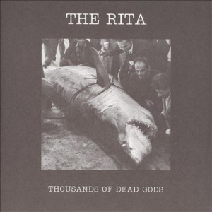
Thousands of Dead Gods (2006) by The Rita many times without ever getting used to it. This makes the noise endlessly surprising, alienating or boring, depending on one’s mood. The sense of noise as abstract is reinforced by its context-lessness; typically the artwork for a Merzbow album is as enigmatic and unrevealing as the album within, and occasionally every bit as flatly un-evocative (not a criticism!) as the Merzbow sound itself. Cultural identifiers in pure noise are also minimalist in the extreme; the race, nationality or gender of noise artists tends to be known only insofar as the artist wishes it to be so.

At the same time, a quality that pure noise shares with more traditional music is that it can noticeably affect the mood of the listener, especially when played at a loud volume. Listening to pure noise can be much like watching ‘white noise’ on a TV screen; the endless movement may be random, but the mind will look for patterns and if it doesn’t find them, create them itself; pure noise often feels detailed in a way that very little actual music does. And it is enjoyable (the word covers a wide range of responses here) or unenjoyable (simpler) for as long as it engages the listener.

Ugly Music: What I shall call ugly music is sometimes easier to pin down; it is music, which means it follows certain structural rules which noise ignores, and the listener enjoys it for its ugliness or not at all. It is notable too that artists who aim for ugliness usually attempt the Wagnerian ideal of the gesamtkunstwerk or ‘total work of art’ where everything from the sound to the lyrics to the artwork contributes to the overall effect.

Ugly music probably began in the 60s with some of The Mothers of Invention’s more indigestible experiments (like Absolutely Free, which is perhaps more difficult than truly ugly), Captain Beefheart or the 17 minute churn of the Velvet Underground’s ‘Sister Ray’, but it came into its own in the artistically serious 1970s (see below) and, in a more populist and relatively lighthearted way with the advent of death metal in the 80s, specifically with albums like Reek of Putrefaction (1988) by Carcass. This classic album is ugly not only in the details of the music and presentation, but in the murky muddiness of its sound; a chance element caused by the cheapness of the recording, which makes some of the album sound like two or three different bands immersed in a swamp, simultaneously playing three different songs, When allied with the rasped vocals of Jeff Walker and the ridiculously deep ones of Bill Steer, this churning noise makes for a disorientating but strangely addictive listening experience, which has something to do with the humour of its extremity (lyrical and musical) as well as the pure heaviness.

carcs
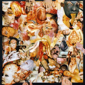
Back in the 80s, this kind of music had an outsider/snob appeal even within the metal genre. 80s metal (on the whole) strove for clarity and precision; Carcass (emerging from an anarcho-crust/punk background) pushed the boundaries of musical extremity and taste (using the notorious collages of medical photos for their artwork, rather than relatively cuddly horror mascots like Iron Maiden’s Eddie) beyond what the standard fan of Iron Maiden, W.A.S.P., Metallica or even Slayer might find acceptable. To say that death metal is relatively lighthearted is slightly misleading – Carcass’ early music was informed by a radical vegetarian disgust with all things meat-based in quite a serious way – but as a subgenre of a popular youth-focussed music it lacks the gravitas of the kind of music which made the late 70s a darker place to have ears.

By contrast with death metal, the sheer ugliness of early industrial music exemplified by the work of Throbbing Gristle, seems designed not so much to shock or alienate with its extremity, so much as to shock and alienate with its familiarity, kind of a negative mirror image of the almost subliminal ambient music being pioneered around the same time in Eno’s Music For Airports.

By reflecting the greyness of the decaying industrial (edging into post-industrial) landscape and society that produced it, the corporate packaging and document-like title made TG’s debut album The Second Annual Report (1977) a masterpiece of grinding mundane-ness. In its way their music is throbzevery bit as evocative of the 1970s as glam or disco, but the way it embodies its era, its brutalist architecture and grey/brown/beige ambience, combats any possible sense of nostalgia. Although it’s easy to say why it’s interesting, liking Throbbing Gristle (as many have done and continue to do) is much harder to explain. The appeal of TG; in effect the appeal of being made to feel uneasy or disgusted, is an odd way to be entertained. On the surface you could say the same about the horror genre in cinema and literature, but Throbbing Gristle’s effect is utterly different from straightforward horror-as-entertainment, feeling (to me anyway) more analogous to the JG Ballard of The Atrocity Exhibition or Crash than to Stephen King, perhaps because like Ballard, TG’s work had more to do with documenting than it did with entertaining. Although there was undoubtedly an element of confrontation in TGs music (especially in a live setting), as with pure noise, confrontation oppaisn’t the focal point that it becomes in the power electronics of groups like Whitehouse and Sutcliffe Jügend who (to some extent) followed on from the early British industrial scene. There is also a more straightforwardly ‘horror noise’ sub-subgenre including bands like Abruptum and the aforementioned Gnaw Their Tongues, whose aim seems to be to engender (with, it must be said, varying degrees of success) extreme anxiety in the listener; significantly different from the almost abstract quality of pure (if harsh) noise artists like Merzbow, easier to understand, but also easier to dismiss as sensationalism.

One of the cumulative effects of abrasive-sounding music has always been to spawn more accessible versions of abrasive-sounding music, in short, to make tunes out of it: noise rock, hardcore punk, death metal, grindcore, grunge, black metal, industrial pop music, techno, trance, drone, shoegaze; all bring a taste of ugliness to the masses in their own way and all are enjoyed, just like traditional pop/rock/soul/country/reggae etc etc etc, by people who like the tunes and like the songs. So they have little part to play in this particular discussion.

2. SO BAD IT’S POSSIBLE TO PRETEND IT’S GOOD

confidAcross all of the arts there are ‘so bad it’s good’ works that appeal on the ironic level of kitsch. These are completely subjective and therefore a bit of a minefield; at what point does listening to something that you personally think is so awful that it’s funny become just listening to it; and is there any difference anyway? Did my teenage self and friends have a different experience listening to an old Shakin’ Stevens tape ‘for a laugh’ than “Shaky”’s actual fans did or do? Well, yes, presumably; they probably don’t laugh as much. Still; it’s all ‘listening with pleasure’ and not only is it subjective, but it’s all about timing. The awfulness of music is as much about the zeitgeist as the popularity of music is; hard to imagine now, but there was a time in the late 80s when listening to Abba (or The Carpenters for that matter) could be enjoyed as revelling in tacky 70s awfulness; but since the early 90s they have been revered by the once-embarrassed media as a great band after all.

Since the 90s in fact, revelling in irony has become so commonplace and mainstream as not to be ironic anymore; at one time including an artist like Tom Jones in the lineup of a major indie rock festival was kind of a hipster joke that the audience was expected to be in on. Since then the line between alternative and mainstream has become blurred, not because mainstream music has become more adventurous, but because ‘alternative’ music became popular and thus blander and more geared towards commercial success and because the mainstream media discovered people they had actually heard of at these oft-derided hippy festivals. The amusingly mainstream guest act at (for example) Glastonbury or T in the Park has almost imperceptibly become the headlining act; no accident, since these artists are usually household names which therefore guarantee ticket sales in a way that even a medium-big indie rock band isn’t.

Nowadays, to have the same kind of kitsch shock value as including Tom Jones in an indie festival once had, you would have to put someone like Gary Glitter or Rolf Harris (an original ironic festival guest, strange to remember) on the stage, doubling the irony and making the whole experience extremely uncomfortable for all concerned. Despite the weird Ballardian/Coum Transmissions echo this experience this might present, it’s probably best not to.

3. NOW THAT’S WHAT I CALL MISERABLE MUSIC
caravThis category takes it for granted that unhappiness is a form of unpleasantness that is most often avoided; which may not be strictly true – or obviously isn’t, given the endless popularity of tragedies, murder mysteries etc. Still, it’s a basic human truth (I hope) that most people would rather be happy than sad. Most of the time that is; historically, music was most often written for occasions; sad music was required for a funeral, just as weddings demanded happy music. Tudor and baroque music often had mythological, narrative or literary inspiration which dictated the mood of the works. For a court composer to make a cheerful-sounding funeral dirge or a comic opera from a tragic mythological story would be perverse at best and bad workmanship at worst.

In modern popular music there are many kinds of sad songs, but from a personal point of view (narrowing it down to music I actually like) there are two;
songs which express the unhappiness of the performer
songs (which may or may not be sad in themselves) which make the listener (me) feel unhappy.

Both of these kinds of songs may actually be very pleasant in an aural sense, so only the latter are strictly relevant here. But – outside of the funereal situation mentioned above – why would someone intentionally listen to music that makes them sad?

There are probably as many reasons as there are people, but two big ones: to make you feel better or to make you feel worse.

A lot of interesting research has been carried out on the restorative power of sad music, so I wont say too much about that. The blues (and early country music too) is a classic example – intended not just as an outlet for the woes of the artist her or himself, but as a sharing of universal wretchedness that brings the relief of empathy/recognition – and it does seem to have a regenerative quality (a kind of earthly parallel to the redemptive power of gospel music) that makes it essentially uplifting in all but the most desolate examples.

Music to make you feel worse is more problematic, but wanting to hear sad music that deepens your depression is a fairly common phenomenon, especially among adolescents. The logic of the blues is that something that reflects your mood or encapsulates your own troubles is a kind of comfort, but it’s also true that brooding on one’s unhappiness can deepen that mood; that one can indulge in misery. Why? Because people are strange and self-pity answers some deep-seated psychological need? Perhaps it is a real kind of masochism after all…

A short, personal masochistic playlist

UNPLEASANT (these examples are all undeniably ‘not nice’, but are oddly exhilarating too)
1. Throbbing Gristle – D.o.A.

doa


 2. Painkiller – Guts of a Virgin

guts


 3. Merzbow – Pulse Demon

Merzbow-pulsedemon


4. Mastery – Valis

mastery


5. Hijōkaidan – Duo

duo


 MUSIC IT HURTS ME (TO VARYING DEGREES) TO LIKE
1. Celine Dion – My Heart Will Go On

celine


2. Samantha Fox – Touch Me

sam


3. Yngwie J Malmsteen’s Rising Force – Now Is The Time

ynglynn


4. Focus – Hocus Pocus

focus


5. Sigue Sigue Sputnik – Dress for Excess

Sigue-Sigue-Sputnik-Dress-For-Excess-40777


MISERABLE MUSIC FOR WALLOWING IN
1. The Smiths – I Know It’s Over

smiths3b


2. Cranes – Tomorrow’s Tears

cranes02


3. Daniel Johnston – I Remember Painfully (plus most of Yip/Jump Music)

danny


4. Adam Cohen – Beautiful

adco


5. Red House Painters – Katy Song

Red_House_Painters_1993_promo_photo


Draining; that’s probably enough misery for now…