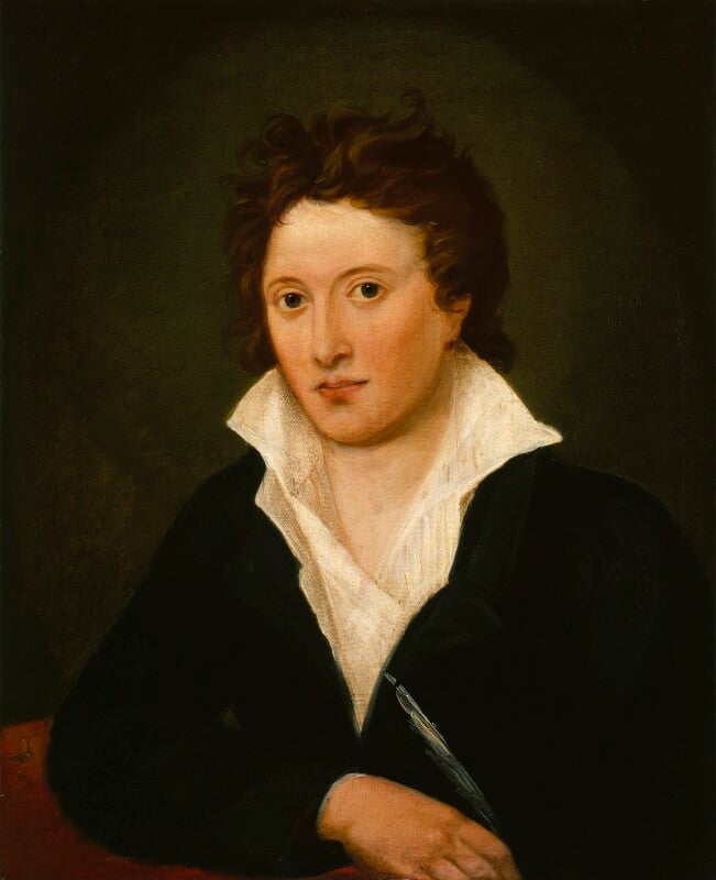
Ignore the sensationalist headline; there are no confessions here, and I’m not a heathen, I’m an atheist. When I was a teenage atheist, one of my main issues with the idea of god had been neatly summed up well over a century earlier by Shelley in The Necessity of Atheism (1811):
If God wishes to be known, cherished, thanked, why does he not show himself under his favourable features to all these intelligent beings by whom he wishes to be loved and adored? Why not manifest himself to the whole earth in an unequivocal manner, much more capable of convincing us than these private revelations which seem to accuse the Divinity of an annoying partiality for some of his creatures? The all−powerful, should he not heave more convincing means by which to show man than these ridiculous metamorphoses, these pretended incarnations, which are attested by writers so little in agreement among themselves?
As an adult atheist I still think that, but I think a lot of other things too. I should possibly point out here that though I don’t believe in any deities, the god I primarily didn’t and don’t believe in was the Christian one, simply because that’s the one who most prominently didn’t and doesn’t exist in my own personal experience. My lack of any kind of religious belief is something I’ve given a lot of thought to over the years and mentioned many times in passing on this website. I’ve never written specifically about it, but several things I’ve recently come across made me want to. One is the slightly dubious, clickbaity claim that (as one headline put it) “God is back” and that Gen Z (or some such amorphous group) is embracing the Catholic church. I’m sure that to some extent that’s true, as the Catholic church is just as evident as always, the choosing of a new Pope is TV news etc, but it’s also true that there have been other, substantially similar news stories about Gen Z embracing astrology and conspiracy theories and feminism and anti-feminism and fretting about world war three. None of those things are mutually exclusive of course (most of them should be; maybe feminism & anti-feminism actually are), and what it seems to add up to is that kind of end-times malaise normally associated with the end of a century or millennium.
I feel like it’s necessary to take those kinds of stories with a pinch of salt though, simply because over the years I’ve read all kinds of similar stories about Gen X which occasionally apply to me and often don’t, but in either case I’ve never been asked my opinion in order to gauge it and neither I presume have most people. And since every generation seems to spawn its own Nazis, centrists, communists and anti-fascists and everything in between, its philanthropists, misanthropes and bystanders, its religious zealots, libertines and atheists (etc, etc, ad nauseam), it seems fair to assume that any theory about a generation, just like any theory about a gender, race or sexuality is going to involve the kinds of generalisations which, once really examined, make the whole theory redundant. Presumably, church attendances are on the rise, but does that mean that belief is on the rise, or just that the desire for belief – quite a different thing – is? Or both? Who knows.
Alongside that, not coincidentally, more and more (inevitably right wing) politicians have been yammering on at first in the USA and now here, about “Judeo-Christian” values. It seems that this is mostly because they don’t like foreigners and Islam and are immune to irony. Because in insisting on the values of two ancient foreign religions from what we now in the West call the Middle East and denying the very similar values of another, very similar (though not quite as ancient) religion also from what we now call the Middle East does seem ironic, especially when one is tying it in with one’s national identity. There’s been a growing rhetoric (again, on the right) that suggests that Christians are becoming an oppressed minority in the UK, which is both tiresome and laughable but nicely (and again not coincidentally) complements the growth of a men’s rights movement that claims feminism (which, like atheism has arguably only recently began to have a fairly minor influence if any on the power structures underlying British society) has ‘gone too far’ and all that fun stuff.
Although my attitude has changed over the years, I don’t think my views really have. I genuinely think that it’s terrible and damaging that all over the world people are punished or ostracised or oppressed or killed or made to feel bad about themselves for offending arbitrary rules established in the name of imaginary beings. And in a way worse, the idea that there are omniscient, omnipotent beings who would be offended by actions which they must have foreseen at the moment of creation but decided to allow anyway, in order to punish them.
That kind of thing seems to be the basis of a lot of atheist polemic. Sometimes I find it entertaining and (depending on the writer) interesting, but, even while still believing every word of it, and feeling that it’s worth insisting on if asked about my views, as a middle aged atheist I wonder about the usefulness of saying it polemically at all. Because – for me at least – the opposite of religious faith isn’t science and logic (though I do believe in those), it’s simply non-faith. And I’m not sure there’s much to learn from that.
It’s not an argument that strengthens any cause, let alone mine, but I have come to think that lack of belief in a god or gods is just as instinctive, reflexive and fundamental as faith in them is. My mother was a Christian in her youth (in an atheist household, oddly for the 1950s) to the point where she considered becoming a nun. During her life, she wavered from various kinds of Christianity, to Taoism and Buddhism and a kind of vague paganism, but – and I think this is the most important point – although she lost her faith in many belief systems over the years, she never lost her essential faith in some kind of benevolent god or spirit at the heart of creation. For me it’s almost the opposite.
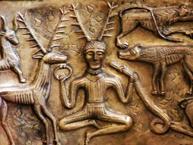
I have always been very interested in religions from Animism to Zoroastrianism in the exact same way that I’ve always been interested in mythology (I don’t really distinguish between the two) and I find pretty much all religions to some degree fascinating. I love churches and places of worship, I love the atmosphere of ‘holy’ places (even pre-historic places we now assume were once sacred) and I love the imagery and paraphernalia of religions, in the exact same way I love art and history. But it’s good that I’ve never wanted to belong to a faith or to become involved with those mythologies, because I can’t remember a time when I ever believed in even the possibility that a deity of any kind was an actual, real thing. Santa Claus either for that matter, although presumably at some pre-remembered point I did believe in him (Him?)
I have no idea where my lack of faith came from but I can pinpoint when I first became aware of it. I went to three ordinary Scottish primary schools, which in the 1980s meant reciting the Lord’s Prayer every morning before the class started. Not surprisingly, I still remember most of it, though mysteriously I can’t work out which bit I thought in my childhood mentioned snot; I was quite deaf then, but I definitely remember a snot reference, which always seemed odd. In my memory that daily recital was just part of a greater daily ritual which also involved (in the early years) chanting the alphabet and (through all of Primary school) greeting the teacher in monotone unison (The phonetic version of Mrs expresses it more accurately) “GOOD MOR-NING ‘MI-SIZ WAT-SON” or whoever the teacher happened to be – seemingly there were no male Primary School teachers in my day.
I have surprisingly sharp memories of looking round the class during the morning prayer to see who else didn’t have their eyes closed – there were usually a few of us, and sometimes we would try to make each other laugh – but a key part of that memory for me is the sureness of the feeling that I wasn’t talking to anybody. The praying itself wasn’t something I questioned or minded – if anything I quite liked it. It didn’t feel at all ‘bad’ or rebellious not to believe, it just never occurred to me at any point that god was real and might be listening, any more than I remember feeling that the notes put up the chimney to Santa would be read by an old man with a red suit and white beard, or that the carrot for Rudolph would be eaten by an actual reindeer.
At school we went to church (I think) three times a year – at Christmas, Easter and (an anomaly) Harvest Festival – and so folk horror-ish paraphenalia like corn dollies are always associated with church in my mind. The sermons were boring, as were some of the hymns, although others, the ones where the kids invariably sang the wrong lyrics, were fun – but I liked (and like) churches. I liked the musty, chilly smell and the wooden pews and the acoustics and the stained glass windows and especially the holiday feeling of being at school but not at school. And, though they only came into school life at these times of year I liked the Bible stories too. It seems funny now, but until well into adulthood the image that the word ‘Palestine’ summoned in my mind was an illustration of Jesus wandering around in pink and turquoise robes; I presume it’s from some forgotten book of Bible stories. But to me, stories – sometimes good ones (in the case of the early days of Moses and the last days of Jesus, very good ones), sometimes boring ones, are all that they were.
But where does lack of belief come from? The same place, presumably as belief.

In Word on a Wing (1976), one of my favourite David Bowie songs – also I think one of his most deeply felt and certainly one of his most open and revealing songs – Bowie, then in LA and in the middle of a drug-fuelled existential crisis but soon to withdraw to Berlin to live a relatively austere and private life, sings:
Just because I believe
Don′t mean I don′t think as well
Don’t have to question everything in heaven or hell
For me, that sums up (non-blind) faith perfectly. Essentially, it’s what Keats (those romantics again!) summarised as ‘negative capability’ (“Negative Capability, that is, when a man is capable of being in uncertainties, mysteries, doubts, without any irritable reaching after fact and reason” – from an 1817 letter to his brothers) but applied to one of the most fundamental human impulses. I completely respect it and see what both Keats and Bowie mean by it, but it’s completely alien to me. Well, not completely: I don’t need to know how a jet engine works to travel by plane, I do indeed have ‘faith’ in it, but what the (nowadays many) commentators who characterise scientific belief as a kind of religious faith seem to overlook is that I don’t believe it because a scientist says it’s true, but because I can actually travel on a jet plane, and even before I did travel on a jet plane I could see that other people travelled on jet planes, that planes really do fly and engines really do work. Which seems like the build up to some kind of New Atheism gotcha of the ‘if God is real why doesn’t he just prove it’ type popular in the 2000s (essentially a more sneery version of the Shelley quote). but that’s not really me either. Although I am definitely an actual ‘speculative atheist’ and I suppose even an ‘atheist fundamentalist’ and though I genuinely do believe that the world and humanity would be better off without religion, I’m just not sure how much better off it would be.
It’s not that the New Atheists were wrong (or even new, thinking again of Shelley). Most of the arguments that were raised against them are easily picked apart. The idea that there is no morality without religion is so obviously wrong that it seems pointless even to argue against it. The same basics of morality (murder and stealing and cheating and lying are bad, treat people as you wish to be treated etc) are and have been all but universal, though not without different nuances, throughout history and throughout world cultures.
But the problem with lack of faith as certainty (and for myself I really am certain about it) is that its arguments, though more logical – at least up to a point, as we shall see – have precisely as much effect on the certainty of faith as the arguments of faith have on the certainty of non-faith. Logic is no help here.
From my point of view, in the certain absence of a god or gods, religion is purely human and therefore many of the (in themselves solid) arguments against it are kind of a cop-out. It’s not unreasonable to find it laughable that a supreme supernatural being should care what food you eat on which days, or what you wear or how you like to have your hair. It seems bizarre that an almighty creator who could presumably do whatever it liked, would take the time to tell humans which crops they prefer to have planted where or that male masturbation is bad rather than simply preventing the possibility of rule-breaking ‘at source’. But the omnipresent invisible elephant in the room is that whether or not a god really felt or feels strongly about these things, whether or not a god had them written down in words, they really were written down in words, by human beings, some of whom definitely did want these rules to exist and to be enforced. And it’s human beings that still enforce them. Also, it’s just as true that primarily secular or entirely secular societies also have rules and customs regarding things like clothing, food, hairstyles and even names, although they rarely come with threats of severe retribution and never with the threat of ongoing retribution after death. And yes, many of these customs – like the acceptable length of women’s skirts in western society – ultimately derive from religious directives, but any authoritarian society, not only theocracies or weird, nominally religious ones like Nazi Germany, but even states where religion is completely anathema like Stalinist Russia, Communist East Germany or the North Korea under its current regime are hardly relaxed about the individual’s freedom of expression.
Religious wars and religious persecution are bad, not because they are religious per se, but because wars and persecution are bad. Wars and persecution may often be provoked by religion, but surely if like me you don’t believe in god, then blaming that non-existent creature for religious wars is just euphemistic buck-passing bullshit? The Crusades were horrific, bloody and unjustifiable, but to blame “Christianity” for them, rather than Christians, that is, actual European human beings, is like blaming, or giving credit to, Tengri for Genghis Khan’s conquest of vast tracts of Asia, or suggesting that Jupiter, Neptune and co enabled the Romans to found their empire. “Catholicism” didn’t create the Spanish Inquisition any more than the concept of Nazism created the Holocaust or Islam as a belief system resulted in 9/11 or the Taliban. Left to themselves, religions, ideologies and philosophies don’t do anything; they just sit there. And they all have one common denominator, and it’s not a deity.
This morning, I saw that the Pope had made a statement that some policy or other of the current US administration is “un-Christian and un-American.” Well. I am glad to see anyone with any kind of authority challenging inhumane, intolerant and fascistic regimes. But those actions are only un-Christian insofar as Christ himself wouldn’t like them, according to the Bible. But Christ was one single man-god who acted a certain way and said certain things. All manner of atrocities are entirely in keeping with the actions of two millennia of Christians. As for un-American, again, the acts the Pope condemns are not compatible with the statements made by the founding fathers of the Unites States of America; but they are probably no worse than the actions carried out by those same founding fathers in their lives or many of the successive governments of the USA. Or indeed many, many other governments in the world. And, to be all New Atheism about it, when it comes to the welfare of children for instance, it’s not like the Catholic church itself has an impressive record. Does that mean the Pope shouldn’t condemn things or that American people shouldn’t try to hold their government to account using the egalitarian rules set down when the country was founded? Of course not; but invoking some kind of imaginary, ideal standard of behaviour really shouldn’t be necessary to do so. There’s human decency after all
Another (non-conclusive, because none of them are) argument for the human, rather than divine nature of religion is that the religions that have survived the longest and strongest in the modern world are those which are most compatible with it. The paternalistic, to varying degrees misogynistic Abrahamic religions all defer their ultimate spiritual rewards (but more on the non-ultimate ones later) until after death. They have no in-built expectation of much material happiness or contentment on this plane of existence and to varying extents they actually value hardship, while prioritising men within the earthly realm. Well, the paths that led us to 21st century culture, especially imperialism and capitalism, are fine with all that. Work and strive now, happiness comes later, unless you are one of the privileged few. Communism in theory isn’t fine with that, but naturally, having been formulated during the Industrial Revolution, when the vast mass of people were already oppressed by a tiny ruling class (itself a mirror image of the earlier rule of Church & monarchical elite vs peasant majority), it is defined by its opposition to capitalism. Early Communism therefore took hardship as a given (there is no proletariat without it) and, in lieu of heaven, deferred the payoff of universal prosperity and equality to some future time when the world revolution has been achieved and all opposition to itself removed. It’s a cliché to say that communism is itself a kind of religion, but the parallels are unignorably consistent; trust the leaders, put up with the shit now, eventually if we’re true to our cause it’ll all work out, if those heretics don’t spoil it.
On the other hand, various older kinds of religions, animism and ‘earth mother’ paganism and so on, value (quite logically) the need to look after the world we live in. It’s not that the religions of the book explicitly say not to, but they aren’t primarily concerned with this world – and imperialism and capitalism and even communism, which have other uses for the material world than care and stewardship, have historically all been fine with that. It’s somehow not very surprising that the aspects of non-Christian religions that became most taboo during the age of imperialism, and therefore attributed to “savage” or primitive cultures – human sacrifice, cannibalism, idol worship and so on – should be parts of Christianity itself. Without human sacrifice, even if it’s only the sacrifice of one special token human, there is no Christianity. The divinity of Christ kind of goes without saying – that’s what makes it a religion. But his humanity is what makes him more than just the old Testament god. And insisting on his humanity inevitably made the eating of his flesh and drinking of his blood controversial. But seriously, whether someone believes they are literally eating the flesh and drinking the blood of an actual human being or only symbolically doing so, it’s a cannibalistic ritual just as atavistic and visceral as any of the imagined horrors that the Christians of the crusading period or the Europeans who spread their faith across the world believed they had encountered. It doesn’t seem too fanciful to say that what really horrified those Christians was the discovery that things they saw as fundamental to their own civilisation might be just as fundamental to civilisations that they had to believe were inherently inferior in order to destroy them.
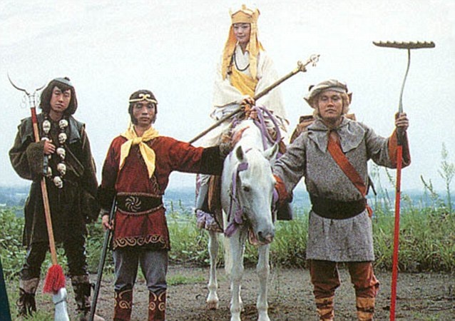
The fact that there are analogous stories to those in the Bible throughout history and world cultures (death, rebirth, sacrifice, enlightenment) suggests that whether or not one has any faith in these stories, they aren’t ‘just’ stories. In fact, a lesson that stayed with me (because it suits my personality I suppose) from the 70s TV show Monkey, based on Wu Cheng’en’s 16th century novel, Journey to the West – something like “winners make losers, therefore remove yourself from competitions” purports to be from a Taoist religious text. Eating the fruit of the tree of knowledge (I like to think a banana) and paying the unexpected price for it is, even as a mythological story, one that has real life analogies all through human history. I remember as a child when plastic coca cola bottles began to replace glass ones. It seemed futuristic and in a weird way utopian – lightweight like a can but resealable, far less risk to your drink if you dropped it than a glass bottle; less broken glass in the streets and parks. Whether or not scientists were already concerned with the problem of plastic’s lifespan or the sheer accumulation of it I don’t know, but kids weren’t, for a few years at least. Which has nothing to do with religion – but the attempt to do good turning out not only to be bad, but to be something that has to be dealt with and paid for down the generations is hardly an alien one. And in this case it was made worse not by religion, but by the inability or unwillingness of people under capitalism (myself included) to distinguish between convenience in the sense of people not having to waste half of their lives in drudgery and convenience in the sense of not having to get up to change TV channels. There’s probably a parable in there somewhere.
A favourite anti-atheist argument is the ‘intelligent design’/watchmaker one. It’s clearly an empty argument, but my counter arguments would only be convincing to an atheist – and not even to all atheists. The argument, put simplistically, that because a watch, or a computer, or anything human-made and complex didn’t just evolve on its own, but had to be consciously invented, therefore means that life, earth and everything else must have been consciously invented too requires an obvious leap of logic. The universe is not a machine, life is not the same as battery life.
The most complex things in our world seem to be human beings, and human beings also produce other human beings, often with no conscious thought and rarely with any kind of design at all. People are accidentally invented all the time. The idea that creation is accidental or ‘just happens’ is hardly a difficult one to grasp. The people that people produce are every bit as complex as their parents and grandparents, but only occasionally, and in the most superficial way, are they designed. Worse than that, logically, we know how humans are created, but even so it’s hardly unusual for them to be produced even when the people doing it very much desire not to do so. To look at the way that the most complex creations on earth are usually made and to label it “intelligent design” would be a strange thing to do, since it doesn’t necessarily include much intelligence or any actual design. Of course that doesn’t prove that things weren’t originally designed, but the gulf between organic living things and intelligently designed things as we experience them, even at the beginning of the AI age, is so fundamentally different that you might as well argue that a cat must have designed clouds because you once saw a cloud that was cat-shaped.
As mentioned in passing before, it’s popular among a certain kind of (usually, but not exclusively right-wing, American) Christian to compare ‘faith’ in science to faith in god, which is a false equivalence, for the jet plane kind of reasons mentioned above – but although I do believe science to be superior in every way to religion – because it learns from experience, for one thing – I do sometimes wonder whether it suffers from being (this sounds very different from how I mean it) homocentric (is ‘anthropocentric’ better? It sounds worse) in a similar kind of way. I remember learning (in a very basic way) about the big bang at school and asking the teacher, not unreasonably I think, *what* was supposed to have exploded and where that came from and being told “that isn’t a scientifically interesting question.” Well, quite possibly all the teacher meant is that at the current time any answer to that question must be pure speculation of a non-mathematical kind, but teen-me felt that it was basically “science works in mysterious ways” and he/I didn’t like that.
Somewhere in this article I had been going to say that Shakespeare was was as right as anybody when he wrote “Nothing will come from nothing” but now that I’ve reached this point I wonder whether being creatures that are born, who come from somewhere, who live for a while, who are subject to time and then who die and stop existing (or go somewhere else) shapes our understanding of everything. I do believe in the big bang because the evidence around us confirms its likelihood. The universe started, it expanded and at some point it will end. The idea of something that just is, forever, or that exists outside of time, whatever that would mean, seems as incomprehensible as non-existence does. That things, including human beings do stop existing is in one way obvious – but things breaking down, decomposing, changing from one form to another and (romantically) melding with the universe or (prosaically) enriching the soil or whatever is a process that is understandable. The personality and individual human consciousness switching off and simply not existing is the hard part to take in. As far as we can tell this isn’t a change in energy type, the electrical impulses that are us don’t seem go anywhere or do anything. But maybe that whole frame of reference; beginning, middle, end isn’t everything, it’s just the limits of human understanding. Which doesn’t, to me, imply the existence of any kind of creator or supreme being, just that there’s scope there for whatever you care to imagine but which you can never truly know. Keats would be fine with that.
Similarly, to apply logic to the existence of god will always be self-defeating, because logic is (as far as we know) a specifically human way of explaining the universe to its/our own satisfaction. The laws of physics and nature and mathematics do seem to work according to logic, which is very helpful for teaching and learning and science, but human beings themselves routinely defy logic in both profound and trivial ways. Many of the things that humans value most highly are completely resistant to logic, like art and god and love and money. Even something as humble as sports; one human being being able to run faster than another or play a game better than another is only dubiously something to celebrate, and if it is, then logically one might expect people to support only the best teams and athletes. If, alternatively it’s to do with identification with and loyalty to one’s own area, then fans might only be expected to support teams or athletes from the same geographical location as yourself, which is occasionally how it works, but just as often isn’t. There’s nothing especially logical about the enjoyment of a race or a game in which you aren’t involved for its own sake. Does that mean that logic is a faulty way of understanding the universe? I don’t know; but it is a faulty way of understanding human beings. The idea that god’s existence is a logical reality in a 2 x 2 = 4 way makes about as much sense as the position of the planets at the time of your birth dictating your future.
As Bowie implied, faith needn’t – and in many cases I’m sure doesn’t – preclude seriously considering the implications of one’s belief. But sometimes it does. I’ve never wanted to believe (I don’t really get why anyone would, if they don’t; which is my deficiency), but as an adult I have always wanted to understand people who do. And in general, I find it frustrating to try to do so, as two different but very similar anecdotes about my encounters with people of faith illustrate. I am aware though that these may say more about me than they do about the believers.
In my professional capacity I was once interviewing a prominent American black metal musician whose latest album went on about blasphemy a lot. Given that black metal encompasses everything from orthodox satanists to heathens and pagans and occultists and chaos magicians and nihilists, I asked what I thought was a reasonable question; what meaning does blasphemy have unless one believes in god? Doesn’t the concept of blasphemy essentially reinforce the religion it attacks by affording it some kind of legitimacy?* The musician’s response was the black metal version of these go up to eleven. I think what he actually said was “Everyone knows what blasphemy is.” And he was right I suppose, but he was also characterising his band as purveyors of simple shock and outrage to the very few people who are still shocked and outraged by blasphemy. Ho hum.*

*this made me think of an occasion in high school where I muttered “of for god’s sake” or something like that and my maths teacher said “don’t blaspheme, William!” and I replied “it would only be blasphemy if god existed” and was given a punishment (lines). It was only years later than realised I deserved the punishment, not because of god, but because I was being a smart arse to a teacher – at the time I just felt righteously angry about the lines.
Likewise, a visit from some very pleasant Jehovah’s Witnesses left me with unexpected admiration for them, but also some frustration; they also left prematurely, which my younger self would have regarded as a victory. The respect was for their answer to the kind of question that seems like a typical smart-arse one, but I was genuinely curious. If there are only 144, 000 places in heaven in your religion (I had only recently learned that strange fact) and those are all spoken for already, why are you knocking on people’s doors trying to spread the word about your faith? I hadn’t expected their response, which was something like “Oh, we don’t expect to see heaven. Heaven is for god and the saints and angels, Earth is the paradise that god made for humans, it just needs to be fixed.” A version of Christianity that withholds the promise of paradise even after death was weird to me, but also impressive. Having a faith where you never expect to attain the best bit seems coolly ascetic, but also kind of servile, which it literally is. The fact that servility seems distasteful to me is I suppose my weakness not theirs.
I was less impressed with the response to what I felt and still feel is a serious question and not just a cynical gotcha; If god is all you say it is, all powerful, blah blah, then why create evil? There was a stock answer ready, which was to do with free will and choice, but even though there are holes to be picked in that too (the ‘free will’ of transgressors has nothing to do with the free will of their victims, what about their will?) – that wasn’t what I meant. What I was asking is, If you can do whatever you like, can see everything that has ever happened and everything that will ever happen, if you are capable, presumably, of endless satisfaction and happiness, why create ‘bad’ – or, more personally perhaps, why create even the concept of ‘things you don’t like’ at all? To that question, I got the Jehovah’s Witness version of “these go up to eleven” and a quick goodbye. But I genuinely wasn’t trying to catch them out, I really wanted to know what they thought about it, but apparently they didn’t think anything. Having said that, I can see now that I write about it, that interrogating your belief system for the benefit of a stranger who obviously isn’t going to be persuaded to join you is probably not all that attractive. Still, I didn’t knock on their door.
So much of religion seems to me to be saying that that, whatever the wonders and horrors and joys and pains of life, it’s not enough and they want more. But again, that’s not exclusive to religious people. I recently saw an unsettling but also unintentionally funny video in which the PA of a shadowy, influential and incredibly wealthy figure was talking about transhumanism and his master’s ultimate Roy Batty/Weyland-from-Prometheus plan not to die at all. Which feels very sci-fi, but also very late Roman Empire. At the same time, my generation grew up with the rumour that Walt Disney’s head is in a refrigerator, awaiting medical science until he can be resurrected when the technology catches up enough. Rebirth and resurrection; there really is nothing new in human history.
All a bit bleak, maybe; but if religion only offered oppression, judgement, condemnation and war then far fewer people would devote their lives to it. And if the negative aspects of religion all exist independently of religion, then so do the positive aspects, and without the same arbitrary punishment/reward structure underlying it.
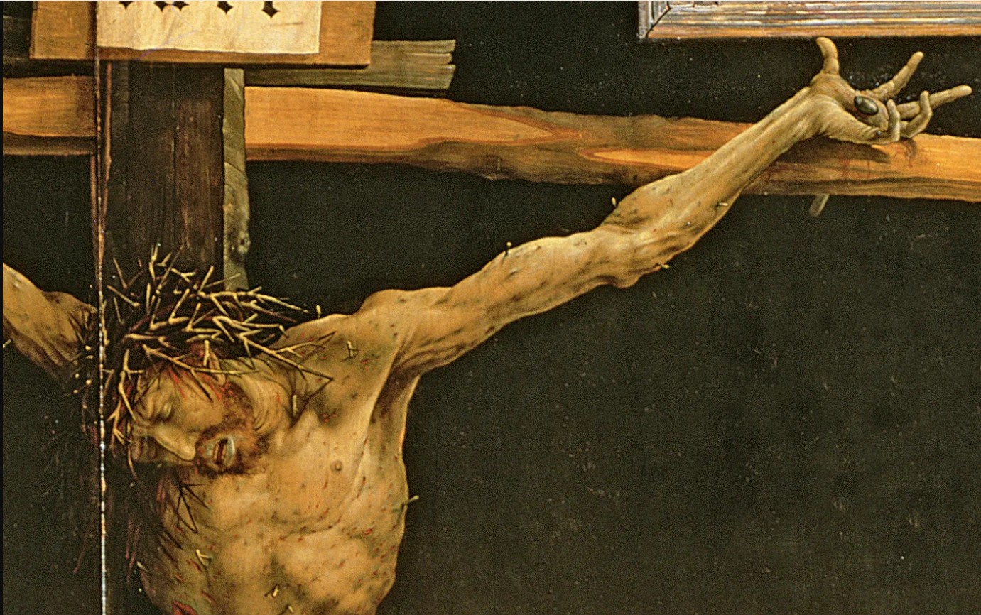
Religion offers comfort to people in distress, it offers a sense of community and belonging, it offers contact to people who feel isolated. It offers various kinds of love. I can’t think of many artworks more moving than Matthias Grünewald’s crucifixion from the Isenheim altarpiece (1512-6), painted to comfort people who were suffering from skin diseases, by showing them the scourged Christ’s suffering, which mirrored their own. But just as the Quran didn’t issue a fatwa against Salman Rushdie and the Bible didn’t take babies from unmarried mothers and kill them and bury them in the grounds of institutions, neither do those books feed the poor, embrace the lonely, paint pictures or create a sense of community. Human beings do those things, and they do them regardless of religion. They do it in societies where religious beliefs aren’t based on the Judeo-Christian tradition and they do it in societies where religious beliefs are actively frowned on. After the dissolution of the USSR, few people were nostalgic about the food queues or the secret police, but many were nostalgic about the sense of community that came from masses of people being in the same situation together. And now that capitalism which, unlikely though it seems, is not always so far removed from Soviet communism, has created its own underclass and hierarchical power structure and pogroms and whatnot, people have also created their own communities, support groups, charities and friendships.
The one positive thing that faith offers that non-faith of my kind doesn’t, is a personal relationship with god – and that’s where we came in; you either believe or you don’t. I can completely understand that having a direct line to someone who knows you and understands you better than you know yourself, who accepts and forgives you could be nice and comforting. Maybe in pre-Christian or non-monotheistic societies that voice was the voice of the ancestors or the spirits of the trees and rivers. I can see how that would be nice too, but for myself I can’t imagine having such a thing or longing for it or even wanting it. For me, you either disbelieve or you don’t.
And maybe that’s really the strongest argument, not against faith, which there is no argument against, but against religions as institutions, as rules and directives of the kind that people are so keen to re-establish. Because if there’s one thing you can see, looking not just at the diversity of religions but at the diversity of beliefs within them, at the different ways that people relate to and communicate with their gods, it’s that god is just as personal and individual as any of its believers and disbelievers and so making an orthodoxy of it can only ever harm more people than it helps.


 This is perhaps art history as human interest and association rather than as aesthetics (this is especially true in the case of the Victorian scraps and scrapbooks, perhaps because the ready-made nature of the scraps themselves makes the objects feel less like the works of an artist and more like a hobby; nothing wrong with that, but as the sort of things you see in auctions and junk shops they have the aura of being ephemera, rather than using ephemera to make something else; a false distinction perhaps), but for me this exhibition brings those two aspects of art – the human/historical and the aesthetic/technical together in a deep and very satisfying way.