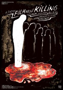
I don’t believe in the death penalty. In this, I’m in the majority, globally. I’m not sure when exactly I became against it; until at least the age of 12 I was pretty much a proto-fascist with an ‘eye-for-an-eye’ sense of justice, as boys tended to be in those days and for all I know still are. But I know that by the time I saw Krzysztof Kieslowski’s brilliantly grim A Short Film About Killing (Krótki film o zabijaniu) when I was 16 or so I was already anti-death penalty and have remained so ever since.
My reasons are, typically, kind of pedantic. There are many obvious arguments against the death penalty; there’s the ‘what if you accidentally kill the wrong person’ argument and that’s a pretty strong one – it has happened and does happen and is irreversible. There’s the fact that the death penalty seems to have a negligible effect on the crime rate. In fact, countries with the death penalty on the whole seem to have more rather than fewer murders (not that there’s necessarily a link between those two things). Even from the coldest and most reptilian, utilitarian point of view – getting rid of the problem of prison overcrowding – any possible benefit is negated by the fact that in most countries with the death penalty, prisoners spend years on death row being fed and housed, rather than being quickly and efficiently ‘processed.’
There’s also the Gandalfian(!) argument from The Lord of the Rings; “Many that live deserve death. And some that die deserve life. Can you give it to them? Then do not be too eager to deal out death in judgement. For even the very wise cannot see all ends.” That wasn’t just a handy deus ex machina that Tolkien used because he needed Gollum to survive in order to destroy the ring. Well, it was that, but Tolkien was also a devout and serious Christian and that was his moral outlook. Thank Cthulhu that unlike his friend CS Lewis, he deliberately left religion out of his books though! In the Biblical commandment Thou Shalt Not Kill, the Judeo-Christian god doesn’t list any exceptions or mitigating circumstances – in that one instance. Of course elsewhere in the Bible there are many circumstances where humans killing humans is considered appropriate and even righteous – the ultimate irony being that Jesus, kind of like an anti-Gollum, has to suffer death through violence to achieve his purpose. Religion is odd; but I’m not a Christian or Jew.
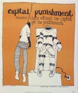
All of those points are relevant, but for me personally, it’s far simpler than that; if you can be legally killed, that means that in the eyes of the state there’s nothing wrong in essence, with killing people. I think there is, and I don’t think that it should just be a matter of having the right paperwork. Put bluntly, to kill a murderer is not telling them ‘what you did is wrong‘ so much as ‘you did it wrong‘ which I don’t think is just a minor difference. On top of that, there’s the whole question of who you are handing this responsibility over life and death to. I have a lot of respect for some lawyers, attorneys, judges, police officers etc, but there are others that I wouldn’t trust with my lunch, let alone my (or anyone else’s) life. States have a character, and often that character is institutionally biased regarding race, class, gender and sexuality. Giving that kind of absolute power within that kind of deeply fallible framework seems likely to create far more problems than it solves. But even in non-death-penalty countries like the UK we routinely give people the legal right to take other people’s lives; all they have to do is join the armed forces.
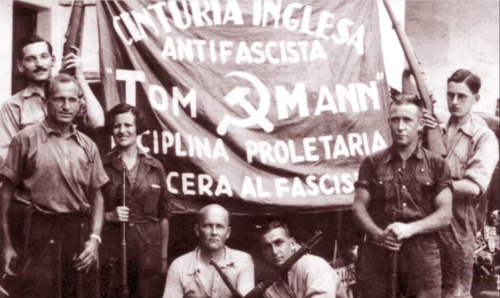
I’m no more consistent than anybody else and my attitudes have their exceptions and contradictions. I (predictably) don’t philosophically differentiate between the military and mercenaries, because what ‘serving your country’ means in practical terms is carrying out whatever the policy of your current government is that week, with no certainty that it won’t be contradicted by a new policy (or a new government) the following week. If enemies suddenly turn out to be allies or vice versa, the dead remain dead. That said – here’s the contradiction – I’m not a pacifist absolutist either, and I think, or like to think, that if an invading army arrived in my country I’d take arms against it.
These things are particular though; everybody likes to think they’d fight for a good cause. The Spanish Civil War stands out for the number of anti-fascist fighters from all over the world who took up arms in defence of Spain, but that happened partly because so many people were ready to – and wanted to – fight. Many of those, George Orwell is a prominent and typical example, belonged to the generation who had been just too young to fight in World War One and whose feelings about war – including a considerable amount of survivor’s guilt – had been shaped by it. The fascist attack on the Spanish republic gave them a clear-cut situation to intervene in, in a way that the more gradual, more political rise of fascism in Italy and Germany didn’t.
But anyway, the death penalty. People of course do terrible things, but although lots of them are significantly more horrific than a lethal injection or the electric chair, the end result is the same. Being – odd, brief segue but bear with me, it’s relevant – a fan of black metal music, the subject of death and murder is one you come across in a different way from just being, say, a fan of horror movies. Because the poser-ish ‘darkness’ of black metal spills over (though less than it used to) into ‘real life,’ almost as if the kind of art you make bears some relation to the kind of person you are. I won’t go into the tedious-but-fascinating Lords of Chaos stuff about Mayhem & Burzum or Absurd because it’s not quite relevant here, but the story of Smutak (Pavel Selyun) who ran Morak Production record label in Belarus is.
In 2012, Selyun discovered that his wife, the artist and singer Frozendark (Victoria Selyunova) was having an affair with the artist, zine editor and musician Kronum (Alexey Vladimirovich Utokva). Sticking with the pseudonyms seems appropriate to the melodrama, so I’ll do that from here on. Smutak murdered both Frozendark and Kronum then dismembered them and was apprehended on the subway three days later with Kronum’s head (or skull; – some accounts say he boiled the head – same difference I suppose but I don’t need to know) in a bag. After his arrest, he was imprisoned in Minsk and after a confession gained under torture and the failure of various appeals he was executed two years later, by being shot in the back of the head.
A horrible postscript that demonstrates how the death penalty punishes the innocent as well as the guilty; after Smutak’s execution the authorities failed to hand over his body to his mother or tell her where he’s buried, the case was handed to the UN Court of Human Rights.
Not many people (and certainly not me) would say that Selyun didn’t ‘deserve’ his treatment. But still. He possibly tortured and definitely killed people and then was tortured and killed. There is a kind of Elizabethan revenge tragedy balance there, but it’s one in which the act of torturing and killing itself is made neutral. Whoever tortured and killed Smutak doesn’t need any kind of defence and won’t face any kind of judgement, because they did it in the name of the law. But the idea that torturing and killing becomes morally neutral because you don’t have any emotional investment in the act is an odd one. Smutak had nothing to gain from his actions other than some kind of horrible satisfaction. The person or people who did the same to him had nothing to gain accept for their wages. Which is morally, what? Better? He reportedly felt the same kind of fear as his victims; well good, I guess, but that did nothing to benefit those victims. It may have pleased the victims’ relatives but I wouldn’t want to examine that kind of pleasure too closely.
 The current case of Luigi Mangione is far stranger. It’s the only time I can recall that the supporters (in this case I think ‘fans’ would be just as correct a word) of someone accused of murder want the suspect to be guilty rather than innocent. Whether they would still feel that way if he looked different or had a history of violent crime or had a different kind of political agenda is endlessly debatable, but irrelevant. It looks as if the State will be seeking the death penalty for him and for all the reasons listed above I think that’s wrong. But assuming that he is guilty, which obviously one shouldn’t do (and if he isn’t, Jesus Christ, good luck getting a fair trial!) Mangione himself and some of his fans, should really be okay with it. If he’s guilty, he hasn’t done anything to help a single person to get access to healthcare or improve the healthcare system or even protested against it in a way that people with the political power to affect change can positively react to. UnitedHealthcare still has a CEO, it still has dubious political connections and it still treats people very badly. That doesn’t mean that it’s an unassailable monolith that can never be changed, but clearly removing one figurehead isn’t how it can be done.
But more to the point; why does the killer (assuming their motives are the ones that are being extrapolated from the crime) care anyway? If actually shooting someone dead in the street is okay, then surely being indirectly responsible for the misery and possible deaths of others is barely even a misdemeanour. It amounts to the kind of Travis Bickle movie logic I’m sure I’ve sneered about elsewhere; complaining about the decay of social values and then committing murder is not reducing the sum total of social decay, it’s adding to it. A society where evil CEOs are shot dead in the street is a society where human beings are shot dead in the street and that becoming acceptable is not likely to be the pathway to a more just, equal or happy society.
What the death penalty does do, and probably a key part of why it’s still used in some countries, is offer a punishment that seems (in the case of murder at least) to fit the crime. Interestingly, public executions – which counterintuitively seem to have no better track record as a deterrent than any other kind of execution – are now vanishingly rare. Part of that is no doubt to do with public disgust and part with institutional secrecy and shame, but I imagine that part of it is also the fear that the public would enjoy it too much.
I’m not sure if I’d think that if it wasn’t for the spate of Islamic State beheadings that were so widely watched on the internet back in the early 2010s (was it?) I watched one, like most people seem to have, and still wish I hadn’t; but you can’t un-ring a bell. That was at the back of my mind when I wrote about saints and martyrdom for this site a while ago and I can bring images of it to mind horribly easily.
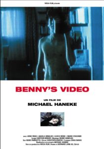
But even before that, it shouldn’t have surprised me – like many other teenage horror movie fans in the pre-internet era I watched exploitation videos like Face of Death that featured executions, accidents etc, and in doing so realised that I was specifically a horror fan and not a fan of whatever that is. I should have learned my lesson there, but it’s undeniable that these things have a murky kind of fascination; since then, thanks to one of my favourite writers, Georges Bataille, I’ve ended up reading about Lingchi (‘Death by a Thousand Cuts’) and looking at the chilling and depressing photos of it, been appalled by postcards of lynchings, seen revolting photographs of soldiers’ desecrated bodies and murder victims. I haven’t gotten used to those images and I hope I never will. Teenage me would no doubt sneer at that because he thought that things that are ‘dark’ are cool, but that seems like a laughable and childish attitude to me now, so I can take his sneering. It might seem that I’m edging towards the point that Michael Haneke is making in Funny Games (1997), which I find a bit tiresome and preachy (even more so the remake), but I’m not. I disagree with the premise of that film because I do think there’s a difference between fictional horror and real horror, and that enjoying one isn’t the same as enjoying the other. I think his 1992 film Benny’s Video makes a similar but much more subtle and complex point far better.
Imprisonment (whatever your views on the justice system) is a pretty unsatisfactory solution for most crimes, but it’s difficult to think of a better one which doesn’t essentially exonerate the kind of behaviour we want to characterise as abnormal or criminal. ‘An eye for an eye’ is the thinking behind the death penalty but its illogical nature can be seen when applied to any other crime. Stealing from a thief is obviously ‘justice’ in that sense, but as a punishment it would be laughable. Raping a rapist would be grotesque and would double the number of rapists in the room every time it happened. But even so, it’s never going to be comfortable that the tax payer is contributing to the relative comfort of someone like (I’ll only mention dead ones, this isn’t a complaint about the legal system being soft on psychopaths) Fred West.
A solution l think I might suggest is one which I’m extremely dubious about myself from lots of different humanitarian, psychological and philosophical points of view; why not offer (and that word alone would make people angry) ‘monsters’ – that is, the kind of killers in a category of their own, who admit to horrendous acts of murder and torture and whose guilt is not in doubt – the ones that will never be allowed freedom – the choice of a lethal injection rather than life imprisonment? That’s a horrible thing to contemplate – but then so is paying for the meals and upkeep of someone like Ian Brady, especially when he essentially had the last laugh, exercising his tiny bit of remaining power over the families of his victims and having his self-aggrandising bullshit book The Gates of Janus published.
That last part was kind of icky and uncomfortable, but so it should be – the whole subject is. So for what it’s worth, those are my thoughts on the death penalty. Time for a shower; until next time, don’t murder anyone please.




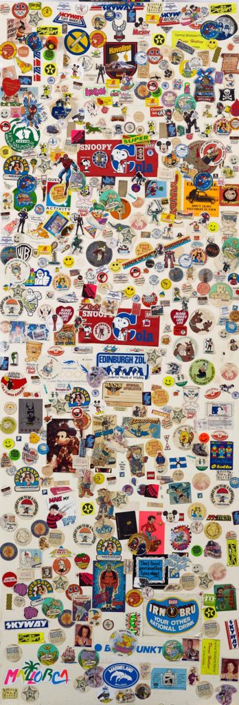
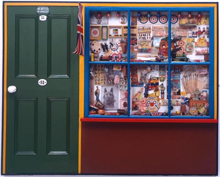
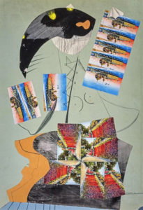
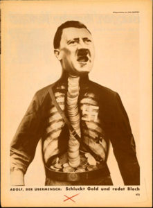
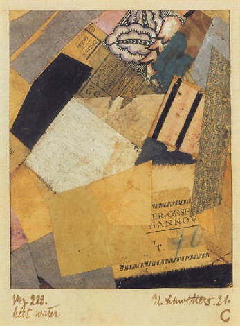
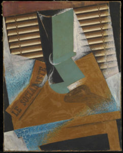
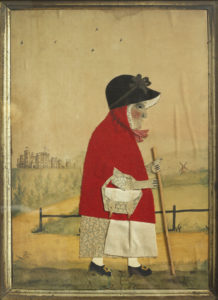 This is perhaps art history as human interest and association rather than as aesthetics (this is especially true in the case of the Victorian scraps and scrapbooks, perhaps because the ready-made nature of the scraps themselves makes the objects feel less like the works of an artist and more like a hobby; nothing wrong with that, but as the sort of things you see in auctions and junk shops they have the aura of being ephemera, rather than using ephemera to make something else; a false distinction perhaps), but for me this exhibition brings those two aspects of art – the human/historical and the aesthetic/technical together in a deep and very satisfying way.