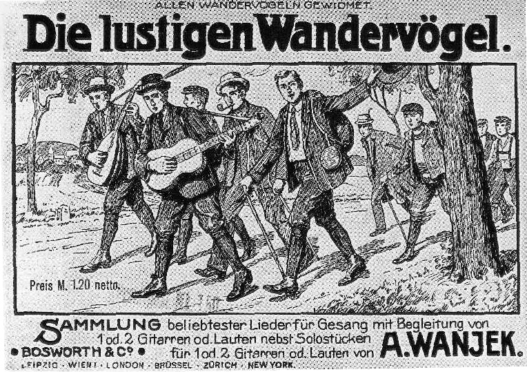
Firstly; if you’re looking at this because of the word ‘incestuous’, shame on you! Anyway, for a variety of reasons, lots of album covers seem to pay tribute to/copy/look like lots of other ones, which is what this is all about.
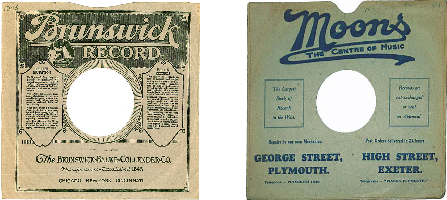
In the early days of shellac and then vinyl records the sleeve was mainly used to advertise either the record label or sometimes the retailer of the disc within.
But this isn’t a history of picture sleeves, interesting though that would be. Once there were music stars who people recognised the faces of, the sleeve became a promotional tool in a far more specific way than before. The main reason initially for ‘lookalike’ sleeves was presumably that artists and/or record labels hoped (and still do) that something that worked for someone else will work for them, artistically and financially and possibly creates a link between the artists in the buyer’s mind. Then there are those who sincerely wish to pay tribute to one of their influences, those who are just unconsciously doing so, and those artists who share a background in a genre/culture etc, and…. well; lots of reasons. Some examples…
1. Blondie – Blondie (Private Stock, 1976) & Kim Wilde – Kim Wilde (RAK, 1981)
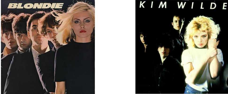
By 1981, Blondie were no longer a cult, punky act, but international superstars. What better inspiration for a kind of pop pastiche of the new wave sound? In comparison with Blondie, Wilde’s first album is pretty pretty weak, though it does have some great songs on it; if you think Kids In America is great.
2. Kiss – Destroyer (Casablanca, 1976) & Manowar – Fighting the World (Atco, 1987)
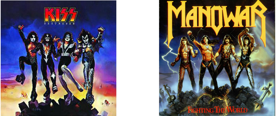
Kiss were tongue-in-cheek cartoonish macho hard rock. Manowar were cartoonish macho metal that was either so completely tongue-in-cheek that they refused to acknowledge the humour of their whole image or else were deadly serious, which is kinda scary; but either way pretty ace. Consciously or not, surely a manly tribute to ‘the old gods’
3. Elvis Presley – Loving You (RCA Victor, 1957) & many, many others including Fabian – The Fabulous Fabian (Chancellor, 1959) and Bryan Ferry – These Foolish Things (Virgin, 1973)
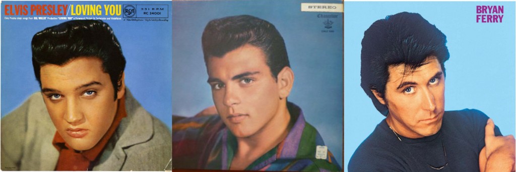
Right from the start, Elvis’ album covers were to create the iconography of pop/rock music, imitated for commercial reasons by his imitators & later paid homage to by artists who grew up with Elvis as the face of rock ‘n’ roll (see also Elvis’ debut album & The Clash’s London Calling)
4. Joni Mitchell – Blue (Reprise, 1971) & Marianne Faithful – Broken English (Island, 1979)
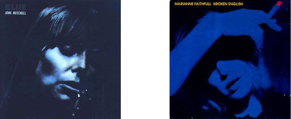
Probably coincidental, but both albums are the definitive releases of iconic female singers & were to an extent departures from their previous work, both are good and both pictures are blue innit. Also, although they are both self-consciously posing for a picture, neither artist was concerned with trading on their looks in the way that record labels have traditionally done with both female and male artists (see Elvis etc) from the 1950s onwards.
5. Carpathian Forest – Through Chasm, Caves & Titan Woods (Avantgarde Music, 1995) & Wongraven – Fjelltronen (Moonfog, 1995)
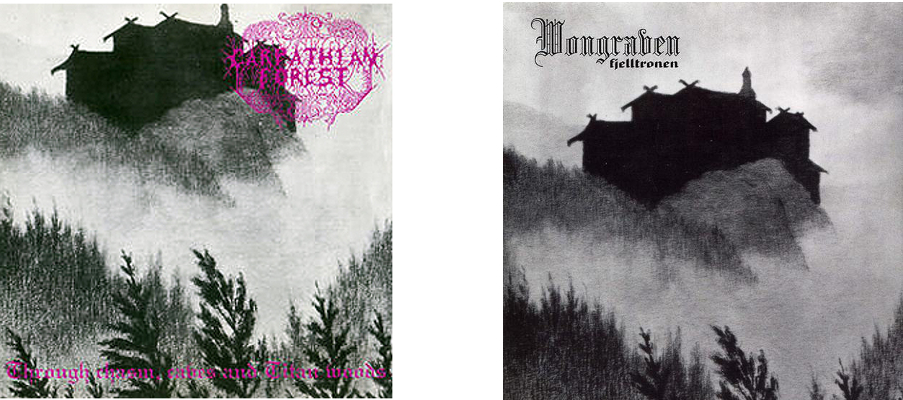
Not exactly a coincidence; both bands used the same picture by Norwegian folkloric artist Theodor Kittelsen (1857-1914), iconic in the black metal scene ever since his drawing Fattigmannen was adopted by Varg Vikernes for Burzum’s Hvis Lyset Tar Oss in 1994
6. Jan & Dean and Friends- The Heart & Soul of Jan & Dean & Friends (Design Records, 1964) & Mel Torme – I’ve Got The World On A String (Allegro, 1964?)
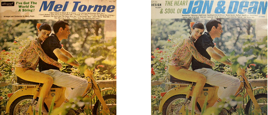
A strange one, presumably these were both budget releases & the labels sourced the attractive but irrelevant artwork from an image library.
7. The Beatles – Sgt Pepper’s Lonely Hearts Club Band (Parlophone, 1967) & The Rolling Stones – Their Satanic Majesties Request (Decca, 1967)
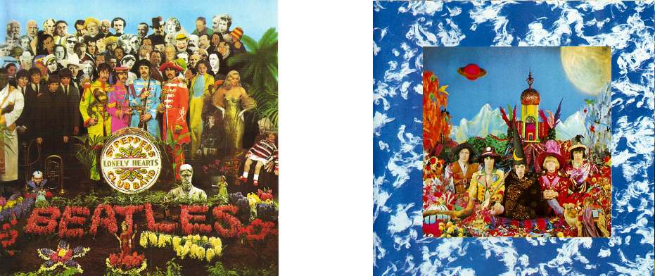
A notorious pairing, the Stones, famously at a bit of a dead end, tried to emulate the feel & popularity of Sgt Pepper with the extremely lavish holographic (etc) artwork of Satanic Majesties, but it didn’t really work. A much better album than it’s reputed to be however.
8. David Bowie – Aladdin Sane (RCA, 1973) & Jobriath – Creatures of the Street (Elektra, 1974)
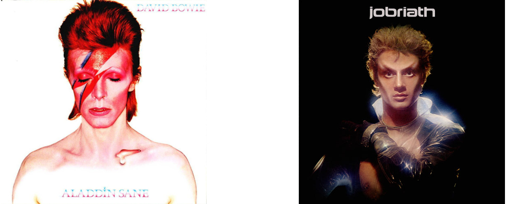
It’s fair to say that Jobriath was influenced by Bowie in pretty much every aspect of his early recording career, but although Creatures… (mentioned elsewhere in this blog) is an interesting but not great LP, the front cover is, alas, just a little bit ridiculous by comparison with Bowie at his iconic peak.
9. The Byrds – Mr Tambourine Man (Columbia, 1965) & The Jimi Hendrix Experience – Are You Experienced (Track Records, 1967)
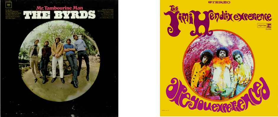 This comparison really traces the advance of psychedelia from a mild distortion of perception to a neon-coloured hallucination over the two years 1965-67
10. The Smiths – The Smiths (Rough Trade, 1984) & UK indie music in general (here; The Wedding Present – George Best (Reception Records, 1987) & Belle & Sebastian – The Boy With The Arab Strap (Jeepster, 1998)
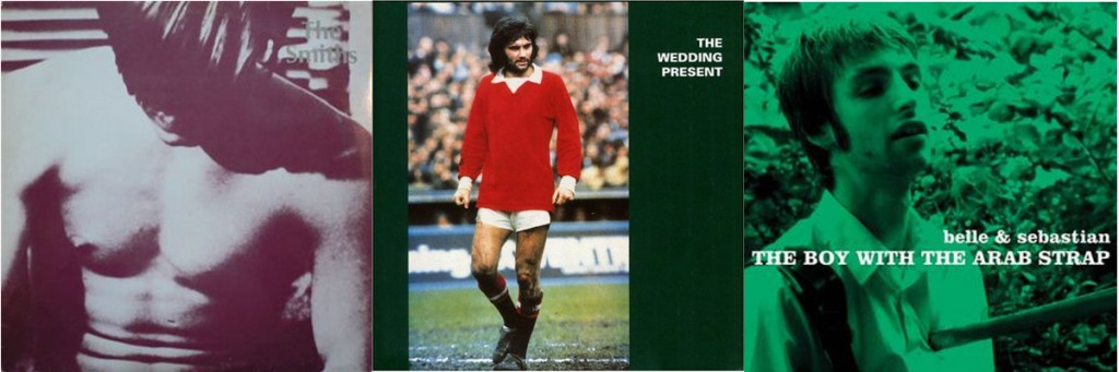
The Smiths (mainly, one presumes, Morrissey) cared about the appearance of their records in a way that few artists have, and the relatively brief period of their recording career (83-87) means that their oeuvre has a unified completeness which is both rare and pleasing; presumably if they had gone on forever they would have tried something new at some point. The look (as well as the sound) of The Smiths had an immediate and lasting impact on the UK indie scene; although The Wedding Present (often characterised as the Smiths fans’ second favourite band)’s classic George Best doesn’t look especially like a Smiths album, the whole aesthetic seems to come from a similar (if slightly less glamorous) source. Stuart Murdoch of Belle & Sebastian seems to have, like Morrissey, a complete vision for the way his band should be and to date the B&S discography has a distinctive (and slightly Smiths-like) appearance. A good proportion of UK indie sleeves still have a very post-Smiths appearance (as does the output of the great My Little Airport from Hong Kong)
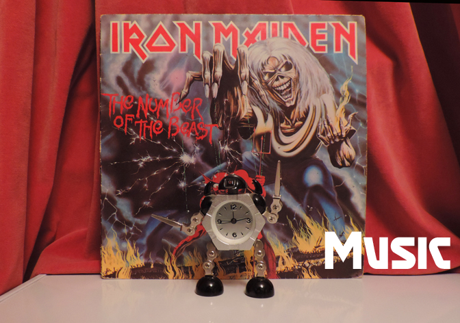
11.. Iron Maiden – Number of the Beast (EMI, 1982) & Megadeth – Peace Sells… But Who’s Buying (Capitol, 1986)
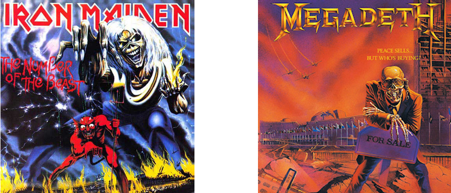
Iron Maiden’s Eddie has influenced the covers of thousands of heavy metal LPs throughout the 80s (and to the present day) but Megadeth’s Vic Rattlehead is probably the most blatant homage & Peace Sells… is probably their best album cover of the era.
12. Bob Dylan – Bob Dylan (Columbia, 1962) & Donovan – What’s Bin Did and What’s Bin Hid (Pye, 1965)
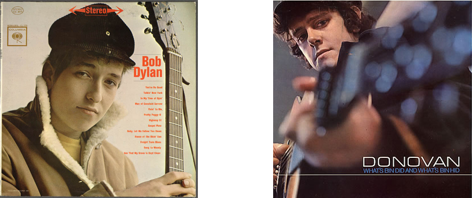
Despite their essentially very different styles, Pye Records was determined to use the surface similarities between the two young folksters to promote Donovan as the British Bob Dylan and to that end, What’s Bin Did… features an informal Dylanesque photo as its cover image.
13. Poison – Look What The Cat Dragged In (Capitol, 1986) & Dogs D’Amour – In The Dynamite Jet Saloon (China Records, 1988)
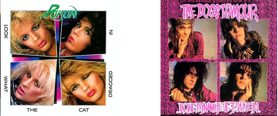
Although the rougher, more rock ‘n’ roll-glam oriented Dogs D’Amour were less influenced by Poison than bands like Tigertailz were, the layout of their least all-over-the-place album is, by accident or design, a scuzzy-glam echo of Poison’s more Hollywood-looking debut.
14. Randy Newman – Randy Newman (Reprise, 1968) & Elton John – Elton John (DJM, 1970)
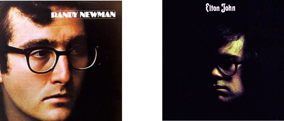
It may be no coincidence that Elton John, with one not-massively-successful album behind him and a few years away from his outrageous glam-era costumes etc should seemingly model the cover of this, his breakthrough album, on Randy Newman; dour, unflamboyant , thus far critically and commercially neglected, but already an artist’s artist. It worked better for Elton.
15. Carnivore – Retaliation (Roadrunner, 1987) & Sodom – Persecution Mania (Steamhammer, 1987)
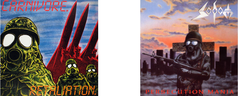
Presumably a coincidence, both of these albums are speed metal classics, although Carnivore are less well remembered than Sodom (who, to be fair are still going). The passing resemblance of these covers probably says as much about the atmosphere of the Cold War era as it does about metal.
16. The Beatles – With The Beatles (Parlophone, 1963) & The Nazz – Nazz (SGC, 1968)
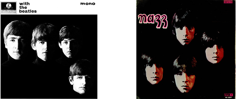
As with the aforementioned Elvis sleeves, every picture of The Beatles in their early years was influential, and none more so than the cool, simple sleeve for With The Beatles. Even so, it’s somewhat surprising to see its influence lingering as late as the psychedelic era, when Todd Rundgren’s Nazz released their debut (which arguably is modelled on the early covers of The Rolling Stones as much as The Beatles. But then the early Stones albums wouldn’t have looked as they do without The Beatles either.
17. The Rolling Stones – Sticky Fingers (Rolling Stones, 1971) and Mötley Crüe – Too Fast For Love (Leathür Records, 1981)
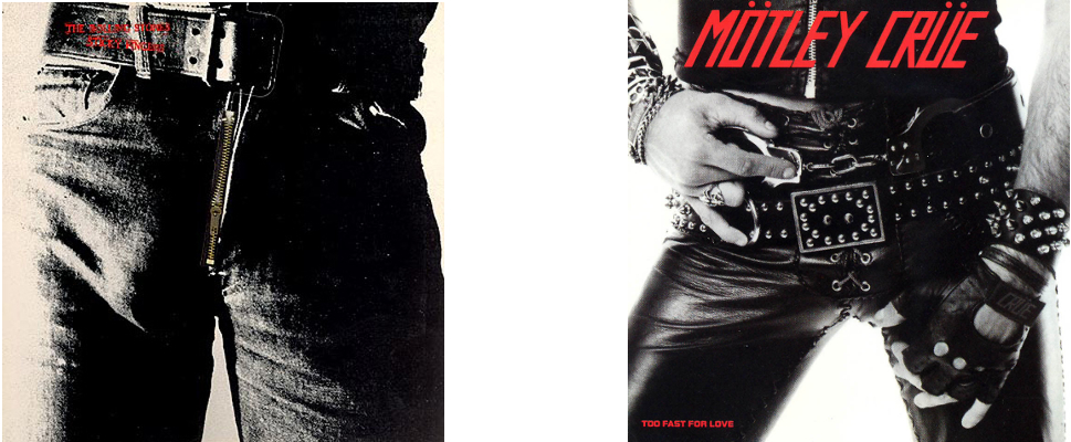
Although only a passing similarity, Motley Crue inherited much of their spirit and attitude from the Stones and the cover of their debut is appropriately a more in-your-face updating of the classic Stones artwork.
18. David Bowie – “Heroes” (RCA, 1977) & Iggy Pop – The Idiot (RCA, 1977)
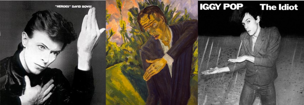
Not a coincidence, Bowie & Iggy Pop worked closely in their Berlin period & both were influenced by German Expressionism, here in particular by Erich Heckel’s painting Roquairol. Iggy’s album is a bit better than Bowie’s though; if only he had worked with Eno!
19. Kate Bush – Never For Ever (EMI, 1980) & Toyah – Anthem (Safari, 1981)
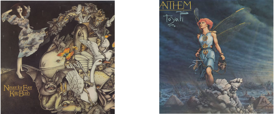
Anthem was probably Toyah’s best album; a nice mix of post-punk and new wave/synth pop influences, but despite her strong image she was never as individual or idiosyncratic as Kate Bush, although the fairytale-ish album cover suggests some similarity.
20. Charles Lloyd – Geeta (A&M, 1973) & Weather Report – Black Market (Columbia, 1976)
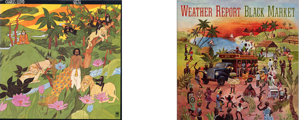
Charles Lloyd started out as a pretty standard post-Coltrane bop-saxophone player, specialising in ‘chamber jazz’, but by the early 70s he, like jazz in general, had become interested in fusion and elements of world music, reflected in the artwork for Geeta. That was pretty much where Weather Report came in, and although mostly Miles Davis influenced, Black Market has, coincidentally or not, a certain Charles Lloyd-ish quality.
21. Witchfynde – Give ‘Em Hell (Rondelet, 1980) & Venom – Black Metal (Neat, 1981)
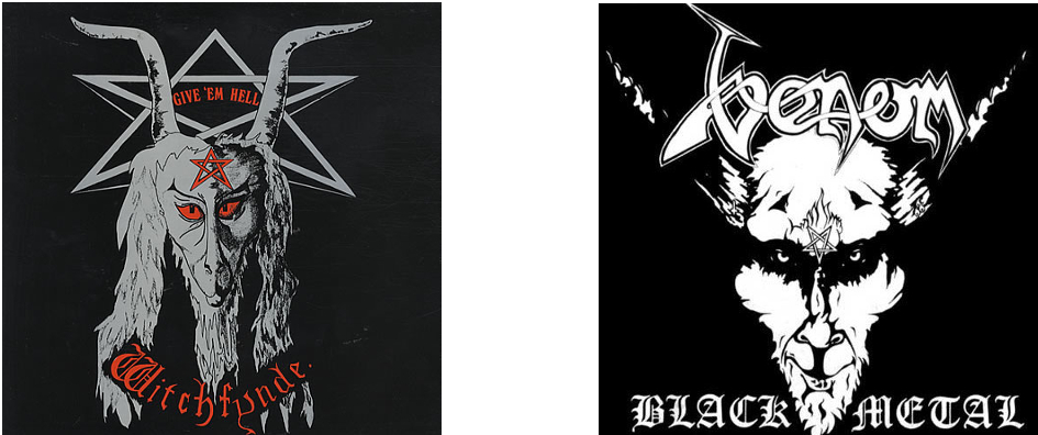
More a case of shared influences than anything else, both Witchfynde and Venom came from the New Wave Of British Heavy Metal and had an interest in the occult and biker rock. Cheap, effective visuals were pretty much an essential part of the NWOBHM, with even early Iron Maiden artwork having a somewhat rough & ready charm.
22. Tigertailz – Young & Crazy (Music For Nations, 1987) & Britny Fox – Britny Fox (Columbia, 1988)
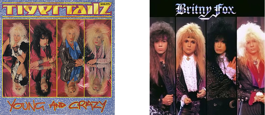
>It’s slightly unlikely that foppish Rococo glamsters Britny Fox would be influenced by Wales’ super-glam Tigertailz, but both bands, despite their idiosyncracies, were drawing from a pool of shared glamorous male influences, going back in pop music to the 70s, but historically back to 16th (and in the case of Britny fox, specifically the 17th/18th) century.
23. The Rolling Stones – Rolling Stones No. 2 (Decca, 1965) & The Dead Boys – We Have Come For Your Children (Sire, 1978)
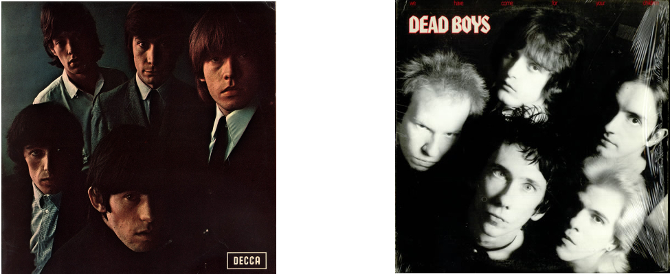
Arguably the Stones cover here has its roots in With The Beatles, but the Stones brought their own surly charisma to the style and it was this that The Dead Boys channelled for their version of (in this case punk) rock, and the cover for their second album seems to pay homage to the Rolling Stones’ second.
24. Mayhem – Live In Leipzig (Obscure Plasma, 1993) & Darkthrone – Transilvanian Hunger (Peaceville, 1994)

Strictly this should be a comparison of Live in Leipzig with Darkthrone’s A Blaze in the Northern Sky (1992), but although A Blaze... pre-dated the release of the Mayhem album (recorded in 1990), the cover picture of Per Yngve “Dead” Ohlin used for the release of Live in Leipzig was well known in the Norwegian black metal underground and indeed, photographs of early Mayhem were, despite King Diamond, Sarcofago etc, pretty much the basis for the 90s Norwegian black metal aesthetic.
25. Jobriath – Jobriath (Elektra, 1973) & David Bowie – Diamond Dogs (RCA, 1974)
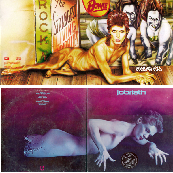
Although it seems unlikely (to say the least) that Bowie would be influenced by Jobriath, there is a slight passing resemblance between the excellent, slightly creepy gatefold artwork of Jobriath’s much hyped but unsuccessful debut and Bowie’s superlative dark glam masterpiece; possibly more to do with a shared influence of traditions of depicting the male nude than anything else.
26. David Bowie – Ziggy Stardust era appearance (1972-4) & Leslie R McKeown – All Washed Up (Ego Trip, 1978)
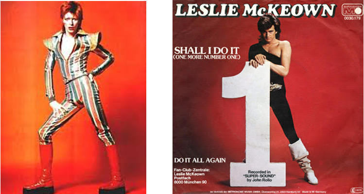
Although not based on any single image of Bowie, ex-Bay City Rollers frontman Les McKeown’s first solo album & singles showcased an image clearly based on the glam-era Bowie of a few years earlier.
27. Venom – Welcome To Hell (Neat, 1981) & Dødheimsgard – Monumental Possession (Malicious, 1995)
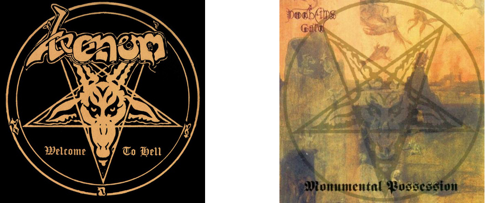
Hardly a coincidence; a large part of black metal’s satanic iconography was brought to the genre by its inventors, and the cover of Venom’s debut has been paid homage to by metal in general more times than almost any other image apart from Iron Maiden’s Eddie
28. David Bowie (again) – Space Oddity (RCA, 1972 reissue) & Marc Bolan & T-Rex – Zinc Alloy and the Hidden Riders of Tomorrow (EMI, 1974)
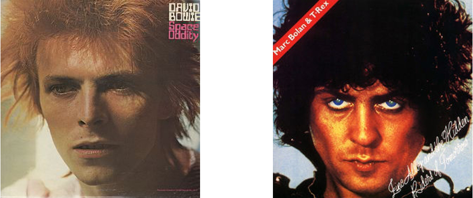
It’s no surprise to see as visual an artist as Bowie featuring repeatedly in this list, but here he seems to have influenced his glam predeccesor and friendly rival Marc Bolan; Whereas earlier T-Rex albums had pioneered Bolan’s fey/fairytale glam image, by ’74 his music had become tired and limited (and ego-centric; T-Rex was now appended to the artist’s name rather than being an entity in its own right) in comparison with that of his old friend Bowie, and Zinc Alloy ( yep :/ ) was all-too-transparently influenced by Ziggy Stardust. The cover, however, seems more influenced by Bowie’s covers for Aladdin Sane and the glam-era reissue of his 1969 album, retitled Space Oddity. Given the slight deterioration of Bolan’s pixie-like charm, Zinc Alloy is unfortunately a less than bewitching or otherworldly sleeve.
29. Steeler – Strike Back (SPV, 1986), Helter Skelter – Welcome to the World of Helter Skelter (Metronome, 1988) & Pretty Boy Floyd – Leather Boyz With Electric Toyz (MCA 1989)
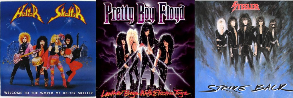
Presumably coincidence based on the common language of 80’s metal (but ultimately traceable back to Kiss in the mid-70s), both Helter Skelter and Pretty Boy Floyd’s late 80s glam-pop masterpieces have ludicrous paintings of the artists on them, very similar in style to German metallists Steeler’s 1986 opus Strike Back. Strangely, the Helter Skelter painting is by Games Workshop legend John Blanche, better known for the kind of dark fantasy images used in Warhammer etc (but also showcased on the cover of Sabbat’s classic UK thrash album History of a Time to Come.) The sleeve for Strike Back seems to be the first updating of this kind of thing since the classic Ken Kelly Kiss covers(!) from the 70s (see above).
30. Eric Carmen – Eric Carmen (Arista, 1975) & John Travolta – Can’t let You Go (Midland, 1977)
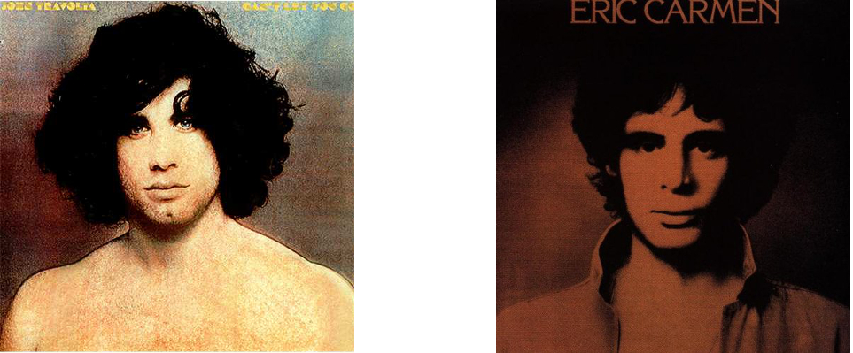
Ex-Raspberries frontman Eric Carmen’s debut solo album is best remembered for ‘All By Myself‘, but it was a strong album that revealed an excellent songwriter and performer with an eclectic range, from the Brian Wilson-esque ‘Sunrise‘ to the near-classical arrangement of that famous hit. John Travolta’s Can’t let You Go was released just as the young actor became a star with Saturday Night Fever and is, not surprisingly wet, bland, funky disco-lite with some soppy ballads thrown in. The covers of both albums showcase the sensitive (and in Travolta’s case, nakedly vulnerable) side of the young stars.
31. Cheap Trick – In Color…and in Black & White (Epic, 1977) & M
ötley Crüe – Girls, Girls, Girls (Elektra, 1987)
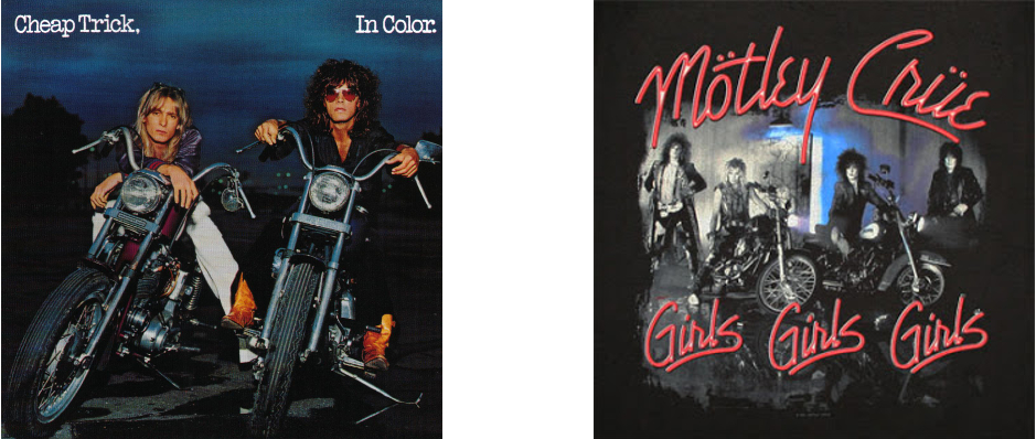
Ten years on from Cheap Trick’s In Color… one of the great hard/pop-rock albums of all time, came one of Mötley Crüe’s best, at the time notable for a (slight) toning down of the band’s glam image. The Crüe cover lacks the humour of Cheap Trick’s (admittedly not really evident in the front image only; the back cover has the band’s two quirkier-looking members on non-motor cycles), but is iconic in its own decadent, 80s way….
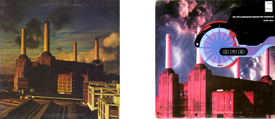
32. Pink Floyd – Animals (EMI/Harvest, 1977) & The Orb – The Orb’s Adventures Beyond the Ultraworld (Big Life, 1991)
An explicit homage, Dr Alex Patterson’s original vision for The Orb was inseparable from the psychedelic explorations of Pink Floyd. Admittedly, by 1977, the spirit of the prog legends’ optimistic experimentation had mostly evaporated, but the Animals sleeve, with its giant inflatable pig drifting over Battersea Power Station remains an iconic, dreamlike and good-natured image which, by 1991 seemed ripe for an update.
33. Genesis – A Trick of the Tail (Charisma, 1976) & FFWD – FFWD (Inter-Modo, 1994)
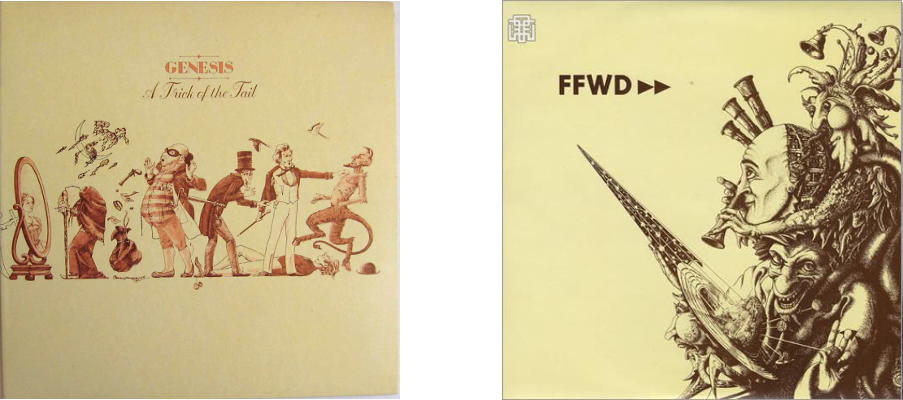
As with The Orb’s music above, FFWD (Robert Fripp, Thomas Fehlmann, Kris Weston, and Dr. Alex Paterson)’s 1994 ambient/prog/experimental album bears a resemblance (only slight in this case) to an album which was fundamentally different from the prog that inspired it. Indeed, the FFWD album seems to be influenced more by the ambient works of Eno than by a progressive band like Genesis (or Fripp’s King Crimson for that matter), but there is at times an atmosphere of pastoral whimsy that recollects the Peter Gabriel-era Genesis of Nursery Cryme or Foxtrot, far removed from the glossy, accessible rock of the Phil Collins-led Trick of the Tail. But that album’s cover has an archetypical prog feel, even if the album doesn’t, and so does the sleeve of FFWD.
<
FIN


 In a similar vein to Forteresse, but slightly more ambient and snow-shrouded and less folk-influenced, Sombres Forêts are one of the more melancholy bands in the scene. To my ears their best album to date is 2008’s Royaume de Glace, a despairing masterpiece with some of the best vocals of any Québec BM album, especially when Annatar shrieks hoarsely over relatively clean guitars on songs like the great The Forest.


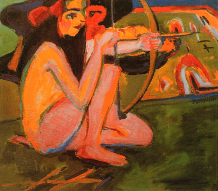
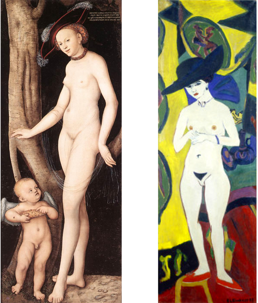
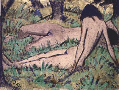
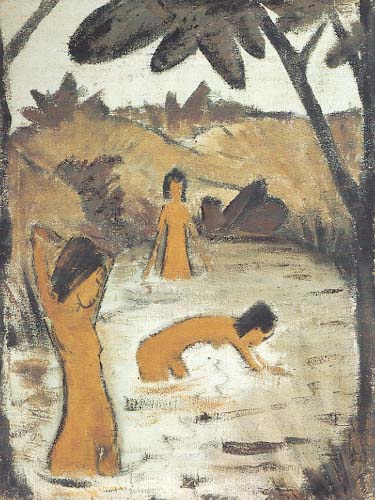
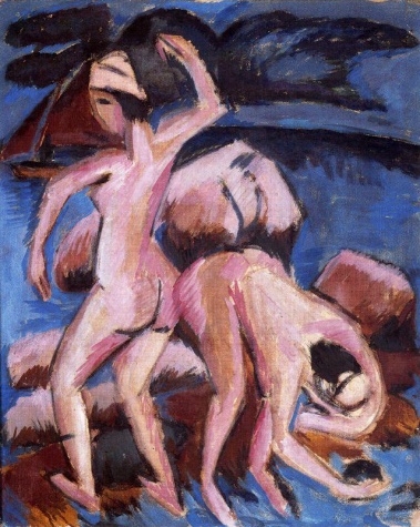
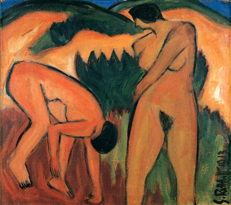
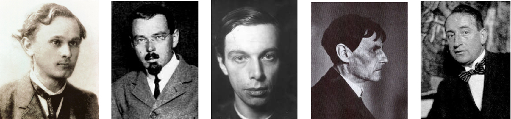
 ax Pechstein, Ernst Ludwig Kirchner and Karl
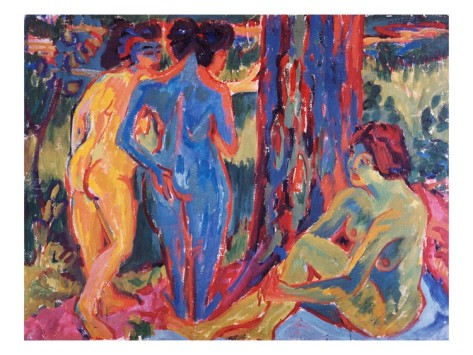

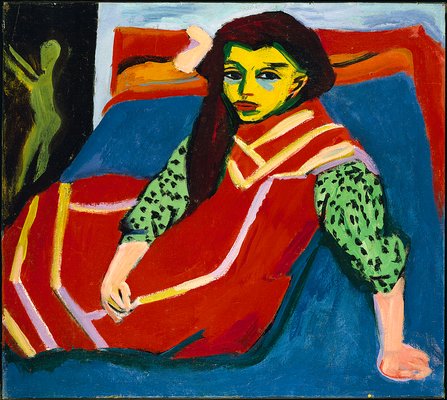
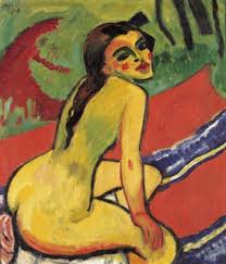
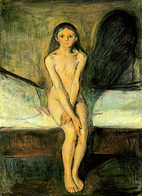 our, makes it comparable in effect to Munch’s Puberty (1895). By removing the same model from an urban environment in Franzi With a Bow and Arrow (1909-11) the tension is replaced instead by a vibrant and carefree energy. The natural setting and dynamic pose (very much a standard image of German nudism) neutralise the troubled psychological aspects apparent in the urban setting.