Apologies to Paul Gorman, whose beautifully written accounts of bike rides partly influenced this article, although Paul actually knows about cycling and I don’t; this is essentially a surrogate fast walk.
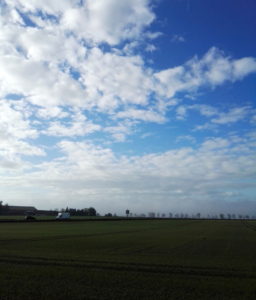
I thought I’d take to the roads early (just before 7.30 am) because it was a beautiful morning that was forecast to become a not-beautiful day, and because, even in 2021 there’s not much traffic on the roads early on a Sunday morning. The roads were shining in the morning sun after a recent bout of heavy rain and unusual-in-May extreme hailstorms, and the fences were strung with light-catching water droplets; it was very pretty.
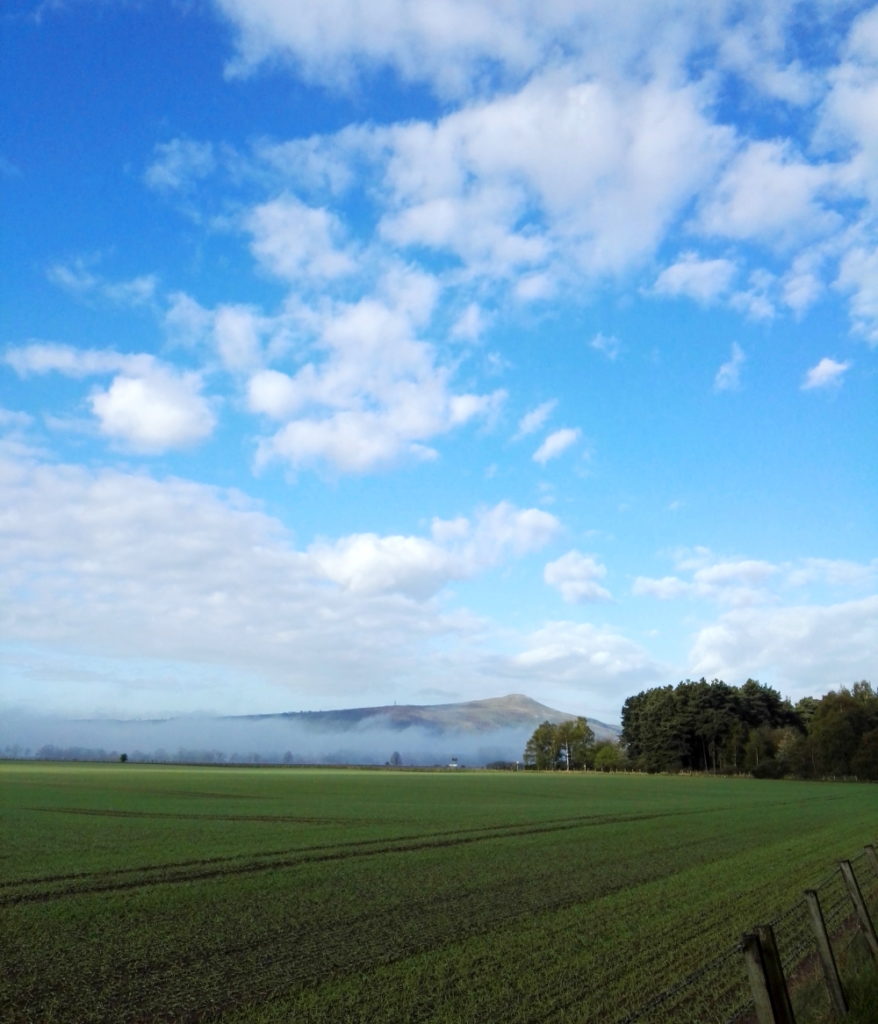
Once out of the village, the landscape here is so flat as to look almost Dutch, aside from the Lomond Hills; still half buried in morning mist. In fact, despite living in this area most of my life, this was really the first time it had occurred to me that this flatness must be what is meant by the ‘Howe of Fife’ – and indeed a quick googling confirmed it; “The term ‘howe’ is derived from an old Scots word meaning a hollow, valley or flat tract of land.” The Lomond Hills themselves, and Bishop Hill on the far end (not visible from my viewpoint) are not particularly big (522 metres at their highest point), but they almost give the impression of mountains from the vantage point of the plain below.
The nice thing about rural cycling is that, although it’s much faster than walking, it still doesn’t disturb anything much around you. On a quiet morning like this (I was passed by one car and one proper cyclist and rode past one dog walker and a jogger on this 8-10 mile trip), nature seems not to pay much attention to you. It turns out that this area is infested (not the right connotations, but there were so many of them) with Yellowhammers, looking almost canary-like in the spring sunshine, plus innumerable sparrows, blackbirds and the odd pheasant shouting like a village idiot in the middle of a field.
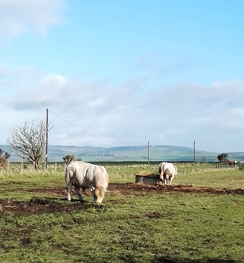
The natural landscape is pretty enough on its own, but because, presumably, of the sort of person I am, I love the unexpected moments of geometry caused by human interference (ploughed furrows deep in shadow in one field, strips of plastic sheeting over rows of berries* in another) and of course the semi-wildlife, like a paddock with three huge, but mellow looking bulls that made me think of the work of Rosa Bonheur.
* Presumably berries? Despite growing up in the countryside and actually living on farms for a fair bit of childhood, I’m surprisingly ignorant about this stuff
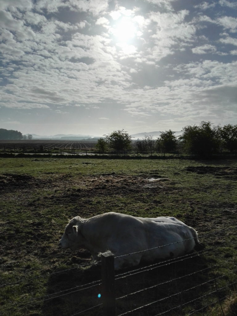
Although her work – and her life – is 19th century in almost every respect, Bonheur is a potent figure for the 21st century. Brought up in an egalitarian Christian-Socialist sect by Jewish parents, Bonheur was a troublesome child who developed a love for animals and for painting. As a young woman she studied animal anatomy (in abattoirs) and dissected carcasses at a veterinary school as well as studying live animals.
She was openly lesbian at a time when it was, if not illegal, certainly frowned upon by the French government; so much so that she had to request permission from the police to wear trousers, as cross-dressing for women was forbidden by law (until 2013!) Her official reason was that it was better clothing for attending sheep and cattle markets, where she made studies, but although that was certainly true, she was generally known among her friends for her masculine clothing and short hair; both very much against the conventions of the time. Nevertheless, she went on to become a mainstream success as an artist and in her own way an establishment figure, both in France and (especially) in the UK, where she met Queen Victoria and painted some anachronistic Highland scenes; she may have been revolutionary by nature and personality, but she seems to have been quite conservative by taste and inclination; never underestimate the complexity of people.
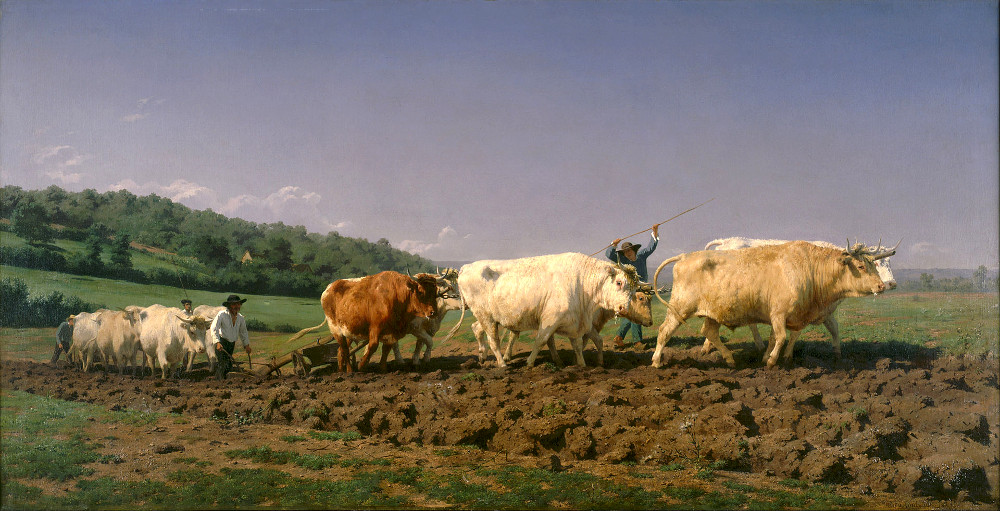
Rosa Bonheur – Ploughing in the Nivernais (1849)


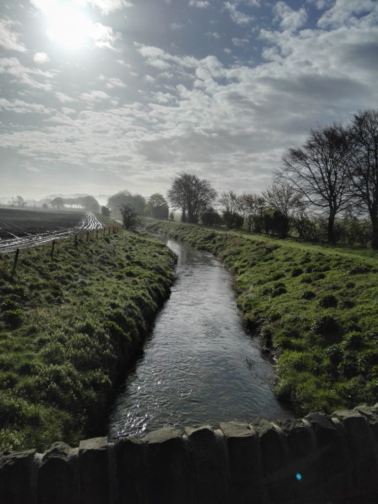 Looking at the scenery, the wildlife and even the roads, you have to wonder; why would anyone not care about this? I don’t mean the Howe of Fife, or Fife, or Scotland, or Britain, or Europe, or the world (although those too); just wherever you happen to be; place. Landscapes should and must change, as we change; not just the geometries and geographies we impose on them, like the furrows and plastic (though it would be nice to do away with the plastic itself), but everything.
500 years ago the Howe of Fife was covered in forest and the monarchs of Scotland hunted wild boar here. A thousand years ago, a Scotland that was very different in shape, size and culture was being ruled by Alexander I, then near the end of his life. He had recently lost his wife, Sybilla of Normandy, the French child of Henry I of England. Alexander would be succeeded by his brother David, then Prince of the Cumbrians; by the late the 16th century when James the Sixth (and first of Great Britain) reigned over Scotland all of those previous details would seem strange. Two thousand years ago, the Howe of Fife was part of southern Caledonia, that is the land to the north of the river Forth; at least the Romans, still fifty years away from their attempted conquest, called it Caledonia. Whether the inhabitants of Caledonia had any name for the landmass in general, as opposed to their own local chiefdoms, isn’t recorded.
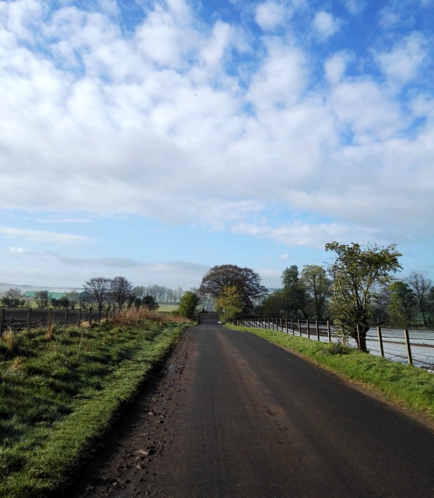 These back roads are quiet, but although nature is everywhere, it’s deceptive, hardly a natural landscape at all. It has been shaped by generations of human beings, by agriculture and the politics of land ownership. That was just as true in King James’s day, when forests belonged to the King and had their own laws, as it is now.
The landscape reminds me both of my childhood love of Tolkien and of a line from The Fellowship of the Ring; where Bilbo says “I want to see the wild country again before I die, and the Mountains; but he [Frodo] is still in love with the Shire, with woods and fields and little rivers.” Tolkien loved both the wilderness and the smaller, more familiar (Oxfordshire-like) scenery of the Shire, but in his landscapes change is almost always bad; both on the larger scale of the desolation that evil brings to Mordor and the fiery chasms opened in the earth when the Dwarves delve ‘too deep’, and on the local level where the Shire is ruined by the arrival of industry.
Michael Moorcock writes perceptively in his I think overly scathing* but often right and always funny essay about Tolkien, Epic Pooh (1987) about the essential conservatism of much of heroic fantasy fiction. The points he makes are even more relevant today, when the desire to return to simpler times is so prevalent. The climate emergency will – regardless of the political will to do so – need to be dealt with as the pace of change outstrips the ways in which our society functions, and it’s important that the necessity to move forward doesn’t become an attempt to go backwards; always attractive in ever-nostalgic Britain. What Tolkien only reluctantly accepts – or accepts in a tragic way that fits with the fatalistic (and Christian) aspects of his vision – is that change is inevitable.
* “The Lord of the Rings is a pernicious confirmation of the values of a morally bankrupt middle-class“ Michael Moorcock – Wizardry and Wild Romance, Gollancz, 1987, p.125. Possibly a bit harsh
In Moorcock’s own heroic fantasy fiction, he not only takes change for granted, it becomes the backdrop against which his series of heroes who make up ‘the Eternal Champion’ fight their never-ending battle for equilibrium in a multiverse where change – in itself neutral – is the only constant:
“Then the earth grew old, its landscapes mellowing and showing signs of age, its ways becoming whimsical and strange in the manner of a man in his last years – The High History of the Runestaff”
(quoted from Count Brass, 1973, but appears lots of other places too)
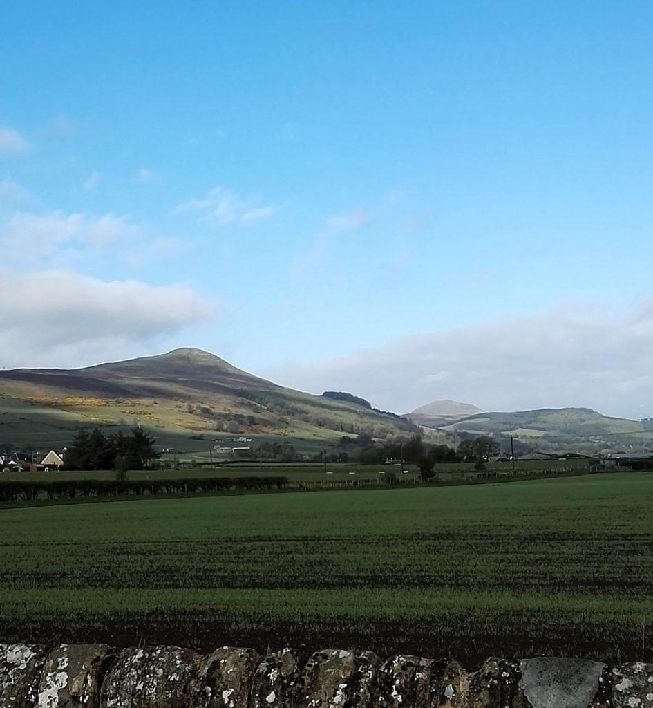
The landscape of the Howe of Fife is not yet – aside from the odd wind turbine – whimsical and strange, but there was a certain surreal quality in the way the beautiful, calm spring morning (which felt more like March than early May) followed days of hailstorms and thunder. Surreal anyway to someone old enough to remember when seasons seemed to have a set pattern. In another twenty or thirty years will British Christmas cards still have snow scenes on them, even though most of the heavy snowfall seems to happen in March or even April?
Human culture is perhaps slow to catch up with the changes it creates; bearing in mind that the traffic on the roads today is light because even after decades of change, there’s a convention that people don’t work on a Sunday, for the most archaic of reasons – but I’m still glad of it. These kinds of thoughts, and Rosa Bonheur too, were partly on my mind because this week there were elections which, although not regime-changing, were important. The results were locally, fairly positive, nationally (Scotland) pretty much as expected and extra-nationally (UK: not quite international, yet at least) a bit disappointing. The collapse of any real kind of left-wing movement has been happening over a long period of time and I suppose at this point all you can say is that people in general don’t want one; or not enough of them do to make it happen. On the other hand a general liberalisation has taken place over the decades that possibly just makes real change seem unnecessary to large numbers of people. And of course, the left eats itself, as always; yesterday I saw online a list of “people that socialism needs more of” (working class people essentially) and “people it needs less of” (non-working class people, basically), whereas surely the point is, it needs all people, if it’s going to work. But whatever.
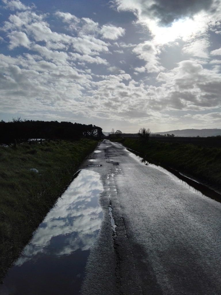
A nice thing about cycling is that, aside from looking around, you can’t really do very much. It clears the mind in a way that car travel, with its technical aspects and its music or radio, doesn’t usually do. It would be possible to listen to the radio while cycling, but probably not very sensible; and in an election week the lack of human noise is very welcome.
After watching/listening to/reading political propaganda and analysis before and after an election it becomes clear just how amorphous peoples’ idea of “the media” seems to be. This week I’ve seen people criticise it essentially to suit their own viewpoint; “the media” is too right/left wing, too politically correct, too reactionary, too critical, not critical enough. Which makes it seem as though the UK media is pretty good at covering all bases.
But TV, radio, the newspapers and the online presence of the major news outlets are a distorting mirror at best. Witness the way that the ‘working class’ – whether positively or negatively – is treated as a monolith. The viewpoint of the media (understandably, given most of its staff and ownership) is middle class; and therefore on TV, on the radio and in newspapers the middle class becomes the norm from which everything and everyone else (both working class and upper class) are observed and commented upon. “Reality TV” features the rich and the poor as something other, something to be looked at and entertained by. But it’s a norm that ignores the facts.
The working class, insofar as there is still such a thing (I am of it and I’m not even really sure) is technically the norm, in the sense that it’s the majority of people, just as it always has been. The UK is (albeit in a less precise way than a century ago) a pyramidal structure, with monarchy and government at the top, the middle class – bigger and both richer and poorer than before, but still identifiable – in (yep) the middle, and the working class as the wide base, incorporating a layer of underclass which fluctuates depending on which government is at the top (it’s bigger now than it was a decade ago). How do you change that false picture the media presents? You don’t; not without changing the society. Marx and Engels wanted the means of production to belong to the workers; in the late 19th and early 20th centuries that stood for something real and meaningful, but while its egalitarian spirit is eternally relevant, in the 21st century the statement itself needs so many qualifications as to be almost meaningless.
What are the means of production? Producing what? Who are the workers? The working class of Marx’s day would barely recognise the working class of today – and they might well look at our lifestyle and be encouraged that the struggle wasn’t in vain. And of course it wasn’t, but that doesn’t mean that the post-industrial 21st century is really much more fair than in the industrial age. Certainly capitalism is even more rapacious and entrenched than ever before, and as callous too. The more things change, the more they stay the same, as the tedious saying goes.
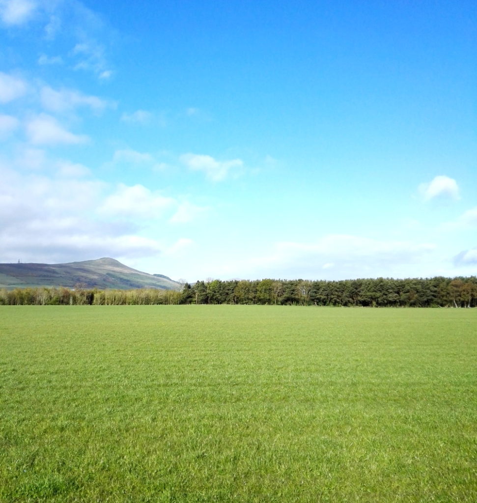
People of course do want change; the right kind of change anyway. And elections are one way of securing it. But this week people who were asked on TV for their reasons for voting gave ‘change’ as a reason for voting for parties who have been in power for 14 years (Scotland) and 9 years (UK) – which seems, at best, like wishful thinking or at least suggests a lack of exciting or convincing alternatives. Arguably, a vote for the SNP in Scotland is a vote for a bigger change than just who currently sits in parliament, but familiarity breeds indifference, and at this point it’s probably good for their cause that they are no longer the only party in favour of an independent Scotland. In a depressing kind of way, circumstances have aided them too.
In 2014 (the year of the last independence referendum) it was easy, personally speaking, to vote against independence on several grounds; a disliking of Nationalism as a principle, so closely related as it is to xenophobia and intolerance. As someone who was very happy to belong to the EU too, independence seemed (laughably in retrospect, though still not wrongly) to endanger Scotland’s membership, since the UK and not Scotland was the member. And there were niggles about the economy, not because Scotland couldn’t function outside of the UK – one of the most irritating arguments for the status quo; I think it’s pretty obvious that it could and can – but because the Salmond leadership seemed to be saying (ie he was, almost literally saying) that he wanted nothing to change regarding the currency etc. Which would put Scotland in the surreal position of being an ‘independent’ nation which had its economy regulated by the Bank of England. Why the Bank of England would accept that, or anyone on either side of the border would want it is mysterious, to say the least.
But anyway, here we are in 2021; nationalism and xenophobia look like being worse and more virulent within the UK than they might be outside of it. We are already out of the EU and, while an independent Scotland becoming a member state is far from a foregone conclusion, the UK rejoining is definitely not about to happen anytime soon. And Covid-19 has given the economy a beating that will take a lot of recovering from, whatever we do. So why not independence? I would of course prefer to have a democratic socialist party in charge of it, but not having a rabidly inept right-wing one would be a step in the right direction.
Without wishing to get bogged down in the minutiae of British politics, the story of the Labour Party (it’s probably not quite dead yet; it always has a far more cyclical life than the Conservative Party) is an instructive one. There’s always been a tug of war between the left and centre elements of the party, but since the 90s there’s always been the dubious argument that veering to the right is the way to win votes and power. But although New Labour was definitely uncomfortably right-wing for a supposedly socialist party, that wasn’t what brought it success. It was the ‘new’ part; drawing a line under history and saying ‘the past ends here and this is what we stand for’ was a big, optimistic step at a time when British politics – as now- had become stagnant and unappealing. The Corbyn left managed something similar, with a younger demographic, but for all its radical ideas, it was immediately familiar to anyone over a certain age.
Much as Blair and co’s propaganda looks vapid and empty in retrospect (because it essentially was), not invoking Marx or even socialism was a key to their success, not because of where they or their supporters sat on the political spectrum (I think it’s true that the majority of the British public probably don’t think of themselves being especially political), but simply because people will, every now and then, give new ideas a chance, if they look exciting enough and if they’re bored or disgusted enough with the status quo. It’s worth bearing in mind.
None of which has nothing obvious to do with this road on this morning, with the patches of bluebells under the trees, which might be left over from the great forest of King James’s time; where wild boar hid, evading the men and the dogs, before they were hunted to extinction.



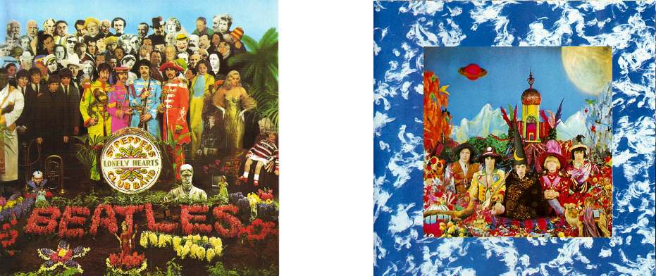
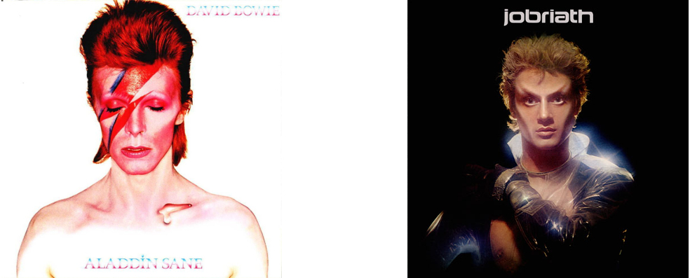
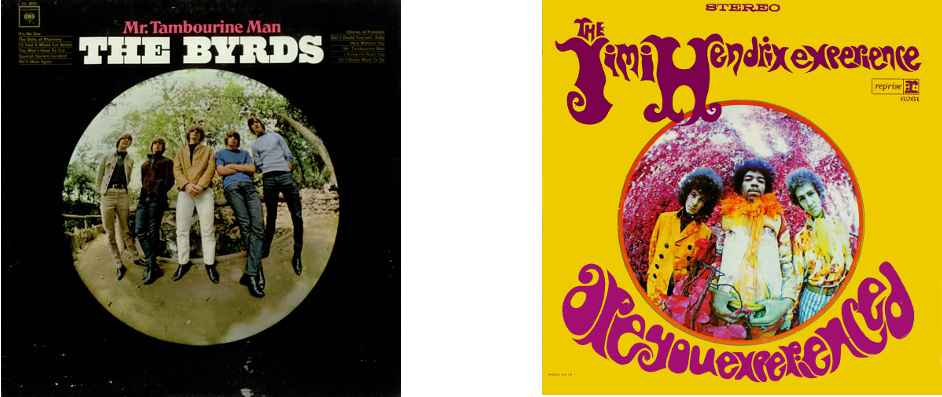 This comparison really traces the advance of psychedelia from a mild distortion of perception to a neon-coloured hallucination over the two years 1965-67
