“Ane doolie sessoun” covid-19 and the art of isolation


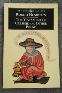
At some point in the late fifteenth century, the poet Robert Henryson (who lived in Dunfermline, not too far from where I’m writing now), began his Testament of Cresseid with one of my favourite openings of any poem:

Ane doolie sessoun to ane cairfull dyte
Suld correspond and be equivalent.

Robert Henryson – The Testament of Cresseid and Other Poems, my edition Penguin Books, 1988, p. 19
I don’t think I knew, word for word, what he was saying when I first read it, but I did get the meaning: essentially that miserable/sad times (‘doolie’, which I guess would be ‘doleful’ a few hundred years later; not sure what it would be now) call for tragic/sad/grim (“cairfull”, literally ‘full-of-care’) poetry, and the words, with their mixture of strangeness and familiarity (people in Scotland have not talked like that for many centuries, but I think that being attuned to the accents and patterns of speech here still makes it easier to understand), stayed with me. The poet goes on to talk about the weather; apparently it was an unseasonable Lent in Fife that year, when “schouris of hail can fra the north discend/that scantlie fra the cauld I micht defend.” Despite impending climate disaster, Fife weather hasn’t changed beyond all recognition it seems; It was only two weeks ago – though it seems far longer now – that I was caught in a hailstorm myself.
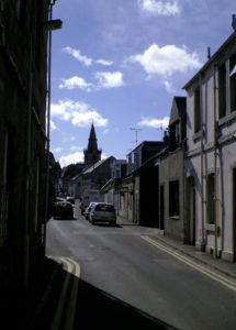
my own photograph from April 2006

The season is still doolie however; not because of the weather, but because of the pandemic sweeping the world, one unlike any that Henryson would have known, but which probably wouldn’t have surprised him; one of the key elements he brought to the Troilus and Cressida story in The Testament of Cresseid is its heroine being struck down by leprosy and joining a leper colony.
the cover of my copy of his poems has a drawing from a medieval manuscript, of a figure which would have been familiar to most readers at the time; a leper with a bell begging for alms.
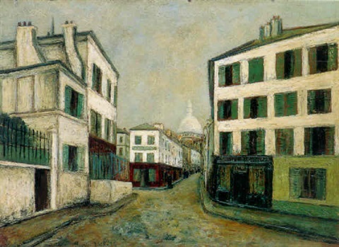
Maurice Utrillo

In fact, with dependable cosmic irony (or if you are less fatalistic, normal seasonal progress), the weather, since ‘stay home’ has been trending online and quarantine officially recommended, has been beautiful here. The streets are fairly, but not yet eerily, quiet. So this particular dyte (the old word that Henryson used referred to his poem but I think stems ultimately from the Latin dictum and can apply to any piece of writing) may not seem especially gloomy (and may in fact be quite sloppy), but it is certainly careful in the sense that Henryson intended. It’s quite easy – and I think reasonable – to be optimistic about the state of the world in April 2020, but not I hope possible for anybody with any sense of empathy to not be concerned about it.

There are some silver linings to the current situation (major caveat: so far); as well as, inevitably, bringing out the worst in some people, a crisis also brings out the best in many more. And a whole range of major and minor plus points, from a measure of environmental recovery to time to catch up with reading, have emerged. For me, one of the nicest things to come out of the crisis so far is – thanks to social media – the way that arts institutions, while physically almost empty, have begun to engage online with a wider range of people than those who are likely to, or physically able to visit the galleries themselves.
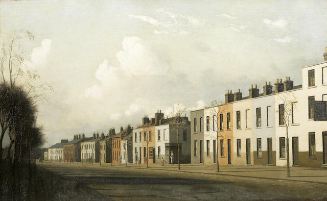
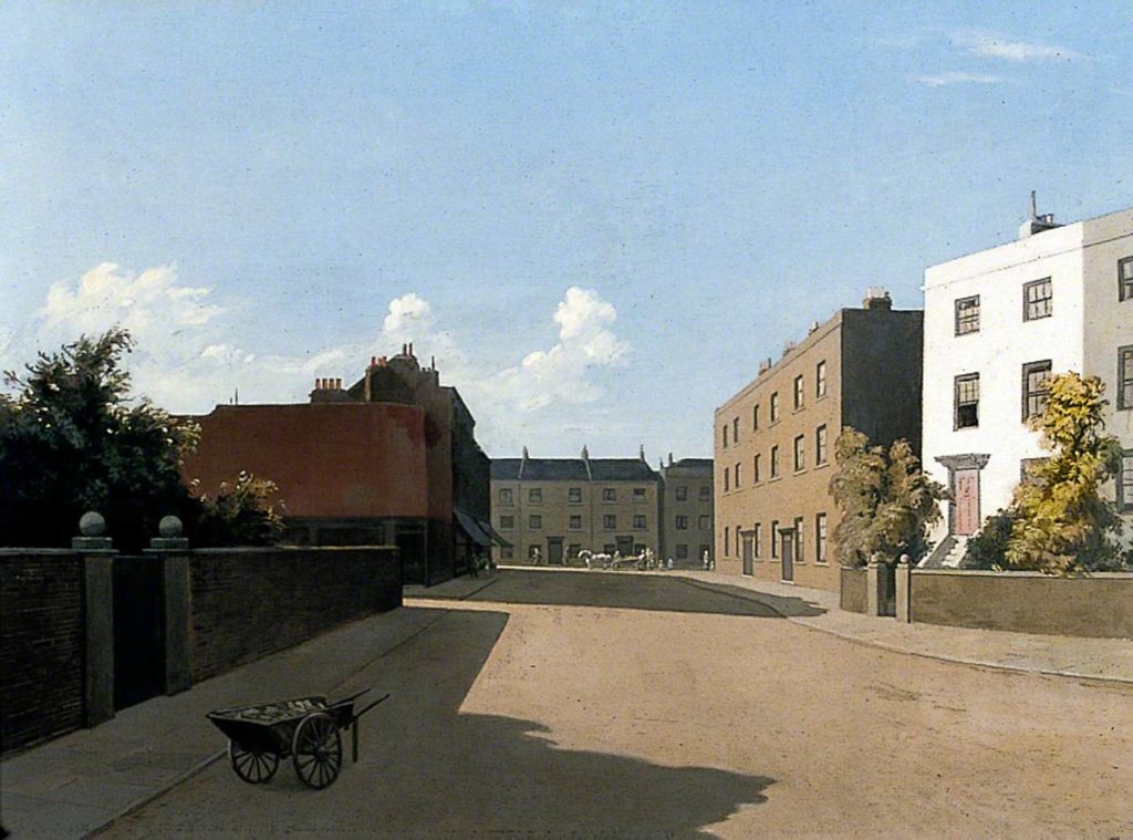
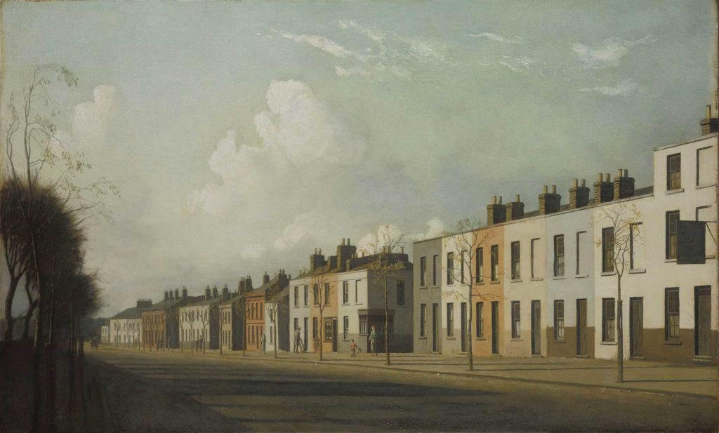
Algernon Newton – The Outskirts of Kensington


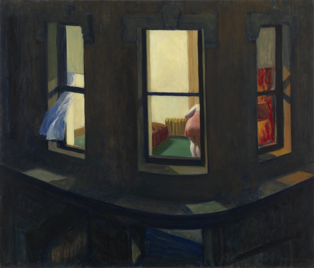
It has been said that Edward Hopper is the artist who has captured this particular moment, and it’s true that his vision of loneliness in the metropolis particularly mirrors our own age of social media and reality TV, in that it is voyeuristic* – we are not looking at ourselves, or at an absence of people, we are looking at other people whose isolation mirrors our own. If there’s something about this particular pandemic that sets it apart from the Spanish flu of 1918-19 or the great plague of 1665 or the Black Death of 1348-9, or any of the devastating outbreaks of disease that sweep the earth from time to time, it’s that online we are (a ridiculous generalisation perhaps, but if you’re reading this chances are you have internet access at least) sharing the experience of isolation; surely in itself a relatively new phenomenon, at least on this kind of a scale. When Daniel Defoe wrote in his fictional memoir of the 1665 plague (and it’s worth remembering that, although he was only five when the plague swept London, he would have had the testimony of many who had survived as adults as well as whatever shadowy memories he himself had of the period)

Passing through a Token-house Yard, in Lothbury, of a sudden a casement violently opened just over my head, and a woman gave three violent screeches, and then cried “Oh! Death, Death, Death!”in a most inimitable tone, and which struck me with horror and a chilness in my very blood. There was nobody to be seen in the whole street, neither did any other window open; for people had no curiosity now in any case; nor could any body help one another

Daniel Defore, A Journal of the Plague Year, 1722, my copy published by Paul Elek Ltd, 1958, p. 79-80

he was depicting a situation which many people could no doubt relate to; after the fact. What we have now is a sense of shared helplessness in real time; this has never existed, quite in this way before. Assuming some kind of return to normality, we (not entirely sure who I mean exactly by ‘we’) will know each other better than we ever have; something to have mixed feelings about no doubt.
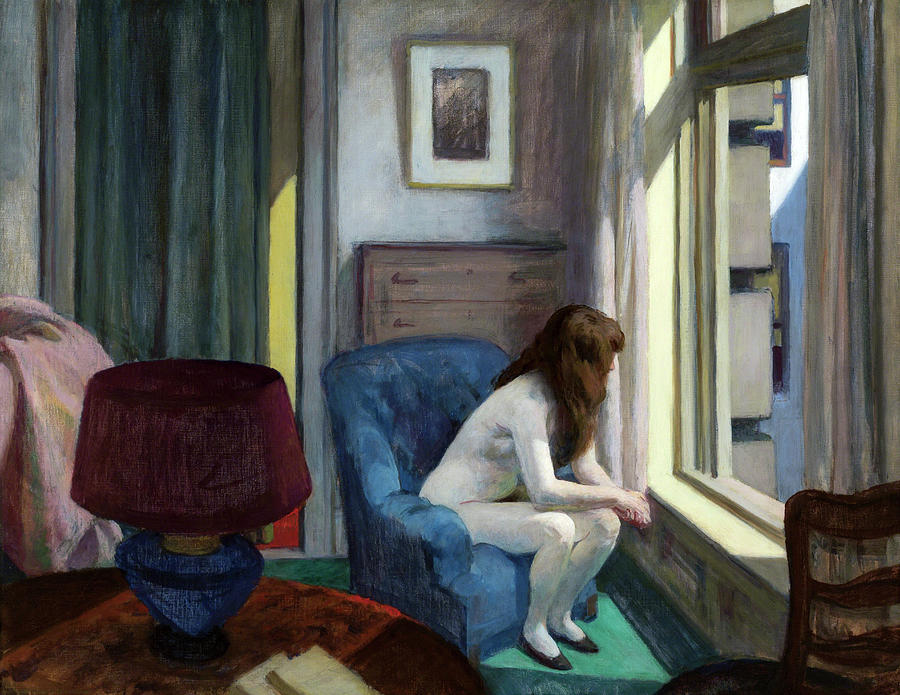
*not a criticism; visual art is voyeurism

Edward Hopper capturing the 2020 zeitgeist with 11 am (1926)

The current appeal of Edward Hopper’s paintings of lonely figures is humanistic and easy to explain. His art, with its depiction of strangers quietly sitting in anonymous places, people who paradoxically we can never know and never know much about, but who we can easily relate to, is profoundly empathetic.  It belongs to a long tradition of quiet loneliness or at least alone-ness that stretches back, in Western, art to the seventeenth century and the art of Vermeer (it’s easy to forget as the children of it, but the idea of art reflecting the individual for reasons other than wealth and status is an essentially Protestant one*) through artists like Arthur Devis (though I’m not sure he intended the quiet melancholy in his paintings) and Vilhelm Hammershoi (who did). In fact, Hammershoi’s beautiful turn-of-the (19th-20th)-century paintings are if anything even more relevant to stay-at-home culture than Hopper’s diner, bar and hotel-dwelling urbanites. With Hopper, we are often watching – spying on – his characters from the outside as if through a pair of binoculars, with Hammershoi we are shut in with them, like ghosts haunting their silent rooms.

*really the only ‘lonely’ figures in pre-Protestant European art are Christ himself  (think of the utter solitary misery of the crucified Jesus in Grunewald’s Isenheim altarpiece) and of course Judas, or those who like him, have separated themselves from Christianity. There is a terrifying solitary quality in some depictions of saints during martyrdom, but for their contemporary audience it was essential to bear in mind that they were not spiritually alone (note: this may be a completely false assertion)
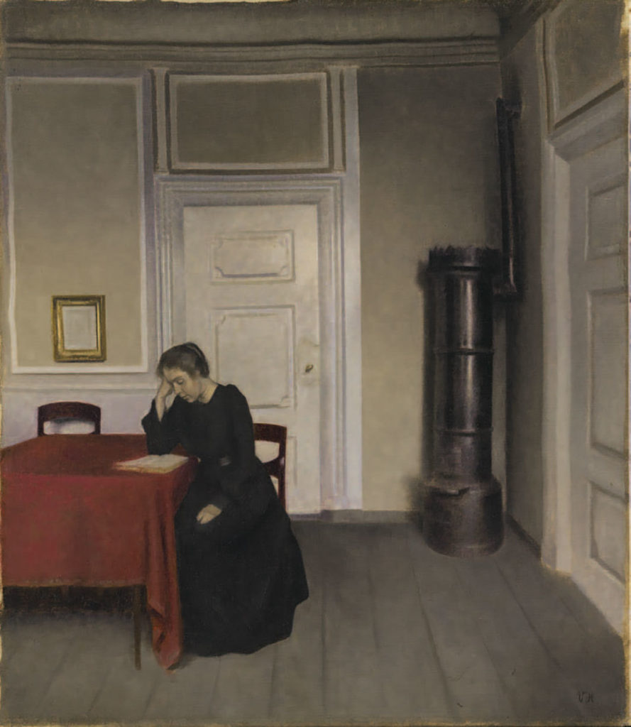
Vilhelm Hammershoi – A room at home with the artist’s wife (1902)
voyeuristic Hopper: Night Windows (1928)

But if Hopper’s most discussed and shared works now are those where we seem to catch, as we do from a train window, a momentary glimpse of a life that is utterly separate from our own. It’s a feeling I associate with childhood and (very) specifically, with travelling through Edinburgh in the winter and seeing glimpses of people at windows and the high ceilings in Georgian houses in the new town when Christmas decorations were up. Who were all these people?


                                                                                             But there are Edward Hopper paintings too – including some of my favourites, like Early Sunday Morning (see below) – where the only human presence is the artist, or the viewer, where Hopper could claim (though I have no idea if he would have) like Christopher Isherwood, I am a camera with its shutter open, quite passive, recording not thinking.* But recording, for a human being, is thinking. And the picture of a place-without-people is rarely as simple as it seems; even in the case of an actual photograph; someone had to be there to photograph it, and had their human reasons for doing so. The tradition of landscape painting exemplifies this; landscapes may be mythical, romantic, realistic, but they have been recorded or edited or invented for a variety of complex human reasons. The landscape painting of earlier eras was often self-consciously beautiful, or psychologically charged (Caspar David Friedrich is the classic example; landscape as a personal, spiritual vision; in some ways in fact his work, with its isolated or dwarfed human figures, is kind of like a romantic-era Hopper), but the fact that the urban landscape is itself an artificial, human-constructed environment gives it a different, poignant (if you are me) dimension.

*Christopher Isherwood, Goodbye To Berlin, in The Berlin Novels, Minerva 1992, p. 243.
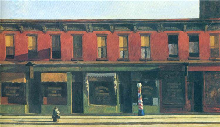
Edward Hopper – Early Sunday Morning (1930)


The appeal of the empty urban landscape in art is perhaps hard to explain to those who don’t see it, but I think it’s worth examining. There is a utopian tradition beginning with (or at least exemplified by) the ‘ideal cities’ produced in Italy in the late 15th century that is in a strange way misanthropic (or at least anthro-indifferent) in that the tranquil geometric perfection of the imaginary cities can only be made less harmonious by the introduction of human figures. But it’s also important to note that these cityscapes actually pre-date landscape painting for its own sake in western art by a few centuries. I don’t think it’s much of an exaggeration to say that in the medieval and renaissance period, the urban landscape had a far greater claim to represent paradise than the natural one. The garden of Eden was a garden after all, not a wilderness, and even the word paradise denotes a walled enclosure in its original Persian meaning. We might think now of paradise existing beyond the realms of human habitation, but in ages where the landscape was mainly something perilous to be passed through as quickly as possible on your way to safety, the controlled human landscape had a lot to be said for it.

Ideal City c.1480s, previously attributed to Piero della Francesca

Like the Renaissance ‘ideal city’, the beautiful post-cubist-realist paintings of Charles Demuth have a sense of perfection, where the severe but harmonious geometry of his industrial buildings seems to preclude more organic shapes altogether.
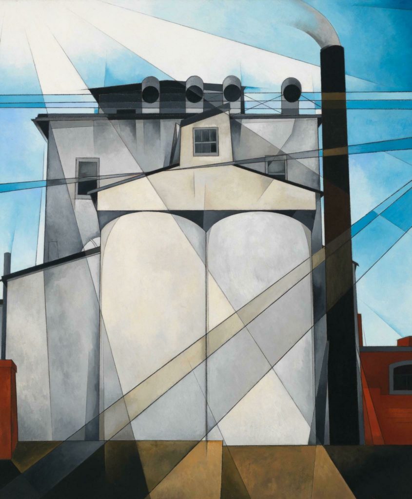
Charles Demuth – My Egypt (1927)

But if Demuth shows an ideal world where human beings seem to have designed themselves out of their own environment, the ideal cities of the renaissance, with their impossibly perfect perspectives are something  more primal and dreamlike; prototypes in fact for the examinations of the inner landscape of the subconscious as practised by proto-surrealist Giorgio de Chirico and his actual-surrealist successors. De Chirico’s eerie ‘metaphysical’ cityscapes are essentially the ideal renaissance cities by twilight, and artists like Paul Delvaux used the extreme, telescoped perspectives of the early renaissance to create their own prescient sense of urban displacement. Why the kind of linear perspective that sucks the eye into the distance should so often be, or feel like, the geometry of dreams is mysterious – one plausible possibility is that it’s the point of view that first forms our perception of the world, the low child’s eye view that renders distances longer and verticals taller; we may be the hero (or at least main protagonist) in our dreams, but that definitely doesn’t mean we dominate them.
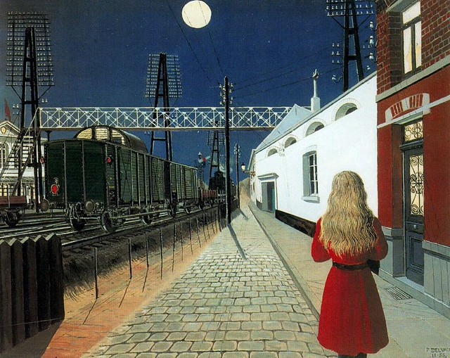
Paul Delvaux – Isolation (1955)

The use of isolated human figures, as in Delvaux and Hopper’s work, gives us a ‘way in’ to a picture, something human to either to relate or respond to (although Delvaux – like Magritte in Not To Be Reproduced (1937) – emphasises the loneliness and again the ultimate unknowable nature of human beings in Isolation by showing the figure only from behind), but the cityscape that is devoid of life, or which reduces the figures to ciphers, has a very different appeal.
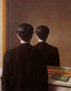
Rene Magritte – Not To Be Reproduced (1937)

Whereas the unpopulated landscape may suggest a prelapsarian, primordial or mythical past, or an entirely alien realm altogether, empty streets are just that; empty. These are utilitarian environments designed specifically for human beings and their patterns reflect our needs. A meadow or hillside or mountain with no visible sign of human life may be ‘unspoiled’; towns and cities, by this definition, come ‘pre-spoiled’, and the absence of people raises questions where a natural landscape usually doesn’t; Where are the people? What has happened?

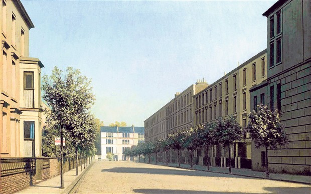
That said, nothing about Hopper’s Early Sunday Morning, Algernon Newton’s paintings of Kensington (or Oguiss’s Paris, or indeed the beautiful photographs of the city in Masataka Nakano’s Tokyo Nobody (2000)) really suggests anything ominous or post-apocalyptic, but even so, the absence of life is the most noticeable thing about them. Whether intended or not, this gives a picture a psychological depth beyond that of a simple topographical study. As with the use of musical instruments within a still life painting (whether there to express the fleetingness of time, or the lute with a broken string to denote discord etc) the inclusion of something with a specific purpose (roads, paths, buildings) apparently not fulfilling that purpose, creates a response as complex as – though very different from – the feeling of looking at those lonely figures in Hopper and Hammershoi’s paintings. Not so different in fact, from the feeling of leaving your home in the spring of 2020 and walking down the deserted street outside.
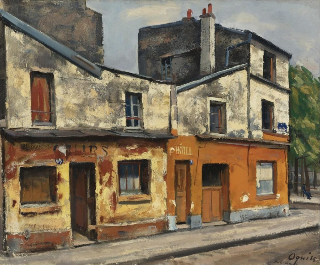
Takanori Oguiss

These paintings can have a slightly uncanny quality reminiscent of (or vice versa) the eerie opening scenes (the best parts) of movies like The Omega Man (1971) and 28 Days Later (2002) or John Carpenter’s classic Escape From New York (1981) where, emptied of people, any sign of life in the city becomes, not a sign of hope, but threatening and full of sinister power. Things will hopefully never reach that point in the current crisis, but as it is, avoiding people in the street is for now the new norm; for the first time I can remember, my natural reserve feels almost like a plus.

Algernon Newton – In Kensington (1922-3)

Those 15th century ‘ideal cities’ were part of the flowering of the renaissance, and, as with every other aspect of it, they were the product of people looking backwards as much as forwards. The actual, non-ideal cities that were lived in by the artists who painted the pictures were largely organic, messy, medieval conglomerations, regularly visited by outbreaks of disease. The ideal city’s emptiness is not only harmonious and logical, it’s clean. And like the classical sculptures, bleached white by time and weather, which were to prove so influential on that generation of artists, the aspiration is towards a kind of sterile perfection which never really existed until long after the culture that created the buildings and the art, had disappeared to leave a ghostly husk of its former self.

Algernon Newton – Spring Morning Camden Hill, 1940

The deserted city or townscape more or less disappears from art from the 15th century until the later years of the industrial revolution, when urban life itself became the subject for modern art. And it makes sense; the reversal in European culture which saw city life become perilous and the countryside as a means of escape was a slow one, and the solution (never more than a partial one) was in building programmes, urban renewal and harmonious town planning; Empire building and colonial expansion fuelled the growth of urbanisation and were fuelled by it; to imagine an empty city at the height of Empire was to imagine extinction. If the idea of empty streets, If there was any remaining collective memory of empty streets in the late 19th century, it was probably an echo of the kind of scenario that Defoe had written about*; less graced by the muses of harmony than haunted by the dead.

*or of natural disasters like drowned villages, or man made catastrophes like the Highland Clearances.

But by the late 19th century, in Europe, plague was less a current concern than it was gothic horror, the memory of a memory, and industrialisation had – for those with a measure of financial security – rendered the city (now with drains and public transport) and the country (now sans dangerous animals and medieval lawlessness) on something of an equal footing. For the generation of the impressionists, both city and country could be celebrated, and both (as has been true ever since) could mean escape. But that impressionist cliche, the ‘bustling metropolis’, defined by Baudelaire’s “fleeting, ephemeral experience of life in an urban metropolis” – the hub of modernity, the engine of culture and progress, when the streets are empty, becomes something else, but it can never just be a collection of buildings.
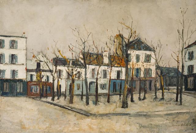
Maurice Utrillo


Not surprisingly perhaps, it seems that to some degree, the art of the deserted street is a kind of declared outsider art; Maurice Utrillo was an alcoholic with mental health issues, and although literally at the centre of the Parisian art scene centred around Montmartre – because he was born there to an artist mother – he was nevertheless a marginal figure, and his paintings of his home town are heavy with melancholy and isolation.

Similarly, although far less gloomy, the Montmartre paintings of Maria Slavona, a foreigner – a German Impressionist painter living in Paris, are depictions of an urban landscape that, while not hostile, is enclosed and other and (to me) brings to mind the close of Philip Larkin’s Here: “Facing the sun, untalkative, out of reach.” Whether that mood is inherent in the paintings, or only in the mind of the person looking at them, is not something I can answer.
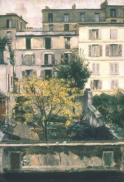
Maria Slavona – Houses in Montmartre (1898)

The German artists of a later generation found a similar sense of alienation at home. The neue sachlichkeit (‘new objectivity’) movement of the Weimar Repulblic may have been a rejection of the extremes of Expressionism and romanticism, but in its embracing of modernity it was a specifically urban movement too. The teeming street scenes of George Grosz and Otto Dix reflected the sometimes chaotic street life of Germany’s big cities in the social and economic upheaval following that followed World War One much as Alfred Döblin’s Berlin Alexanderplatz (1929) was to do in literature, but there were other views of the city too.

It was an era of political unrest, but if one thing united the political left and right it was the understanding that they were living in an essentially transitional period; that change would, and must come.

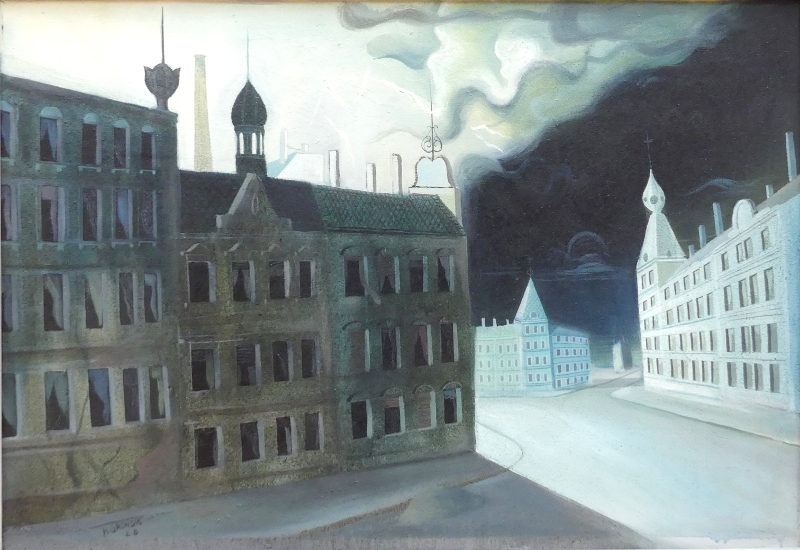
Hans Grundig was the epitome of the kind of artist hated by the Nazi party; politically a communist, he used his art to oppose the creeping rise of fascism but also to capture working class life in the city (in his case Dresden). But in Thunderstorm (Cold Night), 1928, it is the environment itself that condemns the society of the declining republic: the streets are empty and ghostly pale, the buildings, run down and near-derelict, offer little shelter and no comfort, and the people whose fate looked uncertain, are nowhere to be seen. Meanwhile, a storm approached.

Hans Grundig Thunderstorn (Cold NIght), 1928


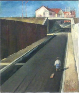
Carl Theodor Protzen – Lonely Street (1932)

Carl Theodor Protzen was, by contrast, an establishment figure; a member of the Association of Fine Artists and the German Society for Christian Art, he was to become a pillar of the Nazi art community. Urban landscapes were his speciality and his depictions of Nazi building projects were to make his name, but just prior to the NSDAP’s rise to power in 1933, he was painting pictures like Lonely Street (1932) that show those same urban landscapes, but without the excitement of progress. Less bleak and doom-laden than Grundig’s city, this is nevertheless an environment which does not embrace or protect humankind; the title reflects the child’s exclusion from the harshly geometric scene in which he finds himself and, although there is no sense of exaggeration, the perspective, as in surrealism, pushes the end of the road ever further into the distance.

This perspective is seen too, in Volker Böhringer’s the Road to Waiblingen, painted in the year that the Nazis came to power. Böhringer, an anti-fascist painter, was later to become a surrealist, and the ominous (blood-stained?) road, stormy clouds and sinister trees suggest that this is  (with apologies to Waiblingen) not a road that he saw leading anywhere very pleasant.
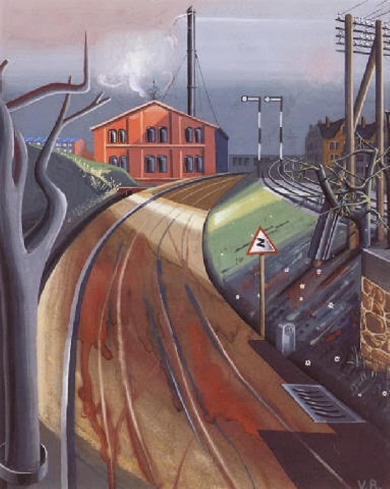
Volker Böhringer – the Road to Waiblingen (1933)

Ever since I was a child, I’ve always loved to visualise (usually at night) a real place, say a nearby hilltop or field, as it is at that moment, with nobody except animals and birds there to see or experience it. It’s a strange kind of excitement that depends on not being able to experience the thing you’re excited about: psychology probably has a term for it – but at a time when people have never been more inescapable (not that one necessarily wants to escape them) there is something appealing about the complex landscapes we have created for our needs, but without the most complex element of all – ourselves – in them. Whether we enjoy the empty streets or not (and hopefully we don’t have to get too used to them), we should probably take the time to look at what is all around us; it’s a rare chance to see our world without us getting in the way.
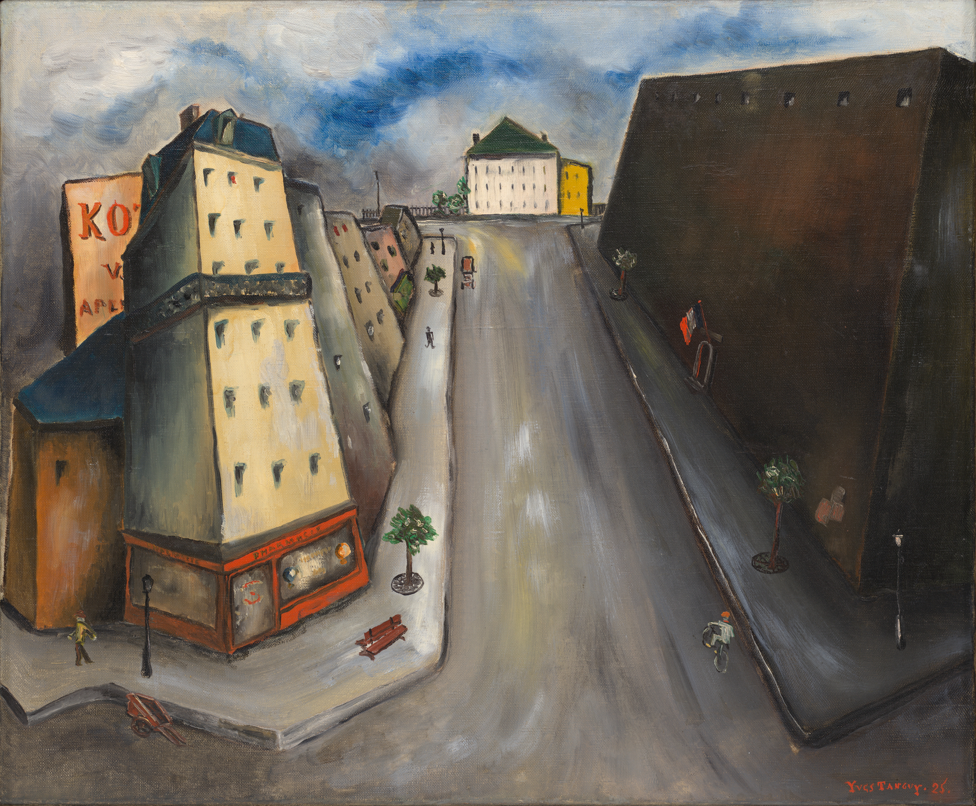
Surrealist social distancing: Rue de la sante (1925) by Yves Tanguy

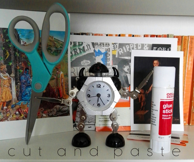
a true state – cut and paste and the art of collage (Edinburgh, summer 2019)

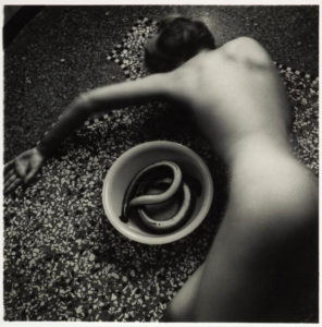
Francesca Woodman, Untitled (1977)

2019 has, in many ways, not been a good year so far. But this summer, the National Galleries of Scotland had (well, has; they are still on) three particularly outstanding exhibitions that brought a bit of light and intelligence to a period of more-than-usual stupidity. At the National Gallery itself, there was the excellent, eye opening and brain-frying Bridget Riley exhibition (closes 22nd September), at the National Portrait Gallery the superb Self Evidence (closes 20th October) in which Francesca Woodman’s tiny, intimate, self-enclosed photographs vibrate balefully in their little corner, overshadowing (for me) the also (but in an entirely different way) intimate and at times frankly challenging monumental works of Robert Mapplethorpe* and, to a lesser extent, the brilliant but (I guess appropriately) don’t-quite-fit-in Diane Arbus portraits of the lives of people marginalised and made invisible by mainstream culture.

*though the Mapplethorpe pictures were the ones that moved me the least, they did provide the priceless spectacle of parents hurrying their curious kids past the notorious 1978 Self Portrait With Whip. They had been warned!

But for me, the highlight of the National Galleries’ summer programme is Cut and Paste: 400 years of Collage at Modern Two (closes 27th October).

Thanks to its inclusive definition of collage (which covers photomontage, traditional collage, plus bits of decoupage, pressed plant samples and even quilting) as well as its historical scope, the exhibition manages to be both focused and wide-ranging, and also (I found) surprisingly moving. What collage does, or at least amplifies – perhaps paradoxically given its use of found/ready-made materials – is that aspect of art that disappears most quickly in reproduction; the hand of the artist. This is art not only as a reflection/projection of culture but one that includes material culture itself.* There is, sometimes regardless of the picture/object, a poignant quality that comes from the materials used, in a way that doesn’t happen with paint, unless you are the kind of conservator who can isolate pigments used to specific periods (I’m not, unfortunately).

*I don’t think this is just pretentious bullshit; but you never know

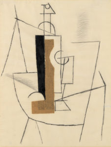
Pablo Picasso, Bottle and Glass on a Table (1912)

I’m getting ahead of myself here, but a seminal collage that makes an appearance in the exhibition, Pablo Picasso’s Bottle and Glass on a Table (1912) is a classic/typical Picasso cubist/spatial experiment, but the use of newspaper – a very specific, dateable piece of ephemera (from Le Journal, 3 December 1912) – gives the work, instantly and inherently, a dimension largely absent in conventional painting. The feeling that the collage is both artwork and artefact; literally as well as figuratively multi-layered, makes a case for collage as a distinct and special art form, a feeling echoed by the Scottish artist Eduardo Paolozzi (represented by some outstanding works in the exibition), for whom the form offered clarification, where formal art training raised problems and questions: “Unlike the world of school where the universe was systematised in a certain order, the reassembly of this disparate material reflected a true state, both autobiographic and dynamic.” (quoted in the exhibition catalogue,  p. 126)

So anyway; the exhibition is arranged chronologically, in the usual Modern Two layout; in various rooms, up the stairs, through the corridors etc, always I think a layout that makes for an engaging, surprising way of looking at art. Partly deliberately (there were too many people in the first room), I went around the exhibition in reverse chronological order and in retrospect that seems like a good decision. This meant that the exhibition opened with the Chapman Brothers’ The Disasters of Everyday Life (2017), a spectacular-looking wall-like object consisting of 80 of Goya’s horrific etchings, The Disasters of War, with of course added bits and pieces, sometimes powerful, sometimes deliberately absurd, I think (though I’d have to go through again the other way) it serves better as a kind of abstract for what is to follow than it would as a conclusion, where peering at a lot of small images might have seemed a bit anticlimactic.
I’m not going to mention every picture in the show, though I can’t think of anything that doesn’t deserve a mention. The first thing to have a major impact for me was Lucy Williams’ 2015 Crescent House, as much a piece of model making as a collage, a strange, small scale (just under a metre long) recreation of a bit of postwar architecture, but simplified and made more colourful, giving it a feeling of harmony almost like a kind of 3D Mondrian.

Lucy Williams – Crescent House (2015)
Linder – Pretty Girl (1977)

Crescent House captures something of the intended optimism of the postwar new town planning that’s most often associated now with neglect and urban decay. I don’t know if it’s a generational thing (Williams is around my age), but for me there was something powerfully bittersweet about the feeling of an abandoned, never-quite-attained future, heightened by the realness of the work as an object.

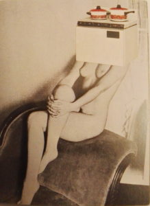
The aesthetic of Crescent House – though that is far lighter in tone – makes me think of the late 70s work of Linder (Sterling), another exhibition highlight. Although similar in its reference points to the pop art collages of Richard Hamilton a couple of decades before (sadly his iconic 1956 collage Just What Is It That Makes Today’s Homes So Different, So Appealing is not in the exhibition, though they do have a nice work by him, Desk from 1964), the feel of Linder’s work is far darker (it makes me think of the confrontational industrial work of Throbbing Gristle and COUM Transmissions around the same period) and the satire more pointed. Works like her Pretty Girl series(1977) exemplify a particular approach to collage. Using the detritus of everyday life; magazines, posters, advertising, it became a way of embodying in the art a criticism of the culture that it’s a reaction to as well as a product of. It’s a feminist criticism of the objectification of women that uses already depersonalised women (part of the problem) and merges them with actual ‘objects of desire’ from a patriarchal culture that above all else believes in commodification for its own benefit.

Craig W. Lowe, Bedroom Cupboard door covered with stickers, 1987-1997

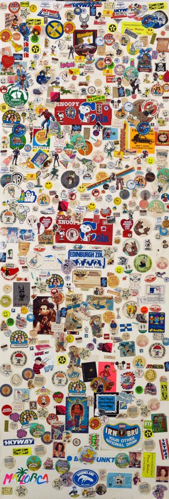
Thanks to the exhibition’s open-minded and inclusive approach, there are some unexpected revelations (but aren’t all revelations unexpected? I mean, that’s obvious). While Craig W. Lowe’s bedroom cupboard door covered in stickers c. 1987-1997) may appeal most as nostalgia, the inclusion of Jamie Reid‘s original Sex Pistols Never Mind The Bollocks cover collage (1977; copyrighted image so I’d better not share) opens realms of not-previously-considered information (at least to me) about one’s record collection. Firstly, the collage is black and white, and secondly, it isn’t just a picture or a ‘file’, it’s an actual thing. Like, presumably all album cover art (and book cover art etc) before the digital age, the NMTB cover in all its yellow and pink (or pink and green) glory, taken for granted forever, is not a picture, it’s a photograph of a picture. In its final form it’s been overlaid with colours, but that object there on the wall in Edinburgh is the thing itself. A strange feeling, like looking at the inscription on a ten pound note and considering that it is a representation of something, rather than ten actual pounds.

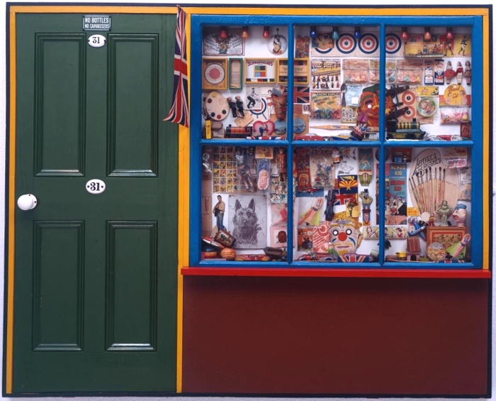
The Sex Pistols cover primes the viewer (at least the viewer going through the exhibition backwards) for the various bits of Peter Blake’s Sgt Pepper’s Lonely Hearts Club Band cover that are on show – and, great though they are (and I like Sgt Pepper quite a bit more than I like Never Mind The Bollocks), without that priming, the Beatles items wouldn’t have the same impact; perhaps because the cover itself is clearly a photograph of objects and cut-outs and seeing them is very cool but not really revelatory, the whole is too familiar and iconic to give the frisson of a moment captured. In fact, Blake’s superb, possibly slightly twee The Toy Shop (1962) is a far more vivid time capsule; clearly pointing to Sgt Pepper, its a conglomeration of bits and bobs familiar to children of the 60s – but also to children of later generations as belonging to the same family as the bits & bobs of their own youth (in my case, comics, football stickers, sweets, TV tie-in toys (He-Man et al), but also the odd antiquated throwbacks that still existed, like bows and arrows and balsa wood or polystyrene gliders which came with a weighted plastic propeller so they flew when thrown – do they still make those?). It’s hard to imagine that there will be a generation that can’t relate to The Toy Shop at all, however virtual entertainment becomes, kids will always like stickers.

Peter Blake – The Toy Shop (1962)

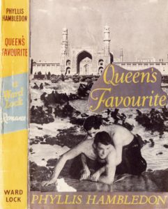
But Blake’s pop art nostalgia – powerful though that is – is one of the few purely positive and joyous post-war works in the show. More typical are the mischievous collage book covers made by Joe Orton and his partner and eventual murderer Kenneth Halliwell. These were put on library books and returned to the library – an act that eventually cost them a six month prison sentence – and they exemplify the sense of the significant, perhaps subversive and illogical accident that drew the surrealists to collage a few generations earlier.

Kenneth Halliwell & Joe Orton – collage on library book cover (c.1960-2)

For the surrealists, collage was almost a manifestation of the galvanising quotation from Lautréamont’s Les Chants de Maldoror (1869) where a boy could be described as being “as beautiful as a chance meeting on a dissecting table of a sewing machine and an umbrella.” This aspect of surrealism is brilliantly captured in Max Ernst’s gothic ‘collage novels’ (one of the most exciting inclusions in the show is an unpublished picture from his 1934 collage novel Une semaine de bonté) as well as in beautiful works by Toyen and some of the collaborative exquisite corpse collages made by André Breton, Jacqueline Lamba and Yves Tanguy, where each artist could only see their own part of the work until it was complete. Again, what I hadn’t really anticipated was the difference it makes seeing these items in real life – for example, I had seen and liked (and own a postcard of) Roland Penrose’s untitled 1937 postcard collage, but seeing it, life size, and looking at the actual real postcards stuck to it, was a weirdly moving experience. But why? It’s something about the immediacy and associations of familiar things, the thought perhaps of Roland Penrose actually going into a newsagent and buying the postcards one day in 1937. Why that should be more moving than an artist using paint I don’t know, except that, like the scrapbooks owned by Tristan Tzara (very exciting to see) and the paper cutouts by Matisse (which until now I’ve never been a fan of) it brings the whole process of making art into an immediate, almost tangible one.

Roland Penrose – Untitled (1937)

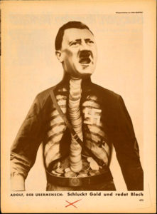
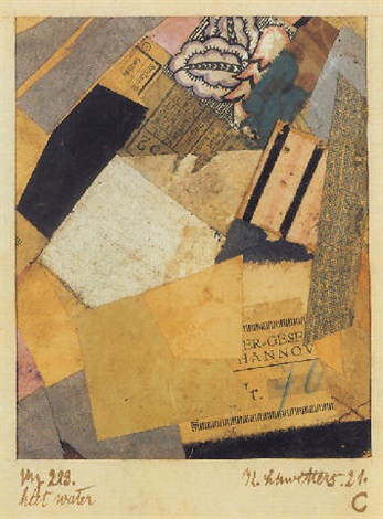
The work of the Dadaists (Hannah Höch was the main reason I wanted to see the show) is less self-consciously unconscious (well, that makes no sense) than the surrealist works, but the element of satire and sometimes bitter humour – especially in John Heartfield’s iconic anti-Nazi photomontages – make them the spiritual ancestors of the works of artists like Carolee Schneemann and Nancy Spero in the 1960s as well as Linder and even Terry Gilliam in the 70s. Highlights for me were the selection of works by Kurt Schwitters, whose own version of Dada, Merz, even had a collage-like genesis, the word itself apparently derived from a fragment of text relating to a banking firm (Kommerz und Privatbank). The fact that the word Merz also has echoes in the words schwerz (pain) and ausmerzen (to weed out or discard) adds to the sense that this was a movement (if you can call one person a movement) for which collage wasn’t an entertaining diversion, but a central idea. The cumulation of meanings and associations in works like Merz 229: Heet Water (1921) makes these small works with their train tickets, textiles, playing cards – pretty much anything that could be cut up and stuck down – powerfully evocative, as well as decorative in themselves.

John Heartfield – Adolf the Superman – swallows gold and spouts junk (1932)
Kurt Schwitters – Merz 229: Heet Water (1921)


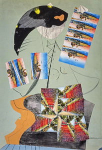
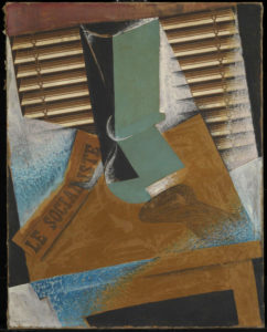
The section on the birth of modernist collage features a group of Picasso works including the the aforementioned Bottle and Glass on a Table, which form year zero of modernist collage, alongside works by peers including Braque (who may actually be the first modernist collage-maker) and Juan Gris (whose The Sunblind, 1914 is a highlight) and then the ripples spreading outwards from that explosive group of works, including the Russian constructivists and suprematists, the Italian Futurists and even the Bloomsbury group in the UK; I was very impressed to come across a painting by Vanessa Bell (Portrait of Molly MacCarthy, 1914-5) that didn’t immediately wilt into insignificance when surrounded by the big names of European modernism.

Juan Gris – The Sunblind (1914)

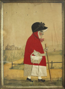
It seems obvious to say that collage is comparatively egalitarian insofar as you don’t need to be able to draw or paint to do it – and it’s true that works by generally non-visual artists like Breton and Joe Orton have a similar energy and atmosphere as those by more conventional artists, but it’s also noticeable that, pre-modernism, although the idea of collage existed and there was sometimes that same element of playfulness, the work is more notable for its skill and ingenuity – especially in the Victorian photomontages – than for any disruptive or ironic qualities. But collage being what it is, it’s here that the sense mentioned earlier of the collage as actual material culture comes into play again, sometimes – especially for me in the small character pieces by George Smart from the early 19th century – powerfully so. Somehow, these little watercolour paintings adorned with carefully cut out and arranged pieces of paper and fabric (irresistibly reminiscent to me of the ‘fuzzy felt’ sets I played with as a child) bring us closer to the artist than just paint on canvas would do.

This is perhaps art history as human interest and association rather than as aesthetics (this is especially true in the case of the Victorian scraps and scrapbooks, perhaps because the ready-made nature of the scraps themselves makes the objects feel less like the works of an artist and more like a hobby; nothing wrong with that, but as the sort of things you see in auctions and junk shops they have the aura of being ephemera, rather than using ephemera to make something else; a false distinction perhaps), but for me this exhibition brings those two aspects of art – the human/historical and the aesthetic/technical together in a deep and very satisfying way.
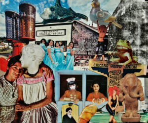
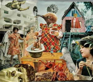
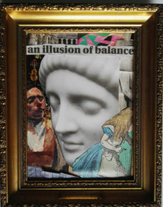
I have no real criticisms of the exhibition; it is thought provoking, beautiful to look at and put together with care and imagination. It might have been nice to have had something by some of the other artists most strongly associated with collage, like Romare Bearden and Wangechi Mutu; but if an exhibition leaves you wanting more that can’t be a bad thing.

***POSTSCRIPT***

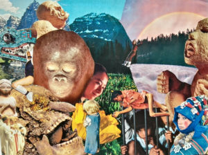
Since I mentioned the anyone-can-do-it aspect of collage, I might as well mention that I went through a phase, especially in my student days of making collages, and while they are nothing special, they do have a kind of diary-esque subtext which has only really become apparent over time. Since it’s my website and no-one can stop me, here are a couple of examples, plus a more recent one.

untitled collage, c. 1998?
untitled collage c. 1998-9


untitled collage, 2019
untitled collage, late 90s

It’s not real if you don’t feel it – but what is ‘it’ and what is ‘real’ and who’s to say anyway?


A wise woman once sang “It’s not real if you don’t feel it”* and as far as the arts are concerned it’s as good a measure of quality as anything. But what is “it” that you are feeling? Is everyone feeling the same thing? Clearly not. Even the opinions of people who do like the same song, the same book, the same film, the same painting, are likely to diverge when it comes to the detail of what they like and how it feels.

*The Goonies “R” Good Enough, (Cyndi Lauper, Stephen Broughton Lunt, Arthur Stead, 1985

Part of the mission of modernism in the early 20th century was to free art from associations; from sentimentality, from tradition, culture, religion, politics and define it for itself. That was necessary, in order to break the endless repetitive staleness of academicism and/or lowest-common-denominator entertainment, and because photography and recorded sound and near-universal literacy had all become significant factors in western society. Looking at the visual arts; if all that art does is to repeat what is already popular, to record and represent and recreate the visual and the actual, then how can it compare or compete with something like the camera which captures that external reality? And if that external reality, in the form of contemporary society, is something the artist rejects or objects to, then why use its tools and its language at all?

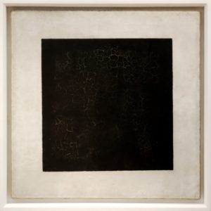
It’s hard to imagine, a century after the modernist explosion (say 1900-1939), the extent to which the arts were in thrall to academicism, presumably because, having fought first for freedom from the world of manual labour and craftsmanship, artists were keen to stress their respectability, their links to nobility, aristocracy and wealth. But access to that world came, not surprisingly, with rules, manners and forms of behaviour which settled, over the course of a couple of centuries, into its own rigid traditions. Therefore, the artists of the modernist era were, like any revolutionaries, especially concerned with making their own manifestos and statements. ‘Art for art’s sake’ is a nineteenth century, essentially romantic/bohemian idea which feels remote from the milieu of modernism, but at the same time a theory of pure art is found even more clearly in something like Kazimir Malevich’s The Non-Objective World (1926) than in anything written by Théophile Gautier or Edgar Allen Poe;

“Art no longer cares to serve the state and religion, it no longer wishes to illustrate the history of manners, it wants to have nothing further to do with the object, as such, and believes that it can exist, in and for itself, without “things”.’

Kazimir Malevich – Black Square (1915)

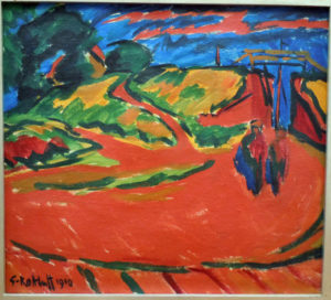
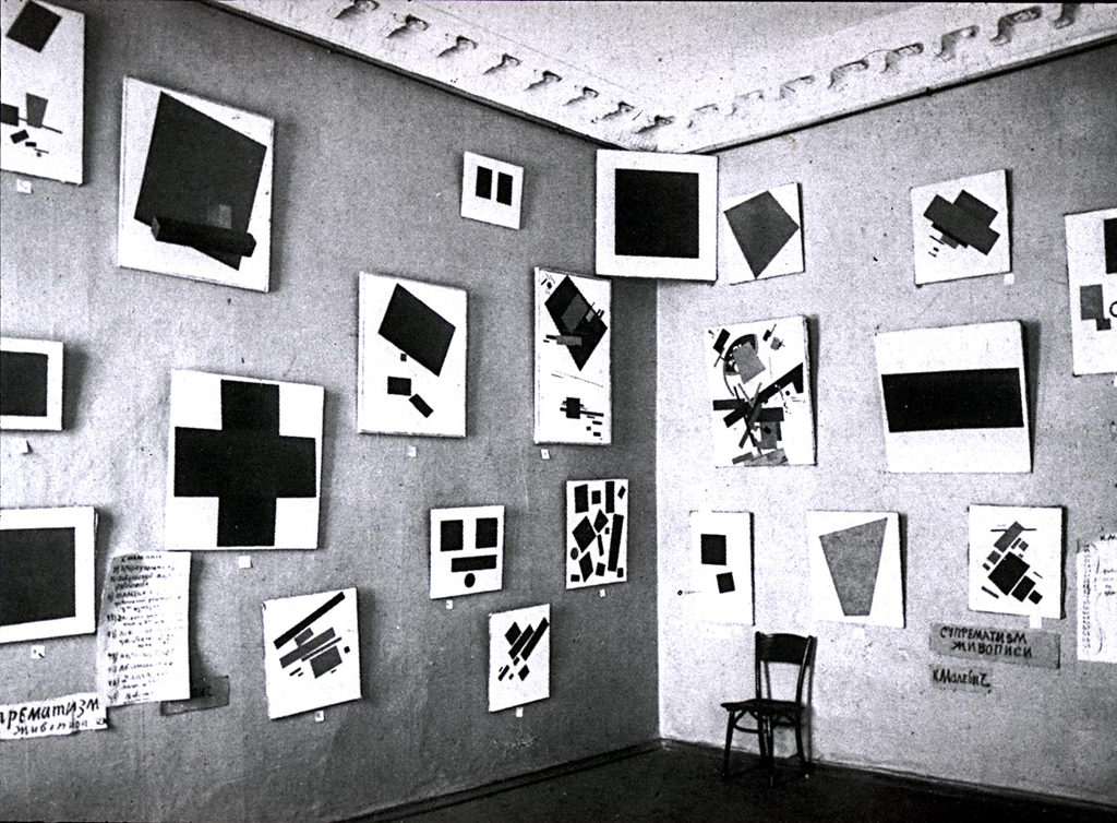
Though formulated later, this is the kind of theorising that helps partially to explain works like Malevich’s Black Square (1st version 1915). Un-controversially considered a masterpiece – and one that I myself like a lot – it nevertheless seems to me a work that gains enormously from some kind of context, even if all that context is, is the knowledge that it is in fact a painting by an artist.  ‘Left to itself’, without any associations, if encountered ‘cold’, especially outside of a gallery, it might just as easily not be ‘art’ at all. And while that isn’t a bad thing, a random black square encountered in one’s daily life doesn’t – depending of course on the individual who encounters it – have the intensity or pregnant quality that one can (repeat of previous caveat) feel standing in front of Malevich’s ‘Black Square’. But what Malevich does in his statement is to take the artist out of the art and anthropomorphise the art itself (“…it wants to have…”). This seems to me to negate – not unintentionally – what is meant by art at all. For myself, I prefer the German Expressionist Karl Schmidt-Rottluff’s statement which, while it doesn’t even slightly contradict the idea of purely abstract art, puts the artist at its centre, rather than treating art as a kind of self-creating phenomenon:

Karl Schmidt-Rottluff, Landscape (1910)

“I know of no new ‘programme’…. Only that art is forever manifesting itself in new forms, since there are forever new personalities – its essence can never alter, I believe. Perhaps I am wrong. But, speaking for myself, I know that I have no programme, only the unaccountable longing to grasp what I see and feel, and to find the purest means of expression for it.”

Karl Schmidt-Rottluff in Kunst und Kunstler (1914) quoted Wolf-Dieter Dube, The Expressionists, p.21 (T&H 1972, transl. Mary Whittall)


If a painting hangs in a forest…

The three key factors here (for me) then are creator-work-recipient. If the artists (Schmidt-Rottluff’s ‘personalities’) are trying to communicate something specific to the recipient with their work, then they either succeed or they don’t. If the artist doesn’t succeed in communicating what they intended to communicate – or if they aren’t thinking of the ‘end user’ at all, and are expressing their own feelings/ideas purely for their own reasons – they may (and probably will) still transmit something of themselves; a personality, an emotion or group of emotions, a mood or idea. But although in either case the work may be imbued with that power, it only becomes power when someone is there to experience and/or interact with it. In material terms, the great masterpieces of painting, be it the Mona Lisa (oil paint on wood), or the Black Square (oil paint on linen) have little more intrinsic ‘value’ than a few tubes of oil paint or a piece of wood or linen; after the lights go out and the visitors go home, they basically cease to exist as art.  The alchemy that takes place when art finds an audience is what makes it art; at least, so it seems to me.

Malevich’s paintings at the 0,10 exhibition, Petrograd 1915. Black Square hangs where traditionally a religious icon would be displayed

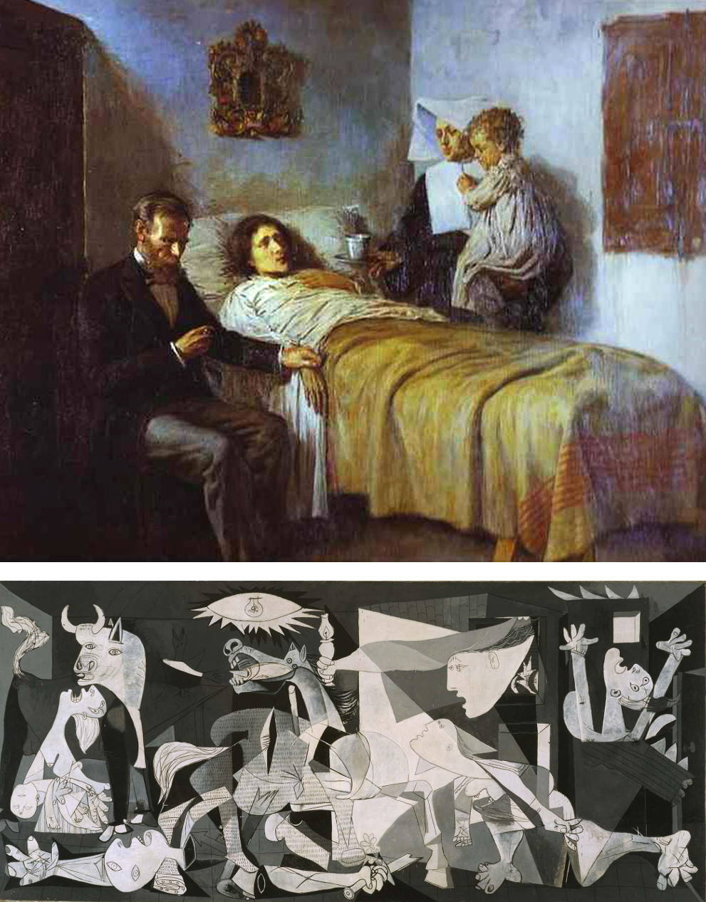
So can there be ‘good’ or ‘bad’ art? Short answer; intuition says yes, but experience says no. Alongside the disintegration of traditional academic rules, there has been the growth and persistence of the myth that, in order to break the rules of art, you must first understand and adhere to the rules. This idea has been strengthened by the fact that some of the iconic figures of modern art, like Picasso and Dali, have been immensely talented by the traditional, renaissance standards of art and could easily have made a career in academic painting; but so what? Would Guernica, looking exactly as it does, be a lesser work if it was the only painting Picasso had ever done, or if his immature works had been unimpressive?

Top: Pablo Picasso – Science & Charity (1897)
Bottom – Pablo Picasso – Guernica (1937)

Separating personal, aesthetic judgements of good and bad from objective judgements is almost impossible; a strong argument could be made for either of the above images being ‘better’ especially since the emotional impact is as subjective as anything else. And separating these kind of aesthetic judgements from moral ones can become even more complicated – can a work of art that is an expression of something ‘bad’ be good? If for example we discovered that Picasso was celebrating rather than mourning the slaughter and destruction at Guernica, would the painting be as good? And what does good even mean in that sentence anyway? The idea that (for instance) a painting, or a song is “bad” is essentially meaningless, despite the fact that millions of paintings and songs are clearly very bad. They can never be demonstrably bad because, as Hamlet says, and even the relatively short history of pop music proves, “there is nothing either good or bad, but thinking makes it so.”  Even the most derivative, tuneless, unimaginative, moronic or amateurish song can and will be loved by someone, or many someones. And beyond people liking it, how can the quality of something like art truly be gauged? Yes, ‘Liking’ can be a complex thing and is not the same as ‘admiring’ and yes, there are people with knowledge and expertise and highly developed critical faculties and so forth; but their opinion can no more prove a work of art is good than a restaurant critic can prove that a Michelin-starred chef’s finest creation tastes better than a Big Mac.

Despite the ‘golden ratio’ of the ancients, Hogarth’s ‘line of beauty’ and the Turner Prize, despite Grammys and Brits and Eurovision Song Contests, there is no logical ‘2 + 2 = 4’ type equation which can prove that “4” = a good work of art. In architecture at least, a building either works as a building (ie stands up and people can go inside) or it doesn’t, but even then, it would probably be easier to ‘prove’ that your local supermarket is logically ‘better’ as a building than Chartres Cathedral, rather than vice versa. But it obviously isn’t (unless you are very lucky) better than Chartres Cathedral. It feels too trite and easy to say ‘art is only as good or bad as an individual’s opinion of it’, but I can’t really do any better than that. You can’t make someone like something by telling them it’s good, however convincing your argument may be to you.

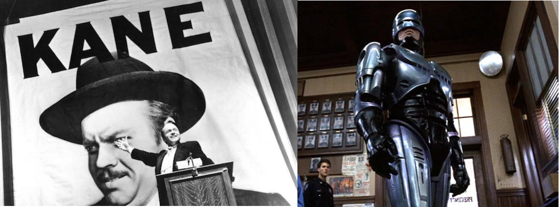
I also don’t think (though I am less convinced about this) there are good or bad reasons for liking a work of art, a song or a book, although there are certainly different levels of engagement, which are still however subjective; I like Citizen Kane but I love Robocop. Do I think Robocop is therefore the better film? Absolutely not. In the western world there is a kind of agreed pantheon of ‘great art’, encapsulated in the ‘high art’ end of the scale by the way in which art history, English literature, cinema et al are taught in institutions and, at the lower end of the scale in books and websites of the ‘1000 albums/films you must hear/see before you die’ type, but in practice everyone constructs their own pantheon, with the importance of the ‘official’ ones being little more than a guide. I know Robocop wouldn’t exist in the same form as it does without the innovations of Citizen Kane, but that doesn’t change the way I feel about either film. In reality, the only way to gauge (for example) the “greatest album ever recorded” is to have a public vote without offering a list of previously selected albums to choose from and then see who ‘wins’ – and I am sure I still wouldn’t agree with it.

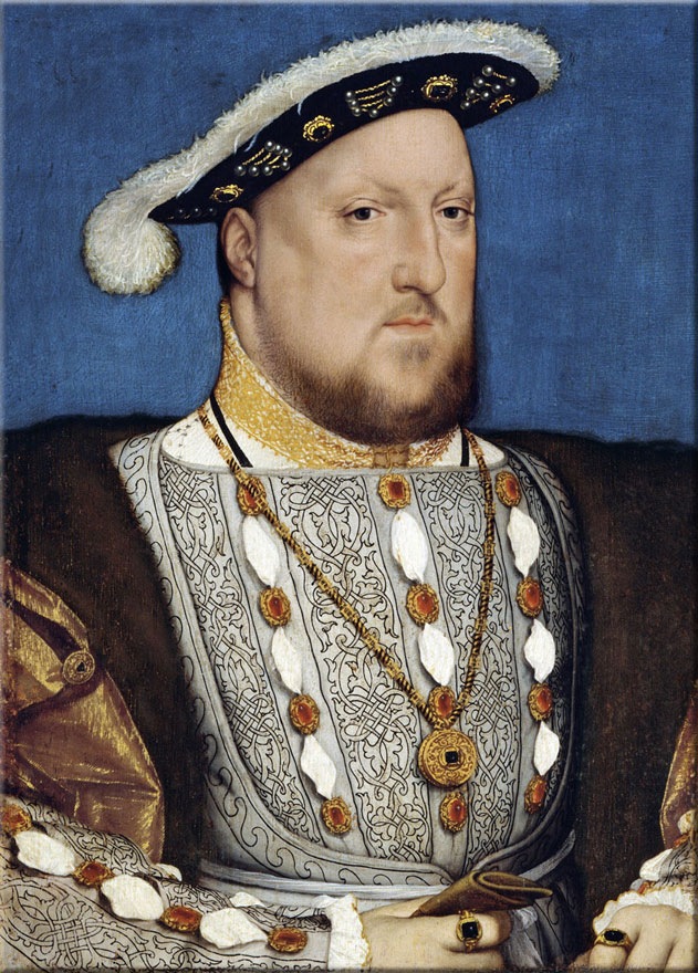
Hans Holbein the Younger; Henry VIII (c.1537)

Over the years, it has often been considered that the correct critical attitude is to remove sentimentality from judgements on the arts, and although it is one way – judging pictures on their composition, harmony etc, ignoring subject altogether, evaluating music on its structure, technical skill etc – it is sometimes almost impossible to do, and really, thinking again of both the emotional satisfaction people get from songs, films, pictures they love, and the example of Malevich’s Black Square, is it even desirable? Thinking of Black Square, to judge a work which has so much context; theoretical, spiritual, cultural and emotional – by the sum of its basic physical attributes is reductive, as well as boring. Likewise, a great portrait in no way relies on the viewer knowing anything about the sitter, but – is Holbein’s great Henry VIII (1537) more interesting/engaging as flat masses of colour laid out in a particular, intricate design on a two-dimensional surface, or as the impression and interpretation of one human being through the eyes, mind and skill of another? The answer for me is the latter, which is really both, since the technical aspects of the first option are anyway incorporated in the second.

Pogo and the Black Square

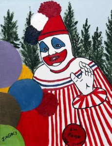
A debate that rears its head fairly often – and I guess will increasingly do so as information about everything becomes more readily available – is whether ‘bad’ people (or just bad people) can make good art. Unlike art, and despite the murkiness of morality (influenced as it is by essentially amoral and anyway changeable concepts like tradition, religion and culture) there are some people that we can agree are bad, or at the very least, ‘not good’. Here’s an uncontroversial opinion; John Wayne Gacy, the ‘killer clown’, rapist and murderer of around 33 young people, was – even if he was at the mercy of his own personality disorder – a bad person. He also made something that is as close to being ‘bad art’ as anything I can think of. The fact that his paintings are collected by people and have sold for serious sums of money has nothing to do with their quality and everything to do with their associations. You could of course say much the same about the Black Square. And if the imaginary passerby who unpreparedly encountered the Black Square also encountered one of Gacy’s paintings, how would the experience differ?

John Wayne Gacy – Pogo the Clown

Firstly, they would know immediately that it was a painting made by a human being, and, if from a western background, they would probably recognise the subject matter. Because of this, Gacy is both at an advantage and disadvantage; advantage because, no matter how the viewer feels about clowns, they have immediate ‘access’ to the painting – ‘I know what that is’. Disadvantage, because while the black square is a black square and therefore looks like a black square, Gacy’s clowns, portraits, skulls etc are – by the standards that most people judge art by – pretty amateurish. He wasn’t an accomplished enough artist (I don’t mean just in a technical way) to communicate anything very deliberately (he wanted his paintings to bring joy into peoples’ lives; which seems unlikely, unless said people are serial killer fetishists), so what the viewer is left with are his obsessions – or at least the ones he could express to his own satisfaction through his paintings.

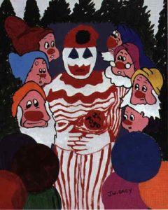
Going back to my highly dubious creator-work-recipient idea of art, the creator, Gacy was (or said he was) trying to do something specific – to create bright and happy pictures to bring joy to the recipient. Whether he succeeded in this aim, regardless of who he was, depends on how one responds to childlike but sometimes enigmatic pictures of clowns. What he definitely did do was to transmit something of himself; a clear-cut but deeply alienated/alienating vision of the world; actually, without a world. Not, as one might expect, a simplified Norman Rockwell America, with the sun in the sky and a clown in the garden, but essentially just the clown; mostly in fact Pogo the clown, Gacy’s own alter ego, sometimes with an extremely cursory, but telling hint of a setting. Not a circus, or the suburbia of the childrens’ parties he haunted, but a hint of a dark, fairytale (the seven dwarfs appear in a particularly odd picture) forest. These are clowns in the wild. The term ‘outsider art’ could have been coined for Gacy’s paintings. The other often-used term, ‘naïve art’ seems fleetingly appropriate, until one considers pictures like his paintings of Charles Manson, or even more so, of Tim Curry’s Pennywise from the TV adaptation of Stephen King’s IT. Gacy may not have been a good painter, he may have been to all intents and purposes insane, but he was not naïve; he knew that he belonged to a pantheon of famous murderers, that he was the original killer clown and he was flattered by the association.
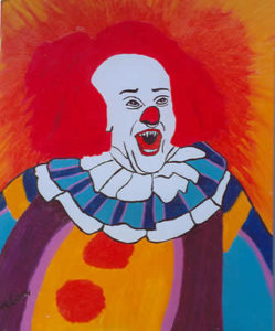
John Wayne Gacy – Pennywise the Clown (1993)

But Gacy was chosen as an intentionally extreme example; even more extreme would be Hitler, whose serviceable but bland and slightly lifeless paintings are also highly collectable, despite lacking even the visceral ‘disturbed’ quality of Gacy’s. Whereas the innocent buyer might just be attracted to Gacy’s clowns for their kitsch, weird, outsider quality, Hitler’s works are best suited for what they were meant to be – postcards, unambitious souvenirs, illustrations. The lack of frisson they have as images is an indicator that the reasons people have for buying them have little to do with the pictures themselves. For, hopefully, a variety of reasons, these people are not buying ‘art’ at all, they are buying history.


The art didn’t abuse…

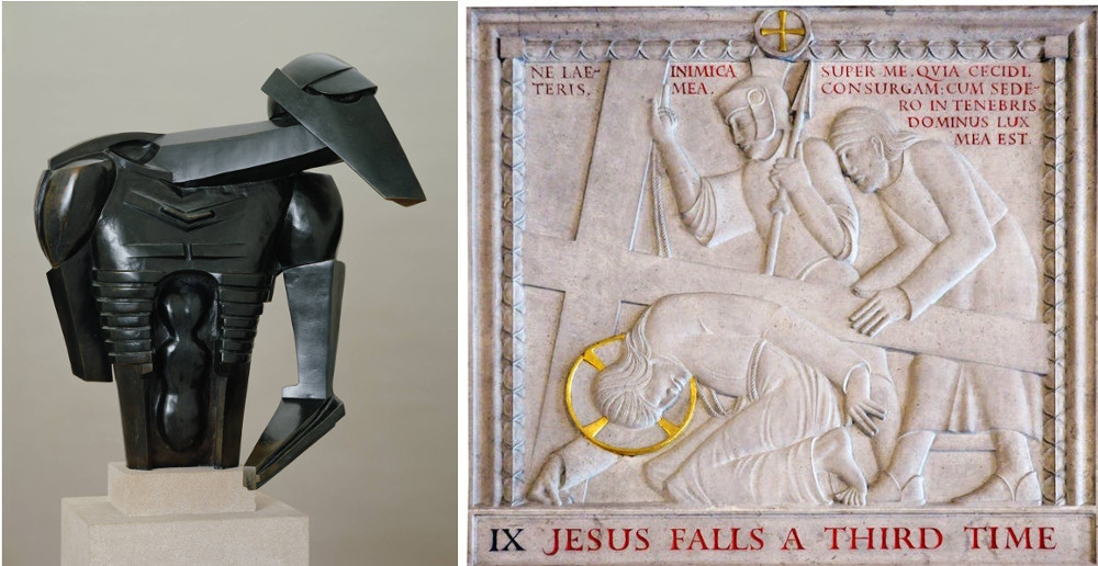
 The world of actual art also has its fair share of murderers, rapists and so forth, and the question of whether their lives and actions invalidates their work is never really answerable. Apart from anything else, what about the legions of artists, musicians, writers whose private lives and opinions we know little or nothing about? Or artists like Andrea del Castagno, known for centuries as a murderer because of a mistake (whether malicious or not we cannot know) in Giorgio Vasari’s biography of him? At this distance of time it isn’t really an issue, even when talking about a definite murderer like Caravaggio. We don’t expect historical figures to have views, opinions and beliefs that we would find acceptable in the 21st century, although people of the 16th century certainly felt at least as strongly about murder as we do now. When we get closer to our own time, things become more complicated. For me, it’s easy to disregard the achievements of, say Eric Gill*, because even without the knowledge of his child (and animal) abuse, his work is not really my cup of tea; graceful and stylish yes, but, given that he was a contemporary of people like Jacob Epstein and Constantin Brâncuși, also a bit un-dynamic, insipidly faux-modern and backwards-looking. And then, adding the context, knowing about Gill’s religious beliefs, a bit churchy, and then, knowing about his abuse of his daughters, hypocritically pious too; it leaves a bad taste. Which doesn’t stop people from loving it, and nor should it; the art didn’t abuse anyone.  (This short article by Waldemar Januszczak is very good on Gill I think).

Left:Jacob Epstein – Rock Drill (1913)
Right: Eric Gill – Stations of the Cross (1913-18)

But one of the points about Gill is that even his apologists probably wouldn’t, these days, hold an exhibition of Gill the artist without at least acknowledging the problems with Gill the man. More my cup of tea, and more relevant to now, the Scottish National Gallery of Modern Art will be hosting an exhibition of Emil Nolde’s work this summer. German Expressionism (or in Nolde’s case, German-Danish Expressionism) is one of the areas of art I love the most and, although Nolde is not one of my favourite artists I will be excited to see his work. But. Emil Nolde was a member of the Nazi Party. That of course doesn’t change his paintings, but it makes them – and the exhibition – problematic for several reasons. The main reason for me, is that, in its pre-exhibition publicity at least, the NGS makes no mention of his Nazism whatsoever. That might still be okay, I suppose, if they didn’t include this little snippet in their bio:

“This exhibition…covers Nolde’s complete career, from his early atmospheric paintings of his homeland right through to the intensely coloured, so-called ‘unpainted paintings’, works done on small pieces of paper during the Third Reich, when Nolde was branded a ‘degenerate’ artist and forbidden to work as an artist.”

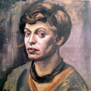
Elfriede Lohse-Wächtler – self portrait (c.1930)

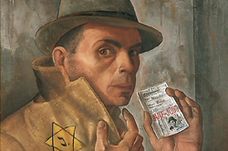
There is a certain amount of schadenfreude in this detail. But there is also the ghost of fellow Expressionist Elfriede Lohse-Wächtler, murdered at Sonnenstein castle in 1940 as part of a government programme to eliminate the mentally ill, and of German-Jewish painters like Charlotte Salomon and the surrealist Felix Nussbaum, murdered in Auschwitz in 1943 and 44 respectively. As a member of the Nazi Party, Nolde was to an extent complicit in their deaths; for him, ‘entartete kunst’, a policy he didn’t necessarily oppose in general,  meant he had to paint unobtrusively, in private and couldn’t exhibit his work until after the war.  For those artists it meant a death sentence, for many others it meant harassment or exile. A more wide-ranging exhibition in which Nolde’s paintings bridge the gap between the work of his fellow ‘degenerates’ including perhaps some of Nussman’s Auschwitz paintings, and the art of Nazi-approved painters like Adolf Ziegler or Conrad Hommel would be a strange and indigestible (and chronologically back to front) thing perhaps, but I think that failing that kind of an overview we, at the very least, shouldn’t be encouraged to feel sorry for Nolde that he had to work in secret because of the actions of the government he supported.

Felix Nussbaum – Self Portrait with Jewish Identity Card (1943)

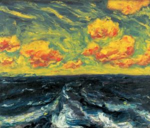
Is Nolde’s art then ‘Nazi art’? No, or at least not in the same way that state-sponsored art under Hitler was. It isn’t didactic, realist or heroic. Nolde saw expressionism and therefore his own painting as definitively German, and was deeply moved by colour, which he equated with emotion. The works of his which I like best (which, by coincidence perhaps, long pre-date even the idea of the Third Reich and belong to the period when he had recently been in contact with the younger artists of Die Brücke) translate that emotion into intense and visionary land and seascapes. These pictures feel utterly free of the ideology of Nazism – but that said, even under Nazi rule, the German ideal of the nude Freikörperkultur (Free Body Culture) and ‘oneness with nature’ was respectable in a way that was unthinkable in the UK, so the apparent freedom of the painting need not be reflected in the kind

Emil Nolde – Autumn Sea (1911)

of egalitarian ideals that artists like Ernst Ludwig Kirchner expressed in their art. If expressionism can be seen as the ultimate kind of subjective painting; where the aim is ultimately to make the viewer feel what the artist feels by filtering a subject through the distorting lens of their individual perception, then Nolde’s paintings show the world as it was felt by someone who could write, in 1938;


For as long as I’ve worked as an artist I have publicly battled against the foreign infiltration of German art, against the dirty dealings on the art market and the disproportionately predominant Jewish influence everywhere in the arts. Now if that is the case, and I have been attacked and persecuted now for years by the side I championed and fought for, then there must be misunderstandings in need of clarification.”

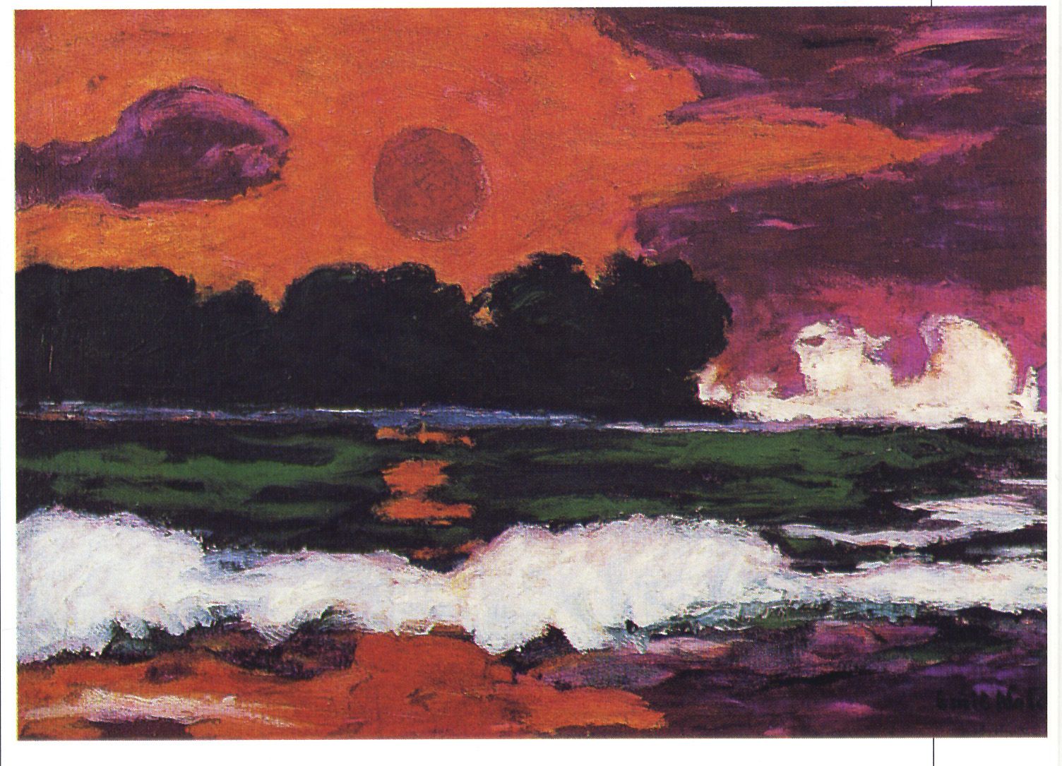
Emil Nolde – Tropical Sun (1915)

As to the question of how easy it is to like Nolde’s ‘unpainted pictures’, I’ll have to wait for the exhibition.

How do you solve a problem like Morrissey (it solves itself)

The Nolde exhibition is only one reason that these issues have been on my mind recently; the other, more personal one is Morrissey. Morrissey is clearly not John Wayne Gacy, or Adolf Hitler, or even Emil Nolde. Nor is he, unlike Varg Vikernes, whose music I also like, a murderer. But I never felt let down by any of those people; with Varg I knew about him before I ever heard his music, I have no emotional investment in it, whereas Morrissey’s recent utterances seem completely at odds with the worldview of his earlier music; which is not his problem, or his fault, I simply interpreted what I wanted to from the art he created, just as it’s possible to look at Emil Nolde’s work and see beauty and freedom there, even if that freedom and beauty is diametrically opposed to the views he professed in his non-artistic life.

I first listened to The Smiths and Morrissey when I was 17, although I was aware of them/him years before. Of all the music I loved as a teenager I think Morrissey’s was the music I identified with the most. I liked The Cure and Joy Division and The Fall probably as much, but their music was – I suppose because it’s less lyrically straightforward – less personal to me. To this day, Morrissey’s lyrics (up to the mid 90s at least) are engraved on my memory and I certainly know more of his lyrics by heart than any other band or artist’s. It’s been very clear for a while now (and murkily apparent for much, much longer) what kind of person, politically, Morrissey is.  And that’s fair enough; he is entitled to his views, even if I think he’s wrong and don’t feel inclined to fund him any further (I still think he is more complex than his worst detractors would say, but so what?)

It’s no use really to say as some people do, that there are artists out there making great work who don’t have extreme right wing views. Obviously that’s true; but unless their art speaks to you why would you care? And most of the time, one has no idea what opinions or beliefs of an artist are anyway, unless they specifically say so. And (to me) art that is explicitly political/religious or politically/religiously-motivated rarely connects on a very deep level; and to paraphrase Cyndi again, it’s not real unless I feel it.

And I always felt The Smiths’ music, deeply, and much of Morrissey’s solo stuff too, though it is less critically acclaimed. His recent/latest statements in the press don’t seem like the words of someone who could write “It’s so easy to laugh/It’s so easy to hate/It takes strength to be gentle and kind”, but that’s people for you.

Initially, several controversies ago, I decided that although I wouldn’t actively avoid Morrissey and his works, I would just no longer buy them in a way which would benefit him directly; mean and possibly unfair I know, but that’s people for you too. I am not someone who is going to burn records, CDs and books, or even throw/give them away in disgust, if they have ever meant anything to me. But then came the latest and most crass Morrissey interview (so far) and I got to the point where I’d be kind of embarrassed to buy anything Morrissey-related at all. It’s not so much (as one example out of many) the factual inaccuracy of statements like “Hitler was left wing” – people have been saying moronic things like that (Hitler was a Zionist etc etc etc) for many years. It’s the fact that, as with those who claim the death toll in the holocaust has been exaggerated, people like Morrissey seem to think that his amazing revelation about Hitler is in any way relevant to the things his regime did and how one should feel about it. As with (ironically) people who taunt vegetarians with ‘Hitler was a vegetarian’, it spectacularly misses the point; Hitler is not famous because he’s a vegetarian, any more than he’s famous for his ‘left wing’ views. And you know that, so don’t be so stupid.

But anyway, in the end my fears that the soundtrack to my youth/life would be tainted only came half true. When Morrissey songs popped up in a shuffle I found that, without any feeling of revulsion, drama or anguish, I just didn’t want to hear them anymore. The connection seems to be gone, without regret and possibly with the relief that I was never – despite the fact that I even, unrepentantly,  like his autobiography – one of those Morrissey obsessives. Maybe one day my love of his music will come back, maybe not. It’s not real if you don’t feel it and, right now I just don’t, so it isn’t. Ho hum.


Review of the Year – the paradox of realism


2017, like most years but somehow more so, was filled with unpleasant things, events and people. For me though, one of the more pleasant features of the year was that I made the effort to visit art galleries more often than previously, in particular to see the superb exhibitions held by the National Galleries of Scotland; after missing Modern Scottish Women in 2016, I was determined to see Beyond Caravaggio at the National Gallery and especially True to Life – British Realist Painting in the 1920s and 1930s at the National Gallery of Modern Art. Both of these exhibitions were excellent, but I am writing mainly about the latter. As curator Patrick Elliott was clearly aware (see also the essay What Sort Of Truth? British Painting Between The Wars by Sacha Llewellyn in the excellent exhibition catalogue), ‘realism’ is not a simple thing to define, and indeed it seems strange that (for example) the peculiar and highly artificial painting of Maxwell Armfield and the shockingly immediate work of David Jagger should be considered the same kind of art.

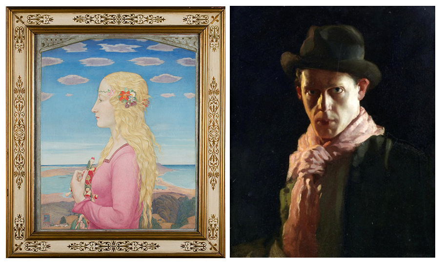
‘Pacific Portrait’ (1929) by Maxwell Armfield (left) and ‘The Conscientious Objector’ (1917) by David Jagger (right)

If ‘Realist’ at first seems a pretty simple and unambiguous description, the fact that many of the artists (Dod Procter, Meredith Frampton, Gluck, Glyn Philpott) and paintings discussed in the exhibition catalogue also appear, equally convincingly, in Edward Lucie-Smith’s book Art Deco Painting (Phaidon, 1990) demonstrates just what a subjective term it really is. What the word seems to denote in the context of this exhibition is something like ‘representational rather than abstract’, which admittedly is an extremely unwieldy and far too wide term.

In the period in which the art of the exhibition was produced (the title says the 1920s and 1930s, but a few earlier and later works were included, so roughly from the years of World War One up to the first half of World War Two), the word realism tended to have mainly negative connotations; for which see Billy Bunter author Frank Richards’ famous 1940 reply to George Orwell’s article Boys’ Weeklies; “They go grubbing in the sewers for their realism, and refuse to believe in the grass and flowers above ground – which nevertheless, are equally real!” This was and still is an aspect of a wider conception of realism that Orwell  himself attacked occasionally in its more extreme political forms. Today, ‘realpolitik’ is used as a term of criticism, but in fact almost all political or social ‘realism’, even when respectable, is basically an excuse for people or governments not to act compassionately when it becomes unprofitable to do so. People who term themselves realists rather than optimists or pessimists tend (in my experience) to lean more towards the latter, but with an added smug quality as befits someone who is never surprised when bad things happen. While the artists of True To Life presumably held beliefs and opinions on a wide range of issues, these are by and large absent from their work as collected here. This is not the 1920s of the General Strike or the 30s of the Depression and The Road To Wigan Pier, let alone the 20s and 30s of Lenin, Mussolini and HItler, or perhaps more to the point, of Picasso, Matisse, or Dadaists and Surrealists.

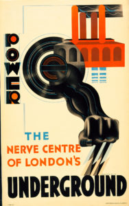
Edward McKnight Kauffer – poster for the London Underground (1930)

Nevertheless, from the delicate figure studies of Dod Procter to James Cowie’s pastoral portraits, it is a window onto certain aspects of British art and life between the wars. Also, the painters’ rejection of the vocabulary of avant garde modernism should be seen in the context of the time; while abstract or semi-abstract art had been at the cutting edge of modernism in the years just prior to and during World War One, not only had the innovators of that era moved on (why not look at my article about Wyndham Lewis in the 20s here?), but the angular, dynamic language of modernism had infiltrated mainstream culture to the point that institutions as staid as the Royal Mail were using designers like John Armstrong and Pat Keely to give the Post Office a modern identity, while Edward McKnight Kauffer and others did similar work for the London Underground and, outside of the UK, fascist Italy, Hitler’s Germany and the Soviet Union all utilised versions of modernist design to establish new national identities. In that sense, the idiosyncratic, apparently old-fashioned and above all individualistic styles adopted by British artists outside of the more radical movements can be seen as, if not revolutionary, then at least stubbornly dedicated to their own visions.

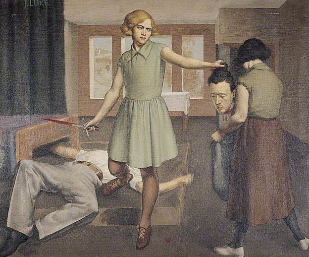
Although it may seem paradoxical or incompatible, the ‘realism’ of these artists is founded to some extent on escapism and idealism; but maybe that is truer of realism in a wider sense than at first seems to be the case. The definitive artistic form of realism (if we think of everyday life as ‘real’ – but I don’t really want to get into philosophical questions here as I’d like to finish this article at some point) nowadays is probably something like instagram, or on a slightly grander level, the documentary film, but the very nature of documenting reality – whether in film, photographs, painting or in writing – is necessarily selective, and in being so, tends towards some kind of commentary (and/or judgement) on its subject. One of the nice things about the True To Life exhibition was that both the grime-and-hardship/warts-and-all and the grass-and-flowers aspects of realism were represented – albeit mostly in a perhaps fairly superficial way. There was very little evidence of the documentary as protest – perhaps because, by the end of WW1, photography had become the obvious tool for this kind of work. That said, social commentary of a sort was present in Thomas Nash & Stanley Spencer’s idiosyncratic recasting of some of the Renaissance’s favourite religious scenes such as the Crucifixion & the Last Judgement in ‘modern dress’ and modern settings (and slightly generic ‘modernist’ styles). This use of realism was not uninventive, but was in essence just another way of looking back at the ‘old masters’; revisiting the groundbreaking realism pioneered in the 14th century. More interesting, (to me) was John Luke’s strange 1929 modern-dress version of one of the baroque era’s favourite Old Testament scenes, Judith and Holofernes, in which the story of the beheading of an Assyrian general is made even more unsettling by having a strangely surreal Agatha Christie/Enid Blyton aura.

John Luke – Judith & Holofernes (1929)

Much as in Edward Lucie-Smith’s Art Deco Painting, the unifying factor in the exhibition’s disparate works was less a matter of style/school or subject than it was atmosphere; the paintings, as different as they are, belong definitively to the period between the wars, in much the same way as the very different works of Evelyn Waugh and Christopher Isherwood did (according to me, here).


If the term ‘realist’ in painting suggests the artist as eye (kind of an analog to (again) Christopher Isherwood’s fictionalised realism; “I am a camera”), the eye of the artist/writer is necessarily as individual as the brain it is connected to. For example, one might assume that realism and idealism were opposites, but there is a strong classicising element among some of the artists in the exhibition – but even then, individual artists seem to have reached a kind of classical serenity and monumentality via different routes.


Meredith Frampton – Sir Charles Grant Robertson (1941)

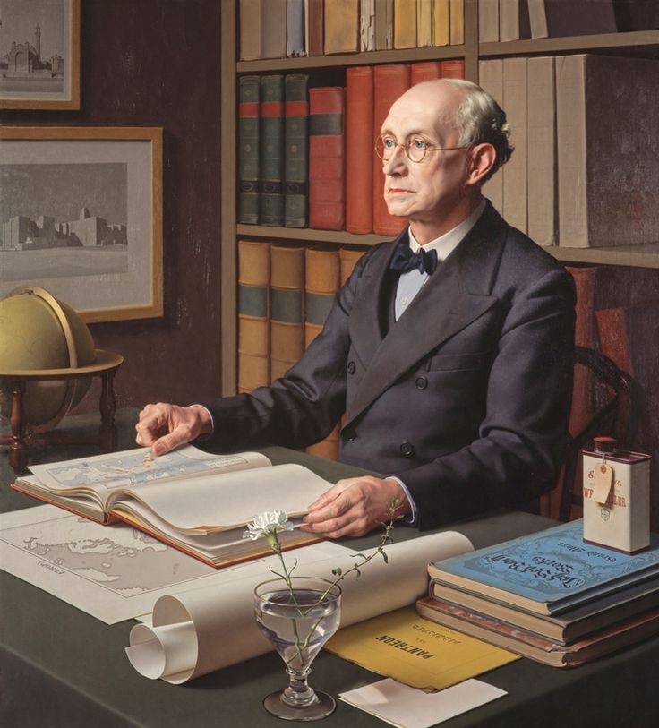
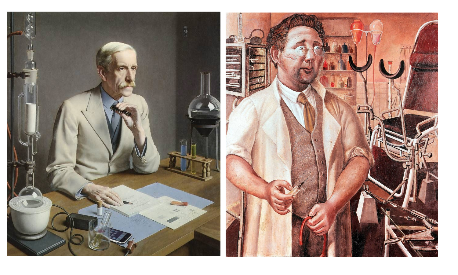
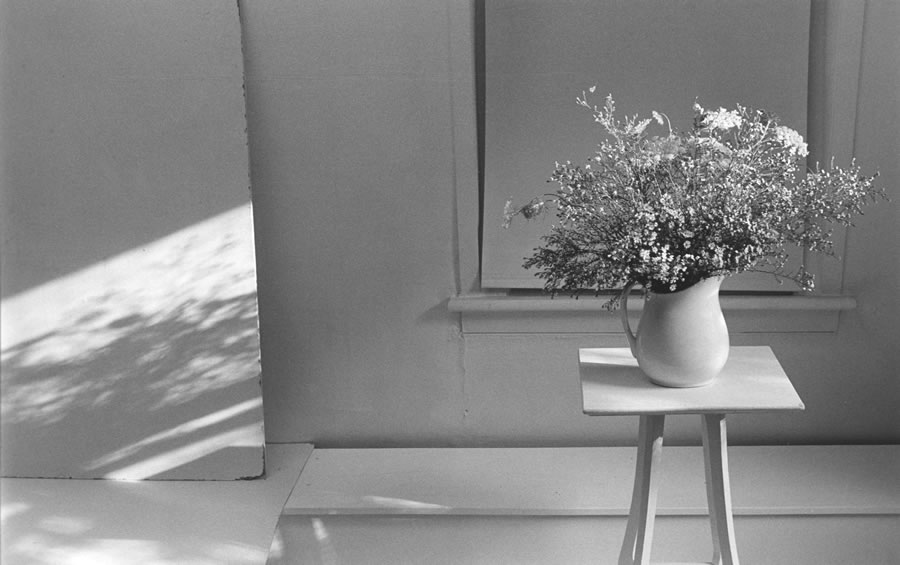
One of the stars of the exhibition for me was the portrait painter (George Vernon) Meredith Frampton (1894-1984). Frampton’s art was in some ways the most ‘realistic’ art in the exhibition, in the sense of being (by far) the most illusionistic and quasi-photographic. In a way, portraits like the stunning Sir Charles Grant Robertson (1941) are less ‘realist’ than than they are ‘corporealist’ – their accumulation of painstakingly rendered detail being in some ways closer to taxidermy than to the realism of a snapshot. In their almost eerie stillness, his portrayals of professional men surrounded by the accoutrements of their work, (another excellent example is Sir Frederick Gowland Hopkins  (1938, below) seem – despite the maximalist inclusiveness of the painting – closer to the carefully composed minimalism of a photographer like Lilo Raymond than to a more or less contemporary realist (or ‘objectivist’) painting like Otto Dix’s theoretically similar portrait of urologist Dr Hans Koch (1921). And yet, for all of their modern realism, both artists looked to the past; for Dix – who had experimented with Expressionist styles earlier in his career, the aim of the modern realist painter was to tackle the breadth and the often-unrecorded detail of modern life with the – to him – unimprovable techniques of the old masters. For Frampton, the source of his style is less the realistic tradition of the Northern Renaissance than it is the monumental, but still ‘realistic’ neoclassicism of Ingres.

Meredith Frampton – Sr Frederick Gowland Hopkins (1938) and Otto Dix – Dr Hans Koch (1921)
Lilo Raymond – Wild Flowers (1992)

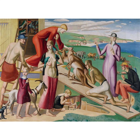
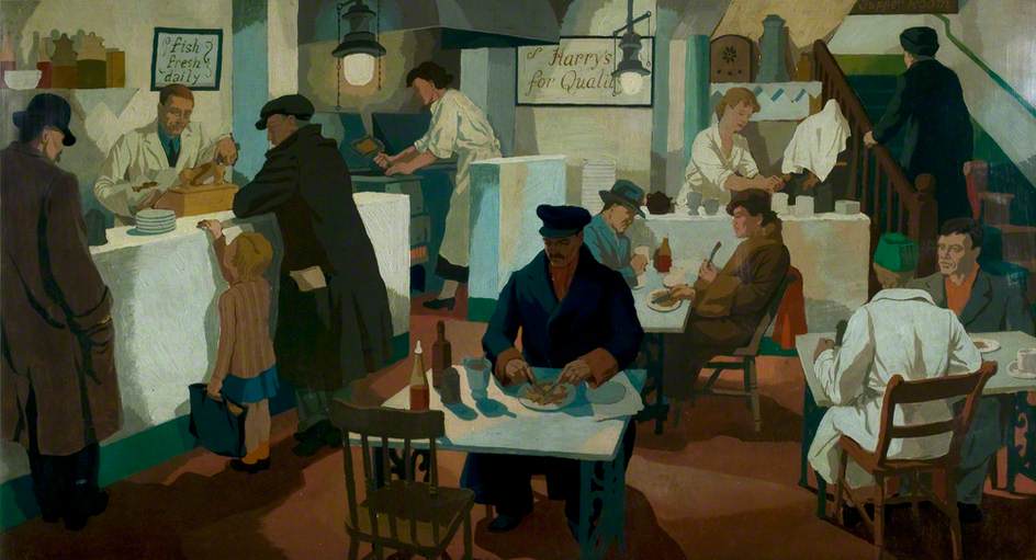
The more usual classical influence on British art of the period was the modernist route via Picasso and cubism; in the case of painters like the ex-Vorticists William Roberts and Edward Wadsworth (also Edward Burra, whose expressionistic 1930 painting The Snack Bar was included in the exhibition), the angularity of Vorticism became a kind of stylistic shorthand that marked out their otherwise fairly conventional/traditional art as ‘modern’. Several other artists in the exhibition, such as Gladys Hynes and James Walker Tucker seem to have used modernist stylistic traits in the same way; to heighten the clarity and monumental qualities of their work; a kind of ‘realism’ as simplified solidity and a classicism that couldn’t be easily written off as old fashioned.

Gladys Hynes – Noah’s Ark (1919)
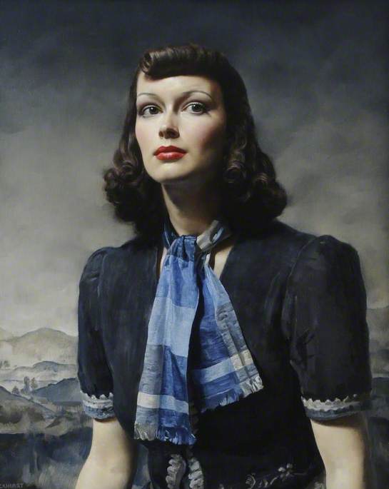
Gerald Leslie Brockhurst – By the Hills (1939)


For society portrait painters like Gerald Leslie Brockhurst and Sir Herbert James Gunn, realism – if explicitly not ‘gritty’ realism – was a necessary part of their trade. The glamour and drama of portraits like Brockhurst’s By the Hills (1939) is what made the artist in demand for fashionable sitters, but their effect – despite relying on a similar sense of heightened photo-realism for their success – is almost the opposite of Frampton’s still life approach. This kind of art was, despite its use of traditional techniques (and even, in the case of By The Hills, a Renaissance-influenced landscape in the background) resolutely of its ‘modern’ age, referencing Hollywood and the world of contemporary fashion, but not really any of the ideas that had affected the visual arts since the mid 1800s.


The same is true of the slightly creepy empty street scenes of Algernon Newton; despite their passing resemblance to the post-impressionist work of Maurice Utrillo, these brilliantly realised townscapes are depictions of the modern world, but not interpretations of it. While the artist captures the melancholy charm of the slightly shabby suburbs he painted, their spirit is more like restrained romanticism, rather than being invested with the revolutionary sense of psychogeography that the proto-surrealist works of Giorgio de Chirico had pioneered two decades earlier. That said, because of the role of artist – not just as a ‘camera’, but also as processor and interpreter of experience – his paintings are something more than a documentary photograph of an empty street.

Algernon Newton – The Outskirts of Cheltenham (1932)


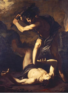
Pietro Novelli – ‘Cain Killing Abel’ (1625)

In fact, what True To Life highlights, is the extent to which the vast majority of art, until fairly recently, had as its aim something that could be called realism; the National Gallery’s Beyond Caravaggio exhibition likewise showed Caravaggio and the artists of the late 16th/early 17th century trying to make their art – both in religious/mythical and modern genre paintings – more immediate & vivid through a kind of dramatic heightened realism. Impressionism broke away from the staid, schematised world of academic painting to capture something closer to the experience of both the artist and viewer, Expressionists tried to infuse their works with the feeling of events as experienced, Futurists tried to capture the violence of the 20th century where traditional techniques tended to distance it… And in that sense, much of the work labelled ‘realist’ in this exhibition works for us now in a way that it possibly didn’t at the time; to a modern audience the work in True to Life is almost all imbued with a between-the-wars ‘period’ quality that seems to capture the zeitgeist of that troubled era, even while sidestepping most of the troubles themselves.

It is with that last point that the artists – without doubting the depth of feeling they put into their work – mainly succeeded in recording (limited aspects of the) reality of their era in a relatively superficial way. As an example, Clifford Rowe’s The Fried Fish Shop (1936) depicts what the interior and clientele of a fried fish shop of the 30s presumably looked like; as such it has sociological and historical value, as well as being a fine, faintly modernist painting. On the other hand, a slightly earlier and in some ways comparable painting like the Vorticist-inspired Rain On Princes Street  (1913) by Stanley Cursiter (it’s quite surprising that none of Cursiter’s fashionable work of the 20s & 30s was included in the exhibition), despite its fractured, faceted and in that sense ‘unrealistic’ modernist appearance, not only captures in its stylised way a glimpse of late Edwardian metropolitan life, but also the feeling – still the same over a hundred years later – of being on Edinburgh’s Princes Street on a busy, rainy day. So in the end I suppose which painting deserves to be called ‘realist’ is as subjective as reality itself.

Clifford Rowe – The Fried Fish Shop (1934)


Stanley Cursiter – Rain on Princes Street (1913)

Constructive Misanthropy: Wyndham Lewis – Tyros & Portraits

PWL

It’s not just ‘the general public’ that sometimes finds abstract or conceptual art to be the empty, meaningless work of opportunistic charlatans; sometimes artists do too. While belonging firmly to the European avant-garde of his time, artist, poet and novelist Percy Wyndham Lewis (1882-1957) created a series of figurative works – the Tyros – which both stand outside of and satirise the modernist movement in a way that we would now recognise as ‘post-modern’ in their knowing, ironic nature.

While the satire of modernism was not new in Lewis’ art, the ‘Tyronic’ works of the 1920s mark the beginning of a wider programme (which included his relatively commercial portraiture of the period) which attempted not just to draw attention to the stagnation and decay which the artist perceived in post-WWI European culture, but also to put forward (somewhat half-heartedly) the aim of a new and rigorous ‘classical’ regeneration of both art and society. In the aftermath of the First World War, Lewis saw an opportunity to start afresh in an age in which artists were ‘creatures of a new state of human life.’[1]

the tyro

With the Tyros, Lewis devoted himself to addressing, in his characteristically humorous and aggressive fashion, what he saw as lingering aspects of the old world, in particular the decadent ‘90s of Oscar Wilde & co and the limp quasi-modernism of the Bloomsbury group. However, much of the underlying philosophy of Lewis’ ‘new’ direction derives from the works – both literary and artistic – of his own earliest, pre-war maturity. The implications of this philosophy run far deeper than simply a criticism of the artistic milieu of 1920s Britain, addressing the very nature of humankind itself, with, typically of the artist, entirely negative conclusions. Indeed, Lewis’ vehement opposition to the apparently progressive movements of his time has often led to an overly simplistic (although understandable) denigration of the artist as a fascist. After an initial flirtation with the far-right, though, he was eventually to dismiss the simple-minded politics of fascism with exactly the same kind of aggressive amusement as he dismissed almost everything else. Much of the power of the ‘Tyronic’ works derives from the tension between the relatively positive aims of Lewis’ programme of regeneration and the basic negativity of his satire and personality. This tragic, even hopeless, view of humankind is integral to the satire of the Tyros as it lay at the very heart of Lewis’ conception of humour.

the tyro 2

 Wyndham Lewis introduced his Tyros in April 1921 at the Leicester Galleries, London, in an exhibition named Tyros and Portraits. Whereas the portraits could, to a certain extent, be seen as conventional, though modernist in style, the Tyros were intended to act as a shock awakening to the docile English spectator – ‘These Tyros’ he wrote in the introduction to the exhibition catalogue, ‘are not meant to be beautiful…they are, of course, forbidding and harsh.’ The Tyros represented a new mythology, a race of human creatures, fully grown, but new to life, reliant on gut emotional responses and free from reason or logic. As such, they are depicted (both in the finished paintings and in the drawings which illustrated his magazine, The Tyro) as grotesque figures, usually grinning, laughing* or sneering. In the magazine’s fictional works the Tyros are depicted as simple-minded fools, usually engaged in inane gossip, almost a prefiguring of the 21st century era of talent-free celebrity. As paintings, they are modernistic in style, but also embody the intellectual concerns that Lewis felt should be the domain of the artist.

*Lewis’ ambivalent feelings about humour were forcefully expressed in the Vorticist manifesto BLAST, where it is both cursed as ‘arch enemy of REAL’ and  blessed as a ‘great barbarous weapon’. More about this below…

The figures of the Tyros, with their naive, childlike responses to life are, at first glance, not courtshipentirely new in Wyndham Lewis’s art. The theme of the human being as an instinctively motivated animal is a feature of both his art and writing from his earliest maturity. The Breton peasants of the Wild Body stories of 1909-17, crude and animalistic, have recognisable features in common with the Tyros. Artistically too, the subjects of his drawings, such as Dieppe Fisherman (1910) and Courtship (1912, right), share with the Tyros the signs of an intuitive, animal nature such as low foreheads, ridiculous postures and a general lack of individuality. His satire has more than one target – though the fisherman and the romantically engaged couple are, to Lewis, comical figures, they are merely representative samples of wider humanity; ‘’men’ are undoubtedly, to a greater or lesser extent, machines… Men are sometimes so palpably machines, their machination is so transparent, that they are comic.’[2] This point of view remained constant in Lewis’s philosophical worldview, but the Tyros nonetheless differ significantly from his earlier work.

The First World War had an enormous impact on the generation who lived through it, Lewis included, as well as on that which came after. Before the war, Lewis was already a public figure – the outspoken leader of the UK’s own avant-garde art movement, the Vorticists. This celebrity was not to survive the war, and neither was the public enthusiasm for (or at least amusement with) the modern art which had created it. Whereas in 1914/15, Lewis’s work had approached complete abstraction, he now found the hard-won achievements of the Vorticist period ‘bleak and empty. They [the abstract geometric forms] wanted filling.[3] The Tyros and Portraits exhibition was Lewis’s first major attempt at fulfilling this goal. With these works he attempted to address the problems with modern art – its lack of contact with or interest in real life, its obsession with the fleeting and transient and its preoccupation with the intuitive and sensual (exemplified slightly later by Ben Nicholson and Kit Wood’s ‘discovery’ of the ‘naive’ painter Alfred Wallis) which, to Lewis, democratised and undermined the skilled, privileged position of the artist, whose role as documenters (and even creators) of culture and guardians of the intellectual heritage of humankind entailed a sense of responsibility which he felt was being betrayed by the artistic elite of his time. Therefore, the satire of the Tyros is intensified by a moral element which had not been present in his depiction of humanity in the pre-war period.

 The primary target of Lewis’s satire, epitomising all that he felt was wrong with modern art, was the Bloomsbury group. Lewis’s enmity towards this group and in particular its leader, omegaRoger Fry, dated back to the pre-war period when he and his fellow Vorticists left Fry’s Omega Workshops in acrimonious circumstances. Lewis’s view of the Bloomsbury group in 1913 – ‘the idol is still Prettiness, with its mid-Victorian languish of the neck’[4] – was not significantly altered by the intervening years and in fact his attitude was probably hardened by the suspicion that the group had underhandedly used the period of the Great War (the group was, in stark contrast to the Vorticists, largely composed of conscientious objectors) to consolidate their standing as the modern art movement in the UK. Despite the obvious paranoia inherent in this point of view, it is certainly the case that the Omega Workshops heightened its profile during the war years, selling its products more widely than earlier, as well as holding the first exhibitions of Children’s Art in 1917, a venture that seemed to encapsulate everything that Lewis felt about the group.

Lewis’s complaints about Bloomsbury were not entirely without foundation. Roger Fry and Clive Bell were, to the art world in France and elsewhere, the face of the English avant-garde, but they failed to use what little influence they had to promote English art outside of their own somewhat cosy coterie – indeed, even artists broadly in sympathy with their aims and methods – such as Ben Nicholson – did not receive the kind of support they could perhaps have expected. Similarly, Lewis’s claim that Fry, Bell and Duncan Grant were dilettantes (and therefore related to the novice status of the Tyros), ‘playing’ at art without any intellectual seriousness is  not entirely without foundation. Even the relatively grander theories of the group (such as ‘significant form’) seem, in practical execution, to correspond with Lewis’s picture of ‘colour-matching, matchbox-making, dressmaking, chair-painting…tinkerers.’[5] Comments such as Fry’s ‘After all, there is only one art; all the arts are the same’[6] or even worse, Clive Bell’s crass use of a sporting metaphor to grade the differing qualities of French versus English artists (‘the English is normally a stone below the French’[7]) strengthen the validity of Lewis’s claims.

The vision of the amateurish, pseudo-intellectual, self-consciously ‘artistic’ figure of the Bloomsbury artist lent itself easily to the grinning, elemental figures of the Tyros. Probably the most powerful work on display in the Tyros and Portraits exhibition was the large (165.1 x 88.9cm) oil painting, A Reading of Ovid (Tyros) of c. 1920.

read ovid

 A Reading of Ovid

This painting, acknowledged by Lewis as one of his most carefully finished works, shows two Tyros disturbed in the act of reading. The humour of the satire derives from the juxtaposition of the vacantly grinning masklike faces of the two figures with the intellectual pastime they are engaged in. This corresponds with Lewis’s extremely bleak theory of the comic in general; ‘in one sense you ought to be just as much surprised at finding a man occupied in this way [reading] as if you had found an orchid or a cabbage… The movement or intelligent behaviour of matter – any autonomous movement of matter, is essentially comic.’[8] At the same time, the satire is more pointed and direct – these ridiculous figures are, as Lewis explained, an attempt to ‘frighten away the bogey of ‘art for art’s sake’’, the basis for the ‘cultivated and snobbish game’ of English art,[9] art which had no root in culture or society, but was an activity – even a hobby – driven only by the whim of the artist. This satire is especially barbed when one takes into account Lewis’s elevated view of the artist as a cultural leader – and whatever his evaluation of Roger Fry’s talent, Lewis did accept that he was a ‘sensitive and real being’ outside of the homogenous and unthinking mass of the general public. He might therefore be expected to feel the sting of the satire keenly. If the foreword to the exhibition catalogue was not specific enough, the clothing of the Tyros in A Reading of Ovid; the baggy suits and the foppish, ostentatious handkerchief, identifies them clearly as the dilettante artists described in Lewis’s 1918 novel, Tarr; ‘the art-touch, the Bloomsbury technique, was very noticeable. Hobson’s tweeds were shabby, from beneath his dejected jacket emerged a pendant seat, his massive shoes were hooded by the superfluous inches of his trousers: a hat… shaded unnecessarily his countenance.’[10]

In contrast to the directness of his visual attack on Bloomsbury, the use of Ovid as the text over which the Tyros grin, leaves the scene open to several interpretations. This may in itself be a joke on Lewis’s part; the author of the Metamorphoses being evoked in a picture which shows primitive ‘elementals’ attempting to transform themselves by aping the manners of their intellectual superiors. It is also possible that Ovid was chosen as the classical author best known for his erotic works, such as The Art of Love, and that the Tyros are simply shown sniggering over the ‘dirty bits’ of one of the world’s great authors, as befits their base, sensual outlook. Yet another interpretation, with wider-reaching conclusions, is that the use of Ovid refers to the ‘return to stability’ within the French avant-garde of the post-war period, a neo-classical revival looking back to Ingres and David. Lewis, with his own leanings towards a new classicism, was scornful of this fad, which he saw as a French retreat into a safe, patriotic ‘mother-tradition’.[11] In this reading of the painting, the pseudo-intellectual Tyros are engaged in a futile attempt to build a new thought-world, entirely grounded in the past. Lastly, it is possible that the use of Ovid as a figure beyond the reach and understanding of the childlike Tyro is a piece of somewhat arrogant self-identification. Ovid, like Lewis, was an outsider figure, both in his own time and in subsequent literary history, and had been excluded from the elite of his own day for the subversive and satirical nature of his art.[12] The arrogance suggested by this interpretation is not at all inconceivable when looked at in the context of Lewis’s artistic programme of this period – his criticism of Fry in particular seems to suggest that a more suitable figurehead for English modernism would be a professional artist and genuine intellectual – i.e. Lewis himself.

Whatever his pretensions, A Reading of Ovid presents vivid evidence of Lewis’s outsider status in the context of European modernism. As a painting, it has little parallel in Europe at that time. The figures,  though influenced by cubist ‘primitivism’ in their hard-edged, geometric, non-naturalistic outlines, bear little resemblance to extant cubist art. Likewise, although effective satire was being produced by Francis Picabia, Marcel Duchamp and (most notably) by the German Expressionist George Grosz, their art has little in common with Lewis’s bizarre vision. Nor do these artists share the scope of Lewis’s aims, balancing artistic, social and philosophical concerns, making the Tyro paintings, as he explained, ‘at once satires, pictures and stories.’[13] Lewis, devoted to the cause of ‘art’ in a way that was anathema to the Dadaists, totally eschewed the iconoclastic playfulness of Picabia and Duchamp. The power of Grosz’s art often derives from the passionate rendering of the artist’s bitterness and disgust with the decay and corruption of post-war Germany, where the economic, social and political situation was far more unstable and extreme than in France or England.

grosz

 Grosz, The Pillars of Society

Lewis’s view of satire did not intend to have the emotional, inflammatory impact of work such as Grosz’s; Lewis declared that ‘satire is cold… the non-human outlook must be there.’[14] It is this coldness that allows the intellectual response that Lewis desired in the viewer. The only real parallels for A Reading of Ovid are in fact in the earlier works of Lewis himself. The effective, non-naturalistic colour scheme of opposed visceral reds and deep metallic blues had been a feature of his art since his earliest, Futurist-inspired works. This colour scheme is the opposite of the warm, harmonious, Matisse-influenced and decorative style of the Bloomsbury painters, and so fulfils the dual function of preventing a sensual response (thereby inviting an intellectual one) and providing a corrective example to contemporary Bloomsbury practice. The composition has a tense vitality which is achieved in a similar way to that of his pre-war abstract works such as Composition (1913, left). This energy comes not from loose, free, energetic compositionbrushwork, but from the way in which the dynamic and surging forms of the Tyros, as with those of the abstract works, are locked into a tense design by firm, clean outlines. The power of the line imprisons the energy of the composition, creating an image which is static, but bursting with potential movement. The vitality is, in the Tyros, not merely abstract ‘design’, but also an integral part of the subject.

The vital energy of the Tyros was stressed in Lewis’s writings, and expressed in their grotesque laughing faces. Laughter, to Lewis, was an important philosophical concept. The ‘wild body’ of the human animal, said Lewis, ‘triumphs in its laughter. Laughter does not progress. It is primitive, hard and unchangeable.’[15] The world this laughter reveals is that of the human animal in its true element, stripped of all artifice. In issue two of his magazine The Tyro, Lewis included a ‘Tyronic dialogue’, in which ‘X’, a Tyro representing Lewis himself, makes the following assertion to his more naive companion – ‘Every civilised milieu is… the devouring jungle driven underground, the instinct of bloody combat restricted to forensic weapons.’[16] This underlying reality, masked by complex human behaviour is also hinted at in smaller works, such as the Tyro Madonna (1921, below right) where religion and sexuality are combined in a totem-like image which seems to satirise the edifices built upon the baser instincts of mankind. Laughter brings this subterranean Darwinian world to the surface – and satire, though a form of criticism, aims partly to provoke an amused response in the viewer. This laughter is, like all laughter, an instinctive reaction, and therefore a tragic reminder of the inescapable fate of the human being – to live and therefore to die as an animal like any other. We are laughing with the Tyros as well as at them.Tyro Madonna

The use of satire, had then, despite its appeal for Lewis, extremely negative connotations. In appealing to the sense of humour, it is the denial of the classicism which he himself had put forward in his portraits as the basis of a new modern art, and in fact the denial of all meaningful progress. Although he attacked the situation of the arts in England vigorously, privately he declared that ‘it would be unwise to regard [this state of affairs] as anything but permanent.’[17] The truth of this remark must have seemed self-evident in the irony that A Reading of Ovid was purchased by one of the leading members of the late-Victorian dilettante class, Osbert Sitwell, himself a butt of Lewis’s satire. Whatever his hopes for the future of art and society, Lewis had, fundamentally, a pessimistic view of humankind. This pessimism, a feature of Lewis’s thought since his early maturity and sharpened by the influence of T.E. Hulme, had been, not surprisingly, deepened by the events of the First World War. The art historian David Peters Corbett claims that Lewis was ‘too satirical’ to show his mourning in his art[18] but in fact, the Tyros themselves, in their elemental stupidity, can be interpreted as a bleak kind of mourning for the pointlessness of the mass slaughter of 1914-18.

The Tyros, vessels for the raw energy and vitality of the human animal, necessarily display none of the stillness and ‘deadness’ which Lewis saw as essential to the creation of an ‘immortal’ classical art, and by their very theme, deny the truth of such an art. However, classicism’s loss is satire’s gain, as the concentration on the eternal truth of the real nature of civilisation paradoxically gives the Tyros a timelessness that transcends the immediate situation they satirise, making them of more than socio-historical interest.

The wide-ranging satire and deep pessimism of Lewis’s outlook did not spare even the intellectual elite which he saw as the ideal leaders and creators of a new culture. The culmination of his ‘Tyronic’ period is the one of the most extraordinary paintings of his career; the self portrait Mr Wyndham Lewis as a Tyro (1920/1).

lewis tyro

 Mr Wyndham Lewis as a Tyro

This painting shares many features with A Reading of Ovid. The colour scheme has dramatic contrasts of dark and light, creating a dramatic tension, again denying the comfortable sensual response of most Bloomsbury art. The composition is jagged and stark, containing great energy within tightly enclosed boundary lines. The Tyro bares his teeth in a sneer, looking disdainfully past the viewer from under the aggressive sweep of his hat. In contrast to the average Tyro his forehead is high, but the facial expression (and his status as a Tyro) suggests animal cunning rather than intelligence. While promoting the exhibition, Lewis stated in an interview with the Daily Express that the vitality of the Tyro is ‘purposeless, and hence sometimes malignant’[19] and this is the aspect we see here. The Tyro sneers at the viewer, revealing the basic, negative instinct underlying Lewis’s complex criticism of art and society. Given that Lewis had repeatedly stated his views on the ultimate tragedy of human life, the ‘terrible nature of its true destiny’[20] as revealed by Darwin, it is not inconceivable that the self-portrait depicts Lewis’s real ‘animal self’, sneering at the somewhat romantic ideal of immortality through art that the artist fostered through his intellectual ambitions. Given the nihilism that formed the heart of Lewis’s worldview, the animal response, the sneer or laugh of the Tyro was the only valid one when confronted by the essential joke of human consciousness. Ultimately, the Tyros invite the audience to laugh with as well as at them; to mock the ridiculousness of humankind and to sneer at its pretensions and aspirations.

inferno

With the Tyros, Wyndham Lewis created a mythology based on the essential transience of human life and the animal impulses which ultimately guide all of our seemingly civilised pursuits. In the end, as the artist no doubt expected, the Tyros failed to accomplish much beyond consolidating Lewis’s position as an antagonistic troublemaker in the art world of inter-war England. In the build up to World War Two, Lewis isolated himself even further with some misjudged political writings, and pursued the pessimism of the Tyros on a bigger, more generalised scale with powerfully negative works such as Two Beach Babies (1933, below) and Inferno (1937, above). Post WW2 though, despite completing his massive, Dante-esque mythological trilogy of novels, The Human Age, he was never to regain either his power as an artist or his standing as a public figure.

Beach Babies

[1] Wyndham Lewis, ‘The Children of the New Epoch’ from The Tyro No.1 available to download at http://dl.lib.brown.edu/pdfs/116015166093419.pdf

[2] Lewis, Men Without Art (1934)

[3] Lewis, Rude Assignment: A Narrative of my Career Up-to-Date (1950)

[4] Lewis, Etchells, Hamilton & Wadsworth, in WK Rose (Ed), the Letters of Wyndham Lewis (1963)

[5] Lewis, The Caliph’s Design (1919)

[6] Fry, quoted in J. Ferguson’s The Arts in Britain in World War One (1980)

[7] C. Bell, quoted by Lewis in The Letters of Wyndham Lewis

[8] Lewis, The Wild Body (1928)

[9] Lewis, The Wild Body (1928)

[10] Lewis, Tarr, 1918

[11] Lewis, The Caliph’s Design

[12] Ovid, The Erotic Poems (trans. P. Green, 1982)

[13] Lewis, The Wild Body

[14] Lewis, Men Without Art (1934)

[15] Lewis, The Wild Body

[16] Lewis, The Wild Body

[17] Lewis to J. Quinn, The Letters of Wyndham Lewis

[18] Peters Corbett (Ed) Wyndham Lewis and the Art of Modern War (1998)

[19] Quoted in The Complete Wild Body (1982)

[20] Lewis, The Wild Body