Imagine a culture so centred on wealth, property and power that it becomes scared of something as fundamental to human existence as sex, and frets endlessly about what it sees as the misuses of sex. A culture that identifies breeding so closely with with money, wealth and status, and women so closely with breeding and therefore with sex that, when looking to replace the traditional symbols of birth and regeneration it rejects sex and even nature and, in the end makes the embodiment of motherhood a virgin and the embodiment of rebirth a dead man. Unhealthy, you might think; misanthropic even – and yet here we are.
But when that misanthropic culture loses the religious imperative that fuelled it for centuries, what should be waiting but those ancient symbols of fertility; rabbits and eggs. But whereas Christianity in its pure, puritanical form found it hard to assimilate these symbols, preferring instead to just impose its own festival of rebirth on top of the pagan one, capitalism, despite being in so many ways compatible with the Judeo-Christian tradition, is essentially uninterested in spiritual matters. So even though capitalism is mostly pretty okay with Christianity, which creates its own consumer-friendly occasions, it proves to be equally okay with paganism, as long as it can sell us the pagan symbols in a lucrative way.
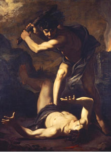
In Christianity the idea of the life cycle is almost surreally reproduced in the (male) Trinity; God the Father, God the Son and God the Holy Spirit – defined by the Lateran Council of 1213 – 15 as “the Father who begets, the Son who is begotten, and the Holy Spirit who proceeds” – there’s no room for anything as earthly or earthy as motherhood. The Virgin Mary is essentially a token female presence, and one with her biological female attributes erased. And yet in every society that has worshipped under the Christian banner, child-bearing has historically only been done by women and child-raising has almost entirely been ‘women’s work’ too. Which makes you think that really, patriarchy is one of the great mysteries of humanity and the fact that it’s seen by many as the natural order of human society is even stranger.
But anyway; Easter. Easter is a mess, even to begin with; its name is pagan (Ēostre or Ôstara, Goddess of the spring) and its Christian traditions, even when embodied in the tragic idea of a man being murdered/sacrificed by being nailed to a cross, were never entrenched enough to suppress the celebratory, even frivolous feeling that spring traditionally brings. Okay, so Christ ascending to heaven is pretty celebratory without being frivolous; but as, in the UK at least, represented by a hot cross bun, with the cross on the top to represent the crucifix and even – to play up the morbid factor that is so central to Christianity – its spices that are supposed allude to the embalming of Christ’s dead body, it’s hardly solemn: it’s a bun.
On the other hand, birth, since the dawn of time and to the present day, is not just a simple cause for rejoicing and in that, the Christian tradition – although it tries to remove the aspects that seem most central to birth to us: women, labour (the word presumably wasn’t chosen accidentally) and procreation – probably tells us more about the seriousness and jeopardy of childbirth than the Easter bunny does.
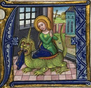
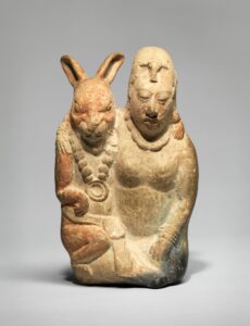
Childbirth is the central and most fundamental human experience and, until the 20th century it was one of the most perilous ones, so naturally the church had to address it. And so there’s a ‘patron’ (interesting choice of word) saint of childbirth; clearly the Virgin Mary is too specialist to be identified with (and perhaps it would even be blasphemous to do so?) so instead there’s St Margaret. Not much help; firstly, St Margaret should surely be a ‘matron saint’ but that’s not a thing, and secondly, in herself she has nothing to do with birth, although she was presumably born. Instead she becomes the saint of childbirth through the symbolic act of bursting out of the dragon who ate her – a strange analogy but one that reflects the hazardous nature of childbirth in medieval times, when mortality rates were high, not just for babies but for their mothers. And what mother couldn’t relate to bursting out of a dragon? But Christianity’s real issue with the whole topic of birth has less to do with birth itself than how humans reproduce in the first place. Rabbits and hares may represent – in ancient cultures across the world, from Europe to Mexico and beyond – fecundity, but it’s an animal idea of fertility for its own sake that has nothing to do with the practical or emotional aspects of producing new human beings, or the legal, dynastic and financial ones that the Old Testament and the ancient world generally saw as the purpose of reproduction.
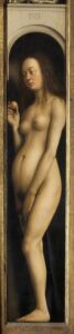
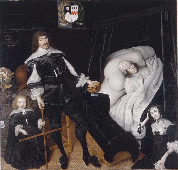
Pregnancy in Western art was a rarity until fairly recently and the puritanical ideas inherited by Victorian Christianity shaped art historical studies, to the point that people (until quite recently) tended to deny the evidence of their own eyes. Surely to believe that Jan and Hubert van Eyck’s hyper-realistic Eve – the mother of the human race – from Ghent Altarpiece (completed in 1432) just has the preferred medieval figure, rather than being pregnant, is perverse, isn’t it? Or that Mrs Arnolfini (Costanza Trenta) in the Arnolfini Portrait of 1434, who is touching her swollen stomach and who had died, presumably in childbirth – the year before this painting was completed, is just an example of that same fashionable shape, seems ridiculously far-fetched. (My favourite among the many theories about the Arnolfini portrait is Margaret Koster’s – which is explored in Waldemar Januszczak’s excellent short film about the painting.)
To go back to Eve; the idea of the first woman pregnant with the first child makes more sense for the 15th century, which was neither squeamish about or embarrassed by the realities of life in the same way that the 19th and early 20th century gentlemen who codified the canon of Western art history were. It’s not impossible that she is just the medieval/gothic ideal of femininity as seen in illuminated manuscripts and carvings; small shoulders, small breasts, big hips and stomach – given an unusually realistic treatment, but it’s hard to believe that even in the 15th century the first reaction of viewers – especially given the realism of the picture – wouldn’t have been to assume she was pregnant. Culture and society has changed a lot in the intervening centuries, but biology hasn’t.
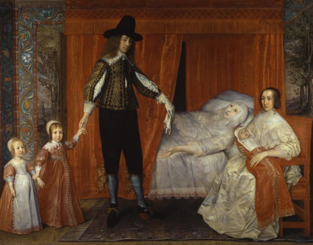
For subsequent generations, the status of women and the perils of childbirth and childhood gave pregnant women and babies a strange presence in secular art. While there’s no reason to assume that people were less caring or sentimental about their partners or their children, portraits were rarely about sentiments, but status. Portraits of women, with the rare exception of Queens, were generally portraits of wives or potential wives, and pregnancy was of crucial dynastic importance. But in times when childbirth was almost as likely to end in death as life for both mother and child, it was presumably a risky thing to record; there are not very many pregnant portraits. Maybe – I should probably have investigated this before writing it – the time a portrait took from commission to completion was also a factor that made it risky? A portrait wasn’t a particularly inexpensive thing, possibly commissioning a portrait of someone who would quite likely be dead within the next nine months felt like an iffy investment, or (to be less mercenary about it) courting bad luck? In the generations that followed, female artists – such as Elizabeth Vigee-Lebrun – could celebrate motherhood in self-portraits, but for the kind of reasons mentioned above – and because of contemporary ideas of ‘decency’ – they were hardly likely to portray themselves as obviously pregnant.
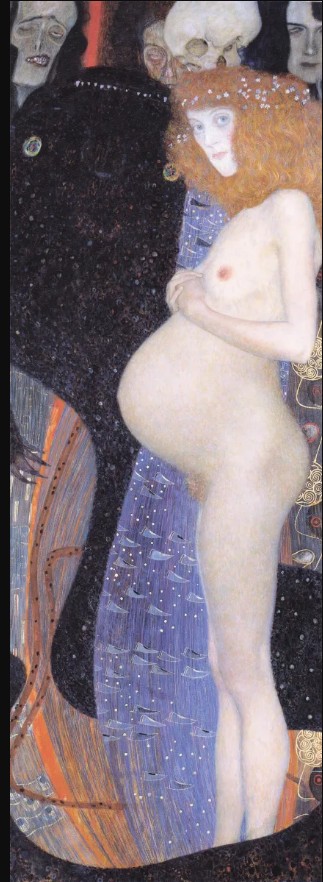
As time went on and connoiseurship and ‘art history’ became a thing I don’t think it’s too much of an exaggeration to say that the arbiters of high culture in the paternalistic (at best, misogynistic at worst) society of Europe were intimidated by the female power inherent in the creation of the human race. The other side of that coin is the (slightly titillating) sense of the beauty, magic and wonder of pregnancy that the pro-female (philogynist? There must be a word) Austrian Gustav Klimt brought to art with Hope I. Beautiful though that is, Klimt’s vision isn’t really so far from the pure virgin/corrupt whore binary of medieval times, especially when you see his beautiful female figure of hope and renewal glowing against a background of death and peril. It really only when women enter the art world in greater numbers that the symbolic and magical aspects of motherhood are reconciled with the more sombre, earthly spirituality that Christianity preferred to represent in a dying man and that pregnant women can just be pregnant women.
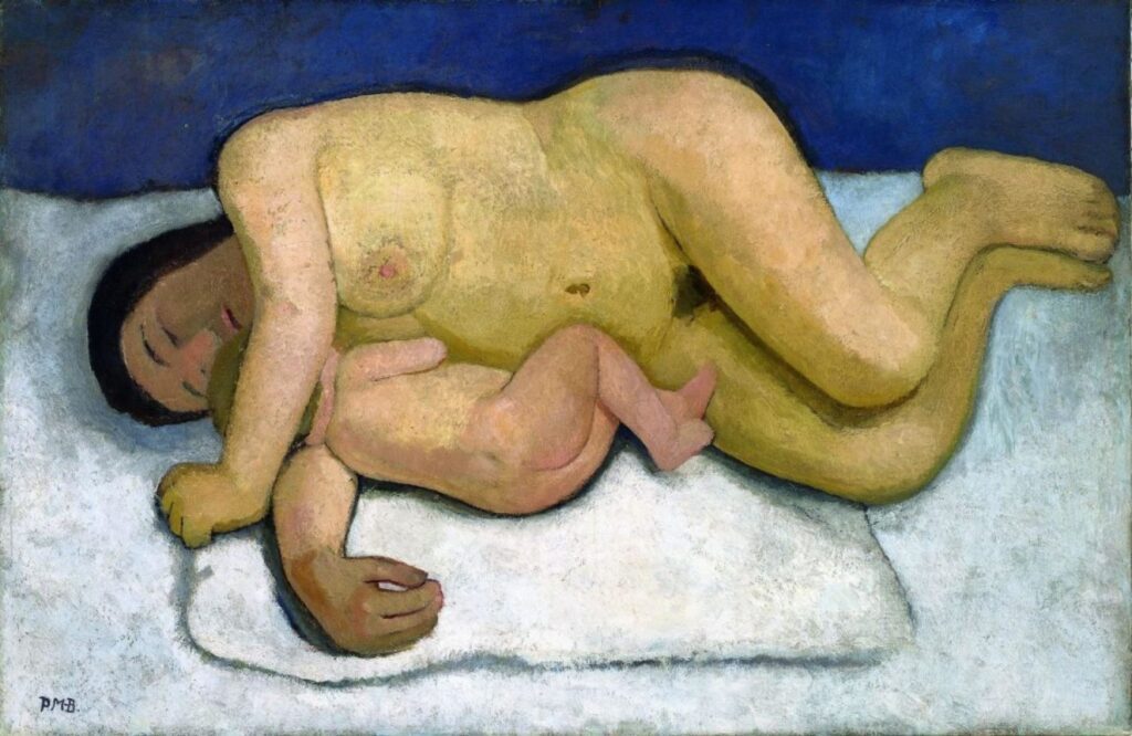
For me, Paula Modersohn-Becker – one of my favourite painters – is the artist of pregnancy and childbirth and a painting like her Reclining Mother and Child II (1907) shows all of the human aspects that were embodied in the contorted Christian images of the Virgin Mary, crucifixion and Christ’s rebirth. In her self-portraits, the magic of Klimt without the titillating overtones, the fragility and peril of the older periods and the prosaic facts of pregnancy and what it does, good and bad, to the body, are all acknowledged. For once, it doesn’t seem ironic, only tragic, that Modersohn-Becker would be one of the many thousands of women of her era to die from complications shortly after giving birth.
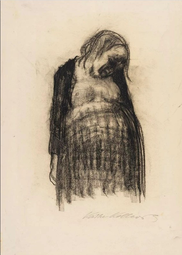
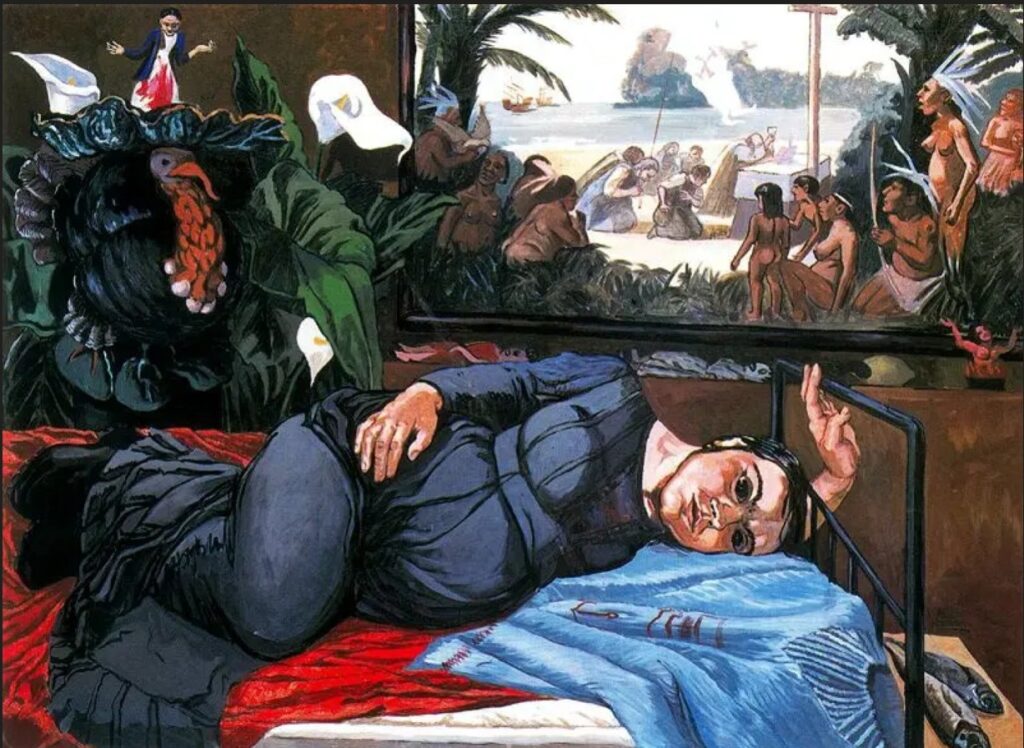
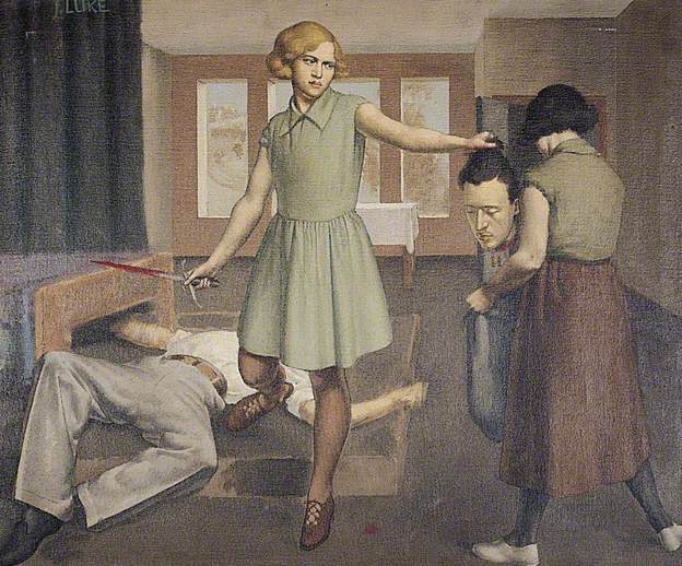
But once the reality had been captured, where to go from there? Anywhere, essentially; after Paula Modersohn-Becker pregnancy becomes just a subject, if a special one; art as creation representing creation. That’s a lofty way of putting it, but for the generation of German artists that followed, ‘realism’ was the whole point, some of the time at least. If Paula Modersohn-Becker represented pregnancy from the point of view of experience, capturing both its beauty and discomfort, Otto Dix the arch-realist gives us just the discomfort. His pregnant mothers are almost all exhausted working class women, heavy, swollen, weighed down by their burden. It’s a beautifully-observed point of view, and an empathetic one, but possibly a very male one too. Although Dix claimed, possibly sincerely, “I’m not that obsessed with making representations of ugliness. Everything I’ve seen is beautiful.” he nevertheless took a definite pride in shocking viewers with his art. As he also said; “All art is exorcism. I paint dreams and visions too; the dreams and visions of my time. Painting is the effort to produce order; order in yourself. There is much chaos in me, much chaos in our time.” By the time Dix painted these pictures he was a father himself, but although his paintings of his family reveal a more tender, if just as incisive, aspect to his art. When he paints these mothers-to-be, with their hard lives in the terminally unstable Weimar Republic, he paints as a pitiless observer, knowing that his work was challenging and confrontational to the generally conservative audience of his time; a time when, like ours, forces of intolerance and conservatism were closing in on the freedom embodied in art this truthful. It’s notable that, while dealing in the same harsh realities as Dix, but with a socially conscious, rather than clinical eye, the artist Käthe Kollwitz gives her women a more studiedly pitiable, though no less ‘realistic’ aura.
But the fact that Dix’s realism, though ‘objective’ was dramatically heightened is highlighted by a comparison between two paintings, one by Dix and the other by his female student Gussy Hippold-Ahnet, painted in 1931/2 and of – I think – the same model. In Dix’s painting, his most famous painting of a pregnant woman, the mother-to-be’s face is averted, hidden in darkness and it’s her almost painful roundness and heaviness that is the focus of the picture. In Hippold-Ahnet’s painting, far less dramatically, the mother sits more or less neatly, looking big but not unhappy. It’s a less dynamic and less assured piece of work – but is it any less real? In Dix’s realism, reality is generally harsh and pitiless, with no veneer of politeness or sentimentality. But although that represents a kind of underlying truth, especially about nature, people are often savage and cruel are nevertheless just as often also polite and sentimental. Gussy’s painting seems less powerful, but she is not showing us, as Dix seems to be, a faceless being representing the eternal, but rarely-remarked-on hardship involved in the joyous business of continuing the human species. Instead, sh3 shows us a woman who happens to be pregnant; both paintings are realistic, both are objective and, as with the symbolic sacrifice of Christ and the eternally recurring Easter bunny, both display different aspects of the truth.
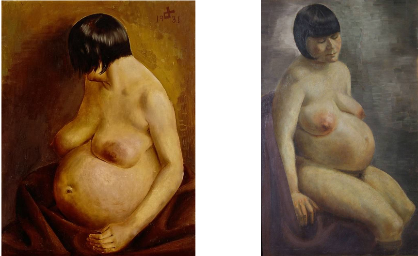
Otto Dix – Pregnant Woman (1931) & Gussy Hippold-Ahnert – Pregnant Woman (1932)
Since the 1920s, attitudes towards pregnancy and women have fluctuated but female artists are no longer the exception within the art world and so women in art can be women in art and not women as a symbols in art. And although male artists have continued – and why not? – to paint pregnant sitters (Lucian Freud’s Pregnant Girl is a beautiful, not uncomplicated example), not surprisingly women do it better. And while I’m not sure if my favourites – Alice Neel and Paula Rego spring to mind – add anything in terms of content and meaning to Paula Modersohn-Becker’s example, what they do add is more experience, wider experience and therefore bring a truer reflection of the source and the central experience of humanity to the world. Regardless of whether or not one believes in a god, everyone believes in that creation story; which is kind of more important than an old, bearded man, a young, sacrificed man and a bird; but it doesn’t matter, there’s room in art for everything. Anyway, enjoy your chocolate eggs.