messages from the past for the future


Sitting down to write this, a month after breaking my leg and having to grapple with hitherto-unconsidered questions like ‘how do I usually sit on a toilet’? and one week before a General Election where my preferred of the apparently plausible outcomes is an unsatisfactory coalition government, it feels strange and maybe wrong to be looking backwards. But, disturbing and reassuring in more or less equal measures, I think it’s a good way to look forward to whatever happens next.

I remember as a child, looking at a stamp album that had belonged to (I think) my dad (or maybe his dad) when he was a child. Even for someone with no interest in stamps, and less interest in collecting them, it was a peculiar and fascinating book; unfamiliar places, people, even currencies. The thing that stands out the most in my memory though is a stamp from Bosnia, a name which at the time I hadn’t heard before and which sounded as unlikely and frankly made-up as countries like Syldavia and Borduria that I knew from Tintin books. That memory itself has a strange and silly quality now, but at the time (somewhere in the mid-80s would be my guess) Bosnia was as fantastical to a child (or me at least) as I expect the Socialist Federative Republic of Yugoslavia would be to Primary school pupils now.

classic cold war artefact: Iron Maiden behind the Iron Curtain laserdisc (1985)

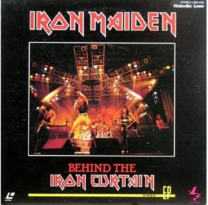
30 years on from the series of revolutions that symbolically culminated in the destruction of the Berlin Wall (the free opening of the Brandenburg Gate itself happened 30 years ago last month) it’s perhaps only natural that those who remember those times should be thinking of them. If you grew up with the cold war in the background (that is, any time really from the years after world war two up until the end of the 80s), the war itself may have constantly ebbed and flowed, but the communist eastern bloc was, monolithically (technically at least duolithically, but that’s not a thing) omnipresent in a way that now seems as unlikely and distant as the Austro-Hungarian Empire. It was there at school (we had to learn about “East Germany” (the GDR or DDR), “West Germany” (FRG or BRD) and the differences between the two, the USSR /CCCP, the space race, the arms race, ‘Mutually Assured Destruction’ etc etc etc), it was there in sports (especially the Olympics, but “West Germany” was quite a big deal during the ten minutes that I liked football) and in entertainment. Usually this meant sinister, emotionless and robot-like communists being the bad guys in endless numbers of films and TV shows (classic example; Rocky IV, but see also Red Dawn, Red Heat ad infinitum – it was interesting, in a depressing kind of way to see this old view of ‘reds’ adopted, without irony in the third, inferior season of Stranger Things this year), but it wasn’t all bad – sometimes bands made a point of playing behind the Iron Curtain and talked about how great the audiences were; I remember Iron Maiden played in Poland, Hungary etc in the mid-80s which presumably was a logistical nightmare, but nice for their fans who mostly would only have been able to hear their music through unofficial or even (the same thing really) illegal channels.

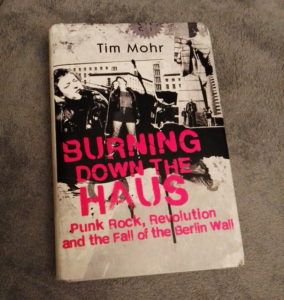
A few things have brought that period, and specifically the GDR, back to me recently; Tim Mohr’s superb book Burning Down The Haus – Punk Rock, Revolution and the Fall of the Berlin Wall (Dialogue Books, 2019), the work of the German photographers Ute and Werner Mahler and the Ostkreuz photography group, interviewed by Kate Simpson in issue 90 of Aesthetica Magazine (August/September 2019), the TV shows Deutschland 83 and Deutschland 86 which I just watched, somewhat belatedly and a series of John le Carré’s classic spy thrillers, notably A Small Town In Germany (1968).
The central realities of all of these things is pretty much the same; in East Germany, the state (specifically the secret police, the notorious Stasi) was watching you, and not only did they not care if you knew it, they wanted you to assume you were being watched.

East Berlin punks at Planterwald, approx. 1981 by Harald Hauswald (Ostkreuz Agency)

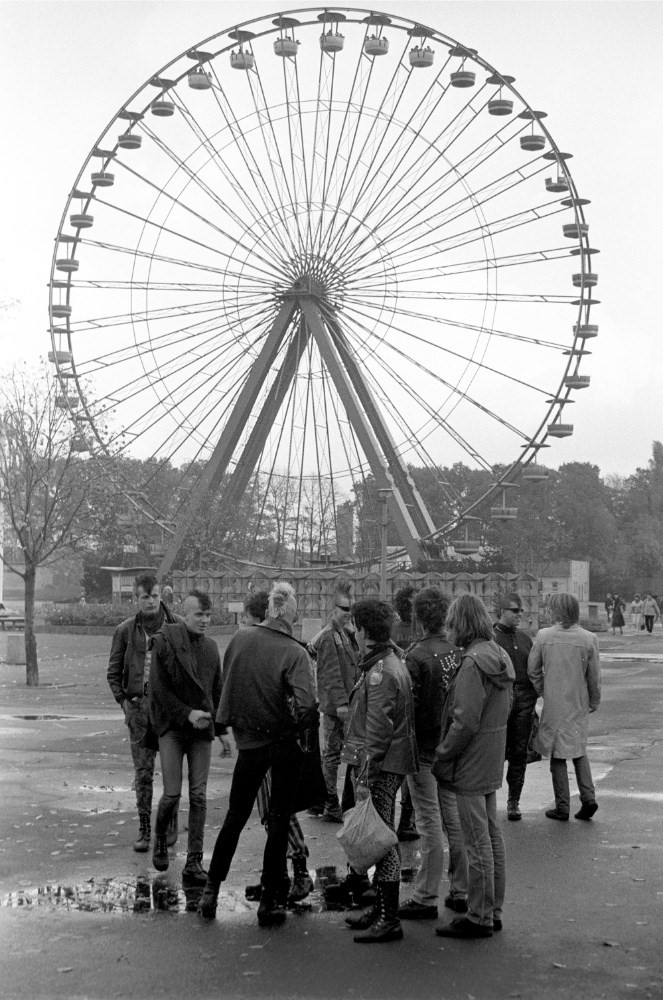
One of the most chilling things in Tim Mohr’s book is the way that, from the beginning of the 80s until its end (punk seems to have had an extended lifespan in the GDR, partly because fashions were slower to take root and spread where the majority of the media was under state control, but also because it remained – from the music to the image – genuinely oppositional and rebellious, rather than being absorbed into mainstream pop culture) the punks were, as often as not arrested because of informants from their own families or even the bands themselves. Nevertheless, after a slow start, the bands multiplied, but in a planned economy with full employment its slogans were something like the opposite of the UK’s punk bands; Too Much Future being the classic East German punk statement; more info here. As Mohr notes, long before the advent of GDR punk, informing for the government was something like an epidemic. In fact, by 1952 – that is, just four years from the official founding of the nation – the Stasi had already recruited 30,000 informants (Burning Down The Haus, p.2), and that figure would rise exponentially throughout the decades. This was the reality that artists like photographer Ute Mahler were working in;

Everyone knew that people were spying for state security. But nobody knew who. It could be anyone. We lived and breathed with this knowledge. In 1980, I stood at a May Day demonstration just below the grandstand. The demonstrators cheered at the government, which was on a podium above me. I got the impression that all the attendees were in agreement and were happy about it. Whilst editing the pictures, I discovered other faces in the crowd. That confirmed to me that you must look closely for what might be hidden.”

Ute Mahler, interviewed in Aesthetica, issue 90, p. 128

Action Force SAS figure, 1982: this creepy thing was one of the ‘good guys’

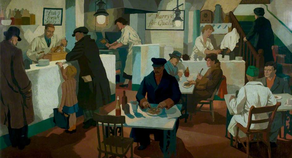
From a child in the UK’s point of view, the activities of the CND, the Greenham Common protestors, WarGames, Raymond Briggs’s When The Wind Blows and even silly things like the Frankie Goes To Hollywood Two Tribes video strengthened rather than diluted the sense that, beyond ‘the west’ there was a huge, sinister and implacable enemy. That video – bad lookalikes of Reagan and Chernenko wrestling – was absurd but actually made child me more aware of the seriousness of the global situation. For a start, I remember thinking the actors were bad lookalikes, but I knew approximately who they were meant to be and what it represented. Actually, although I was very familiar with Reagan I doubt whether I knew Chernenko by name; even now I had to look it up to write this as my only memories of a pre-Gorbachev Soviet leader relate to Andropov, for the simple reason that his name was funny. I vaguely remember him in association with a joking remark (when he died??) that “his hand dropped off”, but whether that was purely from the playground or from TV I don’t know. Even toys contributed to the doomladen atmosphere. The initial run of Action Force (the European release of GI Joe, although initially there was no back story or characters, just – as with the older UK Action Man – a lot of more-or-less accurate contemporary military equipment, including sinister SAS paratroopers with gas masks etc. As I was typing this, I remembered that I used to have a fairly extensive knowledge of the weaponry favoured by the Warsaw Pact vs. NATO troops, which is fun for kids. As far as I remember, although children’s entertainment in the UK wasn’t by and large as propagandist as Hollywood, there wasn’t anything much to counter the idea of the brainwashed, robotlike communist hordes, programmed by the state from birth. And, at no point before 1989 did it feel like that situation was about to change.

That feeling was as strong, or even stronger, inside the Eastern bloc, as Ute and Werner Mahler explain;

“The generations after us might find it hard to understand the complex workings of the GDR, as memory begins to move into the past. These new generations perhaps cannot imagine how one could live in such a country, where one could not officially say what we thought. … When we took pictures in the 1970s and 1980s, we would never have imagined that one day the GDR would not exist. At that time, we wanted to show life as we experienced it – just as it was. Today, the images act as documents from a vanished country. In this way, they are given a renewed sense of purpose.”

Ute & Werner Mahler, interviewed in Aesthetica, issue 90, p.124

Even, as Mohr explains, the day after the Berlin Wall fell, the Stasi were making arrests in something like the usual way, although the state quickly descended into chaos. But maybe everything feels permanent when you live through it; I remember when, what felt like 1000 years or so into Margaret Thatcher’s reich, we had had the Miner’s Strike, the Falklands war, there were millions of unemployed and it seemed like I had never met anyone who liked Thatcher, or anyone who voted for the Conservative Party and yet, come election time they still won. Maybe it’s more significant that I don’t remember anyone I knew being especially keen on Michael Foot or Neil Kinnock? But anyway; my memory is that by 1988, there was no feeling that the cold war was going anywhere; by 1990 it was over. Until I was 23 my only conscious experience was of a Britain run by a Conservative government, and then that was over.

symbol from an 80s
cold war childhood
Bob Light and John Houston’s satirical Gone With The Wind poster, c.1981 – vividly brings back the era to me

One of the stranger things to find, looking back on the phantom communist enemy of my childhood is that, contrary to what appeared to be the case on TV at the time, the people of East Germany, discontented though they obviously were, did not necessarily want to become westerners. As depicted vividly in Deutschland 83 and even more so in Deutschland 86, Communism as practised through the GDR’s dictatorship was a failed ideal, but it remained for many, something like an ideal. The bands documented in Burning Down The Haus, like the immediately post-Communist East German club scene that Mohr experienced himself, were ‘radically egalitarian’. These were, after all, people raised in a system which preached the power of the people, and even enshrined in law the freedom of expression, although in practice it didn’t allow either of those things. Often bands or musicians – people who were routinely arrested, beaten by the authorities, held in prison awaiting trial for months and so on – had opportunities to flee to the west (or were even encouraged to by the authorities who couldn’t cope with them) but chose to stay and work for change. Fascism and consumerism were seen, not just by the authorities, but by the punks, as the enemies of freedom, and even when the punk revolt happened it was often aided by (which seems odd but makes a kind of logical sense) the Lutheran church, which had an uneasy but respectable existence within the state. This meant that not only the punks (who tended towards anarchism in the 19th century sense politically), but also environmentalists, peace activists and other dissidents the church protected and to a degree nurtured, were working under the auspices of an institution which also had essentially anti-capitalist principles at its heart.

Rebelling against a de facto egalitarian state in itself creates a strange situation, as Ute Mahler recalls;

“In the GDR, when the collective was praised as an ideal, we were all lone fighters. In this new society where individuality is so important to so many people – coming together is the key”  quoted in Aesthetica, issue 90, p.124-7

And this is not really a paradox, even to an individualist; if the contrasting but ultimately similar oppressions of the 20th century, whether Nazi Germany, Stalinist Russia, Communist China etc – have taught us anything, it’s that totalitarian power structures, of whatever political hue value conformity above individuality; but also that political progress requires subjected peoples to firstly insist on their individuality, but also to act in concert with each other, to combine their voices in order to be heard.

Perhaps because a general election is looming as I write this, reading about the lost world of the eastern bloc and its failures (mostly the same failures as capitalism to be fair; poverty, starvation, oppression etc etc) begs the question; what is the country that you believe in, if not a reflection of yourself and what you want? The Eastern punks were patriotic in the sense that they wanted the freedom to be themselves, in an East Germany that recognised the right to have dissenting voices and views, to improve the experience of East German citizenship for all. But, like everyone else, they shared their country with the other by-their-own-admission patriots who believed in a completely different country. If you consider yourself a patriot, you are probably living in a country with lots of other patriots whose country has the same name as yours, but whose beliefs and ideals are not the same as yours. Those who fought and died for [name a country] in [name a war] and those who fought and died for [name an opposing country] in [the same war] were fighting for the same thing, but they were also not fighting for the same thing. The people who fought for Britain against the Nazis and the people who fought for Britain against the Zulus both were and were not fighting for the same country, though on an individual level the end result – their deaths, and the deaths of their enemies – was much the same.
Somewhere in a previous, equally muddled* article I mentioned the poet Edward Thomas. Against the WW1 poetry of super-patriot Rupert Brooke, or the “What passing-bells for these who die as cattle?” humanism of Wilfred Owen, you have to balance the entirely personal patriotism of Edward Thomas;

 At the age of thirty-six there was no strong pressure on him to enlist, but in August 1915 he finally made up his mind… When his friend Eleanor Farjeon asked him why, he scooped up a handful of earth and said, ‘For this.’
Andrew Motion, ‘An Imaginary Life’, in Ways of Life, Faber & Faber 2008, p.102.

And no doubt that was true. But what he fought for doesn’t change the fact that what he was injured for (he survived the war, minus an arm) was the global ambitions of the small group of people then running the British Empire. In the end his patriotism and theirs amounted to the same thing; but they were not the same thing.

Thomas’s kind of patriotism is the one that I think most matches my own; despite being a lefty internationalist I am quite a patriotic person. I love Scotland and value it not because it’s the ‘greatest country in the world’ (not that I’m saying it isn’t; just that the concept itself is utterly meaningless I think) and not because it’s beautiful – which it undoubtedly is, but so is every country I’ve been to – but because it is uniquely itself. It’s the big picture and the details; the texture and the atmosphere, the things I like and the things I don’t like. What I’m really saying I suppose is just that it’s the country I know best, the one where all of my responses to the world were shaped – which is of course not something to run up a flagpole and if one somehow did there’s no reason that anyone else in the world should want to salute it. But it is patriotism nonetheless. One of the many ironies of our particularly irony-ridden times is that on the whole, the conservative/nationalist parties of whom there are suddenly it seems very many indeed, are by and large those least committed to any kind of environmental/green policies. Strange because if, like the Conservatives nominally are, you are all about pride in your culture and your country and your history, but aren’t really concerned about the welfare of the actual, physical country as a piece of land then what do you even think you stand for?

So anyway; in the world of 1988, the world of 1990 seemed unthinkable, but it happened anyway, because people wanted it. I know that as 2019 draws to an end the world is full of people, in Chile, in Hong Kong, in Iran and Sudan, in the USA and the UK; in every country, who want thoughtful, compassionate, democratic government and not repression, corruption and leaders who are quasi- or actual dictators. Who want to be represented, not ruled. And it’s not impossible.

* when I read my writing it makes me think of that episode of Peep Show where a disgruntled lapdancer says “If you can’t sum up all the aims in the first line then they’re too diffuse.” I think my writing tends to be a bit diffuse.**

**See?

A continuous chain of little inventions; art in Edinburgh summer 2018


Probably as much as I love any art movement, I love German Expressionism; most of all the artists of Die Brücke (I wrote at length about them here) and their (initially) optimistic quest to forge a new, forward-looking art which was distinctively German, drawing on native traditions (woodcuts, landscape etc), but also attempted to peel away the layers of staleness built up by decades, or even centuries of academicism, to reveal living art beneath. The art of Paula Modersohn-Becker, too, who was doing something similar in Worpeswede, is important to me too, but I also love the more anguished, personal kind of Expressionism that was reflected in the famous Expressionism of German silent cinema (see also Kirchner’s later works, and – not “German Expressionism” per se, but still German and expressionistic, early Dix and Grosz, Max Beckmann, Käthe Kollwitz).

Emil Nolde – Bay (1914)

So, even though Emil Nolde (1867-1956) is perhaps my least favourite of the major German Expressionist painters, and even though I had lots of qualms about it (see here), I was excited to see the Scottish National Gallery of Modern Art’s exhibition Colour Is Life. And it really is good.


In comparison with the much younger artists of Die Brücke, which he joined for a year in 1906* Nolde’s art is just as vivid, but less vibrant (if that makes sense); his colours tend towards the bilious and acidic and his style, though ‘free’, often seems – even in landscapes – more frenzied and less harmonious than the works of the rest of the group. His deeply felt religious paintings, especially – and there is a really remarkable group of them in the exhibition – have an intense, anguished, alienated quality that is more like Munch atmospherically than it is his German contemporaries. It’s among his figurative (but not religious) works that my favourite painting of the exhibition, an enigmatic and slightly double portrait (that I can’t find online), which is smoother in surface texture than the religious pictures and imbued with an oddly menacing atmosphere.

*at which point Nolde was 39 and the group’s founders were in their early to mid twenties

Emil Nolde – Paradise Lost (1921)

I’m glad to say that although I felt like the information at the exhibition tended to downplay his vociferous Nazism a little, it at least acknowledged it – and although it is nowhere explicit in his art, there are some uncomfortably anti-Semitic-caricature-like faces in his paintings of people, including in some of the religious works. But whether I would think that if I didn’t know he was (extremely) anti-Semitic, I can’t say. Interestingly, for an exhibition called Colour Is Life, by far the most powerful works to me were Nolde’s woodcuts (including arguably his most famous work, The Prophet of 1912), where his compositions are remarkable for their economy and stark intensity.

Emil Nolde – The Prophet (1912)

Interestingly (perhaps not coincidentally?) the majority of Nolde’s most impressive work seems to have been done by the mid-1920s, but there is also a selection of his ‘unpainted pictures’ in the exhibition. These are little watercolours, incredibly vivid in their colours, which were made in secret during the period when his work was condemned/forbidden by the Nazi government which Nolde had, however, not only welcomed, but effectively campaigned for since the early 30s. Incidentally, around the time that Nolde was signing the Aufrufs der Kulturscha (1934) which supported Hitler as Fuhrer and joining the National Socialist Association of Northern Schleswig, Ernst Ludwig Kirchner, one of the founders of Die Brücke, was writing “Here we have been hearing terrible rumours about torture of the Jews, but it’s all surely untrue…There is a war in the air. In the museums, the hard-won cultural achievements of the last 20 years are being destroyed, and yet the reason why we founded the Brücke was to encourage truly German art, made in Germany. And now it is supposed to be un-German. Dear God. It does upset me.”*

Head of a South Seas Islands woman (1914)

This was more than just the symptom of a generation gap between different artists; it’s at the heart of why Nolde’s art is, despite surface similarities, so different from that of the artists of Die Brücke; Expressionism is (obviously) about expressing; and yes, Kirchner and co expressed their anxieties, but their vision – at least at the time the group was at its most cohesive – was an optimistic one, accepting other influences as much as it rejected the status quo. To the 21st century, the way they were influenced by the art of other cultures, to simplify and brighten their own work can be uncomfortable; it has something of the ‘noble savage’ myth about it and their assumptions about the freedom and ‘naturalness’ of the tribal cultures whose work they studied in ethnographic museums were made from a viewpoint that now seems colonial and ignorant. But – the point of their own work is that it uses these forms and elements to describe something that is whole, natural and above all universal – the ‘otherness’ of the figures Nolde drew and painted on his trip to the South Seas (and even of his incredibly bold landscapes) just before WW1 is inescapable. His drawings of the people he encountered aren’t caricatures; they are brilliantly observed, but they are themselves ‘ethnographic’ in a way that Kirchner and co’s art strove not to be; Nolde is seeing and recording, not absorbing.

* Kirchner, quoted in Kirchner Museum Davos Biography Ernst Ludwig Kirchner by EW Kornfield, & CE Stauffer (1992)

Still; the Nazi government didn’t care about this distinction, and the exhibition text tells us that Nolde had more paintings shown in the condemnatory Entartete Kunst (‘degenerate art’) exhibition than any other artist, which would be a cause for some schadenfreude if not for the fact that, after petitioning the government (he was on civil if not familiar terms with charming people like Goebbels and Baldur von Schirach) he was informed in late 1941 that any work he undertook should be presented before government officials before any kind of public showing, which is of course harsh and limiting by any normal standards, but surprisingly mild compared to what they were doing to other artists. But, as Nolde must surely have realised, for all their cultural protectionism and promotion of what they considered to be artistically wholesome and correct ideas, the Nazis really weren’t interested in art as art at all.

Julie Wolfthorn – Witch of the Woods (1899)

For some not very pleasant perspective, since I can; Nolde was prevented from making a living from his art for a few years, and had works confiscated (which he did eventually get back however), meanwhile his contemporary, Julie Wolfthorn (only three years older than he was), whose figurative, traditional, slightly folkloric art has at least an equal right to be seen as definitively German (or, far more right, to the anti-modernist authorities of the time), was, as a Jew, too dangerous to exist, and was murdered in 1942, at the age of 78, by the regime which Nolde did his best to be accepted by.


So yes, a beautifully curated and mounted exhibition; but one which leaves a slightly bitter taste.

Toyen – Message of the Forest (1936)

So,  that’s what I paid to see (and it is absolutely worth the price of admission), but in fact the bitterness faded quickly; aside from owning a Kirchner painting that is for me everything that Nolde’s work isn’t, the National Gallery of Modern Art (Modern Two) hosts a permanent (and free) exhibition Surrealism and the Marvellous, which was already great, but has been enhanced hugely by the acquisition of Toyen’s superbly enigmatic The Message of the Forest (1939) and Leonora Carrington’s diminutive but haunting (and at the same time kind of funny) 1939 portrait of Max Ernst, Bird Superior (1939).


Leonora Carrington – Bird Superior (Portrait of Max Ernst), 1939

I could spend (and I think have spent) hours in this room; even longer now, as the archive adjoining it is hosting Club Dada: Berlin and Beyond, a really exciting collection of books, pamphlets, photos etc (and a small Max Ernst painting) that focuses mainly on Berlin Dada but also has some great items from the original Zurich group. Much as one wants to pore over these artefacts, I don’t even mind too much that the books etc are in glass cases since my German is minimal and I can’t read French at all.


Raqib Shaw – The Adoration (after Jan Gossaert), 2015/6 © the artist

Over in Modern One, I nearly didn’t look at the (also free) exhibition Raqib Shaw: Reinventing the Old Masters, partly because part of me doesn’t really want them to be reinvented, and because I didn’t know Shaw’s work, and also because it was up the stairs and I’d been walking around for hours. But I’m glad I did; what a fantastic show! I can’t imagine anyone not being impressed by Shaw’s work, even if it’s not their cup of tea. The paintings (too simple a description; his huge panels are painted in shimmering enamels, but embellished with a kind of cloisonné effect, incorporating jewels, glitter, all kinds of things) are brilliantly drawn and dazzling in their richness and detail (and a bit over the top, which is part of the charm). Although the compositions of the pictures in this exhibition are inspired by ‘old master’ paintings (one of which is one of my all-time favourite pictures, Lucas Cranach’s enigmatic Allegory of Melancholy (1528), displayed alongside Shaw’s painting), the familiarity only makes the extravagant fantasy of Shaw’s works all the more dreamlike and affecting.

Jan Gossart – The Adoration of the Kings (1510/15)

I think we (no, I don’t know who I mean by ‘we’) are used to seeing and accepting things like Biblical scenes or Greek myths presented through the filter of the Italian (or Northern) renaissance, and this is similar but different. With the old masters we (them again) see familiar (or what were once familiar) scenes  presented in a kind of fancy dress of anachronistic costumes/settings etc which were initially intended to heighten the relatable-to realism of the works, but which now add another layer of meaning and cultural baggage. With Shaw’s work, the ghosts of both the original meaning and the original treatment are seen as if through the eyes of someone from another, much more effervescent dimension. The dislocating, hallucinatory blend of familiar (and it isn’t just the source material that’s familiar; Shaw’s use of dazzling, opulent colours and ornate textures is, despite the fantastical elements, quintessentially Indian, to my western eyes anyway) and strange is exhilarating and strangely poignant.* To take my favourite picture; neither Cranach’s or Shaw’s Allegory of Melancholy is sombre exactly; but despite the centuries and world views that separate them, the same delicately wistful atmosphere pervades both pictures. It’s an impressive exhibition.

So, the moral of this is; go to the Scottish National Gallery of Modern Art in Edinburgh if you get the chance. Oh, and the National Gallery of non-modern art too – aside from having an incredible permanent collection, they currently have a Rembrandt – who doesn’t like Rembrandt? – exhibition and have put a fantastic Jenny Saville painting (Aleppo) among the old masters in a way that works amazingly well and was gathering crowds of (especially young) people when I was there.

*Perhaps an obscure (and certainly a geeky) comparison; looking at Raqib Shaw’s pictures reminded me of reading Brendan McCarthy & Pete Milligan’s similarly post modern/immersive/multicultural/hallucinogenic comic strip Rogan Gosh in the 2000AD spinoff Revolver.

Brendan McCarthy & Peter Milligan, Rogan Gosh (1990)


Review of the Year – the paradox of realism


2017, like most years but somehow more so, was filled with unpleasant things, events and people. For me though, one of the more pleasant features of the year was that I made the effort to visit art galleries more often than previously, in particular to see the superb exhibitions held by the National Galleries of Scotland; after missing Modern Scottish Women in 2016, I was determined to see Beyond Caravaggio at the National Gallery and especially True to Life – British Realist Painting in the 1920s and 1930s at the National Gallery of Modern Art. Both of these exhibitions were excellent, but I am writing mainly about the latter. As curator Patrick Elliott was clearly aware (see also the essay What Sort Of Truth? British Painting Between The Wars by Sacha Llewellyn in the excellent exhibition catalogue), ‘realism’ is not a simple thing to define, and indeed it seems strange that (for example) the peculiar and highly artificial painting of Maxwell Armfield and the shockingly immediate work of David Jagger should be considered the same kind of art.

‘Pacific Portrait’ (1929) by Maxwell Armfield (left) and ‘The Conscientious Objector’ (1917) by David Jagger (right)

If ‘Realist’ at first seems a pretty simple and unambiguous description, the fact that many of the artists (Dod Procter, Meredith Frampton, Gluck, Glyn Philpott) and paintings discussed in the exhibition catalogue also appear, equally convincingly, in Edward Lucie-Smith’s book Art Deco Painting (Phaidon, 1990) demonstrates just what a subjective term it really is. What the word seems to denote in the context of this exhibition is something like ‘representational rather than abstract’, which admittedly is an extremely unwieldy and far too wide term.

In the period in which the art of the exhibition was produced (the title says the 1920s and 1930s, but a few earlier and later works were included, so roughly from the years of World War One up to the first half of World War Two), the word realism tended to have mainly negative connotations; for which see Billy Bunter author Frank Richards’ famous 1940 reply to George Orwell’s article Boys’ Weeklies; “They go grubbing in the sewers for their realism, and refuse to believe in the grass and flowers above ground – which nevertheless, are equally real!” This was and still is an aspect of a wider conception of realism that Orwell  himself attacked occasionally in its more extreme political forms. Today, ‘realpolitik’ is used as a term of criticism, but in fact almost all political or social ‘realism’, even when respectable, is basically an excuse for people or governments not to act compassionately when it becomes unprofitable to do so. People who term themselves realists rather than optimists or pessimists tend (in my experience) to lean more towards the latter, but with an added smug quality as befits someone who is never surprised when bad things happen. While the artists of True To Life presumably held beliefs and opinions on a wide range of issues, these are by and large absent from their work as collected here. This is not the 1920s of the General Strike or the 30s of the Depression and The Road To Wigan Pier, let alone the 20s and 30s of Lenin, Mussolini and HItler, or perhaps more to the point, of Picasso, Matisse, or Dadaists and Surrealists.

Edward McKnight Kauffer – poster for the London Underground (1930)

Nevertheless, from the delicate figure studies of Dod Procter to James Cowie’s pastoral portraits, it is a window onto certain aspects of British art and life between the wars. Also, the painters’ rejection of the vocabulary of avant garde modernism should be seen in the context of the time; while abstract or semi-abstract art had been at the cutting edge of modernism in the years just prior to and during World War One, not only had the innovators of that era moved on (why not look at my article about Wyndham Lewis in the 20s here?), but the angular, dynamic language of modernism had infiltrated mainstream culture to the point that institutions as staid as the Royal Mail were using designers like John Armstrong and Pat Keely to give the Post Office a modern identity, while Edward McKnight Kauffer and others did similar work for the London Underground and, outside of the UK, fascist Italy, Hitler’s Germany and the Soviet Union all utilised versions of modernist design to establish new national identities. In that sense, the idiosyncratic, apparently old-fashioned and above all individualistic styles adopted by British artists outside of the more radical movements can be seen as, if not revolutionary, then at least stubbornly dedicated to their own visions.

Although it may seem paradoxical or incompatible, the ‘realism’ of these artists is founded to some extent on escapism and idealism; but maybe that is truer of realism in a wider sense than at first seems to be the case. The definitive artistic form of realism (if we think of everyday life as ‘real’ – but I don’t really want to get into philosophical questions here as I’d like to finish this article at some point) nowadays is probably something like instagram, or on a slightly grander level, the documentary film, but the very nature of documenting reality – whether in film, photographs, painting or in writing – is necessarily selective, and in being so, tends towards some kind of commentary (and/or judgement) on its subject. One of the nice things about the True To Life exhibition was that both the grime-and-hardship/warts-and-all and the grass-and-flowers aspects of realism were represented – albeit mostly in a perhaps fairly superficial way. There was very little evidence of the documentary as protest – perhaps because, by the end of WW1, photography had become the obvious tool for this kind of work. That said, social commentary of a sort was present in Thomas Nash & Stanley Spencer’s idiosyncratic recasting of some of the Renaissance’s favourite religious scenes such as the Crucifixion & the Last Judgement in ‘modern dress’ and modern settings (and slightly generic ‘modernist’ styles). This use of realism was not uninventive, but was in essence just another way of looking back at the ‘old masters’; revisiting the groundbreaking realism pioneered in the 14th century. More interesting, (to me) was John Luke’s strange 1929 modern-dress version of one of the baroque era’s favourite Old Testament scenes, Judith and Holofernes, in which the story of the beheading of an Assyrian general is made even more unsettling by having a strangely surreal Agatha Christie/Enid Blyton aura.

John Luke – Judith & Holofernes (1929)

Much as in Edward Lucie-Smith’s Art Deco Painting, the unifying factor in the exhibition’s disparate works was less a matter of style/school or subject than it was atmosphere; the paintings, as different as they are, belong definitively to the period between the wars, in much the same way as the very different works of Evelyn Waugh and Christopher Isherwood did (according to me, here).


If the term ‘realist’ in painting suggests the artist as eye (kind of an analog to (again) Christopher Isherwood’s fictionalised realism; “I am a camera”), the eye of the artist/writer is necessarily as individual as the brain it is connected to. For example, one might assume that realism and idealism were opposites, but there is a strong classicising element among some of the artists in the exhibition – but even then, individual artists seem to have reached a kind of classical serenity and monumentality via different routes.


Meredith Frampton – Sir Charles Grant Robertson (1941)

One of the stars of the exhibition for me was the portrait painter (George Vernon) Meredith Frampton (1894-1984). Frampton’s art was in some ways the most ‘realistic’ art in the exhibition, in the sense of being (by far) the most illusionistic and quasi-photographic. In a way, portraits like the stunning Sir Charles Grant Robertson (1941) are less ‘realist’ than than they are ‘corporealist’ – their accumulation of painstakingly rendered detail being in some ways closer to taxidermy than to the realism of a snapshot. In their almost eerie stillness, his portrayals of professional men surrounded by the accoutrements of their work, (another excellent example is Sir Frederick Gowland Hopkins  (1938, below) seem – despite the maximalist inclusiveness of the painting – closer to the carefully composed minimalism of a photographer like Lilo Raymond than to a more or less contemporary realist (or ‘objectivist’) painting like Otto Dix’s theoretically similar portrait of urologist Dr Hans Koch (1921). And yet, for all of their modern realism, both artists looked to the past; for Dix – who had experimented with Expressionist styles earlier in his career, the aim of the modern realist painter was to tackle the breadth and the often-unrecorded detail of modern life with the – to him – unimprovable techniques of the old masters. For Frampton, the source of his style is less the realistic tradition of the Northern Renaissance than it is the monumental, but still ‘realistic’ neoclassicism of Ingres.

Meredith Frampton – Sr Frederick Gowland Hopkins (1938) and Otto Dix – Dr Hans Koch (1921)
Lilo Raymond – Wild Flowers (1992)

The more usual classical influence on British art of the period was the modernist route via Picasso and cubism; in the case of painters like the ex-Vorticists William Roberts and Edward Wadsworth (also Edward Burra, whose expressionistic 1930 painting The Snack Bar was included in the exhibition), the angularity of Vorticism became a kind of stylistic shorthand that marked out their otherwise fairly conventional/traditional art as ‘modern’. Several other artists in the exhibition, such as Gladys Hynes and James Walker Tucker seem to have used modernist stylistic traits in the same way; to heighten the clarity and monumental qualities of their work; a kind of ‘realism’ as simplified solidity and a classicism that couldn’t be easily written off as old fashioned.

Gladys Hynes – Noah’s Ark (1919)
Gerald Leslie Brockhurst – By the Hills (1939)


For society portrait painters like Gerald Leslie Brockhurst and Sir Herbert James Gunn, realism – if explicitly not ‘gritty’ realism – was a necessary part of their trade. The glamour and drama of portraits like Brockhurst’s By the Hills (1939) is what made the artist in demand for fashionable sitters, but their effect – despite relying on a similar sense of heightened photo-realism for their success – is almost the opposite of Frampton’s still life approach. This kind of art was, despite its use of traditional techniques (and even, in the case of By The Hills, a Renaissance-influenced landscape in the background) resolutely of its ‘modern’ age, referencing Hollywood and the world of contemporary fashion, but not really any of the ideas that had affected the visual arts since the mid 1800s.


The same is true of the slightly creepy empty street scenes of Algernon Newton; despite their passing resemblance to the post-impressionist work of Maurice Utrillo, these brilliantly realised townscapes are depictions of the modern world, but not interpretations of it. While the artist captures the melancholy charm of the slightly shabby suburbs he painted, their spirit is more like restrained romanticism, rather than being invested with the revolutionary sense of psychogeography that the proto-surrealist works of Giorgio de Chirico had pioneered two decades earlier. That said, because of the role of artist – not just as a ‘camera’, but also as processor and interpreter of experience – his paintings are something more than a documentary photograph of an empty street.

Algernon Newton – The Outskirts of Cheltenham (1932)


Pietro Novelli – ‘Cain Killing Abel’ (1625)

In fact, what True To Life highlights, is the extent to which the vast majority of art, until fairly recently, had as its aim something that could be called realism; the National Gallery’s Beyond Caravaggio exhibition likewise showed Caravaggio and the artists of the late 16th/early 17th century trying to make their art – both in religious/mythical and modern genre paintings – more immediate & vivid through a kind of dramatic heightened realism. Impressionism broke away from the staid, schematised world of academic painting to capture something closer to the experience of both the artist and viewer, Expressionists tried to infuse their works with the feeling of events as experienced, Futurists tried to capture the violence of the 20th century where traditional techniques tended to distance it… And in that sense, much of the work labelled ‘realist’ in this exhibition works for us now in a way that it possibly didn’t at the time; to a modern audience the work in True to Life is almost all imbued with a between-the-wars ‘period’ quality that seems to capture the zeitgeist of that troubled era, even while sidestepping most of the troubles themselves.

It is with that last point that the artists – without doubting the depth of feeling they put into their work – mainly succeeded in recording (limited aspects of the) reality of their era in a relatively superficial way. As an example, Clifford Rowe’s The Fried Fish Shop (1936) depicts what the interior and clientele of a fried fish shop of the 30s presumably looked like; as such it has sociological and historical value, as well as being a fine, faintly modernist painting. On the other hand, a slightly earlier and in some ways comparable painting like the Vorticist-inspired Rain On Princes Street  (1913) by Stanley Cursiter (it’s quite surprising that none of Cursiter’s fashionable work of the 20s & 30s was included in the exhibition), despite its fractured, faceted and in that sense ‘unrealistic’ modernist appearance, not only captures in its stylised way a glimpse of late Edwardian metropolitan life, but also the feeling – still the same over a hundred years later – of being on Edinburgh’s Princes Street on a busy, rainy day. So in the end I suppose which painting deserves to be called ‘realist’ is as subjective as reality itself.

Clifford Rowe – The Fried Fish Shop (1934)


Stanley Cursiter – Rain on Princes Street (1913)