Releases of the Year 2016! Preliminary note…

2016 – oh well; at least there was lots of good music released this year (and it’s still coming!)

As usual, I probably won’t put my favourite releases of the year in any order (apart from the number one ‘release of the year’ itself. I know album or record of the year sounds better, but there are non-albums too, so ‘releases’ it is).

Last year, I made a parallel list of ‘most listened to’ albums that weren’t from that year. But that was a total pain, so probably not this time.

So, in short, who knows how many parts this will be in, or what it will include? Not me, yet. But soon!

.


Play For Today – Current Playlist 25th November 2016


After many delays, another week, another playlist…

1. Kristin Hersh – Wyatt At The Coyote Palace (Omnibus Books, 2016) Review herekristin-again

2. Stench Price – Stench Price EP (Transcending Obscurity Records, 2016)

3. Baby Tears – Succubus Slides (Choice Records, 2016)

4. Bethlehem – Bethlehem (Prophecy Productions, 2016)

5. The History of Colour TV – Wreck (Cranes Records / Weird Books, 2016)

6. Lush – Gala (4AD, 1990)

7. A Tree Grows – Wau Wau Water (Rufftone Records, 2016)

8. Kristin Hersh – Sunny Border Blue (4AD, 2001)

9. LL CoolJ – Radio (Def Jam, 1985)

10. Rachel Mason – Das Ram (Cleopatra Records/Practical Records, 2016) Review here!

11. Ela Orleans – Circles of Upper and Lower Hell (Night School Records, 2016)

12. Eric Dolphy – Out To Lunch! (Blue Note, 1964)

eck

13. Wu-Tang Clan – Wu-Tang Forever (BMG, 1997)

14. Paul K – Omertà (2016)

15. Christine Ott, Tabu (Gizeh Records, 2016)

16. The Raspberries – The Raspberries (Capitol Records, 1972)

17. Isasa – Los Días (La Castanya, 2016)

18. Daniel Land – In Love With A Ghost (2016)

19. Miles Davis – Jack Johnson (Columbia, 1971)

20. Matriarch – Revered Unto The Ages (self-release, 2007)

matriarch


Play For Today – current playlist 27 October 2016


Naturally some crossover with last week’s since my attention span isn’t all that horribly tragic…

kristin-hersh-2010153406-300x300

1. Kristin Hersh – Wyatt At The Coyote Palace (Omnibus Books, 2016) Review here!

2. ThrOes – This Viper Womb (Aesthetic Death, 2016)

2. Black Angel Drifter – Black Angel Drifter (Bastard Recordings, 2016)

3. Daniel Johnston – The What of Whom (Stress Records, 1982)

3. Rachel Mason – Das Ram (Cleopatra Records/Practical Records, 2016) Review here!

4. Debz– Extended Play  EP (Choice Records, 2016) Review here!

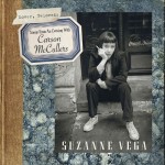
5. Suzanne Vega – Lover, Beloved; Songs from an Evening with Carson McCullers (Amenuensis Productions, 2016)

7. Eno – Another Green World (Island, 1975)

8. Jandek – Chair Beside a Window (Corwood Industries, 1982)

9. Public Enemy – Yo! Bum Rush The Show (Def Jam, 1987)

10.Kate Carr – I Had Myself A Nuclear Spring (Rivertones, 2016)

debz

11.Rachel Mason – Gayley Manor Songs (self-release, 2015)

12. Lugubrum, Face Lion Face Oignon (Aphelion Productions, 2011)

13. Charley Patton – The Complete Recordings, 1929 – 1934 (JSP Records, 2008)

14. Esmé Patterson – We Were Wild (Xtra Mile Recordings, 2016)

15. Opeth – Sorceress (Nuclear Blast, 2016)

16. Neil Young – Everybody Knows This Is Nowhere (Reprise, 1969)

17. The Mothers of Invention – Absolutely Free (Verve, 1967)

18. Miles Davis – Miles In The Sky (Columbia, 1968)

19. Suicidal Tendencies – Suicidal Tendencies (Frontier, 1983)

20. Absentia Lunae – In Vmbrarvm Imperii Gloria (Serpens Caput Productions, 2006)

ablu

Play For Today – current playlist


It’s been a while, so without further ado or elucidation, here’s some of what’s on the turntable (and equivalents) at present:

kristin_hersh_-_photo_credit_billy_oconnell

Kristin Hersh by Billy O’Connell

1. Kristin Hersh – Wyatt At The Coyote Palace (Omnibus Books, 2016)

2. Jingo de Lunch – Perpetuum Mobile (We Bite Records, 1987)

3. Rachel Mason – Das Ram (Cleopatra Records/Practical Records, 2016)

4. Naia Izumi – Natural Disaster EP (self-release, 2016)

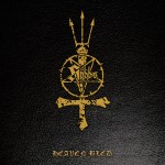
5. Hobbs’ Angel of Death – Heaven Bled (Hell’s Headbangers/High Roller Records, 2016)

6. Suzanne Vega – Lover, Beloved; Songs from an Evening with Carson McCullers (Amenuensis Productions, 2016)

suzanne-vega-billboard_6507. Bessie Smith – The Complete Recordings, Vol 1 (Columbia/Legacy)

8. Ghosts of Sailors At Sea – Red Sky Morning (Faded Maps, 2016

9. Dorje – Centred & One EP (Invisible Hands Music, 2016)

10.Drudkh/Grift – Betrayed By The Sun (Nordvis/Season of Mist, 2016)

11.The Mothers of Invention – Burnt Weenie Sandwich (Reprise Records, 1971)

12. Gentlemans Pistols – Hustler’s Row (Nuclear Blast, 2015)

13. Kaada/Patton – Bacteria Cult (Ipecac, 2016)

14. Maki Asakawa – Masi Asakawa (Honest Jon’s, 2016)

15. Nightsatan – Nightsatan and the Loops of Doom (Svart records, 2014)

16. Pilot – From the Album of the Same Name (EMI, 1974)

17. Haar/Ur Draugr – split (ATMF, 2016)

18. Wardruna – Runaljod – Ragnarok (By Norse Music, 2016)

19. Scott Walker – Scott 3 (Phillips, 1969)

20. The Stupid Daikini – Everything is Fine (self-release, 2015)

b_smith2s


Symphonies of Sadness, Dirges of Disgust, Noxious Noise: Musical Masochism


Any kind of masochism is (to non-masochists/collaborators) peculiar and difficult to understand; no less so when it is related to music; but I’m going to try to understand it anyway.

I have isolated three main areas which can be loosely classified under the ‘masochistic’ heading, but there may well be more:

1. Self-consciously unpleasant music which is “enjoyed” (or just enjoyed; a subtle but perhaps important difference) for its intentionally unpleasant/disturbing/unsettling or harsh sound

2. Music which is humorously/ironically enjoyed for its perceived awfulness*

3. Non-unpleasant music which is listened to specifically for its upsetting/depressing or negative emotional effect

Uniting all of these is the fact that they are not everyday listening (for me anyway), but in are special music which retains its potency by being indulged in only occasionally and when prepared for the physical (tinnitus) or mental (lachrymose) consequences.

*aka ‘guilty pleasures’ of course; but that is a whole other discussion; if guilt is an appropriate emotion for listening to music it would have to be something a bit less innocuous than I have in mind. ‘Embarrassing pleasures’ would be a more accurate and even more dodgy-sounding description

1. UNPLEASANT NOISES
The first category is very distinct from the other two; not only is the unpleasantness aural (and intentionally unpleasant), it is precisely the nastiness that appeals to the listener. Why that should be is mysterious; I have used the word ‘masochism’ in the title here, but only because everyone knows what it means and because I can’t think of a better term; but neither ‘sexual masochism disorder’, BDSM or so-called non-sexual masochism (“self-defeating personality disorder”) really functions in the same way as listening to, say The Rita (noise artist Sam McKinlay) or Gnaw Their Tongues.

russolo

Noise as (anti)music goes back at least as far as the Dada and Futurist movements of the early 20th century (on the left is Luigi Russolo with one of his Futurist instruments), but on the whole (I think) it’s true that the noise that was created, though fascinating to hear, was more about the process of composing and rule-breaking than listening for pleasure. The same may be true of a lot of experimental noise since then, with classic albums such as Yoko Ono’s Yoko Ono/Plastic Ono Band and Lou Reed’s Metal Machine Music probably being far more frequently owned than enjoyed. Various musique concréte and other avant garde pieces have the same kind of status, being performed perhaps more for historical/academic (albeit interesting) reasons rather than for the purpose of actual entertainment (which is not of course to say that people aren’t entertained by it).

merzbow

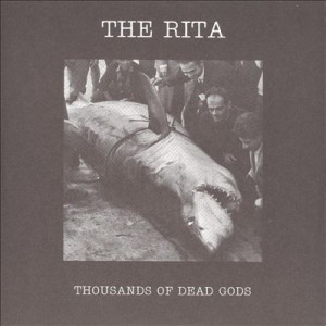
Noise: So what of semi-musical or non-musical noise like Merzbow or just plain ugly music? It’s hard to say where the appeal lies, but with pure noise it seems to be at least partly visceral. It has an immediate, emotional impact; it has nothing to do with traditional musical qualities such as melody, catchiness or even memorable-ness, since it’s possible to listen to the abstract noise of (for example) theritaThousands of Dead Gods (2006) by The Rita many times without ever getting used to it. This makes the noise endlessly surprising, alienating or boring, depending on one’s mood. The sense of noise as abstract is reinforced by its context-lessness; typically the artwork for a Merzbow album is as enigmatic and unrevealing as the album within, and occasionally every bit as flatly un-evocative (not a criticism!) as the Merzbow sound itself. Cultural identifiers in pure noise are also minimalist in the extreme; the race, nationality or gender of noise artists tends to be known only insofar as the artist wishes it to be so.
At the same time, a quality that pure noise shares with more traditional music is that it can noticeably affect the mood of the listener, especially when played at a loud volume. Listening to pure noise can be much like watching ‘white noise’ on a TV screen; the endless movement may be random, but the mind will look for patterns and if it doesn’t find them, create them itself; pure noise often feels detailed in a way that very little actual music does. And it is enjoyable (the word covers a wide range of responses here) or unenjoyable (simpler) for as long as it engages the listener.

Ugly Music: What I shall call ugly music is sometimes easier to pin down; it is music, which means it follows certain structural rules which noise ignores, and the listener enjoys it for its ugliness or not at all. It is notable too that artists who aim for ugliness usually attempt the Wagnerian ideal of the gesamtkunstwerk or ‘total work of art’ where everything from the sound to the lyrics to the artwork contributes to the overall effect.

Ugly music probably began in the 60s with some of The Mothers of Invention’s more indigestible experiments (like Absolutely Free, which is perhaps more difficult than truly ugly), Captain Beefheart or the 17 minute churn of the Velvet Underground’s ‘Sister Ray’, but it came into its own in the artistically serious 1970s (see below) and, in a more populist and relatively lighthearted way with the advent of death metal in the 80s, specifically with albums like Reek of Putrefaction (1988) by Carcass. This classic album is ugly not only in the details of the music and presentation, but in the murky muddiness of its sound; a chance element caused by the cheapness of the recording, which makes some of the album sound like two or three different bands immersed in a swamp, simultaneously playing three different songs, When allied with the rasped vocals of Jeff Walker and the ridiculously deep ones of Bill Steer, this churning noise makes for a disorientating but strangely addictive listening experience, which has something to do with the humour of its extremity (lyrical and musical) as well as the pure heaviness.
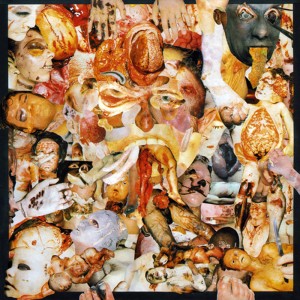
carcsBack in the 80s, this kind of music had an outsider/snob appeal even within the metal genre. 80s metal (on the whole) strove for clarity and precision; Carcass (emerging from an anarcho-crust/punk background) pushed the boundaries of musical extremity and taste (using the notorious collages of medical photos for their artwork, rather than relatively cuddly horror mascots like Iron Maiden’s Eddie) beyond what the standard fan of Iron Maiden, W.A.S.P., Metallica or even Slayer might find acceptable. To say that death metal is relatively lighthearted is slightly misleading – Carcass’ early music was informed by a radical vegetarian disgust with all things meat-based in quite a serious way – but as a subgenre of a popular youth-focussed music it lacks the gravitas of the kind of music which made the late 70s a darker place to have ears.

By contrast with death metal, the sheer ugliness of early industrial music exemplified by the work of Throbbing Gristle, seems designed not so much to shock or alienate with its extremity, so much as to shock and alienate with its familiarity, kind of a negative mirror image of the almost subliminal ambient music being pioneered around the same time in Eno’s Music For Airports.

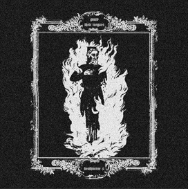
By reflecting the greyness of the decaying industrial (edging into post-industrial) landscape and society that produced it, the corporate packaging and document-like title made TG’s debut album The Second Annual Report (1977) a masterpiece of grinding mundane-ness. In its way their music is throbzevery bit as evocative of the 1970s as glam or disco, but the way it embodies its era, its brutalist architecture and grey/brown/beige ambience, combats any possible sense of nostalgia. Although it’s easy to say why it’s interesting, liking Throbbing Gristle (as many have done and continue to do) is much harder to explain. The appeal of TG; in effect the appeal of being made to feel uneasy or disgusted, is an odd way to be entertained. On the surface you could say the same about the horror genre in cinema and literature, but Throbbing Gristle’s effect is utterly different from straightforward horror-as-entertainment, feeling (to me anyway) more analogous to the JG Ballard of The Atrocity Exhibition or Crash than to Stephen King, perhaps because like Ballard, TG’s work had more to do with documenting than it did with entertaining. Although there was undoubtedly an element of confrontation in TGs music (especially in a live setting), as with pure noise, confrontation oppaisn’t the focal point that it becomes in the power electronics of groups like Whitehouse and Sutcliffe Jügend who (to some extent) followed on from the early British industrial scene. There is also a more straightforwardly ‘horror noise’ sub-subgenre including bands like Abruptum and the aforementioned Gnaw Their Tongues, whose aim seems to be to engender (with, it must be said, varying degrees of success) extreme anxiety in the listener; significantly different from the almost abstract quality of pure (if harsh) noise artists like Merzbow, easier to understand, but also easier to dismiss as sensationalism.
One of the cumulative effects of abrasive-sounding music has always been to spawn more accessible versions of abrasive-sounding music, in short, to make tunes out of it: noise rock, hardcore punk, death metal, grindcore, grunge, black metal, industrial pop music, techno, trance, drone, shoegaze; all bring a taste of ugliness to the masses in their own way and all are enjoyed, just like traditional pop/rock/soul/country/reggae etc etc etc, by people who like the tunes and like the songs. So they have little part to play in this particular discussion.

2. SO BAD IT’S POSSIBLE TO PRETEND IT’S GOOD
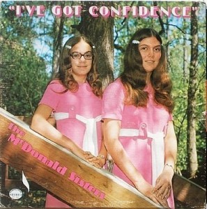
confidAcross all of the arts there are ‘so bad it’s good’ works that appeal on the ironic level of kitsch. These are completely subjective and therefore a bit of a minefield; at what point does listening to something that you personally think is so awful that it’s funny become just listening to it; and is there any difference anyway? Did my teenage self and friends have a different experience listening to an old Shakin’ Stevens tape ‘for a laugh’ than “Shaky”’s actual fans did or do? Well, yes, presumably; they probably don’t laugh as much. Still; it’s all ‘listening with pleasure’ and not only is it subjective, but it’s all about timing. The awfulness of music is as much about the zeitgeist as the popularity of music is; hard to imagine now, but there was a time in the late 80s when listening to Abba (or The Carpenters for that matter) could be enjoyed as revelling in tacky 70s awfulness; but since the early 90s they have been revered by the once-embarrassed media as a great band after all.

Since the 90s in fact, revelling in irony has become so commonplace and mainstream as not to be ironic anymore; at one time including an artist like Tom Jones in the lineup of a major indie rock festival was kind of a hipster joke that the audience was expected to be in on. Since then the line between alternative and mainstream has become blurred, not because mainstream music has become more adventurous, but because ‘alternative’ music became popular and thus blander and more geared towards commercial success and because the mainstream media discovered people they had actually heard of at these oft-derided hippy festivals. The amusingly mainstream guest act at (for example) Glastonbury or T in the Park has almost imperceptibly become the headlining act; no accident, since these artists are usually household names which therefore guarantee ticket sales in a way that even a medium-big indie rock band isn’t.

Nowadays, to have the same kind of kitsch shock value as including Tom Jones in an indie festival once had, you would have to put someone like Gary Glitter or Rolf Harris (an original ironic festival guest, strange to remember) on the stage, doubling the irony and making the whole experience extremely uncomfortable for all concerned. Despite the weird Ballardian/Coum Transmissions echo this experience this might present, it’s probably best not to.

3. NOW THAT’S WHAT I CALL MISERABLE MUSIC
caravThis category takes it for granted that unhappiness is a form of unpleasantness that is most often avoided; which may not be strictly true – or obviously isn’t, given the endless popularity of tragedies, murder mysteries etc. Still, it’s a basic human truth (I hope) that most people would rather be happy than sad. Most of the time that is; historically, music was most often written for occasions; sad music was required for a funeral, just as weddings demanded happy music. Tudor and baroque music often had mythological, narrative or literary inspiration which dictated the mood of the works. For a court composer to make a cheerful-sounding funeral dirge or a comic opera from a tragic mythological story would be perverse at best and bad workmanship at worst.

In modern popular music there are many kinds of sad songs, but from a personal point of view (narrowing it down to music I actually like) there are two;
songs which express the unhappiness of the performer
songs (which may or may not be sad in themselves) which make the listener (me) feel unhappy.

Both of these kinds of songs may actually be very pleasant in an aural sense, so only the latter are strictly relevant here. But – outside of the funereal situation mentioned above – why would someone intentionally listen to music that makes them sad?

There are probably as many reasons as there are people, but two big ones: to make you feel better or to make you feel worse.

A lot of interesting research has been carried out on the restorative power of sad music, so I wont say too much about that. The blues (and early country music too) is a classic example – intended not just as an outlet for the woes of the artist her or himself, but as a sharing of universal wretchedness that brings the relief of empathy/recognition – and it does seem to have a regenerative quality (a kind of earthly parallel to the redemptive power of gospel music) that makes it essentially uplifting in all but the most desolate examples.

Music to make you feel worse is more problematic, but wanting to hear sad music that deepens your depression is a fairly common phenomenon, especially among adolescents. The logic of the blues is that something that reflects your mood or encapsulates your own troubles is a kind of comfort, but it’s also true that brooding on one’s unhappiness can deepen that mood; that one can indulge in misery. Why? Because people are strange and self-pity answers some deep-seated psychological need? Perhaps it is a real kind of masochism after all…

A short, personal masochistic playlist

UNPLEASANT (these examples are all undeniably ‘not nice’, but are oddly exhilarating too)
1. Throbbing Gristle – D.o.A.

doa


 2. Painkiller – Guts of a Virgin

guts


 3. Merzbow – Pulse Demon

Merzbow-pulsedemon


4. Mastery – Valis

mastery


5. Hijōkaidan – Duo

duo


 MUSIC IT HURTS ME (TO VARYING DEGREES) TO LIKE
1. Celine Dion – My Heart Will Go On

celine


2. Samantha Fox – Touch Me

sam


3. Yngwie J Malmsteen’s Rising Force – Now Is The Time
ynglynn


4. Focus – Hocus Pocus

focus


5. Sigue Sigue Sputnik – Dress for Excess
Sigue-Sigue-Sputnik-Dress-For-Excess-40777


MISERABLE MUSIC FOR WALLOWING IN
1. The Smiths – I Know It’s Over

smiths3b


2. Cranes – Tomorrow’s Tears

cranes02


3. Daniel Johnston – I Remember Painfully (plus most of Yip/Jump Music)

danny


4. Adam Cohen – Beautiful

adco


5. Red House Painters – Katy Song

Red_House_Painters_1993_promo_photo


Draining; that’s probably enough misery for now…
The First Monthly Report: January 2016


Along with some tragic deaths, abysmal weather and so forth, 2016 began with lots of good stuff, some of it inevitably acquired at christmas, like for instance…

FREZNO by Tony Stamolis (Process Books, 2008)

frez

Frezno is great partly because photographer Tony Stamolis’ hometown Fresno is, or appears to be, pretty much anywhere. The great cities of the world have their special charm and character, their iconic structures and buildings, their famous associations. Fresno has wasteland, litter, housing projects, car parks, people, stuff. Most of us see this kind of stuff every day, but mostly we don’t really notice it. Tony Stamolis not only notices it, but records it. His eye for significant detail is unerring; this isn’t an accumulation of lowlife sleaze and slum glamour, it’s life as it is it is lived by people everywhere, the poetry of unglamorous everyday-ness; which was good enough for James Joyce after all.

Conny Ochs – Future Fables (Exile on Mainstream)

conny-ochs-future-fables

This is one of those surprisingly rare albums that is really all about the songs. Conny Ochs has worked in a variety of alt-rock and Americana-ish styles, but here style takes second place to classic, simple songwriting; catchy tunes with guitars/bass/drums that are the perfect vehicle for Ochs’ expressive voice and thoughtful lyrics. Not in the style of anyone, but if you like Elliott Smith or early Neil Young, check this out.

Charles Burns – Sugar Skull (Jonathan Cape, 2014)

burnsy

Charles Burns ends his utterly grotesque but beautifully drawn three part graphic novel with a typically enigmatic, but thankfully satisfying final part. The story is virtually impossible to summarise, but feels like an (autobiographical?) adolescent-becomes-adult rights of passage story told as a dream narrative by William Burroughs and HP Lovecraft and illustrated by Herge. The hard-edged drawing style and psychological horror makes for an uneasy but gripping mixture and if the trilogy is in the end less emotionally disturbing than Burns’ oddly anguished The Black Hole, it’s more readable and probably his most artistically accomplished work to date.

Richie Hawtin – From My Mind To Yours (Plus 8)

hawtin

Richie Hawtin returns, laden down with honorary doctorates, to demonstrate that techno, reduced to beeps, beats and peculiar noises, can be as expressive and unique as any music can in the hands of a master. Pristine sound, nocturnal atmospheres and abrasive textures make this a classic of headphones techno, although you probably can dance to it, if that’s your thing.

States of Decay – Daniel Barter & Daniel Marbaix (Carpet Bombing Culture, 2013)

states

Carpet Bombing Culture’s series of beautifully produced books on Urban Exploration and abandonment goes to the USA with this stunning collection of photographs of mysteriously abandoned and neglected theatres, railway stations, churches, industrial sites and hotels, captured in all their haunting, haunted beauty. As with most Urbex books, it’s the strange mix of nostalgia, sadness and disbelief that makes this so special.

Abbath – Abbath (Season of Mist)

abbath

There was every reason to expect something like a repeat of Abbath’s solo project I, whose Between Two Worlds (2006) was a good, fun metal album with some great moments. But the former Immortal frontman significantly upped the ante with this powerful (but still fun) collection of black-tinged metal anthems that proved that whoever won the name and wrote the lyrics, the spirit of Immortal resided in the man who gave it one of the most distinctive voices and faces in metal. Appropriately triumphant.

There’s definitely more; but this will do for now 🙂


An Illuminated Eccentric; the art of Christophe Szpajdel

 Christophe

What do black/death metal band Book of Belial and Kim Kardashian have in common? Aside from a desire to spread evil and darkness, the answer is that both have had their names immortalised by the iconic logo designer Christophe Szpajdel. Although inextricably linked to the extreme metal underground by his classic works for a vast array of bands, Szpajdel is first and foremost a great artist and designer and his work now has an audience far beyond the metal subculture to which he still undeniably belongs.

bookardashian

Szpajdel has been drawing bespoke logos since 1987, his big break coming in the early 90s with the classic and hugely influential logo for Norwegian black metal legends Emperor. Since then his work has helped to define the aesthetic style of underground metal, but also become well-known in its own right, being featured in exhibitions and books, including his own volume, Lord of the Logos.

 It’s typical of the UK that, despite being based in Exeter (and having been a UK resident for the past fifteen years), Szpajdel’s work receives far greater acclaim and coverage elsewhere in the world; a real shame, and a situation which will hopefully be remedied as his reputation continues to expand both within and outside of the metal realm.

In conversation, Christophe is funny and informative and has a passion for drawing and, especially, logo design (his own and that of others) which shines through everything he says. It’s worth pointing out too, that in a time when useable graphics have arguably never been easier to come by, he remains committed to the art of imaginative, hand-drawn, pencil and ink images; unique works which have the feel that only comes from manual labour and contemplation.

impiety

Anyway, enough introduction; here’s the man himself – What are you looking forward to in 2016?

CS: This year I have lined up a few exhibitions, I have a possible show in Manchester for March-April at the Gallery Grim and another possibly in London. But I have had quite a long list of exhibitions in the past, so what is more exciting to look forward to is in June, when I have my first proper workshop, which is going to happen in Vancouver, Canada. That workshop is going to be together with [photographer] Peter Beste. This is something really to look forward to. I had a talk earlier today about an exhibition in Romania, in the Carpathian mountains. Last year I had a very successful last-minute impromptu exhibition in Japan. I’m actually looking forward to having a much bigger exhibition there, because that last exhibition became something of a timebomb. It filled the venue, they literally squeezed in, and I had three hours of non-stop autographs. All these Japanese people were taking selfies with me, which is something I have never seen like this before. In the UK, selfies are a big habit; in Japan, selfies are an absolute obsession.  It’s the same with queuing. Here in the UK, everyone is used to queuing, the Japanese have turned queuing into an art form. So last year was a giant leap in my artistic career.”

As mentioned in my intro, Christophe’s name is known worldwide in metal circles, but although his love for and knowledge of metal music is obvious, his real passion is for designing logos, not simply recycling past glories.bruno

CS: Yes, there is always metal, but this year I have made a new experience, I have done some pop culture logos. I drew for Calvin Harris and Bruno Mars, and Kim Kardashian, and Katie Price, Wayne Rooney (laughs).  Also Maverick Sabre –  you know; really popular artists, because I have the will to have my work exposed to a calvharmuch bigger public. And at the moment I’ve been thinking about, just for fun, working on a Beyoncé logo, because she is so much talked about.  So there’s this whole series of pop culture logos, I did EastEnders, Coronation Street, Emmerdale, Shortland Street. So I had some real fun exploring the mainstream. But the metal public is always the most receptive to my work. It’s my public, it’s the one who collects my work. A lot of people who see my work who haven’t been acquainted with the metal scene say that it’s not something they would be going for. Or that it’s nice but it’s grim.

coronat

There was a time when the extreme metal underground was essentially a DIY business at all levels, but its growth, aided by that of the internet over the last two decades has taken your local extreme band from demos, fanzines and tape trading, to small indie labels, to world tours and ‘Norwegian Grammys’, with the concomitant rise of the oxymoron that is ‘big’ underground bands. No genre demonstrates this better than black metal; and it should be noted that the high profile black metal image that has evolved is in part due to the instantly recognisable work of Christophe Szpajdel himself. Classic 90s logos like his ones for Emperor and Moonspell set a style which is still widely imitated 30 years on.

emperor

As the world has changed, Szpajdel has changed with it, but although he puts in full-time hours designing logos, he still doesn’t rely on his art for his income, which means his work is, by the standard of graphic designers with his profile and pedigree, almost ludicrously inexpensive.

WOLVES LOGO

CS: “The cost varies, but really I am aiming for a fee of one hundred US dollars. Anybody who contacts me first must be prepared to pay my fee. This year I am also looking to introduce an hourly rate. I discussed this with some artists in Devon who saw my work, and they told me ‘you really need to concentrate on a contract. Send the client a contract that stipulates that there is $100 initial fee for the first draft; but the first draft includes a finalised logo. If they then want further drafts then you absolutely need to introduce an hourly rate.’ So I am working out those details soon.

old graves landscape

Bands who contact me now for a logo for free, I say ‘if you want a logo then I want to see the 50% deposit. And when I see the deposit in my PayPal account I will then start working on the logos. If I don’t have the deposit then I’m not going to make a move.’

So is the logo done just for fun, or out of enthusiasm for the subject now a thing of the past?

CS: No, because times like now [January], when it’s been quite quiet over the festive period so, I sometimes just dish out a logo to someone, to people who support my work, just to experiment and to exercise my freedom. There’s a woman called Natalie Corless who has posted a lot on my Facebook wall that she likes my logos so I did her an impromptu logo and she loved it. And so she posted and promoted my album on her timeline and she got me some clients! And this was a person who randomly added me on Facebook. And at the end of the day, she liked my work and she got me five clients, who paid $100 each. So these kind of random people who add me on facebook, they’re not as random as you might think.

Do you forsee a time when you will live from just doing your artwork?

CS: Well, I would love to. But since I’ve started charging professionally, I have observed a steep drop of the amount of clients who commission a logo from me. There are lots of other artists, for example Chris Horst, or Gragoth from Luciferium War Graphics. They offer packages. Chris Horst for example specialises in logos, but for $50 he does logos that include drafts, revisions, work on the computer, digitised, vectorised, coloured, all that; for just $50. Gragoth from Luciferium War Graphics, he is offering for $300, a complete package. Like it has album covers, banners, ad banners, website, myspace layouts, reverb nation layouts, logo, all inclusive for $300. And he is having a lot of success.

maries copy

But my work’s selling point is it is unique; it is absolutely handmade. I work in collaboration with some graphic designers to digitise my logos. Because now that I charge $100, my clients expect work exactly, precisely, rigorously, to their expectations. They expect the logo to be vectorised, digitised, they expect it in different formats; .PNG, .AI, Vector file, .RAR, .PDF, .GIF files, all the different formats.”

mavsab

One would think that, as Christophe is now (and has been since the 90s) a well-known name, that bands would request a logo in his trademark style (or one of them), but surprisingly this isn’t always the case…

CS: When I used to do logos in my own style they all got rejected. Now I listen to what the clients want. When they pay the deposit I would like the band to discuss exactly what they are looking for. And actually I want them to send me examples by other artists and not mine, so I can avoid repeating myself. I’m also in very close contact and have been doing quite a lot of collaborative works with a guy called Raoul Mazzero from Italy. He is an absolute genius. He actually helped me how to create outstanding logos, and how to solve the symmetry problems. He’s been a huge help, and we’re looking at a possible Italian show too.”

Is symmetry something you aim for in general?

CS: I actually have an automatic impulse to create symmetrical logos, but I have also done quite a lot of asymmetrical logos. But symmetrical logos are just natural to me. I find a symmetrical logo to be more outstanding, and to be more balanced.

xvarhnah

So what is a good logo to you?

CS: I think the readability of a logo is essential. A logo has to be readable, even in a small format. And I try to convince my clients and my customers that a logo needs to be readable. Not to be overly decorated, especially if it is going to be displayed very small on a poster or on the corner of a CD. On most of the logos I produce I am aiming for readability. And if the client wants a completely unreadable logo I am simply saying ‘why don’t we opt for several designs? Why don’t we think about doing a logo which is made of letters only, which is readable and then a more limited logo for t-shirts that can go more unreadable?'”

carrion

Do you have any interest in doing cover designs etc as well as the logos?

CS: No.  I’ve tried to do it and it doesn’t really come well. I found out that doing album covers is not my speciality. However, I did work last year on a mural in Exeter. This is something I wanted to experience. I love working outside, especially in the summer months. In the winter, I essentially work in my studio. But in the summer I’m working a lot outside.

murial

The mural is a rare Christophe Szpajdel work, not only because of the scale, but the use of colour.

mural

CS: “In my logos I do everything in black and white.  However, there are a few exceptions. For the 2014 Remembrance Day I did a logo with red poppies on it. [since this interview took place, Christophe also designed the beautiful memorial logo for David Bowie below also) Sometimes I like to share my thoughts through an artwork, like a logo. I find that logos come to me a lot better, it’s my vocation as an artist. I find that I prefer to put my hand into one pot, rather than to try to put my hand into a lot of pots.”

remembow

Although Christophe is known for his black and death metal logos, it would be a mistake to regard these as being in one single style; beginning in the 90s with the bold, spiky logos such as the classic designs for Emperor et al, but he also pioneered the naturalistic, organic, ‘spreading roots’ style logos now extremely widespread in the genre (I have chosen his logo for Grim as both a perfect example and a personal favourite) and latterly has turned to increasingly bold, primitive designs.

GRIM LOGO

He has also experimented with various alphabets and styles, a favourite of mine being his masterful and atmospheric Art Nouveau and Art Deco inspired designs.

artsnoovos

decos copy

CS: “I like to do Art Nouveau logos, Art Nouveau logos give fantastic ways for using the space, using space between the letters, rather than pure black metal old school logos, which generally look crumpled. And I think that these usual kinds of logos actually reduce the chance for a band to become well known. Sometimes it’s an ultra-radical kind of orthodox black metal band who wants only to release ten copies of their demo or something, but unfortunately I prefer a logo to be standing out, to be readable. It has to be readable at first sight, but at the same time it has to be outstanding. it has to be kick-ass and memorable, not just a bunch of letters put together, but a logo.

Is creating a simple logo easier or more difficult than complicated one?

CS: “When it’s a complicated and sophisticated logo I mostly get it right the first time. If it’s a simple logo, that is where the client will challenge me. Because in a simple logo, that’s when any imperfection will be seen. And the client will be the first to see it. And this is what I really love; logos to be incredibly easy to recognise straight ahead. [note; the logos Christophe lists here are not his own designs] Think about Gojira; I love that logo. It’s simple, it’s clear, and even if you see it very small, you recognise straight away; that is Gojira and no other band. Think about a band like Tool. They have a perfect logo because it stands out, it’s unique, and it’s appropriate. Or logos like Anthrax; it’s modern, it’s thrash, it’s simple, it’s distinctive, it’s unique. Same, think about the logo of Helloween; or the logo of Malice. Think about Bathory!”

Or indeed Emperor…

CS: “You see, when I did Emperor, they had a sort of logo they used with upside down crosses, and it was too black metal, I thought they needed something simple, and imperious. And I got it right first time. You know, you throw your first dart and you get it right in the centre of the target. Bam! Like that. It’s a logo which is at the same time simple, distinctive, useable in any size, which works in any size and format.”

And of course you now have your own logo…

CS: “Yes, I have the Lord of the Logos, which is my trademark, which is my book.”

lord logo book

It’s a beautiful book, have you plans for more?

CS: “Well, Lord of the Logos, is still available, it’s still sellng. I’m looking to release a second volume, which has a working  title of Ancient Modernism later this year. The title comes from a whole concept I’ve developed . The concept in tundo creationhe new logos is a real travel through time and dimension. So there is a timeline, beginning with really primitive logos I have created. A band called Gau, which means ‘night’ in Basque, this logo is very prehistoric, almost as if it was drawn by dinosaurs. With these very prehistoric plants around, no crows, no wolves. Very prehistoric, almost reptilian, taken from a time there was no mammals, no birds, there were just reptiles and primitive insects; trilobites, and ammonites. And in fact I live in Exeter, by the Jurassic coast, so you can send yourself spinning on a time travel of 200 millions years. So we go from these very simplistic logos, like Undo Creation from Georgia, up to the most sophisticated logos; art deco, or futuristic logos, like I did for Outsider Industries. Or Haunted, an Italian project.

outsider

It seems like, although drawing logos still isn’t your ‘day job’, it’s definitely your main focus…

C.S: “I’m trying to keep myself at the age of 45, forever doing logos. The main reason is being single; all the time being single, so I can concentrate 100% on my logos because this is what gives me happiness. I have never been married, never had children; my first child is that book, Lord of the Logos. And that child is growing all the time, it has been in many hands, and it’s being appreciated by people who have never been listening to metal. Lord of the Logos is really only focussing on what inspires me; it’s photographs and logos. And there are some medieval aspects, but mostly it’s nature. All the photos have been taken by myself, and the logos are all my own work and it reflects the places that have inspired me. It includes many parts of Devon, Dartmoor, Southampton, Oregon, California, south of France, Belgium. Quite a lot of places that I have visited. And last year there was also the release of the compendium, Logos from Hell by Mark Riddick, and I’ve got something like 200 of my works in there; no other artist had 200 logos collected in one compendium book. The book is very heavy.

LOGOS_FROM_HELL_Cover

Collecting works into books creates a great  reference work for graphic artists, but does it inspire you to look back at your old stuff?

CS: “I have been at the moment making a complete retrospective and over the next while… I have been looking to post on Facebook for the first time logos that I did from 1992 to 1999. So a real retrospective that includes some logos like a band called Eternity of Darkness that I did in 1992, something like that; that was a UK band. And Stone Circle. We’re talking about very, very old stuff from the 90s…

What were the logos that first got your attention? In the 70s there were some classics like Kiss…

Yeah; the original [Paul Stanley designed] Kiss logo with the SS style lettering; it’s just exactly the kind of logo that got me as a kid. I started listening to Kiss in 1977. I also loved bands like The Cure. I remember going to see them when I was 12 and it was like going to enter a completely forbidden country. When I went in ’82 it was all the ‘post-punks’ but when I saw them again in ’87, that was the time of all the Goths. There were just loads of Goths; the people you just couldn’t see in the daytime. You just couldn’t see these people outside of some special place like Camden. In Camden you could see all these illuminated people with a vivid imagination; and I am one of them, I definitely consider myself as an illuminated eccentric with a vivid imagination.

 At this point do you have any idea how many logos you’ve done?

It would be easily a good ten thousand. And there are quite a lot of logos that I unfortunately parted with the originals. Because in many cases I’d be drawing on the go and just hand the drawings over to the client. Like a band from Italy called Deathraid, who were a little bit in the vein of the oh-so-legendary Necrodeath…

…brief interlude as we discuss Necrodeath’s Into the Macabre and Christophe reveals that, however wide his tastes and artistic ambitions, his roots are most definitely in the underground metal scene of his youth:

CS: “Into the Macabre very memorable, it’s very simplistic, its raw. It’s got that vibe. The songs are just basically keeping you on your toes. It’s a great blend of thrash, speed metal with that slight black metal edge, but at the same time it’s very insane, it’s very haunting. It’s the kind of album if you hear it once you will remember it for the rest of your life.”

Well, it was recorded before all the genre boundaries were really established…

CS: “Yes, it was just straight from hell metal. And that was what I adored.”

Last year, Christophe’s iconic Emperor logo became, for the first time, a source of something other than pride, when it became the basis for some joke Christmas jumper designs posted online by the Foo Fighters; which still rankles, evidently…

CS: That drove me absolutely ballistic. And I could have sued them, but I had a much nicer idea. I came up with a Foo Fighters logo designed by myself, which has a black metal vibe, but with the FF of Foo Fighters and elements of the Foo Fighters logo but had a black metal, but still readable, Emperor-esque inspiration, without being a barbaric cut-paste like this pathetic Foo Fighters Emperor-esque logo which had been done on a computer.

foo

A lot of people brought it to my attention and there was much going on on my Facebook wall that I finally said I’m gonna ram it down and post the logo. This is how the Foo Fighters logo should be! Woe to the guy who ripped off my Emperor logo and made a right pig’s ear out of it! Of course I had some people who told me I should be honoured. Well! Honoured of having my art being disfigured, desecrated, stolen and mistreated like that? Bollocks. If they really wanted to have an Emperor tribute logo they would have contacted me! They wouldn’t have contacted a lousy, so-called graphic designer, who made this terrible pig’s ear out of it, and on this awful, terrible, shameful Christmas jumper!

So what is  the legal situation with the Emperor logo? Do you have any rights or does the band just own it?

I still have the right to exhibit. I had a massive exhibition; last year started great. I had the Marks of Metal exhibition in Odense in Denmark. There was an encounter between me, who did the Emperor logo and Kristian Wåhlin, Necrolord, who did the Emperor album cover. We actually brought the actual works, and we were there with the works together, making the same kind of statements. We both did these works when we were just Emperor fans, when we were young. I was exactly twenty when I did the Emperor logos, I was still doing my studies and I did it as kind of a hobby. When I did that logo in January 1991, during my first year winter exams, I would never imagine that Emperor would become so big. It wasn’t until 1994 and In the Nightside Eclipse that my name became big. That was when my name spread in the underground and became known among the metallers.

emperor_logo

How do you feel about that logo now? Do you still like it?

Yes, I love it still. It’s become one of the timeless classics. Think about Motorhead, think about  Iron Maiden, think about Abba! Tom Jones, he’s still going on. The Foundations; Build Me Up Buttercup. These are artists and songs I loved and still love. Think of Elvis Presley; these are timeless classics and the Emperor logo is one of those classics. And it’s one of the few logos that is still unaltered after 30 years. And when people meet me they say ‘you’re the Emperor logo guy!’ Of course there lots of  other bands from the 90s whose logos I did; but Emperor is the one that stands out.

Do you feel your focus as an artist has changed much since 1991?

CS: “Well, in the 90s I wouldn’t say that I wanted only true black metal exclusively, but there was no way on earth that I would have been doing the logos for Kim Kardashian and people like that… I do wonder where those will take me…

jamol

Links:

Facebook

Devon Artists Network

Google Plus

Contact: christophe.szpajdel@gmail.com


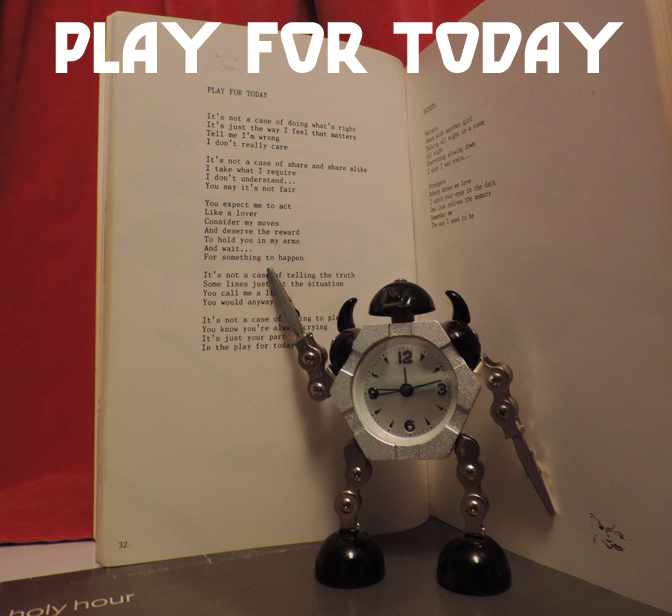
PLAY FOR TODAY

An irregular series, being in the nature of a kind of playlist, ‘now playing’ or similar item, with or without further comment, perhaps to be interpreted as recommendatory, but of course entirely subjective in nature…

Copy? Compliment? Coincidence? Incestuous album covers!

Firstly; if you’re looking at this because of the word ‘incestuous’, shame on you! Anyway, for a variety of reasons, lots of album covers seem to pay tribute to/copy/look like lots of other ones, which is what this is all about.

In the early days of shellac and then vinyl records the sleeve was mainly used to advertise either the record label or sometimes the retailer of the disc within.

sleeves

But this isn’t a history of picture sleeves, interesting though that would be. Once there were music stars who people recognised the faces of, the sleeve became a promotional tool in a far more specific way than before. The main reason initially for ‘lookalike’ sleeves was presumably that artists and/or record labels hoped (and still do) that something that worked for someone else will work for them, artistically and financially and possibly creates a link between the artists in the buyer’s mind. Then there are those who sincerely wish to pay tribute to one of their influences, those who are just unconsciously doing so, and those artists who share a background in a genre/culture etc, and…. well; lots of reasons. Some examples…

1. Blondie – Blondie (Private Stock, 1976) & Kim Wilde – Kim Wilde (RAK, 1981)

comp1
By 1981, Blondie were no longer a cult, punky act, but international superstars. What better inspiration for a kind of pop pastiche of the new wave sound?  In comparison with Blondie, Wilde’s first album is pretty pretty weak, though it does have some great songs on it; if you think Kids In America is great.

2. Kiss – Destroyer (Casablanca, 1976) & Manowar – Fighting the World (Atco, 1987)

comp2
Kiss were tongue-in-cheek cartoonish macho hard rock. Manowar were cartoonish macho metal that was either so completely tongue-in-cheek that they refused to acknowledge the humour of their whole image or else were deadly serious, which is kinda scary; but either way pretty ace. Consciously or not, surely a manly tribute to ‘the old gods’

3. Elvis Presley – Loving You (RCA Victor, 1957) & many, many others including Fabian – The Fabulous Fabian (Chancellor, 1959) and Bryan Ferry – These Foolish Things (Virgin, 1973)

comp29
Right from the start, Elvis’ album covers were to create the iconography of pop/rock music, imitated for commercial reasons by his imitators & later paid homage to by artists who grew up with Elvis as the face of rock ‘n’ roll (see also Elvis’ debut album & The Clash’s London Calling)

4. Joni Mitchell – Blue (Reprise, 1971) & Marianne Faithful – Broken English (Island, 1979)

comp3

Probably coincidental, but both albums are the definitive releases of iconic female singers & were to an extent departures from their previous work, both are good and both pictures are blue innit. Also, although they are both self-consciously posing for a picture, neither artist was concerned with trading on their looks in the way that record labels have traditionally done with both female and male artists (see Elvis etc) from the 1950s onwards.

5. Carpathian Forest – Through Chasm, Caves & Titan Woods (Avantgarde Music, 1995) & Wongraven – Fjelltronen (Moonfog, 1995)

comp26

Not exactly a coincidence; both bands used the same picture by Norwegian folkloric artist Theodor Kittelsen (1857-1914), iconic in the black metal scene ever since his drawing Fattigmannen was adopted by Varg Vikernes for Burzum’s Hvis Lyset Tar Oss in 1994

6. Jan & Dean and Friends- The Heart & Soul of Jan & Dean & Friends (Design Records, 1964) & Mel Torme – I’ve Got The World On A String (Allegro, 1964?)

comp4

A strange one, presumably these were both budget releases & the labels sourced the attractive but irrelevant artwork from an image library.

7. The Beatles – Sgt Pepper’s Lonely Hearts Club Band (Parlophone, 1967) & The Rolling Stones – Their Satanic Majesties Request (Decca, 1967)

comp5

A notorious pairing, the Stones, famously at a bit of a dead end, tried to emulate the feel & popularity of Sgt Pepper with the extremely lavish holographic (etc) artwork of Satanic Majesties, but it didn’t really work. A much better album than it’s reputed to be however.

8. David Bowie – Aladdin Sane (RCA, 1973) & Jobriath – Creatures of the Street (Elektra, 1974)

comp6

It’s fair to say that Jobriath was influenced by Bowie in pretty much every aspect of his early recording career, but although Creatures… (mentioned elsewhere in this blog) is an interesting but not great LP, the front cover is, alas, just a little bit ridiculous by comparison with Bowie at his iconic peak.

9. The Byrds – Mr Tambourine Man (Columbia, 1965) & The Jimi Hendrix Experience – Are You Experienced (Track Records, 1967)

comp27This comparison really traces the advance of psychedelia from a mild distortion of perception to a neon-coloured hallucination over the two years 1965-67

10. The Smiths – The Smiths (Rough Trade, 1984) & UK indie music in general (here; The Wedding Present – George Best (Reception Records, 1987) & Belle & Sebastian – The Boy With The Arab Strap (Jeepster, 1998)

indie

The Smiths (mainly, one presumes, Morrissey) cared about the appearance of their records in a way that few artists have, and the relatively brief period of their recording career (83-87) means that their oeuvre has a unified completeness which is both rare and pleasing; presumably if they had gone on forever they would have tried something new at some point. The look (as well as the sound) of The Smiths had an immediate and lasting impact on the UK indie scene; although The Wedding Present (often characterised as the Smiths fans’ second favourite band)’s classic George Best doesn’t look especially like a Smiths album, the whole aesthetic seems to come from a similar (if slightly less glamorous) source. Stuart Murdoch of Belle & Sebastian seems to have, like Morrissey, a complete vision for the way his band should be and to date the B&S discography has a distinctive (and slightly Smiths-like) appearance. A good proportion of UK indie sleeves still have a very post-Smiths appearance (as does the output of the great My Little Airport from Hong Kong)

11.. Iron Maiden – Number of the Beast (EMI, 1982) & Megadeth – Peace Sells… But Who’s Buying (Capitol, 1986)

comp7

Iron Maiden’s Eddie has influenced the covers of thousands of heavy metal LPs throughout the 80s (and to the present day) but Megadeth’s Vic Rattlehead is probably the most blatant homage & Peace Sells… is probably their best album cover of the era.

12. Bob Dylan – Bob Dylan (Columbia, 1962) & Donovan – What’s Bin Did and What’s Bin Hid (Pye, 1965)

comp8

Despite their essentially very different styles, Pye Records was determined to use the surface similarities between the two young folksters to promote Donovan as the British Bob Dylan and to that end, What’s Bin Did… features an informal Dylanesque photo as its cover image.

13. Poison – Look What The Cat Dragged In (Capitol, 1986) & Dogs D’Amour – In The Dynamite Jet Saloon (China Records, 1988)

comp9

Although the rougher, more rock ‘n’ roll-glam oriented Dogs D’Amour were less influenced by Poison than bands like Tigertailz were, the layout of their least all-over-the-place album is, by accident or design, a scuzzy-glam echo of Poison’s more Hollywood-looking debut.

14. Randy Newman – Randy Newman (Reprise, 1968) & Elton John – Elton John (DJM, 1970)

comp10

It may be no coincidence that Elton John, with one not-massively-successful album behind him and a few years away from his outrageous glam-era costumes etc should seemingly model the cover of this, his breakthrough album, on Randy Newman; dour, unflamboyant , thus far critically and commercially neglected, but already an artist’s artist. It worked better for Elton.

15. Carnivore – Retaliation (Roadrunner, 1987) & Sodom – Persecution Mania (Steamhammer, 1987)

comp11

Presumably a coincidence, both of these albums are speed metal classics, although Carnivore are less well remembered than Sodom (who, to be fair are still going). The passing resemblance of these covers probably says as much about the atmosphere of the Cold War era as it does about metal.

16. The Beatles – With The Beatles (Parlophone, 1963) & The Nazz – Nazz (SGC, 1968)

comp12

As with the aforementioned Elvis sleeves, every picture of The Beatles in their early years was influential, and none more so than the cool, simple sleeve for With The Beatles. Even so, it’s somewhat surprising to see its influence lingering as late as the psychedelic era, when Todd Rundgren’s Nazz released their debut (which arguably is modelled on the early covers of The Rolling Stones as much as The Beatles. But then the early Stones albums wouldn’t have looked as they do without The Beatles either.

17. The Rolling Stones – Sticky Fingers (Rolling Stones, 1971) and Mötley Crüe – Too Fast For Love (Leathür Records, 1981)

comp13

Although only a passing similarity, Motley Crue inherited much of their spirit and attitude from the Stones and the cover of their debut is appropriately a more in-your-face updating of the classic Stones artwork.

18. David Bowie – “Heroes” (RCA, 1977) & Iggy Pop – The Idiot (RCA, 1977)

comp14

Not a coincidence, Bowie & Iggy Pop worked closely in their Berlin period & both were influenced by German Expressionism, here in particular by Erich Heckel’s painting Roquairol. Iggy’s album is a bit better than Bowie’s though; if only he had worked with Eno!

19. Kate Bush – Never For Ever (EMI, 1980) & Toyah – Anthem (Safari, 1981)

comp15

Anthem was probably Toyah’s best album; a nice mix of post-punk and new wave/synth pop influences, but despite her strong image she was never as individual or idiosyncratic as Kate Bush, although the fairytale-ish album cover suggests some similarity.

20. Charles Lloyd – Geeta (A&M, 1973) & Weather Report – Black Market (Columbia, 1976)

comp16

Charles Lloyd started out as a pretty standard post-Coltrane bop-saxophone player, specialising in ‘chamber jazz’, but by the early 70s he, like jazz in general, had become interested in fusion and elements of world music, reflected in the artwork for Geeta. That was pretty much where Weather Report came in, and although mostly Miles Davis influenced, Black Market has, coincidentally or not, a certain Charles Lloyd-ish quality.

21. Witchfynde – Give ‘Em Hell (Rondelet, 1980) & Venom – Black Metal (Neat, 1981)

comp17

More a case of shared influences than anything else, both Witchfynde and Venom came from the New Wave Of British Heavy Metal and had an interest in the occult and biker rock. Cheap, effective visuals were pretty much an essential part of the NWOBHM, with even early Iron Maiden artwork having a somewhat rough & ready charm.

22. Tigertailz – Young & Crazy (Music For Nations, 1987) & Britny Fox – Britny Fox (Columbia, 1988)

comp28

>It’s slightly unlikely that foppish Rococo glamsters Britny Fox would be influenced by Wales’ super-glam Tigertailz, but both bands, despite their idiosyncracies, were drawing from a pool of shared glamorous male influences, going back in pop music to the 70s, but historically back to 16th (and in the case of Britny fox, specifically the 17th/18th) century.

23. The Rolling Stones – Rolling Stones No. 2 (Decca, 1965) & The Dead Boys – We Have Come For Your Children (Sire, 1978)

comp18

Arguably the Stones cover here has its roots in With The Beatles, but the Stones brought their own surly charisma to the style and it was this that The Dead Boys channelled for their version of (in this case punk) rock, and the cover for their second album seems to pay homage to the Rolling Stones’ second.

24. Mayhem – Live In Leipzig (Obscure Plasma, 1993) & Darkthrone – Transilvanian Hunger (Peaceville, 1994)

comp19

Strictly this should be a comparison of Live in Leipzig with Darkthrone’s A Blaze in the Northern Sky (1992), but although A Blaze... pre-dated the release of the Mayhem album (recorded in 1990), the cover picture of Per Yngve “Dead” Ohlin used for the release of Live in Leipzig was well known in the Norwegian black metal underground and indeed, photographs of early Mayhem were, despite King Diamond, Sarcofago etc, pretty much the basis for the 90s Norwegian black metal aesthetic.

25. Jobriath – Jobriath (Elektra, 1973) & David Bowie – Diamond Dogs (RCA, 1974)

comp20

Although it seems unlikely (to say the least) that Bowie would be influenced by Jobriath, there is a slight passing resemblance between the excellent, slightly creepy gatefold artwork of Jobriath’s much hyped but unsuccessful debut and Bowie’s superlative dark glam masterpiece; possibly more to do with a shared influence of traditions of depicting the male nude than anything else.

26. David Bowie – Ziggy Stardust era appearance (1972-4) & Leslie R McKeown – All Washed Up (Ego Trip, 1978)

comp21

Although not based on any single image of Bowie, ex-Bay City Rollers frontman Les McKeown’s first solo album & singles showcased an image clearly based on the glam-era Bowie of a few years earlier.

27. Venom – Welcome To Hell (Neat, 1981) & Dødheimsgard – Monumental Possession (Malicious, 1995)

comp30

Hardly a coincidence; a large part of black metal’s satanic iconography was brought to the genre by its inventors, and the cover of Venom’s debut has been paid homage to by metal in general more times than almost any other image apart from Iron Maiden’s Eddie

28. David Bowie (again) – Space Oddity (RCA, 1972 reissue) & Marc Bolan & T-Rex – Zinc Alloy and the Hidden Riders of Tomorrow (EMI, 1974)

comp22

It’s no surprise to see as visual an artist as Bowie featuring repeatedly in this list, but here he seems to have influenced his glam predeccesor and friendly rival Marc Bolan; Whereas earlier T-Rex albums had pioneered Bolan’s fey/fairytale glam image, by ’74 his music had become tired and limited (and ego-centric; T-Rex was now appended to the artist’s name rather than being an entity in its own right) in comparison with that of his old friend Bowie, and Zinc Alloy ( yep :/ ) was all-too-transparently influenced by Ziggy Stardust. The cover, however, seems more influenced by Bowie’s covers for Aladdin Sane and the glam-era reissue of his 1969 album, retitled Space Oddity. Given the slight deterioration of Bolan’s pixie-like charm, Zinc Alloy is unfortunately a less than bewitching or otherworldly sleeve.

29. Steeler – Strike Back (SPV, 1986), Helter Skelter – Welcome to the World of Helter Skelter (Metronome, 1988) & Pretty Boy Floyd – Leather Boyz With Electric Toyz (MCA 1989)

comp23

Presumably coincidence based on the common language of 80’s metal (but ultimately traceable back to Kiss in the mid-70s), both Helter Skelter and Pretty Boy Floyd’s late 80s glam-pop masterpieces have ludicrous paintings of the artists on them, very similar in style to German metallists Steeler’s 1986 opus Strike Back. Strangely, the Helter Skelter painting is by Games Workshop legend John Blanche, better known for the kind of dark fantasy images used in Warhammer etc (but also showcased on the cover of Sabbat’s classic UK thrash album History of a Time to Come.) The sleeve for Strike Back seems to be the first updating of this kind of thing since the classic Ken Kelly Kiss covers(!) from the 70s (see above).

30. Eric Carmen – Eric Carmen (Arista, 1975) & John Travolta – Can’t let You Go (Midland, 1977)

comp24

Ex-Raspberries frontman Eric Carmen’s debut solo album is best remembered for ‘All By Myself‘, but it was a strong album that revealed an excellent songwriter and performer with an eclectic range, from the Brian Wilson-esque ‘Sunrise‘ to the near-classical arrangement of that famous hit. John Travolta’s Can’t let You Go was released just as the young actor became a star with Saturday Night Fever and is, not surprisingly wet, bland, funky disco-lite with some soppy ballads thrown in. The covers of both albums showcase the sensitive (and in Travolta’s case, nakedly vulnerable) side of the young stars.

31. Cheap Trick – In Color…and in Black & White (Epic, 1977) & M

ötley CrüeGirls, Girls, Girls (Elektra, 1987)

comp25

Ten years on from Cheap Trick’s In Color… one of the great hard/pop-rock albums of all time, came one of Mötley Crüe’s best, at the time notable for a (slight) toning down of the band’s glam image. The Crüe cover lacks the humour of Cheap Trick’s (admittedly not really evident in the front image only; the back cover has the band’s two quirkier-looking members on non-motor cycles), but is iconic in its own decadent, 80s way….

32. Pink Floyd – Animals (EMI/Harvest, 1977) & The Orb – The Orb’s Adventures Beyond the Ultraworld (Big Life, 1991)

pinkorb

An explicit homage, Dr Alex Patterson’s original vision for The Orb was inseparable from the psychedelic explorations of Pink Floyd. Admittedly, by 1977, the spirit of the prog legends’ optimistic experimentation had mostly evaporated, but the Animals sleeve, with its giant inflatable pig drifting over Battersea Power Station remains an iconic, dreamlike and good-natured image which, by 1991 seemed ripe for an update.

33. Genesis – A Trick of the Tail (Charisma, 1976) & FFWD – FFWD (Inter-Modo, 1994)

proggz

As with The Orb’s music above, FFWD (Robert Fripp, Thomas Fehlmann, Kris Weston, and Dr. Alex Paterson)’s 1994 ambient/prog/experimental album bears a resemblance (only slight in this case) to an album which was fundamentally different from the prog that inspired it. Indeed, the FFWD album seems to be influenced more by the ambient works of Eno than by a progressive band like Genesis (or Fripp’s King Crimson for that matter), but there is at times an atmosphere of pastoral whimsy that recollects the Peter Gabriel-era Genesis of Nursery Cryme or Foxtrot, far removed from the glossy, accessible rock of the Phil Collins-led Trick of the Tail. But that album’s cover has an archetypical prog feel, even if the album doesn’t, and so does the sleeve of FFWD.

<

FIN

WAIT! Best releases of 2015; those glaring omissions in full*

*disclaimer; not in full

I somehow forgot these eminently worthy records when compiling my end of year list and I couldn’t leave them out. So much for brevity!

Gentlemans Pistols – Hustler’s Row (Nuclear Blast)

Gentpis‘Retro’ without being an exercise in pure nostalgia, Hustler’s Row was that rare ’70s hard rock’ styled album that doesn’t feel like its trying to be any band other than themselves; and most importantly, the songs are up to the standard of those bands that lesser artists try so hard to emulate.

Troyka – Ornothophobia (Naim Jazz Records) troyka-ornithophobiaTricky, angular and unfunky jazz that is the opposite of background muzak; unless you want to feel perturbed. Not at all relaxing, not exactly exhilarating, but strangely addictive.

Bolder Damn – Mourning (reissue, Guerssen Records)

BolderFirst proper issue of this 1971 Florida obscurity; songs are ‘fine’ rather than great, but really its appeal is all about Blue Cheer-inspired, Grand Funk-flavoured heavy hippy fuzz and period atmosphere.

Rachel Grimes – The Clearing (Temporary Residence Records)

TRR242LP_Jacket_RE11183Ominous, brooding and sometimes awkward chamber music; initially it felt a bit perfunctory, but then kept recurring in my head after I thought I’d forgotten all about it in a way that felt significant. And it grew from there

Godhole – Godhole (Mind Ripper Collective)

godho This double EP kind of converted me to powerviolence, a genre that never really held my attention before; seismic, unpleasant noise for sure, but feeling and substance too; this never becomes background in the way pure noise can. The Anthrophobia collaboration with Crozier is equally worthy of attention, for the same reasons.

And more of those honourable mentions…

Colin Stetson & Sarah Neufeld – Never Were The Way She Was (Constellation Records) – kind of sparse & bleak, but sometimes violin, saxophone & clarinet is all you need

Gorgoroth – Instinctus Bestialis (Soulseller Records) – Not the best-ever Gorgoroth album, but pretty strong; and I love Infernus’ guitar playing

Steve Vai – Stillness in Motion – Vai Live in LA (Sony) – somehow not boring; shocked.

Melechesh – Enki (Nuclear Blast) – thrashy, middle-eastern inflected black metal nastiness; as good as anything they’ve released.

Pete Oxley & Nicolas Meier – Chasing Tales (MGP Records) – two brilliantly contrasting guitarists at their best

Napalm Death – Apex Predator – Easy Meat (Century Media): another intelligent, informed and powerful Napalm Death album; still at the top of their game after 15 albums

Spiritual Beggars – Mantra III (reissue) (Sony) – welcome reissue of the classic Swedish stoner/psych masterpiece

Inquisition – Into The Infernal Regions Of The Ancient Cult – Reissue  (Season of Mist) – okay, a reissue, but a very welcome reminder of one of the cornerstones of atmospheric (but very un-soft) black metal

An Autumn For Crippled Children – The Long Goodbye (Wickerman Recordings) – This album didn’t really improve on the excellent Try Not To Destroy Everything You Love, but its mixture of desolate, atmospheric shoegaze-influenced music and harsh BM bits was just as effective.

Venusian Death Cell – Honey Girl (self-released) – People always seem to think I’m joking when I recommend VDC, but I’m not

Bjork – Vulnicura (One Little Indian) – More personal, revealing and emotional than most recent-ish Bjork albums, not sure if I prefer it to Biophilia though.

Blasphemic Cruelty – Crucible of the Infernum (Hells Headbangers) – a short blast from the depths of the US underground, Blasphemic Cruelty have lost none of their power or potency; and their musicianship is outstanding.

Night of the Demon –  Curse of the Damned (Steamhammer/SPV) – There was a LOT of 80s nostalgia in 2015, but metalwise this was one of the best; NWOBHM-influenced metal with heart and looking like a release from Mausoleum Records c.1987; nice

Acherontas – Ma-IoN – Formulas of Reptilian Unification (World Terror Committee) – The orthodox black metal revival lumbered/wafted on throughout the year, producing lots of great albums along the way; like this one.

Árstíðir Lífsins – Aldafǫðr ok Munka Dróttinn (Van Records) – A sombre, wintry collection of folk/classical/BM influenced songs

Leviathan – Scar Sighted (Profound Lore) – pretty much the album fans expect from Wrest at this point, but none the worse for that; brooding, stern, focussed and never comforting.

Goat Semen – Ego Svm Satana (Hell’s Headbangers) – Long awaited and worth the wait, but for me their 2007 live album had an unnerving, sweaty intensity that puts it just ahead of this

Mastery – Valis (The Flenser) – invigoratingly unpleasant, yammering, disorientating black metal noise

Tribulation –  The Children of the Night (Century Media) – melodramatic, cinematic but catchy black metal; like Watain used to make

Drudkh – A Furrow Cut Short (Season of Mist) – For me, probably the 3rd best Drudkh album, but that only shows how great they are; post-Burzum black metal at its best

Blaze of Perdition – Near Death Revelations (Agonia Records) – A good, strong album imbued with a feel of grim, hard-won authenticity