
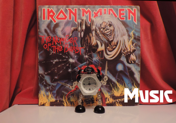
A short month, but full of things, not least my own birthday! So plenty of stuff to discuss…
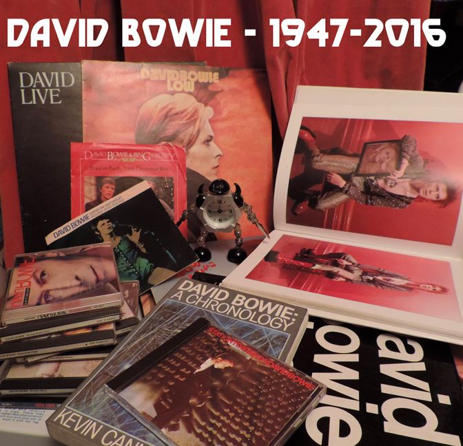
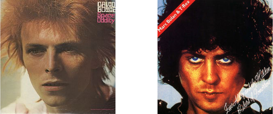
Unfortunately, David Bowie is still dead and in fact has been more productive than ever as a commercial entity, as music, magazines, TV shows, pop stars and books pay tribute to the great man.
One of the more unusual books to appear in the wake (sorry) of Bowie’s death is the (big even for a coffee table) book: produced by the personalised gifting website ijustloveit.co.uk:
David Bowie: A Newspaper History
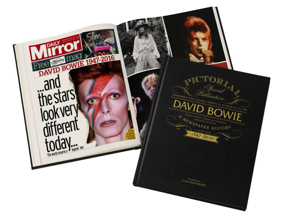
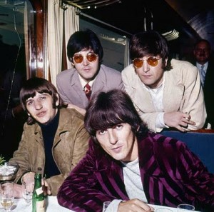
Published in a large (indeed, tabloid newspaper) format, but with an embossed leather cover, David Bowie: A Newspaper History is an extremely fascinating but mostly not at all heartwarming memento of a career of dazzling highs and normal human lows as seen through the distorting lens of The Daily Mirror; revealed here – in case you didn’t suspect it – as a sensationalist tabloid that never really understood anything about the man except for his fame and newsworthiness. Although there is some introductory scene-setting concerning the outrageously long-haired Bowie of 1965 (with a great full-page photo) and a brief snippet about his Man Who Sold The World man-dress, the book really takes off, as one would expect, in 1972, when Bowie became a household name after the Ziggy-era singles began to chart, to the bemusement of the older generation and, one assumes, the readers of the Daily Mirror.
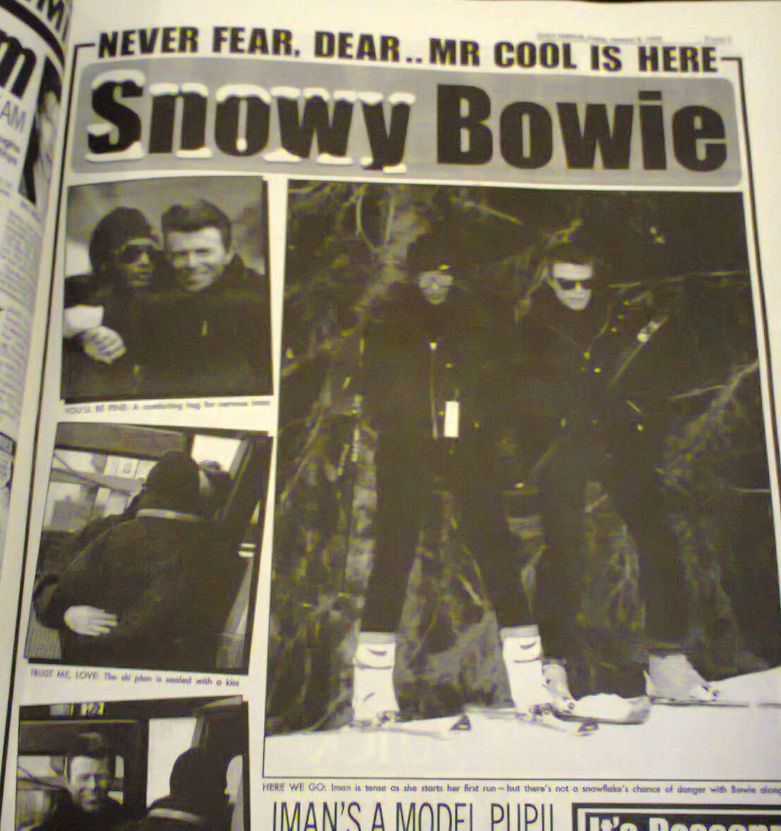
For the next few years, the Mirror veers between the predictable extremes of fashion icon idolatry and ‘has-he-gone-too-far?’ tabloid outrage. So we see David and Angie, the toast of the fashion world, David and Lulu, the ‘odd couple’, ‘Bowie Goes Straight!’ as glam rock dies, depressingly muck-raking coverage of David and Angie’s separation (“ZOWIE: boy in the middle”), rumours about his love life, innuendo about his drug use, continuing surprise at the longevity of his career and good health. What makes the book so fascinating is that the Bowie stories are framed with whatever else was going on at the time; political scandals, murder, adverts for banks, cheap chicken, New Mirror Bingo, all giving a vivid and immediate contemporary context that a biography can only do justice through exposition and anecdote. It also incidentally shows how central Bowie was, and continued to be, to popular culture in the 70s and 80s; film and television, Live Aid, riots in Brixton, new advances in technology and marketing (‘Vote for the songs you want to hear on Bowie’s 1990 tour’); Bowie was there, leading, following, keeping his distance or taking part; it’s no wonder his absence is felt so keenly.
If the tabloid culture of the 70s and 80s was deplorable but kind of fun in its eminent shockability, worse was to come in the 90s. The Mirror may(?) have been a cut above The Sun or News of the World, but its journalism epitomises the tabloid culture where anything private is ‘secret’, non-married partners are invariably ‘lovers’ and the language used is a bizarre mixture of pedestrian illiterate-friendly English, salacious puritanism and puerile baby-talk. From being the ‘bizarre pop phenomenon’ of the 70s and ‘pop chameleon’ of the 80s, Bowie now becomes just ‘rock star David Bowie’ and the Mirror wants to have its cake and eat it; being shocked and condemnatory where there is suspicion of drug use or disharmony between Bowie and ex-bandmates, shocked/amused by anything vaguely unusual that Bowie said/did/wore (We can be hairdoes..), but also devoting ‘heartwarming’ stories to anything that normal famous people do; a full page is devoted to the birth of his daughter (Daddy Stardust) and his recovery from heart surgery (I AM HUNKY DORY).
In amongst all this are a some genuinely interesting pieces; a fairly short and shallow interview with Alun Palmer in 2003 is fascinating because the Mirror wanted to know about things that NME, Mojo etc didn’t; his health, his personal life, his smoking; everything in fact except the actual music he was making.
In more recent times it all becomes a bit reprehensible; Aladdin Retirement (2012) attempts to pry into his private life and quotes nameless ‘friends’ about his desire to avoid the limelight without the slightest sense of irony or self-awareness. Even worse are the frankly vile speculations by ex-music journalists who should know better concerning his flurry of activity in 2013 (DOES A TRAGIC REASON LIE BEHIND THE THIN WHITE DUKE’S RETURN?) which fizzle out as Bowie doesn’t die and the paper loses interest, instead satisfying itself as usual with photos of Bowie caught off-guard, looking normal and, sin of sins, his age.
And then, inevitably, comes Blackstar (Album of the Week no less; actually a very good review) and then the obituaries; the hypocritically respectful overviews of his life and career intercut with whatever snippets and details they could get on the state of his health during the final months of ‘secrecy’ while he fought cancer.
David Bowie: A Newspaper History is a fascinating, absorbing book. Fans, people who have followed Bowie’s career and work will find in it hundreds of photographs they may not have seen before, the kind of stories that don’t make it into serious biographies, but also a peculiar parallel universe where their hero is distorted into somebody that only unbelievers will recognise; David Bowie the ‘superstar’.
Highly recommended; in an odd way it’s a very fitting memorial to a life lived in public, even if it leaves a funny, slightly bitter taste in the end.
Some music that occupied the ears during February:
The reliably interesting Folkwit Records have a few excellent new releases:
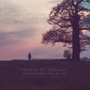 Astrophysics Saved My Life is the second album by folk-rock group Rivers of England and it’s a rich, accessible and pleasant album that wears its unorthodox aspects very lightly. The most audible reference point is less folk (let alone ‘folk rock’) and more the jazzy John Martyn of Solid Air, although Rivers of England’s sound is never quite as unearthly as that comparison suggests, not least because singer/songwriter Rob Spalding has a David Gray-like (though not David Gray-sounding) directness in his vocal performances that is very different from John Martyn’s allusive, intuitive delivery. It’s a strong set of songs that seems set for mainstream success; they would be an eminently suitable festival band, so hopefully they should be on some main (or at least big) stages this summer.
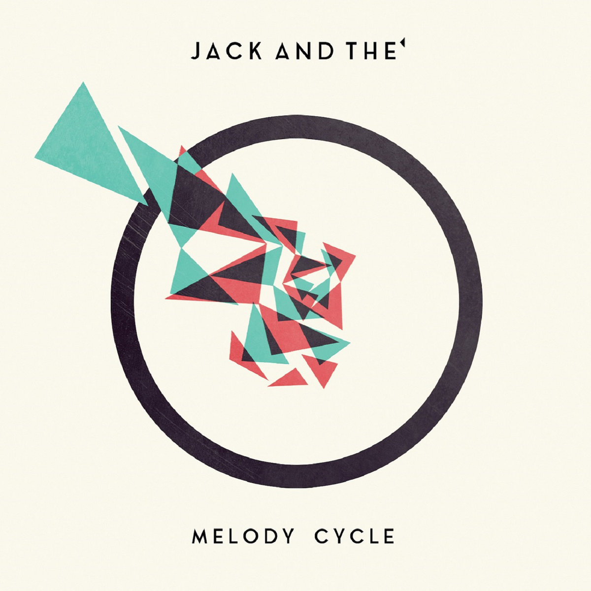 Less ‘normal’ and slightly more my cup of tea is Melody Cycle by Jack And The’, the musical project of Edinburgh-based French multi-instrumentalist Julien Lonchamp.
The album presents, in beautiful widescreen clarity, a kind of incidental-TV-music-baroque-jazz-pop that has a breezy charm that veers towards twee-ness at times, but is so brilliantly orchestrated that its complexity never overwhelms its sunny, life affirming quality. If you imagine The Beach Boys’ immortal ‘Aren’t You Glad‘ being played by a French version of Cornelius’ old band Flipper’s Guitar aided by Roy Wood-era ELO on strings and woodwind and you are not only being weird but possibly getting close to the sound of Jack And The’; better just to listen to Melody Cycle though, that way you’ll know exactly what it sounds like.
Away from Folkwit, I fell in love with sound artist Lisa Busby‘s superb Fingers In The Gloss, lutenist Josef van Wissem‘s beautiful new album When Will The Bright Day Come and the Iggy Pop/Tarwater/Alva Noto Walt Whitman release Leaves of Grass and some great songs by awesome synth-punk/pop duo Sex Cells but as I’ve written about those in depth on the brilliant site Echoes and Dust I shan’t discuss them further here; but check them out though. Also great is the new Hexvessel album, When We Are Death, see the new issue of Zero Tolerance Magazine (issue 071) for more on that, including my interview with frontman Mat McNerney (also of Grave Pleasures, CODE, DHG etc)
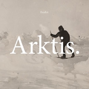
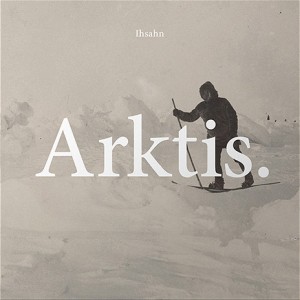 In a heavier vein than the Folkwit records, my favourite metal musician Ihsahn is preparing to release his new album Arktis. through Candlelight Records. Where Das Seelenbrechen (my favourite Ihsahn album to date) mixed avant-garde electronica, classic songwriting, Scott Walker-ish experimentation and rock and metal elements, Arktis. feels like a true successor to the first two Ihsahn albums, The Adversary and angL. It’s an unashamedly, exuberantly heavy metal album for the most part, and while it isn’t without experimental elements it feels like Ihsahn is concentrating more on songwriting, the riff and having fun; and it’s great.
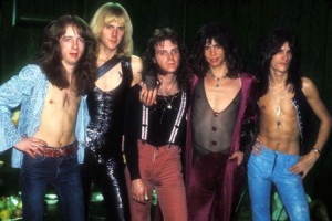
 Speaking of unashamed heavy metal, an unexpected treat to (belatedly) come my way was the latest albums by Scottish NWOBHM legends Holocaust. Released through Sleaszy Rider Records, Predator is 100% a classic metal album, displaying that the band have lost none of the fire or power that brought them to the world’s attention with The Nightcomers back in 1981. As with fellow NWOBHM survivors Saxon, the band’s approach bears little resemblance to the kind of nostalgic pastiches of 80s metal made by so many modern ’80s style’ bands, instead drawing on the same impulses that made the NWOBHM so vital in the first place; passion, skill, good songwriting and an absolute disregard for the dictates of fashion.
Predator isn’t only a great set of songs, it’s a heavy metal album for the twenty-first century and not just for ageing metal warriors longing for the golden age of their youth. They will like it too though.
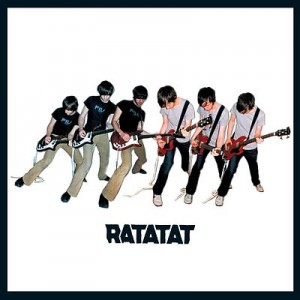 Away from current releases, birthday presents allowed me to overdose on the works of RATATAT, specifically their perfect debut album as well as LP3 and LP4. RATATAT are an interesting band to study chronologically, since their work manages to be both hard to label and surprisingly homogenous in itself. LP3 feels like the most experimental of the three (of all their albums in fact), but it’s a slightly deceptive perception, since LP4 was mostly recorded in the same sessions, so it’s mostly a matter of selection. It feels as though the duo are attempting to explore all of the possibilities within a fairly narrow range of sounds/styles and since their latest album Magnifique (2015) is perhaps their best to date, they hopefully still have plenty of exploring to do.
 Going back in time, but never sounding more relevant than it does in 2016, Public Enemy‘s immortal It Takes A Nation Of Millions To Hold Us Back was being played probably too loud in my earphones for much of the month. Listening to Chuck D’s incredible delivery on songs like Louder Than A Bomb (to me one of the best rap performances I’ve heard) two things spring to mind; firstly that Chuck D has the perfect balance between power/authority/style and coherently getting his message across, and secondly that, from the perspective of Public Enemy in 1988, the USA in 2016 is probably both better and worse than they could have foreseen.
If all Public Enemy had done was to inform and warn though, they would certainly have been important, but they wouldn’t necessarily have been one of the great musical groups of all time; It Takes A Nation Of Millions… is also a superb album just as sound. Terminator X’s innovative sampling and superlative turntable skills and Flavor Flav’s irrepressible personality bring as much to the album as Chuck D’s more authoritative persona and it’s no surprise that the album was embraced by kids and critics, people of all races and nations; that’s what classic albums do.
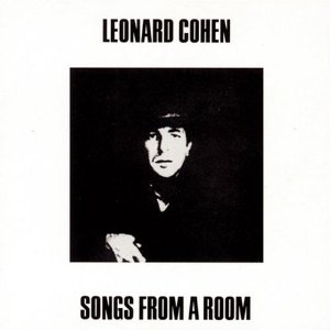 Older still, Leonard Cohen‘s Songs From A Room is an album I knew but didn’t own and it seems as good a place as any to start with his work. Strangely, I mainly know the songs from trying to learn to play the guitar with them (I can’t remember why, but the songbook for Songs From A Room and a Songs of George Formby were the only two chord books I had for years; sounds like a charity shop purchase). Maybe it’s because I spent large chunks of late adolescence listening to Joy Division, Cranes, The Smiths etc, but I don’t find Leonard Cohen at all depressing; and really, if as people often claim apologetically, ‘he isn’t really a singer, he’s a poet’, then what is Bob Dylan, or even Lou Reed? Cohen’s voice may not be flamboyant, but it’s inherently musical, and it delivers his emotionally complex lyrics with perfect clarity. The musical sparseness of the album too is a plus, stripped of late 60s ornament, it is timeless and beautiful.
I read some books in February too.
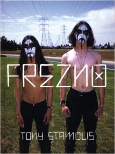
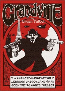 An extremely fun, quick, easy but not simple read was the first volume of Bryan Talbot‘s graphic novel series Grandville. Named in honour of the French caricaturist Grandville* the series consists of old fashioned ‘scientific romance thrillers’ that are part pointed steampunk satire, part Rupert the Bear; a very satisfying mixture as it turns out, and beautifully designed and drawn too. As it happens, Bryan Talbot had already drawn possibly my favourite ever steampunk comic art in his tenure as artist on Nemesis The Warlock in 2000AD comic. His ‘Gothic Empire’ episodes are beautifully atmospheric, some of the finest artwork from one of 2000AD’s golden ages.
*Jean Ignace Isidore Gérard; Freddie Mercury was also a fan, the imagery of his final Queen album Innuendo was influenced by Grandville
 Another book with pictures is the brilliant Vivia
 n Maier: Street Photographer edited by John Maloof and published by powerHouse Books. Another beautifully designed book, it collects the amazingly evocative street photos of Vivien Maier, taken from the 1950s onwards but not discovered until after her death in 2009. As a record of the minutiae of everyday life in big cities in days gone by, her photographs would be valuable enough; but they are also the testament to a genuinely remarkable photographic talent, a photographer who knew exactly what would make a good picture and how to capture it, both naturally and strikingly.
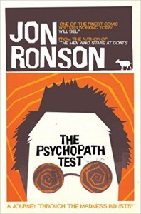 As February ends, I’m reading Jon Ronson‘s now famous The
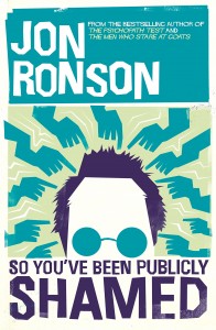 Psychopath Test. A superb and funny investigation into the nature of madness of various types, it retrospectively suffers a little from its own success, the ideas and stories having been widely disseminated since publication (Channel 4’s Psychopath Night etc) and on the whole I think I prefer his latest, So You’ve Been Publicly Shamed (recently published in paperback) which should be made mandatory reading for anyone who uses social networking sites or thinks that the world needs to hear their opinion. It’s genuinely one of the best books I’ve read in a long time and manages to say something new and meaningful about the ways the world has changed over the last few years while no-one was paying attention, except to their computers and phones.
Oh; here’s five minutes of your life you’ll never get back:
https://www.youtube.com/watch?v=jsBAmwSgX7w
Anyway, onwards: March!


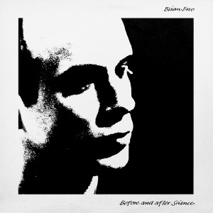
 The Gouster Sessions 1974 (fragment) – This is so frustrating, tantalising and great; the song fragments; Shilling the Rubes, I Am A Lazer, After Today and the rough version of Young Americans come from what is currently my favourite Bowie period and the recording has just a little more grit than the finished album. Bowie and his band sound on top form and the bits of studio banter sound amazingly relaxed and fun given Bowie’s apparent drug intake and exhaustion during that time. I wish the full sessions would turn up and be released.
 (and Diamond Dogs in general) for years (its only fairly recently been supplanted as my favourite Bowie album by Young Americans) and I’m not sure that he ever sang a song better than this. The part in the first verse where he sings ‘I looked at you and wondered if you saw things my way’ over the ominous churchy organ part (so to speak) is to me one of the greatest moments in all Bowie-dom. Hugely atmospheric, perfectly articulated and chilling/moving/ominous. For years I thought the chorus (or semi-lack thereof) let the song down, but I’m not so sure now.
 Word on a Wing (from Station to Station, 1976) – Speaking of ideologically dubious Bowie material, Station to Station must be one of the creepiest albums ever recorded by a mainstream pop artist; not least because its melange of decadent European culture, emotional withdrawal and exhaustion and overtones of religious and magical yearning are imbued with a dark romanticism. Word on a Wing is just beautiful and weary though.
 seems not to have been (in his music at least, but see below) an especially nostalgic person. But writing the music for the TV adaptation of Hanif Kureishi’s 70’s-set drama allowed him to look at his early work as others saw it, and this breezy yet yearning song is extremely moving, if you’re me.
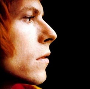 Lady Stardust (from Ziggy Stardust & the Spiders from Mars, 1972) – A beautiful, brilliantly produced and performed song that exemplifies everything glam-era Bowie stood for; sexy, glamorous, gender-ambiguous and an immaculate pop song too. Sigh.

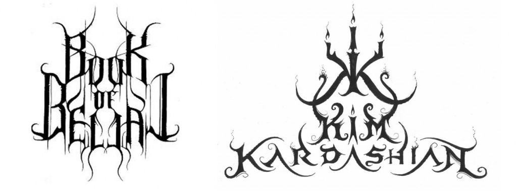
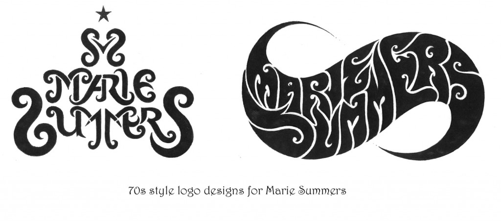
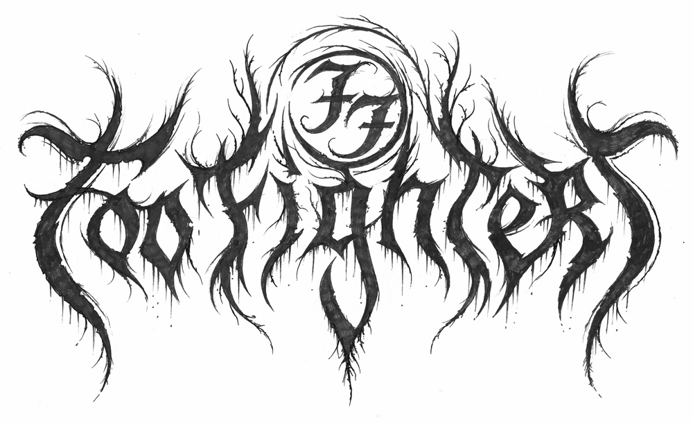
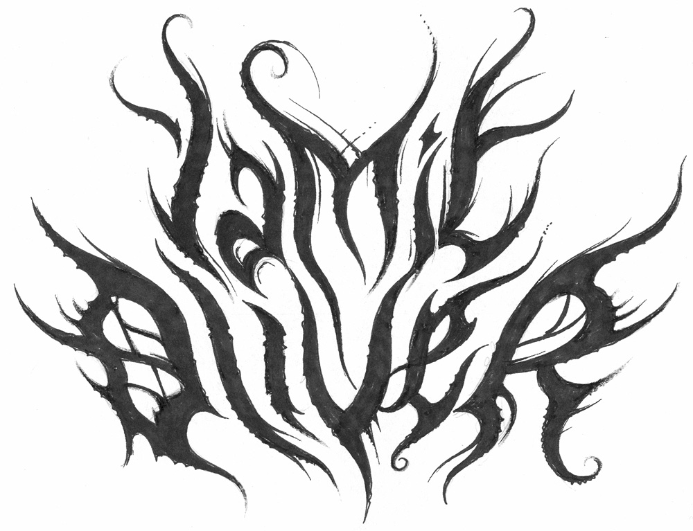
 much bigger public. And at the moment I’ve been thinking about, just for fun, working on a Beyoncé logo, because she is so much talked about. So there’s this whole series of pop culture logos, I did EastEnders, Coronation Street, Emmerdale, Shortland Street. So I had some real fun exploring the mainstream. But the metal public is always the most receptive to my work. It’s my public, it’s the one who collects my work. A lot of people who see my work who haven’t been acquainted with the metal scene say that it’s not something they would be going for. Or that it’s nice but it’s grim.
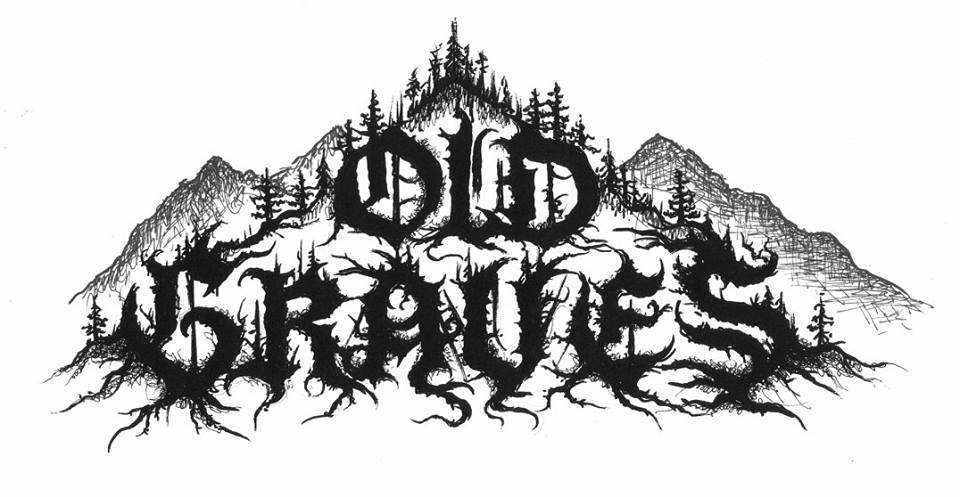
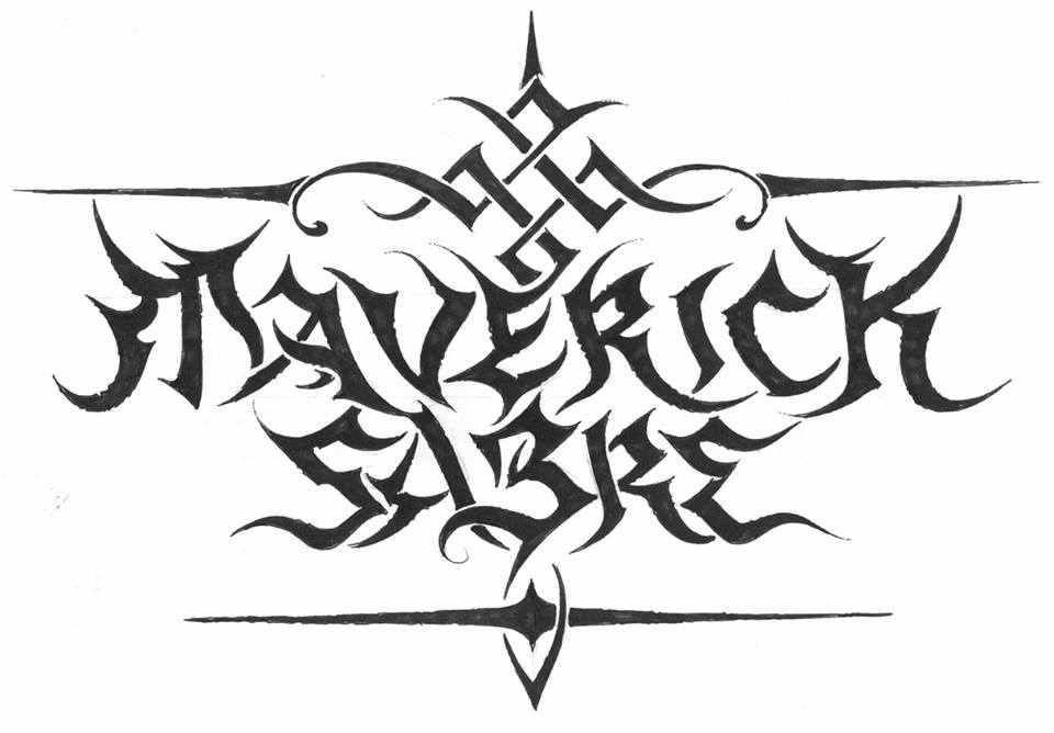
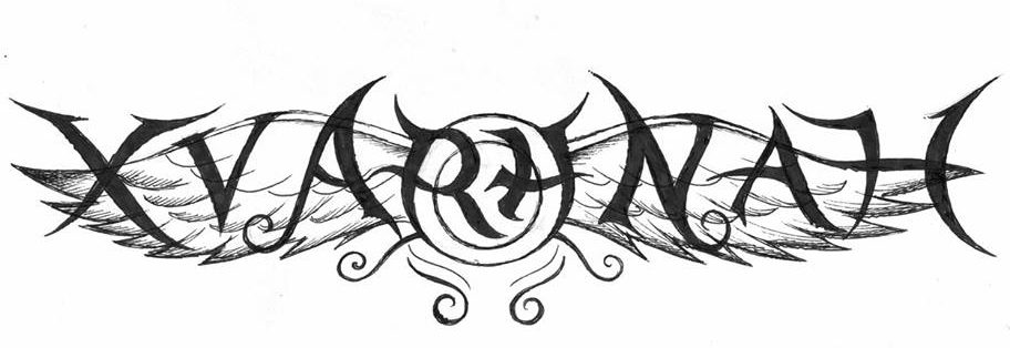


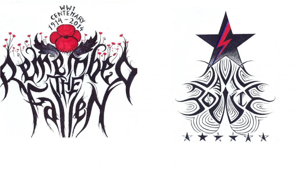
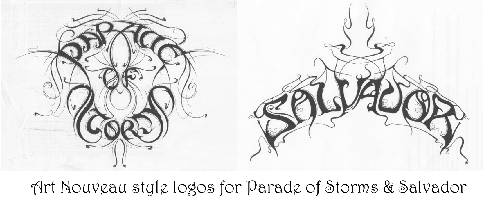

 he new logos is a real travel through time and dimension. So there is a timeline, beginning with really primitive logos I have created. A band called Gau, which means ‘night’ in Basque, this logo is very prehistoric, almost as if it was drawn by dinosaurs. With these very prehistoric plants around, no crows, no wolves. Very prehistoric, almost reptilian, taken from a time there was no mammals, no birds, there were just reptiles and primitive insects; trilobites, and ammonites. And in fact I live in Exeter, by the Jurassic coast, so you can send yourself spinning on a time travel of 200 millions years. So we go from these very simplistic logos, like Undo Creation from Georgia, up to the most sophisticated logos; art deco, or futuristic logos, like I did for Outsider Industries. Or Haunted, an Italian project.


 I’ve been listening to David Bowie for more than half of my life, but like most people of my generation, I’ve been very aware of him for much longer than that.
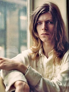 There were two (as I remember) more or less simultaneous but separate things that led me in my late teens to Bowie’s music; a book about Lou Reed (I was already a big Velvet Underground fan) which led me onto Queen Bitch and therefore Hunky Dory (for a long time my favourite album) and seeing The Man Who Fell To Earth on TV and therefore listening to Low, which was in my mother’s record collection; and loving it.


 Car (1966), which perhaps surprisingly prefigures the genre with its funky soul influence. The Spencer Davis Group’s equally soulful Gimme Some Lovin’ (1966) also features possible cowbell* although to my ears it sounds more like a tambourine. *see note on Honky Tonk Woman below
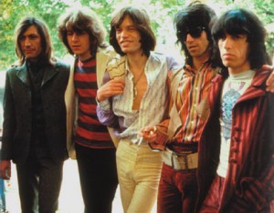 and from then on the song establishes cowbell rock; a rocking, yet laidback beat that holds everything else together. It was to prove hugely influential on the rock of the 70s and every revival thereof up until the present day. Interestingly (this is the part alluded to in the introductory note; thanks anonymous person), it is most likely erstwhile Spencer Davis Group producer Jimmy Miller, rather than the undoubtedly brilliant Charlie Watts, who plays the cowbell.
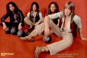 Free – All Right Now (1970) – picks up where Honky Tonk Women left off, with even bigger gaps in the riff; more room for cowbell. Most of Free’s early work should really be in the ‘implied cowbell’ list below
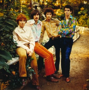 any) is not very audible but this should be a cowbell classic based on the riff alone (more such nonsense below).
 Slade – The Bangin’ Man (1974) – a tongue in cheek, slightly sad song, seemingly alluding to the memory problems the great Don Powell suffered when recovering from a horrendous car crash; but his drum/cowbell playing here is peerless.
 perfect backdrop for some classic cowbell courtesy (I presume) of the great Aynsley Dunbar. Interestingly, Bowie’s flirtation with cowbell rock outlasted his glam period; check out the Young Americans-era outtake I’m Divine for some classic cowbell with more of a funk flavour.
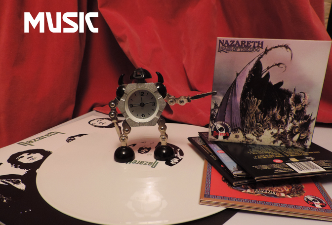
 Nazareth – Hair of the Dog (1975) – basically a compendium of everything cheesy-but-good about mid-70s hard rock; and they came from Dunfermline!
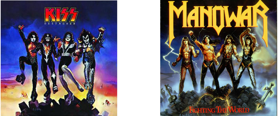
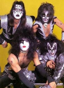 cowbell in 1975/6 because it’s all over the classic Rock & Roll Over album (released November 1976), giving it a looser, warmer feel than the also great but clinically orchestrated Destroyer (released March 1976, shockingly; When they were good, they were productive!)
 but this slow & dirty-sounding masterpiece has the real thing.
 War – Low Rider (1975) – somewhat out of genre being funk, but this song belongs in any discussion of the cowbell in popular music. I’m sure Funkadelic must have used it too, but nothing comes to mind so I’ll leave that for now…

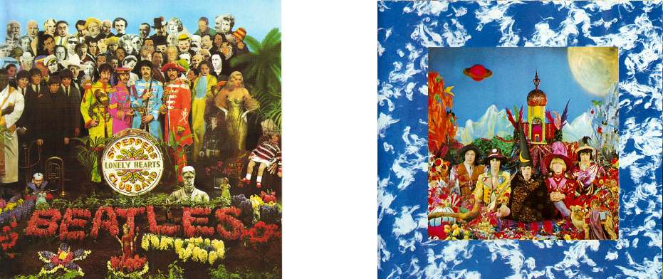
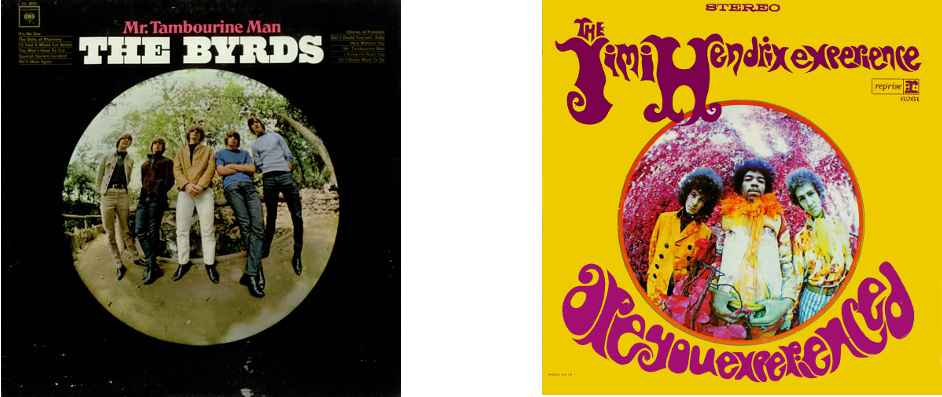 This comparison really traces the advance of psychedelia from a mild distortion of perception to a neon-coloured hallucination over the two years 1965-67


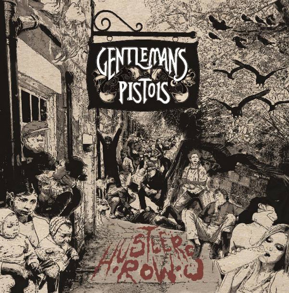 ‘Retro’ without being an exercise in pure nostalgia, Hustler’s Row was that rare ’70s hard rock’ styled album that doesn’t feel like its trying to be any band other than themselves; and most importantly, the songs are up to the standard of those bands that lesser artists try so hard to emulate.
 Tricky, angular and unfunky jazz that is the opposite of background muzak; unless you want to feel perturbed. Not at all relaxing, not exactly exhilarating, but strangely addictive.
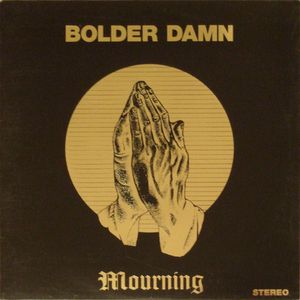 First proper issue of this 1971 Florida obscurity; songs are ‘fine’ rather than great, but really its appeal is all about Blue Cheer-inspired, Grand Funk-flavoured heavy hippy fuzz and period atmosphere.
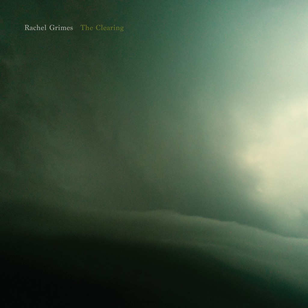 Ominous, brooding and sometimes awkward chamber music; initially it felt a bit perfunctory, but then kept recurring in my head after I thought I’d forgotten all about it in a way that felt significant. And it grew from there
 This double EP kind of converted me to powerviolence, a genre that never really held my attention before; seismic, unpleasant noise for sure, but feeling and substance too; this never becomes background in the way pure noise can. The Anthrophobia collaboration with Crozier is equally worthy of attention, for the same reasons.