Review of the Year – the paradox of realism


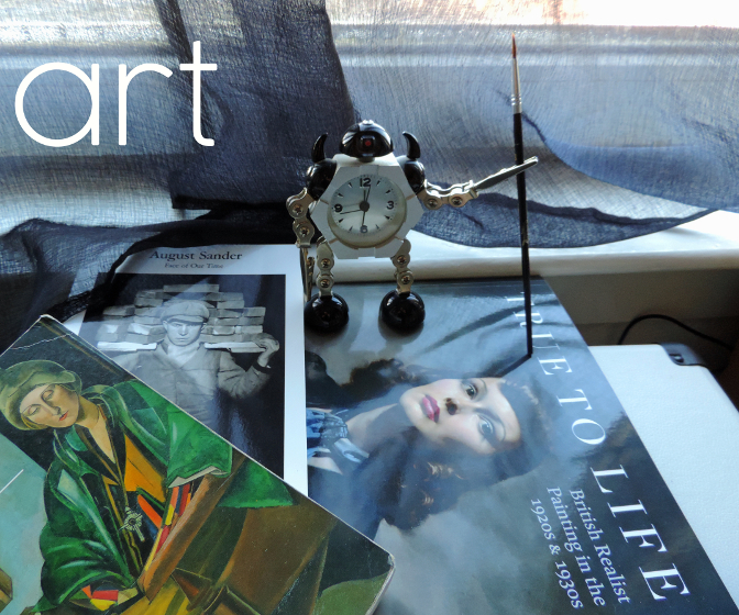
2017, like most years but somehow more so, was filled with unpleasant things, events and people. For me though, one of the more pleasant features of the year was that I made the effort to visit art galleries more often than previously, in particular to see the superb exhibitions held by the National Galleries of Scotland; after missing Modern Scottish Women in 2016, I was determined to see Beyond Caravaggio at the National Gallery and especially True to Life – British Realist Painting in the 1920s and 1930s at the National Gallery of Modern Art. Both of these exhibitions were excellent, but I am writing mainly about the latter. As curator Patrick Elliott was clearly aware (see also the essay What Sort Of Truth? British Painting Between The Wars by Sacha Llewellyn in the excellent exhibition catalogue), ‘realism’ is not a simple thing to define, and indeed it seems strange that (for example) the peculiar and highly artificial painting of Maxwell Armfield and the shockingly immediate work of David Jagger should be considered the same kind of art.

‘Pacific Portrait’ (1929) by Maxwell Armfield (left) and ‘The Conscientious Objector’ (1917) by David Jagger (right)

If ‘Realist’ at first seems a pretty simple and unambiguous description, the fact that many of the artists (Dod Procter, Meredith Frampton, Gluck, Glyn Philpott) and paintings discussed in the exhibition catalogue also appear, equally convincingly, in Edward Lucie-Smith’s book Art Deco Painting (Phaidon, 1990) demonstrates just what a subjective term it really is. What the word seems to denote in the context of this exhibition is something like ‘representational rather than abstract’, which admittedly is an extremely unwieldy and far too wide term.

In the period in which the art of the exhibition was produced (the title says the 1920s and 1930s, but a few earlier and later works were included, so roughly from the years of World War One up to the first half of World War Two), the word realism tended to have mainly negative connotations; for which see Billy Bunter author Frank Richards’ famous 1940 reply to George Orwell’s article Boys’ Weeklies; “They go grubbing in the sewers for their realism, and refuse to believe in the grass and flowers above ground – which nevertheless, are equally real!” This was and still is an aspect of a wider conception of realism that Orwell  himself attacked occasionally in its more extreme political forms. Today, ‘realpolitik’ is used as a term of criticism, but in fact almost all political or social ‘realism’, even when respectable, is basically an excuse for people or governments not to act compassionately when it becomes unprofitable to do so. People who term themselves realists rather than optimists or pessimists tend (in my experience) to lean more towards the latter, but with an added smug quality as befits someone who is never surprised when bad things happen. While the artists of True To Life presumably held beliefs and opinions on a wide range of issues, these are by and large absent from their work as collected here. This is not the 1920s of the General Strike or the 30s of the Depression and The Road To Wigan Pier, let alone the 20s and 30s of Lenin, Mussolini and HItler, or perhaps more to the point, of Picasso, Matisse, or Dadaists and Surrealists.

Edward McKnight Kauffer – poster for the London Underground (1930)

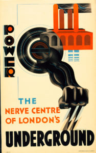
Nevertheless, from the delicate figure studies of Dod Procter to James Cowie’s pastoral portraits, it is a window onto certain aspects of British art and life between the wars. Also, the painters’ rejection of the vocabulary of avant garde modernism should be seen in the context of the time; while abstract or semi-abstract art had been at the cutting edge of modernism in the years just prior to and during World War One, not only had the innovators of that era moved on (why not look at my article about Wyndham Lewis in the 20s here?), but the angular, dynamic language of modernism had infiltrated mainstream culture to the point that institutions as staid as the Royal Mail were using designers like John Armstrong and Pat Keely to give the Post Office a modern identity, while Edward McKnight Kauffer and others did similar work for the London Underground and, outside of the UK, fascist Italy, Hitler’s Germany and the Soviet Union all utilised versions of modernist design to establish new national identities. In that sense, the idiosyncratic, apparently old-fashioned and above all individualistic styles adopted by British artists outside of the more radical movements can be seen as, if not revolutionary, then at least stubbornly dedicated to their own visions.

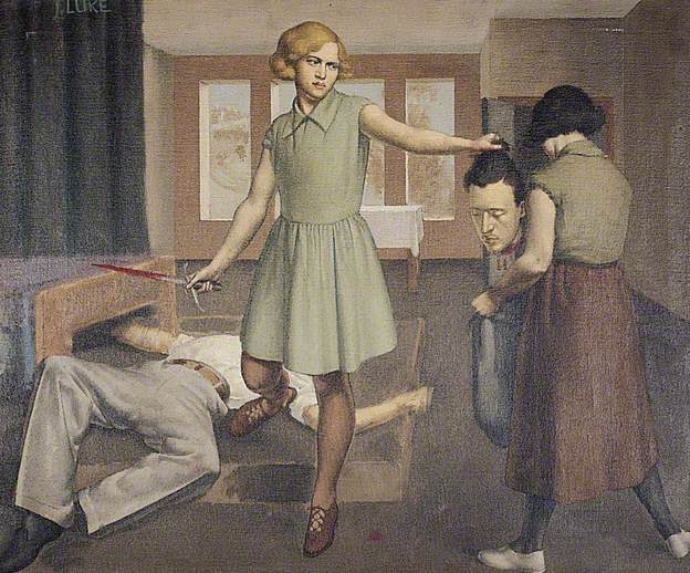
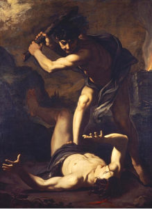
Although it may seem paradoxical or incompatible, the ‘realism’ of these artists is founded to some extent on escapism and idealism; but maybe that is truer of realism in a wider sense than at first seems to be the case. The definitive artistic form of realism (if we think of everyday life as ‘real’ – but I don’t really want to get into philosophical questions here as I’d like to finish this article at some point) nowadays is probably something like instagram, or on a slightly grander level, the documentary film, but the very nature of documenting reality – whether in film, photographs, painting or in writing – is necessarily selective, and in being so, tends towards some kind of commentary (and/or judgement) on its subject. One of the nice things about the True To Life exhibition was that both the grime-and-hardship/warts-and-all and the grass-and-flowers aspects of realism were represented – albeit mostly in a perhaps fairly superficial way. There was very little evidence of the documentary as protest – perhaps because, by the end of WW1, photography had become the obvious tool for this kind of work. That said, social commentary of a sort was present in Thomas Nash & Stanley Spencer’s idiosyncratic recasting of some of the Renaissance’s favourite religious scenes such as the Crucifixion & the Last Judgement in ‘modern dress’ and modern settings (and slightly generic ‘modernist’ styles). This use of realism was not uninventive, but was in essence just another way of looking back at the ‘old masters’; revisiting the groundbreaking realism pioneered in the 14th century. More interesting, (to me) was John Luke’s strange 1929 modern-dress version of one of the baroque era’s favourite Old Testament scenes, Judith and Holofernes, in which the story of the beheading of an Assyrian general is made even more unsettling by having a strangely surreal Agatha Christie/Enid Blyton aura.

John Luke – Judith & Holofernes (1929)

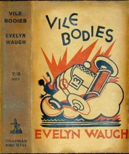
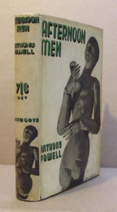
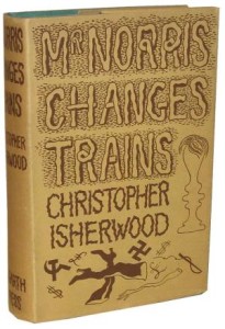
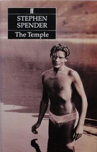
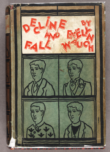
Much as in Edward Lucie-Smith’s Art Deco Painting, the unifying factor in the exhibition’s disparate works was less a matter of style/school or subject than it was atmosphere; the paintings, as different as they are, belong definitively to the period between the wars, in much the same way as the very different works of Evelyn Waugh and Christopher Isherwood did (according to me, here).


If the term ‘realist’ in painting suggests the artist as eye (kind of an analog to (again) Christopher Isherwood’s fictionalised realism; “I am a camera”), the eye of the artist/writer is necessarily as individual as the brain it is connected to. For example, one might assume that realism and idealism were opposites, but there is a strong classicising element among some of the artists in the exhibition – but even then, individual artists seem to have reached a kind of classical serenity and monumentality via different routes.


Meredith Frampton – Sir Charles Grant Robertson (1941)

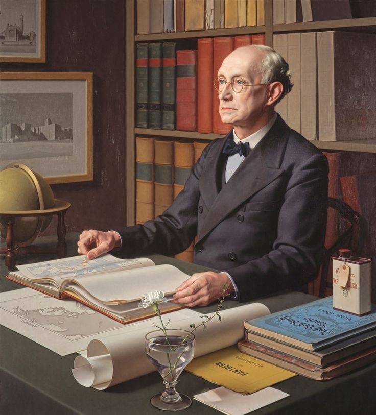
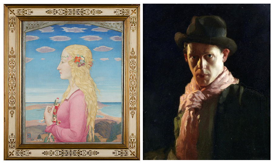
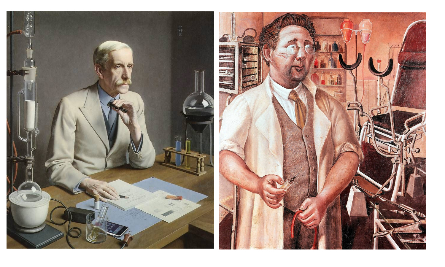
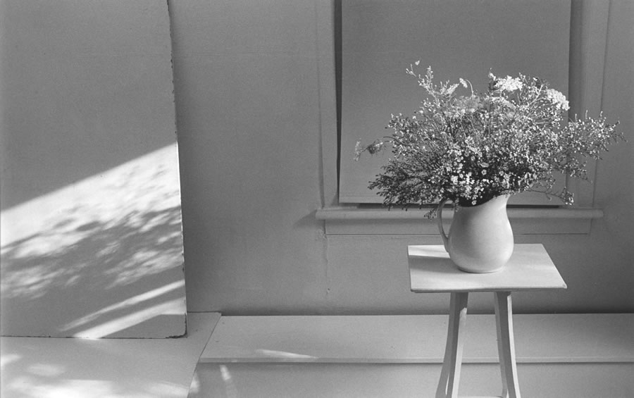
One of the stars of the exhibition for me was the portrait painter (George Vernon) Meredith Frampton (1894-1984). Frampton’s art was in some ways the most ‘realistic’ art in the exhibition, in the sense of being (by far) the most illusionistic and quasi-photographic. In a way, portraits like the stunning Sir Charles Grant Robertson (1941) are less ‘realist’ than than they are ‘corporealist’ – their accumulation of painstakingly rendered detail being in some ways closer to taxidermy than to the realism of a snapshot. In their almost eerie stillness, his portrayals of professional men surrounded by the accoutrements of their work, (another excellent example is Sir Frederick Gowland Hopkins  (1938, below) seem – despite the maximalist inclusiveness of the painting – closer to the carefully composed minimalism of a photographer like Lilo Raymond than to a more or less contemporary realist (or ‘objectivist’) painting like Otto Dix’s theoretically similar portrait of urologist Dr Hans Koch (1921). And yet, for all of their modern realism, both artists looked to the past; for Dix – who had experimented with Expressionist styles earlier in his career, the aim of the modern realist painter was to tackle the breadth and the often-unrecorded detail of modern life with the – to him – unimprovable techniques of the old masters. For Frampton, the source of his style is less the realistic tradition of the Northern Renaissance than it is the monumental, but still ‘realistic’ neoclassicism of Ingres.

Meredith Frampton – Sr Frederick Gowland Hopkins (1938) and Otto Dix – Dr Hans Koch (1921)
Lilo Raymond – Wild Flowers (1992)

The more usual classical influence on British art of the period was the modernist route via Picasso and cubism; in the case of painters like the ex-Vorticists William Roberts and Edward Wadsworth (also Edward Burra, whose expressionistic 1930 painting The Snack Bar was included in the exhibition), the angularity of Vorticism became a kind of stylistic shorthand that marked out their otherwise fairly conventional/traditional art as ‘modern’. Several other artists in the exhibition, such as Gladys Hynes and James Walker Tucker seem to have used modernist stylistic traits in the same way; to heighten the clarity and monumental qualities of their work; a kind of ‘realism’ as simplified solidity and a classicism that couldn’t be easily written off as old fashioned.

Gladys Hynes – Noah’s Ark (1919)
Gerald Leslie Brockhurst – By the Hills (1939)


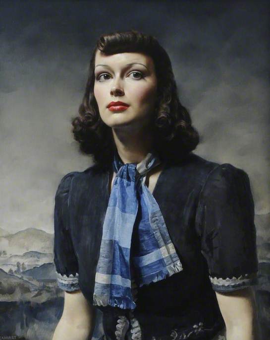
For society portrait painters like Gerald Leslie Brockhurst and Sir Herbert James Gunn, realism – if explicitly not ‘gritty’ realism – was a necessary part of their trade. The glamour and drama of portraits like Brockhurst’s By the Hills (1939) is what made the artist in demand for fashionable sitters, but their effect – despite relying on a similar sense of heightened photo-realism for their success – is almost the opposite of Frampton’s still life approach. This kind of art was, despite its use of traditional techniques (and even, in the case of By The Hills, a Renaissance-influenced landscape in the background) resolutely of its ‘modern’ age, referencing Hollywood and the world of contemporary fashion, but not really any of the ideas that had affected the visual arts since the mid 1800s.


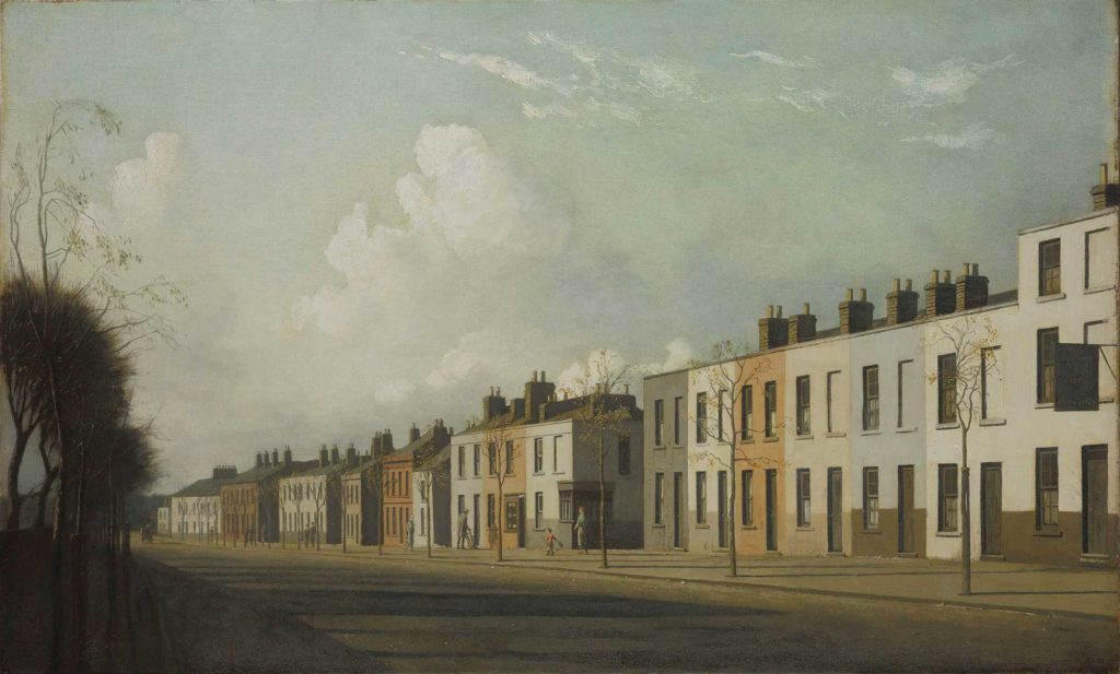
The same is true of the slightly creepy empty street scenes of Algernon Newton; despite their passing resemblance to the post-impressionist work of Maurice Utrillo, these brilliantly realised townscapes are depictions of the modern world, but not interpretations of it. While the artist captures the melancholy charm of the slightly shabby suburbs he painted, their spirit is more like restrained romanticism, rather than being invested with the revolutionary sense of psychogeography that the proto-surrealist works of Giorgio de Chirico had pioneered two decades earlier. That said, because of the role of artist – not just as a ‘camera’, but also as processor and interpreter of experience – his paintings are something more than a documentary photograph of an empty street.

Algernon Newton – The Outskirts of Cheltenham (1932)


Pietro Novelli – ‘Cain Killing Abel’ (1625)

In fact, what True To Life highlights, is the extent to which the vast majority of art, until fairly recently, had as its aim something that could be called realism; the National Gallery’s Beyond Caravaggio exhibition likewise showed Caravaggio and the artists of the late 16th/early 17th century trying to make their art – both in religious/mythical and modern genre paintings – more immediate & vivid through a kind of dramatic heightened realism. Impressionism broke away from the staid, schematised world of academic painting to capture something closer to the experience of both the artist and viewer, Expressionists tried to infuse their works with the feeling of events as experienced, Futurists tried to capture the violence of the 20th century where traditional techniques tended to distance it… And in that sense, much of the work labelled ‘realist’ in this exhibition works for us now in a way that it possibly didn’t at the time; to a modern audience the work in True to Life is almost all imbued with a between-the-wars ‘period’ quality that seems to capture the zeitgeist of that troubled era, even while sidestepping most of the troubles themselves.

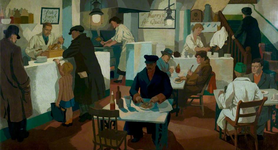
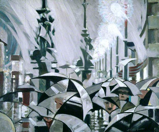
It is with that last point that the artists – without doubting the depth of feeling they put into their work – mainly succeeded in recording (limited aspects of the) reality of their era in a relatively superficial way. As an example, Clifford Rowe’s The Fried Fish Shop (1936) depicts what the interior and clientele of a fried fish shop of the 30s presumably looked like; as such it has sociological and historical value, as well as being a fine, faintly modernist painting. On the other hand, a slightly earlier and in some ways comparable painting like the Vorticist-inspired Rain On Princes Street  (1913) by Stanley Cursiter (it’s quite surprising that none of Cursiter’s fashionable work of the 20s & 30s was included in the exhibition), despite its fractured, faceted and in that sense ‘unrealistic’ modernist appearance, not only captures in its stylised way a glimpse of late Edwardian metropolitan life, but also the feeling – still the same over a hundred years later – of being on Edinburgh’s Princes Street on a busy, rainy day. So in the end I suppose which painting deserves to be called ‘realist’ is as subjective as reality itself.

Clifford Rowe – The Fried Fish Shop (1934)


Stanley Cursiter – Rain on Princes Street (1913)

Someone Of No Importance: Evelyn Waugh and inter-war Futilitarianism


The news that one of your favourite novels is being made into a film or TV show is never straightforwardly pleasurable; yes, there’s an excitement about seeing scenes from the page (and from your own imaginings of them) on screen, but there’s a certain amount of apprehension too. Nobody will look right (at first anyway), they may not sound right, and if you don’t like them you may be stuck with them whenever you re-read the book (especially if you didn’t have a particularly clear image of them in your mind in the first place or if, like me the image you do have often bears strangely little relation to the writer’s actual descriptions). Then there’s the tone and authorial voice/point of view, the inner life of the characters… It’s actually surprising there are any good adaptations of books. But there are many, the best of which (to me at least) are those that capture the essence of the book without necessarily being ‘faithful adaptations’ (Catch-22, Ghost World) or which use the book as a launchpad for the filmmakers’ own ideas (Blade Runner, Jaws). Most adaptations are of course neither of these. Which brings us to the BBC’s ‘not bad’ version of Evelyn Waugh’s Decline and Fall.

It’s first of all a strange book to have chosen; a black comedy whose fans – as with fans of JG Ballard’s Crash, William Burroughs’ Naked Lunch and Bret Easton Ellis’ American Psycho – know in advance to expect an approximate, rather than precise rendering of. Decline and Fall is not an extreme book in the graphic sense that those three are, but, like at least two of them, its humour is grounded in its unremitting unpleasantness and in the end it’s a bleak, essentially misanthropic, nihilistic kind of comedy, tellingly completed before Waugh’s conversion to Roman Catholicism. For a variety of reasons, though, ‘bleak’ isn’t how the TV version feels.

But before moving on to the show, it’s worth looking at why the book is the way it is. Firstly, and most importantly, it’s an exaggerated reflection of certain aspects of its creator’s personality and an expression of his sense of humour. Even post-conversion, when there is a modicum of compassion for some of the characters in his work, Waugh’s books – with the exception of Brideshead Revisited – are mostly funny but extremely mean-spirited black comedies full of caricatures and snobbishness made extremely funny by his writing style, and in his first few novels that’s pretty much all there is. The surprising depth of feeling in even these books comes from the fact that Waugh allows that his characters – even a relative cipher like Decline and Fall’s bland non-hero Paul Pennyfeather – have human emotions, even if they are rarely respected by others or the author. In Decline and Fall , the snobbishness, misogyny and the – to modern readers – strange treatment of child abuse in which certain pupils seem partly culpable in their encouragement of the paedophile (I hope that most of us would now agree that the victim of child abuse can’t really be complicit in it), can be explained pretty simply: it was the milieu that the young Waugh knew. His education at an all-boys public school and his subsequent university life and work as a teacher in (again) an all-boys public school were overwhelmingly male experiences and child abuse was, if not actually legal or even acceptable, then at least a tacitly accepted if not much written about part of public school life. Nowadays, we might find it odd for a writer to include that kind of thing in a book where the original author’s note reads ‘Please bear in mind throughout that IT IS MEANT TO BE FUNNY.’ but although the novel was self-consciously outrageous, the aspects that most trouble modern readers; abuse, misogyny, racism, were probably not that much dwelt upon in the late 20s.

The reason that Waugh’s comedies are so rarely successfully adapted into other formats is that their action is farcical, but not complicated. In 1920s comedy, PG Wodehouse is the obvious star, and his work lends itself naturally to stage and television adaptation thanks to his intricate joke-like plots (complete with a punchline at the end). The comedy is there in the story and the writer’s style is the dressing that brings it to life. Waugh’s early plots meanwhile are loosely constructed to non-existent and chaotic and often implausible (yet somehow also more realistic than Wodehouse) and his writing style is everything. It’s a weird, slightly unworkable comparison, but now that I’ve made it; with Wodehouse, his stories are like a kind of pantomime or fairytale, played out by characters the author loves and which are completely ludicrous but make perfect sense on their own terms. With Waugh, it’s often as though a real (perhaps even tragic) story about real people is being told by someone who finds the whole thing funny and has little to no sympathy for the fools and the predicaments they find themselves in. Wodehouse orchestrates the events like a stage director, while Waugh reports them like a condescending gossip. To me, he is the funnier of the two, but his presence is also necessary; if you remove Wodehouse the narrator from his stories, you are left with characters that embody the warmth and silliness of the narrator’s voice, acting out stories which are in themselves funny. If you remove Waugh you are left with people you never really know making fools of themselves in painful ways. If you had never read Waugh but only watched adaptations of his work, one might expect his books to read something like a posh version of Tom Sharpe; which they definitely don’t.

The other main reason that Waugh’s early books are the way they are is because he was part of that couple of generations who lived through the First World War, but who were too young to take part. The impact this had is undeniable and the British literature of the 20s and 30s is filled with very different books by very different writers which nevertheless have various things in common with each other and which I like very much.  The early 21st century may be in some ways a far more cynical time than the 1920s, but in effect it is both nicer and nastier. Most of us no longer accept the inequalities of the class system, or discrimination in race and gender. We are also no longer surprised that human beings can slaughter each other in their millions in mechanised ways; but while being used to that idea, it’s also true that, unlike Waugh’s generation, we (at least we in the UK) haven’t had the experience of half of the adult males that were there in our early childhood simply not existing anymore, or living in a country where almost every town and village doesn’t have a monument to those killed in a war we remember. A large part of the literature of the 20s and 30s consists of writers either trying to find meaning in a society whose way of life has been changed forever, whose old beliefs; in religion, in tradition, no longer seem to have any meaning, or of trying simply to escape the realities of modern life altogether. In the mid-to – late 1930s, politics would take centre stage in British literature, but for a period from around 1920 to 1935 the anxieties of the country’s younger writers were revealed in a series of strangely formless but oddly similar novels, which were once labelled ‘futilitarian’.

booox

These are my favourites, might as well do this chronologically…

Aldous Huxley – Crome Yellow (1921), Antic Hay (1923) and Point Counter Point (1928)

antic

Huxley was in fact slightly older (20 when WW1 broke out, whereas Waugh was only 11) but he could not take part in combat due to his chronically bad eyesight. His early novels (I think Antic Hay is the best) make a very interesting comparison with Waugh’s, because at first they seem fairly similar; modern comedies where the storylines (such as they are) mostly revolve around the social lives of young, wealthy and irresponsible people. But the tone and content is very different. While Waugh was at school during WW1, with not only all the jingoism and propaganda that that entailed, but also the noticeable absence of adult male teachers and role models, for Huxley, WW1 was the period of Bloomsbury (he worked as a farm labourer at Garsington Manor, home of the society hostess and patron of the arts Lady Ottoline Morrell. For him, social life meant intellectual conversation; the discussion of art and modernism, conscientious objection, philosophy, pacifism. The comedy in novels like Antic Hay comes mainly from his satirical portrayals of the kinds of people he was mixing with but they are funny in both a broad way (the hero Theodore Gumbril’s invention of ‘pneumatic trousers’) and a deeper one (relationships and their difficulties). The main difference from Waugh is that whereas the comedy in a book like Waugh’s Vile Bodies arises from the somewhat desperate attempts of the main characters to have fun in the face of the meaningless void underlying modern life, in Huxley’s works the comedy arises from the characters’ often farcical and pretentious attempts at finding meaning through conversation, art and philosophy. The contrast between Huxley’s novels and an apparently very similar one – Wyndham Lewis’ great satire The Apes of God (1930) is especially striking because the milieu the books are set in almost identical (they knew many of the same people) and because, like Huxley, Wyndham Lewis was not nihilistic. He was however, immensely negative and the fact that he had seen active service in WW1 and was also himself a pioneering artist made him extremely impatient with what he saw as the wishy-washy dilettantism of the Bloomsbury artists and writers and their detachment from real life. The contrast between Antic Hay and The Apes of God is the difference between an affectionate Max Beerbohm cartoon and a merciless James Gillray caricature.

Evelyn Waugh – Decline and Fall (1928) and Vile Bodies (1930)

Viles_Bodies

What makes these books distinctively post-WW1 is the nihilism at their heart. The younger generation of the 1920s were probably more different from their parents (products of the Victorian era) than any generation before or since (excepting maybe that of the 60s) and the tone of Waugh’s novels is resolutely modern and, despite its insistence on/preoccupation with social class, the feel is one of fragmentation and instability, especially in comparison with pre-War literature. When older people are presented, it is almost always as an archaic survival from a distant era. If the war is mentioned at all, its in an almost nostalgic way by people for whom it was the backdrop of their youth or childhood. The most surprising thing about Waugh’s books is the unexpected poignancy that comes from his mostly unsympathetic handling of his characters; Vile Bodies, probably his most determinedly unpleasant book, is also his funniest (aside from the grotesque later masterpiece The Loved One).

Anthony Powell – Afternoon Men (1931)

afternoon men

Of all the books here, Afternoon Men feels perhaps the least ambitious, but makes me laugh the most. I have read some of Anthony Powell’s other books (and started but not finished his Dance to the Music of Time series), but they just aren’t the same. The story is almost identical to those of Huxley and Waugh – a group of young people meet up socially and drink a lot, have affairs etc – although the social class of Powell’s protagonist William Atwater is lowly enough that he actually has a normal, office-based job – a rarity in any of these books. Atwater’s friends and acquaintances are the usual mixture of bohemian high society people but it is Powell’s abrupt, lightly modernistic writing style and feel for dialogue that makes it work so well:

“’I work in a museum’, said Atwater. He was getting sleepier and felt he ought to say something. He had begun to be depressed.

‘That must be very interesting work, isn’t it?’

‘No.’

‘Isn’t it really?’

‘I often think of running away to sea.’

‘I think it must be very interesting.’

‘Do you?’

* * * *

‘What about your books?’ Atwater stood up. He could not do all the stuff about the books. He was too sleepy. He said:

‘There are these. And then there are those.’”

(Afternoon Men, p.35-6, 1963 Penguin edition)

As a writer, Powell is far more deadpan and less misanthropic than Waugh, but he creates a similarly poignant effect; it would be quite possible to film this novel and, used verbatim, the dialogue might still be funny, but what essentially makes the book work is the style in which it is written.

Cyril Connolly – The Rock Pool (written 1935. published 1936)

220px-Rockpool

The Rock Pool is the only novel by Connolly – best known as a literary critic – and it is one of my favourite books. Connolly was the same age and (more or less) social class as Evelyn Waugh, and the novel is the portrait of a snobbish young man of means who goes to the French Riviera to observe life in an artist’s colony, with the explicit intention of writing a period piece about the kind of carefree1920s-style life of leisure that no longer existed in the London of the 30s, but might still be going on there.  In fact, it isn’t  – and instead he finds himself drawn into the lives of the impoverished artists, conmen and bar owners there until it becomes clear that he is not the detached ironic observer he imagined, but has in fact found his niche and his people, whether he wants to have or not. In comparison with Waugh and even Huxley, Connolly is far more sympathetic to his characters and the tone is completely different from Waugh’s slightly contemptuous detachment:

“’Tell me, why do you come here if you are such a snob?’

‘Who said I was a snob?’

‘Why, everybody… I’m sure it must be very amusing.’

He felt old and miserable, going through life trying to peddle a personality of which people would not even accept a free sample.”

(The Rock Pool, p.90-91, Penguin edition, 1963)

The fact that The Rock Pool is a product of the mid-30s and not the 20s is part of its charm. While Connolly’s contemporaries and peers were becoming interested in philosophy and science (Huxley), religion (Waugh) or politics and social commentary (George Orwell, Christopher Isherwood, WH Auden etc), Connolly accepted, with insight, the aimless, aesthetic worldview of his 20s generation, even as it became obsolete.

Christopher Isherwood –  Mr Norris Changes Trains (1935)

mr norris

Isherwood’s first two novels, All The Conspirators (1928) and The Memorial (1932) are also relevant here, but Mr Norris… (probably best known, with its semi-sequel Goodbye To Berlin (1939) as being the inspiration for the musical Cabaret) have more in common with the books described above. While both of his earlier books dealt specifically with the generation gap that had resulted from the First World War (and The Memorial is explicitly concerned with the effects of WW1 on British society), Mr Norris is, although very different in tone, essentially similar to The Rock Pool – a comical story about the adventures of a young upper class person out of his element. Although famous for its evocation of the politics and life of late Weimar and early Nazi Berlin, the novels were born from Isherwood’s desire – in 1929/30, rather than the mid-late 30s of the novels – not for any kind of social or political commentary, but to escape the milieu of upper class England and experience the hedonistic lifestyle of Berlin. As with most Waugh and Powell, the book’s main protagonist is less vividly drawn than the more extreme characters who surround him, and in many ways Isherwood accomplishes a kind of heightened, occasionally grotesque realism something like the Neue Sachlichkeit artists (Otto Dix, Georg Grosz, Rudolf Schlichter, Christian Schad etc) who were working in Germany in the same period, and whose paintings have often adorned the covers of his books. The fact that his books are partly autobiographical (and written in the first person, as ‘William Bradshaw’, Isherwood’s own middle names) means there is little of the distancing effect of Waugh and although there is much humour in Isherwood’s early novels, often at the expense of his characters, they are written with a warmth and compassion that makes them translate to the screen without losing too much of the feel of the novel – with the exception of the narrator himself, who suffers by being mostly a nondescript bystander, so that in Cabaret, the Christopher Isherwood/William Bradshaw character has to become the very different Brian Roberts.

oh – not chronological now, but also – Stephen Spender – The Temple (written 1929, published 1988)

220px-TheTemple

While Isherwood was in Berlin with WH Auden, their friend Stephen Spender found his way to Hamburg, seeking not only the hedonistic freedom of Weimar Germany, but also freedom from censorship. As Spender wrote in the introduction to the (very) belated first edition of The Temple, England in 1929 was a country where James Joyce’s Ulysses was banned, as was Radclyffe Hall’s The Well of Loneliness. In going to Germany, his motives were at least partly artistic, and as he noted, “The Temple is pre-thirties and pre-political.” The same could be said of all of the novels discussed here. In that sense, The Temple sits strangely, but appropriately, in the company of the books of Waugh, Anthony Powell and co. In comparison with Isherwood’s Berlin stories, Spender’s novel is far more concerned with the inner life of its narrator and his Hamburg is less vividly drawn, but at the same time the book is far more explicit about sex than Isherwood (though to be fair Spender revised The Temple before publication in the 80s so it isn’t clear how much of the explicitness existed in 1929 – enough to prevent it from being published though). It’s a summery, if slightly troubled book, not improved by the author’s retrospective awareness of how fleeting the freedom it describes would be. Also, although Spender was himself far from humourless, there’s an earnest quality that makes the tone of the book unique in this list; it’s far more of a considered portrait of a time, than a story about some young people.

Decline and Fall – the TV show

decandeff

So, finally – to that TV adaptation of Decline and Fall. It wasn’t actually bad at all (vastly better than the mystifyingly titled 1969 movie adaptation, Decline and Fall…of a Bird Watcher), but despite all the positive reviews it wasn’t (to me anyway) right either; how come? Firstly, the book was published in 1928 and had a contemporary setting. That means that it is now a period piece, which on the screen, gives an instantly distancing effect. The twenties in particular (actually, the twenties and thirties; TV rarely discriminates between the two) has evolved a certain lighthearted and somewhat cosy screen presence on television over the years, from the nostalgic adaptation(s) of Waugh’s very different Brideshead Revisited to gentle Sunday evening drama of The House of Elliot to Jeeves and Wooster and even You Rang M’Lord.

Thanks to these shows and others like them (not to mention films like Bugsy Malone and The Great Gatsby in its various versions) there’s a kind of visual shorthand for the twenties, consisting of; striped blazers, flapper fashions, art deco, the Charleston and hedonistic and/or gormless aristocrats, the fantasy of being independently wealthy, plus the odd Moseley-inspired fascist and monocled lesbian; all of which fits Decline and Fall pretty well, in a superficial kind of way. But while nostalgia is, appropriately, an element in all of the aforementioned programmes (not so much The Great Gatsby, ironic given how the film version traded on the visual aspects of its high society settings etc), it should really have no place in Decline and Fall. Nostalgia can’t help being present though, just through the accumulation of period detail and the kind of broad acting that a comedy set among the upper classes in the 20s seems to require. This broad approach is again fair enough in a way, since Decline and Fall is essentially a novel where the characters are close to being caricatures anyway.

The most obvious place the book differs from the television adaptation is that in the book, the mostly innocent and bland fish-out-of-water main character, Paul Pennyfeather doesn’t have to be – and often isn’t – particularly likeable; the reader doesn’t have to like him or identify with him to find his story funny and anyway, Waugh makes it explicit that we are not seeing Pennyfeather at his best or most typical or indeed in his element at all. Considering the ridiculous (and at times heartbreaking) circumstances he finds himself in, his outbursts of bitterness are surprisingly few and far between. Presenting a not-very-likeable character having misadventures with even less likeable characters is not, however a particularly ratings-grabbing idea, so it’s not surprising the BBC didn’t play it that way. It would never have occurred to me to cast the comedian Jack Whitehall in the leading role, but the hapless/diffident/youthful/naive sides of Pennyfeather’s nature are not that far removed from Whitehall’s usual persona and I don’t mean it as an insult when I say he captures the somewhat one-dimensional, nonentity-like aspect of Pennyfeather quite well.

But, in the bigger picture, the fact that the BBC is spending money on an Evelyn Waugh adaptation at all may not really be a good sign. As Jon Savage wrote in 1986 (re. the TV adaptation of Brideshead Revisited):

Waugh’s elevation into legend – as the house god of literary London – has come at the same time as, and may have fuelled, a concerted ideological attack on the social gains of the whole post-war period.” (Jon Savage, Waugh Crimes, The Face, September 1986, in Time Travel – Pop, Media and Sexuality 1976-99, Chatto & Windus 1996, p. 206).

The adaptation of Decline and Fall in 2017 says as much about the current rise of conservatism as the success of Brideshead Revisited did about Margaret Thatcher’s mid 80s, both about the nature of the conservatism itself, and the ways society has changed since the last strengthening of the right.  The choice of Brideshead to capture a conservative zeitgeist was an obvious and safe one; Waugh’s least characteristic, if most successful novel, it is (or at least it can be easily adapted as) a straightforward nostalgic paean to/romanticisation of the leisured life of the aristocracy in the pre-WW2 period, the last time they could be seen as  the leaders of fashion and in a real sense ‘the ruling class’, with an Empire and subordinate classes to (literally) ‘lord it’ over. Then as now, the appeal of traditional ‘Britishness’ was strong, both with the kind of conservative, older elements in society/in charge and those who see progressiveness only in terms of threatening change/instability. Back in 1986, the ‘golden age’ of Brideshead Revisited was still remembered by the older generations, including many who were still active in the political life of the country.

But although the BBC made a costume drama, perhaps the most conservative television form, and although Waugh was a lifelong conservative and reactionary, Decline and Fall the novel, as discussed above, is hardly conservative at all; it doesn’t stand for anything, and its guiding principle seems to be that people are foolish and stupid and ruin their own lives and the lives of others without caring or even noticing. It’s a book which mostly gets away with its casual misogyny and racism because of its overwhelming misanthropy; if these people are laughable and stupid and ridiculous then at least he doesn’t show us anyone that isn’t; the fact that one of the book’s most likeable comic characters is a teacher who is not only a bad teacher, but a serial child abuser shows just what an odd choice it is for a BBC costume drama. The way the BBC tackled the more problematic aspects says a lot about where society is in 2017. In the novel, the (in modern terminology) paedophile teacher Captain Grimes’ abuse of the children in his care is seen by the other characters as distasteful and disreputable, as well as criminal, but is still seen as something one can be funny about. Somewhat surprisingly, this element made it to the screen more or less untouched, albeit without the flirtatiousness of Grimes’ favourite victim (as we, but not he, would see it), Clutterbuck. It is interesting though, to note that when reviewing the show, the word paedophile has almost always been replaced by the equivalent but somehow less inflammatory word ‘pederast’; somehow enjoying the comical exploits of a fictional paedophile might not be okay. It’s presumably the respectability of the source material (Decline and Fall may be outrageous, but Waugh is a pillar of British literature), the broadness of the comedy and the relative vagueness of the acts that makes it acceptable. And I think that’s right in a way; the element is there in the novel, it’s supposed to be and is uncomfortably funny in the novel (Waugh really was a kind of anti-Wodehouse at that point in his career), even though child abuse itself is obviously not funny. It can be assumed I think that the makers of the programme are not condoning anything, and hand-wringing self-censorship would not make the programme better; but there seems to have been a certain amount of that anyway, as we shall see.

Jack-Whitehall-Decline-And-Fall

As the misanthropy of the novel is reduced in the TV version largely because of Jack Whitehall’s sympathetic portrayal of Paul Pennyfeather, the misogyny of the book more or less evaporates onscreen, largely because the female characters are no more or less caricatures than the male ones, and are played by real women. In the book, the women are mostly predatory in one way or another and are strictly there to be admired, feared or despised – and the admiration always ends in disillusion. In Waugh’s mature books (even his best ones like A Handful of Dust) it could be argued that this feeling never significantly changes.

Where the BBC seems to have been most squeamish is with the novel’s racism. Although the anti-Welsh feeling made it to the screen more or less unchanged and again, partly neutralised by the fact that almost all of the characters were played so broadly, the episode featuring Margot Beste-Chetwynde’s African-American boyfriend Sebastian “Chokey” Cholmondley is more problematic. In the adaptation, Chiké Okonkwo plays the character exactly as written; he is articulate, urbane and enthusiastic about ecclesiastical architecture; but, when he says in the novel, “You folk think that because we’re coloured we don’t care about nothing but jazz. Why, I’d give all the jazz in the world for just one little stone from one of your cathedrals”, it’s supposed to be funny, not just because of the naivety of the lines, but because they comes from a black character. His entry into the book as Margot Beste-Chetwynde’s companion at the school games sets the tone for the whole episode:

“’I hope you don’t mind my bringing Chokey, Dr Fagan?’ she said. ‘He’s just crazy about sport.’

‘I sure am that,’ said Chokey.

’Dear Mrs Beste-Chetwynde!’ said Dr Fagan; ‘dear, dear Mrs Beste-Chetwynde!’ He pressed her glove, and for a moment was at a loss for words of welcome, for ‘Chokey’, though graceful of bearing and irreproachably dressed, was a Negro.” (Decline and Fall, p. 75)

Throughout the scene that follows, Chokey talks about church architecture, music and his race, and did so in the TV version, but the fact of his articulacy and the idea that his presence among high society people is in itself funny remains inescapable in the novel.  Also, what the BBC understandably didn’t include, was the way that almost every other character present comments on Chokey’s presence, or the abusive terms they use when doing so. I’m not sure what else they could have done while remaining at all true to the novel. On the one extreme, removing the single black character from a TV show in the name of  not upsetting people with racism would make no sense, and on the other, having Jack Whitehall say, as Paul Pennyfeather does in the novel, “I say Grimes, what d’you suppose the relationship is between Mrs Beste-Chetwynde and that n—–?” would – to say the least – have spoiled the show and made Pennyfeather a less sympathetic character than the BBC want him to be. But possibly they should have?

When writing about Waugh in 1986, Jon Savage wrote;

“It is extremely important that British culture develops a way of addressing the present and the future rather than the past, that recognises our pluralistic, multiracial society and our position, finger-in-the-dyke of trends in world politics” (Time Travel – Pop, Media and Sexuality 1976-99, Chatto & Windus 1996, p. 207)

and that’s still true – indeed, it’s more true now than it was even five years ago. But Decline and Fall isn’t it. Obviously, its anarchic vision isn’t as straightforwardly nostalgic and conservative in 2017 as Brideshead was in the 80s, but that’s partly because popular culture, post-Brass Eye, post-I’m A Celebrity and post-Operation Yew Tree is massively more coarse and more receptive to deliberate bad taste than the 80s was, or the 20s were for that matter. In its concern with period detail and its twee Jeeves and Wooster-ish execution, the makers of Decline and Fall have swapped the viciously funny nihilism of Waugh’s 1920s for a slightly cosy bad taste pantomime world which is equally as uncomfortable in its own very different way and leaves a comparable, but again different funny taste. Still; it wasn’t awful.

waugh_decline_440


An Illuminated Eccentric; the art of Christophe Szpajdel

 Christophe

What do black/death metal band Book of Belial and Kim Kardashian have in common? Aside from a desire to spread evil and darkness, the answer is that both have had their names immortalised by the iconic logo designer Christophe Szpajdel. Although inextricably linked to the extreme metal underground by his classic works for a vast array of bands, Szpajdel is first and foremost a great artist and designer and his work now has an audience far beyond the metal subculture to which he still undeniably belongs.

bookardashian

Szpajdel has been drawing bespoke logos since 1987, his big break coming in the early 90s with the classic and hugely influential logo for Norwegian black metal legends Emperor. Since then his work has helped to define the aesthetic style of underground metal, but also become well-known in its own right, being featured in exhibitions and books, including his own volume, Lord of the Logos.

 It’s typical of the UK that, despite being based in Exeter (and having been a UK resident for the past fifteen years), Szpajdel’s work receives far greater acclaim and coverage elsewhere in the world; a real shame, and a situation which will hopefully be remedied as his reputation continues to expand both within and outside of the metal realm.

In conversation, Christophe is funny and informative and has a passion for drawing and, especially, logo design (his own and that of others) which shines through everything he says. It’s worth pointing out too, that in a time when useable graphics have arguably never been easier to come by, he remains committed to the art of imaginative, hand-drawn, pencil and ink images; unique works which have the feel that only comes from manual labour and contemplation.

impiety

Anyway, enough introduction; here’s the man himself – What are you looking forward to in 2016?

CS: This year I have lined up a few exhibitions, I have a possible show in Manchester for March-April at the Gallery Grim and another possibly in London. But I have had quite a long list of exhibitions in the past, so what is more exciting to look forward to is in June, when I have my first proper workshop, which is going to happen in Vancouver, Canada. That workshop is going to be together with [photographer] Peter Beste. This is something really to look forward to. I had a talk earlier today about an exhibition in Romania, in the Carpathian mountains. Last year I had a very successful last-minute impromptu exhibition in Japan. I’m actually looking forward to having a much bigger exhibition there, because that last exhibition became something of a timebomb. It filled the venue, they literally squeezed in, and I had three hours of non-stop autographs. All these Japanese people were taking selfies with me, which is something I have never seen like this before. In the UK, selfies are a big habit; in Japan, selfies are an absolute obsession.  It’s the same with queuing. Here in the UK, everyone is used to queuing, the Japanese have turned queuing into an art form. So last year was a giant leap in my artistic career.”

As mentioned in my intro, Christophe’s name is known worldwide in metal circles, but although his love for and knowledge of metal music is obvious, his real passion is for designing logos, not simply recycling past glories.bruno

CS: Yes, there is always metal, but this year I have made a new experience, I have done some pop culture logos. I drew for Calvin Harris and Bruno Mars, and Kim Kardashian, and Katie Price, Wayne Rooney (laughs).  Also Maverick Sabre –  you know; really popular artists, because I have the will to have my work exposed to a calvhar
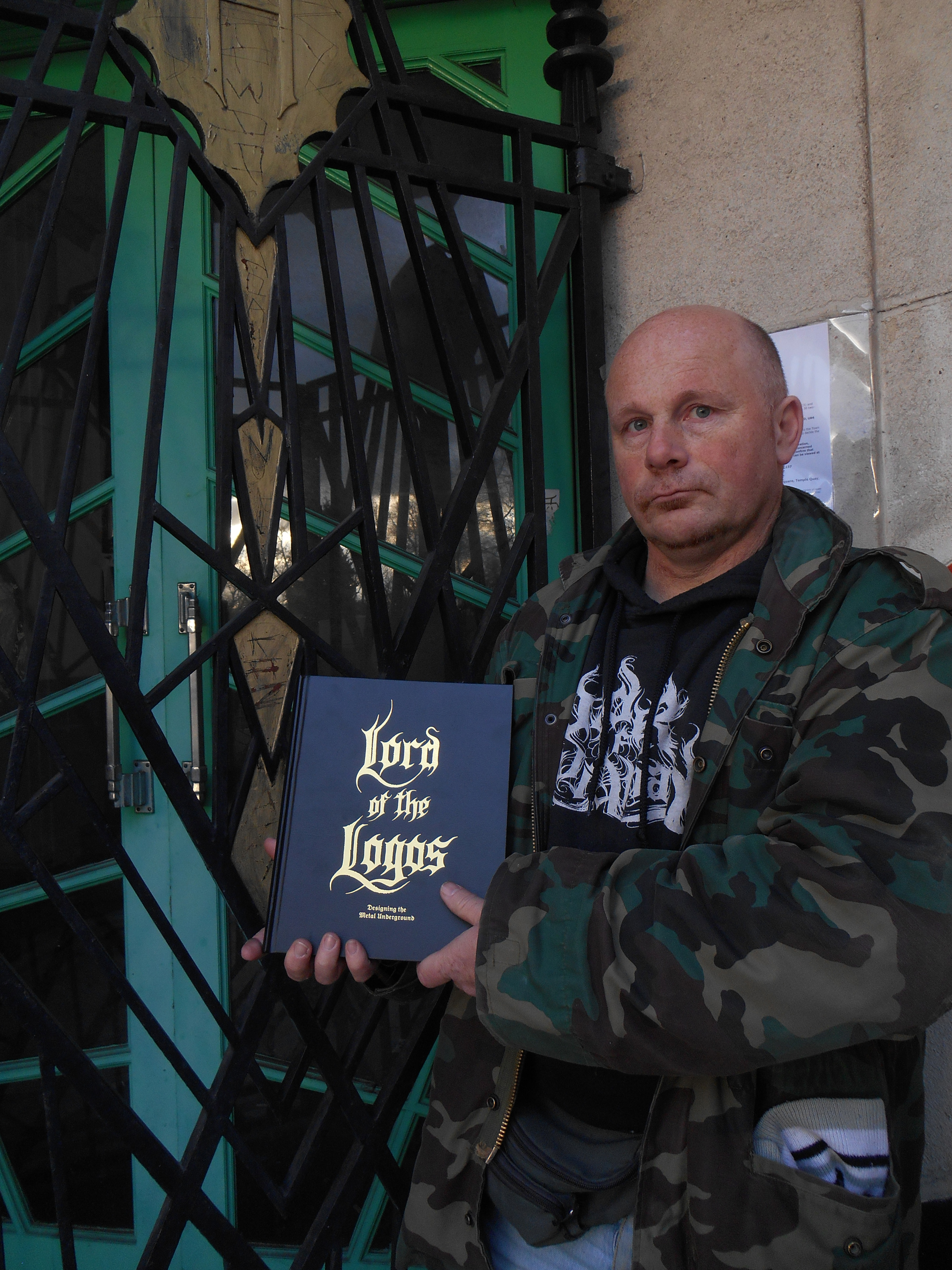
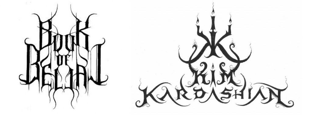
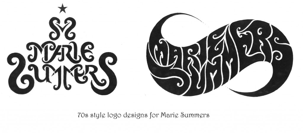
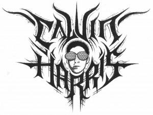
much bigger public. And at the moment I’ve been thinking about, just for fun, working on a Beyoncé logo, because she is so much talked about.  So there’s this whole series of pop culture logos, I did EastEnders, Coronation Street, Emmerdale, Shortland Street. So I had some real fun exploring the mainstream. But the metal public is always the most receptive to my work. It’s my public, it’s the one who collects my work. A lot of people who see my work who haven’t been acquainted with the metal scene say that it’s not something they would be going for. Or that it’s nice but it’s grim.

coronat

There was a time when the extreme metal underground was essentially a DIY business at all levels, but its growth, aided by that of the internet over the last two decades has taken your local extreme band from demos, fanzines and tape trading, to small indie labels, to world tours and ‘Norwegian Grammys’, with the concomitant rise of the oxymoron that is ‘big’ underground bands. No genre demonstrates this better than black metal; and it should be noted that the high profile black metal image that has evolved is in part due to the instantly recognisable work of Christophe Szpajdel himself. Classic 90s logos like his ones for Emperor and Moonspell set a style which is still widely imitated 30 years on.

emperor

As the world has changed, Szpajdel has changed with it, but although he puts in full-time hours designing logos, he still doesn’t rely on his art for his income, which means his work is, by the standard of graphic designers with his profile and pedigree, almost ludicrously inexpensive.

WOLVES LOGO

CS: “The cost varies, but really I am aiming for a fee of one hundred US dollars. Anybody who contacts me first must be prepared to pay my fee. This year I am also looking to introduce an hourly rate. I discussed this with some artists in Devon who saw my work, and they told me ‘you really need to concentrate on a contract. Send the client a contract that stipulates that there is $100 initial fee for the first draft; but the first draft includes a finalised logo. If they then want further drafts then you absolutely need to introduce an hourly rate.’ So I am working out those details soon.

old graves landscape

Bands who contact me now for a logo for free, I say ‘if you want a logo then I want to see the 50% deposit. And when I see the deposit in my PayPal account I will then start working on the logos. If I don’t have the deposit then I’m not going to make a move.’

So is the logo done just for fun, or out of enthusiasm for the subject now a thing of the past?

CS: No, because times like now [January], when it’s been quite quiet over the festive period so, I sometimes just dish out a logo to someone, to people who support my work, just to experiment and to exercise my freedom. There’s a woman called Natalie Corless who has posted a lot on my Facebook wall that she likes my logos so I did her an impromptu logo and she loved it. And so she posted and promoted my album on her timeline and she got me some clients! And this was a person who randomly added me on Facebook. And at the end of the day, she liked my work and she got me five clients, who paid $100 each. So these kind of random people who add me on facebook, they’re not as random as you might think.

Do you forsee a time when you will live from just doing your artwork?

CS: Well, I would love to. But since I’ve started charging professionally, I have observed a steep drop of the amount of clients who commission a logo from me. There are lots of other artists, for example Chris Horst, or Gragoth from Luciferium War Graphics. They offer packages. Chris Horst for example specialises in logos, but for $50 he does logos that include drafts, revisions, work on the computer, digitised, vectorised, coloured, all that; for just $50. Gragoth from Luciferium War Graphics, he is offering for $300, a complete package. Like it has album covers, banners, ad banners, website, myspace layouts, reverb nation layouts, logo, all inclusive for $300. And he is having a lot of success.

maries copy

But my work’s selling point is it is unique; it is absolutely handmade. I work in collaboration with some graphic designers to digitise my logos. Because now that I charge $100, my clients expect work exactly, precisely, rigorously, to their expectations. They expect the logo to be vectorised, digitised, they expect it in different formats; .PNG, .AI, Vector file, .RAR, .PDF, .GIF files, all the different formats.”

mavsab

One would think that, as Christophe is now (and has been since the 90s) a well-known name, that bands would request a logo in his trademark style (or one of them), but surprisingly this isn’t always the case…

CS: When I used to do logos in my own style they all got rejected. Now I listen to what the clients want. When they pay the deposit I would like the band to discuss exactly what they are looking for. And actually I want them to send me examples by other artists and not mine, so I can avoid repeating myself. I’m also in very close contact and have been doing quite a lot of collaborative works with a guy called Raoul Mazzero from Italy. He is an absolute genius. He actually helped me how to create outstanding logos, and how to solve the symmetry problems. He’s been a huge help, and we’re looking at a possible Italian show too.”

Is symmetry something you aim for in general?

CS: I actually have an automatic impulse to create symmetrical logos, but I have also done quite a lot of asymmetrical logos. But symmetrical logos are just natural to me. I find a symmetrical logo to be more outstanding, and to be more balanced.

xvarhnah

So what is a good logo to you?

CS: I think the readability of a logo is essential. A logo has to be readable, even in a small format. And I try to convince my clients and my customers that a logo needs to be readable. Not to be overly decorated, especially if it is going to be displayed very small on a poster or on the corner of a CD. On most of the logos I produce I am aiming for readability. And if the client wants a completely unreadable logo I am simply saying ‘why don’t we opt for several designs? Why don’t we think about doing a logo which is made of letters only, which is readable and then a more limited logo for t-shirts that can go more unreadable?'”

carrion

Do you have any interest in doing cover designs etc as well as the logos?

CS: No.  I’ve tried to do it and it doesn’t really come well. I found out that doing album covers is not my speciality. However, I did work last year on a mural in Exeter. This is something I wanted to experience. I love working outside, especially in the summer months. In the winter, I essentially work in my studio. But in the summer I’m working a lot outside.

murial

The mural is a rare Christophe Szpajdel work, not only because of the scale, but the use of colour.

mural

CS: “In my logos I do everything in black and white.  However, there are a few exceptions. For the 2014 Remembrance Day I did a logo with red poppies on it. [since this interview took place, Christophe also designed the beautiful memorial logo for David Bowie below also) Sometimes I like to share my thoughts through an artwork, like a logo. I find that logos come to me a lot better, it’s my vocation as an artist. I find that I prefer to put my hand into one pot, rather than to try to put my hand into a lot of pots.”

remembow

Although Christophe is known for his black and death metal logos, it would be a mistake to regard these as being in one single style; beginning in the 90s with the bold, spiky logos such as the classic designs for Emperor et al, but he also pioneered the naturalistic, organic, ‘spreading roots’ style logos now extremely widespread in the genre (I have chosen his logo for Grim as both a perfect example and a personal favourite) and latterly has turned to increasingly bold, primitive designs.

GRIM LOGO

He has also experimented with various alphabets and styles, a favourite of mine being his masterful and atmospheric Art Nouveau and Art Deco inspired designs.

artsnoovos

decos copy

CS: “I like to do Art Nouveau logos, Art Nouveau logos give fantastic ways for using the space, using space between the letters, rather than pure black metal old school logos, which generally look crumpled. And I think that these usual kinds of logos actually reduce the chance for a band to become well known. Sometimes it’s an ultra-radical kind of orthodox black metal band who wants only to release ten copies of their demo or something, but unfortunately I prefer a logo to be standing out, to be readable. It has to be readable at first sight, but at the same time it has to be outstanding. it has to be kick-ass and memorable, not just a bunch of letters put together, but a logo.

Is creating a simple logo easier or more difficult than complicated one?

CS: “When it’s a complicated and sophisticated logo I mostly get it right the first time. If it’s a simple logo, that is where the client will challenge me. Because in a simple logo, that’s when any imperfection will be seen. And the client will be the first to see it. And this is what I really love; logos to be incredibly easy to recognise straight ahead. [note; the logos Christophe lists here are not his own designs] Think about Gojira; I love that logo. It’s simple, it’s clear, and even if you see it very small, you recognise straight away; that is Gojira and no other band. Think about a band like Tool. They have a perfect logo because it stands out, it’s unique, and it’s appropriate. Or logos like Anthrax; it’s modern, it’s thrash, it’s simple, it’s distinctive, it’s unique. Same, think about the logo of Helloween; or the logo of Malice. Think about Bathory!”

Or indeed Emperor…

CS: “You see, when I did Emperor, they had a sort of logo they used with upside down crosses, and it was too black metal, I thought they needed something simple, and imperious. And I got it right first time. You know, you throw your first dart and you get it right in the centre of the target. Bam! Like that. It’s a logo which is at the same time simple, distinctive, useable in any size, which works in any size and format.”

And of course you now have your own logo…

CS: “Yes, I have the Lord of the Logos, which is my trademark, which is my book.”

lord logo book

It’s a beautiful book, have you plans for more?

CS: “Well, Lord of the Logos, is still available, it’s still sellng. I’m looking to release a second volume, which has a working  title of Ancient Modernism later this year. The title comes from a whole concept I’ve developed . The concept in tundo creation
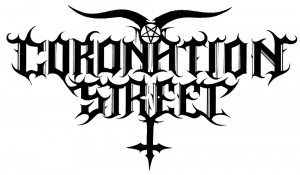
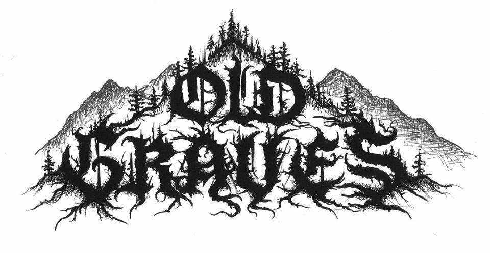
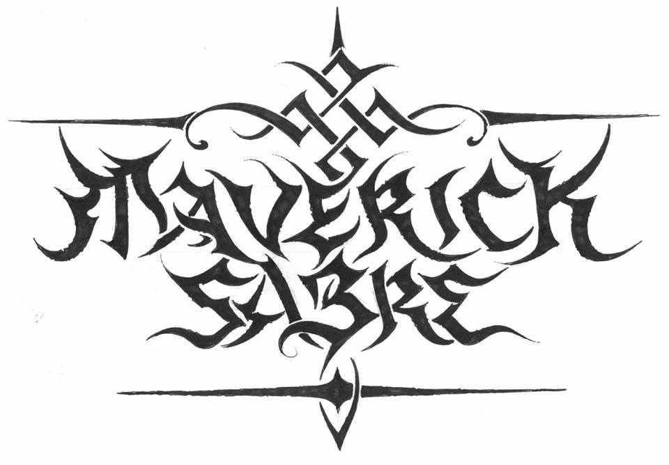
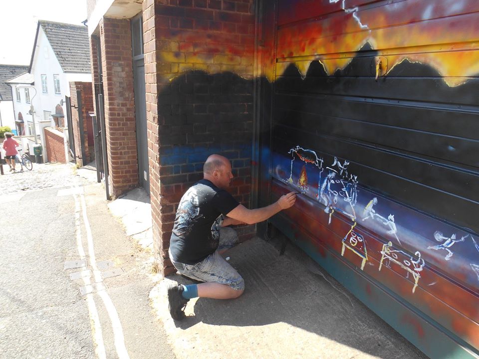
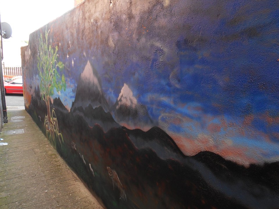
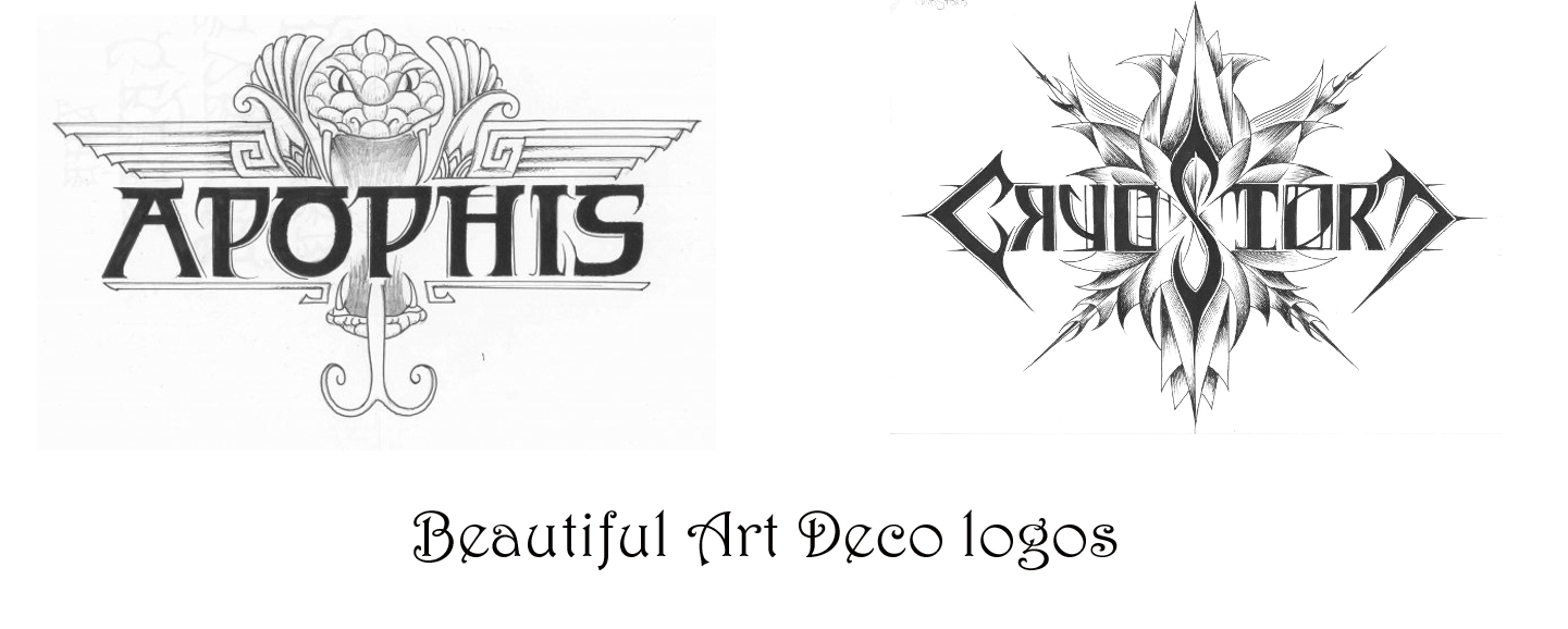
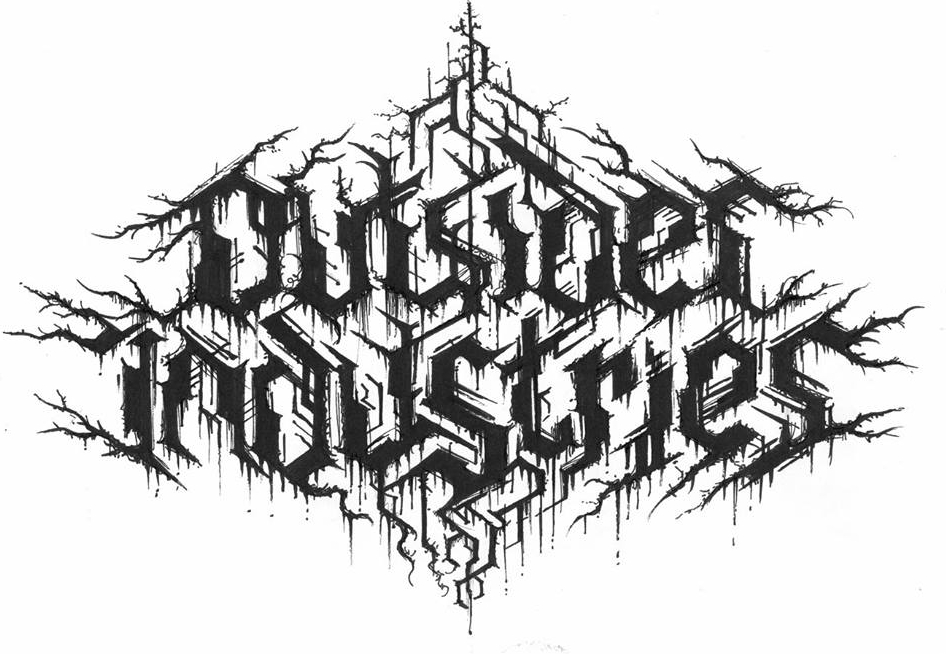
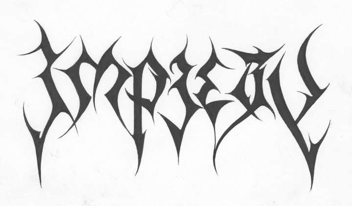
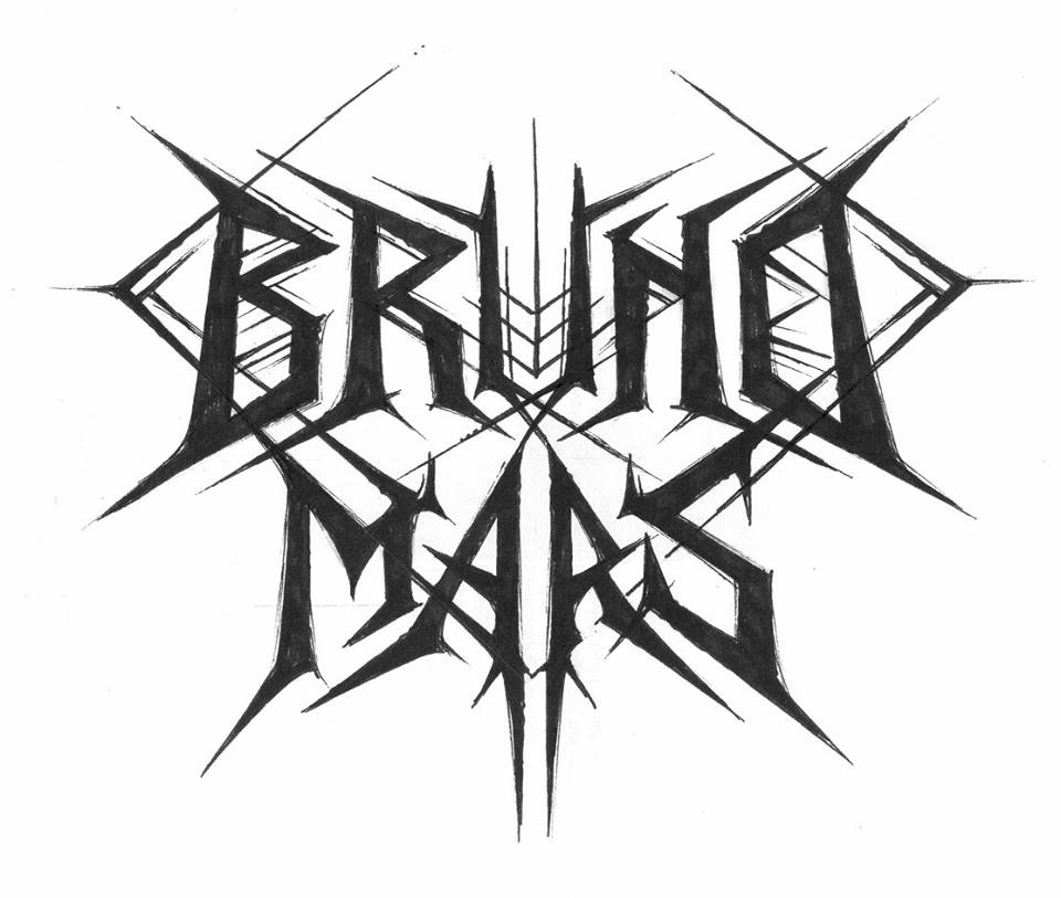
he new logos is a real travel through time and dimension. So there is a timeline, beginning with really primitive logos I have created. A band called Gau, which means ‘night’ in Basque, this logo is very prehistoric, almost as if it was drawn by dinosaurs. With these very prehistoric plants around, no crows, no wolves. Very prehistoric, almost reptilian, taken from a time there was no mammals, no birds, there were just reptiles and primitive insects; trilobites, and ammonites. And in fact I live in Exeter, by the Jurassic coast, so you can send yourself spinning on a time travel of 200 millions years. So we go from these very simplistic logos, like Undo Creation from Georgia, up to the most sophisticated logos; art deco, or futuristic logos, like I did for Outsider Industries. Or Haunted, an Italian project.

outsider

It seems like, although drawing logos still isn’t your ‘day job’, it’s definitely your main focus…

C.S: “I’m trying to keep myself at the age of 45, forever doing logos. The main reason is being single; all the time being single, so I can concentrate 100% on my logos because this is what gives me happiness. I have never been married, never had children; my first child is that book, Lord of the Logos. And that child is growing all the time, it has been in many hands, and it’s being appreciated by people who have never been listening to metal. Lord of the Logos is really only focussing on what inspires me; it’s photographs and logos. And there are some medieval aspects, but mostly it’s nature. All the photos have been taken by myself, and the logos are all my own work and it reflects the places that have inspired me. It includes many parts of Devon, Dartmoor, Southampton, Oregon, California, south of France, Belgium. Quite a lot of places that I have visited. And last year there was also the release of the compendium, Logos from Hell by Mark Riddick, and I’ve got something like 200 of my works in there; no other artist had 200 logos collected in one compendium book. The book is very heavy.

LOGOS_FROM_HELL_Cover

Collecting works into books creates a great  reference work for graphic artists, but does it inspire you to look back at your old stuff?

CS: “I have been at the moment making a complete retrospective and over the next while… I have been looking to post on Facebook for the first time logos that I did from 1992 to 1999. So a real retrospective that includes some logos like a band called Eternity of Darkness that I did in 1992, something like that; that was a UK band. And Stone Circle. We’re talking about very, very old stuff from the 90s…

What were the logos that first got your attention? In the 70s there were some classics like Kiss…

Yeah; the original [Paul Stanley designed] Kiss logo with the SS style lettering; it’s just exactly the kind of logo that got me as a kid. I started listening to Kiss in 1977. I also loved bands like The Cure. I remember going to see them when I was 12 and it was like going to enter a completely forbidden country. When I went in ’82 it was all the ‘post-punks’ but when I saw them again in ’87, that was the time of all the Goths. There were just loads of Goths; the people you just couldn’t see in the daytime. You just couldn’t see these people outside of some special place like Camden. In Camden you could see all these illuminated people with a vivid imagination; and I am one of them, I definitely consider myself as an illuminated eccentric with a vivid imagination.

 At this point do you have any idea how many logos you’ve done?

It would be easily a good ten thousand. And there are quite a lot of logos that I unfortunately parted with the originals. Because in many cases I’d be drawing on the go and just hand the drawings over to the client. Like a band from Italy called Deathraid, who were a little bit in the vein of the oh-so-legendary Necrodeath…

…brief interlude as we discuss Necrodeath’s Into the Macabre and Christophe reveals that, however wide his tastes and artistic ambitions, his roots are most definitely in the underground metal scene of his youth:

CS: “Into the Macabre very memorable, it’s very simplistic, its raw. It’s got that vibe. The songs are just basically keeping you on your toes. It’s a great blend of thrash, speed metal with that slight black metal edge, but at the same time it’s very insane, it’s very haunting. It’s the kind of album if you hear it once you will remember it for the rest of your life.”

Well, it was recorded before all the genre boundaries were really established…

CS: “Yes, it was just straight from hell metal. And that was what I adored.”

Last year, Christophe’s iconic Emperor logo became, for the first time, a source of something other than pride, when it became the basis for some joke Christmas jumper designs posted online by the Foo Fighters; which still rankles, evidently…

CS: That drove me absolutely ballistic. And I could have sued them, but I had a much nicer idea. I came up with a Foo Fighters logo designed by myself, which has a black metal vibe, but with the FF of Foo Fighters and elements of the Foo Fighters logo but had a black metal, but still readable, Emperor-esque inspiration, without being a barbaric cut-paste like this pathetic Foo Fighters Emperor-esque logo which had been done on a computer.

foo

A lot of people brought it to my attention and there was much going on on my Facebook wall that I finally said I’m gonna ram it down and post the logo. This is how the Foo Fighters logo should be! Woe to the guy who ripped off my Emperor logo and made a right pig’s ear out of it! Of course I had some people who told me I should be honoured. Well! Honoured of having my art being disfigured, desecrated, stolen and mistreated like that? Bollocks. If they really wanted to have an Emperor tribute logo they would have contacted me! They wouldn’t have contacted a lousy, so-called graphic designer, who made this terrible pig’s ear out of it, and on this awful, terrible, shameful Christmas jumper!

So what is  the legal situation with the Emperor logo? Do you have any rights or does the band just own it?

I still have the right to exhibit. I had a massive exhibition; last year started great. I had the Marks of Metal exhibition in Odense in Denmark. There was an encounter between me, who did the Emperor logo and Kristian Wåhlin, Necrolord, who did the Emperor album cover. We actually brought the actual works, and we were there with the works together, making the same kind of statements. We both did these works when we were just Emperor fans, when we were young. I was exactly twenty when I did the Emperor logos, I was still doing my studies and I did it as kind of a hobby. When I did that logo in January 1991, during my first year winter exams, I would never imagine that Emperor would become so big. It wasn’t until 1994 and In the Nightside Eclipse that my name became big. That was when my name spread in the underground and became known among the metallers.

emperor_logo

How do you feel about that logo now? Do you still like it?

Yes, I love it still. It’s become one of the timeless classics. Think about Motorhead, think about  Iron Maiden, think about Abba! Tom Jones, he’s still going on. The Foundations; Build Me Up Buttercup. These are artists and songs I loved and still love. Think of Elvis Presley; these are timeless classics and the Emperor logo is one of those classics. And it’s one of the few logos that is still unaltered after 30 years. And when people meet me they say ‘you’re the Emperor logo guy!’ Of course there lots of  other bands from the 90s whose logos I did; but Emperor is the one that stands out.

Do you feel your focus as an artist has changed much since 1991?

CS: “Well, in the 90s I wouldn’t say that I wanted only true black metal exclusively, but there was no way on earth that I would have been doing the logos for Kim Kardashian and people like that… I do wonder where those will take me…

jamol

Links:

Facebook

Devon Artists Network

Google Plus

Contact: christophe.szpajdel@gmail.com