Between me thinking about writing something about what home and belonging means and actually starting to do it, it’s become a far more topical subject than I expected, which seems to be how these things go these days.
The initial impulse to write it came from several unconnected things; some photos I took in Iceland over a decade ago; the lyrics to the R.E.M. song “(Don’t Go Back to) Rockville;” a beautifully evocative description of a rundown railway station in a dusty, remote part of Austria-Hungary in the 1900s. That description felt especially poignant because Austria-Hungary is a country (and the Habsburg Empire an Empire) that no longer exists, but which must have felt permanent in its day and which people in the 1900s felt just as patriotic and loyal towards or just as ambivalent about as people now do towards the constituent parts of the United Kingdom or/and the UK itself. But all of that has retreated into the distance a little because as I write this, up and down the country – even in this little corner of rural Scotland – people are engaged in a protest of sorts. Unusually for a protest, it takes the form of doing something which has always been entirely acceptable to do and which no one has ever tried to discourage the protesters from doing; hanging up flags.
The flags that have made it onto the news – especially from the recent, ironically-named “Unite the Kingdom” right-wing rally in London, are mostly St George’s cross (the flag of England), interspersed with Union flags. In this village the flag fliers tend, naturally to instead display the Saltire/St Andrew’s cross (the flag of Scotland, reputedly the oldest national flag in Europe – which if its semi-mythical origins are correct actually predates the Kingdom of Scotland itself by a couple of centuries) and the Union flag.
Flags are, by design, simple and very easy to identify, but they are also kind of a blunt instrument when it comes to signalling. Other people in this area have been displaying the Saltire and the medieval Scottish flag (the Royal Banner; a rampant red lion on a yellow ground) with no Union flag. I presume this is some kind of anti-unionist/nationalist counter-protest but I may be wrong; to be sure I’d have to ask the flag fliers, and who wants to do that? Whatever else they are, national flags tend not to be especially inviting, particularly when displayed in their country of origin. Nearby I’ve also seen – in a more obvious counter-protest – people displaying Palestinian and Pride flags.
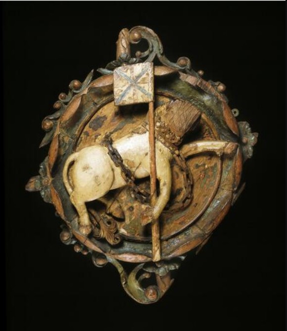
It’s a regularly remarked-on (and ultimately meaningless) irony that the historical St George was a Turkish man of Palestinian descent, but less remarked on (though similarly meaningless in this context) that St Andrew, who the saltire represents, was born in what is modern day (Israel-occupied) Syria. Lions (though not red ones) are native to sub-Saharan Africa and India. And yet, for the people waving, wearing, hanging, painting or generally displaying the flags, these symbols of Syrian and Turkish-Palestinian saints and these African/Indian mammals (1 for Scotland, 3 for England, though confusingly the English ones were historically referred to as leopards, which scans less well for a football song lyric) are symbols, I presume, of home. And therefore the people displaying them for patriotic, political or intimidating purposes mostly don’t care what their origins are, which is fair enough. It’s my home too, but although I have no special feelings about the flags of Scotland or the UK, seeing them all over the place, rather than just on official buildings or big hotels is oddly alienating, just like seeing the stars and stripes on every other street on a trip to the USA was.
The flags of your nation, displayed in that nation, tell you two things; firstly, where you are – which you already know – and secondly, that somebody wants you to be very aware of where you are, which you still already know. Theoretically, people display flags for themselves and not for anybody else, but a flag by its nature is a signal and for most of the time, the person who flies it outside their home or paints it on the street or on some historical landmark, or puts a sticker on a bus shelter can’t see it, but anyone passing by can.
Because so many of the people involved in the current protests are xenophobic (not really derogatory; many of them are explicitly saying they are protesting against “migrants”. “I belong here,” is not a protest; and anyway nobody is disputing it. “You don’t belong here” is mostly what the protest is about) there’s been a lot of discussion about what kind of symbols our flags are and what, beside dead saints, they represent. Obviously, flags themselves aren’t racist, or at least are only as racist as the people displaying them. There are possibly a few exceptions; most obviously, I feel like any Jewish or Romany person has the right to feel victimised if someone is displaying a black swastika in white circle on red ground; I wouldn’t think it was outlandishly sensitive if an African-American person felt offended by someone waving a Confederate flag at them. Still, it’s strange the extent to which seeing the flag of your country everywhere makes that country feel like a different place from the one you grew up in.
But home is a strange thing anyway and ‘feeling at home’ in the comfortable sense of being where you are supposed to be, in the place that it feels natural to be, isn’t universal; clearly the protesters don’t feel it or they wouldn’t be protesting.

The poet Philip Larkin – often seen as a definitively (I refuse to use the word ‘quintessentially’) English figure and sometimes derided as a ‘Little Englander,’ made some interesting observations about home that demonstrate how one-dimensional that (otherwise not unfair) assessment of him is. In The Importance of Elsewhere (1955), he argues (well, it’s a poem, not an argument; anyway, he says) that feeling lonely and out of place is a normal, appropriate and even a comforting response to being in alien surroundings (specifically Belfast) – “Strangeness made sense. The salt rebuff of speech,/Insisting so on difference, made me welcome.” The strangeness of the place itself “went/ To prove me separate, not unworkable.” On the other hand, feeling lonely and out of place in the place you come from and where you theoretically do belong does the opposite; and it possibly says unpleasant things about the place itself, too.
Larkin was right; for himself at least and therefore it’s not surprising to find that a slightly earlier poem (Places, Loved Ones, 1954) begins “No, I have never found / The place where I could say / This is my proper ground / Here I shall stay…..” A few years later, he obliquely questioned whether the idea of home is even desirable at all, since ‘belonging’ to anything can only ever be transitory – “Home is so sad. It stays as it was left, / Shaped to the comfort of the last to go” (Home is so Sad, 1958). Eventually and unexpectedly, he did find that place where he could say this is, etc, etc – which turned out to be Hull. He celebrated the city in a 1961 poem called Here – the title is surely a self-referential one, looking back to that fourth line of Places, Loved Ones, quoted above, Here is one of Larkin’s very few poems of belonging, but inevitably he celebrates the town for what would normally be considered its negative traits; inaccessibility, neglect and, if not actual unfriendliness, then at least a distant kind of reserve; “Here is unfenced existence: / Facing the sun, untalkative, out of reach.” He really was the Morrissey of 20th century English poetry.
Coventry was where Larkin came from, but though he wrote about it several times, it was never in the sense of feeling at home there. But if “feeling at home” means some kind of existential peace and contentment, there’s no real reason why that you should have any particular connection with the place you’re originally from, unless you happened to have an idyllic childhood. Equally, there’s no special reason why where you currently live should be where you feel at home, unless you are contented there like, presumably, the angry people with their flags and paint. But if they really love their country they certainly hide it well, not just because of their anger, but also how they treat the place and the mess they leave behind; they really do protest too much.

I’m loath to mention Morrissey again but a short side note seems relevant. For all his apparently xenophobic Englishness, Morrissey doesn’t (in common with many xenophobic, wealthy ‘patriots’) love England enough to actually live there. But to be fair, he rarely claims to love it at all; Morrissey is, thankfully, far more Larkin than Farage. The question of his (unusually complex but now undeniable) right-leaning politics goes back a long way, but when in 1992 he released the album Your Arsenal and alarm bells rang in the NME offices at the title of the song “The National Front Disco“, those NME scribes did him a disservice. He’s not foolish or racist enough to write a song actually glorifying the NF, though the song is definitely and maybe deliberately an uncomfortable one. In the lyrics he puts his finger (sympathetically or otherwise; it’s impossible to say) on the mentality of the kind of people currently waving placards telling foreigners to get out of “are country” (wish I was making that up). “There’s a country, you don’t live there / But one day you would like to / And if you show them what you’re made of / Then you might do.” That is really the essence of the march that happened last week in London and the smaller versions of it across the UK, including, dismayingly, one in Falkirk (one likes to think Scotland is above that kind of thing but realistically nowhere is, people being what they are).
‘Home’ is only on the most mundane level the place where you live, and the less mundane ideas of home are far more mysterious and often very personal. Without wishing to delve much into etymology, ‘home’ is a concept which even in its basic form as a noun (The place where a person or animal dwells, as the OED slightly creepily puts it) includes meanings that I don’t think I was aware of; “figurative. With reference to the grave or one’s state after death. Frequently with preceding adjective; ‘long home‘.” Apparently ‘long home’ was a common usage in Old English – and if you don’t belong in your grave then where do you belong? The long home is where the heart is; which makes me think of the last line of Wuthering Heights – surely one of the most beautiful endings to any deeply unpleasant novel:
I lingered round them, under that benign sky: watched the moths fluttering among the heath and harebells, listened to the soft wind breathing through the grass, and wondered how anyone could ever imagine unquiet slumbers for the sleepers in that quiet earth. Emily Bronte, Wuthering Heights, 1847
And then there’s home as in ‘too close to home,’ ‘coming home to roost,’ ‘the Home Office’, a point being ‘driven home,’ ‘home truths,’ ‘Home Rule,’ ‘make yourself at home’ (I have vague memories of a comedian or comedy character introducing their act by saying something like ‘Make yourself at home. Unless you’re in a hotel in which case make yourself in a hotel.‘ Vic Reeves? Alan Partridge? No idea).
Relatedly, belonging is a strange, unpredictable and entirely personal sensation. Larkin seems not to have felt he belonged anywhere until he found somewhere suitably impersonal and forbidding. Morrissey seems to thrive as an eternal outsider in Los Angeles, though it’s hard to think of anyone who seems more like an embodiment of Manchester. Belonging (I don’t say this self-pityingly, I’m comfortable with it) isn’t a feeling I’ve felt especially often and when I have it’s been at random times and sometimes in unexpected and unlikely places. Just recently, out walking in the area where I live and where I mostly grew up, I had one aspect of belonging; the exact kind of weather I obscurely feel most at home in; mild, grey, windless, with a low, quilted-looking heavy sky that didn’t quite threaten rain and let no ray of sunshine through. I like muggy weather and have never yet met anyone else who does. It’s kind of the other side of Larkin’s The Importance of Elsewhere – if not feeling at home ‘at home’ makes you unworkable (as he puts it), maybe the conditions that you feel the most at home in equally say something, possibly something unflattering, about you? Enjoying blue skies and sunshine (which I do too, although less so) just seems more positive somehow.
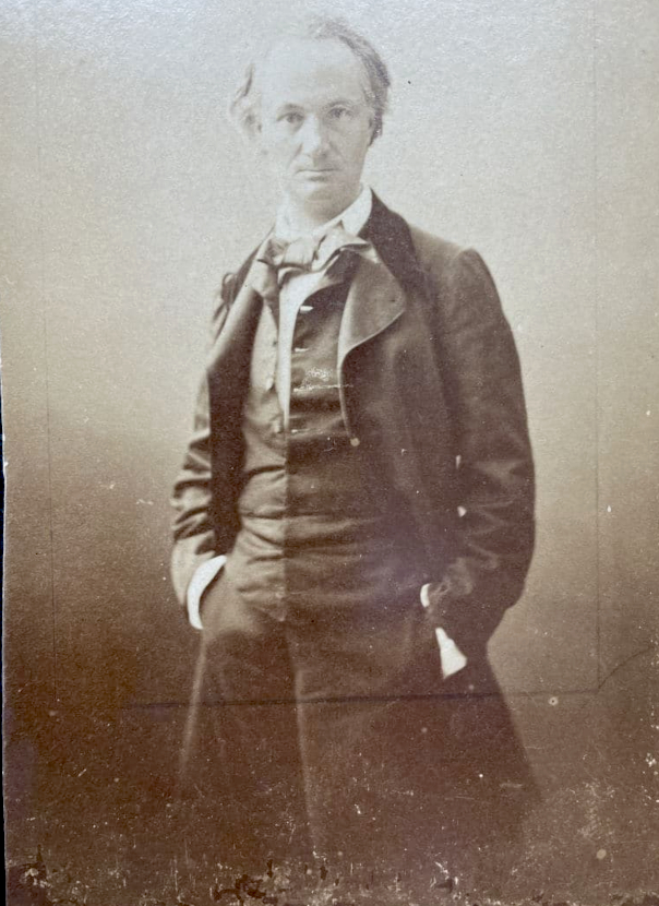
Clearly for the protesters, ‘belonging’ is as much about people – a homogenous group of people – as it is about place. That’s the opposite of the vague kind of belonging that I sometimes identify with, the kind of thing expressed (very romantically) by Charles Baudelaire when he writes about ‘the flâneur’ in The Painter of Modern Life (1863). “To be absent from home and yet feel oneself everywhere at home; to view the world, to be at the heart of the world, and yet hidden from the world […] The spectator is a prince who rejoices everywhere in his incognito. … The lover of universal life enters into the crowd as into an immense reservoir of electrical energy. One might compare him, also, to a mirror, immense as that crowd; to a kaleidoscope endowed with consciousness which, with its every movement, conveys the multiplicity of life, and the grace in motion of every element of that life.” Well, I rarely feel as enthusiastic as that, and I generally don’t like being in a crowd with a specific purpose, even a benign one like the audience at a concert. But on the other hand, though I rarely feel at home anywhere, I never feel like my home has been stolen or invaded, and I don’t feel threatened because I see or hear people who are different from me. So that’s nice.
Xenophobia is kind of stranger than misanthropy, which is at least understandable, because human beings can be destructive and unpleasant like no other species. But although humanity has apparently infinite variety on the personal level, that variety, though it seems to terrify some people, is on every other level, extremely limited. However many names we choose to give this geographical (rather than political) area; the British Isles, the United Kingdom, Scotland, Wales, England, Ireland, Northern Europe – the population is, -whichever newcomers may arrive, and wherever they arrive from – pretty homogenous, because the human race is pretty homogenous. I was interested to hear my vague gut feeling given scientific validity by the archaeologist Dr Helen Geake (on the Time Team podcast of 9th September this year.) In response to a question about the diversity of the population of Anglo-Saxon England (following the discovery of a skeleton with African ancestry in an Anglo-Saxon cemetery) she said, “I’m not wanting to say ethnically diverse, partly because […] there’s so little genetic variability between humans that I don’t think we have anything like ethnicities or races or whatever. I just don’t think that makes any sense when you look at the science. I think it’s more of a diversity of appearance and origin.” When you consider the inter-species variation between, say a lion (since I mentioned them before) and a housecat, or a chihuahua and a Saint Bernard, it’s clear that the gradations between human beings are far more subtle. And when it comes to people you feel an affinity with, you’re as likely to feel at home (that expression seems stranger the more you consider it) with someone you met by chance recently (or even met virtually online), as with someone you’ve known since you were a child. Interestingly (there’s a euphemism!) I read just this morning that a “Race Science Institute – ie debunked Nazi bullshit – funded by one of the world’s richest men is currently trying to be influential in UK politics.
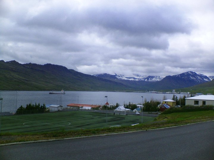
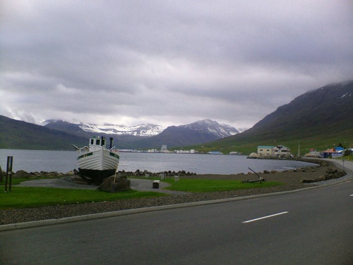
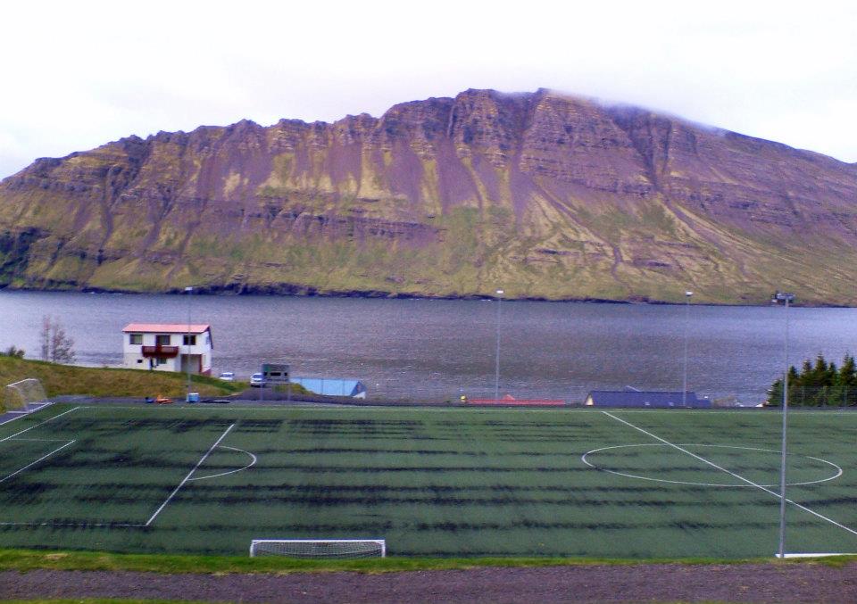
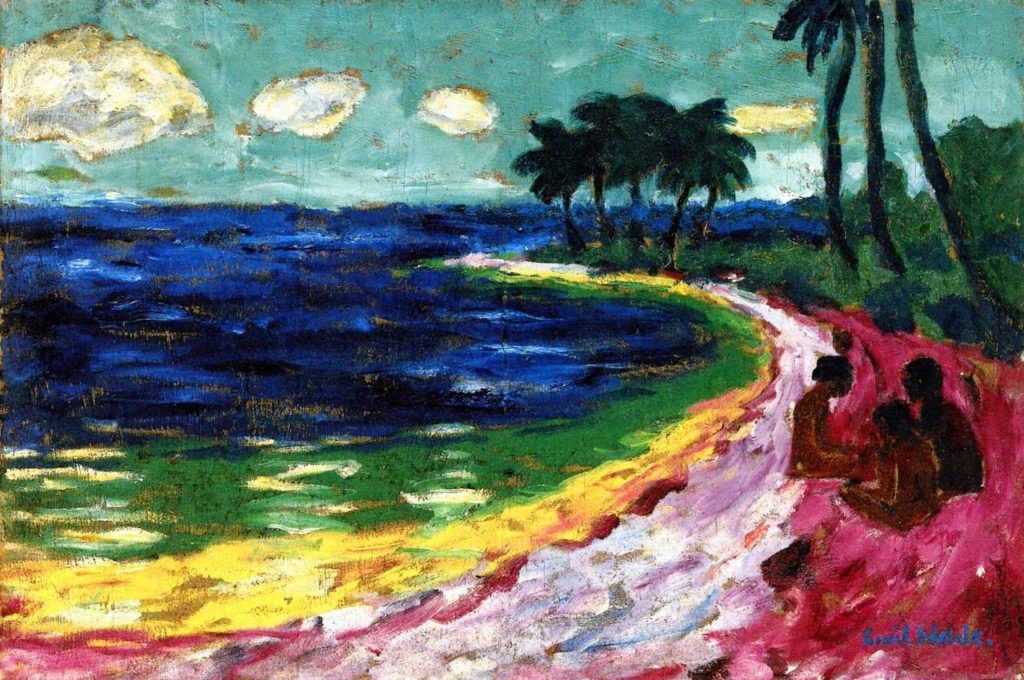
Randomly – although it’s the thing that made me think about writing all this in the first place – I don’t think I’ve ever had that ‘at home’ feeling more strongly than I did when walking in the outskirts of a small town in Iceland at 4.30 am one July, during a night where the ‘midnight sun’ felt more like perpetual dusk. Why should that be? I have no idea. The conditions were right I suppose – not unlike the flat grey day mentioned earlier. Iceland is very beautiful but although this stretch of road ran alongside a fjord at some points, it mostly wasn’t something so picturesque that you’d put it on a postcard. It featured details as apparently uninspiring (but weirdly loveable to me) as a mouldering football pitch and a school or some kind of municipal building. At one point there was a boat on a platform, which did give more of that sense of ‘elsewhere’. What did ‘at home’ feel like? You know it when you feel it I suppose – a kind of vaguely melancholy contentment that may partly have come from having had a few drinks plus 24 hours or so without sleep; it was comfortable and it didn’t feel like exhaustion.
If I tried to express that feeling to some of the protesters, quite possibly they’d say something like “If you like it so much why don’t you go and live there” (British people have a long history of telling people if they don’t like the country they can just leave, and yet they rarely feel like they themselves should leave if they don’t like the country). It occurs to me now that when racists, xenophobes or (popular current euphemism) “concerned citizens” scream at people to go back where they came from, when they wrap themselves in the flags of their own country and wield their national identity at people, what they are doing may partly be asserting how they feel about their home, but what they really want is for everyone they oppose to not feel at home. And when, at the best of times, ‘feeling at home’ is a fleeting and precarious emotion, that’s kind of a shitty thing to do.
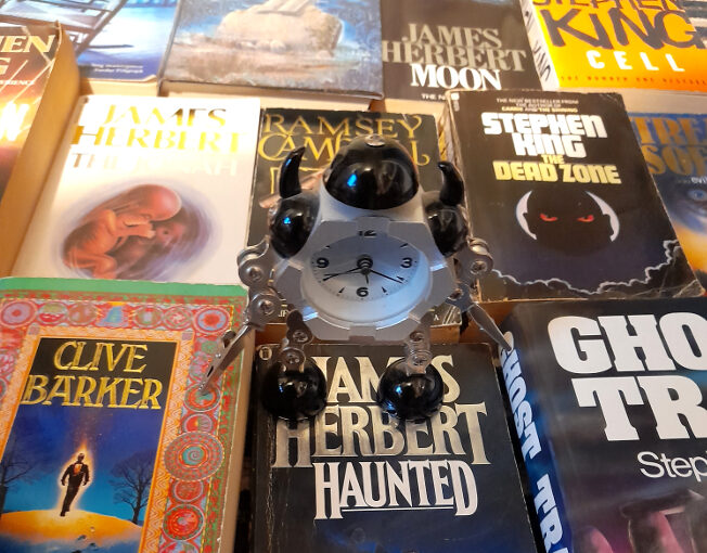


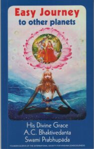 Why is it painful to get rid of books? Pompously, because the books you own are a reflection of yourself; of skins shed and personalities outgrown and discarded, and in a way a direct line back to your (possibly alarming) former selves with their sometimes alien tastes and enthusiasms.* Less pompously, because in general, I want more books, not fewer. I can’t think of an occasion when I got rid of a book simply because I didn’t like or just didn’t want it, though I’m sure it’s happened. And so, for decades I still owned (and may still have somewhere) the little red Gideons Bible that was given out to pupils when starting high school (do they still do that?). Its bookplate (ex-libris? Both terms seem very archaic) hints strongly at the typical kind of 12 year old boy that it was given to: Name: William Pinfold Form: human. Similarly, I may still have the books given to me in the street by Hare Krishna followers, which seems not to happen now but was a frequent enough thing in the early 90s that I can still remember without checking** that they were credited to and/or consisted of teachings by “His Divine Grace A.C. Bhaktivedanta Swami.” They often had nice, pleasingly psychedelic cover paintings but were invariably disappointing to try to read because, even when they had amazing titles like Easy Journey to Other Planets, they were all about Krishna consciousness – who knew?. But these are books that would be impossible to replace (in a personal sense; easy enough to get hold of different copies of them). More complicatedly – and just annoyingly, with space at a premium, I have multiple copies of some favourite books and will probably buy even more copies of them, if I come across them with covers that I like but don’t have and if they are cheap.


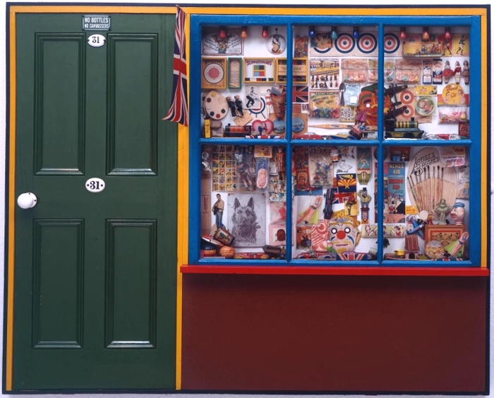
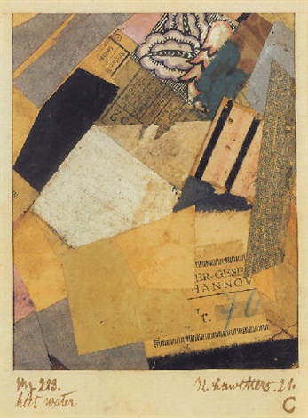
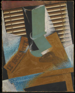
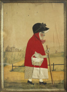 This is perhaps art history as human interest and association rather than as aesthetics (this is especially true in the case of the Victorian scraps and scrapbooks, perhaps because the ready-made nature of the scraps themselves makes the objects feel less like the works of an artist and more like a hobby; nothing wrong with that, but as the sort of things you see in auctions and junk shops they have the aura of being ephemera, rather than using ephemera to make something else; a false distinction perhaps), but for me this exhibition brings those two aspects of art – the human/historical and the aesthetic/technical together in a deep and very satisfying way.
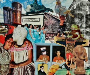


 sophisticated, articulate, menacing but not unfriendly. A few years later, when I began to read
  And that’s just the lyrics; another thing about The Fall that made an impression on me early on was that, although MES was incredibly fussy and perfectionist about the band’s music, he wasn’t snobbish in the usual way; no tune, if it was catchy, was too silly for Mark E. Smith. Think of the speedy but somehow miniature-sounding rock guitar on ‘Underground Medicine‘ or loping, bouncy beat to ‘Gramme Friday‘ or the oddly jaunty, countryish ‘Fit And Working Again‘. or the kazoo on ‘The North Will Rise Again‘– this was ‘angular’ (the definitive descriptive term for late 70s/early 80s UK indie rock) if you like, but it was not standard ‘post-punk’ music, nor was it (as it could easily have been) twee in that beloved ramshackle UK indie/C86 kind of way. Perhaps because Mark E. Smith was not (99% of the time) a melodic singer, the band could play anything behind him and it sounded right. When, at the beginning of one of my favourite songs, ‘Slates‘, MES shouts ‘this is the definitive rant‘ he’s nailing part of the charm of his work. As long as the rant was in place, no tune was too small, too jingly or too silly to make something worthwhile out of.
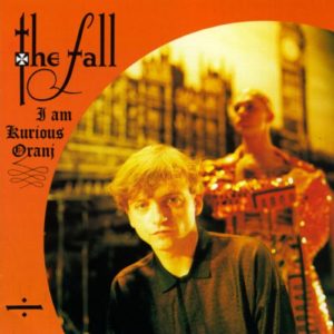 lot of it, and it was mostly pretty affordable, especially the stuff from the band’s then slightly maligned, now justly celebrated mid-80s period of relative commercial success. In itself, that success was odd and underlined just how unique the band, and specifically Smith’s vision, was. I loved that Mark E. Smith saw nothing elitist or strange about working with a ballet company, or in writing for the theatre and working with ‘serious’ artists and yet the people I knew who derided Morrissey as being “poncy” never seemed to think that about MES. The fact that he refused to separate the ‘high’ arts from his work with The Fall was so powerful. Everyone knows, for example, that Brian May is an astrophysicist, but imagine if astrophysics had somehow been indivisible from his work with Queen; they would have been far a more peculiar and far less successful, but also (with no offence intended to the band or its members) probably more interesting band.
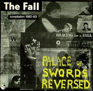
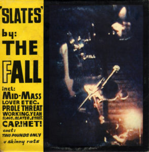 Although most of my favourite Fall albums are the early ones (especially Dragnet, Grotesque (After The Gramme) and Hex Enduction Hour) those 80s albums with the Mark and Brix-led lineup(s), especially The Wonderful and Frightening World Of The Fall are pretty unassailable and perhaps the least overtly commercial ‘commercial’ period of any band I can think of. The band stayed good though, and although I am not a Fall completist (a vocation rather than a hobby) I’ve found that any Fall record one picks up will have something great on it; and there aren’t many bands with a 40 year career you can say that about.
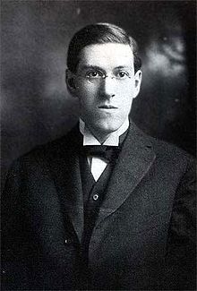 It’s approximately 90 years since HP Lovecraft wrote, “The oldest and strongest emotion of mankind is fear, and the oldest and strongest kind of fear is the fear of the unknown.” (in the essay Supernatural Horror in Literature (1926-7)), and it’s got to be something like 25 years or so since I first read those words (in the HP Lovecraft Omnibus Vol 2, Dagon and other Macabre Tales, Grafton Books, 1985, p.423 ). So what about it?
 This kind of complexity is what makes history more interesting than it’s sometimes given credit for. The Scottish Enlightenment was a wonderful, positive, outward-looking movement, but it coexisted in Scotland with a joyless, moralising and oppressive Calvinist culture. Time and nostalgia have a way of homogenising peoples and cultures. The popular idea of ancient Rome is probably one of conquest, grandeur and decadence, but what is the popular idea, if there is one, of ‘an ancient Roman’? Someone, probably a man, probably from Italy, in a toga or armour; quite likely an emperor, a soldier or a gladiator, rather than say, a merchant, clerk or farmer. But even within this fairly narrow image, a complex figure like the emperor Elagabalus (who was Syrian, teenage, possibly transgender) defeats the obvious school textbook perceptions of ‘Roman-ness’ (as, perhaps, it did for the Romans themselves). Even in our own time, the fact that older generations from the 60s/70s to the present could lament the passing of times when ‘men were men & women were women’ etc is – to say the least – extremely disingenuous. Presumably what they mean is a time when non-‘manly’ men could be openly discriminated against and/or abused and women could be expected to be quiet and submissive.
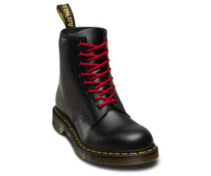 It’s an interesting point. The fleetingness with which you experience things has nothing to do with their power as memories. I have no idea what the first horror film I saw was, but I do know that a scene on some TV show where skinheads (or possibly a single skinhead) glued a man’s hands to the wall of a lift/elevator scared me as a child and stayed with me for a long time. Maybe that was because I used to see skinheads around on the streets (you had to watch the colour of the laces in their Doc Martens to see if they were ‘bad’ skinheads or not – though they were probably kids too, I now realise). I also know now (but didn’t then) that these were the