what do you look like?

A few years ago a friend sent me a photograph of the ten-year-old us in our Primary School football team. I was able, without too much thought, to put names to all eleven of the boys, but the biggest surprise was that my initial reaction, for maybe a second but more like two seconds, was not to recognise myself. In my defence, I don’t have any other pictures of me at that age, and even more unusually, in that picture I’m genuinely smiling. Usually I froze when a camera was pointed at me (and still do, if it takes too long), but I must have felt safer than usual in a group shot, because it is a real smile and not the standard grimace that normally happened when I was asked to smile for photographs. I could possibly also be forgiven for my confusion because in contrast with my present self, ten year old me had no eyebrows, a hot-pink-to-puce complexion and unmanageably thick, wavy, fair hair; but even so, that was the face I looked at in the mirror every day for years and, more to the point, that gangly child with comically giant hands actually is me; but what would I know?

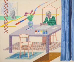
My favourite of David Hockney’s self portraits – Self Portrait with Blue Guitar (1977)

In a recent documentary, the artist David Hockney made a remark (paraphrased because I don’t have it to refer to) that resonated with me; your face isn’t for you, it’s for other people. And, as you’d expect of someone who has spent a significant part of his long career scrutinizing people and painting portraits of them, he has a point. Everyone around you has a more accurate idea of what you look like than you do. Even when you see someone ‘in real life’ who you are used to seeing in photographs or films, there’s a moment of mental recalibration; even if they look like their image, the human being before you in three dimensions is a whole different scale from the thing you are used to seeing. I remember reading in some kids’ novel that the young footballer me liked (I’m guessing Willard Price but can’t swear to it) that when being shown photographs of themselves, the indigenous people of (I think) New Guinea, not only weren’t impressed, but didn’t recognise them as anything in particular. Like Hockney, they had a point; if the Victorian people who invented photography hadn’t grown up with a tradition of ‘realistic,’ representational art would they have seen any relationship between themselves as living, breathing, colourful, space-filling three-dimensional organisms and the monochromatic marks on little flat pieces of paper? The response of the fictional New Guinea tribespeople is actually more logical than the response (surprise, wonder, awe) that’s expected of them in the novel.

Hockney went on further to say that portrait painting (if the sitter is present with the artist) gives a better idea of a person than photography does. At first this is a harder argument to buy into in a way, but it has its own logic too. A photograph, as he pointed out, is a two-dimensional record of one second in time, whereas the portrait painter creates their also two-dimensional image from spending time in the company of the sitter and focusing on them, a different, deeper kind of focus, since it engages the brain as well as the senses, than the technical one that happens with a lens, light and film or digital imaging software. A camera doesn’t care what you are like, it just sees how you look, from that angle, for that second. Maybe my big 10-year-old smile really is representative of how I was, but from memory it doesn’t represent that period for me at all.

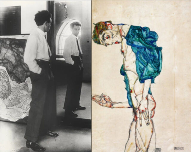
Egon Schiele in his studio c.1915 (left) vs his 1913 self-portrait (right)

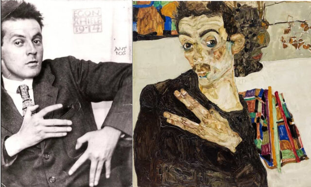
But I might never have written this had I not been reading Frank Whitford’s excellent monograph on the Austrian expressionist painter Egon Schiele (Thames & Hudson, 1981). Schiele is famous for (among other things) his twisted, emaciated and fanatically awkward self-portraits. The man he depicts is scrawny, elongated, intense, sometimes almost feline and utterly modern. Schiele in photographs, on the other hand, is quite a different presence. He sometimes has the expected haunted look and the familiar shock of hair, and he poses almost as awkwardly, but otherwise he looks surprisingly dapper, civilised, diminutive, square faced and elfin. But if we think – and it seems logical that we do – that the photographs show us the ‘real’ Schiele, then the descriptions of those who knew him suggest otherwise. “a slim young man of more than average height… Pale but not sickly, thin in the face, large dark eyes and full longish dark brown hair which stood out in all directions. His manner was a little shy, a little timid and a little self-confident. He did not say much, but when spoken to his face always lit up with the glimmer of a quiet smile.” (Heinrich Benesch, quoted in Whitford, p.66) This description doesn’t exactly clash with the Schiele of the photographs (though he never appears especially tall), but it’s somehow far easier to identify with the dark-eyed, paradoxically shy and confident Schiele of the self portraits. In his own writings, Schiele seems as tortured and intense as in his paintings, but in photographs he appears confident, knowing and slightly arch.  His face, as Hockney says, may not have been for him, but he seems to have captured it in his art in ways that his friends and acquaintances recognised, and which the camera apparently didn’t.

Schiele in 1914 by Josef Anton Trčka (left) vs his 1911 self portrait (right)

Which, what, proves Hockney both right (portraiture is superior to photography) and wrong (Schiele knew his own face)? And anyway, what does that have to do with the 10-year old me? Nothing really, except that the camera, objective and disinterested, captured an aspect of me in that second which may or may not have been “true.” Objectivity and disinterestedness are positive qualities for evaluating facts, but when it comes to human beings, facts and truth have a complicated relationship. Photography, through its “realness,” has issues capturing these complexities, unless the photographer is aware of them and – Diane Arbus and Nan Goldin spring to mind – has the ability to imbue their work with more than the obvious surface information that is the camera’s speciality. But manually-created art, with its human heart and brain directing, naturally takes the relationship between truth and facts in its stride.

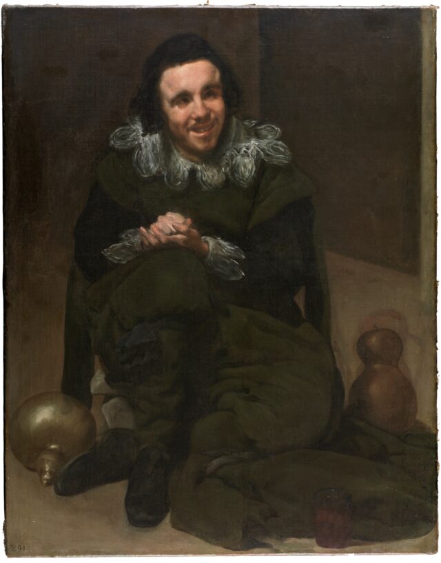
One final example that proves nothing really, except to my satisfaction. Around the year 1635, the Spanish painter Diego Velázquez was tasked with painting portraits of the assorted fools, jesters dwarfs and buffoons whose lives were spent entertaining the Spanish court. Most of these people suffered from mental or physical disabilities (or both) and were prized (I think a more accurate word than ‘valued’ in this context) for their difference from ‘normal’ people; in the same way as carnival “freaks” into the early 20th century in fact. Although these people were comparatively privileged, compared to what their lives would have been like had they not been adopted by the Royal court, their position in the household was more akin to pets than friends or even servants. Juan de Calabazas (“John of Gourds; a gourd was a traditional jester’s attribute) suffered from unknown mental illnesses and physical tics. In a time and place where formality and manners were rigidly maintained, especially around the monarch – where a misstep in etiquette could have serious or even fatal consequences, buffoons like Juan entertained the court with unfettered, sometimes nonsensical or outrageous speech, impulsive laughter and strange, free behaviour. Whereas in normal society these people would be lucky even to survive, in the Court their behaviour was celebrated and encouraged. Velázquez is rightly famous for the empathy and humanity with which he painted portraits of these marginalised figures, but although, as Wikipedia (why not?) puts it; “Velázquez painted [Juan] in a relatively calm state, further showing Velazquez’s equal show of dignity to all, whether king or jester” that seems an unusual response to the portrait below, It’s not untrue, but for me at least, Velázquez’s process of humanisation is painful too. The knowledge that this man lived his life as a plaything of the rich and powerful, alive only because they found him funny is troubling enough. But that pathos seems to be embodied in the picture and you know, or it feels like you know, that Velázquez didn’t find him funny, or at least not only funny. It’s something like watching David Lynch’s The Elephant Man compared to looking at the Victorian photographs of the real Joseph Merrick. Seeing the photographs is troubling, seeing Lynch’s cinematic portrait is too, but it’s deeply moving too.

Juan de Calabazas (c.1635-9) by Diego Velázquez

All of which may just be a way of saying that a camera is a machine and does what it does – recording the exterior of what it’s pointed at – perfectly, while a human being does, and feels, many things simultaneously, probably not perfectly. Well I’m sure we all knew that anyway. I eventually got eyebrows, by the way.


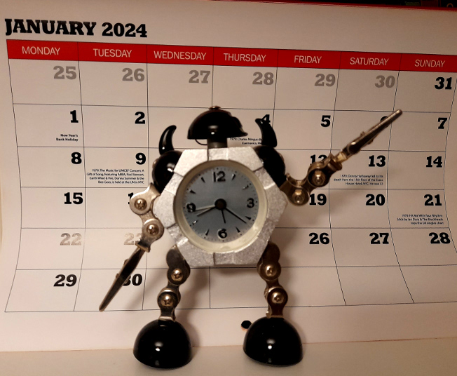
2024 – welcome to the/a future(s)


Another year – and the actual name of the year itself gets ever stranger and more unlikely and exotically futuristic, if you grew up in the era when the film 2001: A Space Odyssey was still set in the future. And here’s the annual attempt to get something onto this site at the beginning of the year – just made it in the first week this time – and hopefully, to post more often. The goal is a minimum of once a month but I think goals are better than resolutions so that’s as far as I will go.

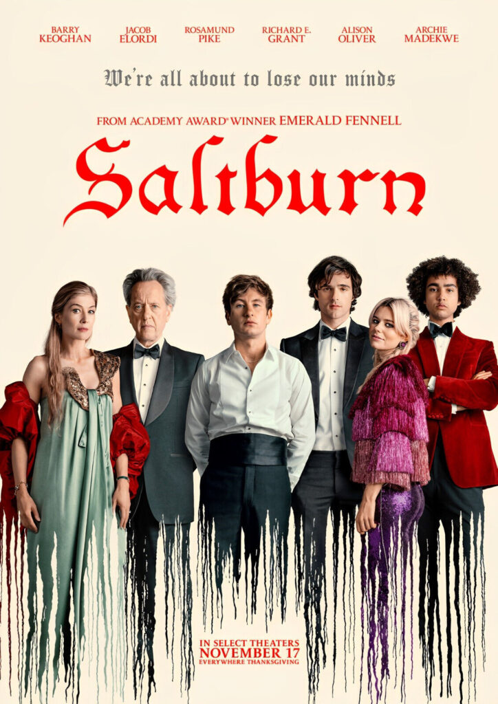
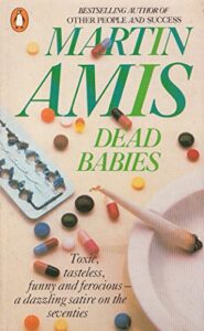
2023 was the usual mixed bag of things; I didn’t see any of the big movies of the year yet. I have watched half of Saltburn, which so far makes me think of the early books of Martin Amis, especially Dead Babies (1975) and Success (1978) – partly because I read them again after he died last year. They are both still good/nasty/funny, especially Success, but whereas I find that having no likeable characters in a book is one thing, and doesn’t stop the book from being entertaining, watching unlikeable characters in a film is different – more like spending time with actual unlikeable people, perhaps because – especially in a film like Saltburn – you can only guess at their motivations and inner life. So, the second half of Saltburn remains unwatched – but I liked it enough that I will watch it.
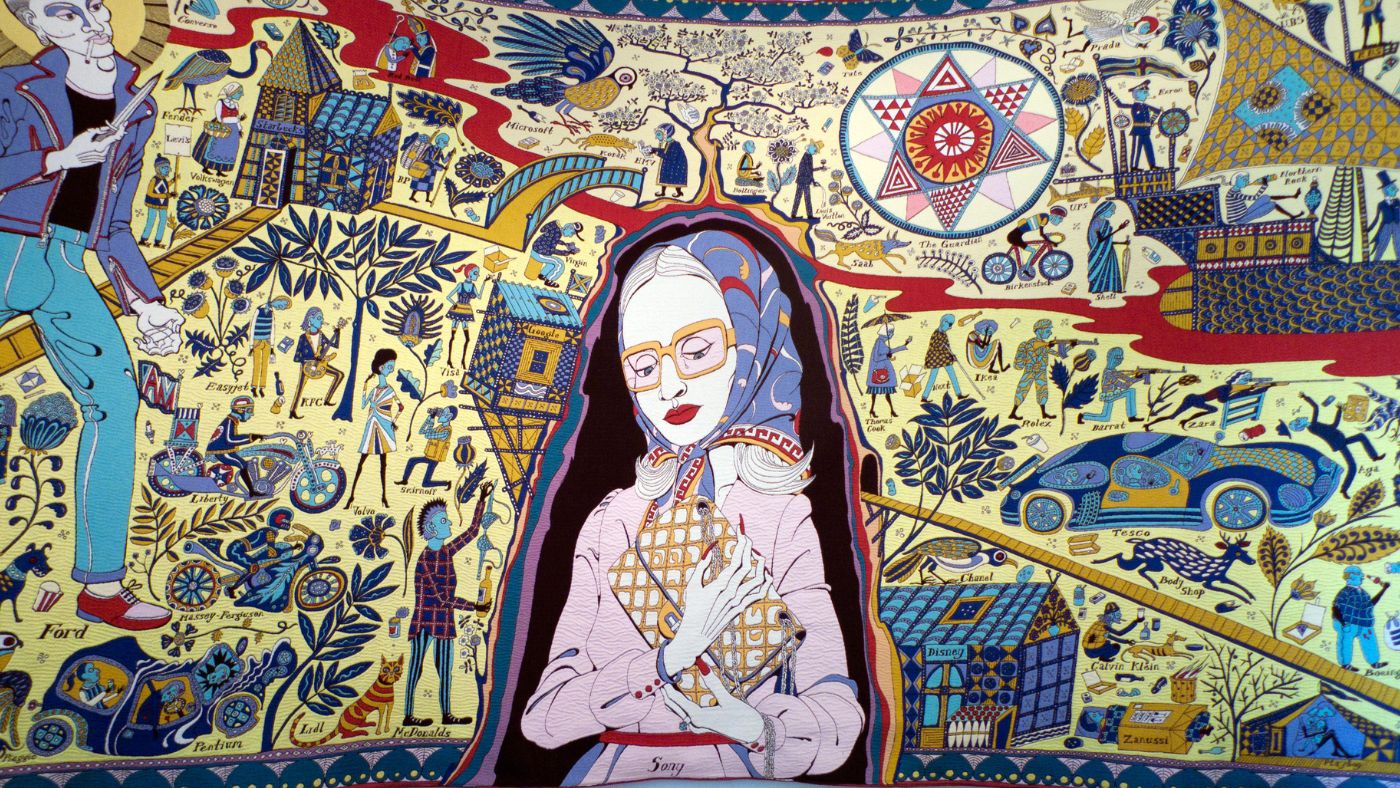
Grayson Perry – The Walthamstow Tapestry (detail)

I didn’t see many exhibitions last year but am very glad that I caught Grayson Perry’s Smash Hits in Edinburgh. I didn’t really plan to see it as assumed in advance I wouldn’t like it, but in fact I loved it and ended up having a new respect for GP that only partly evaporates whenever I see him on TV.

Kristin Hersh by Peter Mellekas

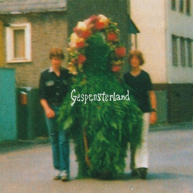
I can’t be bothered going in depth about my favourite music of the year because the year is over and I’ve written about most it elsewhere. Old teenage favourites came back strongly: Kristin Hersh’s superb run of albums continued with Clear Pond Road. I hadn’t thought a lot about Slowdive in years but I really liked Everything is Alive and was very pleased to see them get the kind of acclaim that mostly eluded them when I was buying their first album a million years ago. Teenage Fanclub’s Nothing Lasts Forever and Drop Nineteens’ Hard Light were good too, and The Girl is Crying in her Latte by Sparks was probably my favourite of theirs outside of their early 70s classics. There were some excellent black metal (or black metal-related) albums too; much as I don’t like to think of Immortal without Abbath, Demonaz did himself proud with War Against All. Niklas Kvarforth returned to form with the brilliant Shining and Skálmöld’s Ýdalir is as good as anything they’ve recorded. In less guitar-oriented genres, I loved Kid Koala’s Creatures of the Late Afternoon and the latest Czarface record but my favourite album of the year if I had to choose one was the loveably lo-fi and enigmatic compilation Gespensterland.

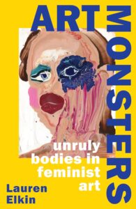
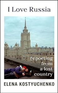
I read lots of good books in 2023 – I started keeping a list but forgot about it at some point – but the two that stand out in my memory as my favourites are both non-fiction. Lauren Elkin’s Art Monsters: Unruly Bodies in Feminist Art  is completely engrossing and full of exciting ways of really looking at pictures. I wrote at length about Elena Kostyuchenko’s I Love Russia here. Kostyuchenko introduced me to a country that I only knew via history and stereotypes and her book is an exercise in what good journalism should be – informative, interesting, compassionate and readable. Both of these books cut across a wide range of subjects and examine unfamiliar things but also analyse the familiar from unfamiliar points of view; you should read them, if you haven’t already.
 

It’s no great surprise to me that my favourite books of the year would be – like much of my favourite art – by women. Though I think the individual voice is crucial in all of the arts, individuals don’t grow in a vacuum and because female (and, more widely, non-male) voices and viewpoints have always been overlooked, excluded, marginalised and/or patronised, women and those outside of the standard, traditional male authority figures more generally, tend to have more interesting and insightful perspectives than the ‘industry standard’ artist or commentator does. The first time that thought really struck me was when I was a student, reading about Berlin Dada and finding that Hannah Höch was obviously a much more interesting and articulate artist than (though I love his work too) her partner Raoul Hausmann, but that Hausmann had always occupied a position of authority and a reputation as an innovator, where she had little-to-none. And the more you look the more you see examples of the same thing. In fact, because women occupied – and in many ways still occupy – more culturally precarious positions than men, that position informs their work – thinking for example of artists like Leonora Carrington, Kay Sage or – a bigger name now – Frida Kahlo – giving it layers of meaning inaccessible to – because unexperienced by – their male peers.
The fact that women know more about themselves but also more about men than men do – because they have always had to – gives their work an emotional and intellectual charge often missing from those who belong comfortably within a tradition. This is a pretty well-worn idea – it’s why outsiders like Van Gogh or dropouts like Gauguin’s work speaks to us more clearly than the academic, tradition-bound art that they grew up with. Anybody on the margins, in whatever sense, of “mainstream society” has to have a working knowledge of that society, just to exist. Society has far less need to understand or even notice those people. – therefore their points of view are likely to not only be more individual, but more acute when it comes to observing the world in which they live. Class, race, gender; all of these things are always fascinatingly central to art and art history and the gradual recognition of that fact is making art history ever more exciting and vibrant. For now at least; we live in a time of conservative backlashes which attempt to restore order to those with a comfortable position within yesterday’s world – there will probably be an art historical backlash at some point, and the reputations of the mainstream stars of art in Van Gogh and Gauguin’s day, like William-Adolphe Bouguereau will find their reputations restored.

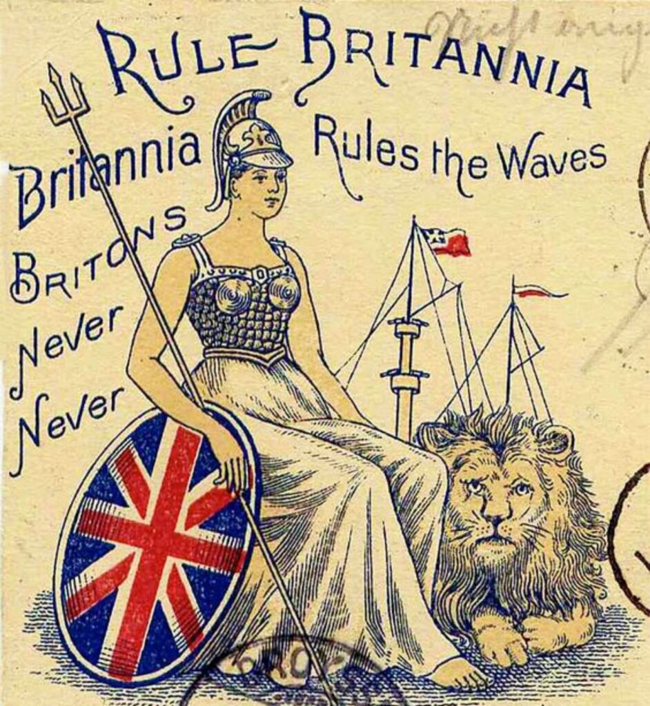
If that backlash comes, it will be from the academic equivalent of those figures who, in 2023 continued to dominate the cultural landscape. These are conservative (even if theoretically radical) people who pride themselves on their superior rational, unsentimental and “common sense” outlook, but whose views tend to have a surprising amount in common with some of the more wayward religious cults. Subscribing to shallowly Darwinist ideas, but only insofar as they reinforce one’s own prejudices and somehow never feeling the need to follow them to their logical conclusions is not new, but it’s very now. Underlying  ideas like the ‘survival of the fittest’, which then leads to the more malevolent idea of discouraging the “weak” in society by abolishing any kind of social structure that might support them is classic conservatism in an almost 19th century way, but somehow it’s not surprising to see these views gaining traction in the discourse of the apparently futuristic world of technology. In more that one way, these kinds of traditionalist, rigidly binary political and social philosophies work exactly like religious cults, with their apparently arbitrary cut off points for when it was that progress peaked/halted and civilisation turned bad. That point varies; but to believe things were once good but are now bad must always be problematic, because when, by any objective standards, was everything good, or were even most things good? For a certain class of British politician that point seems to have been World War Two, which kind of requires one to ignore actual World War Two. But the whole of history is infected by this kind of thinking – hence strange, disingenuous debates about how bad/how normal Empite, colonialism or slavery were; incidentially, you don’t even need to read the words of abolitionists or slaves themselves (though both would be good to read) to gain a perspective of whether or not slavery was  considered ‘normal’ or bad by the standards of the time. Just look at the lyrics to Britain’s most celebratory, triumphalist song of the 18th century, Rule Britannia. James Thomson didn’t write “Britons never, never, never shall be slaves; though there’s nothing inherently wrong with slavery.” They knew it was something shameful, something to be dreaded, even while celebrating it.
But anyways, the kind of avowedly forward-looking people we that are saddled with now, with their apparent concern for the future of the human species – especially the wellbeing of thus far non-existent future humans, as opposed to actual real living humans are, unlike the Amish, okay with progress, in the material sense of cars, computers, aircraft, spacecraft. But that only makes their core concern with traditional values and what is natural/unnatural even more nonsensical. If the defining thing about human beings is nature – men are like this, but not like that, women are like that, but not this; that nature dictates that compassion and medical science ate wasted on the weak and inferior, etc, then why draw the line at controlling gender and reproduction? Why get excited about the use of vaccines, or whether or not people “should” eat meat? If nature/”natural” really is the be all end all of human existence, why wear clothes, drive cars, cook food, use computers, build houses?  At what point does nature dictate what we do or can or should do? Isn’t everything humans do inherently natural because we have the capacity to do it and actually do do it?

Again, despite the supposed rationalism that fuels the superiority complexes of so many powerful people in whatever sector, their bullshit traditional ideas are dictated against – and always have been – by the lived experience of almost everyone in the world. If ‘real men’ are strong, rational and above all heterosexual, how come most of us will have met, throughout our lives, emotional, irrational men who can’t cope with pressure, who aren’t in control of themselves or their environment? How come homosexuality has existed since the beginning of recorded time and does not go away no matter how traditional or repressive society becomes or how much generation after generation insists that it is unnatural? If ‘real women’ are weak, gentle, sentimental, maternal, submissive and above all heterosexual, how come (etc, etc, etc, etc) Because of decadent western society? Well Western society is partly founded on the ideas of Ancient Greece, which though pretty misogynistic, famously did not have quite the same views on sexuality. And how come these people equally exist in every other society too? Could it be that traditional ideas of ‘human nature’ have nothing to do with actual nature but have always existed in western patriarchal societies simply to reinforce the status quo in the interests of those at the top of the hierarchical tree? From monarchies to oligarchies to modern democracies and communist states – all of which have their own ruling class, even when it is explicitly labelled otherwise – it’s been in the interest of those in charge to prevent anything which fundamentally changes the way things work.

For similar reasons, people in western society (perhaps elsewhere; I am no expert) who live unremarkable and mediocre lives within essentially complacent, and often apolitical circles are increasingly drawn to right rather than left wing extremism to gain prominence and (importantly) material success. Extremist views across the spectrum are entertainingly “edgy” and titillating to people who like to be entertained by controversy and/or shocked by outrageous behaviour, but right-wing views are far more acceptable within the media – and therefore are far more lucrative and rewarding – because they don’t threaten the financial basis that underpins the media and political structure.

So in short – only joking, this will be a long sentence (deep breath). If comedian or podcaster A) gains millions of followers who are excited about disruptive ideas that undermine the state by questioning the validity of the (sigh) mainstream media, by interrogating ideas of media ownership and the accumulation of wealth and power and so on, that represents a genuine threat to Rupert Murdoch, Viscount Rothermere, Meta and Elon Musk in a way that comedian or podcaster B), gaining millions of followers who lean towards ideas that disrupt society by attacking progressive, egalitarian or (sigh) “woke” culture does not. Regardless of the actual or avowed political beliefs of these media magnates, is comedian/podcaster A or comedian/podcaster B going to be the one they champion in order to tap into the zeitgeist (which media magnates have to do to survive)?

BUT ANYWAY, it would be nice to think that these things would be less central or at least more ignorable in 2024. It would also be nice if people in power could not enable the worst elements in society (where the two things are separable). It would be more than nice if the governments of the world would listen to people and end the butchering of helpless civilians. It’s important to remember that it is in the interests of governments – even relatively benign ones – that people in general feel powerless. But we’re not. If making resolutions works for you then make them, if not then don’t, if you have goals then aim for those and you may achieve something even if not everything you want to achieve. But if something is unacceptable to you, don’t accept it. You may have money, power, time or you may have little more than your own body and/or your own mind, but those are 100% yours and the most important things of all. Happy New Year and good luck!

chocolate eggs & bunnies & blood: happy Easter!

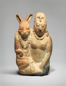
ceramic sculpture of a Moon Goddess and her rabbit partner, Mexico, c.700 AD

Imagine a culture so centred on wealth, property and power that it becomes scared of sex and  frets endlessly about what it sees as the misuses of sex. A culture that identifies breeding so closely with with money, wealth and status, and women so closely with breeding and therefore with sex that, when looking to replace traditional symbols of birth and regeneration it rejects sex and even nature and, in the end makes the embodiment of motherhood a virgin and the embodiment of rebirth a dead man. Unhealthy, you might think; misanthropic even – and yet here we are.

But when that culture loses its religious imperative, what should be waiting? Those old symbols of fertility; rabbits and eggs. But whereas Christianity in its pure form found it hard to assimilate these symbols, preferring instead to just impose its own festival of rebirth on top of the pagan one,  capitalism, despite  being in so many ways compatible with the Judeo-Christian tradition, is essentially uninterested in spiritual matters. So even though it’s mostly pretty okay with Christianity, which creates its own consumer-friendly occasions, it proves to be equally okay with paganism too, as long as it can sell us the pagan symbols back in a lucrative way.

Easter is, after all, a mess to begin with; its name is pagan (Ēostre or Ôstara, Goddess of the spring) and its Christian traditions, even when embodied in the tragic idea of a man being killed by being nailed to a cross was never entrenched enough to suppress the essentially celebratory, even frivolous feeling that spring traditionally brings. Okay, so Christ ascending to heaven is pretty celebratory without being frivolous; but as, in the UK at least, represented by a hot cross bun, with its cross on the top to represent the crucifix and even – to play up the morbid factor that is so central to Christianity – its spices that are supposed allude to the embalming of Christ’s dead body, it’s hardly solemn: it’s a bun.

On the other hand, birth, since the dawn of time and to the present day, is not just a simple cause for rejoicing and in that the Christian tradition, though it tries to remove the aspects that seem most central to birth to us: women, labour (the word presumably wasn’t chosen accidentally) and procreation, probably tells us more about the seriousness and jeopardy of childbirth than the Easter bunny does.

The patron (matron?) saint of childbirth is no help; St Margaret in herself has nothing to do with birth (although she was presumably born), but becomes its saint through the symbolic act of bursting out of the dragon who ate her – a strange analogy but one that reflects the hazardous nature of childbirth in medieval times, when mortality rates were high, not just for babies but for their mothers. Rabbits may represent – in ancient cultures across the world, from Europe to Mexico and beyond – fecundity, but it’s an animal idea of fertility for its own sake that has nothing to do with the practical or emotional aspects of producing new human beings.

St Margaret, “reborn” after being eaten by a dragon
Jan Van Eyck’s Eve (c.1432) from the Ghent Altarpiece

Pregnancy in Western art was a rarity until fairly recently; and even now, the puritanical ideas inherited from Victorian Christianity mean that the apparently pregnant Eve of Jan Van Eyck’s Ghent Altarpiece (completed in 1432) is a subject of debate: Eve pregnant with humankind makes sense, and the 15th century was certainly more in touch with the realities of human life than the 19th and early 20th century men who codified the canon of Western art history – but maybe she is simply the medieval/gothic ideal of femininity as seen in illuminated manuscripts and carvings; small shoulders, small breasts, big hips and stomach – given an unusually realistic treatment.

Gustav Klimt – Hope I (1903)

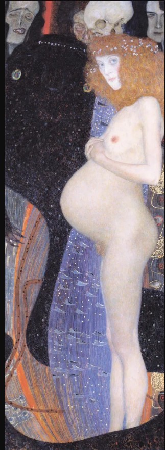
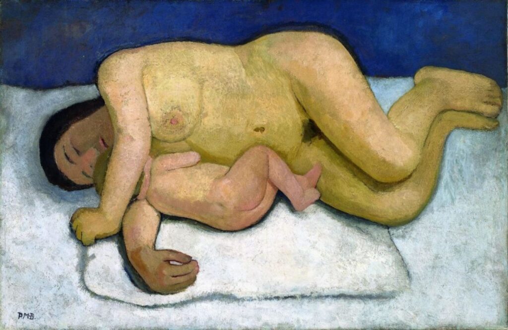
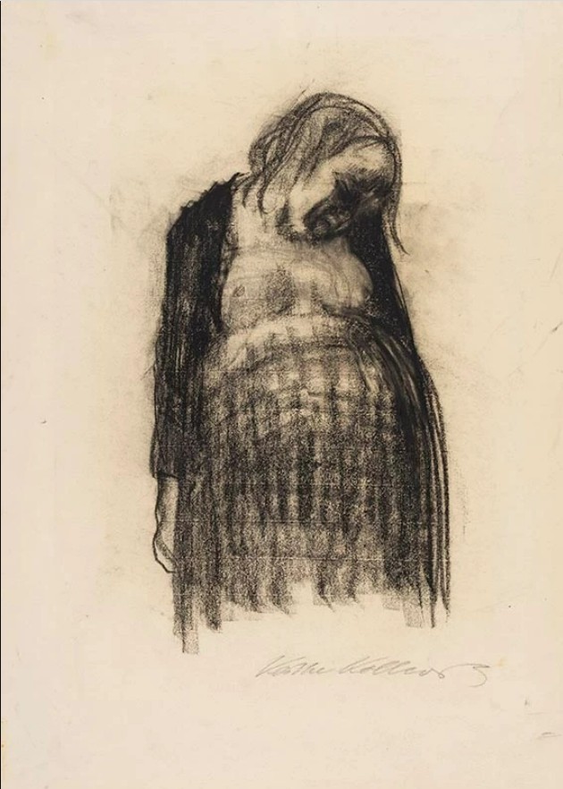
As the nineteenth century gave way to the 20th, Gustav Klimt was able to bring the beauty and wonder of pregnancy and birth to art with Hope I, his beautiful female figure of hope and renewal glowing against a background of death and peril, but it’s only really when women begin painting that that the symbolic and magical aspects of motherhood are reconciled with the more sombre, earthly spirituality that Christianity preferred to represent in a dying man and with the fundamental animal nature of humankind, without that being a negative thing. A painting like Paula Modersohn-Becker’s Reclining Mother and Child II (1907) shows all of the human aspects that were embodied in the contorted Christian images of the Virgin Mary, crucifixion and Christ’s rebirth: human beings that are fragile, loving, vulnerable and dependent on each other, but also the things that were missing; biology and the bonds it creates. The magic of Klimt, but not represented in a titillating way, and depicted in concrete rather than symbolic terms.

Paula Modersohn-Becker – Reclining Mother & Child II (1906)

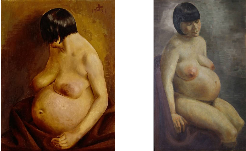
For the generation after Paula Modersohn-Becker, everything was seen through the fragmenting prism of World War One, and so Otto Dix, more cynical, less intimately involved, shows us the physical discomfort of pregnancy minus its magic. Dix, despite his famous claim, “I’m not that obsessed with making representations of ugliness. Everything I’ve seen is beautiful.” took a definite pride in shocking viewers with his art; as he also said; “All art is exorcism. I paint dreams and visions too; the dreams and visions of my time. Painting is the effort to produce order; order in yourself. There is much chaos in me, much chaos in our time.” By the time Dix painted these pictures he was a father himself, but although his paintings of his family reveal a more tender, if just as incisive, aspect to his art, here he paints as a pitiless observer, knowing that his work was challenging and confrontational to the generally conservative audience of his time; a time when, like ours, forces of intolerance and conservatism were closing in on the freedom embodied in art this truthful.

Otto Dix – Pregnant Woman (1931) & Gussy Hippold-Ahnert – Pregnant Woman (1932)


But despite his clinical eye and devotion to the ‘new objectivity’ (“The Neue Sachlichkeit – I invented it“) Dix’s truth is a dramatic, heightened kind, designed to penetrate the complacency of his era. Meanwhile, his pupil, Gussy Hippold-Ahnert tackled the same subject and almost certainly even the same model with a realism that is at first less striking but also far less dramatizing.  Gussy was of course a woman and is not showing us, as Dix seems to be, a faceless being representing the eternal, but rarely remarked on hardship involved in the joyous business of continuing the species. Instead, Hippold-Ahnert shows us a woman who happens to be pregnant; both paintings are realistic, both are objective and, as with the symbolic sacrifice of Christ and the eternally recurring bunny, both display different aspects of the truth.

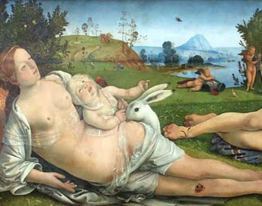
My favourite bunny in art: detail from Piero di Cosimo’s Venus, Mars & Cupid (1505)

But anyway; enjoy your chocolate.


forget my fate: saints and sex workers; the art of violence & martyrdom

In a way, this article concerns religious art, though the person who wrote it has no religious beliefs whatsoever. But when people really, passionately, even if unconsciously, believe – in a religion, a philosophy, an idea – that belief imbues the works they create with the power of human feeling. Art, music, architecture, literature, objects; that power that is retained whether or not the observer accepts or understands the ideas that are living within those things. That’s my opinion anyway; I may not believe in the supernatural, but I do believe the ‘natural’ contains magic of its own.

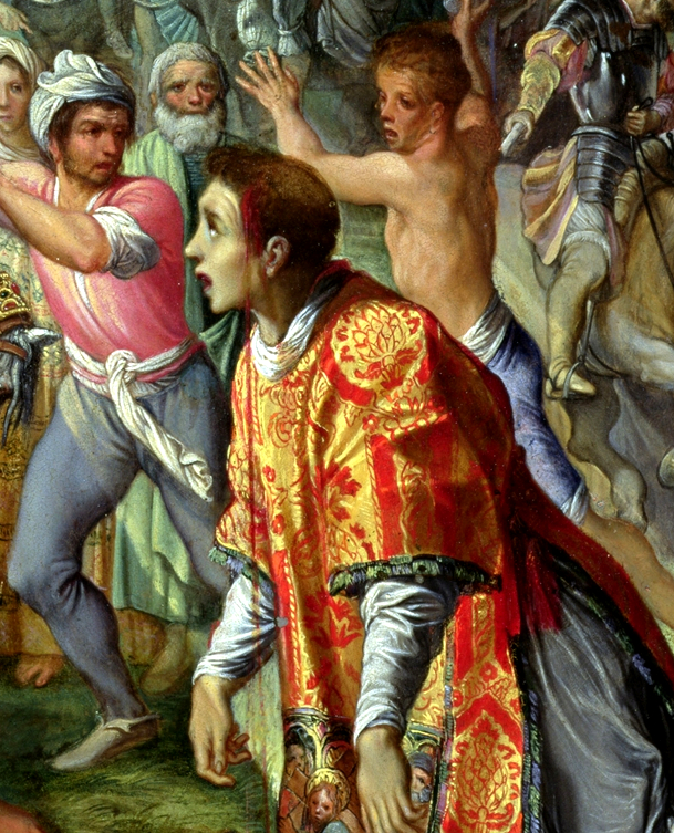
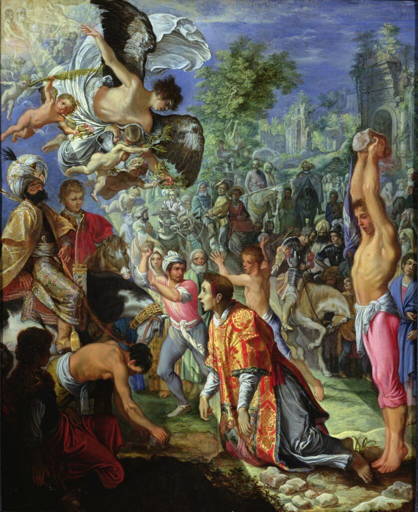
Adam Elsheimer – The Stoning of St Stephen, 1603 (detail)

So anyway; when, in Purcell’s 1688 opera Dido and Aeneas, the dying Queen of Carthage sings Nahum Tate’s beautiful words, “Remember me, but forget my fate”, she is articulating something that was then becoming, and to some extent remains a kind of ideal as humanity tried, perhaps pointlessly, to distance itself from death. Caught in a pincer movement between the Reformation, which had eliminated much of the rich mythology of religion in its determination to reduce the clutter and distance between human beings and their God, and the dawning of what would become the age of reason, which sought to cast off the shadow of crude medieval brutality and superstition, death, once an unavoidable and largely accepted part of daily life, had become something akin to what it is today. That is, entirely acceptable – even celebrated, in fiction and entertainment, in real life it’s preferably kept out of sight and out of mind as far as is possible. But although the impulse to distance oneself from the more viscerally negative aspects of life is understandable, it’s almost the opposite of the way that people, for a couple of centuries at least, related to saints.

Saints have remained celebrated through the years to some extent, but still, since their medieval heyday they have found themselves playing a gradually diminishing role in Western European society. Interestingly though, while Christianity lost much of its cast of characters and stories through the ages, what it never lost in the Reformation – quite the opposite in fact – is that key idea which saints’ lives so often embodied: misery now, rewards later. And it was this, despite the apparent opposition of the two ideologies, which made Christianity and all of the Abrahamic religions such successful facilitators, or carriers (in the pharmaceutical sense) of capitalism. But, while saints faded from the vital figures of the middle ages into their current, more modest position, they remained venerated, if not worshipped, even in the Protestant faith, and still played a vital role in Catholic countries. That being so, plenty of the somewhat harrowing and graphic art generated in their names in earlier years survives; and rightly so.

Take for example Adam Elseheimer’s 1603 Stoning of St Stephen. As a German artist working in Catholic Rome, Elseheimer’s position may have been anomalous, but no faith of any kind is required to understand and empathise with the young saint’s fate. We may not (or we may) share his implied, rather than shown, exultation at the parting of the clouds and the glimpse of heaven beyond, but we can recognise his pain, fear and loneliness. We’ve seen it many times, not only in cinema and in literature, but even more in news reports and photographs or, if we are unlucky, as eyewitnesses to (or victims of) real events. This painting make me think of the harrowing footage, a few years back, of prisoners being beheaded by Islamic State fighters, but they have echoes too, in those everyday acts of violence in which there are, thankfully, usually no deaths – but rarely any obvious sign of divine intervention either.

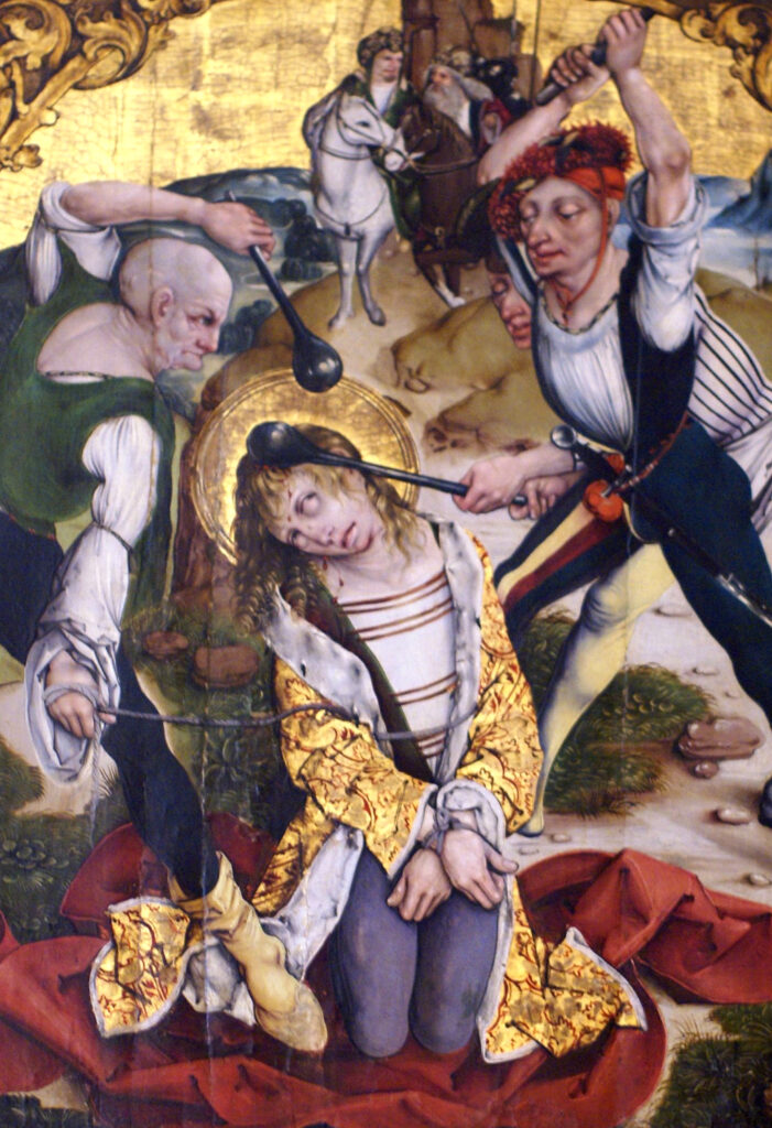
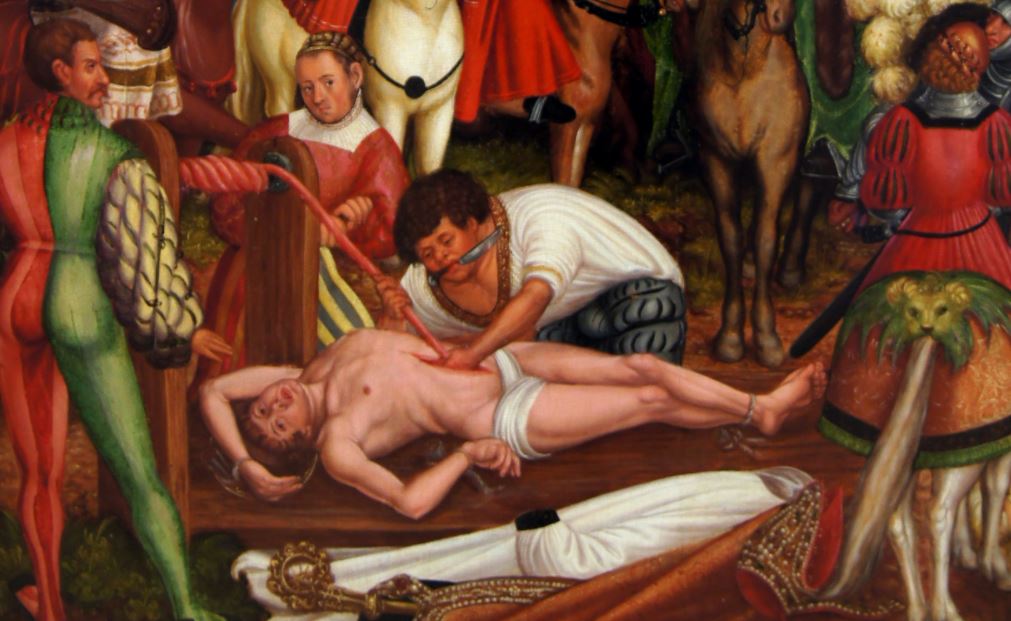
detail of St Sebastian being clubbed to death by Master WB (probably Wolfgang Beurer, c.1500)

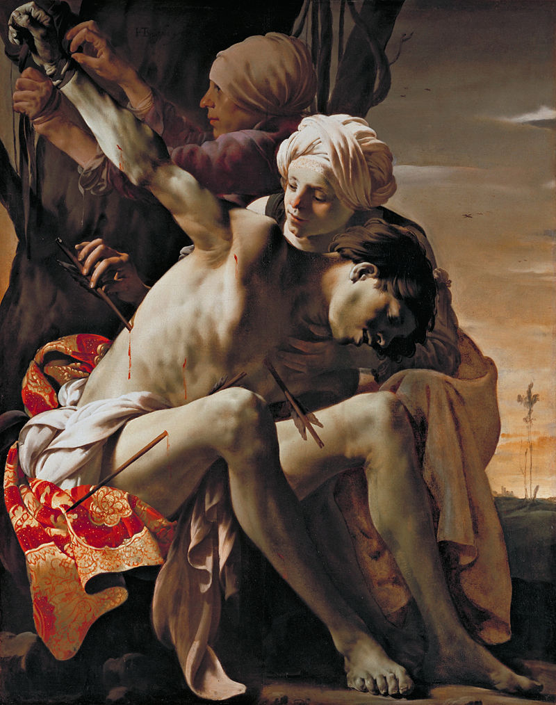
One of the most strikingly contemporary-feeling examples of the art of martyrdom is the series of Scenes from the life of St Sebastian in the Cathedral Museum, Mainz, painted by Master WB (probably the Middle Rhenish painter and engraver Wolfgang Beurer). St Sebastian is one of the most often-painted of saints, usually shown as a kind of surrogate Jesus, young and beautiful, but pierced by (sometimes a lot of) arrows. But the whole point of that part of his legend, is that the arrows didn’t kill him. Tended by St Irene of Rome (in the baroque era the healing of St Sebastian was painted quite often; there are some very beautiful and moving pictures, like the famous Georges de la Tour painting from 1650, and my favourite, by Hendrick Ter Brugghen, from a little earlier) he recovered, and went about his saintly business.

Unusually though, Beurer’s cycle of paintings takes the story past the Christ-like recovery of Sebastian and through to his eventual death, after he journeyed to see the Emperor Diocletian and scold him about his sinful life. This time, the young saint was clubbed to death and didn’t recover. This is a very different death from the ceremonial, iconic execution by arrows. There’s a sense of solemnity, of procedural, if dubious, legality that affords the victim of a firing squad a kind of Christ-like dignity – in paintings at least. There’s no way to make a clubbing to death look dignified though, and Beurer/Master WB doesn’t try. Instead he shows the by now pitifully uncomposed figure of the saint being beset by three cheerfully brutish soldiers with beautifully painted lead clubs.

Hendrik Ter Brugghen -St Sebastian tended by St Irene, 1625
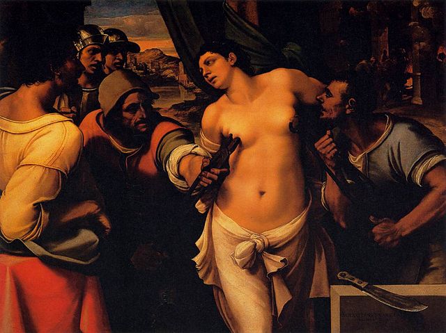
Sebastiano del Piombo’s Martyrdom of St Agatha 1520 (technically doesn’t feature her martyrdom)

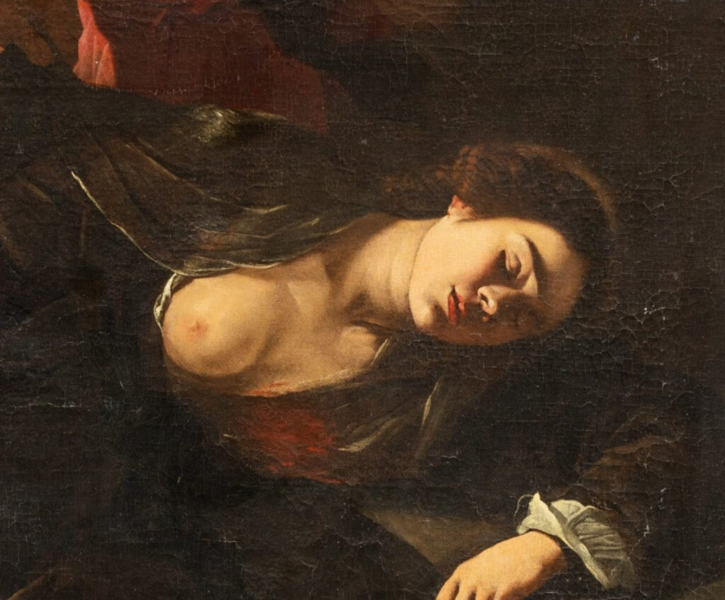
St Agatha, like Sebastian, is unusual in that her actual martyrdom – technically, she died in prison at some unspecified time later, after being healed by St Peter – is never pictured. Instead what is shown, essentially for titillating reasons, as horrendous as that is, is not even her torture, where her body was torn with hooks, but only the specific detail of her breasts being cut or torn off.
But although her death seems rarely to have been depicted, there are paintings of the healing of St Agatha in prison by St Peter. Partly this might be because of the two-saints-for-the-price-of-one nature of the image, but perhaps more importantly it afforded the artist another opportunity to show female nudity without fearing religious censure.

detail of St Agatha healed by St Peter in prison by an unknown Neapolitan painter of the early 17th century

Although these paintings – Heinrich Vogtherr’s Martyrdom of St Erasmus (1516) is another great example – are full of religious feeling, it’s far easier as a secular person (or as this secular person) to respond emotionally to a painting of a martyrdom than it is to the ultimate martyrdom of the crucifixion of Christ. Jesus is of course something more than a human being, and though we are supposed to respond to his suffering in a human way, he’s still god after all; he presumably planned it and he can take it. Saints though, are different. The point may be the same – suffering holy people, relating to Christ as their father, in the same way that Christ related to god/himself as his – but these are just human beings. They may be idealised by artists, as they were in their official hagiographies, but they are supposed to be relatable for ordinary, unsaintly people.

Heinrich Vogtherr – the Martyrdom of St Erasmus, 1516 (detail)

Many artists captured the loneliness of Christ on the cross, but the loneliness of Christ, even alone in the dark, is qualitatively different from that of the martyr saints. In their last moments, the saints are usually closely surrounded by their enemies, who are of course also their fellow, imperfect human beings. The pain of Christ, too, tends, for the most part, to be a remote and rarefied thing; it’s familiar to everyone, in an almost neutralised way, from living the cultural landscape of western society. But the pain of the saints is something we recognise in a more direct way. It’s unlikely, I hope, that many people reading this, have first-hand experience of fatal stonings, mutilations, disembowelings or bludgeonings, but these saints, with their looks of glazed shock and their vividly painted blood, are a figures we have become used to in other, secular contexts.

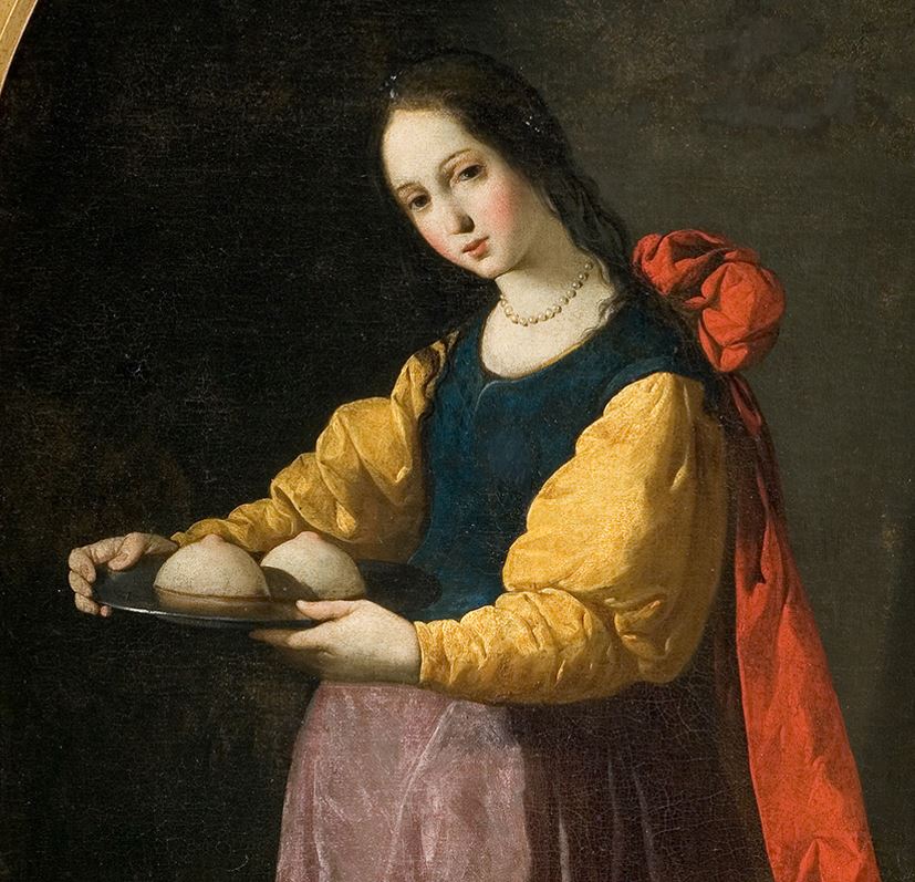
Francisco de Zurbarán St Agatha, c.1630-33 (detail)

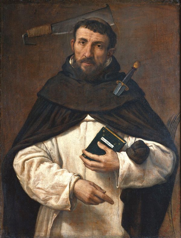
It’s fair to assume that these saints wanted to be remembered. But would they – and there are many, many more of them in addition to the few I’ve shown; from the big names like St Matthew and St John the Baptist (beheaded), to St Peter and St Andrew (crucified) to the more obscure, like Saints Cosmas and Damian (beheaded by pagans) and St Ursula (shot with an arrow by the Huns) to the theatrically horrific, like St Bartholomew (flayed and beheaded) and St Erasmus (intestines pulled out with a spindle) –  have wanted to be remembered for the nature of their deaths? Even divorced from these kind of narrative paintings, the saints were rarely depicted without their sometimes bizarre attributes, the strangest ones that spring to mind being the aforementioned Agatha, in a more serene setting, bearing her severed breasts on a plate, or Saint Peter of Verona, normally depicted with the cleaver still embedded in his skull.

After the Age of Enlightenment, these explicit, visceral images more or less disappeared from western art for a couple of centuries, despite the occasional politically-motivated flashback like Jaques-Louis David’s Death of Marat (1793). Unexpectedly, they returned in a slightly altered and ideologically almost opposite, and certainly far more secular form in interwar Germany, made vivid by the horrors of World War One. But although a comparison with the Lustmord (sex murder) paintings of the Weimar Republic seems like, and possibly is, a flippant and/or blasphemous one, it feels valid, especially in relation to the paintings of St Agatha with their uncomfortably conflicting motives and coolly horrific imagery.

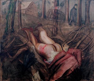
Paintings like George Grosz’s John the Sex Murderer (1918) and Otto Dix’s horrific Lustmord (especially the lost 1922 painting that exists only in black and white photos) have parallels with St Agatha, the painting I want to briefly talk about is less blatantly sensationalist and to my eyes at least has something of the heartbreaking empathy of Wolfgang Beurer’s St Stephen. Like Dix’s but less confrontational, Lustmord (1930) by the great Neue Sachlichkeit painter and photographer Karl Hubbuch, shows only the aftermath of the murder, rather than the act itself. But rather than losing force because of its relative restraint, Hubbuch’s image is imbued with all of the loneliness, fear, isolation and fragility seen in the face of Elseheimer’s St Stephen and the pitiful battered corpse of Beurer’s.

Karl Hubbuch – The Sex Murder (1930)

In the end, whatever the means or motivation for these pictures, what we are left with is the pictures themselves; and if they should survive beyond their meanings and attributions, people will, perhaps sadly, always be able to see what they represent. This is the opposite of art for art’s sake; but then, to appreciate the form of – for example – Wilfred Owen’s war poetry and study that form and its mechanics without taking into account what that apparatus is for is to miss the point. Likewise, the skill of a painter like Beurer, whose intention was to make the holy real and relatable, or of Elseheimer, or Sebastiano del Piombo, or even Karl Hubbuch, wasn’t there solely in an effort to amaze the viewer with the painter’s skill or advertise their technical ability.

Lorenzo Lotto – St Peter of Verona (1549)

It may be that these sex workers and saints would have preferred, like Purcell and Tate’s Dido of Carthage, to be remembered, but to have their fates forgotten – but instead forget that you know the titles and subjects of these pictures. These people were, as many people still are, tortured, killed and disposed of without sympathy or ceremony. It would be nice if they were all remembered.


cycle; woods and fields and little rivers


With apologies to Paul Gorman, whose beautifully written accounts of bike rides partly influenced this article, although Paul actually knows about cycling and I don’t; this is essentially a surrogate fast walk.

setting off

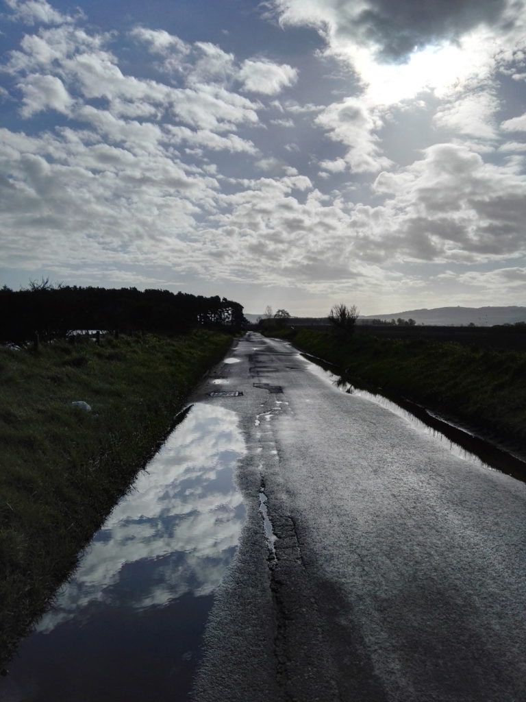
I thought I’d take to the roads early (just before 7.30 am) because it was a beautiful morning that was forecast not to become a beautiful day, and because, even in 2021 there’s not much traffic on the road early on a Sunday morning. A recent bout of not atypical heavy rain and not unprecedented (one of the overused words of the last 18 months of so) but still definitely unusual-in-May extreme hailstorms left the roads shining in the morning sun and the fences strung with light-catching water droplets; it was very pretty.
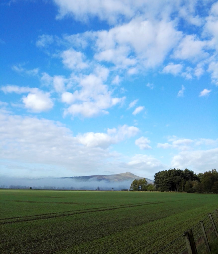
Once out of the village, the landscape here is so flat as to look almost Dutch, aside from the Lomond Hills; still half buried in morning mist. In fact, despite living here most of my life, this was really the first time I had considered that this must be what is meant by the ‘Howe of Fife’ and indeed a quick googling confirmed it; “The term ‘howe’ is derived from an old Scots word meaning a hollow, valley or flat tract of land.” The Lomonds themselves, and Bishop Hill on the far end (not visible from my viewpoint) are really not particularly big, but almost give the impression of mountains from the vantage point of the plain below.

the Howe of Fife looking towards East Lomond

The nice thing about rural cycling is that, although much faster than walking, it doesn’t disturb anything much around you, and on a quiet morning (on my 8-10 mile cycle I was passed by one car, one proper cyclist and rode past one dog walker and a jogger) like this, nature seems not to pay much attention to you. It turns out that this area is infested (not the right connotations, but there were so many of them) with Yellowhammers, looking almost canary-like in the spring sunshine, plus innumerable sparrows, blackbirds and the odd village idiot-like pheasant shouting in the middle of a field.
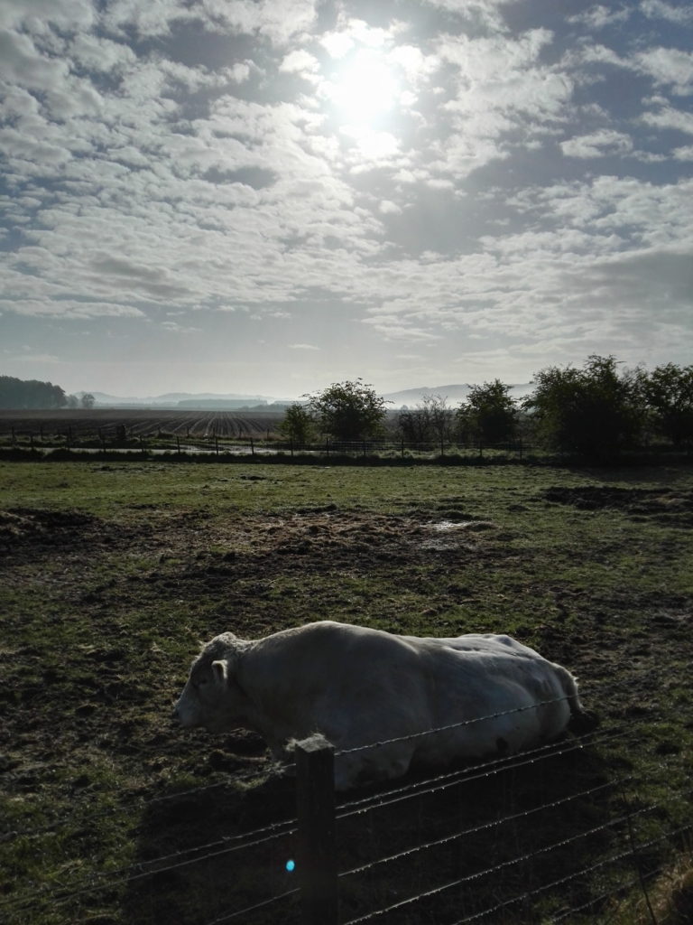
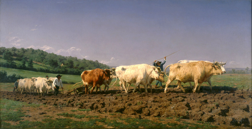
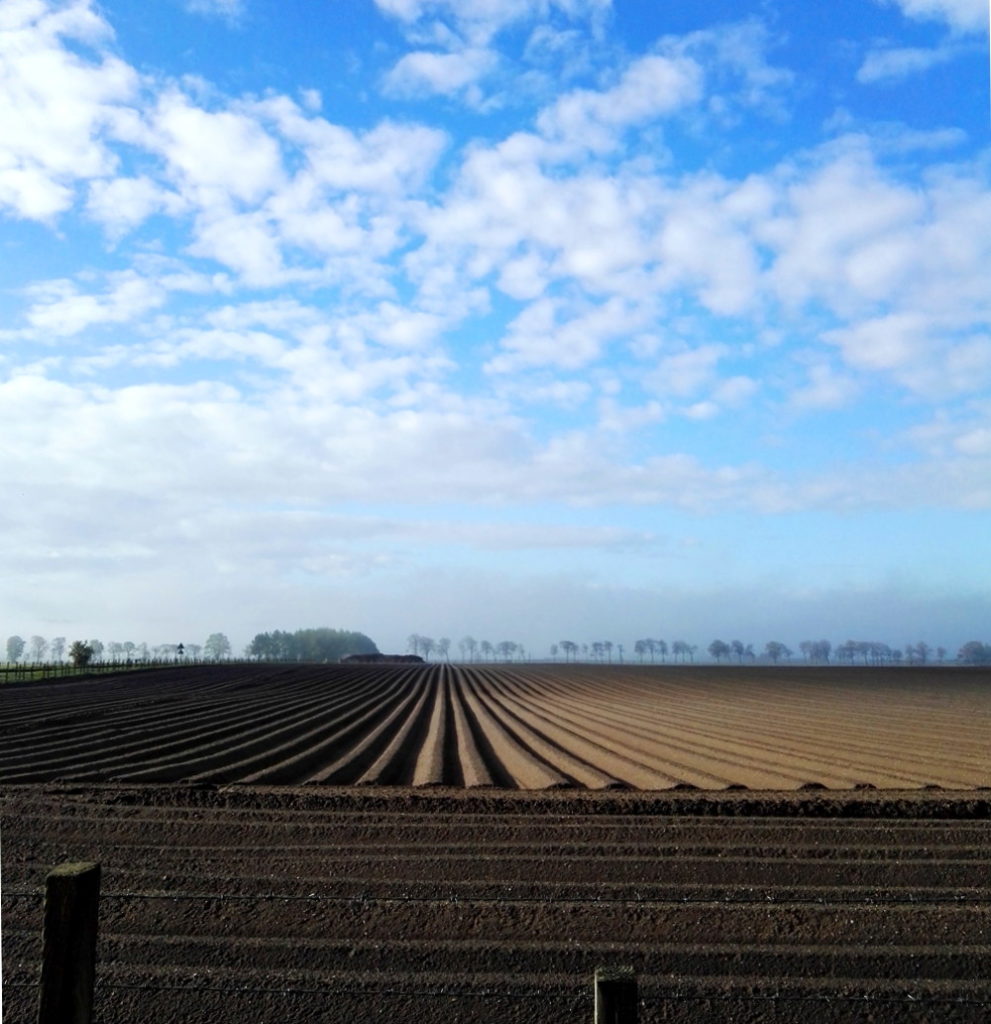
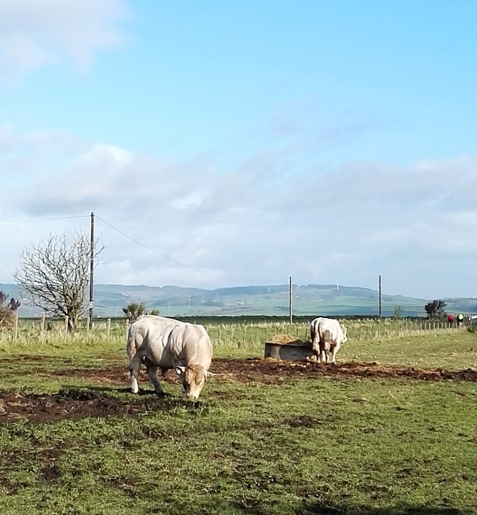
The natural landscape is pretty enough on its own, but because, presumably, of the sort of person I am, I love the unexpected moments of geometry caused by human interference (ploughed furrows deep in shadow in one field, strips of plastic sheeting over rows of berries* in another) and of course the semi-wildlife, like a paddock with three huge, but mellow looking bulls that made me think of the work of Rosa Bonheur.

local bull

Although her work – and her life – is 19th century in almost every respect, Bonheur is a potent figure for the 21st century. Brought up in an egalitarian Christian-Socialist sect by Jewish parents, Bonheur was a troublesome child who developed a love for animals and for painting and as a young woman studied animal anatomy (in abattoirs) and dissected animals at a veterinary school as well as studying live animals. She was openly lesbian at a time when it was, if not illegal, certainly frowned upon by the French government; so much so that she had to request permission from the police to wear trousers, as cross-dressing for women was forbidden by law (until 2013!) Her official reason was that it was better clothing for attending sheep and cattle markets, where she made studies, but although that was certainly true, she was generally known among her friends for her masculine clothing and short hair; both very much against the conventions of the time. Nevertheless, she went on to become a mainstream success and in her own way an establishment figure, both in France and (especially) in the UK, where she met Queen Victoria and painted some anachronistic Highland scenes; she may have been revolutionary by nature and personality, but she seems to have been quite conservative by taste and inclination; never underestimate the complexity of people.

*I mean, maybe berries? Despite growing up in the countryside and actually on farms for a fair bit of childhood, I’m none the wiser about that

Rosa Bonheur – Ploughing in the Nivernais (1849)
geometry imposed on nature
and again; with plastic

Looking at the scenery, the wildlife, the roads, you have to wonder; why would anyone not care about this? I don’t mean the Howe of Fife, or Fife, or Scotland, or Britain, or Europe, or the world (although those too); just wherever you happen to be; place. Landscapes should and must change, as we change; not just the geometries and geographies we impose on them, like the furrows and plastic (though it would be nice to do away with the plastic itself), but everything. 500 years ago the Howe of Fife was covered in forest and the monarchs of Scotland hunted wild boar here. A thousand years ago, a Scotland that was different in shape, size and culture was being ruled by Alexander I, then near the end of his life, having recently lost his wife Sybilla of Normandy, the French child of Henry I of England; Alexander would be succeeded by his brother David, then Prince of the Cumbrians; by James’s time all of these details would seem strange. Two thousand years ago, the Howe of Fife was part of southern Caledonia, that is the land to the north of the river Forth; at least the Romans, still fifty years from their attempted conquest, called it Caledonia, whether the inhabitants of Caledonia had any name for the landmass in general, as opposed to their own local chiefdoms, isn’t recorded.

These back roads are quiet, but although nature is everywhere, it’s deceptive, hardly a natural landscape at all. It has been shaped by generations of human beings, by agriculture and the politics of land ownership, no less in King James’s day, when forests belonged to the King and had their own laws, than now. It reminds me both of my childhood love of Tolkien and of a line from The Fellowship of the Ring; where Bilbo says “I want to see the wild country again before I die, and the Mountains; but he [Frodo] is still in love with the Shire, with woods and fields and little rivers.” Tolkien loved both the wilderness and the smaller, more familiar (Oxfordshire-like) scenery of the Shire, but in his landscapes change is almost always bad; both on the larger scale of the desolation that evil brings to Mordor and the fiery chasms opened in the earth when the Dwarves delve ‘too deep’, and on the local level where the Shire is ruined by the arrival of industry. Michael Moorcock writes perceptively in his I think overly scathing (“The Lord of the Rings is a pernicious confirmation of the values of a morally bankrupt middle-class ‘Epic Pooh’, in Wizardry and Wild Romance, Gollancz, 1987, p.125), but often right and always funny essay about Tolkien, Epic Pooh (1987) about the essential conservatism of much of heroic fantasy fiction, and the points he makes are even more relevant today. The climate emergency will – regardless of the political will to do so – at some point need to be dealt with, as the pace of change outstrips the ways in which our society functions, and it’s important that the necessity to move forward doesn’t become an attempt to turn the clock back; always attractive in ever-nostalgic Britain. What Tolkien only reluctantly accepts – or accepts in a tragic way that fits with the more fatalistic (and Christian) aspects of his vision – is that change is inevitable. In Moorcock’s own heroic fantasy fiction, he not only takes change for granted, it becomes the backdrop against which his series of heroes who make up ‘the Eternal Champion’ fight their never-ending battle for equilibrium in a multiverse where change – in itself neutral – is the only constant:

“Then the earth grew old, its landscapes mellowing and showing signs of age, its ways becoming whimsical and strange in the manner of a man in his last years – The High History of the Runestaff”

(quoted from Count Brass, 1973, but appears lots of other places too)

the Lomond Hills after the mist burned off

The landscape of the Howe of Fife is not yet – the odd wind turbine aside – whimsical and strange, but there was a certain surreal quality in the way the beautiful spring morning (which felt more like early spring than early May) followed days of hailstorms and thunder. Surreal anyway to someone old enough to remember when seasons seemed to have a set pattern. In another twenty or thirty years will British Christmas cards still have snow scenes on them, even though most of the heavy snowfall seems to happen now in March or even April? Human culture is perhaps slow to catch up with the changes it creates; bearing in mind that the traffic on the roads today is light because even after decades of change there’s a convention that people don’t work on a Sunday, for the most archaic of reasons – but I’m still glad of it. These kinds of thoughts, and Rosa Bonheur too, were partly on my mind because this week there were elections which, although not regime-changing, were important. The results were locally, fairly positive, nationally (Scotland) pretty much as expected and extra-nationally (UK: not quite international, yet at least) a bit disappointing. The collapse of any real kind of left-wing movement has been happening over a long period of time and I suppose at this point all you can say is that people in general don’t want one; or not enough of them to make it happen. On the other hand a general liberalisation has taken place that possibly just makes it seem unnecessary to large numbers of people. And of course, the left eats itself, as always; yesterday I saw online a list of “people that socialism needs more of” (working class people essentially) and “people it needs less of” (non-working class people, basically), whereas surely the whole point is, it needs all people, if it’s going to work. But whatever.

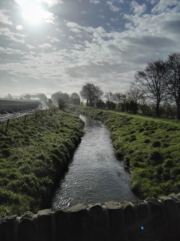
the remains of yesterday’s rain

A nice thing about cycling is that, aside from looking around, you can’t really do very much. It clears the mind in a way that car travel, with its technical aspects and its music or radio, doesn’t usually do. It would be possible to listen to the radio while cycling, but probably not very sensible; and in an election week the lack of human noise is very welcome. After watching/listening to/reading political propaganda and analysis before and after an election it becomes clear just how versatile “the media” seems to be. This week I’ve seen people criticise it essentially to suit their own viewpoint; it’s too right/left wing, too politically correct, too reactionary, too critical, not critical enough. Which makes it seem as though the UK media is pretty good at covering all bases. But TV, radio and the newspapers are a distorting mirror at best. Witness the way that the ‘working class’ – whether positively or negatively – is treated as a monolith. The viewpoint of the media (understandably, given most of its staff and ownership) is middle class; and therefore on TV, on the radio and in newspapers the middle class becomes the norm from which everything and everyone else (both working class and upper class) are observed and commented upon. “Reality TV” features the rich or the poor as something other, something to be looked at and entertained by. But it’s a norm that ignores the facts. The working class, insofar as there is still such a thing (I am of it and I’m not even really sure) is technically the norm, in the sense that it’s the majority, just as it always has been. The UK is (albeit in a less precise way than a century ago) a pyramidal structure, with monarchy and government at the top, the middle class – bigger and both richer and poorer than before, but still identifiable – in (yep) the middle, and the working class as the wide base, incorporating a layer of underclass which fluctuates depending on which government is at the top (it’s bigger now than it was a decade ago). How do you change that false picture the media presents? You don’t really; not without changing the society. Marx and Engels wanted the means of production to belong to the workers; in the late 19th and early 20th centuries that stood for something real and meaningful, but while its egalitarian spirit is eternally relevant, in the 21st century the statement itself needs so many qualifications as to be almost meaningless. What are the means of production? Producing what? Who are the workers? The working class of Marx’s day would barely recognise the working class of today – and they might well look at our lifestyle and be encouraged that the struggle wasn’t in vain. And of course it wasn’t, but that doesn’t mean that the post-industrial 21st century is really much more fair than in the industrial age, certainly capitalism is even more rapacious and entrenched than ever before, and as callous too. The more things change, the more they stay the same, as the tedious saying goes.

the flatness of the Howe

People of course do want change; the right kind of change anyway. And elections are one way of securing it. But this week people who were asked on TV for their reasons for voting gave ‘change’ as a reason for voting for parties who have been in power for 14 years (Scotland) and 9 years (UK) – which seems at best like wishful thinking or at least suggests a lack of exciting or convincing alternatives, to say the least. Arguably of course, a vote for the SNP in Scotland is a vote for a bigger change than just who currently sits in parliament, but familiarity breeds indifference and at this point it’s probably good for their cause that they are no longer the only party in favour of an independent Scotland. And in a depressing kind of way, circumstances have aided them too. In 2014 it was easy, personally speaking, to vote against independence on several grounds; a disliking of Nationalism as a principle, so closely related as it is to xenophobia and intolerance. As someone who was very happy to belong to the EU too, independence seemed (laughably in retrospect, though still not wrongly) to endanger Scotland’s membership, since the UK and not Scotland was the member. And there were niggles about the economy, not because Scotland couldn’t function outside of the UK – one of the most irritating arguments for the status quo; I think it’s pretty obvious that it could and can – but because the Salmond leadership seemed to be saying (ie he was saying) that he wanted nothing to change regarding the currency etc. Which would seem to put Scotland in the surreal position of being a supposedly independent nation which has its economy regulated by the Bank of England. Why the Bank of England would accept that, or anyone on either side of the border would want it is mysterious, to say the least. But anyway, here we are in 2021; nationalism and xenophobia look like being worse and more virulent in the UK than outside of it. We are already out of the EU and, while an independent Scotland being a member state is far from a foregone conclusion, the UK rejoining is definitely not about to happen anytime soon. And Covid-19 has given the economy a beating that will take a lot of recovering from, whatever we do. So why not independence? I would of course prefer to have a democratic socialist party in charge of it, but not having a rabidly inept right-wing one would be a step in the right direction.

apparent rural idyll

Without wishing to get bogged down even more in the minutiae of British politics, the story of the Labour Party (it’s probably not quite dead yet; it always has a far more cyclical life than the Conservative Party) is an instructive one. There’s always been a tug of war between the left and centre elements of the party, but since the 90s there’s always been the dubious argument that veering to the right is the way to win votes and power. But although New Labour was definitely uncomfortably right-wing for a supposedly socialist party, that wasn’t what brought it success. It was the ‘new’ part; drawing a line under history and saying ‘the past ends here and this is what we stand for’ was a big, optimistic step at a time when British politics – as now- had become stagnant and unappealing. The Corbyn left managed something similar, with a younger demographic, but for all its radical ideas, it was immediately familiar to anyone over a certain age. Much as Blair and co’s propaganda looks vapid and empty in retrospect (because it essentially was), not invoking Marx or even socialism was a key to their success, not because of where they or their supporters sat on the political spectrum (I think it’s true that the majority of the British public probably don’t think of themselves being especially political), but simply because people will, every now and then, give new ideas a chance, if they look exciting enough and if they’re bored or disgusted enough with the status quo; It’s worth bearing in mind. None of which has nothing obvious to do with this road on this morning, with the patches of bluebells under the trees, which might be left over from the great forest of King James’s time; where wild boar hid, evading the men and the dogs, before they were hunted to extinction.


inside the doll’s house

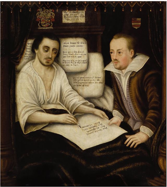
Thomas Braithwaite of Ambleside making his will (1607, artist unknown)

The dying man glows with sickness in his mildewy-looking bed, the light seeming to emanate from where he sits, crammed into the airless, box-like room. He signs his will while his friend looks on intently with concern and restrained grief.

The artist who painted Thomas Braithwaite of Ambleside making his will in 1607 may not have been considered important enough as an artist, (still a person of relatively low social status in northern Europe, though this was starting to change with painters like Rubens and his pupil Anthony Van Dyck) to warrant signing the picture or having their name recorded at all, except perhaps in the household accounts – but they were important as a witness, and the painting is itself a kind of legal document, although it’s more than that too. The great enemy of the Elizabethan and Jacobean ages wasn’t death, with which most adults would have been on very familiar terms,  but disorder and chaos*; and this, despite its tragic appearance, is a painting devoted to the age’s great virtue; order. Both the dying lord (an inscription records the date of his death (Thomas Braithwaite of gentry stock, died 22 December, 1607, aged 31) and his friend George Preston of Holker are identifiable to those who knew them by their likenesses and to those who didn’t, by their coats-of-arms. Biblical texts tell us that Thomas Braithwaite was a virtuous man, but so does the painting itself; this is a man who, even while he lay dying, took care of his business. His passing is tragic, but, he reassures us, it will cause only grief and not inconvenience.

*see EMW Tillyard, The Elizabethan World Picture, Pelican Books, 1972, p.24

We talk about religious faith now as a kind of choice as much as a belief system, but for all its paranoia about atheism –and all the subsequent romanticism about that era’s new spirit of humanism – the Tudor and Stewart ages had inherited a world view in which the existence, not only of God and Heaven and Hell, but the essential hierarchy of existence, was more or less taken for granted. We may differentiate arbitrarily now between religion and superstition, but for the people in these cramped and airless paintings there was no real contradiction between, say Christianity and astrology, because in accepting without exception the primacy of god the creator, it all works out in the end – everything that has ever existed and everything that will ever exist, already exists. Perhaps human beings aren’t supposed to divine the future, but God has written it and the signs – comets, unseasonal weather, the movement of the stars and the behaviour of animals – are there to be read and interpreted by anyone with the nerve to do so.


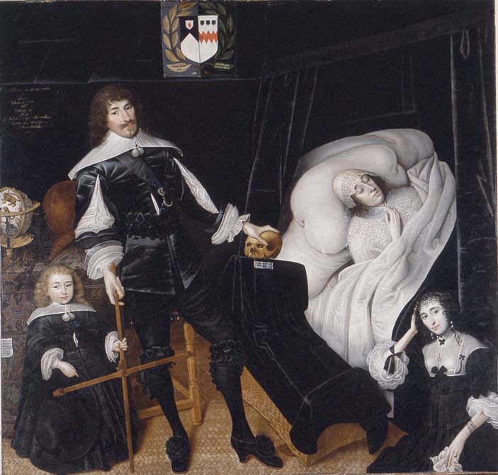
John Souch – Sir Thomas Aston at his Wife’s Deathbed (1635)

In an off-kilter, vertigo-inducing room that seems almost to unfurl outwards from the skull at its centre, an illogical space hung with black velvet, a man and his son, looking outwards, but not at us, stand by the deathbed of their wife and mother, while a glamorous young woman meets our gaze from where she sits, apparently on the floor at the foot of the bed.

There’s virtue in this painting too, but mostly this one really is about death. It’s there at the centre, where the lord’s hand sits on a skull, recalling the kind of drama which was then passing out of fashion, just as this kind of painting was. The skull, like the black-draped cradle (with its inscription that reads He who sows in flesh reaps bones), acts as a vanitas motif, focussing the viewer’s attention on the shortness of life, but also recalls the enthusiastically morbid writing of men like John Webster and Thomas Middleton. Sir Thomas and his wife had grown up in an England where plays like Middleton’s Revenger’s Tragedy often featured soliloquies over the remains of loved ones. Sir Thomas Aston is not being consumed by a desire for revenge, but his hand on the skull can’t help recalling Hamlet, or even more so, anti-heroes like Middleton’s Vindice, who opens The Revenger’s Tragedy contemplating the skull of his fiancée;

My study’s ornament, thou shell of death/once the bright face of my betrothed lady/When life and beauty naturally fill’d out/these ragged imperfections,/when two heaven-pointed diamonds were set/ in those unsightly rings – then t’was a face/so far beyond the artificial shine/of any woman’s bought complexion
The Revenger’s Tragedy, Act1 Sc 1, in Thomas Middleton, Five Plays ed. Bryan Loughrey & Neil Taylor, Penguin Books, 1988 p.73

Sir Thomas, unlike Vindice, displays the correct behaviour for a grieving man with an orphaned young son – not, the deadpan ‘stiff upper lip’ restraint of later generations of British gentlemen – though he is a dignified figure, but the kind of behaviour noted in books of etiquette like the anonymous Bachelor’s Banquet of 1603, which states that if

in the midst of this their mutual love and solace, it chanceth she dies, whereat he grieves so extremely, that he is almost beside himself with sorrow: he mourns, not only in his apparel for a show, but unfeignedly, in his very heart, and that so much, that he shuns all places of pleasure, and all company, lives solitary, and spends the time in daily complaints and moans, and bitterly bewailing the loss of so good a wife, wherein no man can justly blame him, for it is a loss worthy to be lamented.

The Bachelor’s Banquet in The Laurel Masterpieces of World Literature – Elizbethan Age, ed. Harry T. Moore, Dell Books, 1965,  p.324)

It is perhaps this behaviour we should read in Sir Thomas’s sideways glance, not the hauteur of the nobleman but the remoteness of the recently bereaved. His black sash is adorned with a death’s head brooch; he and his young son (also Thomas) are to be considered men of the world; to their left a globe sits on a tapestry decorated with elephants. But all their worldly knowledge and faith is no help here; the two Astons grasp a cross staff bearing the inscription, The seas can be defined, the earth can be measured, grief is immeasurable. Given this display of intense, but restrained grief, the smiling girl – the only person who makes eye contact with us – is a strange figure, despite her beautiful mourning clothes, and it may be that she is the lady in the bed, as she looked in happier times, there to show us, and remind father and son, of what they are missing.

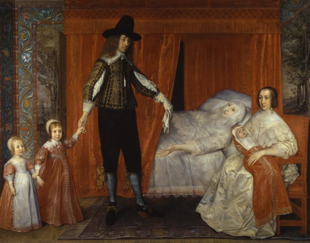
David Des Granges – The Saltonstall Family c.1636-7

On what looks like a shallow stage opening onto a bed in a cupboard, a strangely-scaled set of figures pose stiffly, only the older child meeting our eye with a knowing smirk, although the strangely capsule-like baby seems aware of us too.

As in the Souch painting, the father figure dominates, just as they dominated their households; the household being a microcosm of the state, the state itself a microcosm of the universe.* Mr Saltonstall, despite being at the apex of a pyramid of hierarchy that allowed absolute power, does not look devoid of compassion or warmth – indeed, he has had himself depicted holding the hand of his son, who himself mirrors (in, it has to be said, a less benign-looking way) this gesture of casual mastery, holding his little sister’s wrist, demonstrating just how the links in this chain of family work. And the family is inside the kind of house familiar nowadays to the heritage tourist as a mirror of the world that produced it; mansions like overgrown doll’s houses, big on the outside, but strangely cramped and illogical inside, with peculiar little wood-panelled rooms and an ancient smell of damp.

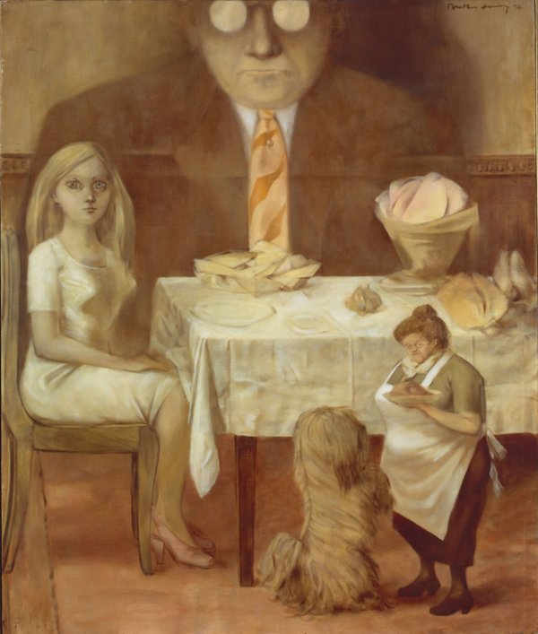
Dorothea Tanning – A Family Portrait (1954)

The nakedness of the power structure here isn’t subtle; and it isn’t supposed to be, because it wasn’t there to be questioned but accepted. Virtue lies in following god’s system of organisation, any suggestion to the contrary would make it an entirely different kind of painting. And indeed when painting – and painters – achieved a higher social standing in the century that followed, the messages become more subtle, only reappearing in something like this blatant form again in western art in the post-Freudian era, with a painting like Dorothea Tanning’s 1954 A Family Portrait. But Tanning’s painting is a knowing representation of a reality she was aware of but which had the force of tradition alone. Its appearance in the mid-17th century reflects the reality of the age; the truth, if not the only truth.


*EMW Tillyard, The Elizabethan World Picture, p.98-9

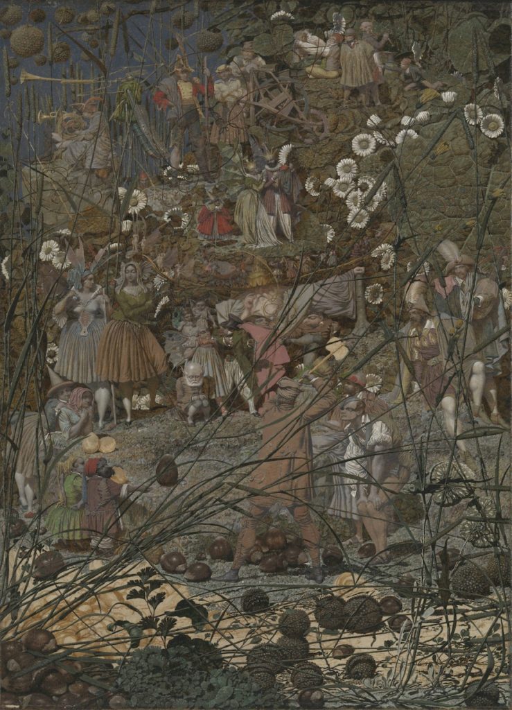
Richard Dadd – The Fairy Feller’s Master Stroke (1855-64)

The first impression, looking at these kinds of paintings, is something like looking at fairyland through the distorting lens of Richard Dadd’s insanity centuries later; comical and disturbing, familiar and illogical. These painters of the Elizabethan and Jacobean tradition (their art died out at around the same time as Charles I did in the middle of the seventeeth century) – Souch, Des Granges, William Larkin and their many nameless contemporaries – were at the tail end of a dying tradition that would be replaced by something more spacious, gracious, modern and ‘realistic’; but ‘realistic’ is a loaded word and it’s entirely likely that this older tradition captures their world more accurately. We don’t need a time machine (though it would be nice) – a visit to almost any castle, palace or stately home is enough to confirm that the velvet curtains and classical paraphernalia of a Rubens or Van Dyck portrait does not tell the whole story of their era, even among the tiny demographic who their art served. It is a world that we would probably find dark and claustrophobic; witness the smallness of furniture, the lowness of the doorways and the dark paintings of dead ancestors, and this – regardless of the fact that it is partly due to what would later be seen as incompetence* – is what is preserved in this tradition of painting, as well as in the homes these people left behind.

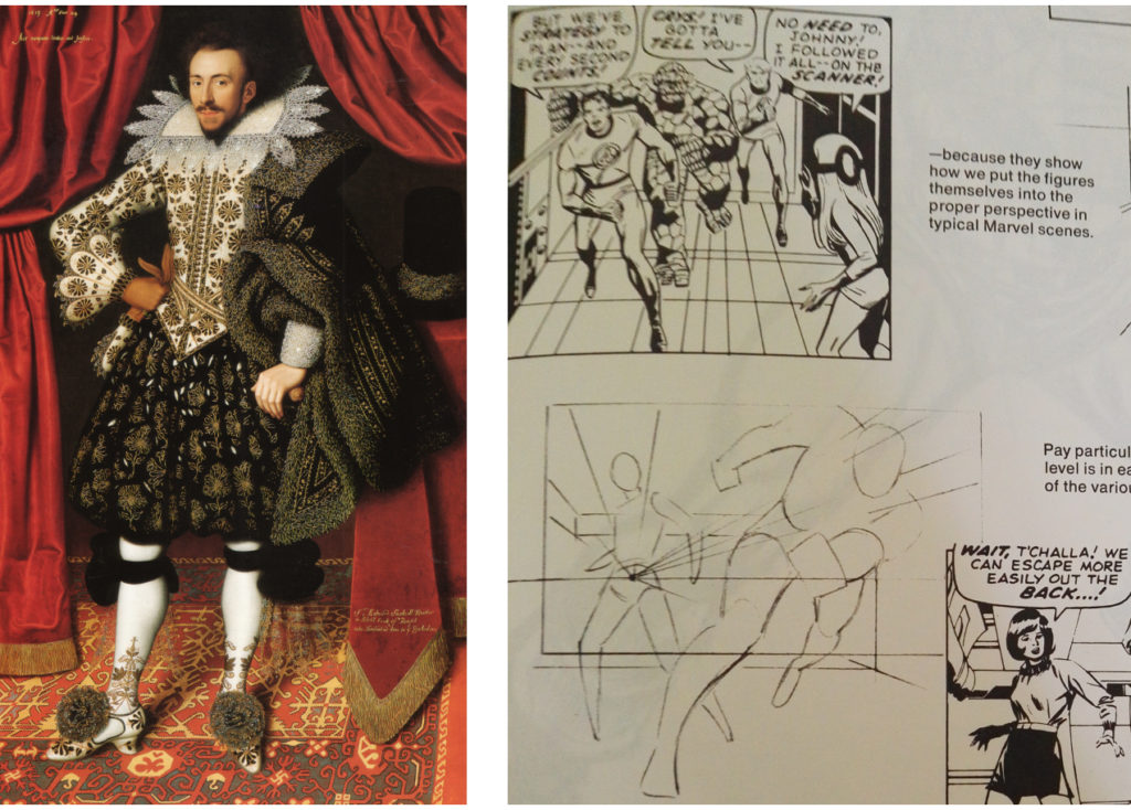
* it’s a matter of fact that the average artist drawing a superhero comic in the 20th/21st century has a better grasp of mathematical perspective – and the idea of perspective at all – than even the more accomplished Elizabethan or Jacobean portrait painter 

William Larkin: a great painter who could have learned something from John Buscema & Stan Lee’s ‘How to Draw Comics the Marvel Way’ (1978)

This is the kind of art that the Renaissance and its aftermath is supposed to have made obsolete – but though the word ‘art’ may owe its origin to its nature as something artificial, it also tells the truth, or a truth, regardless of its creators’ intentions. But if I’m implying that it’s realistic rather than idealistic, what does ‘realistic’ mean? Often when deriding ‘modern art’ (a meaningless term, since the art it usually refers to is often post-dated by art – like Jack Vettriano for instance – that is not considered to be ‘modern’) the assumption is that modern art is kind of aberration, a straying from a realistic norm*. But when looked at as a whole (or as much of a whole as is possible from a particular cultural viewpoint) it becomes quickly apparent that art that is ‘realistic’ in the narrowly photographic sense is a tiny island in the vast ocean of art history – and what is more, relies on ideas – such as the opposition of ‘abstract’ and ‘realistic’, that may have no currency whatsoever outside of the Western tradition.

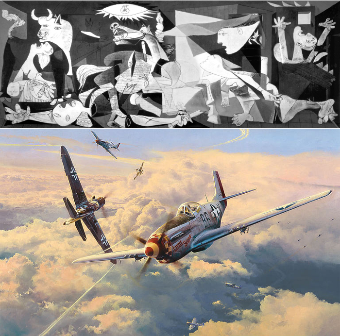
visions of war: Picasso’s Guernica (1937) and Robert Taylor’s Struggle For Supremacy (2001)

Even within Western cultures, the idea that photographic equates to experiential is debatable; despite the persistence (outside of academia) of the idea that Picasso was primarily an artist who painted noses on the wrong side of heads etc, a painting like his Guernica clearly has more in common with images of war as it was experienced in the 20th century – even vicariously through cinema and TV – than the kind of ‘war art’ that my granddad had on his walls, beautiful paintings in a tradition that lives on through artists like Robert Taylor, visions of war where the fear and panic becomes excitement and drama, an altogether easier thing to be entertained by.

*A classic example of this attitude came from Philip Larkin, who, when writing about modernism in jazz, digressed to cover all of the arts, noting

All that I am saying is that the term ‘modern’ when applied to art, has a more than chronological meaning: it denotes a quality of irresponsibility peculiar to this [ie the 20th] century… the artist has become over-concerned with his material (hence an age of technical experiment) and, in isolation, has busied himself with the two principal themes of modernism, mystification and outrage. Philip Larkin, All What Jazz, Faber & Faber, 1970, p.23

Picasso was trying to capture the feel of his century – but most of the great courtly artists of the sixteenth and seventeenth centuries – the Renaissance masters who became household names – were trying to capture something loftier, to escape the more earthy, earthly aspects of theirs, not least because they were the first generation to attain something like the status that Picasso would later attain; artists as creators and inventors, not craftsmen and recorders. And therefore that feeling of the life of the times shines through more vividly in the work of artists like John Souch and David Des Granges. The 17th century was a time when the world – even the world inhabited by the aristocracy – was far smaller than it is today in one sense, but the wider world seemed correspondingly bigger and more dangerous, but also perhaps richer or deeper, just as these people – often married by 12 or 14, learned – if they were allowed to learn – by 20, old by 40, were both smaller and bigger than we are.

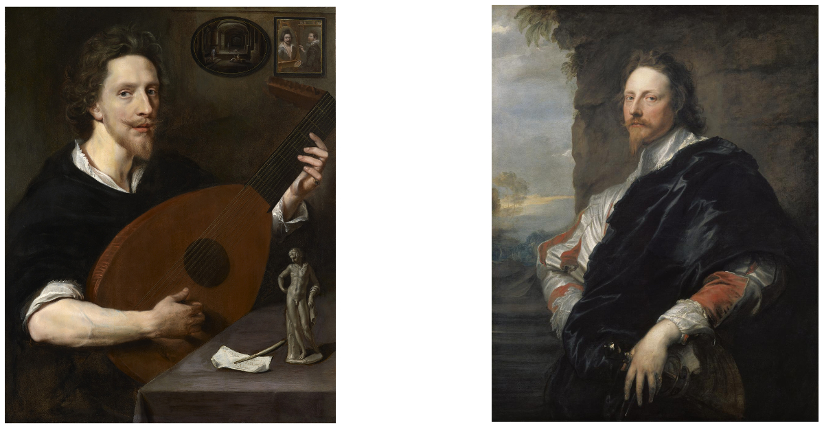
This kind of painting, part portrait, part narrative, was uniquely suited to the lives it recorded, and in one late example its strengths can be contrasted with those of the baroque style that swept it away. In 1613, Nicholas Lanier was a rising star in the English court, composer of a masque for the marriage of the Earl of Somerset. Around this time he was painted by an unknown artist, in the semi-emblematic tradition of artists like John Souch. There are references – the classical statue, the pen and paper with its mysterious inscription (RE/MI/SOL/LA) that highlight that this man is more than just a lutenist, but at the same time he is most definitely that, and the artist has taken care to render realistically Lanier’s muscles as he holds the instrument; an artist yes, but a workman of sorts too. By 1632, Lanier was the Master of the King’s Music and a trusted envoy of King Charles, who even sent him on picture-buying missions. And it is this gentleman that Van Dyck captures; aloof, authoritative, not someone we can picture sweating over a difficult piece of music.

Nicholas Lanier (1613) by an unknown artist (left) and Nicholas Lanier (1632) by Anthony van Dyck (right)

With the art of Van Dyck, the courts of Britain were to discover an ideal of aristocratic indifference which would partly define the project of British imperialism and which is, unfortunately, still with us today. But the truth of Van Dyck’s age, and those which preceded him was stranger, darker and more human. And it’s there still, in those damp-smelling big-small houses, and in the art that died with King Charles.


7.6 billion mirrors – the value of art

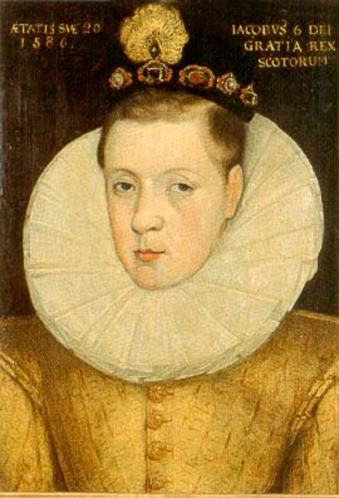
Aged 20/1586
James 6/By Grace of God King of Scotland

Was it a cold morning in Edinburgh in 1586 when James VI, only twenty years old, very aware of his status as a divinely-appointed monarch, but with already a lifetime’s experience of human nature and earthly politics, sat in front of Adrian Vanson to be painted? Was he nervous? His watchful eyes suggest not, but his position, though finally secure, probably didn’t feel very stable; just three years earlier he had been imprisoned by those ruling in his name, and this year, although he signed a treaty of mutual defence with England against the possibility of a Catholic invasion, his mother who he had succeeded, remained in England, alive and imprisoned. Was Vanson nervous? Or was it just another job? The King wasn’t always noted for his good temper, but the artist, who had come to Scotland from the Netherlands via London (where he had an uncle) already knew James, and had first painted some pictures for the young King in 1581, before his imprisonment and, in happier circumstances, the year before this portrait, had painted a more glamorous and light-hearted portrait of the King to be taken abroad and shown to prospective suitors. But this picture, sombre, stern even, is about power; James 6th by the grace of God King of Scotland. When we look at this painting, at this sulky looking young man, we are making some kind of connection, looking through the eyes, albeit via the hand, of a Dutch man who died around 420 years ago. The painting – even if by the standards by which art is usually judged, it’s ‘not great’ – has a personal value, one human being, recorded by another, as well as a cultural one. It tells us something about fashions, lifestyles, the way a king could be depicted in that country, in that period (for all his divinity he is not an iconic figure), class structures, religion – but what is it “worth”? What is any work of art worth?

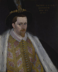
James again, when both he and the artist were a long 9 years older

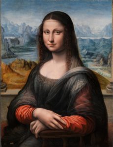
Leaving aside metaphorical, metaphysical or aphoristic answers, or going into a much more long winded but possibly worthwhile conversation about what art is (I’m going to say it’s a deliberate act of creation, but even that is arguable), let’s assume we know what art is. Googling ‘art definition’ initially brings up five presumably definitive and certainly iconic pictures, the Mona Lisa, The Starry Night (both as famous as their creators, pretty much), Les Demoiselles d’Avignon (whose creator – Picasso – is more famous than the painting), The (or rather Leonardo’s) Last Supper and A Sunday Afternoon on the Island of La Grand Jatte, which I think is probably more famous as an image than a title, and the image is more famous than its creator Seurat.
What are these paintings worth? I’m sure facts and figures are available, but this is not – despite the age of some of the paintings, about intrinsic worth; I imagine there is a basic going rate for an early 16th century Italian renaissance portrait on panel (and so forth), but that has little to do at this point with the price of the Mona Lisa. The painting would be just as good (or just as whatever you think it is) if the artist was unknown, but the value has – and always has had – a lot to do with Leonardo da Vinci and the perception of him as more than just someone who painted good portraits
.

a (but not “the”) Mona Lisa, an early copy probably by one of Leonardo’s apprentices

Separating the art from the artist is always a difficult and controversial subject, but should really be easier in the visual arts that almost any other field. Yes, artists have their own ‘voice’ or visual language, but that is not the same as reading their actual words, or hearing their actual voice; and yet – because, I guess, of market forces, artists are routinely known and valued above and beyond their works and those works – even their doodles and fragments – are valued accordingly. A scrawled caricature in a margin by Leonardo (or Picasso) can be “worth” many times what a highly finished, technically brilliant oil painting by an unknown artist is. This disconnect happens because although art history is human history, “the art world” as it has existed since at least the 19th century is more like horse racing – take away the money and what you have is a far smaller number of people who are genuinely interested in how fast a horse can run.
Which is fine – but the question of what a painting (for instance) is “worth” has become the way art is engaged with popularly; somehow art, unlike sport, has never earned its own daily segment on the news and really it only appears there when the sums it raises are enormous (Leonardo’s Salvator Mundi), the sums lost are enormous (theft, fires, vandalism), or it’s part of a story that’s interesting in itself (Nazi art hoards, previously undiscovered ‘masterpieces’ etc). But the veneration of artists above art – now at the very peculiar stage at which a painting “after” (that is, not by, and possibly not even from the same era as) a famous ‘old master’ can be worth a far higher sum than a genuine painting by a lesser known ‘old master’ – masks the true value of art, which may be cultural, but is ultimately always personal
.
Even without any knowledge of the King James or his life, we are able, if we can see –  just by being human –  to make certain assumptions about the kind of person he was, and what he may have been thinking or feeling on that day in 1586. This kind of empathy is an act of the imagination; if we are mind-reading it is ultimately our own mind we are reading – but no more so than when we meet eyes with a stranger on the street or on a train. And if looking at Vanson’s King James is – because we can find out these facts – a connection with both an immigrant living in what must have in many ways been an unfamiliar country, and with a young man who had recently attained some kind of power, not only over his own life, but over a country, at the cost of his mother, then what of a painting like the Mona Lisa? It is, regardless of how compromised it has become by fame, monetary value and endless theorising, a link with the mind and ideas – and hand – of Leonardo and a kind of communication with the sitter herself. She was probably Lisa Gioconda, she may have already been dead, but although I stand by all of the above, what I seem to have suggested is that a painting is a kind of code to be broken or a museum to be explored and unpacked. These things enrich our understanding of or connection with a painting, but they don’t make it. What makes art so fascinating – but also why it doesn’t have five minutes on the news every night – is because it’s so individual. It’s (VERY) possible to not care in the slightest about the outcome of, say a rugby or football match, but the final score is the final score, regardless of how anyone feels about the quality of the game or the skill of the players. It would not be satisfactory somehow to have a football match where no points were awarded and the outcome of the game depended on how you feel about it. But in art it is completely respectable – and I don’t think wrong – to say, (To paraphrase the great surrealist painter Leonora Carrington); if you really want to know what the Mona Lisa’s smile means, think about how it makes you feel.

Composition in White, Black, Red and Grey (1932) by Marlow Moss

This might seem like reducing art to the level of ‘human interest’, but what else is there? The choice of figurative paintings with a possible narrative element is a matter of taste and makes the human element unavoidable. But if we feel intense emotion when looking at a Mark Rothko painting, a sense of peace and calm from a Mondrian, Marlow Moss or Hans Arp picture, or exhilaration in front of a Peter Lanyon work, the fact remains that ‘we feel’ (or ‘we don’t feel’) is the common denominator. Viewers through the ages who have detected echoes of divine order and harmony in the works of Piero Della Francesa or Fra Angelico have only definitely detected them with any certainty within their own perceptions, which is not to say that they aren’t feeling something the artist himself felt. There’s a philosophical, ‘tree falling in the woods’ point here; is Van Gogh’s ‘Sunflowers’ a work of emotional and artistic intensity after the gallery lights go out? Or is it more like a kind of magic spell or booby trap, triggered only when a spectator is there to observe it?

That said, figurative art, especially portraiture, is – however many layers of information are contained in it – relatively easy to ‘understand’ on a basic level; ie if we can see, we can see what it is. It is the understanding and appreciation that remains entirely individual and subjective. Conceptual art – shockingly still around in much the same forms as it has been since the 60s – is, despite its apparently interpretation-inviting name, less transparent. This means that, unlike something we instantly recognise, it’s – initially at least – only as powerful as its visual impact. And in fact, whereas familiarity invites interpretation in traditional art, it tends to – on a popular level at least – repel it in conceptual art. The controversy surrounding classic media frenzy conceptual pieces like Carl Andre’s pile of bricks, or Tracy Emin’s unmade bed is because everyone knows exactly what a pile of bricks, or a sleeping bag or a bed is, and they don’t feel the need or desire to think further about it and if they do they feel – no doubt wrongly – that they are putting more thought into it than the artist did.

Comedian (2019) by Maurizio Cattelan
Carl Andre – Equivalent V (1966-69)

That is the ‘philistine’ response and it’s easy to have sympathy with; personally, I don’t mind wondering what a conceptual work means, but if I get no kind of emotional or cerebral response from looking at it in the first place then I’d rather the artist had just written their ideas down. This is me and my deficiency though – if Maurizio Cattelan put his heart and soul into taping that banana to the wall – or even if he just enjoyed doing it – who am I or anyone else to devalue that? And if whoever paid that much money for it is getting some similar experience, or just the satisfaction of being the owner of the most expensive banana in the world – then that’s hard to argue with too.

Portrait of an unknown woman by an unknown artist c.1725

I don’t think it devalues art – quite the opposite – to think of it as a form of communication between individuals, even if as mentioned above, it is really communication with the one person you will ever know with any certainty – yourself. What I seem to be saying (which I may not entirely agree with) is that art is a mirror. Take this beautiful painting from around 1725 by an unknown artist of an unknown lady. To me, this is a real connection with this unknowable person – but again, only as unknowable as any face that passes you in the street never to be seen again – she was a real person, sitting in a room, around 300 years ago, probably wearing something she liked or that told the world how she wanted to be seen, being painted by someone – and by 1725 it could have been a man or a woman – with whom they may have been engaging, impatient, chatty… We can only guess and extrapolate from the picture. That extrapolation will be different every time depending on the viewer and their own knowledge, not just of history, but of people and experience. If 7.6 billion people look at the picture it becomes in essence 7.6 billion pictures, 7.6 billion mirrors.

That is not to say that the picture is ‘better’ than Cattelan’s banana. If I came across the banana taped to a wall anywhere except an art fair would I see it as art? In a way yes, in the sense that it is literally artificial – not the fruit itself, but its location would clearly be a deliberate, human act and not – as a nail in a wall might be – something that could feasibly have a purely utilitarian meaning. It would be puzzling – far more so in fact that in an art fair where the (surely expected by the artist) first reaction of most non-art world people would surely be the eye-rolling ‘so this is ‘art’ is it?’ Whether it would be intriguing, or thought-provoking seems less likely, except insofar as provoking thoughts like ‘who put that banana there and why?’ Which I guess is perfectly valid – and in its own way a genuine connection of the viewer and artists’ minds, though not something that would probably take up much brain space after the initial wondering. But then, many – even most, people (whether or not they would approve of it as art vs the banana) might just as well look at the woman in her fine dress 300 years ago, or the young King James, and pass on without even wondering anything at all.

“Ane doolie sessoun” covid-19 and the art of isolation


At some point in the late fifteenth century, the poet Robert Henryson (who lived in Dunfermline, not too far from where I’m writing now), began his Testament of Cresseid with one of my favourite openings of any poem:

Ane doolie sessoun to ane cairfull dyte
Suld correspond and be equivalent.

Robert Henryson – The Testament of Cresseid and Other Poems, my edition Penguin Books, 1988, p. 19

I don’t think I knew, word for word, what he was saying when I first read it, but I did get the meaning: essentially that miserable/sad times (‘doolie’, which I guess would be ‘doleful’ a few hundred years later; not sure what it would be now) call for tragic/sad/grim (“cairfull”, literally ‘full-of-care’) poetry, and the words, with their mixture of strangeness and familiarity (people in Scotland have not talked like that for many centuries, but I think that being attuned to the accents and patterns of speech here still makes it easier to understand), stayed with me. The poet goes on to talk about the weather; apparently it was an unseasonable Lent in Fife that year, when “schouris of hail can fra the north discend/that scantlie fra the cauld I micht defend.” Despite impending climate disaster, Fife weather hasn’t changed beyond all recognition it seems; It was only two weeks ago – though it seems far longer now – that I was caught in a hailstorm myself.

my own photograph from April 2006

The season is still doolie however; not because of the weather, but because of the pandemic sweeping the world, one unlike any that Henryson would have known, but which probably wouldn’t have surprised him; one of the key elements he brought to the Troilus and Cressida story in The Testament of Cresseid is its heroine being struck down by leprosy and joining a leper colony.
the cover of my copy of his poems has a drawing from a medieval manuscript, of a figure which would have been familiar to most readers at the time; a leper with a bell begging for alms.

Maurice Utrillo

In fact, with dependable cosmic irony (or if you are less fatalistic, normal seasonal progress), the weather, since ‘stay home’ has been trending online and quarantine officially recommended, has been beautiful here. The streets are fairly, but not yet eerily, quiet. So this particular dyte (the old word that Henryson used referred to his poem but I think stems ultimately from the Latin dictum and can apply to any piece of writing) may not seem especially gloomy (and may in fact be quite sloppy), but it is certainly careful in the sense that Henryson intended. It’s quite easy – and I think reasonable – to be optimistic about the state of the world in April 2020, but not I hope possible for anybody with any sense of empathy to not be concerned about it.

There are some silver linings to the current situation (major caveat: so far); as well as, inevitably, bringing out the worst in some people, a crisis also brings out the best in many more. And a whole range of major and minor plus points, from a measure of environmental recovery to time to catch up with reading, have emerged. For me, one of the nicest things to come out of the crisis so far is – thanks to social media – the way that arts institutions, while physically almost empty, have begun to engage online with a wider range of people than those who are likely to, or physically able to visit the galleries themselves.

Algernon Newton – The Outskirts of Kensington


It has been said that Edward Hopper is the artist who has captured this particular moment, and it’s true that his vision of loneliness in the metropolis particularly mirrors our own age of social media and reality TV, in that it is voyeuristic* – we are not looking at ourselves, or at an absence of people, we are looking at other people whose isolation mirrors our own. If there’s something about this particular pandemic that sets it apart from the Spanish flu of 1918-19 or the great plague of 1665 or the Black Death of 1348-9, or any of the devastating outbreaks of disease that sweep the earth from time to time, it’s that online we are (a ridiculous generalisation perhaps, but if you’re reading this chances are you have internet access at least) sharing the experience of isolation; surely in itself a relatively new phenomenon, at least on this kind of a scale. When Daniel Defoe wrote in his fictional memoir of the 1665 plague (and it’s worth remembering that, although he was only five when the plague swept London, he would have had the testimony of many who had survived as adults as well as whatever shadowy memories he himself had of the period)

Passing through a Token-house Yard, in Lothbury, of a sudden a casement violently opened just over my head, and a woman gave three violent screeches, and then cried “Oh! Death, Death, Death!”in a most inimitable tone, and which struck me with horror and a chilness in my very blood. There was nobody to be seen in the whole street, neither did any other window open; for people had no curiosity now in any case; nor could any body help one another

Daniel Defore, A Journal of the Plague Year, 1722, my copy published by Paul Elek Ltd, 1958, p. 79-80

he was depicting a situation which many people could no doubt relate to; after the fact. What we have now is a sense of shared helplessness in real time; this has never existed, quite in this way before. Assuming some kind of return to normality, we (not entirely sure who I mean exactly by ‘we’) will know each other better than we ever have; something to have mixed feelings about no doubt.

*not a criticism; visual art is voyeurism

Edward Hopper capturing the 2020 zeitgeist with 11 am (1926)

The current appeal of Edward Hopper’s paintings of lonely figures is humanistic and easy to explain. His art, with its depiction of strangers quietly sitting in anonymous places, people who paradoxically we can never know and never know much about, but who we can easily relate to, is profoundly empathetic.  It belongs to a long tradition of quiet loneliness or at least alone-ness that stretches back, in Western, art to the seventeenth century and the art of Vermeer (it’s easy to forget as the children of it, but the idea of art reflecting the individual for reasons other than wealth and status is an essentially Protestant one*) through artists like Arthur Devis (though I’m not sure he intended the quiet melancholy in his paintings) and Vilhelm Hammershoi (who did). In fact, Hammershoi’s beautiful turn-of-the (19th-20th)-century paintings are if anything even more relevant to stay-at-home culture than Hopper’s diner, bar and hotel-dwelling urbanites. With Hopper, we are often watching – spying on – his characters from the outside as if through a pair of binoculars, with Hammershoi we are shut in with them, like ghosts haunting their silent rooms.

*really the only ‘lonely’ figures in pre-Protestant European art are Christ himself  (think of the utter solitary misery of the crucified Jesus in Grunewald’s Isenheim altarpiece) and of course Judas, or those who like him, have separated themselves from Christianity. There is a terrifying solitary quality in some depictions of saints during martyrdom, but for their contemporary audience it was essential to bear in mind that they were not spiritually alone (note: this may be a completely false assertion)

Vilhelm Hammershoi – A room at home with the artist’s wife (1902)
voyeuristic Hopper: Night Windows (1928)

But if Hopper’s most discussed and shared works now are those where we seem to catch, as we do from a train window, a momentary glimpse of a life that is utterly separate from our own. It’s a feeling I associate with childhood and (very) specifically, with travelling through Edinburgh in the winter and seeing glimpses of people at windows and the high ceilings in Georgian houses in the new town when Christmas decorations were up. Who were all these people?


                                                                                             But there are Edward Hopper paintings too – including some of my favourites, like Early Sunday Morning (see below) – where the only human presence is the artist, or the viewer, where Hopper could claim (though I have no idea if he would have) like Christopher Isherwood, I am a camera with its shutter open, quite passive, recording not thinking.* But recording, for a human being, is thinking. And the picture of a place-without-people is rarely as simple as it seems; even in the case of an actual photograph; someone had to be there to photograph it, and had their human reasons for doing so. The tradition of landscape painting exemplifies this; landscapes may be mythical, romantic, realistic, but they have been recorded or edited or invented for a variety of complex human reasons. The landscape painting of earlier eras was often self-consciously beautiful, or psychologically charged (Caspar David Friedrich is the classic example; landscape as a personal, spiritual vision; in some ways in fact his work, with its isolated or dwarfed human figures, is kind of like a romantic-era Hopper), but the fact that the urban landscape is itself an artificial, human-constructed environment gives it a different, poignant (if you are me) dimension.

*Christopher Isherwood, Goodbye To Berlin, in The Berlin Novels, Minerva 1992, p. 243.

Edward Hopper – Early Sunday Morning (1930)


The appeal of the empty urban landscape in art is perhaps hard to explain to those who don’t see it, but I think it’s worth examining. There is a utopian tradition beginning with (or at least exemplified by) the ‘ideal cities’ produced in Italy in the late 15th century that is in a strange way misanthropic (or at least anthro-indifferent) in that the tranquil geometric perfection of the imaginary cities can only be made less harmonious by the introduction of human figures. But it’s also important to note that these cityscapes actually pre-date landscape painting for its own sake in western art by a few centuries. I don’t think it’s much of an exaggeration to say that in the medieval and renaissance period, the urban landscape had a far greater claim to represent paradise than the natural one. The garden of Eden was a garden after all, not a wilderness, and even the word paradise denotes a walled enclosure in its original Persian meaning. We might think now of paradise existing beyond the realms of human habitation, but in ages where the landscape was mainly something perilous to be passed through as quickly as possible on your way to safety, the controlled human landscape had a lot to be said for it.

Ideal City c.1480s, previously attributed to Piero della Francesca

Like the Renaissance ‘ideal city’, the beautiful post-cubist-realist paintings of Charles Demuth have a sense of perfection, where the severe but harmonious geometry of his industrial buildings seems to preclude more organic shapes altogether.

Charles Demuth – My Egypt (1927)

But if Demuth shows an ideal world where human beings seem to have designed themselves out of their own environment, the ideal cities of the renaissance, with their impossibly perfect perspectives are something  more primal and dreamlike; prototypes in fact for the examinations of the inner landscape of the subconscious as practised by proto-surrealist Giorgio de Chirico and his actual-surrealist successors. De Chirico’s eerie ‘metaphysical’ cityscapes are essentially the ideal renaissance cities by twilight, and artists like Paul Delvaux used the extreme, telescoped perspectives of the early renaissance to create their own prescient sense of urban displacement. Why the kind of linear perspective that sucks the eye into the distance should so often be, or feel like, the geometry of dreams is mysterious – one plausible possibility is that it’s the point of view that first forms our perception of the world, the low child’s eye view that renders distances longer and verticals taller; we may be the hero (or at least main protagonist) in our dreams, but that definitely doesn’t mean we dominate them.

Paul Delvaux – Isolation (1955)

The use of isolated human figures, as in Delvaux and Hopper’s work, gives us a ‘way in’ to a picture, something human to either to relate or respond to (although Delvaux – like Magritte in Not To Be Reproduced (1937) – emphasises the loneliness and again the ultimate unknowable nature of human beings in Isolation by showing the figure only from behind), but the cityscape that is devoid of life, or which reduces the figures to ciphers, has a very different appeal.

Rene Magritte – Not To Be Reproduced (1937)

Whereas the unpopulated landscape may suggest a prelapsarian, primordial or mythical past, or an entirely alien realm altogether, empty streets are just that; empty. These are utilitarian environments designed specifically for human beings and their patterns reflect our needs. A meadow or hillside or mountain with no visible sign of human life may be ‘unspoiled’; towns and cities, by this definition, come ‘pre-spoiled’, and the absence of people raises questions where a natural landscape usually doesn’t; Where are the people? What has happened?

That said, nothing about Hopper’s Early Sunday Morning, Algernon Newton’s paintings of Kensington (or Oguiss’s Paris, or indeed the beautiful photographs of the city in Masataka Nakano’s Tokyo Nobody (2000)) really suggests anything ominous or post-apocalyptic, but even so, the absence of life is the most noticeable thing about them. Whether intended or not, this gives a picture a psychological depth beyond that of a simple topographical study. As with the use of musical instruments within a still life painting (whether there to express the fleetingness of time, or the lute with a broken string to denote discord etc) the inclusion of something with a specific purpose (roads, paths, buildings) apparently not fulfilling that purpose, creates a response as complex as – though very different from – the feeling of looking at those lonely figures in Hopper and Hammershoi’s paintings. Not so different in fact, from the feeling of leaving your home in the spring of 2020 and walking down the deserted street outside.

Takanori Oguiss

These paintings can have a slightly uncanny quality reminiscent of (or vice versa) the eerie opening scenes (the best parts) of movies like The Omega Man (1971) and 28 Days Later (2002) or John Carpenter’s classic Escape From New York (1981) where, emptied of people, any sign of life in the city becomes, not a sign of hope, but threatening and full of sinister power. Things will hopefully never reach that point in the current crisis, but as it is, avoiding people in the street is for now the new norm; for the first time I can remember, my natural reserve feels almost like a plus.

Algernon Newton – In Kensington (1922-3)

Those 15th century ‘ideal cities’ were part of the flowering of the renaissance, and, as with every other aspect of it, they were the product of people looking backwards as much as forwards. The actual, non-ideal cities that were lived in by the artists who painted the pictures were largely organic, messy, medieval conglomerations, regularly visited by outbreaks of disease. The ideal city’s emptiness is not only harmonious and logical, it’s clean. And like the classical sculptures, bleached white by time and weather, which were to prove so influential on that generation of artists, the aspiration is towards a kind of sterile perfection which never really existed until long after the culture that created the buildings and the art, had disappeared to leave a ghostly husk of its former self.

Algernon Newton – Spring Morning Camden Hill, 1940

The deserted city or townscape more or less disappears from art from the 15th century until the later years of the industrial revolution, when urban life itself became the subject for modern art. And it makes sense; the reversal in European culture which saw city life become perilous and the countryside as a means of escape was a slow one, and the solution (never more than a partial one) was in building programmes, urban renewal and harmonious town planning; Empire building and colonial expansion fuelled the growth of urbanisation and were fuelled by it; to imagine an empty city at the height of Empire was to imagine extinction. If the idea of empty streets, If there was any remaining collective memory of empty streets in the late 19th century, it was probably an echo of the kind of scenario that Defoe had written about*; less graced by the muses of harmony than haunted by the dead.

*or of natural disasters like drowned villages, or man made catastrophes like the Highland Clearances.

But by the late 19th century, in Europe, plague was less a current concern than it was gothic horror, the memory of a memory, and industrialisation had – for those with a measure of financial security – rendered the city (now with drains and public transport) and the country (now sans dangerous animals and medieval lawlessness) on something of an equal footing. For the generation of the impressionists, both city and country could be celebrated, and both (as has been true ever since) could mean escape. But that impressionist cliche, the ‘bustling metropolis’, defined by Baudelaire’s “fleeting, ephemeral experience of life in an urban metropolis” – the hub of modernity, the engine of culture and progress, when the streets are empty, becomes something else, but it can never just be a collection of buildings.

Maurice Utrillo


Not surprisingly perhaps, it seems that to some degree, the art of the deserted street is a kind of declared outsider art; Maurice Utrillo was an alcoholic with mental health issues, and although literally at the centre of the Parisian art scene centred around Montmartre – because he was born there to an artist mother – he was nevertheless a marginal figure, and his paintings of his home town are heavy with melancholy and isolation.

Similarly, although far less gloomy, the Montmartre paintings of Maria Slavona, a foreigner – a German Impressionist painter living in Paris, are depictions of an urban landscape that, while not hostile, is enclosed and other and (to me) brings to mind the close of Philip Larkin’s Here: “Facing the sun, untalkative, out of reach.” Whether that mood is inherent in the paintings, or only in the mind of the person looking at them, is not something I can answer.

Maria Slavona – Houses in Montmartre (1898)

The German artists of a later generation found a similar sense of alienation at home. The neue sachlichkeit (‘new objectivity’) movement of the Weimar Repulblic may have been a rejection of the extremes of Expressionism and romanticism, but in its embracing of modernity it was a specifically urban movement too. The teeming street scenes of George Grosz and Otto Dix reflected the sometimes chaotic street life of Germany’s big cities in the social and economic upheaval following that followed World War One much as Alfred Döblin’s Berlin Alexanderplatz (1929) was to do in literature, but there were other views of the city too.

It was an era of political unrest, but if one thing united the political left and right it was the understanding that they were living in an essentially transitional period; that change would, and must come.

Hans Grundig was the epitome of the kind of artist hated by the Nazi party; politically a communist, he used his art to oppose the creeping rise of fascism but also to capture working class life in the city (in his case Dresden). But in Thunderstorm (Cold Night), 1928, it is the environment itself that condemns the society of the declining republic: the streets are empty and ghostly pale, the buildings, run down and near-derelict, offer little shelter and no comfort, and the people whose fate looked uncertain, are nowhere to be seen. Meanwhile, a storm approached.

Hans Grundig Thunderstorn (Cold NIght), 1928


Carl Theodor Protzen – Lonely Street (1932)

Carl Theodor Protzen was, by contrast, an establishment figure; a member of the Association of Fine Artists and the German Society for Christian Art, he was to become a pillar of the Nazi art community. Urban landscapes were his speciality and his depictions of Nazi building projects were to make his name, but just prior to the NSDAP’s rise to power in 1933, he was painting pictures like Lonely Street (1932) that show those same urban landscapes, but without the excitement of progress. Less bleak and doom-laden than Grundig’s city, this is nevertheless an environment which does not embrace or protect humankind; the title reflects the child’s exclusion from the harshly geometric scene in which he finds himself and, although there is no sense of exaggeration, the perspective, as in surrealism, pushes the end of the road ever further into the distance.

This perspective is seen too, in Volker Böhringer’s the Road to Waiblingen, painted in the year that the Nazis came to power. Böhringer, an anti-fascist painter, was later to become a surrealist, and the ominous (blood-stained?) road, stormy clouds and sinister trees suggest that this is  (with apologies to Waiblingen) not a road that he saw leading anywhere very pleasant.

Volker Böhringer – the Road to Waiblingen (1933)

Ever since I was a child, I’ve always loved to visualise (usually at night) a real place, say a nearby hilltop or field, as it is at that moment, with nobody except animals and birds there to see or experience it. It’s a strange kind of excitement that depends on not being able to experience the thing you’re excited about: psychology probably has a term for it – but at a time when people have never been more inescapable (not that one necessarily wants to escape them) there is something appealing about the complex landscapes we have created for our needs, but without the most complex element of all – ourselves – in them. Whether we enjoy the empty streets or not (and hopefully we don’t have to get too used to them), we should probably take the time to look at what is all around us; it’s a rare chance to see our world without us getting in the way.

Surrealist social distancing: Rue de la sante (1925) by Yves Tanguy

a true state – cut and paste and the art of collage (Edinburgh, summer 2019)

Francesca Woodman, Untitled (1977)

2019 has, in many ways, not been a good year so far. But this summer, the National Galleries of Scotland had (well, has; they are still on) three particularly outstanding exhibitions that brought a bit of light and intelligence to a period of more-than-usual stupidity. At the National Gallery itself, there was the excellent, eye opening and brain-frying Bridget Riley exhibition (closes 22nd September), at the National Portrait Gallery the superb Self Evidence (closes 20th October) in which Francesca Woodman’s tiny, intimate, self-enclosed photographs vibrate balefully in their little corner, overshadowing (for me) the also (but in an entirely different way) intimate and at times frankly challenging monumental works of Robert Mapplethorpe* and, to a lesser extent, the brilliant but (I guess appropriately) don’t-quite-fit-in Diane Arbus portraits of the lives of people marginalised and made invisible by mainstream culture.

*though the Mapplethorpe pictures were the ones that moved me the least, they did provide the priceless spectacle of parents hurrying their curious kids past the notorious 1978 Self Portrait With Whip. They had been warned!

But for me, the highlight of the National Galleries’ summer programme is Cut and Paste: 400 years of Collage at Modern Two (closes 27th October).

Thanks to its inclusive definition of collage (which covers photomontage, traditional collage, plus bits of decoupage, pressed plant samples and even quilting) as well as its historical scope, the exhibition manages to be both focused and wide-ranging, and also (I found) surprisingly moving. What collage does, or at least amplifies – perhaps paradoxically given its use of found/ready-made materials – is that aspect of art that disappears most quickly in reproduction; the hand of the artist. This is art not only as a reflection/projection of culture but one that includes material culture itself.* There is, sometimes regardless of the picture/object, a poignant quality that comes from the materials used, in a way that doesn’t happen with paint, unless you are the kind of conservator who can isolate pigments used to specific periods (I’m not, unfortunately).

*I don’t think this is just pretentious bullshit; but you never know

Pablo Picasso, Bottle and Glass on a Table (1912)

I’m getting ahead of myself here, but a seminal collage that makes an appearance in the exhibition, Pablo Picasso’s Bottle and Glass on a Table (1912) is a classic/typical Picasso cubist/spatial experiment, but the use of newspaper – a very specific, dateable piece of ephemera (from Le Journal, 3 December 1912) – gives the work, instantly and inherently, a dimension largely absent in conventional painting. The feeling that the collage is both artwork and artefact; literally as well as figuratively multi-layered, makes a case for collage as a distinct and special art form, a feeling echoed by the Scottish artist Eduardo Paolozzi (represented by some outstanding works in the exibition), for whom the form offered clarification, where formal art training raised problems and questions: “Unlike the world of school where the universe was systematised in a certain order, the reassembly of this disparate material reflected a true state, both autobiographic and dynamic.” (quoted in the exhibition catalogue,  p. 126)

So anyway; the exhibition is arranged chronologically, in the usual Modern Two layout; in various rooms, up the stairs, through the corridors etc, always I think a layout that makes for an engaging, surprising way of looking at art. Partly deliberately (there were too many people in the first room), I went around the exhibition in reverse chronological order and in retrospect that seems like a good decision. This meant that the exhibition opened with the Chapman Brothers’ The Disasters of Everyday Life (2017), a spectacular-looking wall-like object consisting of 80 of Goya’s horrific etchings, The Disasters of War, with of course added bits and pieces, sometimes powerful, sometimes deliberately absurd, I think (though I’d have to go through again the other way) it serves better as a kind of abstract for what is to follow than it would as a conclusion, where peering at a lot of small images might have seemed a bit anticlimactic.
I’m not going to mention every picture in the show, though I can’t think of anything that doesn’t deserve a mention. The first thing to have a major impact for me was Lucy Williams’ 2015 Crescent House, as much a piece of model making as a collage, a strange, small scale (just under a metre long) recreation of a bit of postwar architecture, but simplified and made more colourful, giving it a feeling of harmony almost like a kind of 3D Mondrian.

Lucy Williams – Crescent House (2015)
Linder – Pretty Girl (1977)

Crescent House captures something of the intended optimism of the postwar new town planning that’s most often associated now with neglect and urban decay. I don’t know if it’s a generational thing (Williams is around my age), but for me there was something powerfully bittersweet about the feeling of an abandoned, never-quite-attained future, heightened by the realness of the work as an object.

The aesthetic of Crescent House – though that is far lighter in tone – makes me think of the late 70s work of Linder (Sterling), another exhibition highlight. Although similar in its reference points to the pop art collages of Richard Hamilton a couple of decades before (sadly his iconic 1956 collage Just What Is It That Makes Today’s Homes So Different, So Appealing is not in the exhibition, though they do have a nice work by him, Desk from 1964), the feel of Linder’s work is far darker (it makes me think of the confrontational industrial work of Throbbing Gristle and COUM Transmissions around the same period) and the satire more pointed. Works like her Pretty Girl series(1977) exemplify a particular approach to collage. Using the detritus of everyday life; magazines, posters, advertising, it became a way of embodying in the art a criticism of the culture that it’s a reaction to as well as a product of. It’s a feminist criticism of the objectification of women that uses already depersonalised women (part of the problem) and merges them with actual ‘objects of desire’ from a patriarchal culture that above all else believes in commodification for its own benefit.

Craig W. Lowe, Bedroom Cupboard door covered with stickers, 1987-1997

Thanks to the exhibition’s open-minded and inclusive approach, there are some unexpected revelations (but aren’t all revelations unexpected? I mean, that’s obvious). While Craig W. Lowe’s bedroom cupboard door covered in stickers c. 1987-1997) may appeal most as nostalgia, the inclusion of Jamie Reid‘s original Sex Pistols Never Mind The Bollocks cover collage (1977; copyrighted image so I’d better not share) opens realms of not-previously-considered information (at least to me) about one’s record collection. Firstly, the collage is black and white, and secondly, it isn’t just a picture or a ‘file’, it’s an actual thing. Like, presumably all album cover art (and book cover art etc) before the digital age, the NMTB cover in all its yellow and pink (or pink and green) glory, taken for granted forever, is not a picture, it’s a photograph of a picture. In its final form it’s been overlaid with colours, but that object there on the wall in Edinburgh is the thing itself. A strange feeling, like looking at the inscription on a ten pound note and considering that it is a representation of something, rather than ten actual pounds.

The Sex Pistols cover primes the viewer (at least the viewer going through the exhibition backwards) for the various bits of Peter Blake’s Sgt Pepper’s Lonely Hearts Club Band cover that are on show – and, great though they are (and I like Sgt Pepper quite a bit more than I like Never Mind The Bollocks), without that priming, the Beatles items wouldn’t have the same impact; perhaps because the cover itself is clearly a photograph of objects and cut-outs and seeing them is very cool but not really revelatory, the whole is too familiar and iconic to give the frisson of a moment captured. In fact, Blake’s superb, possibly slightly twee The Toy Shop (1962) is a far more vivid time capsule; clearly pointing to Sgt Pepper, its a conglomeration of bits and bobs familiar to children of the 60s – but also to children of later generations as belonging to the same family as the bits & bobs of their own youth (in my case, comics, football stickers, sweets, TV tie-in toys (He-Man et al), but also the odd antiquated throwbacks that still existed, like bows and arrows and balsa wood or polystyrene gliders which came with a weighted plastic propeller so they flew when thrown – do they still make those?). It’s hard to imagine that there will be a generation that can’t relate to The Toy Shop at all, however virtual entertainment becomes, kids will always like stickers.

Peter Blake – The Toy Shop (1962)

But Blake’s pop art nostalgia – powerful though that is – is one of the few purely positive and joyous post-war works in the show. More typical are the mischievous collage book covers made by Joe Orton and his partner and eventual murderer Kenneth Halliwell. These were put on library books and returned to the library – an act that eventually cost them a six month prison sentence – and they exemplify the sense of the significant, perhaps subversive and illogical accident that drew the surrealists to collage a few generations earlier.

Kenneth Halliwell & Joe Orton – collage on library book cover (c.1960-2)

For the surrealists, collage was almost a manifestation of the galvanising quotation from Lautréamont’s Les Chants de Maldoror (1869) where a boy could be described as being “as beautiful as a chance meeting on a dissecting table of a sewing machine and an umbrella.” This aspect of surrealism is brilliantly captured in Max Ernst’s gothic ‘collage novels’ (one of the most exciting inclusions in the show is an unpublished picture from his 1934 collage novel Une semaine de bonté) as well as in beautiful works by Toyen and some of the collaborative exquisite corpse collages made by André Breton, Jacqueline Lamba and Yves Tanguy, where each artist could only see their own part of the work until it was complete. Again, what I hadn’t really anticipated was the difference it makes seeing these items in real life – for example, I had seen and liked (and own a postcard of) Roland Penrose’s untitled 1937 postcard collage, but seeing it, life size, and looking at the actual real postcards stuck to it, was a weirdly moving experience. But why? It’s something about the immediacy and associations of familiar things, the thought perhaps of Roland Penrose actually going into a newsagent and buying the postcards one day in 1937. Why that should be more moving than an artist using paint I don’t know, except that, like the scrapbooks owned by Tristan Tzara (very exciting to see) and the paper cutouts by Matisse (which until now I’ve never been a fan of) it brings the whole process of making art into an immediate, almost tangible one.

Roland Penrose – Untitled (1937)

The work of the Dadaists (Hannah Höch was the main reason I wanted to see the show) is less self-consciously unconscious (well, that makes no sense) than the surrealist works, but the element of satire and sometimes bitter humour – especially in John Heartfield’s iconic anti-Nazi photomontages – make them the spiritual ancestors of the works of artists like Carolee Schneemann and Nancy Spero in the 1960s as well as Linder and even Terry Gilliam in the 70s. Highlights for me were the selection of works by Kurt Schwitters, whose own version of Dada, Merz, even had a collage-like genesis, the word itself apparently derived from a fragment of text relating to a banking firm (Kommerz und Privatbank). The fact that the word Merz also has echoes in the words schwerz (pain) and ausmerzen (to weed out or discard) adds to the sense that this was a movement (if you can call one person a movement) for which collage wasn’t an entertaining diversion, but a central idea. The cumulation of meanings and associations in works like Merz 229: Heet Water (1921) makes these small works with their train tickets, textiles, playing cards – pretty much anything that could be cut up and stuck down – powerfully evocative, as well as decorative in themselves.

John Heartfield – Adolf the Superman – swallows gold and spouts junk (1932)
Kurt Schwitters – Merz 229: Heet Water (1921)


The section on the birth of modernist collage features a group of Picasso works including the the aforementioned Bottle and Glass on a Table, which form year zero of modernist collage, alongside works by peers including Braque (who may actually be the first modernist collage-maker) and Juan Gris (whose The Sunblind, 1914 is a highlight) and then the ripples spreading outwards from that explosive group of works, including the Russian constructivists and suprematists, the Italian Futurists and even the Bloomsbury group in the UK; I was very impressed to come across a painting by Vanessa Bell (Portrait of Molly MacCarthy, 1914-5) that didn’t immediately wilt into insignificance when surrounded by the big names of European modernism.

Juan Gris – The Sunblind (1914)

It seems obvious to say that collage is comparatively egalitarian insofar as you don’t need to be able to draw or paint to do it – and it’s true that works by generally non-visual artists like Breton and Joe Orton have a similar energy and atmosphere as those by more conventional artists, but it’s also noticeable that, pre-modernism, although the idea of collage existed and there was sometimes that same element of playfulness, the work is more notable for its skill and ingenuity – especially in the Victorian photomontages – than for any disruptive or ironic qualities. But collage being what it is, it’s here that the sense mentioned earlier of the collage as actual material culture comes into play again, sometimes – especially for me in the small character pieces by George Smart from the early 19th century – powerfully so. Somehow, these little watercolour paintings adorned with carefully cut out and arranged pieces of paper and fabric (irresistibly reminiscent to me of the ‘fuzzy felt’ sets I played with as a child) bring us closer to the artist than just paint on canvas would do.

This is perhaps art history as human interest and association rather than as aesthetics (this is especially true in the case of the Victorian scraps and scrapbooks, perhaps because the ready-made nature of the scraps themselves makes the objects feel less like the works of an artist and more like a hobby; nothing wrong with that, but as the sort of things you see in auctions and junk shops they have the aura of being ephemera, rather than using ephemera to make something else; a false distinction perhaps), but for me this exhibition brings those two aspects of art – the human/historical and the aesthetic/technical together in a deep and very satisfying way.

I have no real criticisms of the exhibition; it is thought provoking, beautiful to look at and put together with care and imagination. It might have been nice to have had something by some of the other artists most strongly associated with collage, like Romare Bearden and Wangechi Mutu; but if an exhibition leaves you wanting more that can’t be a bad thing.

***POSTSCRIPT***

Since I mentioned the anyone-can-do-it aspect of collage, I might as well mention that I went through a phase, especially in my student days of making collages, and while they are nothing special, they do have a kind of diary-esque subtext which has only really become apparent over time. Since it’s my website and no-one can stop me, here are a couple of examples, plus a more recent one.

untitled collage, c. 1998?
untitled collage c. 1998-9


untitled collage, 2019
untitled collage, late 90s

A continuous chain of little inventions; art in Edinburgh summer 2018


Probably as much as I love any art movement, I love German Expressionism; most of all the artists of Die Brücke (I wrote at length about them here) and their (initially) optimistic quest to forge a new, forward-looking art which was distinctively German, drawing on native traditions (woodcuts, landscape etc), but also attempted to peel away the layers of staleness built up by decades, or even centuries of academicism, to reveal living art beneath. The art of Paula Modersohn-Becker, too, who was doing something similar in Worpeswede, is important to me too, but I also love the more anguished, personal kind of Expressionism that was reflected in the famous Expressionism of German silent cinema (see also Kirchner’s later works, and – not “German Expressionism” per se, but still German and expressionistic, early Dix and Grosz, Max Beckmann, Käthe Kollwitz).

Emil Nolde – Bay (1914)

So, even though Emil Nolde (1867-1956) is perhaps my least favourite of the major German Expressionist painters, and even though I had lots of qualms about it (see here), I was excited to see the Scottish National Gallery of Modern Art’s exhibition Colour Is Life. And it really is good.


In comparison with the much younger artists of Die Brücke, which he joined for a year in 1906* Nolde’s art is just as vivid, but less vibrant (if that makes sense); his colours tend towards the bilious and acidic and his style, though ‘free’, often seems – even in landscapes – more frenzied and less harmonious than the works of the rest of the group. His deeply felt religious paintings, especially – and there is a really remarkable group of them in the exhibition – have an intense, anguished, alienated quality that is more like Munch atmospherically than it is his German contemporaries. It’s among his figurative (but not religious) works that my favourite painting of the exhibition, an enigmatic and slightly double portrait (that I can’t find online), which is smoother in surface texture than the religious pictures and imbued with an oddly menacing atmosphere.

*at which point Nolde was 39 and the group’s founders were in their early to mid twenties

Emil Nolde – Paradise Lost (1921)

I’m glad to say that although I felt like the information at the exhibition tended to downplay his vociferous Nazism a little, it at least acknowledged it – and although it is nowhere explicit in his art, there are some uncomfortably anti-Semitic-caricature-like faces in his paintings of people, including in some of the religious works. But whether I would think that if I didn’t know he was (extremely) anti-Semitic, I can’t say. Interestingly, for an exhibition called Colour Is Life, by far the most powerful works to me were Nolde’s woodcuts (including arguably his most famous work, The Prophet of 1912), where his compositions are remarkable for their economy and stark intensity.

Emil Nolde – The Prophet (1912)

Interestingly (perhaps not coincidentally?) the majority of Nolde’s most impressive work seems to have been done by the mid-1920s, but there is also a selection of his ‘unpainted pictures’ in the exhibition. These are little watercolours, incredibly vivid in their colours, which were made in secret during the period when his work was condemned/forbidden by the Nazi government which Nolde had, however, not only welcomed, but effectively campaigned for since the early 30s. Incidentally, around the time that Nolde was signing the Aufrufs der Kulturscha (1934) which supported Hitler as Fuhrer and joining the National Socialist Association of Northern Schleswig, Ernst Ludwig Kirchner, one of the founders of Die Brücke, was writing “Here we have been hearing terrible rumours about torture of the Jews, but it’s all surely untrue…There is a war in the air. In the museums, the hard-won cultural achievements of the last 20 years are being destroyed, and yet the reason why we founded the Brücke was to encourage truly German art, made in Germany. And now it is supposed to be un-German. Dear God. It does upset me.”*

Head of a South Seas Islands woman (1914)

This was more than just the symptom of a generation gap between different artists; it’s at the heart of why Nolde’s art is, despite surface similarities, so different from that of the artists of Die Brücke; Expressionism is (obviously) about expressing; and yes, Kirchner and co expressed their anxieties, but their vision – at least at the time the group was at its most cohesive – was an optimistic one, accepting other influences as much as it rejected the status quo. To the 21st century, the way they were influenced by the art of other cultures, to simplify and brighten their own work can be uncomfortable; it has something of the ‘noble savage’ myth about it and their assumptions about the freedom and ‘naturalness’ of the tribal cultures whose work they studied in ethnographic museums were made from a viewpoint that now seems colonial and ignorant. But – the point of their own work is that it uses these forms and elements to describe something that is whole, natural and above all universal – the ‘otherness’ of the figures Nolde drew and painted on his trip to the South Seas (and even of his incredibly bold landscapes) just before WW1 is inescapable. His drawings of the people he encountered aren’t caricatures; they are brilliantly observed, but they are themselves ‘ethnographic’ in a way that Kirchner and co’s art strove not to be; Nolde is seeing and recording, not absorbing.

* Kirchner, quoted in Kirchner Museum Davos Biography Ernst Ludwig Kirchner by EW Kornfield, & CE Stauffer (1992)

Still; the Nazi government didn’t care about this distinction, and the exhibition text tells us that Nolde had more paintings shown in the condemnatory Entartete Kunst (‘degenerate art’) exhibition than any other artist, which would be a cause for some schadenfreude if not for the fact that, after petitioning the government (he was on civil if not familiar terms with charming people like Goebbels and Baldur von Schirach) he was informed in late 1941 that any work he undertook should be presented before government officials before any kind of public showing, which is of course harsh and limiting by any normal standards, but surprisingly mild compared to what they were doing to other artists. But, as Nolde must surely have realised, for all their cultural protectionism and promotion of what they considered to be artistically wholesome and correct ideas, the Nazis really weren’t interested in art as art at all.

Julie Wolfthorn – Witch of the Woods (1899)

For some not very pleasant perspective, since I can; Nolde was prevented from making a living from his art for a few years, and had works confiscated (which he did eventually get back however), meanwhile his contemporary, Julie Wolfthorn (only three years older than he was), whose figurative, traditional, slightly folkloric art has at least an equal right to be seen as definitively German (or, far more right, to the anti-modernist authorities of the time), was, as a Jew, too dangerous to exist, and was murdered in 1942, at the age of 78, by the regime which Nolde did his best to be accepted by.


So yes, a beautifully curated and mounted exhibition; but one which leaves a slightly bitter taste.

Toyen – Message of the Forest (1936)

So,  that’s what I paid to see (and it is absolutely worth the price of admission), but in fact the bitterness faded quickly; aside from owning a Kirchner painting that is for me everything that Nolde’s work isn’t, the National Gallery of Modern Art (Modern Two) hosts a permanent (and free) exhibition Surrealism and the Marvellous, which was already great, but has been enhanced hugely by the acquisition of Toyen’s superbly enigmatic The Message of the Forest (1939) and Leonora Carrington’s diminutive but haunting (and at the same time kind of funny) 1939 portrait of Max Ernst, Bird Superior (1939).


Leonora Carrington – Bird Superior (Portrait of Max Ernst), 1939

I could spend (and I think have spent) hours in this room; even longer now, as the archive adjoining it is hosting Club Dada: Berlin and Beyond, a really exciting collection of books, pamphlets, photos etc (and a small Max Ernst painting) that focuses mainly on Berlin Dada but also has some great items from the original Zurich group. Much as one wants to pore over these artefacts, I don’t even mind too much that the books etc are in glass cases since my German is minimal and I can’t read French at all.


Raqib Shaw – The Adoration (after Jan Gossaert), 2015/6 © the artist

Over in Modern One, I nearly didn’t look at the (also free) exhibition Raqib Shaw: Reinventing the Old Masters, partly because part of me doesn’t really want them to be reinvented, and because I didn’t know Shaw’s work, and also because it was up the stairs and I’d been walking around for hours. But I’m glad I did; what a fantastic show! I can’t imagine anyone not being impressed by Shaw’s work, even if it’s not their cup of tea. The paintings (too simple a description; his huge panels are painted in shimmering enamels, but embellished with a kind of cloisonné effect, incorporating jewels, glitter, all kinds of things) are brilliantly drawn and dazzling in their richness and detail (and a bit over the top, which is part of the charm). Although the compositions of the pictures in this exhibition are inspired by ‘old master’ paintings (one of which is one of my all-time favourite pictures, Lucas Cranach’s enigmatic Allegory of Melancholy (1528), displayed alongside Shaw’s painting), the familiarity only makes the extravagant fantasy of Shaw’s works all the more dreamlike and affecting.

Jan Gossart – The Adoration of the Kings (1510/15)

I think we (no, I don’t know who I mean by ‘we’) are used to seeing and accepting things like Biblical scenes or Greek myths presented through the filter of the Italian (or Northern) renaissance, and this is similar but different. With the old masters we (them again) see familiar (or what were once familiar) scenes  presented in a kind of fancy dress of anachronistic costumes/settings etc which were initially intended to heighten the relatable-to realism of the works, but which now add another layer of meaning and cultural baggage. With Shaw’s work, the ghosts of both the original meaning and the original treatment are seen as if through the eyes of someone from another, much more effervescent dimension. The dislocating, hallucinatory blend of familiar (and it isn’t just the source material that’s familiar; Shaw’s use of dazzling, opulent colours and ornate textures is, despite the fantastical elements, quintessentially Indian, to my western eyes anyway) and strange is exhilarating and strangely poignant.* To take my favourite picture; neither Cranach’s or Shaw’s Allegory of Melancholy is sombre exactly; but despite the centuries and world views that separate them, the same delicately wistful atmosphere pervades both pictures. It’s an impressive exhibition.

So, the moral of this is; go to the Scottish National Gallery of Modern Art in Edinburgh if you get the chance. Oh, and the National Gallery of non-modern art too – aside from having an incredible permanent collection, they currently have a Rembrandt – who doesn’t like Rembrandt? – exhibition and have put a fantastic Jenny Saville painting (Aleppo) among the old masters in a way that works amazingly well and was gathering crowds of (especially young) people when I was there.

*Perhaps an obscure (and certainly a geeky) comparison; looking at Raqib Shaw’s pictures reminded me of reading Brendan McCarthy & Pete Milligan’s similarly post modern/immersive/multicultural/hallucinogenic comic strip Rogan Gosh in the 2000AD spinoff Revolver.

Brendan McCarthy & Peter Milligan, Rogan Gosh (1990)