bounders in oiks’ clothing – the reign of the ordinary bloke


“His manner was so friendly that I forgot to put on my cockney accent, and he looked closely at me, and said how painful it must be for a man of my stamp, etc. Then he said, ‘I say, you won’t be offended, will you? Do you mind taking this?’ ‘This’ was a shilling, with which we bought some tobacco and had our first smoke that day. This was the only time in the whole journey when we managed to tap money.”

George Orwell, ‘Hop-Picking’, October 1931. Collected Essays, Journalism and Letters of George Orwell Volume 1 An Age Like This 1920-1940. Penguin, 1968, p. 83

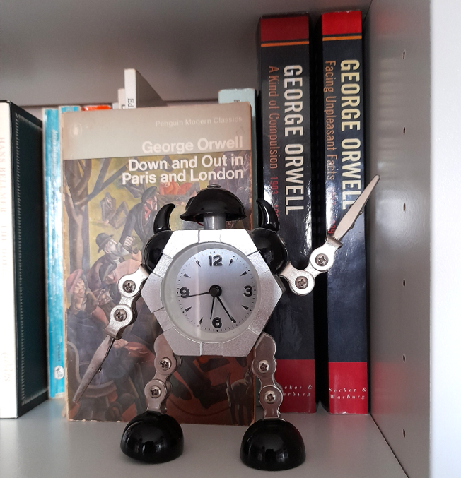
Clearly, the old school tie works, even when it isn’t worn. Incidents like this pop up several times in George Orwell’s writings of the 30s, in articles like “The Spike” and in Down and Out in Paris and London (1933) etc., and they always make him uncomfortable. The reminder of the deference that he was, in his original identity as old Etonian Eric Blair, accustomed to and had been trained for in his daily life was both welcome and unwelcome. Unwelcome, because firstly, it was embarrassing to be ‘unmasked’ in front of people with whom he had become friends precisely because at the level of society at which they existed – and in these writings it is the poorest of the working class or the unemployed and destitute – there were no class distinctions anymore; as he says in Down and Out in Paris and London, regarding a typical London lodging house:

All races, even black and white, mixed in it on terms of equality. There were Indians there, and when I spoke to one of them in bad Urdu he addressed me as ‘tum’ – a thing to make one shudder, if t had been India. We had got below the range of colour prejudice.

George Orwell, Down and Out in Paris and London, Gollancz 1933, p. 150

Though Orwell was sometimes taken aback by the levelling effect that poverty had, he welcomes it too – his occasional unmasking as a “gentleman” was an unpleasant reminder of his abandoned life as a police officer and tool of colonial oppression in Burma. But it was also useful in a way – not just because money and gentle treatment was welcome after weeks or months of hardship, but because it was a stark and simple illustration of exactly the kind of injustice, inequality and disparity he sought to draw attention to with his writing. Orwell is happy to write openly about his deception, partly because it was essentially harmless and necessary, in order to truly experience the kind of life he wanted to write about. But perhaps he was also comfortable doing so because, much as he would have liked to have ‘proletarian’ readers, – and probably did have a few – he was mainly writing for an audience of his peers; the political class who could, if they really wanted to, improve the lives of the vast, faceless mass of unemployed and homeless that they were no doubt aware of, but preferred to think about, if at all, as feckless layabouts who probably deserved their lowly status.

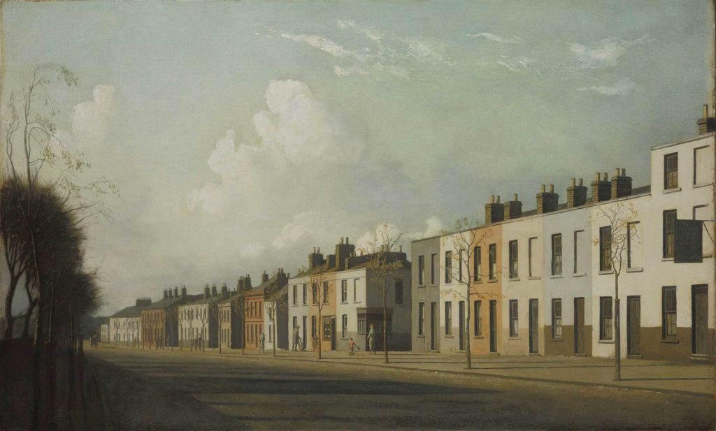
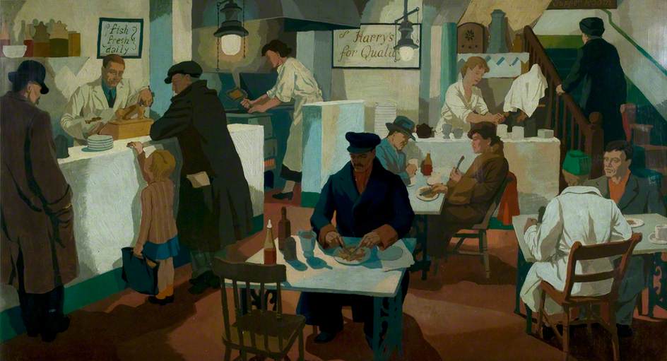
There were of course many working-class readers in the 1930s, possibly even more than there are now, given the enormous output of publishers of what Orwell calls “cheap novels” in that era, not to mention the libraries, newspapers and periodicals designed to cater for every possible niche hobby, that he lists in his 1940 essay ‘Boys’ Weeklies‘. In fact, he notes in Down and Out in Paris and London, that even the unemployed, homeless underclass of itinerant tramps were voracious readers of Buffalo Bill novels and the like, whenever they could get hold of them. Of course, even the most ‘proletarian’ newspapers and publishing houses were owned in the 1930s by people with backgrounds similar to Orwell’s – and by and large they still are. Likewise, at that point it would probably have seemed natural that it was this same class who were to be found running the more recently established broadcasters, notably the BBC. Natural, because before WW2, the role of the upper class was still very much seen as ‘the management’ of the British Empire with the middle class as administrators, but both far outnumbered by the working class who did the work (well, management and administration are work too, but you know what I mean).

What might – or on reflection, might not – have surprised Orwell is that 70+ years after his death, when class differences have been (or appear to have been) diminished, the leaders, for a while, of the relatively extreme left and right-wings of British politics and who appealed openly to the working classes should have been ex-public schoolboys called Nigel and Jeremy. It might surprise him too, to find that members of the openly-elitist public-school educated minority to which he belonged would still be going around pretending to be ‘ordinary blokes,’* almost like he did, in newspapers and especially on television. There are differences in the 21st century; the working class, although now interchangeable to a far greater extent with the middle class, are by virtue of numbers, the main demographic catered to by TV and so whereas Orwell was trying to blend with his social inferiors to prove a point to his peers, undercover toffs today are mostly trying to blend with them in order to appeal directly to, and ultimately financially benefit from, those working class people.

* even as a working class person I inwardly cringe writing “ordinary bloke,” but I think it’s the correct phrase in this instance for what these people think they represent. But bloody hell, “ordinary bloke” – from here on in I’ll just write “OB”

Some observations; the incognito upper class type seems mostly to be a male thing. The female counterparts of these kinds of commentators and presenters are there – Kirstie Allsop or Mary Berry spring to mind, but unlike the men they seem content to be unselfconsciously posh, which is fair enough.

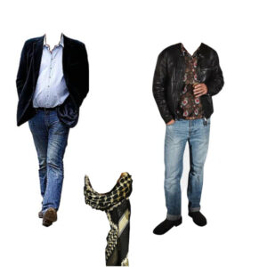
There are various different versions of the type. Some are benign and essentially innocent; people who, one assumes, would have been dropouts whether or not opportunities in TV beckoned and whose scruffy clothes and sloppy speech were probably originally adopted to annoy their parents or just as a way of opting out of the expectations that come along with class privilege (but you get to keep the privilege anyway, so… )

Since at least the 1960s, the pop and rock music business has always been full of these kind of people – and since the 60s too, their opposite has existed; the vastly wealthy who weren’t born into an upper class background. It’s possible that these people, rock stars and entrepreneurs act in some ways as role models to the posh OBs

.

on the left, the standard uniform of the privately-educated “ordinary bloke” On the right, the more raffish, bohemian version of the same. Big posh expensive scarf optional but works with either.

The kind of TV shows made by the benign-dropout demographic tend to reflect a somewhat genteel outsider status* and are often geared towards niche hobbies and interests, so that the whole thing has the aura of the upper class dilletante of the 20s, dabbling in publishing modernist poetry or abstract art. This is a public role in a way, but although it allows the presenter to share his views on the world and life in general, it feels essentially more like a sharing of enthusiasms than anything overtly or covertly patronising or manipulative.

*I do realise that every word of this is probably wildly unfair and doesn’t take into account any of the genuine struggles that come with class expectations etc: oh well.

Where it feels less benign and perhaps more deceptive is when the “OB”-ness of the presenter is an embodiment of what he thinks an actual “ordinary bloke” is like. Perhaps not surprisingly, the evidence suggests that the posh public schoolboy assumes that the OB is what the tabloid press – also, it should be noted, owned by posh ex-public schoolboys – tries to condition them to be. No doubt there are working class people who are old fashioned, conservative, unreconstructedly misogynistic, knee-jerk racist xenophobes, impatient with anything that might seem effete – but it’s also clear that the tabloid press wants them to be that way and does what it can to continue and spread these attitudes. Which is logical enough; the whole point of the class system is to preserve itself and ensure the survival of privilege, blood lines and all that crap. An interesting question – which I don’t know the answer to – is whether it is it self-awareness or self-deception that makes the ersatz OB hide his upper-class accent for TV purposes. Either way it’s probably a wise move, because if there’s one thing that seems risibly effete to the kind of proletarian the tabloid press imagines, it’s the particular kind of upper class speech nurtured in the most expensive and exclusive public schools.

It seems that on the whole, the public is pretty much okay with the fake OB as entertainer and cultural commentator; except for those regular instances when he goes “too far.” But the whole raison d’etre of this kind of public figure is to test the boundaries of what is acceptable, always with the safety net that the whole persona is so obviously contrived that nothing they say can ever be taken seriously, surely? But it’s notable that the self-consciously “outrageous” incidents that pop up from time to time, that seem to simultaneously mark out where those boundaries are and make reactionary attitudes just a little bit more acceptable, always come from the same place. It’s that sweet spot where the tabloid-owner’s classist projection of the “ordinary bloke” – impatient with having to respect people, constantly at war with ‘political-correctness-gone-mad’ – happens to coincide and blend with the underlying upper class snobbery and prejudice that we aren’t supposed to notice, because of that bluff OB exterior. Class prerogatives, racism, classism, the fear of privilege being eroded, the snooty, outraged ‘don’t-you-know-who-I-am?’ loathing of having to deal with or, god forbid, defer to social or racial inferiors; the fear of change. But never mind, it’s all just a joke, innit, and if you take it seriously then you are a puritanical killjoy and who would ever want to be that? No self-respecting ordinary bloke, anyway.


Review of the Year – the paradox of realism


2017, like most years but somehow more so, was filled with unpleasant things, events and people. For me though, one of the more pleasant features of the year was that I made the effort to visit art galleries more often than previously, in particular to see the superb exhibitions held by the National Galleries of Scotland; after missing Modern Scottish Women in 2016, I was determined to see Beyond Caravaggio at the National Gallery and especially True to Life – British Realist Painting in the 1920s and 1930s at the National Gallery of Modern Art. Both of these exhibitions were excellent, but I am writing mainly about the latter. As curator Patrick Elliott was clearly aware (see also the essay What Sort Of Truth? British Painting Between The Wars by Sacha Llewellyn in the excellent exhibition catalogue), ‘realism’ is not a simple thing to define, and indeed it seems strange that (for example) the peculiar and highly artificial painting of Maxwell Armfield and the shockingly immediate work of David Jagger should be considered the same kind of art.

‘Pacific Portrait’ (1929) by Maxwell Armfield (left) and ‘The Conscientious Objector’ (1917) by David Jagger (right)

If ‘Realist’ at first seems a pretty simple and unambiguous description, the fact that many of the artists (Dod Procter, Meredith Frampton, Gluck, Glyn Philpott) and paintings discussed in the exhibition catalogue also appear, equally convincingly, in Edward Lucie-Smith’s book Art Deco Painting (Phaidon, 1990) demonstrates just what a subjective term it really is. What the word seems to denote in the context of this exhibition is something like ‘representational rather than abstract’, which admittedly is an extremely unwieldy and far too wide term.

In the period in which the art of the exhibition was produced (the title says the 1920s and 1930s, but a few earlier and later works were included, so roughly from the years of World War One up to the first half of World War Two), the word realism tended to have mainly negative connotations; for which see Billy Bunter author Frank Richards’ famous 1940 reply to George Orwell’s article Boys’ Weeklies; “They go grubbing in the sewers for their realism, and refuse to believe in the grass and flowers above ground – which nevertheless, are equally real!” This was and still is an aspect of a wider conception of realism that Orwell  himself attacked occasionally in its more extreme political forms. Today, ‘realpolitik’ is used as a term of criticism, but in fact almost all political or social ‘realism’, even when respectable, is basically an excuse for people or governments not to act compassionately when it becomes unprofitable to do so. People who term themselves realists rather than optimists or pessimists tend (in my experience) to lean more towards the latter, but with an added smug quality as befits someone who is never surprised when bad things happen. While the artists of True To Life presumably held beliefs and opinions on a wide range of issues, these are by and large absent from their work as collected here. This is not the 1920s of the General Strike or the 30s of the Depression and The Road To Wigan Pier, let alone the 20s and 30s of Lenin, Mussolini and HItler, or perhaps more to the point, of Picasso, Matisse, or Dadaists and Surrealists.

Edward McKnight Kauffer – poster for the London Underground (1930)

Nevertheless, from the delicate figure studies of Dod Procter to James Cowie’s pastoral portraits, it is a window onto certain aspects of British art and life between the wars. Also, the painters’ rejection of the vocabulary of avant garde modernism should be seen in the context of the time; while abstract or semi-abstract art had been at the cutting edge of modernism in the years just prior to and during World War One, not only had the innovators of that era moved on (why not look at my article about Wyndham Lewis in the 20s here?), but the angular, dynamic language of modernism had infiltrated mainstream culture to the point that institutions as staid as the Royal Mail were using designers like John Armstrong and Pat Keely to give the Post Office a modern identity, while Edward McKnight Kauffer and others did similar work for the London Underground and, outside of the UK, fascist Italy, Hitler’s Germany and the Soviet Union all utilised versions of modernist design to establish new national identities. In that sense, the idiosyncratic, apparently old-fashioned and above all individualistic styles adopted by British artists outside of the more radical movements can be seen as, if not revolutionary, then at least stubbornly dedicated to their own visions.

Although it may seem paradoxical or incompatible, the ‘realism’ of these artists is founded to some extent on escapism and idealism; but maybe that is truer of realism in a wider sense than at first seems to be the case. The definitive artistic form of realism (if we think of everyday life as ‘real’ – but I don’t really want to get into philosophical questions here as I’d like to finish this article at some point) nowadays is probably something like instagram, or on a slightly grander level, the documentary film, but the very nature of documenting reality – whether in film, photographs, painting or in writing – is necessarily selective, and in being so, tends towards some kind of commentary (and/or judgement) on its subject. One of the nice things about the True To Life exhibition was that both the grime-and-hardship/warts-and-all and the grass-and-flowers aspects of realism were represented – albeit mostly in a perhaps fairly superficial way. There was very little evidence of the documentary as protest – perhaps because, by the end of WW1, photography had become the obvious tool for this kind of work. That said, social commentary of a sort was present in Thomas Nash & Stanley Spencer’s idiosyncratic recasting of some of the Renaissance’s favourite religious scenes such as the Crucifixion & the Last Judgement in ‘modern dress’ and modern settings (and slightly generic ‘modernist’ styles). This use of realism was not uninventive, but was in essence just another way of looking back at the ‘old masters’; revisiting the groundbreaking realism pioneered in the 14th century. More interesting, (to me) was John Luke’s strange 1929 modern-dress version of one of the baroque era’s favourite Old Testament scenes, Judith and Holofernes, in which the story of the beheading of an Assyrian general is made even more unsettling by having a strangely surreal Agatha Christie/Enid Blyton aura.

John Luke – Judith & Holofernes (1929)

Much as in Edward Lucie-Smith’s Art Deco Painting, the unifying factor in the exhibition’s disparate works was less a matter of style/school or subject than it was atmosphere; the paintings, as different as they are, belong definitively to the period between the wars, in much the same way as the very different works of Evelyn Waugh and Christopher Isherwood did (according to me, here).


If the term ‘realist’ in painting suggests the artist as eye (kind of an analog to (again) Christopher Isherwood’s fictionalised realism; “I am a camera”), the eye of the artist/writer is necessarily as individual as the brain it is connected to. For example, one might assume that realism and idealism were opposites, but there is a strong classicising element among some of the artists in the exhibition – but even then, individual artists seem to have reached a kind of classical serenity and monumentality via different routes.


Meredith Frampton – Sir Charles Grant Robertson (1941)

One of the stars of the exhibition for me was the portrait painter (George Vernon) Meredith Frampton (1894-1984). Frampton’s art was in some ways the most ‘realistic’ art in the exhibition, in the sense of being (by far) the most illusionistic and quasi-photographic. In a way, portraits like the stunning Sir Charles Grant Robertson (1941) are less ‘realist’ than than they are ‘corporealist’ – their accumulation of painstakingly rendered detail being in some ways closer to taxidermy than to the realism of a snapshot. In their almost eerie stillness, his portrayals of professional men surrounded by the accoutrements of their work, (another excellent example is Sir Frederick Gowland Hopkins  (1938, below) seem – despite the maximalist inclusiveness of the painting – closer to the carefully composed minimalism of a photographer like Lilo Raymond than to a more or less contemporary realist (or ‘objectivist’) painting like Otto Dix’s theoretically similar portrait of urologist Dr Hans Koch (1921). And yet, for all of their modern realism, both artists looked to the past; for Dix – who had experimented with Expressionist styles earlier in his career, the aim of the modern realist painter was to tackle the breadth and the often-unrecorded detail of modern life with the – to him – unimprovable techniques of the old masters. For Frampton, the source of his style is less the realistic tradition of the Northern Renaissance than it is the monumental, but still ‘realistic’ neoclassicism of Ingres.

Meredith Frampton – Sr Frederick Gowland Hopkins (1938) and Otto Dix – Dr Hans Koch (1921)
Lilo Raymond – Wild Flowers (1992)

The more usual classical influence on British art of the period was the modernist route via Picasso and cubism; in the case of painters like the ex-Vorticists William Roberts and Edward Wadsworth (also Edward Burra, whose expressionistic 1930 painting The Snack Bar was included in the exhibition), the angularity of Vorticism became a kind of stylistic shorthand that marked out their otherwise fairly conventional/traditional art as ‘modern’. Several other artists in the exhibition, such as Gladys Hynes and James Walker Tucker seem to have used modernist stylistic traits in the same way; to heighten the clarity and monumental qualities of their work; a kind of ‘realism’ as simplified solidity and a classicism that couldn’t be easily written off as old fashioned.

Gladys Hynes – Noah’s Ark (1919)
Gerald Leslie Brockhurst – By the Hills (1939)


For society portrait painters like Gerald Leslie Brockhurst and Sir Herbert James Gunn, realism – if explicitly not ‘gritty’ realism – was a necessary part of their trade. The glamour and drama of portraits like Brockhurst’s By the Hills (1939) is what made the artist in demand for fashionable sitters, but their effect – despite relying on a similar sense of heightened photo-realism for their success – is almost the opposite of Frampton’s still life approach. This kind of art was, despite its use of traditional techniques (and even, in the case of By The Hills, a Renaissance-influenced landscape in the background) resolutely of its ‘modern’ age, referencing Hollywood and the world of contemporary fashion, but not really any of the ideas that had affected the visual arts since the mid 1800s.


The same is true of the slightly creepy empty street scenes of Algernon Newton; despite their passing resemblance to the post-impressionist work of Maurice Utrillo, these brilliantly realised townscapes are depictions of the modern world, but not interpretations of it. While the artist captures the melancholy charm of the slightly shabby suburbs he painted, their spirit is more like restrained romanticism, rather than being invested with the revolutionary sense of psychogeography that the proto-surrealist works of Giorgio de Chirico had pioneered two decades earlier. That said, because of the role of artist – not just as a ‘camera’, but also as processor and interpreter of experience – his paintings are something more than a documentary photograph of an empty street.

Algernon Newton – The Outskirts of Cheltenham (1932)


Pietro Novelli – ‘Cain Killing Abel’ (1625)

In fact, what True To Life highlights, is the extent to which the vast majority of art, until fairly recently, had as its aim something that could be called realism; the National Gallery’s Beyond Caravaggio exhibition likewise showed Caravaggio and the artists of the late 16th/early 17th century trying to make their art – both in religious/mythical and modern genre paintings – more immediate & vivid through a kind of dramatic heightened realism. Impressionism broke away from the staid, schematised world of academic painting to capture something closer to the experience of both the artist and viewer, Expressionists tried to infuse their works with the feeling of events as experienced, Futurists tried to capture the violence of the 20th century where traditional techniques tended to distance it… And in that sense, much of the work labelled ‘realist’ in this exhibition works for us now in a way that it possibly didn’t at the time; to a modern audience the work in True to Life is almost all imbued with a between-the-wars ‘period’ quality that seems to capture the zeitgeist of that troubled era, even while sidestepping most of the troubles themselves.

It is with that last point that the artists – without doubting the depth of feeling they put into their work – mainly succeeded in recording (limited aspects of the) reality of their era in a relatively superficial way. As an example, Clifford Rowe’s The Fried Fish Shop (1936) depicts what the interior and clientele of a fried fish shop of the 30s presumably looked like; as such it has sociological and historical value, as well as being a fine, faintly modernist painting. On the other hand, a slightly earlier and in some ways comparable painting like the Vorticist-inspired Rain On Princes Street  (1913) by Stanley Cursiter (it’s quite surprising that none of Cursiter’s fashionable work of the 20s & 30s was included in the exhibition), despite its fractured, faceted and in that sense ‘unrealistic’ modernist appearance, not only captures in its stylised way a glimpse of late Edwardian metropolitan life, but also the feeling – still the same over a hundred years later – of being on Edinburgh’s Princes Street on a busy, rainy day. So in the end I suppose which painting deserves to be called ‘realist’ is as subjective as reality itself.

Clifford Rowe – The Fried Fish Shop (1934)


Stanley Cursiter – Rain on Princes Street (1913)