“Nothing was to be seen of the Castle hill; fog and darkness surrounded it; not even the faintest glimmer of light was present to suggest that the Castle was there.” Franz Kafka, The Castle, translated by Jon Calame & Seth Rogoff, 2014, Vitalis Verlag
“The Castle hill was hidden veiled in mist and darkness, nor was there even a glimmer of light to show that a castle was there.” Franz Kafka, The Castle, translated by Willa & Edwin Muir, 1930, my edition Penguin Modern Classics, 1984
The Castle (Penguin, 1984) vs The Castle, (Vitalis, 2014)
I have a possibly bad habit of buying multiple copies of books I love, if I see them for a good price, especially if they have a cover that I like and don’t already have. Fairly often, I won’t actually read the new-to-me edition unless I happen to be in the mood for that particular book at the time of the purchase, because after all, it’s the same book. Or at least it usually is. I’ve had my 1984 Penguin Modern Classics paperback of Kafka’s The Castle for decades, though it was already second hand when I bought it. I first read the book at high school, a falling-to-bits old hardback from the school library. I have no idea which edition that was, but when I read it again in my early 20s, the novel seemed just as I remembered, just as obscurely relatable and with that specific atmosphere that is a big part of what makes something ‘Kafka-esque’. That school version was almost certainly some edition of the 1930 translation by the fascinating Scottish couple Willa and Edwin Muir. They were the first translators of Kafka in English and theirs was and to some extent still is the standard version. Indeed, it was that couple who introduced Kafka and his particular aura to the English-reading world; which is quite a big deal when you think about it.
Recently, in a charity shop, I came across a copy of The Castle that I hadn’t seen before, with a cover I was immediately drawn to. It’s from 2014 and though it’s in English it’s was put out by by Vitalis books, a publisher which, judging by its Wikipedia entry, sounds uniquely suited to disseminating the works of Kafka, a German-speaking Czech Jew who was raised in a Yiddish-speaking household:
Vitalis Publishing is the only German literary publisher in the Czech Republic. Founded in 1993 by Austrian-born physician and medical historian Harald Salfellner, it harks back to the cultural heyday of the fin de siècle before 1914, a period of shared German, Czech, and Jewish influence. The publishing program features Czech (Jan Neruda, Božena Němcová), German (Gustav Meyrink, Rainer Maria Rilke), Jewish (Oskar Wiener, Oskar Baum), and Austrian (Adalbert Stifter, Marie von Ebner-Eschenbach) authors as common representatives of Bohemian literature.
Lots there to be curious about, but let’s stick to Kafka for now. My old Penguin paperback of The Castle, which features two chapters not included in the original 1930 UK edition (which were separately translated by Eithne Wilkins & Ernst Kaiser), is from of my least favourite stylistic phase of the Penguin Modern Classics series. At that point in the early 80s, the spines of the books, in a nostalgic nod to the classic early days of Penguin, were orange and white, while the covers were white with (mostly) modernist paintings chosen to more-or-less fit the books. The Castle does have a nice cover illustration, by Elizabeth Pyle, but otherwise the design is a little drab. The book is 298 pages of fairly but not unreadably small print. The Vitalis edition is far more stylish and the cover artwork uses a beautifully evocative photograph of (Bohemian?) “Peasant women” from 1918 and a photograph of Friedland (or Frýdlant) castle in Czechia. The type looks around the same size as the Penguin edition, but though the book is slightly bigger than the Penguin, it has 382 pages.
Even allowing for the fact that the Vitalis Castle includes nice, dark, moody and scratchy illustrations by Karel Hruška, it’s a noticeably longer book, and the reason for that is revealed in the two quotes at the top of the page. The Muirs’ prose – like Edwin Muir’s own poetry, which is worth checking out – is terse and spare, but also flexible and evocative. It’s the “voice” that Kafka has had for me since I was a teenager. It also has the benefit – or at least I think it’s a benefit, more later – of having been translated close to Kafka’s own time. When that first British edition of The Castle was published and Edwin Muir wrote in his introduction “Franz Kafka’s name, as far as I can discover, is almost unknown to English readers,” he was talking about an author who had only been dead for six years, and the book itself had only been in print in Kafka’s own language for four years.
Calame and Rogoff’s writing is slightly more lyrical to my ears/eyes, a little more long-winded, but in its way just as precise. I very much appreciate the two semi-colons in the first sentence of the passage above. The cumulative effect of their translation is a book which feels familiar but gently different. Another comparison, this time the opening of chapter 10:
“K. stepped out into the windswept street and peered into the darkness.” (Willa & Edwin Muir) versus “K. stepped outside onto the wildly windswept steps and peered into the darkness.” (Calame and Rogoff)
Which is the better sentence is just a matter of taste; the Muir version doesn’t feel especially superior to me, but on the other hand it does feel more ‘Kafka-esque’ – but is it? And what about this, from the end of chapter 15?
“And he pressed her hand cordially once more as he swung himself on to the wall of the neighbouring garden.” (Muirs) versus “He was still pressing her hand fervently as he swung himself onto the fence of the neighbouring garden.” (C&R)
Well; ‘cordially’ and ‘fervently’ are two very different things aren’t they? To me, that word choice significantly changes the tone of the passage. And this time, it’s the modern version that feels more redolent of Kafka as I think of him; which isn’t the same as saying it’s a better translation of the original text.
I have no idea whether it impacted on Calame and Rogoff or not, but modern translations of Kafka are made in a world where ‘Kafka-esque’ is a thing, and where Kafka himself – his image, with those big, dark, suspicion-filled eyes and his hypersensitive personality as revealed in his personal writings, prone to intense feelings of harassment and persecution – colour how we see his work. The Trial in particular feels like that persona, that image, in the form of a novel, and surely nobody embarking on a new translation of the book could be uninfluenced by its familiar Kafka-ness, regardless of how faithful or otherwise they were to the original text.
Faith and Faithfulness
witty (if dated) wordplay in Asterix
There’s a mystery to what faithfulness even means in translation – Google translate and AI are perfectly capable of making word-for-word translations of texts, but they seem somehow unable to make living, readable prose out of them. When I think of books that I’ve only ever read in translation (and I’ve never read more than maybe 6 or 7 pages of text in any language other than English or Scots, alas), going all the way back to childhood and the Asterix (René Goscinny, trans. Anthea Bell & Derek Hockridge) and Tintin (Hergé – Leslie Lonsdale-Cooper & Michael Turner) series’, I realise how much of the character of those books is owed to their translations.
In those particular cases the translations seem almost miraculously good. To capture witty wordplay, puns etc while also keeping the original narrative flowing is a formidable skill. I can’t help thinking that if I read literal translations of Tintin and Asterix, or learned to read French myself (let’s not get carried away) and read the originals, I would discover a new respect for both the translators and the original authors.
wordy whimsy in Tintin
Translating from one language to another seems like it should be a practical rather than artistic thing, but the extent to which Kafka’s work is ‘Kafka-esque’ in English is in some ways a choice, and as time goes on more and more choices are available to the translator of any text. The obvious choices – whether to be true, word-for-word, to an author’s text, or to their ‘voice’ and atmosphere, whether to provide a faithful translation or a ‘good read’ have always been there. But as time goes by, arguably just as important is the decision of whether to make a novel or piece of writing true to its time and place or to our own. This isn’t a small thing, it’s both the readability and the character of a book. The right thing to do presumably varies from book to book, but in my experience, you don’t really know what you prefer until you come across something you don’t like.
Dostoevsky presented as a trashy airport novel (with no translator credit)
With The Castle, although the more modern text felt different to me, it wasn’t a difference that spoiled or significantly altered my enjoyment of the book, it was just something I noticed. But those translation choices can be jarring. A recent example of this came when reading two novels by the Finnish author Arto Paasilinna – The Year of the Hare (1975) and The Howling Miller (1981). Both were (which I find obscurely annoying) translated into English from French translations rather than from Finnish, but while The Howling Miller (which I read first) was written in straightforward, simple and clear English prose which felt a bit basic, but entirely appropriate to the subject, the translator of The Year of the Hare made the (completely valid) decision to translate the casual, slang-filled prose of the French translation (and presumably the Finnish original) into supposedly modern and slang-filled British English, which was deeply irritating and also damaged the integrity of the novel. Standard phrases like “bloody hell” or whatever are one thing; so familiar as to seem timeless and universal. But slang dates quickly and is often generationally specific and can be weirdly embarrassing to read, if it’s not your slang.
Even worse in narrative terms, using regionally specific terms when you don’t change the distinctively ‘foreign’ names of characters or the setting of a book can give a feeling of unreality to the whole text. Quite possibly it’s just me, but reading a passage where a character called Kaarlo Vatanen, living in rural Finland, refers to having “twenty quid” in his pocket is kind of like reading Crime and Punishment and coming across something like “Shit! It’s the pigs!” hollered Raskolnikov. Don’t do that please. Similarly, recently reading a (very) American translation of Georges Bataille’s notorious 1928 novel TheStory of the Eye made it a different kind of uncomfortable from the kind I remembered. Seemingly I’m okay with the murder, depravity, perversity etc, but somehow repeated references to the unnamed narrator and his fellow protagonists “jerking off” just took me too far out of early 20th century France to be enjoyable.
But even though I didn’t like the idiom the translators used for The Year of the Hare and The Story of the Eye, the arguments for doing it are pretty sound. When adapting a foreign, unfamiliar book for a new audience, making it accessible is clearly important. The Year of the Hare was published in 1975 and implicitly set in that period, so there’s nothing technically wrong with writing it in modern, slangy English, except that it’s not set in Britain and so it feels wrong to pedants like me. There presumably is a 1920s French slang term for masturbation, but ‘jerking off’ feels so specifically American that it’s jarring – and I don’t think that’s just anti-Americanism, I feel like ‘wanking’ would have had a similar effect. Related, but probably more difficult is translating a classic novel into modern English. I’m not really a Dickens fan, but when I think of the few books of his that I’ve read, his prose seems entirely inseparable both from his stories and from his period. Does that mean that Tolstoy or Zola’s works should be translated into “Victorian” English? Annoying as that might well be, I’m tempted to say that for me, the answer is yes.
Positives and negatives
It’s a different kind of translation, but making books into films brings these kinds of questions into sharper focus. There have been several film adaptation of HG Wells’ The War of the Worlds, but for all of their virtues, if you return to Wells’s novel it seems obvious within the first few pages that though it’s eminently adaptable, any film of the novel set in 1898 would be far better (but presumably ridiculously expensive to make) than the existing versions. Similarly, no adaptation of Nineteen Eighty-Four except the venerable BBC adaptation starring Peter Cushing has quite captured the stark, bracing post-war, entirely British greyness (in a good way) of Orwell’s prose. That Cushing version feels right, but has its own negative points, especially cheapness, lack of definition (because old TV). But the tone is right. And it’s that tone, as much as anything, that people think of as “Orwellian,” even though outside of Nineteen Eighty-Four and (to a far lesser extent) Animal Farm, it’s really not the usual tone of his writing.
The other dystopian novel frequently paired with Nineteen Eighty-Four is Aldous Huxley’s Brave New World, but despite the relative closeness of age, class and education of Orwell (born 1903) and Huxley (born 1894), they could hardly be tonally further apart. As someone who first read and loved Huxley’s early, satirical social comedies like Antic Hay (1923) (still my favourite) and Point Counter Point (1928), the thing that struck me most when I first read Brave New World (1932) is how similar it is in its prose. Although, unlike The War of the Worlds but like Nineteen Eighty-Four, it’s set in the future, any film of it should really be set in a 1930s future and have a slightly old fashioned, ‘Boy’s Own adventure’ flavour which seems completely at odds with the book’s grim dystopian reputation. When reading the novel, its tone (which feels more post-WW1 1920s than pre-WW2 1930s), feels entirely natural and is a part of what makes the book so readable. But is that tone there in modern foreign translations of the book? Possibly not, and when you think about it, why would it be?
The Bible and the Bloody Countess
John Donne: a portrait of the poet as a young dandy
As anyone who has had to “do” Shakespeare at school – or who likes reading him – will know, 16th/17th century writers had a respect for and love of puns that is far removed from their current status as vessels of knowingly lame humour (that said, ‘brave new world’ is from Shakespeare, isn’t it?). It’s sad that that love of wordplay has become so debased, because even though I personally love puns even just as lame humour, it means we have to consciously think or analyse in order to appreciate the breadth of allusions and associations – and therefore feelings – that a writer could evoke in their readership (or a playwright in their audience) without having to labour a point.
Partly, it was easier to pun meaningfully before spelling was fully standardised. When John Donne wrote The Sun Rising* , it was risqué in the mild way it still is – the poet complains about the sunrise because he doesn’t want he and his girlfriend to have to get out of bed – but also in a far more daring way. To a Jacobean audience the sun (or sunne, or sonne) rising would automatically create an association with the son (of God) rising, a pun that transforms and strengthens the meaning of the poem, since, then as now (actually far more than now), the earthly representatives of God were not especially keen on young unmarried couples lying in bed together.
*published in 1633 but necessarily written earlier – he died in 1631 – and probably quite a lot earlier since he was known as a poet in his youth but a priest and preacher from 1615
And that textual richness isn’t just intended meanings and associations. As language evolves so does meaning, and so, whether one likes it or not, do associations. Since the 1960s, seeing the title The Sun Rising may well make people think of Rolf Harris’s 1960 novelty pop hit Sun Arise – a kind of well-intentioned but not unproblematic pastiche of Aboriginal Australian music that was a big hit all over the English-speaking world. Harris’s subsequent career as a popular children’s entertainer and, latterly, a hugely unpopular sexual predator make the already iffy song even more dubious, but even that creates its own set of unexpected cultural associations. Back in 1971, before settling definitively on a kind of bad taste, pantomime horror modus operandi, Alice Cooper (then the name of both the American rock band and its singer) experimented with a kind of general absurdist, transgressive approach. To that end, on their third (but first commercially successful) album Love It To Death, alongside paeans to troubled teendom (I’m Eighteen, Is It My Body?) and old horror movies (The Ballad of Dwight Frye), the band recorded an amusingly straight-faced cover of Sun Arise, just to be smartasses. Only 40 years later did the song turn out to be a masterstroke that unexpectedly fit in with their macabre and tasteless raison d’être after all; patience is a virtue, clearly.
But anyway, the idea of translating The Sun Rising, with even its intended meaning intact, into a language that doesn’t share common roots and words with English makes me think of Philip Larkin saying* (wrongly, I think) “A writer can have only one language, if language is going to mean anything to him.” It makes sense in a way – there can be an impersonal quality, especially when reading poetry in translation, that makes lots of translations feel the same as each other, not that that’s always a bad thing necessarily.
*in a 1982 interview with Robert Phillips in the Paris Review (Philip Larkin, Required Writing, p.69)
On that topic, another Penguin Classics book I love is the 1965 collection Poems of the Late T’ang, in which A.C. Graham translates the works of seven Chinese poets whose lives span more than a century, from 712 to 858 AD. In his introduction, Graham stresses the differences between poets, contrasting the ‘bare, bleak style’ of Meng Chiao (751 – 814) with the ‘strange and daring’ poetry of Meng Chiao’s friend Han Yü (768 – 824) but although I love both, I don’t really find a huge tonal difference between them (just to quote the first examples of each that he publishes):
Above the gorges one thread of sky: Cascades in the gorges twine a thousand cords (opening lines of Sadness of the Gorges)
And
A frosty wind harries the wu-t’ung, (parasol tree) The crowded leaves stick wilting to the tree (opening lines of Autumn Thoughts)
It might just be me, but I don’t even detect major differences between the poetry of between Tu Fu, writing in the 750s or 60s –
The autumn wastes are each day wilder: Cold in the river the blue sky stirs (opening lines of The Autumn Wastes)
and Li Shang-Yin, who was writing almost a century later:
The East wind sighs, the fine rains come: Beyond the pool of waterlilies, the noise of faint thunder. (Untitled)
I wouldn’t expect poets in English, centuries apart, to write this similarly, but of course the words I am reading are AC Graham’s and not Tu Fu’s or Meng Chiao’s. These are beautiful poems and if there’s a deficiency in them it’s mine, not the poets’ and certainly not the translator’s. In poetry this compressed and distilled there must be a whole world of meaning, allusion and subtlety – the sort of thing I can see (when forced to think about it) in Donne – that AC Graham was aware of but could only explain in footnotes and appendices. And I’m sure that’s exactly what Larkin referred to in his strictures about language. But if a writer can have only truly have one language, “if language is going to mean anything to him,” what about translators, who are almost always also writers in their own right? And what about unusual cases like JRR Tolkien or Anthony Burgess?
Burgess’s A Clockwork Orange is one of my all-time favourite novels – it’s also the product, very obviously, of someone who could speak and think, fluently, in a lot of languages. Ten is the number he usually gave, ‘with bits and pieces of others’. Burgess created the book’s slang, Nadsat, in order to write about ‘the youth’ in a way that didn’t date like real slang and it definitely worked. Rightly, I think, Burgess didn’t want a glossary of Nadsat terms in the book. Some publishers have added one anyway, but the book works far better if the reader just immerses themselves in the narrator’s voice and his disorienting world. But Burgess was only human, and in perhaps the novel’s weakest moment (because it takes us out of that world) he couldn’t resist pointing out that the language his young narrator Alex speaks isn’t just whimsy on the part of the author:
‘Quaint,’ said Dr Brodsky, like smiling, ‘the dialect of the tribe. Do you know anything of its provenance, Branom?’ ‘Odd bits of rhyming slang,’ said Branom, who did not look quite so much like a friend any more. ‘A bit of gipsy talk, too. But most of the roots are Slav. Propaganda. Subliminal penetration.’ ‘All right, all right, all right,’ said Dr Brodsky, like impatient and not interested any more.
I’ve always felt that Brodsky’s impatience is really Burgess’s mild embarrassment at finding himself pointing out how clever he is, but who knows? How A Clockwork Orange works in translation I can’t imagine, especially in countries with the Slavic languages Burgess borrows from, but I can imagine it must be both a joy and a nightmare to translate.
I hope for the sake of its readers that the translators who tackle A Clockwork Orange come up with words as horribly effective as Burgess’s. When Alex and his gang (yes, I know they are his droogs) come across a rival gang attacking a child, Alex says that they were “just getting ready to do something on a weepy young devotchka they had there, not more than ten, she creeching away but with her platties still on,” The word “creeching” is clearly just “screeching” without the s, but somehow it seems harsher, more intense, implying a rawness related as much to a croak as a screech; Burgess knew what he was doing. So, in his very different way, did Tolkien, another linguist, who gives the cultures and places of Middle Earth their individual, believable textures via languages that draw on real prototypes in the same way as Burgess’s Nadsat does. It’s also worth comparing Tolkien’s beautifully translated Beowulf with Seamus Heaney’s very different, but equally beautiful one. Both writers have a reverence for the original text and their interpretations are similar enough to suggest fidelity to the original – but they are also different enough to demonstrate just how flexible language can be.
That flexibility suggests that no text is truly beyond translation, and the fact that fictional cultures can be realistically portrayed by the words they and their creators use hints at the power inherent in language. Like any power, it can be used in negative ways as well as good ones. Translations can, or at least could, be withheld when it was felt expedient to do so, though the internet has probably made that more difficult. It seems trivial, but something that was (up until the 1960s I’d guess) fairly common and which I’ve occasionally come across in older books, are translations of foreign texts where the narrative lapses into its original language – or occasionally into French in books actually written in English – when the writing becomes ‘obscene.’
trashy 70s paperback of non-trashy 50s meditative biography
An example that springs to mind, because I have it, is the 1957 biography of the notorious medieval Hungarian Countess Erzsébet Bathory, written by the surrealist poet Valentine Penrose (nee Hugo). In its English translation – by the also somewhat notorious Scottish writer Alexander Trocchi – Penrose’s text is rendered into sensual English, except, that is, when Bathory’s predatory exploits against young peasant women in her orbit become too explicit, at which point the text lapses into French. No doubt the publisher, John Calder – who specialised in avant-garde literature and especially previously banned books – was wary of obscenity charges, which he would later fall foul of with Alexander Trocchi’s Cain’s Book and Hubert Selby Jr’s Last Exit to Brooklyn. Ironically, my 1970s NEL edition of The Bloody Countess, though by design a trashy, titillating exploitation-type paperback, reproduces the Calder text, elisions and all. It also features a lazy, sensationalist blurb on the cover which reveals that the publisher didn’t know that Valentine Penrose was a woman, which is unnervingly slapdash.
But even if British publishers self-censored for mostly legal reasons, the clear lesson that comes from old editions of transgressive texts is that those with a classical education – that is, the upper classes, who routinely learned Latin, Greek and French at school, but only they – could be entrusted to read all the sex and violence they liked. I’m in two minds over whether the reason for that is the literally patronising one of ‘protecting the children’ or the more generally patronising one that the upper class could be trusted with that kind of thing but the more animalistic and irrational lower classes might be led astray by it. Either way it’s kind of ironic, given that centuries earlier, the impetus for publishing anything at all in English was to allow the expanding literate population to read the Bible in their own language.
And if the translation of a modern text into modern English can create variations as different as a ‘cordial’ vs a ‘fervent’ hand-hold* imagine the pitfalls inherent in making the translation of an ancient text central into something comprehensible to a modern civilisation. And in the important case of the Bible, not just ‘an ancient text’ but a collection of various ancient texts, partly written in an obscure and difficult language. And add to that that key books of the text purport to be eye-witness accounts – but which are however written in Greek, reporting on sermons and parables originally delivered in spoken Aramaic, it’s clearly beyond the grasp of Google translate.
*if that seems trivial, imagine receiving an invitation to some kind of gathering that begins, “you are cordially invited to… versus “you are fervently invited to…” The second would seem a little offputting to me
We’re used to the fact that almost everything in the Bible is open to interpretation, partly because by now ‘the Christian church’ is actually hundreds of Christian churches, each with its own version of what the Bible means, and that’s just talking about the Bible as it stands now. Taking into account the dubious question of how accurately modern translations relate to the original text, and how accurately the original text relates to the events it describes, it was always going to be a minefield. It doesn’t take much reading to discover that things as fundamental to the faith as the monotheistic nature of the Old Testament god, or how literally the Virgin birth should be taken in the New Testament are dependent on translations which may be approximate rather than precise. Just for one example, writers – both scholarly and crank-ish – have observed that the word used to describe Mary’s state, “parthenos” in ancient Greek texts generally means ‘a young woman’ and not necessarily, not even usually, a virgin. We’re immediately in murky waters. Because of that interpretation of that word it’s been credibly suggested (by Jane Schaberg, among many others) that in the Gospels God therefore only blesses Mary’s pregnancy, rather than causing it himself. Credibly, that is, if one’s main issue with the story of Jesus is the Virgin birth, rather than the existence of God in the first place.
possibly less begetting and smiting in this bible
However one chooses to interpret it, interpretation is required when looking at the texts of the Bible. It’s a record of events which has come down to us in much the same way as Homer’s Odyssey, and with as many different voices involved along the way. Even if one takes the Bible at face value – notoriously difficult, in its contradictory entirety – and accepts it as truth, it’s a deeply problematic text, to say the least. The Gospels were written down by followers of Jesus – who they knew personally, and worshipped – in the aftermath of his early death. For the parts of his life pre-dating their association with him, they are presumably relying on accounts given to them by the man himself. These would be based on his own memories of his youth and childhood – but for the circumstances of his own birth, thirty-three years earlier, he presumably only had the accounts of his parents (whether earthly or divine) to rely on. Unless Jesus spoke Greek (I feel like they would have mentioned it if he had), those memories were then translated into a different language with different allusions and associations from his own, before being subjected to centuries of edits and deletions, only later being given ‘authoritative’ editions (and different ones for different countries and sects), each of them offering its own truth, rather than one definitive truth.
So, whether we are reading Homer or Ovid or the Gospel of St Luke, or The Castle, or Asterix the Legionary in English, we are reading an adaptation, a work imagined into existence by more than one writer and if we’re lucky it’s Willa and Edwin Muir or Anthea Bell and Derek Hockridge. If we’re not so lucky we may end up inadvertently worshipping a false idol or something and, who knows, even facing eternal damnation if you believe in such things. It’s an important job.
credit where its due: the translators get (almost) equal billing with the authors
I love books. I want books. Post-Christmas I’m in the enviable position of having – not money, but in a way even better, virtual money that can only be spent on books. What I don’t have though, is a lot of space for books. So, periodically pruning the library (too grand a word) or book collection (worse?) or “my books” (better) is a painful necessity. But what to prune, and why? So far, every single time I’ve put together a box of books and dispersed it to charity shops I’ve almost immediately ‘needed’ one of the books I purged. On a few occasions (see here) I’ve bought back books (not the same actual copy though; I’m not that bad, yet) that I got rid of. And I’ll probably do it again, but I’m trying not to.
Why is it painful to get rid of books? Pompously, because the books you own are a reflection of yourself; of skins shed and personalities outgrown and discarded, and in a way a direct line back to your (possibly alarming) former selves with their sometimes alien tastes and enthusiasms.* Less pompously, because in general, I want more books, not fewer. I can’t think of an occasion when I got rid of a book simply because I didn’t like or just didn’t want it, though I’m sure it’s happened. And so, for decades I still owned (and may still have somewhere) the little red Gideons Bible that was given out to pupils when starting high school (do they still do that?). Its bookplate (ex-libris? Both terms seem very archaic) hints strongly at the typical kind of 12 year old boy that it was given to: Name: William Pinfold Form: human. Similarly, I may still have the books given to me in the street by Hare Krishna followers, which seems not to happen now but was a frequent enough thing in the early 90s that I can still remember without checking** that they were credited to and/or consisted of teachings by “His Divine Grace A.C. Bhaktivedanta Swami.” They often had nice, pleasingly psychedelic cover paintings but were invariably disappointing to try to read because, even when they had amazing titles like Easy Journey to Other Planets, they were all about Krishna consciousness – who knew?. But these are books that would be impossible to replace (in a personal sense; easy enough to get hold of different copies of them). More complicatedly – and just annoyingly, with space at a premium, I have multiple copies of some favourite books and will probably buy even more copies of them, if I come across them with covers that I like but don’t have and if they are cheap.
*case in point; I had forgotten how much I liked Camille Paglia in the days before libertarianism was an essentially standard right-wing-asshole viewpoint and when her provocative/confrontational ideas didn’t yet include being disingenuously frivolous about child abuse
** I’m only human though; I spelled his name wrong until looking out a picture of the book, Possibly absorbing his teachings might have helped?
So yes, I have quite a lot of books; but although ‘book collectors’ exist, I don’t qualify as one. Collecting is deliberate and with presumably, a specific end point in view; a collection. Collecting things is fun up to a point, but ultimately a thankless and frustrating task without the required personality type. It (fleetingly) irritates me when an author I like has written four or five books and the publisher changes the cover design or size after the first few, so the mismatched chaos of a complete collection is not for me. Not to mention that there are writers – Michael Moorcock, in print since the 1950s and as far as I know still writing, is the obvious example for me – who have, over the course of decades, written a ridiculous number of books, which have appeared under countless imprints in myriad editions and countries and therefore offer an opportunity for an epic and soul-crushingly futile quest for the true completist. I am not that completist.
who wouldn’t want a beautiful Aubrey Beardsley ex-libris in all their books? But who would want to actually paste them into all their books?
On the other hand, following the old stately home-library tradition of having a personalised ex-libris/bookplate/sticker thing, with its individualistic iconography always seems like a nice idea – even if it’s essentially just a picturesque way of writing your name in a book, which I would never do. It’s nice see a decorative ex-libris in an old book, but although the thought of having one’s own books personalised in that way is nice, the reality of actually sticking them in the books – fun for maybe the first ten or twenty, but after that too tedious to consider, is not so appealing. So, not a collector; but even not a true bibliophile either, at least in the sense that sometimes is written about. I do love books, but not all or any books, I don’t contemplate, like a wine taster, the smell of old books. There are of course books with distinctive odours, some pleasant (to me) like the dry and somehow slightly spicy smell (probably best to not think too much about) of old calf-bound volumes from the 18th century and earlier, others less so, like the peculiarly vomit-like bouquet of new children’s books. And though browsing through shelves and rooms of books can be and usually is an entirely pleasant pastime, after the excitement has faded there can be something a little depressing about looking through piles of chilly, mildewy, corrugated and fat-with-damp paperbacks in the bigger, more drafty and warehouse-like charity shops or auction rooms.
the uninspiring cover that inspired me to read beyond my taste, strangely
Still; books are artifacts in themselves and not just valuable for their contents. Though judging books by their covers is frowned on, that’s kind of what the covers are for. I’ve written about this stuff in several places before so won’t go on about it here, but there’s never been a time that I’ve read as hungrily or as indiscriminately as when I was a child, and until I found authors that were trustworthy – I will try to get onto the second part of that Robert Westall feature some time this year – covers were the thing that drew me in. I loved fantasy, history and sci-fi, so covers were what made books leap off the shelves of the local library or school library. And there were somehow never enough books to read, so that when, aged 12 – 14 or so, our English teacher required pupils to take books out of the school library every week, it was a perfect opportunity to branch out. After a fairly short time the kind of books I automatically wanted to read had been exhausted and it was necessary to try something else. It’s a strange thing, reading not-for-you books, kind of like trying on other people’s clothes, but I gave it a go, as I have a few times since then*. The book that stands out in my memory – or at least its cover does – is Desmond Bagley’s Bahama Crisis (1980). Being a newcomer to men’s thrillers (still an alien world mostly) I think I was expecting, without much excitement, James Bond (never a fan)-style action, but as I very hazily remember the book was mostly a soapy kind of story about the difficulties of running a hotel in the Bahamas.(??) I didn’t mind it, but although records tell me** that I got more Desmond Bagleys out of the library – I had to get something – none of them, or their titles or even their covers stick in my mind at all.
*reading not-for-me books, not trying on other peoples’ clothes ** there’s a list in an old school jotter which I never threw away
It’s hard to imagine, as the world has become ever-more commercially driven, but it feels like publishers nowadays underestimate the seductive power of a good cover design (though what constitutes a good one is obviously subjective). There are several authors I liked as a young adult – Milan Kundera, Ian McEwan and Truman Capote spring to mind, but so (who would have thought it?) does Jean-Paul Sartre – who I might well never have read at all if I didn’t find the covers of their books so alluring. In retrospect the late 80s/early 90s seems like a golden age of book design to me, and don’t think it’s entirely because of the age I was when I first saw them. I was still only in my early 20s a few years later when book jackets became dominated by neon, acid colours and deliberately jarring designs and those left me cold at the time and look dated now. The covers I associate with that ‘golden age’ are entirely typical of the look that much literary fiction was going for at the time.
Milan Kundera’s books are actually about 50% better when read with these covers
Have there ever been cooler looking books than the 80s Faber & Faber or “King Penguin” (whatever happened to King Penguins?) Milan Kunderas? Or Russell Mills‘ genius covers for Picador’s Ian McEwans? Is it just a coincidence that they have a lot in common Dave McKean’s graphic novel designs of the time like Violent Cases and Arkham Asylum or Bill Sienkiewicz’s Stray Toasters? And though Penguin Modern Classics still look good now have they ever looked better than the pale green spines and black and white photo covers of that period?
assorted Ian McEwans, graphic novels & Penguin Modern Classicsbilious mid-90s book designBoris Vallejo good; John Norman bad
Of course covers can mislead too; much as Peruvian painter Boris Vallejo is some kind of genius, one quickly learned that his covers were no guarantee of quality. Everything about John Norman’s Gor series – the sub-Tolkien/Robert E Howard setting, the Vallejo (and Vallejo imitators – of whom there were many) artwork, the swords and sorcery and gratuitous violence and sex – were guaranteed to appeal to the male, teenage fantasy fan; and yet the books were bizarrely dull to read. Actually, to be fair to Norman, the sex in the Gor books is hardly gratuitous, since it’s basically the whole point of the series; but the endless, tedious essays about masculine power and the bondage fantasies that pepper his books; without the thrill of the quest or even an alleviating sense of humour, is definitely an acquired taste. It was good to read, years later, Micheal Moorcock – along with Tolkien my favourite fantasy author – writing about how boring and tacky the Gor books were. I didn’t think it could just be me. Of course, Moorcock attacked Tolkien too, but though his essay Epic Pooh is not only a good read, but also hard to argue with at times (Moorcock’s main point is that Tolkien is conservative in his worldview and reproduces the class outlook and prejudices of his generation in his fiction) somehow Tolkien’s books resist the criticism effortlessly, if you’re a fan. I think it’s because for Tolkien, the background and history and world-building (as I believe they say nowadays) was the main point of interest, whereas for most subsequent heroic fantasy authors, all that is just the window dressing, so that Middle Earth feels real and believable in a way that most fantasy “realms” don’t. I don’t think there’s any point in Lord of the Rings where the reader has a question that they feel Tolkien couldn’t answer satisfactorily. That said, I imagine sex-related questions would have made him uncomfortable, whereas John Norman might not be able to tell you the detailed history and folklore of Counter-Earth as Tolkien could with Middle Earth, but he could definitely tell you which ropes, gag or whips are favoured by which tribes.
So; looking through my books there are many different versions of myself; because you read books that reflect your interests but often you also get those interests from books themselves. From the age of 8 or so, the Fighting Fantasy role-playing game book series cut across many of my interests. But even then, those books appealed to the child-me in the first place because I loved history and mythology and legends and Asterix the Gaul. But I’ve written more about children’s books and related subjects here and here and here and here and probably elsewhere too, so will try not to repeat myself. It’s easy to think of books that had a big influence on my interests as a child – the version of me that wanted to be an archaeologist wasn’t just thanks to Indiana Jones; before I ever saw Raiders of the Lost Ark I was already fascinated by the Aztecs and Incas because of Tintin and the Romans via Asterix – but also those things plus Ancient Egypt, Ancient China, the Normans, medieval history and knights etc via a big book called The History of the World that I got at a Primary School “Bring & Buy Sale” when I must have been 8 or so. That book had – still has in fact – painted illustrations that I remember vividly; ancient Sumerians, Julius Caesar being stabbed to death in the forum, ancient Greek ladies in strange clothes that exposed their breasts; mysteriously exciting even to an 8 year old, Genghis Khan on his horse, Viking raiders etc, etc. The me who loved space stuff was partly thanks to excitement about the space shuttle program (admittedly that cooled off after the Challenger disaster) and Star Wars, but also 2000 AD comic and the very badly-bound but beautiful reprints of old Dan Dare comics that Paper Tiger published in the early 80s)
But all this is getting away from the point, which is that book ownership is not just about reading. Books like the Bible or Easy Journey to Other Planets are not being kept to read, any more than E.W. Hildick’s Deadline for McGurk, a towering masterpiece as a kid but probably unreadable as an adult, or the different variants of The Fellowship of the Ring or JG Ballard’s Crash that take up valuable shelf space. Getting rid of them would feel wrong, at least unless there was a good cause or if more worthy books come along and the space must reluctantly be yielded to them. That’s the not-so-great thing about having book tokens to spend; the need to consider, plan and use them wisely. I probably won’t.
Book lover’s regrets – should have bought it but didn’t! Perhaps the greatest book cover of all time
What do black/death metal band Book of Belial and Kim Kardashian have in common? Aside from a desire to spread evil and darkness, the answer is that both have had their names immortalised by the iconic logo designer Christophe Szpajdel. Although inextricably linked to the extreme metal underground by his classic works for a vast array of bands, Szpajdel is first and foremost a great artist anddesignerand his work now has an audience far beyond the metal subculture to which he still undeniably belongs.
Szpajdel has been drawing bespoke logos since 1987, his big break coming in the early 90s with the classic and hugely influential logo for Norwegian black metal legends Emperor. Since then his work has helped to define the aesthetic style of underground metal, but also become well-known in its own right, being featured in exhibitions and books, including his own volume, Lord of the Logos.
It’s typical of the UK that, despite being based in Exeter (and having been a UK resident for the past fifteen years), Szpajdel’s work receives far greater acclaim and coverage elsewhere in the world; a real shame, and a situation which will hopefully be remedied as his reputation continues to expand both within and outside of the metal realm.
In conversation, Christophe is funny and informative and has a passion for drawing and, especially, logo design (his own and that of others) which shines through everything he says. It’s worth pointing out too, that in a time when useable graphics have arguably never been easier to come by, he remains committed to the art of imaginative, hand-drawn, pencil and ink images; unique works which have the feel that only comes from manual labour and contemplation.
Anyway, enough introduction; here’s the man himself – What are you looking forward to in 2016?
CS: This year I have lined up a few exhibitions, I have a possible show in Manchester for March-April at the Gallery Grim and another possibly in London. But I have had quite a long list of exhibitions in the past, so what is more exciting to look forward to is in June, when I have my first proper workshop, which is going to happen in Vancouver, Canada. That workshop is going to be together with [photographer] Peter Beste. This is something really to look forward to. I had a talk earlier today about an exhibition in Romania, in the Carpathian mountains. Last year I had a very successful last-minute impromptu exhibition in Japan. I’m actually looking forward to having a much bigger exhibition there, because that last exhibition became something of a timebomb. It filled the venue, they literally squeezed in, and I had three hours of non-stop autographs. All these Japanese people were taking selfies with me, which is something I have never seen like this before. In the UK, selfies are a big habit; in Japan, selfies are an absolute obsession. It’s the same with queuing. Here in the UK, everyone is used to queuing, the Japanese have turned queuing into an art form. So last year was a giant leap in my artistic career.”
As mentioned in my intro, Christophe’s name is known worldwide in metal circles, but although his love for and knowledge of metal music is obvious, his real passion is for designing logos, not simply recycling past glories.
CS: Yes, there is always metal, but this year I have made a new experience, I have done some pop culture logos. I drew for Calvin Harris and Bruno Mars, and Kim Kardashian, and Katie Price, Wayne Rooney (laughs). Also Maverick Sabre – you know; really popular artists, because I have the will to have my work exposed to a much bigger public. And at the moment I’ve been thinking about, just for fun, working on a Beyoncé logo, because she is so much talked about. So there’s this whole series of pop culture logos, I did EastEnders, Coronation Street, Emmerdale, Shortland Street. So I had some real fun exploring the mainstream. But the metal public is always the most receptive to my work. It’s my public, it’s the one who collects my work. A lot of people who see my work who haven’t been acquainted with the metal scene say that it’s not something they would be going for. Or that it’s nice but it’s grim.
There was a time when the extreme metal underground was essentially a DIY business at all levels, but its growth, aided by that of the internet over the last two decades has taken your local extreme band from demos, fanzines and tape trading, to small indie labels, to world tours and ‘Norwegian Grammys’, with the concomitant rise of the oxymoron that is ‘big’ underground bands. No genre demonstrates this better than black metal; and it should be noted that the high profile black metal image that has evolved is in part due to the instantly recognisable work of Christophe Szpajdel himself. Classic 90s logos like his ones for Emperor and Moonspell set a style which is still widely imitated 30 years on.
As the world has changed, Szpajdel has changed with it, but although he puts in full-time hours designing logos, he still doesn’t rely on his art for his income, which means his work is, by the standard of graphic designers with his profile and pedigree, almost ludicrously inexpensive.
CS: “The cost varies, but really I am aiming for a fee of one hundred US dollars. Anybody who contacts me first must be prepared to pay my fee. This year I am also looking to introduce an hourly rate. I discussed this with some artists in Devon who saw my work, and they told me ‘you really need to concentrate on a contract. Send the client a contract that stipulates that there is $100 initial fee for the first draft; but the first draft includes a finalised logo. If they then want further drafts then you absolutely need to introduce an hourly rate.’ So I am working out those details soon.
Bands who contact me now for a logo for free, I say ‘if you want a logo then I want to see the 50% deposit. And when I see the deposit in my PayPal account I will then start working on the logos. If I don’t have the deposit then I’m not going to make a move.’
So is the logo done just for fun, or out of enthusiasm for the subject now a thing of the past?
CS: No, because times like now [January], when it’s been quite quiet over the festive period so, I sometimes just dish out a logo to someone, to people who support my work, just to experiment and to exercise my freedom. There’s a woman called Natalie Corless who has posted a lot on my Facebook wall that she likes my logos so I did her an impromptu logo and she loved it. And so she posted and promoted my album on her timeline and she got me some clients! And this was a person who randomly added me on Facebook. And at the end of the day, she liked my work and she got me five clients, who paid $100 each. So these kind of random people who add me on facebook, they’re not as random as you might think.
Do you forsee a time when you will live from just doing your artwork?
CS: Well, I would love to. But since I’ve started charging professionally, I have observed a steep drop of the amount of clients who commission a logo from me. There are lots of other artists, for example Chris Horst, or Gragoth from Luciferium War Graphics. They offer packages. Chris Horst for example specialises in logos, but for $50 he does logos that include drafts, revisions, work on the computer, digitised, vectorised, coloured, all that; for just $50. Gragoth from Luciferium War Graphics, he is offering for $300, a complete package. Like it has album covers, banners, ad banners, website, myspace layouts, reverb nation layouts, logo, all inclusive for $300. And he is having a lot of success.
But my work’s selling point is it is unique; it is absolutely handmade. I work in collaboration with some graphic designers to digitise my logos. Because now that I charge $100, my clients expect work exactly, precisely, rigorously, to their expectations. They expect the logo to be vectorised, digitised, they expect it in different formats; .PNG, .AI, Vector file, .RAR, .PDF, .GIF files, all the different formats.”
One would think that, as Christophe is now (and has been since the 90s) a well-known name, that bands would request a logo in his trademark style (or one of them), but surprisingly this isn’t always the case…
CS: When I used to do logos in my own style they all got rejected. Now I listen to what the clients want. When they pay the deposit I would like the band to discuss exactly what they are looking for. And actually I want them to send me examples by other artists and not mine, so I can avoid repeating myself. I’m also in very close contact and have been doing quite a lot of collaborative works with a guy called Raoul Mazzero from Italy. He is an absolute genius. He actually helped me how to create outstanding logos, and how to solve the symmetry problems. He’s been a huge help, and we’re looking at a possible Italian show too.”
Is symmetry something you aim for in general?
CS: I actually have an automatic impulse to create symmetrical logos, but I have also done quite a lot of asymmetrical logos. But symmetrical logos are just natural to me. I find a symmetrical logo to be more outstanding, and to be more balanced.
So what is a good logo to you?
CS: I think the readability of a logo is essential. A logo has to be readable, even in a small format. And I try to convince my clients and my customers that a logo needs to be readable. Not to be overly decorated, especially if it is going to be displayed very small on a poster or on the corner of a CD. On most of the logos I produce I am aiming for readability. And if the client wants a completely unreadable logo I am simply saying ‘why don’t we opt for several designs? Why don’t we think about doing a logo which is made of letters only, which is readable and then a more limited logo for t-shirts that can go more unreadable?'”
Do you have any interest in doing cover designs etc as well as the logos?
CS: No. I’ve tried to do it and it doesn’t really come well. I found out that doing album covers is not my speciality. However, I did work last year on a mural in Exeter. This is something I wanted to experience. I love working outside, especially in the summer months. In the winter, I essentially work in my studio. But in the summer I’m working a lot outside.
The mural is a rare Christophe Szpajdel work, not only because of the scale, but the use of colour.
CS: “In my logos I do everything in black and white. However, there are a few exceptions. For the 2014 Remembrance Day I did a logo with red poppies on it. [since this interview took place, Christophe also designed the beautiful memorial logo for David Bowie below also) Sometimes I like to share my thoughts through an artwork, like a logo. I find that logos come to me a lot better, it’s my vocation as an artist. I find that I prefer to put my hand into one pot, rather than to try to put my hand into a lot of pots.”
Although Christophe is known for his black and death metal logos, it would be a mistake to regard these as being in one single style; beginning in the 90s with the bold, spiky logos such as the classic designs for Emperor et al, but he also pioneered the naturalistic, organic, ‘spreading roots’ style logos now extremely widespread in the genre (I have chosen his logo for Grim as both a perfect example and a personal favourite) and latterly has turned to increasingly bold, primitive designs.
He has also experimented with various alphabets and styles, a favourite of mine being his masterful and atmospheric Art Nouveau and Art Deco inspired designs.
CS: “I like to do Art Nouveau logos, Art Nouveau logos give fantastic ways for using the space, using space between the letters, rather than pure black metal old school logos, which generally look crumpled. And I think that these usual kinds of logos actually reduce the chance for a band to become well known. Sometimes it’s an ultra-radical kind of orthodox black metal band who wants only to release ten copies of their demo or something, but unfortunately I prefer a logo to be standing out, to be readable. It has to be readable at first sight, but at the same time it has to be outstanding. it has to be kick-ass and memorable, not just a bunch of letters put together, but a logo.
Is creating a simple logo easier or more difficult than complicated one?
CS: “When it’s a complicated and sophisticated logo I mostly get it right the first time. If it’s a simple logo, that is where the client will challenge me. Because in a simple logo, that’s when any imperfection will be seen. And the client will be the first to see it. And this is what I really love; logos to be incredibly easy to recognise straight ahead. [note; the logos Christophe lists here are not his own designs] Think about Gojira; I love that logo. It’s simple, it’s clear, and even if you see it very small, you recognise straight away; that is Gojira and no other band. Think about a band like Tool. They have a perfect logo because it stands out, it’s unique, and it’s appropriate. Or logos like Anthrax; it’s modern, it’s thrash, it’s simple, it’s distinctive, it’s unique. Same, think about the logo of Helloween; or the logo of Malice. Think about Bathory!”
Or indeed Emperor…
CS: “You see, when I did Emperor, they had a sort of logo they used with upside down crosses, and it was too black metal, I thought they needed something simple, and imperious. And I got it right first time. You know, you throw your first dart and you get it right in the centre of the target. Bam! Like that. It’s a logo which is at the same time simple, distinctive, useable in any size, which works in any size and format.”
And of course you now have your own logo…
CS: “Yes, I have the Lord of the Logos, which is my trademark, which is my book.”
It’s a beautiful book, have you plans for more?
CS: “Well, Lord of the Logos, is still available, it’s still sellng. I’m looking to release a second volume, which has a working title of Ancient Modernism later this year.The title comes from a whole concept I’ve developed . The concept in the new logos is a real travel through time and dimension. So there is a timeline, beginning with really primitive logos I have created. A band called Gau, which means ‘night’ in Basque, this logo is very prehistoric, almost as if it was drawn by dinosaurs. With these very prehistoric plants around, no crows, no wolves. Very prehistoric, almost reptilian, taken from a time there was no mammals, no birds, there were just reptiles and primitive insects; trilobites, and ammonites. And in fact I live in Exeter, by the Jurassic coast, so you can send yourself spinning on a time travel of 200 millions years. So we go from these very simplistic logos, like Undo Creation from Georgia, up to the most sophisticated logos; art deco, or futuristic logos, like I did for Outsider Industries. Or Haunted, an Italian project.
It seems like, although drawing logos still isn’t your ‘day job’, it’s definitely your main focus…
C.S: “I’m trying to keep myself at the age of 45, forever doing logos. The main reason is being single; all the time being single, so I can concentrate 100% on my logos because this is what gives me happiness. I have never been married, never had children; my first child is that book, Lord of the Logos. And that child is growing all the time, it has been in many hands, and it’s being appreciated by people who have never been listening to metal. Lord of the Logos is really only focussing on what inspires me; it’s photographs and logos. And there are some medieval aspects, but mostly it’s nature. All the photos have been taken by myself, and the logos are all my own work and it reflects the places that have inspired me. It includes many parts of Devon, Dartmoor, Southampton, Oregon, California, south of France, Belgium. Quite a lot of places that I have visited. And last year there was also the release of the compendium, Logos from Hell by Mark Riddick, and I’ve got something like 200 of my works in there; no other artist had 200 logos collected in one compendium book. The book is very heavy.
Collecting works into books creates a great reference work for graphic artists, but does it inspire you to look back at your old stuff?
CS: “I have been at the moment making a complete retrospective and over the next while… I have been looking to post on Facebook for the first time logos that I did from 1992 to 1999. So a real retrospective that includes some logos like a band called Eternity of Darkness that I did in 1992, something like that; that was a UK band. And Stone Circle. We’re talking about very, very old stuff from the 90s…
What were the logos that first got your attention? In the 70s there were some classics like Kiss…
Yeah; the original [Paul Stanley designed] Kiss logo with the SS style lettering; it’s just exactly the kind of logo that got me as a kid. I started listening to Kiss in 1977. I also loved bands like The Cure. I remember going to see them when I was 12 and it was like going to enter a completely forbidden country. When I went in ’82 it was all the ‘post-punks’ but when I saw them again in ’87, that was the time of all the Goths. There were just loads of Goths; the people you just couldn’t see in the daytime. You just couldn’t see these people outside of some special place like Camden. In Camden you could see all these illuminated people with a vivid imagination; and I am one of them, I definitely consider myself as an illuminated eccentric with a vivid imagination.
At this point do you have any idea how many logos you’ve done?
It would be easily a good ten thousand. And there are quite a lot of logos that I unfortunately parted with the originals. Because in many cases I’d be drawing on the go and just hand the drawings over to the client. Like a band from Italy called Deathraid, who were a little bit in the vein of the oh-so-legendary Necrodeath…
…brief interlude as we discuss Necrodeath’s Into the Macabre and Christophe reveals that, however wide his tastes and artistic ambitions, his roots are most definitely in the underground metal scene of his youth:
CS: “Into the Macabre very memorable, it’s very simplistic, its raw. It’s got that vibe. The songs are just basically keeping you on your toes. It’s a great blend of thrash, speed metal with that slight black metal edge, but at the same time it’s very insane, it’s very haunting. It’s the kind of album if you hear it once you will remember it for the rest of your life.”
Well, it was recorded before all the genre boundaries were really established…
CS: “Yes, it was just straight from hell metal. And that was what I adored.”
Last year, Christophe’s iconic Emperor logo became, for the first time, a source of something other than pride, when it became the basis for some joke Christmas jumper designs posted online by the Foo Fighters; which still rankles, evidently…
CS: That drove me absolutely ballistic. And I could have sued them, but I had a much nicer idea. I came up with a Foo Fighters logo designed by myself, which has a black metal vibe, but with the FF of Foo Fighters and elements of the Foo Fighters logo but had a black metal, but still readable, Emperor-esque inspiration, without being a barbaric cut-paste like this pathetic Foo Fighters Emperor-esque logo which had been done on a computer.
A lot of people brought it to my attention and there was much going on on my Facebook wall that I finally said I’m gonna ram it down and post the logo. This is how the Foo Fighters logo should be! Woe to the guy who ripped off my Emperor logo and made a right pig’s ear out of it! Of course I had some people who told me I should be honoured. Well! Honoured of having my art being disfigured, desecrated, stolen and mistreated like that? Bollocks. If they really wanted to have an Emperor tribute logo they would have contacted me! They wouldn’t have contacted a lousy, so-called graphic designer, who made this terrible pig’s ear out of it, and on this awful, terrible, shameful Christmas jumper!
So what is the legal situation with the Emperor logo? Do you have any rights or does the band just own it?
I still have the right to exhibit. I had a massive exhibition; last year started great. I had the Marks of Metal exhibition in Odense in Denmark. There was an encounter between me, who did the Emperor logo and Kristian Wåhlin, Necrolord, who did the Emperor album cover. We actually brought the actual works, and we were there with the works together, making the same kind of statements. We both did these works when we were just Emperor fans, when we were young. I was exactly twenty when I did the Emperor logos, I was still doing my studies and I did it as kind of a hobby. When I did that logo in January 1991, during my first year winter exams, I would never imagine that Emperor would become so big. It wasn’t until 1994 and In the Nightside Eclipse that my name became big. That was when my name spread in the underground and became known among the metallers.
How do you feel about that logo now? Do you still like it?
Yes, I love it still. It’s become one of the timeless classics. Think about Motorhead, think about Iron Maiden, think about Abba! Tom Jones, he’s still going on. The Foundations; Build Me Up Buttercup. These are artists and songs I loved and still love. Think of Elvis Presley; these are timeless classics and the Emperor logo is one of those classics. And it’s one of the few logos that is still unaltered after 30 years. And when people meet me they say ‘you’re the Emperor logo guy!’ Of course there lots of other bands from the 90s whose logos I did; but Emperor is the one that stands out.
Do you feel your focus as an artist has changed much since 1991?
CS: “Well, in the 90s I wouldn’t say that I wanted only true black metal exclusively, but there was no way on earth that I would have been doing the logos for Kim Kardashian and people like that… I do wonder where those will take me…
Firstly; if you’re looking at this because of the word ‘incestuous’, shame on you! Anyway, for a variety of reasons, lots of album covers seem to pay tribute to/copy/look like lots of other ones, which is what this is all about.
In the early days of shellac and then vinyl records the sleeve was mainly used to advertise either the record label or sometimes the retailer of the disc within.
But this isn’t a history of picture sleeves, interesting though that would be. Once there were music stars who people recognised the faces of, the sleeve became a promotional tool in a far more specific way than before. The main reason initially for ‘lookalike’ sleeves was presumably that artists and/or record labels hoped (and still do) that something that worked for someone else will work for them, artistically and financially and possibly creates a link between the artists in the buyer’s mind. Then there are those who sincerely wish to pay tribute to one of their influences, those who are just unconsciously doing so, and those artists who share a background in a genre/culture etc, and…. well; lots of reasons. Some examples…
1. Blondie – Blondie (Private Stock, 1976) & Kim Wilde – Kim Wilde (RAK, 1981)
By 1981, Blondie were no longer a cult, punky act, but international superstars. What better inspiration for a kind of pop pastiche of the new wave sound? In comparison with Blondie, Wilde’s first album is pretty pretty weak, though it does have some great songs on it; if you think Kids In America is great.
2. Kiss – Destroyer (Casablanca, 1976) & Manowar – Fighting the World (Atco, 1987)
Kiss were tongue-in-cheek cartoonish macho hard rock. Manowar were cartoonish macho metal that was either so completely tongue-in-cheek that they refused to acknowledge the humour of their whole image or else were deadly serious, which is kinda scary; but either way pretty ace. Consciously or not, surely a manly tribute to ‘the old gods’
3. Elvis Presley – Loving You (RCA Victor, 1957) & many, many others including Fabian – The Fabulous Fabian (Chancellor, 1959) and Bryan Ferry – These Foolish Things (Virgin, 1973)
Right from the start, Elvis’ album covers were to create the iconography of pop/rock music, imitated for commercial reasons by his imitators & later paid homage to by artists who grew up with Elvis as the face of rock ‘n’ roll (see also Elvis’ debut album & The Clash’s London Calling)
4. Joni Mitchell – Blue (Reprise, 1971) & Marianne Faithful – Broken English (Island, 1979)
Probably coincidental, but both albums are the definitive releases of iconic female singers & were to an extent departures from their previous work, both are good and both pictures are blue innit. Also, although they are both self-consciously posing for a picture, neither artist was concerned with trading on their looks in the way that record labels have traditionally done with both female and male artists (see Elvis etc) from the 1950s onwards.
Not exactly a coincidence; both bands used the same picture by Norwegian folkloric artist Theodor Kittelsen (1857-1914), iconic in the black metal scene ever since his drawing Fattigmannen was adopted by Varg Vikernes for Burzum’s Hvis Lyset Tar Oss in 1994
6. Jan & Dean and Friends- The Heart & Soul of Jan & Dean & Friends (Design Records, 1964) & Mel Torme – I’ve Got The World On A String (Allegro, 1964?)
A strange one, presumably these were both budget releases & the labels sourced the attractive but irrelevant artwork from an image library.
7. The Beatles – Sgt Pepper’s Lonely Hearts Club Band (Parlophone, 1967) & The Rolling Stones – Their Satanic Majesties Request (Decca, 1967)
A notorious pairing, the Stones, famously at a bit of a dead end, tried to emulate the feel & popularity of Sgt Pepper with the extremely lavish holographic (etc) artwork of Satanic Majesties, but it didn’t really work. A much better album than it’s reputed to be however.
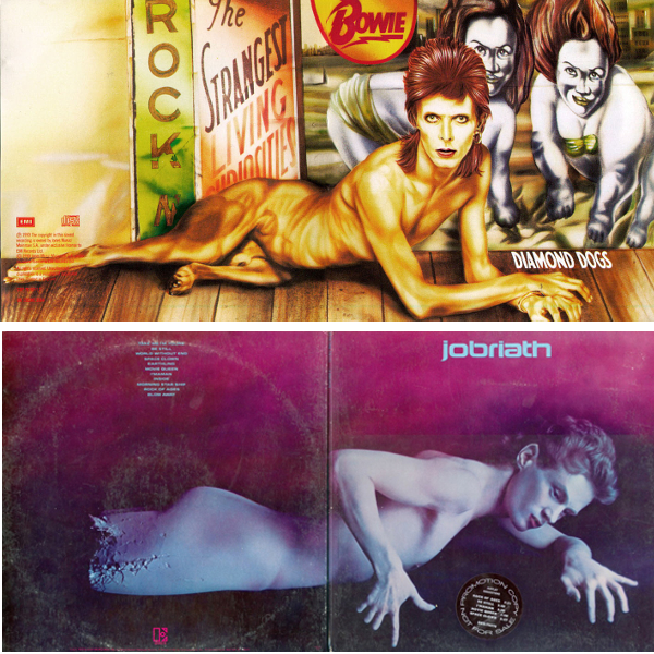
8. David Bowie – Aladdin Sane (RCA, 1973) & Jobriath – Creatures of the Street (Elektra, 1974)
It’s fair to say that Jobriath was influenced by Bowie in pretty much every aspect of his early recording career, but although Creatures… (mentioned elsewhere in this blog) is an interesting but not great LP, the front cover is, alas, just a little bit ridiculous by comparison with Bowie at his iconic peak.
9. The Byrds – Mr Tambourine Man (Columbia, 1965) & The Jimi Hendrix Experience – Are You Experienced (Track Records, 1967)
This comparison really traces the advance of psychedelia from a mild distortion of perception to a neon-coloured hallucination over the two years 1965-67
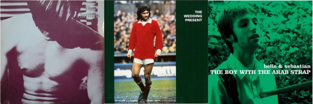
10. The Smiths – The Smiths (Rough Trade, 1984) & UK indie music in general (here; The Wedding Present – George Best (Reception Records, 1987) & Belle & Sebastian – The Boy With The Arab Strap (Jeepster, 1998)
The Smiths (mainly, one presumes, Morrissey) cared about the appearance of their records in a way that few artists have, and the relatively brief period of their recording career (83-87) means that their oeuvre has a unified completeness which is both rare and pleasing; presumably if they had gone on forever they would have tried something new at some point. The look (as well as the sound) of The Smiths had an immediate and lasting impact on the UK indie scene; although The Wedding Present (often characterised as the Smiths fans’ second favourite band)’s classic George Best doesn’t look especially like a Smiths album, the whole aesthetic seems to come from a similar (if slightly less glamorous) source. Stuart Murdoch of Belle & Sebastian seems to have, like Morrissey, a complete vision for the way his band should be and to date the B&S discography has a distinctive (and slightly Smiths-like) appearance. A good proportion of UK indie sleeves still have a very post-Smiths appearance (as does the output of the great My Little Airport from Hong Kong)
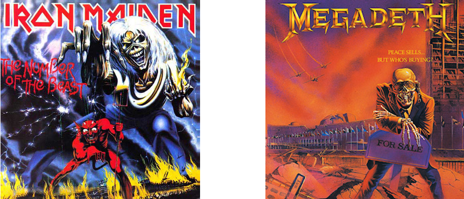
11.. Iron Maiden – Number of the Beast (EMI, 1982) & Megadeth – Peace Sells… But Who’s Buying (Capitol, 1986)
Iron Maiden’s Eddie has influenced the covers of thousands of heavy metal LPs throughout the 80s (and to the present day) but Megadeth’s Vic Rattlehead is probably the most blatant homage & Peace Sells… is probably their best album cover of the era.
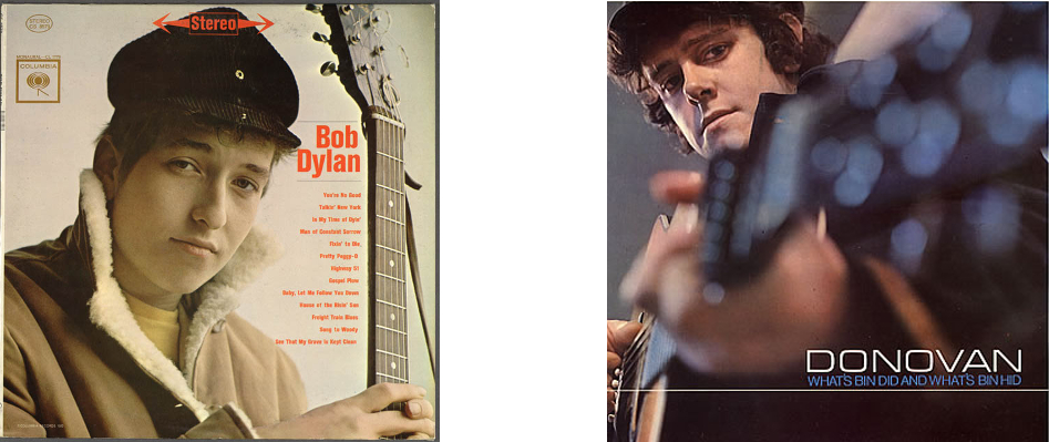
12. Bob Dylan – Bob Dylan (Columbia, 1962) & Donovan – What’s Bin Did and What’s Bin Hid (Pye, 1965)
Despite their essentially very different styles, Pye Records was determined to use the surface similarities between the two young folksters to promote Donovan as the British Bob Dylan and to that end, What’s Bin Did… features an informal Dylanesque photo as its cover image.
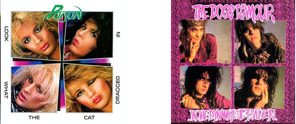
13. Poison – Look What The Cat Dragged In (Capitol, 1986) & Dogs D’Amour – In The Dynamite Jet Saloon (China Records, 1988)
Although the rougher, more rock ‘n’ roll-glam oriented Dogs D’Amour were less influenced by Poison than bands like Tigertailz were, the layout of their least all-over-the-place album is, by accident or design, a scuzzy-glam echo of Poison’s more Hollywood-looking debut.
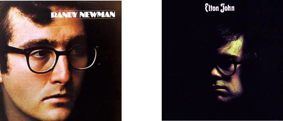
14. Randy Newman – Randy Newman (Reprise, 1968) & Elton John – Elton John (DJM, 1970)
It may be no coincidence that Elton John, with one not-massively-successful album behind him and a few years away from his outrageous glam-era costumes etc should seemingly model the cover of this, his breakthrough album, on Randy Newman; dour, unflamboyant , thus far critically and commercially neglected, but already an artist’s artist. It worked better for Elton.
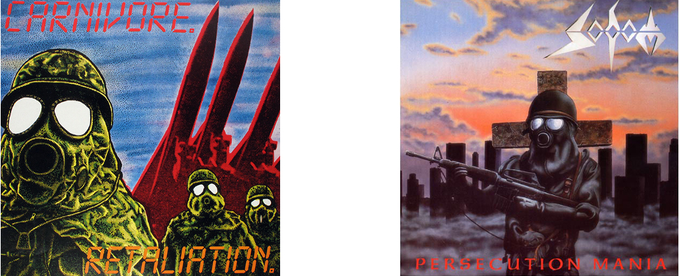
Presumably a coincidence, both of these albums are speed metal classics, although Carnivore are less well remembered than Sodom (who, to be fair are still going). The passing resemblance of these covers probably says as much about the atmosphere of the Cold War era as it does about metal.
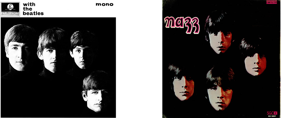
16. The Beatles – With The Beatles (Parlophone, 1963) & The Nazz – Nazz (SGC, 1968)
As with the aforementioned Elvis sleeves, every picture of The Beatles in their early years was influential, and none more so than the cool, simple sleeve for With The Beatles. Even so, it’s somewhat surprising to see its influence lingering as late as the psychedelic era, when Todd Rundgren’s Nazz released their debut (which arguably is modelled on the early covers of The Rolling Stones as much as The Beatles. But then the early Stones albums wouldn’t have looked as they do without The Beatles either.
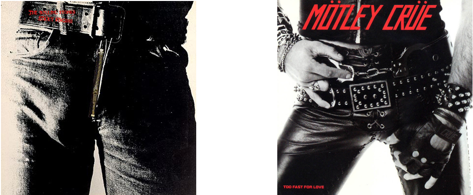
17. The Rolling Stones – Sticky Fingers (Rolling Stones, 1971) and Mötley Crüe – Too Fast For Love (Leathür Records, 1981)
Although only a passing similarity, Motley Crue inherited much of their spirit and attitude from the Stones and the cover of their debut is appropriately a more in-your-face updating of the classic Stones artwork.
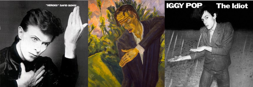
18. David Bowie – “Heroes” (RCA, 1977) & Iggy Pop – The Idiot (RCA, 1977)
Not a coincidence, Bowie & Iggy Pop worked closely in their Berlin period & both were influenced by German Expressionism, here in particular by Erich Heckel’s painting Roquairol. Iggy’s album is a bit better than Bowie’s though; if only he had worked with Eno!
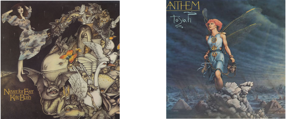
19. Kate Bush – Never For Ever (EMI, 1980) & Toyah – Anthem (Safari, 1981)
Anthem was probably Toyah’s best album; a nice mix of post-punk and new wave/synth pop influences, but despite her strong image she was never as individual or idiosyncratic as Kate Bush, although the fairytale-ish album cover suggests some similarity.
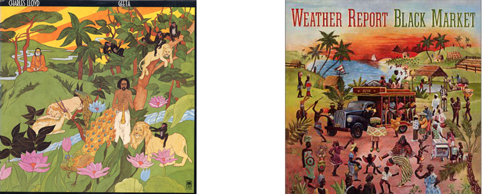
20. Charles Lloyd – Geeta (A&M, 1973) & Weather Report – Black Market (Columbia, 1976)
Charles Lloyd started out as a pretty standard post-Coltrane bop-saxophone player, specialising in ‘chamber jazz’, but by the early 70s he, like jazz in general, had become interested in fusion and elements of world music, reflected in the artwork for Geeta. That was pretty much where Weather Report came in, and although mostly Miles Davis influenced, Black Market has, coincidentally or not, a certain Charles Lloyd-ish quality.
21. Witchfynde – Give ‘Em Hell (Rondelet, 1980) & Venom – Black Metal (Neat, 1981)
More a case of shared influences than anything else, both Witchfynde and Venom came from the New Wave Of British Heavy Metal and had an interest in the occult and biker rock. Cheap, effective visuals were pretty much an essential part of the NWOBHM, with even early Iron Maiden artwork having a somewhat rough & ready charm.
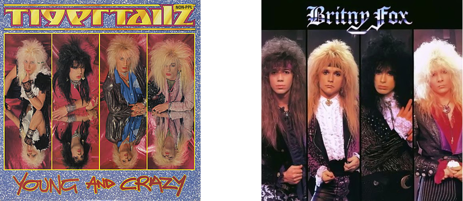
22. Tigertailz – Young & Crazy (Music For Nations, 1987) & Britny Fox – Britny Fox (Columbia, 1988)
>It’s slightly unlikely that foppish Rococo glamsters Britny Fox would be influenced by Wales’ super-glam Tigertailz, but both bands, despite their idiosyncracies, were drawing from a pool of shared glamorous male influences, going back in pop music to the 70s, but historically back to 16th (and in the case of Britny fox, specifically the 17th/18th) century.
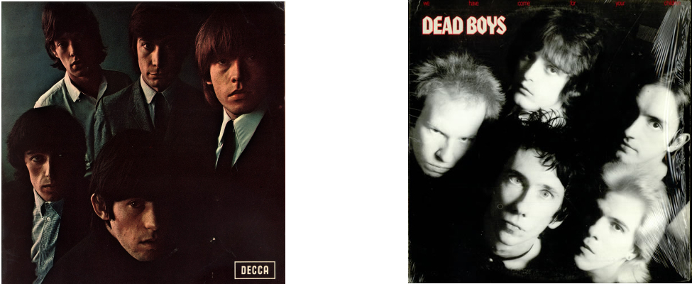
23. The Rolling Stones – Rolling Stones No. 2 (Decca, 1965) & The Dead Boys – We Have Come For Your Children (Sire, 1978)
Arguably the Stones cover here has its roots in With The Beatles, but the Stones brought their own surly charisma to the style and it was this that The Dead Boys channelled for their version of (in this case punk) rock, and the cover for their second album seems to pay homage to the Rolling Stones’ second.
24. Mayhem – Live In Leipzig (Obscure Plasma, 1993) & Darkthrone – Transilvanian Hunger (Peaceville, 1994)
Strictly this should be a comparison of Live in Leipzig with Darkthrone’s A Blaze in the Northern Sky (1992), but although A Blaze... pre-dated the release of the Mayhem album (recorded in 1990), the cover picture of Per Yngve “Dead” Ohlin used for the release of Live in Leipzig was well known in the Norwegian black metal underground and indeed, photographs of early Mayhem were, despite King Diamond, Sarcofago etc, pretty much the basis for the 90s Norwegian black metal aesthetic.
Although it seems unlikely (to say the least) that Bowie would be influenced by Jobriath, there is a slight passing resemblance between the excellent, slightly creepy gatefold artwork of Jobriath’s much hyped but unsuccessful debut and Bowie’s superlative dark glam masterpiece; possibly more to do with a shared influence of traditions of depicting the male nude than anything else.
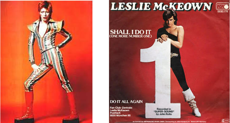
26. David Bowie – Ziggy Stardust era appearance (1972-4) & Leslie R McKeown – All Washed Up (Ego Trip, 1978)
Although not based on any single image of Bowie, ex-Bay City Rollers frontman Les McKeown’s first solo album & singles showcased an image clearly based on the glam-era Bowie of a few years earlier.
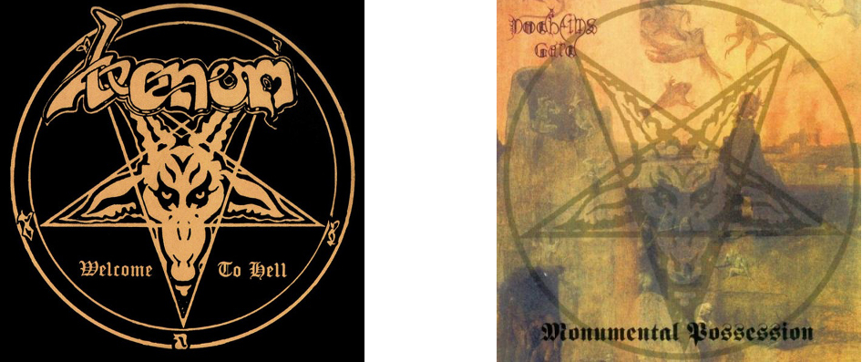
Hardly a coincidence; a large part of black metal’s satanic iconography was brought to the genre by its inventors, and the cover of Venom’s debut has been paid homage to by metal in general more times than almost any other image apart from Iron Maiden’s Eddie
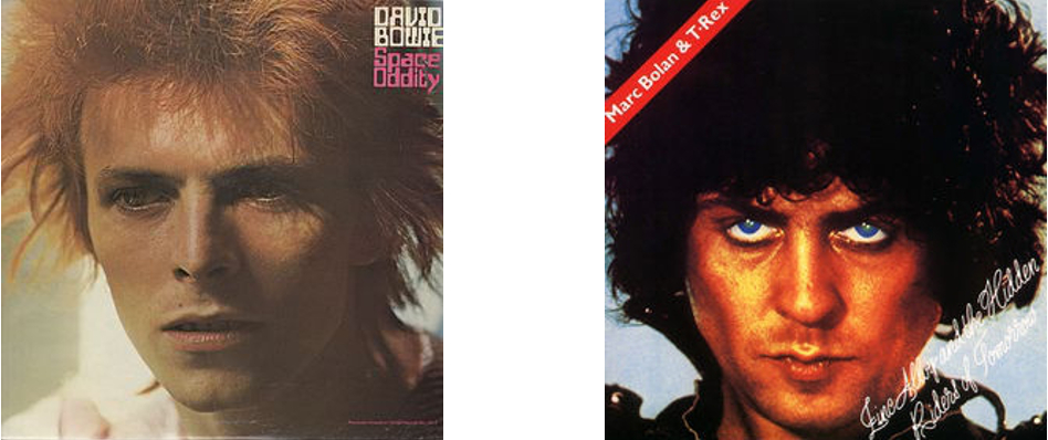
28. David Bowie (again) – Space Oddity (RCA, 1972 reissue) & Marc Bolan & T-Rex – Zinc Alloy and the Hidden Riders of Tomorrow (EMI, 1974)
It’s no surprise to see as visual an artist as Bowie featuring repeatedly in this list, but here he seems to have influenced his glam predeccesor and friendly rival Marc Bolan; Whereas earlier T-Rex albums had pioneered Bolan’s fey/fairytale glam image, by ’74 his music had become tired and limited (and ego-centric; T-Rex was now appended to the artist’s name rather than being an entity in its own right) in comparison with that of his old friend Bowie, and Zinc Alloy ( yep :/ ) was all-too-transparently influenced by Ziggy Stardust. The cover, however, seems more influenced by Bowie’s covers for Aladdin Sane and the glam-era reissue of his 1969 album, retitled Space Oddity. Given the slight deterioration of Bolan’s pixie-like charm, Zinc Alloy is unfortunately a less than bewitching or otherworldly sleeve.
29. Steeler – Strike Back (SPV, 1986), Helter Skelter – Welcome to the World of Helter Skelter (Metronome, 1988) & Pretty Boy Floyd – Leather Boyz With Electric Toyz (MCA 1989)
Presumably coincidence based on the common language of 80’s metal (but ultimately traceable back to Kiss in the mid-70s), both Helter Skelter and Pretty Boy Floyd’s late 80s glam-pop masterpieces have ludicrous paintings of the artists on them, very similar in style to German metallists Steeler’s 1986 opus Strike Back. Strangely, the Helter Skelter painting is by Games Workshop legend John Blanche, better known for the kind of dark fantasy images used in Warhammer etc (but also showcased on the cover of Sabbat’s classic UK thrash album History of a Time to Come.) The sleeve for Strike Back seems to be the first updating of this kind of thing since the classic Ken Kelly Kiss covers(!) from the 70s (see above).
30. Eric Carmen – Eric Carmen (Arista, 1975) & John Travolta – Can’t let You Go (Midland, 1977)
Ex-Raspberries frontman Eric Carmen’s debut solo album is best remembered for ‘All By Myself‘, but it was a strong album that revealed an excellent songwriter and performer with an eclectic range, from the Brian Wilson-esque ‘Sunrise‘ to the near-classical arrangement of that famous hit. John Travolta’s Can’t let You Go was released just as the young actor became a star with Saturday Night Fever and is, not surprisingly wet, bland, funky disco-lite with some soppy ballads thrown in. The covers of both albums showcase the sensitive (and in Travolta’s case, nakedly vulnerable) side of the young stars.
31. Cheap Trick – In Color…and in Black & White (Epic, 1977) & M
ötley Crüe – Girls, Girls, Girls (Elektra, 1987)
Ten years on from Cheap Trick’s In Color… one of the great hard/pop-rock albums of all time, came one of Mötley Crüe’s best, at the time notable for a (slight) toning down of the band’s glam image. The Crüe cover lacks the humour of Cheap Trick’s (admittedly not really evident in the front image only; the back cover has the band’s two quirkier-looking members on non-motor cycles), but is iconic in its own decadent, 80s way….
32. Pink Floyd – Animals (EMI/Harvest, 1977) & The Orb – The Orb’s Adventures Beyond the Ultraworld (Big Life, 1991)
An explicit homage, Dr Alex Patterson’s original vision for The Orb was inseparable from the psychedelic explorations of Pink Floyd. Admittedly, by 1977, the spirit of the prog legends’ optimistic experimentation had mostly evaporated, but the Animals sleeve, with its giant inflatable pig drifting over Battersea Power Station remains an iconic, dreamlike and good-natured image which, by 1991 seemed ripe for an update.
33. Genesis – A Trick of the Tail (Charisma, 1976) & FFWD – FFWD (Inter-Modo, 1994)
As with The Orb’s music above, FFWD (Robert Fripp, Thomas Fehlmann, Kris Weston, and Dr. Alex Paterson)’s 1994 ambient/prog/experimental album bears a resemblance (only slight in this case) to an album which was fundamentally different from the prog that inspired it. Indeed, the FFWD album seems to be influenced more by the ambient works of Eno than by a progressive band like Genesis (or Fripp’s King Crimson for that matter), but there is at times an atmosphere of pastoral whimsy that recollects the Peter Gabriel-era Genesis of Nursery Cryme or Foxtrot, far removed from the glossy, accessible rock of the Phil Collins-led Trick of the Tail. But that album’s cover has an archetypical prog feel, even if the album doesn’t, and so does the sleeve of FFWD.
It’s not just ‘the general public’ that sometimes finds abstract or conceptual art to be the empty, meaningless work of opportunistic charlatans; sometimes artists do too. While belonging firmly to the European avant-garde of his time, artist, poet and novelist Percy Wyndham Lewis (1882-1957) created a series of figurative works – the Tyros – which both stand outside of and satirise the modernist movement in a way that we would now recognise as ‘post-modern’ in their knowing, ironic nature.
While the satire of modernism was not new in Lewis’ art, the ‘Tyronic’ works of the 1920s mark the beginning of a wider programme (which included his relatively commercial portraiture of the period) which attempted not just to draw attention to the stagnation and decay which the artist perceived in post-WWI European culture, but also to put forward (somewhat half-heartedly) the aim of a new and rigorous ‘classical’ regeneration of both art and society. In the aftermath of the First World War, Lewis saw an opportunity to start afresh in an age in which artists were ‘creatures of a new state of human life.’[1]
With the Tyros, Lewis devoted himself to addressing, in his characteristically humorous and aggressive fashion, what he saw as lingering aspects of the old world, in particular the decadent ‘90s of Oscar Wilde & co and the limp quasi-modernism of the Bloomsbury group. However, much of the underlying philosophy of Lewis’ ‘new’ direction derives from the works – both literary and artistic – of his own earliest, pre-war maturity. The implications of this philosophy run far deeper than simply a criticism of the artistic milieu of 1920s Britain, addressing the very nature of humankind itself, with, typically of the artist, entirely negative conclusions. Indeed, Lewis’ vehement opposition to the apparently progressive movements of his time has often led to an overly simplistic (although understandable) denigration of the artist as a fascist. After an initial flirtation with the far-right, though, he was eventually to dismiss the simple-minded politics of fascism with exactly the same kind of aggressive amusement as he dismissed almost everything else. Much of the power of the ‘Tyronic’ works derives from the tension between the relatively positive aims of Lewis’ programme of regeneration and the basic negativity of his satire and personality. This tragic, even hopeless, view of humankind is integral to the satire of the Tyros as it lay at the very heart of Lewis’ conception of humour.
Wyndham Lewis introduced his Tyros in April 1921 at the Leicester Galleries, London, in an exhibition named Tyros and Portraits. Whereas the portraits could, to a certain extent, be seen as conventional, though modernist in style, the Tyros were intended to act as a shock awakening to the docile English spectator – ‘These Tyros’ he wrote in the introduction to the exhibition catalogue, ‘are not meant to be beautiful…they are, of course, forbidding and harsh.’ The Tyros represented a new mythology, a race of human creatures, fully grown, but new to life, reliant on gut emotional responses and free from reason or logic. As such, they are depicted (both in the finished paintings and in the drawings which illustrated his magazine, The Tyro) as grotesque figures, usually grinning, laughing* or sneering. In the magazine’s fictional works the Tyros are depicted as simple-minded fools, usually engaged in inane gossip, almost a prefiguring of the 21st century era of talent-free celebrity. As paintings, they are modernistic in style, but also embody the intellectual concerns that Lewis felt should be the domain of the artist.
*Lewis’ ambivalent feelings about humour were forcefully expressed in the Vorticist manifesto BLAST, where it is both cursed as ‘arch enemy of REAL’ and blessed as a ‘great barbarous weapon’. More about this below…
The figures of the Tyros, with their naive, childlike responses to life are, at first glance, not entirely new in Wyndham Lewis’s art. The theme of the human being as an instinctively motivated animal is a feature of both his art and writing from his earliest maturity. The Breton peasants of the Wild Body stories of 1909-17, crude and animalistic, have recognisable features in common with the Tyros. Artistically too, the subjects of his drawings, such as Dieppe Fisherman (1910) and Courtship (1912, right), share with the Tyros the signs of an intuitive, animal nature such as low foreheads, ridiculous postures and a general lack of individuality. His satire has more than one target – though the fisherman and the romantically engaged couple are, to Lewis, comical figures, they are merely representative samples of wider humanity; ‘’men’ are undoubtedly, to a greater or lesser extent, machines… Men are sometimes so palpably machines, their machination is so transparent, that they are comic.’[2] This point of view remained constant in Lewis’s philosophical worldview, but the Tyros nonetheless differ significantly from his earlier work.
The First World War had an enormous impact on the generation who lived through it, Lewis included, as well as on that which came after. Before the war, Lewis was already a public figure – the outspoken leader of the UK’s own avant-garde art movement, the Vorticists. This celebrity was not to survive the war, and neither was the public enthusiasm for (or at least amusement with) the modern art which had created it. Whereas in 1914/15, Lewis’s work had approached complete abstraction, he now found the hard-won achievements of the Vorticist period ‘bleak and empty. They [the abstract geometric forms] wanted filling.’[3] The Tyros and Portraits exhibition was Lewis’s first major attempt at fulfilling this goal. With these works he attempted to address the problems with modern art – its lack of contact with or interest in real life, its obsession with the fleeting and transient and its preoccupation with the intuitive and sensual (exemplified slightly later by Ben Nicholson and Kit Wood’s ‘discovery’ of the ‘naive’ painter Alfred Wallis) which, to Lewis, democratised and undermined the skilled, privileged position of the artist, whose role as documenters (and even creators) of culture and guardians of the intellectual heritage of humankind entailed a sense of responsibility which he felt was being betrayed by the artistic elite of his time. Therefore, the satire of the Tyros is intensified by a moral element which had not been present in his depiction of humanity in the pre-war period.
The primary target of Lewis’s satire, epitomising all that he felt was wrong with modern art, was the Bloomsbury group. Lewis’s enmity towards this group and in particular its leader, Roger Fry, dated back to the pre-war period when he and his fellow Vorticists left Fry’s Omega Workshops in acrimonious circumstances. Lewis’s view of the Bloomsbury group in 1913 – ‘the idol is still Prettiness, with its mid-Victorian languish of the neck’[4] – was not significantly altered by the intervening years and in fact his attitude was probably hardened by the suspicion that the group had underhandedly used the period of the Great War (the group was, in stark contrast to the Vorticists, largely composed of conscientious objectors) to consolidate their standing as the modern art movement in the UK. Despite the obvious paranoia inherent in this point of view, it is certainly the case that the Omega Workshops heightened its profile during the war years, selling its products more widely than earlier, as well as holding the first exhibitions of Children’s Art in 1917, a venture that seemed to encapsulate everything that Lewis felt about the group.
Lewis’s complaints about Bloomsbury were not entirely without foundation. Roger Fry and Clive Bell were, to the art world in France and elsewhere, the face of the English avant-garde, but they failed to use what little influence they had to promote English art outside of their own somewhat cosy coterie – indeed, even artists broadly in sympathy with their aims and methods – such as Ben Nicholson – did not receive the kind of support they could perhaps have expected. Similarly, Lewis’s claim that Fry, Bell and Duncan Grant were dilettantes (and therefore related to the novice status of the Tyros), ‘playing’ at art without any intellectual seriousness is not entirely without foundation. Even the relatively grander theories of the group (such as ‘significant form’) seem, in practical execution, to correspond with Lewis’s picture of ‘colour-matching, matchbox-making, dressmaking, chair-painting…tinkerers.’[5] Comments such as Fry’s ‘After all, there is only one art; all the arts are the same’[6] or even worse, Clive Bell’s crass use of a sporting metaphor to grade the differing qualities of French versus English artists (‘the English is normally a stone below the French’[7]) strengthen the validity of Lewis’s claims.
The vision of the amateurish, pseudo-intellectual, self-consciously ‘artistic’ figure of the Bloomsbury artist lent itself easily to the grinning, elemental figures of the Tyros. Probably the most powerful work on display in the Tyros and Portraits exhibition was the large (165.1 x 88.9cm) oil painting, A Reading of Ovid (Tyros) of c. 1920.
A Reading of Ovid
This painting, acknowledged by Lewis as one of his most carefully finished works, shows two Tyros disturbed in the act of reading. The humour of the satire derives from the juxtaposition of the vacantly grinning masklike faces of the two figures with the intellectual pastime they are engaged in. This corresponds with Lewis’s extremely bleak theory of the comic in general; ‘in one sense you ought to be just as much surprised at finding a man occupied in this way [reading] as if you had found an orchid or a cabbage… The movement or intelligent behaviour of matter – any autonomous movement of matter, is essentially comic.’[8] At the same time, the satire is more pointed and direct – these ridiculous figures are, as Lewis explained, an attempt to ‘frighten away the bogey of ‘art for art’s sake’’, the basis for the ‘cultivated and snobbish game’ of English art,[9] art which had no root in culture or society, but was an activity – even a hobby – driven only by the whim of the artist. This satire is especially barbed when one takes into account Lewis’s elevated view of the artist as a cultural leader – and whatever his evaluation of Roger Fry’s talent, Lewis did accept that he was a ‘sensitive and real being’ outside of the homogenous and unthinking mass of the general public. He might therefore be expected to feel the sting of the satire keenly. If the foreword to the exhibition catalogue was not specific enough, the clothing of the Tyros in A Reading of Ovid; the baggy suits and the foppish, ostentatious handkerchief, identifies them clearly as the dilettante artists described in Lewis’s 1918 novel, Tarr; ‘the art-touch, the Bloomsbury technique, was very noticeable. Hobson’s tweeds were shabby, from beneath his dejected jacket emerged a pendant seat, his massive shoes were hooded by the superfluous inches of his trousers: a hat… shaded unnecessarily his countenance.’[10]
In contrast to the directness of his visual attack on Bloomsbury, the use of Ovid as the text over which the Tyros grin, leaves the scene open to several interpretations. This may in itself be a joke on Lewis’s part; the author of the Metamorphoses being evoked in a picture which shows primitive ‘elementals’ attempting to transform themselves by aping the manners of their intellectual superiors. It is also possible that Ovid was chosen as the classical author best known for his erotic works, such as The Art of Love, and that the Tyros are simply shown sniggering over the ‘dirty bits’ of one of the world’s great authors, as befits their base, sensual outlook. Yet another interpretation, with wider-reaching conclusions, is that the use of Ovid refers to the ‘return to stability’ within the French avant-garde of the post-war period, a neo-classical revival looking back to Ingres and David. Lewis, with his own leanings towards a new classicism, was scornful of this fad, which he saw as a French retreat into a safe, patriotic ‘mother-tradition’.[11] In this reading of the painting, the pseudo-intellectual Tyros are engaged in a futile attempt to build a new thought-world, entirely grounded in the past. Lastly, it is possible that the use of Ovid as a figure beyond the reach and understanding of the childlike Tyro is a piece of somewhat arrogant self-identification. Ovid, like Lewis, was an outsider figure, both in his own time and in subsequent literary history, and had been excluded from the elite of his own day for the subversive and satirical nature of his art.[12] The arrogance suggested by this interpretation is not at all inconceivable when looked at in the context of Lewis’s artistic programme of this period – his criticism of Fry in particular seems to suggest that a more suitable figurehead for English modernism would be a professional artist and genuine intellectual – i.e. Lewis himself.
Whatever his pretensions, A Reading of Ovid presents vivid evidence of Lewis’s outsider status in the context of European modernism. As a painting, it has little parallel in Europe at that time. The figures, though influenced by cubist ‘primitivism’ in their hard-edged, geometric, non-naturalistic outlines, bear little resemblance to extant cubist art. Likewise, although effective satire was being produced by Francis Picabia, Marcel Duchamp and (most notably) by the German Expressionist George Grosz, their art has little in common with Lewis’s bizarre vision. Nor do these artists share the scope of Lewis’s aims, balancing artistic, social and philosophical concerns, making the Tyro paintings, as he explained, ‘at once satires, pictures and stories.’[13] Lewis, devoted to the cause of ‘art’ in a way that was anathema to the Dadaists, totally eschewed the iconoclastic playfulness of Picabia and Duchamp. The power of Grosz’s art often derives from the passionate rendering of the artist’s bitterness and disgust with the decay and corruption of post-war Germany, where the economic, social and political situation was far more unstable and extreme than in France or England.
Grosz, The Pillars of Society
Lewis’s view of satire did not intend to have the emotional, inflammatory impact of work such as Grosz’s; Lewis declared that ‘satire is cold… the non-human outlook must be there.’[14] It is this coldness that allows the intellectual response that Lewis desired in the viewer. The only real parallels for A Reading of Ovid are in fact in the earlier works of Lewis himself. The effective, non-naturalistic colour scheme of opposed visceral reds and deep metallic blues had been a feature of his art since his earliest, Futurist-inspired works. This colour scheme is the opposite of the warm, harmonious, Matisse-influenced and decorative style of the Bloomsbury painters, and so fulfils the dual function of preventing a sensual response (thereby inviting an intellectual one) and providing a corrective example to contemporary Bloomsbury practice. The composition has a tense vitality which is achieved in a similar way to that of his pre-war abstract works such as Composition (1913, left). This energy comes not from loose, free, energetic brushwork, but from the way in which the dynamic and surging forms of the Tyros, as with those of the abstract works, are locked into a tense design by firm, clean outlines. The power of the line imprisons the energy of the composition, creating an image which is static, but bursting with potential movement. The vitality is, in the Tyros, not merely abstract ‘design’, but also an integral part of the subject.
The vital energy of the Tyros was stressed in Lewis’s writings, and expressed in their grotesque laughing faces. Laughter, to Lewis, was an important philosophical concept. The ‘wild body’ of the human animal, said Lewis, ‘triumphs in its laughter. Laughter does not progress. It is primitive, hard and unchangeable.’[15] The world this laughter reveals is that of the human animal in its true element, stripped of all artifice. In issue two of his magazine The Tyro, Lewis included a ‘Tyronic dialogue’, in which ‘X’, a Tyro representing Lewis himself, makes the following assertion to his more naive companion – ‘Every civilised milieu is… the devouring jungle driven underground, the instinct of bloody combat restricted to forensic weapons.’[16] This underlying reality, masked by complex human behaviour is also hinted at in smaller works, such as the Tyro Madonna (1921, below right) where religion and sexuality are combined in a totem-like image which seems to satirise the edifices built upon the baser instincts of mankind. Laughter brings this subterranean Darwinian world to the surface – and satire, though a form of criticism, aims partly to provoke an amused response in the viewer. This laughter is, like all laughter, an instinctive reaction, and therefore a tragic reminder of the inescapable fate of the human being – to live and therefore to die as an animal like any other. We are laughing with the Tyros as well as at them.
The use of satire, had then, despite its appeal for Lewis, extremely negative connotations. In appealing to the sense of humour, it is the denial of the classicism which he himself had put forward in his portraits as the basis of a new modern art, and in fact the denial of all meaningful progress. Although he attacked the situation of the arts in England vigorously, privately he declared that ‘it would be unwise to regard [this state of affairs] as anything but permanent.’[17] The truth of this remark must have seemed self-evident in the irony that A Reading of Ovid was purchased by one of the leading members of the late-Victorian dilettante class, Osbert Sitwell, himself a butt of Lewis’s satire. Whatever his hopes for the future of art and society, Lewis had, fundamentally, a pessimistic view of humankind. This pessimism, a feature of Lewis’s thought since his early maturity and sharpened by the influence of T.E. Hulme, had been, not surprisingly, deepened by the events of the First World War. The art historian David Peters Corbett claims that Lewis was ‘too satirical’ to show his mourning in his art[18] but in fact, the Tyros themselves, in their elemental stupidity, can be interpreted as a bleak kind of mourning for the pointlessness of the mass slaughter of 1914-18.
The Tyros, vessels for the raw energy and vitality of the human animal, necessarily display none of the stillness and ‘deadness’ which Lewis saw as essential to the creation of an ‘immortal’ classical art, and by their very theme, deny the truth of such an art. However, classicism’s loss is satire’s gain, as the concentration on the eternal truth of the real nature of civilisation paradoxically gives the Tyros a timelessness that transcends the immediate situation they satirise, making them of more than socio-historical interest.
The wide-ranging satire and deep pessimism of Lewis’s outlook did not spare even the intellectual elite which he saw as the ideal leaders and creators of a new culture. The culmination of his ‘Tyronic’ period is the one of the most extraordinary paintings of his career; the self portrait Mr Wyndham Lewis as a Tyro (1920/1).
Mr Wyndham Lewis as a Tyro
This painting shares many features with A Reading of Ovid. The colour scheme has dramatic contrasts of dark and light, creating a dramatic tension, again denying the comfortable sensual response of most Bloomsbury art. The composition is jagged and stark, containing great energy within tightly enclosed boundary lines. The Tyro bares his teeth in a sneer, looking disdainfully past the viewer from under the aggressive sweep of his hat. In contrast to the average Tyro his forehead is high, but the facial expression (and his status as a Tyro) suggests animal cunning rather than intelligence. While promoting the exhibition, Lewis stated in an interview with the Daily Express that the vitality of the Tyro is ‘purposeless, and hence sometimes malignant’[19] and this is the aspect we see here. The Tyro sneers at the viewer, revealing the basic, negative instinct underlying Lewis’s complex criticism of art and society. Given that Lewis had repeatedly stated his views on the ultimate tragedy of human life, the ‘terrible nature of its true destiny’[20] as revealed by Darwin, it is not inconceivable that the self-portrait depicts Lewis’s real ‘animal self’, sneering at the somewhat romantic ideal of immortality through art that the artist fostered through his intellectual ambitions. Given the nihilism that formed the heart of Lewis’s worldview, the animal response, the sneer or laugh of the Tyro was the only valid one when confronted by the essential joke of human consciousness. Ultimately, the Tyros invite the audience to laugh with as well as at them; to mock the ridiculousness of humankind and to sneer at its pretensions and aspirations.
With the Tyros, Wyndham Lewis created a mythology based on the essential transience of human life and the animal impulses which ultimately guide all of our seemingly civilised pursuits. In the end, as the artist no doubt expected, the Tyros failed to accomplish much beyond consolidating Lewis’s position as an antagonistic troublemaker in the art world of inter-war England. In the build up to World War Two, Lewis isolated himself even further with some misjudged political writings, and pursued the pessimism of the Tyros on a bigger, more generalised scale with powerfully negative works such as Two Beach Babies (1933, below) and Inferno (1937, above). Post WW2 though, despite completing his massive, Dante-esque mythological trilogy of novels, The Human Age, he was never to regain either his power as an artist or his standing as a public figure.

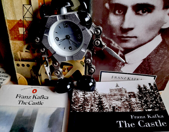
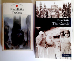
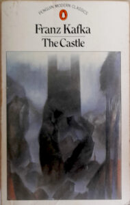 Lots there to be curious about, but let’s stick to Kafka for now. My old Penguin paperback of The Castle, which features two chapters not included in the original 1930 UK edition (which were separately translated by Eithne Wilkins & Ernst Kaiser), is from of my least favourite stylistic phase of the Penguin Modern Classics series. At that point in the early 80s, the spines of the books, in a nostalgic nod to the classic early days of Penguin, were orange and white, while the covers were white with (mostly) modernist paintings chosen to more-or-less fit the books. The Castle does have a nice cover illustration, by Elizabeth Pyle, but otherwise the design is a little drab. The book is 298 pages of fairly but not unreadably small print. The Vitalis edition is far more stylish and the cover artwork uses a beautifully evocative photograph of (Bohemian?) “Peasant women” from 1918 and a photograph of Friedland (or Frýdlant) castle in Czechia. The type looks around the same size as the Penguin edition, but though the book is slightly bigger than the Penguin, it has 382 pages.
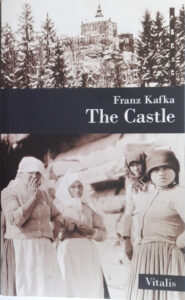 Even allowing for the fact that the Vitalis Castle includes nice, dark, moody and scratchy illustrations by Karel Hruška, it’s a noticeably longer book, and the reason for that is revealed in the two quotes at the top of the page. The Muirs’ prose – like Edwin Muir’s own poetry, which is worth checking out – is terse and spare, but also flexible and evocative. It’s the “voice” that Kafka has had for me since I was a teenager. It also has the benefit – or at least I think it’s a benefit, more later – of having been translated close to Kafka’s own time. When that first British edition of The Castle was published and Edwin Muir wrote in his introduction “Franz Kafka’s name, as far as I can discover, is almost unknown to English readers,” he was talking about an author who had only been dead for six years, and the book itself had only been in print in Kafka’s own language for four years.
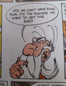
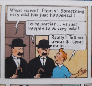
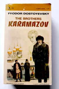

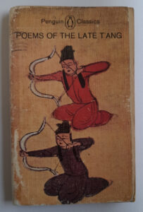
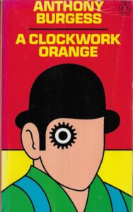 Burgess’s A Clockwork Orange is one of my all-time favourite novels – it’s also the product, very obviously, of someone who could speak and think, fluently, in a lot of languages. Ten is the number he usually gave, ‘with bits and pieces of others’. Burgess created the book’s slang, Nadsat, in order to write about ‘the youth’ in a way that didn’t date like real slang and it definitely worked. Rightly, I think, Burgess didn’t want a glossary of Nadsat terms in the book. Some publishers have added one anyway, but the book works far better if the reader just immerses themselves in the narrator’s voice and his disorienting world. But Burgess was only human, and in perhaps the novel’s weakest moment (because it takes us out of that world) he couldn’t resist pointing out that the language his young narrator Alex speaks isn’t just whimsy on the part of the author:
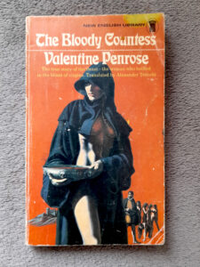
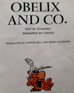

 Why is it painful to get rid of books? Pompously, because the books you own are a reflection of yourself; of skins shed and personalities outgrown and discarded, and in a way a direct line back to your (possibly alarming) former selves with their sometimes alien tastes and enthusiasms.* Less pompously, because in general, I want more books, not fewer. I can’t think of an occasion when I got rid of a book simply because I didn’t like or just didn’t want it, though I’m sure it’s happened. And so, for decades I still owned (and may still have somewhere) the little red Gideons Bible that was given out to pupils when starting high school (do they still do that?). Its bookplate (ex-libris? Both terms seem very archaic) hints strongly at the typical kind of 12 year old boy that it was given to: Name: William Pinfold Form: human. Similarly, I may still have the books given to me in the street by Hare Krishna followers, which seems not to happen now but was a frequent enough thing in the early 90s that I can still remember without checking** that they were credited to and/or consisted of teachings by “His Divine Grace A.C. Bhaktivedanta Swami.” They often had nice, pleasingly psychedelic cover paintings but were invariably disappointing to try to read because, even when they had amazing titles like Easy Journey to Other Planets, they were all about Krishna consciousness – who knew?. But these are books that would be impossible to replace (in a personal sense; easy enough to get hold of different copies of them). More complicatedly – and just annoyingly, with space at a premium, I have multiple copies of some favourite books and will probably buy even more copies of them, if I come across them with covers that I like but don’t have and if they are cheap.
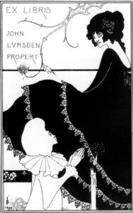
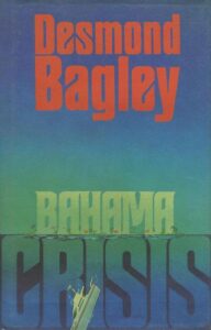
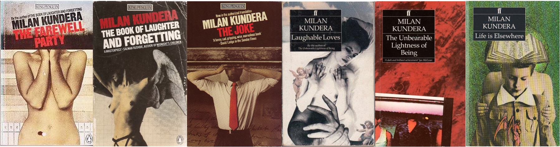
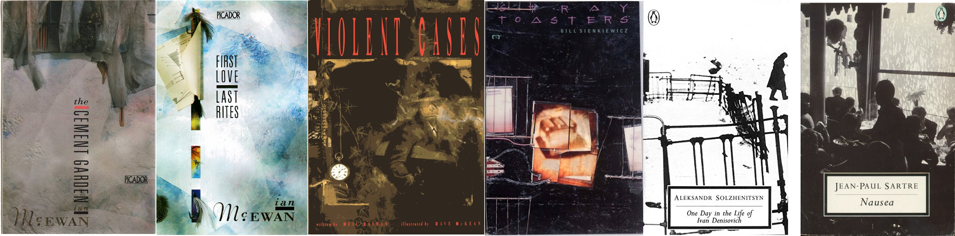
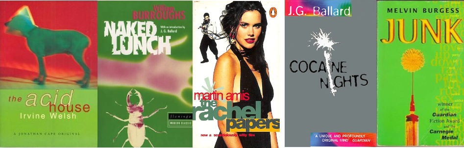
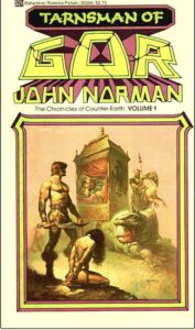
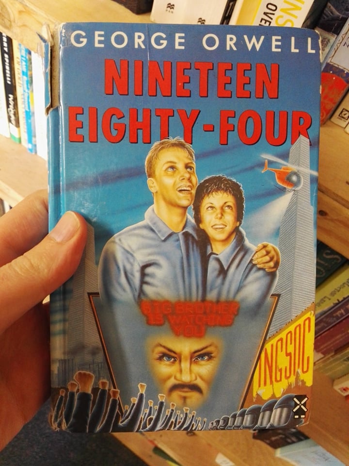

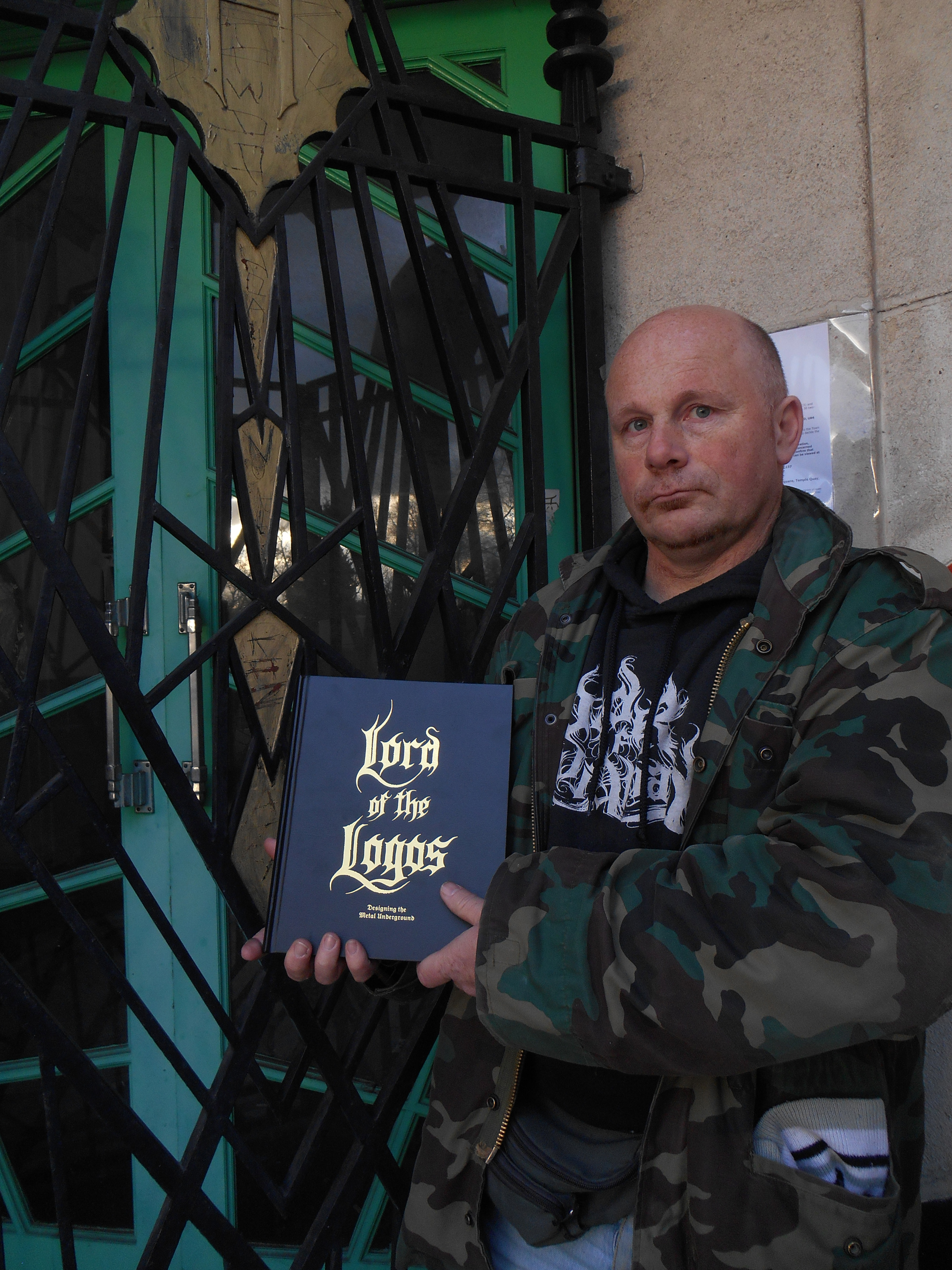
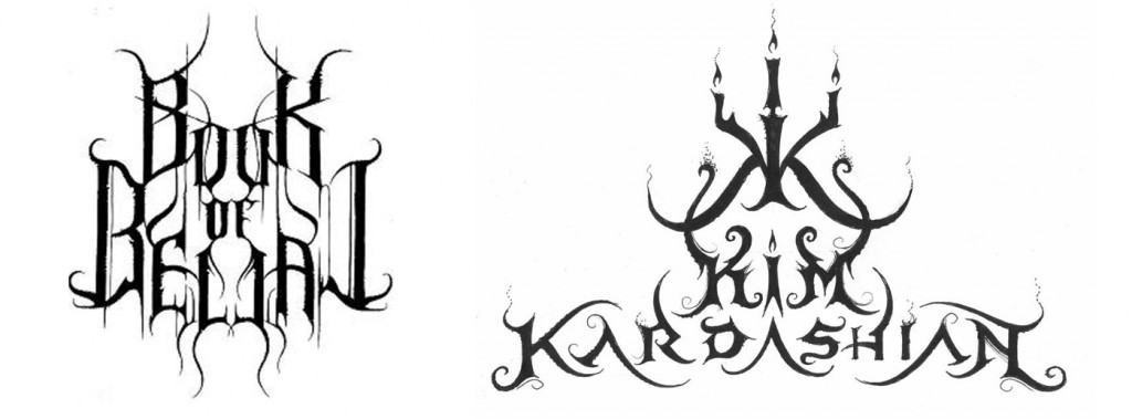
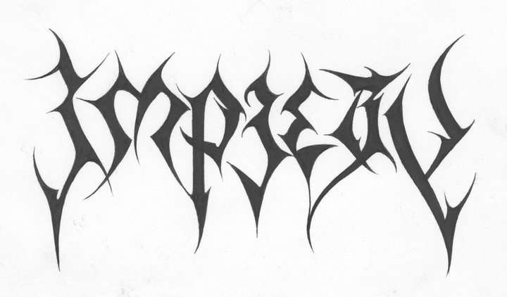
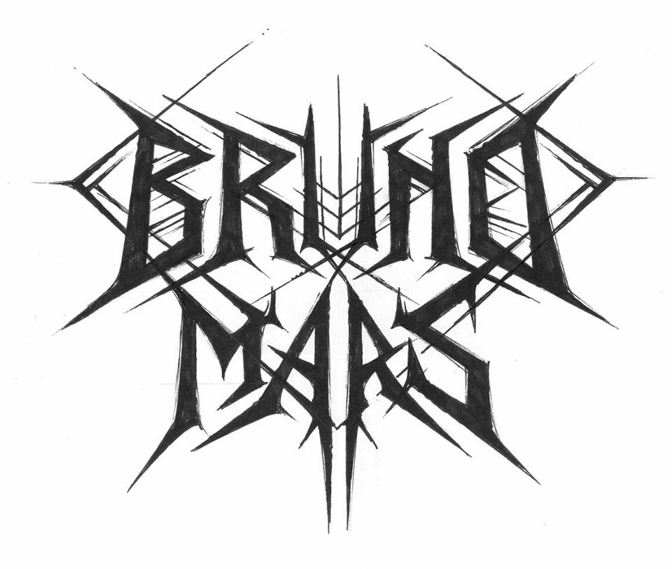
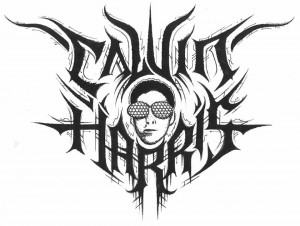 much bigger public. And at the moment I’ve been thinking about, just for fun, working on a Beyoncé logo, because she is so much talked about. So there’s this whole series of pop culture logos, I did EastEnders, Coronation Street, Emmerdale, Shortland Street. So I had some real fun exploring the mainstream. But the metal public is always the most receptive to my work. It’s my public, it’s the one who collects my work. A lot of people who see my work who haven’t been acquainted with the metal scene say that it’s not something they would be going for. Or that it’s nice but it’s grim.
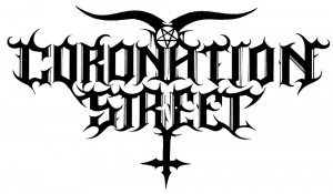
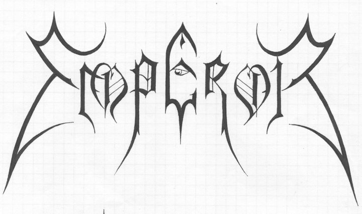
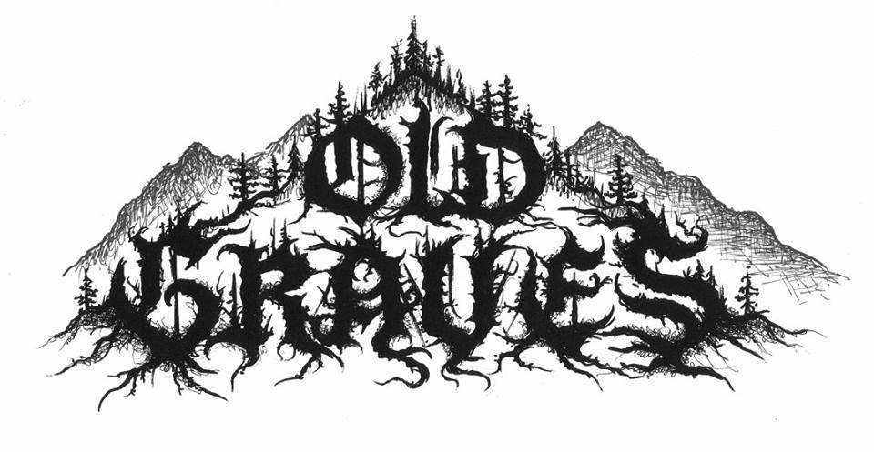
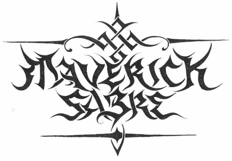


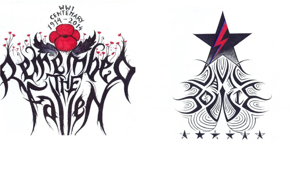
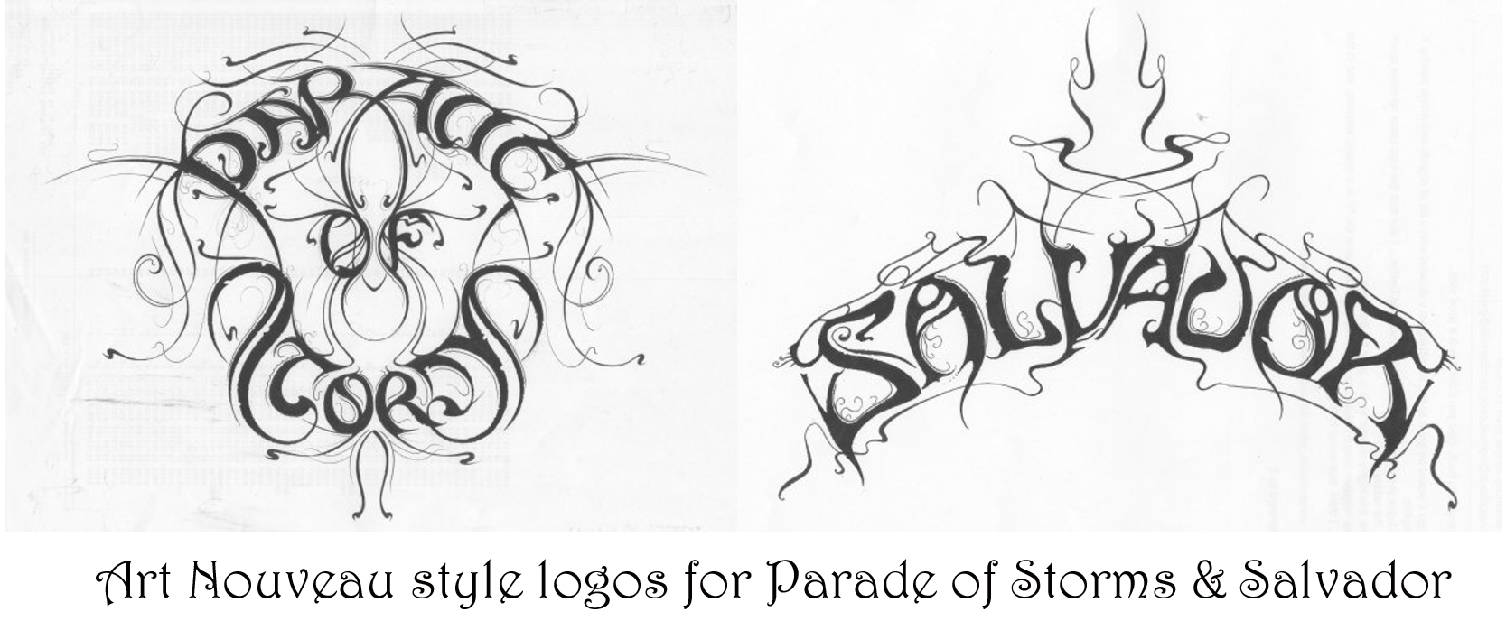
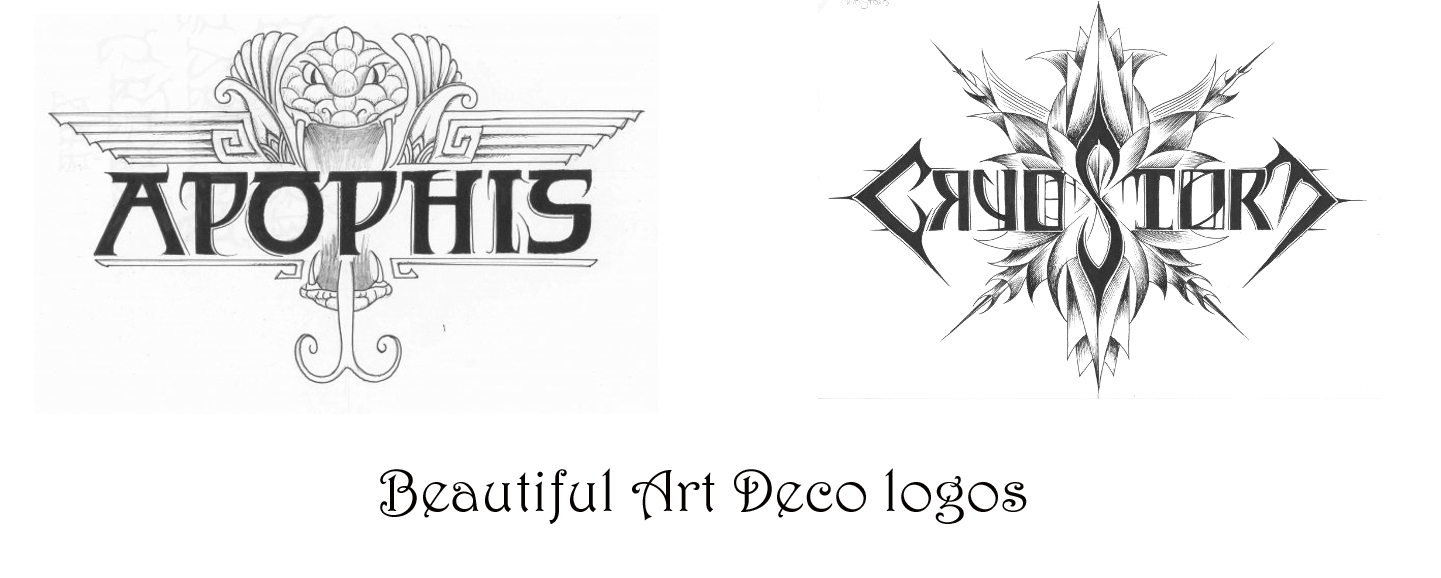
 he new logos is a real travel through time and dimension. So there is a timeline, beginning with really primitive logos I have created. A band called Gau, which means ‘night’ in Basque, this logo is very prehistoric, almost as if it was drawn by dinosaurs. With these very prehistoric plants around, no crows, no wolves. Very prehistoric, almost reptilian, taken from a time there was no mammals, no birds, there were just reptiles and primitive insects; trilobites, and ammonites. And in fact I live in Exeter, by the Jurassic coast, so you can send yourself spinning on a time travel of 200 millions years. So we go from these very simplistic logos, like Undo Creation from Georgia, up to the most sophisticated logos; art deco, or futuristic logos, like I did for Outsider Industries. Or Haunted, an Italian project.
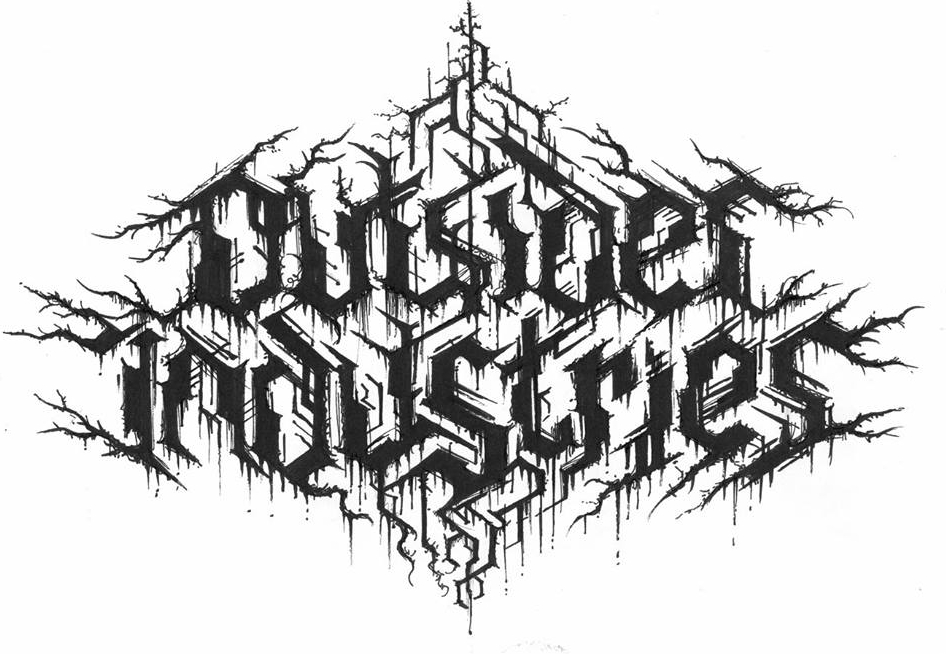
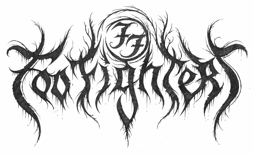
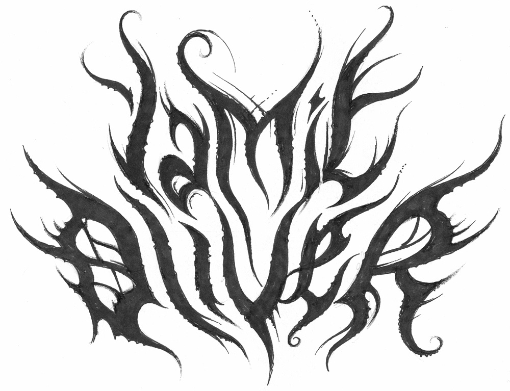
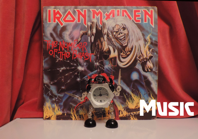
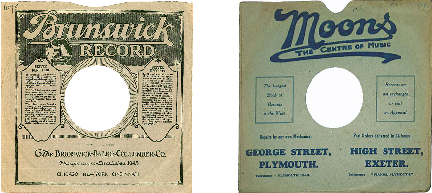
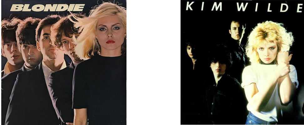
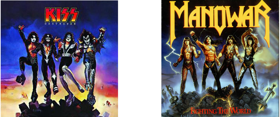
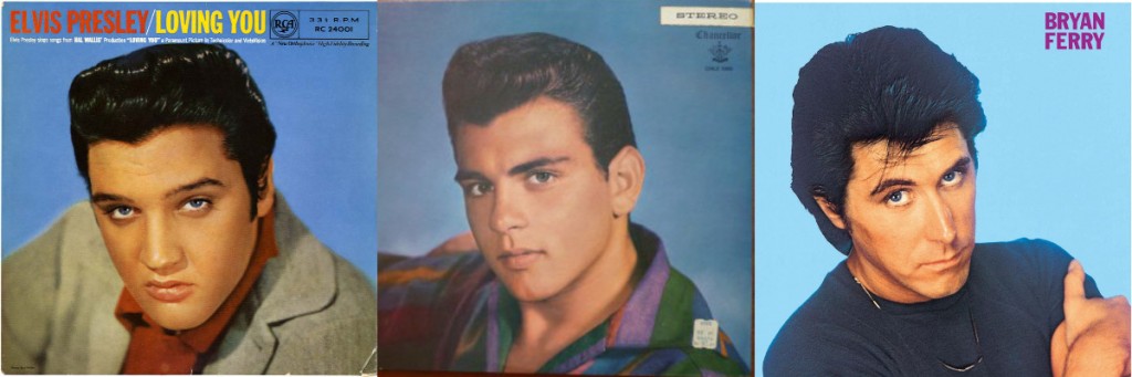
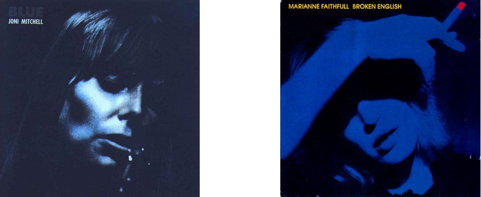
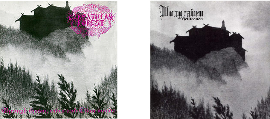
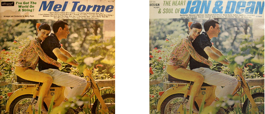
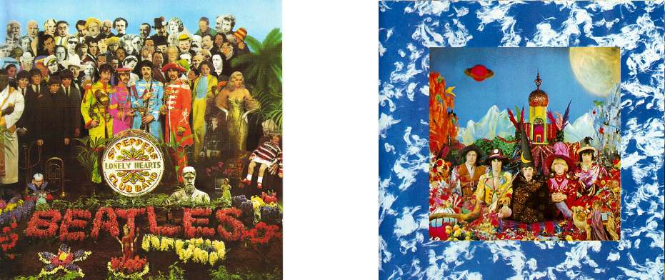
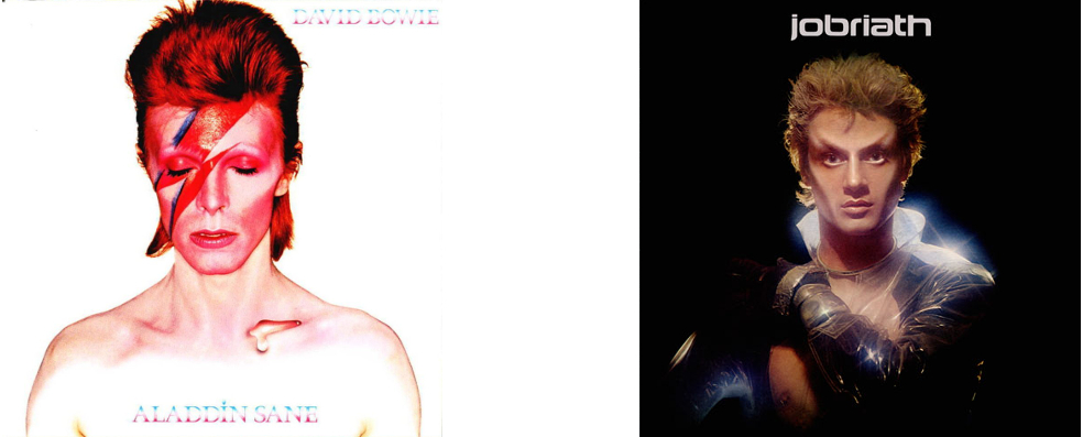
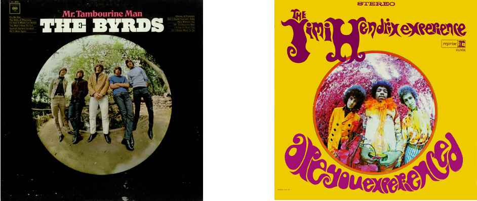 This comparison really traces the advance of psychedelia from a mild distortion of perception to a neon-coloured hallucination over the two years 1965-67