A continuous chain of little inventions; art in Edinburgh summer 2018


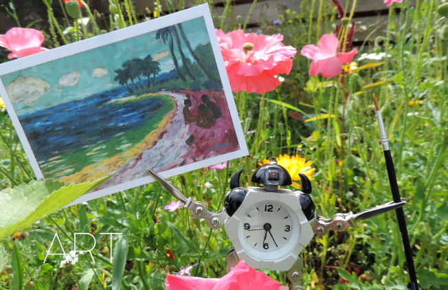
Probably as much as I love any art movement, I love German Expressionism; most of all the artists of Die Brücke (I wrote at length about them here) and their (initially) optimistic quest to forge a new, forward-looking art which was distinctively German, drawing on native traditions (woodcuts, landscape etc), but also attempted to peel away the layers of staleness built up by decades, or even centuries of academicism, to reveal living art beneath. The art of Paula Modersohn-Becker, too, who was doing something similar in Worpeswede, is important to me too, but I also love the more anguished, personal kind of Expressionism that was reflected in the famous Expressionism of German silent cinema (see also Kirchner’s later works, and – not “German Expressionism” per se, but still German and expressionistic, early Dix and Grosz, Max Beckmann, Käthe Kollwitz).

Emil Nolde – Bay (1914)

So, even though Emil Nolde (1867-1956) is perhaps my least favourite of the major German Expressionist painters, and even though I had lots of qualms about it (see here), I was excited to see the Scottish National Gallery of Modern Art’s exhibition Colour Is Life. And it really is good.


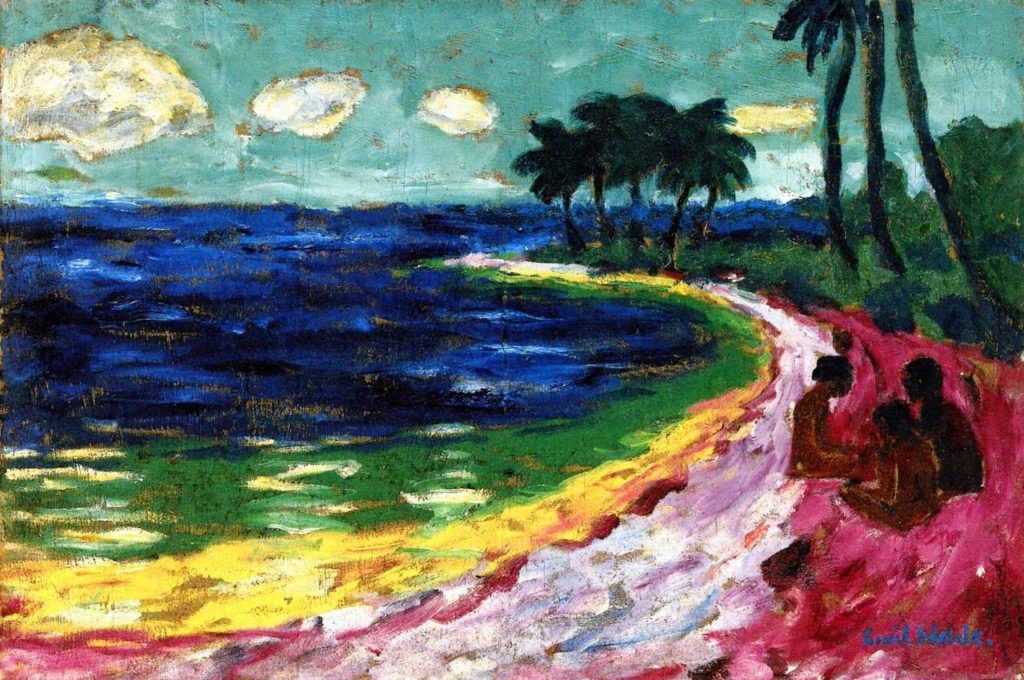
In comparison with the much younger artists of Die Brücke, which he joined for a year in 1906* Nolde’s art is just as vivid, but less vibrant (if that makes sense); his colours tend towards the bilious and acidic and his style, though ‘free’, often seems – even in landscapes – more frenzied and less harmonious than the works of the rest of the group. His deeply felt religious paintings, especially – and there is a really remarkable group of them in the exhibition – have an intense, anguished, alienated quality that is more like Munch atmospherically than it is his German contemporaries. It’s among his figurative (but not religious) works that my favourite painting of the exhibition, an enigmatic and slightly double portrait (that I can’t find online), which is smoother in surface texture than the religious pictures and imbued with an oddly menacing atmosphere.

*at which point Nolde was 39 and the group’s founders were in their early to mid twenties

Emil Nolde – Paradise Lost (1921)

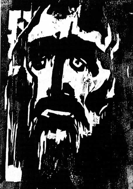
I’m glad to say that although I felt like the information at the exhibition tended to downplay his vociferous Nazism a little, it at least acknowledged it – and although it is nowhere explicit in his art, there are some uncomfortably anti-Semitic-caricature-like faces in his paintings of people, including in some of the religious works. But whether I would think that if I didn’t know he was (extremely) anti-Semitic, I can’t say. Interestingly, for an exhibition called Colour Is Life, by far the most powerful works to me were Nolde’s woodcuts (including arguably his most famous work, The Prophet of 1912), where his compositions are remarkable for their economy and stark intensity.

Emil Nolde – The Prophet (1912)

Interestingly (perhaps not coincidentally?) the majority of Nolde’s most impressive work seems to have been done by the mid-1920s, but there is also a selection of his ‘unpainted pictures’ in the exhibition. These are little watercolours, incredibly vivid in their colours, which were made in secret during the period when his work was condemned/forbidden by the Nazi government which Nolde had, however, not only welcomed, but effectively campaigned for since the early 30s. Incidentally, around the time that Nolde was signing the Aufrufs der Kulturscha (1934) which supported Hitler as Fuhrer and joining the National Socialist Association of Northern Schleswig, Ernst Ludwig Kirchner, one of the founders of Die Brücke, was writing “Here we have been hearing terrible rumours about torture of the Jews, but it’s all surely untrue…There is a war in the air. In the museums, the hard-won cultural achievements of the last 20 years are being destroyed, and yet the reason why we founded the Brücke was to encourage truly German art, made in Germany. And now it is supposed to be un-German. Dear God. It does upset me.”*

Head of a South Seas Islands woman (1914)

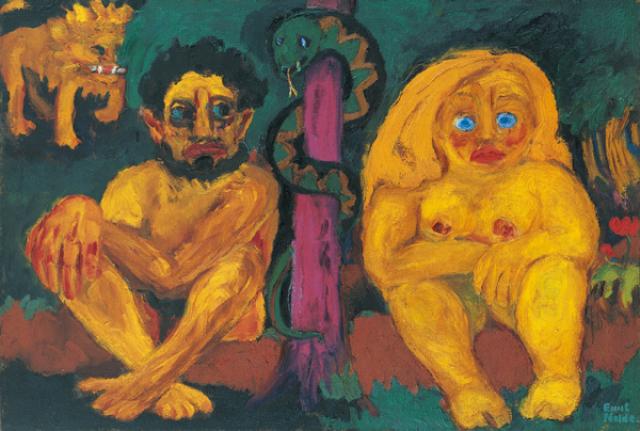
This was more than just the symptom of a generation gap between different artists; it’s at the heart of why Nolde’s art is, despite surface similarities, so different from that of the artists of Die Brücke; Expressionism is (obviously) about expressing; and yes, Kirchner and co expressed their anxieties, but their vision – at least at the time the group was at its most cohesive – was an optimistic one, accepting other influences as much as it rejected the status quo. To the 21st century, the way they were influenced by the art of other cultures, to simplify and brighten their own work can be uncomfortable; it has something of the ‘noble savage’ myth about it and their assumptions about the freedom and ‘naturalness’ of the tribal cultures whose work they studied in ethnographic museums were made from a viewpoint that now seems colonial and ignorant. But – the point of their own work is that it uses these forms and elements to describe something that is whole, natural and above all universal – the ‘otherness’ of the figures Nolde drew and painted on his trip to the South Seas (and even of his incredibly bold landscapes) just before WW1 is inescapable. His drawings of the people he encountered aren’t caricatures; they are brilliantly observed, but they are themselves ‘ethnographic’ in a way that Kirchner and co’s art strove not to be; Nolde is seeing and recording, not absorbing.

* Kirchner, quoted in Kirchner Museum Davos Biography Ernst Ludwig Kirchner by EW Kornfield, & CE Stauffer (1992)

Still; the Nazi government didn’t care about this distinction, and the exhibition text tells us that Nolde had more paintings shown in the condemnatory Entartete Kunst (‘degenerate art’) exhibition than any other artist, which would be a cause for some schadenfreude if not for the fact that, after petitioning the government (he was on civil if not familiar terms with charming people like Goebbels and Baldur von Schirach) he was informed in late 1941 that any work he undertook should be presented before government officials before any kind of public showing, which is of course harsh and limiting by any normal standards, but surprisingly mild compared to what they were doing to other artists. But, as Nolde must surely have realised, for all their cultural protectionism and promotion of what they considered to be artistically wholesome and correct ideas, the Nazis really weren’t interested in art as art at all.

Julie Wolfthorn – Witch of the Woods (1899)

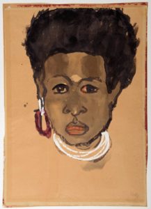
For some not very pleasant perspective, since I can; Nolde was prevented from making a living from his art for a few years, and had works confiscated (which he did eventually get back however), meanwhile his contemporary, Julie Wolfthorn (only three years older than he was), whose figurative, traditional, slightly folkloric art has at least an equal right to be seen as definitively German (or, far more right, to the anti-modernist authorities of the time), was, as a Jew, too dangerous to exist, and was murdered in 1942, at the age of 78, by the regime which Nolde did his best to be accepted by.


So yes, a beautifully curated and mounted exhibition; but one which leaves a slightly bitter taste.

Toyen – Message of the Forest (1936)

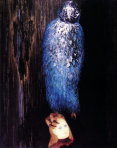
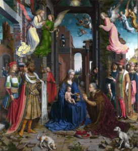
So,  that’s what I paid to see (and it is absolutely worth the price of admission), but in fact the bitterness faded quickly; aside from owning a Kirchner painting that is for me everything that Nolde’s work isn’t, the National Gallery of Modern Art (Modern Two) hosts a permanent (and free) exhibition Surrealism and the Marvellous, which was already great, but has been enhanced hugely by the acquisition of Toyen’s superbly enigmatic The Message of the Forest (1939) and Leonora Carrington’s diminutive but haunting (and at the same time kind of funny) 1939 portrait of Max Ernst, Bird Superior (1939).


Leonora Carrington – Bird Superior (Portrait of Max Ernst), 1939

I could spend (and I think have spent) hours in this room; even longer now, as the archive adjoining it is hosting Club Dada: Berlin and Beyond, a really exciting collection of books, pamphlets, photos etc (and a small Max Ernst painting) that focuses mainly on Berlin Dada but also has some great items from the original Zurich group. Much as one wants to pore over these artefacts, I don’t even mind too much that the books etc are in glass cases since my German is minimal and I can’t read French at all.


Raqib Shaw – The Adoration (after Jan Gossaert), 2015/6 © the artist

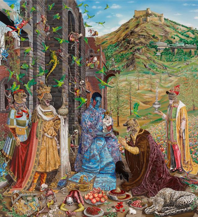
Over in Modern One, I nearly didn’t look at the (also free) exhibition Raqib Shaw: Reinventing the Old Masters, partly because part of me doesn’t really want them to be reinvented, and because I didn’t know Shaw’s work, and also because it was up the stairs and I’d been walking around for hours. But I’m glad I did; what a fantastic show! I can’t imagine anyone not being impressed by Shaw’s work, even if it’s not their cup of tea. The paintings (too simple a description; his huge panels are painted in shimmering enamels, but embellished with a kind of cloisonné effect, incorporating jewels, glitter, all kinds of things) are brilliantly drawn and dazzling in their richness and detail (and a bit over the top, which is part of the charm). Although the compositions of the pictures in this exhibition are inspired by ‘old master’ paintings (one of which is one of my all-time favourite pictures, Lucas Cranach’s enigmatic Allegory of Melancholy (1528), displayed alongside Shaw’s painting), the familiarity only makes the extravagant fantasy of Shaw’s works all the more dreamlike and affecting.

Jan Gossart – The Adoration of the Kings (1510/15)

I think we (no, I don’t know who I mean by ‘we’) are used to seeing and accepting things like Biblical scenes or Greek myths presented through the filter of the Italian (or Northern) renaissance, and this is similar but different. With the old masters we (them again) see familiar (or what were once familiar) scenes  presented in a kind of fancy dress of anachronistic costumes/settings etc which were initially intended to heighten the relatable-to realism of the works, but which now add another layer of meaning and cultural baggage. With Shaw’s work, the ghosts of both the original meaning and the original treatment are seen as if through the eyes of someone from another, much more effervescent dimension. The dislocating, hallucinatory blend of familiar (and it isn’t just the source material that’s familiar; Shaw’s use of dazzling, opulent colours and ornate textures is, despite the fantastical elements, quintessentially Indian, to my western eyes anyway) and strange is exhilarating and strangely poignant.* To take my favourite picture; neither Cranach’s or Shaw’s Allegory of Melancholy is sombre exactly; but despite the centuries and world views that separate them, the same delicately wistful atmosphere pervades both pictures. It’s an impressive exhibition.

So, the moral of this is; go to the Scottish National Gallery of Modern Art in Edinburgh if you get the chance. Oh, and the National Gallery of non-modern art too – aside from having an incredible permanent collection, they currently have a Rembrandt – who doesn’t like Rembrandt? – exhibition and have put a fantastic Jenny Saville painting (Aleppo) among the old masters in a way that works amazingly well and was gathering crowds of (especially young) people when I was there.

*Perhaps an obscure (and certainly a geeky) comparison; looking at Raqib Shaw’s pictures reminded me of reading Brendan McCarthy & Pete Milligan’s similarly post modern/immersive/multicultural/hallucinogenic comic strip Rogan Gosh in the 2000AD spinoff Revolver.

Brendan McCarthy & Peter Milligan, Rogan Gosh (1990)


Review of the Year – the paradox of realism


2017, like most years but somehow more so, was filled with unpleasant things, events and people. For me though, one of the more pleasant features of the year was that I made the effort to visit art galleries more often than previously, in particular to see the superb exhibitions held by the National Galleries of Scotland; after missing Modern Scottish Women in 2016, I was determined to see Beyond Caravaggio at the National Gallery and especially True to Life – British Realist Painting in the 1920s and 1930s at the National Gallery of Modern Art. Both of these exhibitions were excellent, but I am writing mainly about the latter. As curator Patrick Elliott was clearly aware (see also the essay What Sort Of Truth? British Painting Between The Wars by Sacha Llewellyn in the excellent exhibition catalogue), ‘realism’ is not a simple thing to define, and indeed it seems strange that (for example) the peculiar and highly artificial painting of Maxwell Armfield and the shockingly immediate work of David Jagger should be considered the same kind of art.

‘Pacific Portrait’ (1929) by Maxwell Armfield (left) and ‘The Conscientious Objector’ (1917) by David Jagger (right)

If ‘Realist’ at first seems a pretty simple and unambiguous description, the fact that many of the artists (Dod Procter, Meredith Frampton, Gluck, Glyn Philpott) and paintings discussed in the exhibition catalogue also appear, equally convincingly, in Edward Lucie-Smith’s book Art Deco Painting (Phaidon, 1990) demonstrates just what a subjective term it really is. What the word seems to denote in the context of this exhibition is something like ‘representational rather than abstract’, which admittedly is an extremely unwieldy and far too wide term.

In the period in which the art of the exhibition was produced (the title says the 1920s and 1930s, but a few earlier and later works were included, so roughly from the years of World War One up to the first half of World War Two), the word realism tended to have mainly negative connotations; for which see Billy Bunter author Frank Richards’ famous 1940 reply to George Orwell’s article Boys’ Weeklies; “They go grubbing in the sewers for their realism, and refuse to believe in the grass and flowers above ground – which nevertheless, are equally real!” This was and still is an aspect of a wider conception of realism that Orwell  himself attacked occasionally in its more extreme political forms. Today, ‘realpolitik’ is used as a term of criticism, but in fact almost all political or social ‘realism’, even when respectable, is basically an excuse for people or governments not to act compassionately when it becomes unprofitable to do so. People who term themselves realists rather than optimists or pessimists tend (in my experience) to lean more towards the latter, but with an added smug quality as befits someone who is never surprised when bad things happen. While the artists of True To Life presumably held beliefs and opinions on a wide range of issues, these are by and large absent from their work as collected here. This is not the 1920s of the General Strike or the 30s of the Depression and The Road To Wigan Pier, let alone the 20s and 30s of Lenin, Mussolini and HItler, or perhaps more to the point, of Picasso, Matisse, or Dadaists and Surrealists.

Edward McKnight Kauffer – poster for the London Underground (1930)

Nevertheless, from the delicate figure studies of Dod Procter to James Cowie’s pastoral portraits, it is a window onto certain aspects of British art and life between the wars. Also, the painters’ rejection of the vocabulary of avant garde modernism should be seen in the context of the time; while abstract or semi-abstract art had been at the cutting edge of modernism in the years just prior to and during World War One, not only had the innovators of that era moved on (why not look at my article about Wyndham Lewis in the 20s here?), but the angular, dynamic language of modernism had infiltrated mainstream culture to the point that institutions as staid as the Royal Mail were using designers like John Armstrong and Pat Keely to give the Post Office a modern identity, while Edward McKnight Kauffer and others did similar work for the London Underground and, outside of the UK, fascist Italy, Hitler’s Germany and the Soviet Union all utilised versions of modernist design to establish new national identities. In that sense, the idiosyncratic, apparently old-fashioned and above all individualistic styles adopted by British artists outside of the more radical movements can be seen as, if not revolutionary, then at least stubbornly dedicated to their own visions.

Although it may seem paradoxical or incompatible, the ‘realism’ of these artists is founded to some extent on escapism and idealism; but maybe that is truer of realism in a wider sense than at first seems to be the case. The definitive artistic form of realism (if we think of everyday life as ‘real’ – but I don’t really want to get into philosophical questions here as I’d like to finish this article at some point) nowadays is probably something like instagram, or on a slightly grander level, the documentary film, but the very nature of documenting reality – whether in film, photographs, painting or in writing – is necessarily selective, and in being so, tends towards some kind of commentary (and/or judgement) on its subject. One of the nice things about the True To Life exhibition was that both the grime-and-hardship/warts-and-all and the grass-and-flowers aspects of realism were represented – albeit mostly in a perhaps fairly superficial way. There was very little evidence of the documentary as protest – perhaps because, by the end of WW1, photography had become the obvious tool for this kind of work. That said, social commentary of a sort was present in Thomas Nash & Stanley Spencer’s idiosyncratic recasting of some of the Renaissance’s favourite religious scenes such as the Crucifixion & the Last Judgement in ‘modern dress’ and modern settings (and slightly generic ‘modernist’ styles). This use of realism was not uninventive, but was in essence just another way of looking back at the ‘old masters’; revisiting the groundbreaking realism pioneered in the 14th century. More interesting, (to me) was John Luke’s strange 1929 modern-dress version of one of the baroque era’s favourite Old Testament scenes, Judith and Holofernes, in which the story of the beheading of an Assyrian general is made even more unsettling by having a strangely surreal Agatha Christie/Enid Blyton aura.

John Luke – Judith & Holofernes (1929)

Much as in Edward Lucie-Smith’s Art Deco Painting, the unifying factor in the exhibition’s disparate works was less a matter of style/school or subject than it was atmosphere; the paintings, as different as they are, belong definitively to the period between the wars, in much the same way as the very different works of Evelyn Waugh and Christopher Isherwood did (according to me, here).


If the term ‘realist’ in painting suggests the artist as eye (kind of an analog to (again) Christopher Isherwood’s fictionalised realism; “I am a camera”), the eye of the artist/writer is necessarily as individual as the brain it is connected to. For example, one might assume that realism and idealism were opposites, but there is a strong classicising element among some of the artists in the exhibition – but even then, individual artists seem to have reached a kind of classical serenity and monumentality via different routes.


Meredith Frampton – Sir Charles Grant Robertson (1941)

One of the stars of the exhibition for me was the portrait painter (George Vernon) Meredith Frampton (1894-1984). Frampton’s art was in some ways the most ‘realistic’ art in the exhibition, in the sense of being (by far) the most illusionistic and quasi-photographic. In a way, portraits like the stunning Sir Charles Grant Robertson (1941) are less ‘realist’ than than they are ‘corporealist’ – their accumulation of painstakingly rendered detail being in some ways closer to taxidermy than to the realism of a snapshot. In their almost eerie stillness, his portrayals of professional men surrounded by the accoutrements of their work, (another excellent example is Sir Frederick Gowland Hopkins  (1938, below) seem – despite the maximalist inclusiveness of the painting – closer to the carefully composed minimalism of a photographer like Lilo Raymond than to a more or less contemporary realist (or ‘objectivist’) painting like Otto Dix’s theoretically similar portrait of urologist Dr Hans Koch (1921). And yet, for all of their modern realism, both artists looked to the past; for Dix – who had experimented with Expressionist styles earlier in his career, the aim of the modern realist painter was to tackle the breadth and the often-unrecorded detail of modern life with the – to him – unimprovable techniques of the old masters. For Frampton, the source of his style is less the realistic tradition of the Northern Renaissance than it is the monumental, but still ‘realistic’ neoclassicism of Ingres.

Meredith Frampton – Sr Frederick Gowland Hopkins (1938) and Otto Dix – Dr Hans Koch (1921)
Lilo Raymond – Wild Flowers (1992)

The more usual classical influence on British art of the period was the modernist route via Picasso and cubism; in the case of painters like the ex-Vorticists William Roberts and Edward Wadsworth (also Edward Burra, whose expressionistic 1930 painting The Snack Bar was included in the exhibition), the angularity of Vorticism became a kind of stylistic shorthand that marked out their otherwise fairly conventional/traditional art as ‘modern’. Several other artists in the exhibition, such as Gladys Hynes and James Walker Tucker seem to have used modernist stylistic traits in the same way; to heighten the clarity and monumental qualities of their work; a kind of ‘realism’ as simplified solidity and a classicism that couldn’t be easily written off as old fashioned.

Gladys Hynes – Noah’s Ark (1919)
Gerald Leslie Brockhurst – By the Hills (1939)


For society portrait painters like Gerald Leslie Brockhurst and Sir Herbert James Gunn, realism – if explicitly not ‘gritty’ realism – was a necessary part of their trade. The glamour and drama of portraits like Brockhurst’s By the Hills (1939) is what made the artist in demand for fashionable sitters, but their effect – despite relying on a similar sense of heightened photo-realism for their success – is almost the opposite of Frampton’s still life approach. This kind of art was, despite its use of traditional techniques (and even, in the case of By The Hills, a Renaissance-influenced landscape in the background) resolutely of its ‘modern’ age, referencing Hollywood and the world of contemporary fashion, but not really any of the ideas that had affected the visual arts since the mid 1800s.


The same is true of the slightly creepy empty street scenes of Algernon Newton; despite their passing resemblance to the post-impressionist work of Maurice Utrillo, these brilliantly realised townscapes are depictions of the modern world, but not interpretations of it. While the artist captures the melancholy charm of the slightly shabby suburbs he painted, their spirit is more like restrained romanticism, rather than being invested with the revolutionary sense of psychogeography that the proto-surrealist works of Giorgio de Chirico had pioneered two decades earlier. That said, because of the role of artist – not just as a ‘camera’, but also as processor and interpreter of experience – his paintings are something more than a documentary photograph of an empty street.

Algernon Newton – The Outskirts of Cheltenham (1932)


Pietro Novelli – ‘Cain Killing Abel’ (1625)

In fact, what True To Life highlights, is the extent to which the vast majority of art, until fairly recently, had as its aim something that could be called realism; the National Gallery’s Beyond Caravaggio exhibition likewise showed Caravaggio and the artists of the late 16th/early 17th century trying to make their art – both in religious/mythical and modern genre paintings – more immediate & vivid through a kind of dramatic heightened realism. Impressionism broke away from the staid, schematised world of academic painting to capture something closer to the experience of both the artist and viewer, Expressionists tried to infuse their works with the feeling of events as experienced, Futurists tried to capture the violence of the 20th century where traditional techniques tended to distance it… And in that sense, much of the work labelled ‘realist’ in this exhibition works for us now in a way that it possibly didn’t at the time; to a modern audience the work in True to Life is almost all imbued with a between-the-wars ‘period’ quality that seems to capture the zeitgeist of that troubled era, even while sidestepping most of the troubles themselves.

It is with that last point that the artists – without doubting the depth of feeling they put into their work – mainly succeeded in recording (limited aspects of the) reality of their era in a relatively superficial way. As an example, Clifford Rowe’s The Fried Fish Shop (1936) depicts what the interior and clientele of a fried fish shop of the 30s presumably looked like; as such it has sociological and historical value, as well as being a fine, faintly modernist painting. On the other hand, a slightly earlier and in some ways comparable painting like the Vorticist-inspired Rain On Princes Street  (1913) by Stanley Cursiter (it’s quite surprising that none of Cursiter’s fashionable work of the 20s & 30s was included in the exhibition), despite its fractured, faceted and in that sense ‘unrealistic’ modernist appearance, not only captures in its stylised way a glimpse of late Edwardian metropolitan life, but also the feeling – still the same over a hundred years later – of being on Edinburgh’s Princes Street on a busy, rainy day. So in the end I suppose which painting deserves to be called ‘realist’ is as subjective as reality itself.

Clifford Rowe – The Fried Fish Shop (1934)


Stanley Cursiter – Rain on Princes Street (1913)

An Illuminated Eccentric; the art of Christophe Szpajdel

 Christophe

What do black/death metal band Book of Belial and Kim Kardashian have in common? Aside from a desire to spread evil and darkness, the answer is that both have had their names immortalised by the iconic logo designer Christophe Szpajdel. Although inextricably linked to the extreme metal underground by his classic works for a vast array of bands, Szpajdel is first and foremost a great artist and designer and his work now has an audience far beyond the metal subculture to which he still undeniably belongs.

bookardashian

Szpajdel has been drawing bespoke logos since 1987, his big break coming in the early 90s with the classic and hugely influential logo for Norwegian black metal legends Emperor. Since then his work has helped to define the aesthetic style of underground metal, but also become well-known in its own right, being featured in exhibitions and books, including his own volume, Lord of the Logos.

 It’s typical of the UK that, despite being based in Exeter (and having been a UK resident for the past fifteen years), Szpajdel’s work receives far greater acclaim and coverage elsewhere in the world; a real shame, and a situation which will hopefully be remedied as his reputation continues to expand both within and outside of the metal realm.

In conversation, Christophe is funny and informative and has a passion for drawing and, especially, logo design (his own and that of others) which shines through everything he says. It’s worth pointing out too, that in a time when useable graphics have arguably never been easier to come by, he remains committed to the art of imaginative, hand-drawn, pencil and ink images; unique works which have the feel that only comes from manual labour and contemplation.

impiety

Anyway, enough introduction; here’s the man himself – What are you looking forward to in 2016?

CS: This year I have lined up a few exhibitions, I have a possible show in Manchester for March-April at the Gallery Grim and another possibly in London. But I have had quite a long list of exhibitions in the past, so what is more exciting to look forward to is in June, when I have my first proper workshop, which is going to happen in Vancouver, Canada. That workshop is going to be together with [photographer] Peter Beste. This is something really to look forward to. I had a talk earlier today about an exhibition in Romania, in the Carpathian mountains. Last year I had a very successful last-minute impromptu exhibition in Japan. I’m actually looking forward to having a much bigger exhibition there, because that last exhibition became something of a timebomb. It filled the venue, they literally squeezed in, and I had three hours of non-stop autographs. All these Japanese people were taking selfies with me, which is something I have never seen like this before. In the UK, selfies are a big habit; in Japan, selfies are an absolute obsession.  It’s the same with queuing. Here in the UK, everyone is used to queuing, the Japanese have turned queuing into an art form. So last year was a giant leap in my artistic career.”

As mentioned in my intro, Christophe’s name is known worldwide in metal circles, but although his love for and knowledge of metal music is obvious, his real passion is for designing logos, not simply recycling past glories.bruno

CS: Yes, there is always metal, but this year I have made a new experience, I have done some pop culture logos. I drew for Calvin Harris and Bruno Mars, and Kim Kardashian, and Katie Price, Wayne Rooney (laughs).  Also Maverick Sabre –  you know; really popular artists, because I have the will to have my work exposed to a calvhar
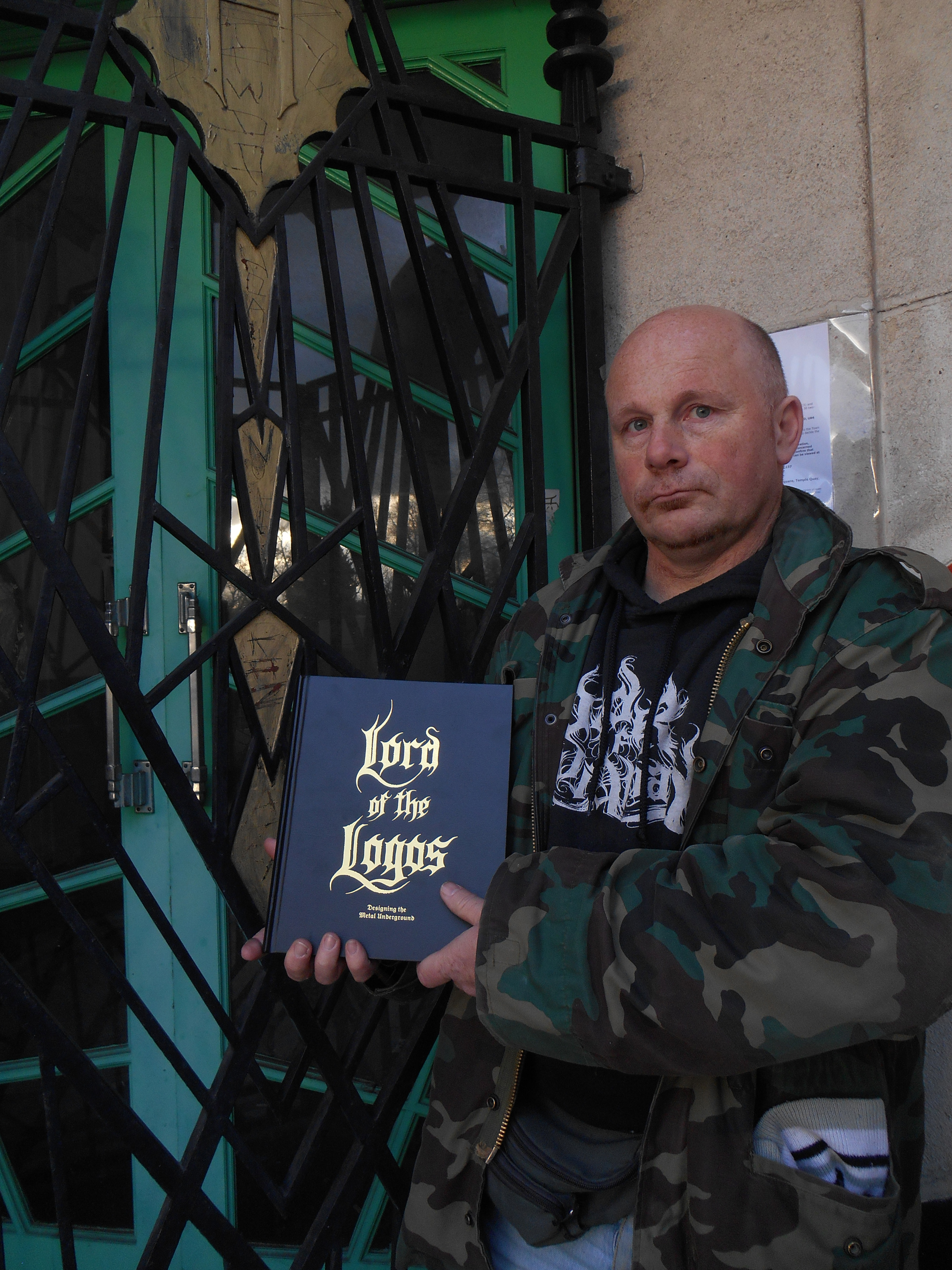
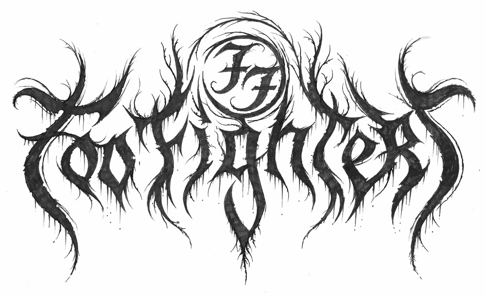
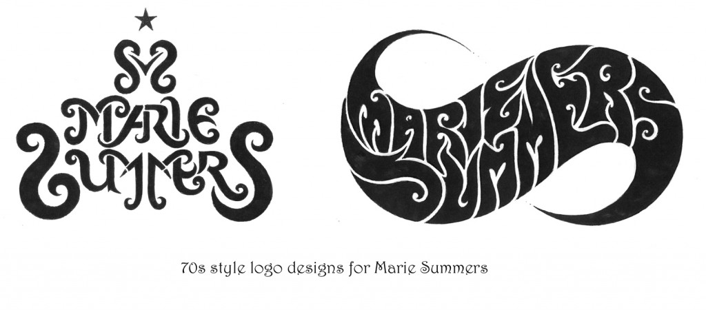
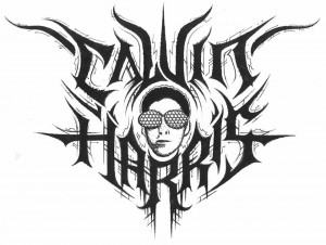
much bigger public. And at the moment I’ve been thinking about, just for fun, working on a Beyoncé logo, because she is so much talked about.  So there’s this whole series of pop culture logos, I did EastEnders, Coronation Street, Emmerdale, Shortland Street. So I had some real fun exploring the mainstream. But the metal public is always the most receptive to my work. It’s my public, it’s the one who collects my work. A lot of people who see my work who haven’t been acquainted with the metal scene say that it’s not something they would be going for. Or that it’s nice but it’s grim.

coronat

There was a time when the extreme metal underground was essentially a DIY business at all levels, but its growth, aided by that of the internet over the last two decades has taken your local extreme band from demos, fanzines and tape trading, to small indie labels, to world tours and ‘Norwegian Grammys’, with the concomitant rise of the oxymoron that is ‘big’ underground bands. No genre demonstrates this better than black metal; and it should be noted that the high profile black metal image that has evolved is in part due to the instantly recognisable work of Christophe Szpajdel himself. Classic 90s logos like his ones for Emperor and Moonspell set a style which is still widely imitated 30 years on.

emperor

As the world has changed, Szpajdel has changed with it, but although he puts in full-time hours designing logos, he still doesn’t rely on his art for his income, which means his work is, by the standard of graphic designers with his profile and pedigree, almost ludicrously inexpensive.

WOLVES LOGO

CS: “The cost varies, but really I am aiming for a fee of one hundred US dollars. Anybody who contacts me first must be prepared to pay my fee. This year I am also looking to introduce an hourly rate. I discussed this with some artists in Devon who saw my work, and they told me ‘you really need to concentrate on a contract. Send the client a contract that stipulates that there is $100 initial fee for the first draft; but the first draft includes a finalised logo. If they then want further drafts then you absolutely need to introduce an hourly rate.’ So I am working out those details soon.

old graves landscape

Bands who contact me now for a logo for free, I say ‘if you want a logo then I want to see the 50% deposit. And when I see the deposit in my PayPal account I will then start working on the logos. If I don’t have the deposit then I’m not going to make a move.’

So is the logo done just for fun, or out of enthusiasm for the subject now a thing of the past?

CS: No, because times like now [January], when it’s been quite quiet over the festive period so, I sometimes just dish out a logo to someone, to people who support my work, just to experiment and to exercise my freedom. There’s a woman called Natalie Corless who has posted a lot on my Facebook wall that she likes my logos so I did her an impromptu logo and she loved it. And so she posted and promoted my album on her timeline and she got me some clients! And this was a person who randomly added me on Facebook. And at the end of the day, she liked my work and she got me five clients, who paid $100 each. So these kind of random people who add me on facebook, they’re not as random as you might think.

Do you forsee a time when you will live from just doing your artwork?

CS: Well, I would love to. But since I’ve started charging professionally, I have observed a steep drop of the amount of clients who commission a logo from me. There are lots of other artists, for example Chris Horst, or Gragoth from Luciferium War Graphics. They offer packages. Chris Horst for example specialises in logos, but for $50 he does logos that include drafts, revisions, work on the computer, digitised, vectorised, coloured, all that; for just $50. Gragoth from Luciferium War Graphics, he is offering for $300, a complete package. Like it has album covers, banners, ad banners, website, myspace layouts, reverb nation layouts, logo, all inclusive for $300. And he is having a lot of success.

maries copy

But my work’s selling point is it is unique; it is absolutely handmade. I work in collaboration with some graphic designers to digitise my logos. Because now that I charge $100, my clients expect work exactly, precisely, rigorously, to their expectations. They expect the logo to be vectorised, digitised, they expect it in different formats; .PNG, .AI, Vector file, .RAR, .PDF, .GIF files, all the different formats.”

mavsab

One would think that, as Christophe is now (and has been since the 90s) a well-known name, that bands would request a logo in his trademark style (or one of them), but surprisingly this isn’t always the case…

CS: When I used to do logos in my own style they all got rejected. Now I listen to what the clients want. When they pay the deposit I would like the band to discuss exactly what they are looking for. And actually I want them to send me examples by other artists and not mine, so I can avoid repeating myself. I’m also in very close contact and have been doing quite a lot of collaborative works with a guy called Raoul Mazzero from Italy. He is an absolute genius. He actually helped me how to create outstanding logos, and how to solve the symmetry problems. He’s been a huge help, and we’re looking at a possible Italian show too.”

Is symmetry something you aim for in general?

CS: I actually have an automatic impulse to create symmetrical logos, but I have also done quite a lot of asymmetrical logos. But symmetrical logos are just natural to me. I find a symmetrical logo to be more outstanding, and to be more balanced.

xvarhnah

So what is a good logo to you?

CS: I think the readability of a logo is essential. A logo has to be readable, even in a small format. And I try to convince my clients and my customers that a logo needs to be readable. Not to be overly decorated, especially if it is going to be displayed very small on a poster or on the corner of a CD. On most of the logos I produce I am aiming for readability. And if the client wants a completely unreadable logo I am simply saying ‘why don’t we opt for several designs? Why don’t we think about doing a logo which is made of letters only, which is readable and then a more limited logo for t-shirts that can go more unreadable?'”

carrion

Do you have any interest in doing cover designs etc as well as the logos?

CS: No.  I’ve tried to do it and it doesn’t really come well. I found out that doing album covers is not my speciality. However, I did work last year on a mural in Exeter. This is something I wanted to experience. I love working outside, especially in the summer months. In the winter, I essentially work in my studio. But in the summer I’m working a lot outside.

murial

The mural is a rare Christophe Szpajdel work, not only because of the scale, but the use of colour.

mural

CS: “In my logos I do everything in black and white.  However, there are a few exceptions. For the 2014 Remembrance Day I did a logo with red poppies on it. [since this interview took place, Christophe also designed the beautiful memorial logo for David Bowie below also) Sometimes I like to share my thoughts through an artwork, like a logo. I find that logos come to me a lot better, it’s my vocation as an artist. I find that I prefer to put my hand into one pot, rather than to try to put my hand into a lot of pots.”

remembow

Although Christophe is known for his black and death metal logos, it would be a mistake to regard these as being in one single style; beginning in the 90s with the bold, spiky logos such as the classic designs for Emperor et al, but he also pioneered the naturalistic, organic, ‘spreading roots’ style logos now extremely widespread in the genre (I have chosen his logo for Grim as both a perfect example and a personal favourite) and latterly has turned to increasingly bold, primitive designs.

GRIM LOGO

He has also experimented with various alphabets and styles, a favourite of mine being his masterful and atmospheric Art Nouveau and Art Deco inspired designs.

artsnoovos

decos copy

CS: “I like to do Art Nouveau logos, Art Nouveau logos give fantastic ways for using the space, using space between the letters, rather than pure black metal old school logos, which generally look crumpled. And I think that these usual kinds of logos actually reduce the chance for a band to become well known. Sometimes it’s an ultra-radical kind of orthodox black metal band who wants only to release ten copies of their demo or something, but unfortunately I prefer a logo to be standing out, to be readable. It has to be readable at first sight, but at the same time it has to be outstanding. it has to be kick-ass and memorable, not just a bunch of letters put together, but a logo.

Is creating a simple logo easier or more difficult than complicated one?

CS: “When it’s a complicated and sophisticated logo I mostly get it right the first time. If it’s a simple logo, that is where the client will challenge me. Because in a simple logo, that’s when any imperfection will be seen. And the client will be the first to see it. And this is what I really love; logos to be incredibly easy to recognise straight ahead. [note; the logos Christophe lists here are not his own designs] Think about Gojira; I love that logo. It’s simple, it’s clear, and even if you see it very small, you recognise straight away; that is Gojira and no other band. Think about a band like Tool. They have a perfect logo because it stands out, it’s unique, and it’s appropriate. Or logos like Anthrax; it’s modern, it’s thrash, it’s simple, it’s distinctive, it’s unique. Same, think about the logo of Helloween; or the logo of Malice. Think about Bathory!”

Or indeed Emperor…

CS: “You see, when I did Emperor, they had a sort of logo they used with upside down crosses, and it was too black metal, I thought they needed something simple, and imperious. And I got it right first time. You know, you throw your first dart and you get it right in the centre of the target. Bam! Like that. It’s a logo which is at the same time simple, distinctive, useable in any size, which works in any size and format.”

And of course you now have your own logo…

CS: “Yes, I have the Lord of the Logos, which is my trademark, which is my book.”

lord logo book

It’s a beautiful book, have you plans for more?

CS: “Well, Lord of the Logos, is still available, it’s still sellng. I’m looking to release a second volume, which has a working  title of Ancient Modernism later this year. The title comes from a whole concept I’ve developed . The concept in tundo creation
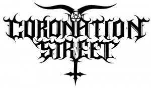
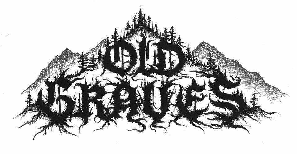
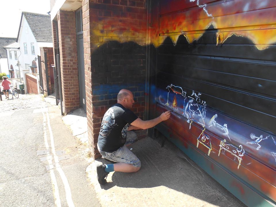
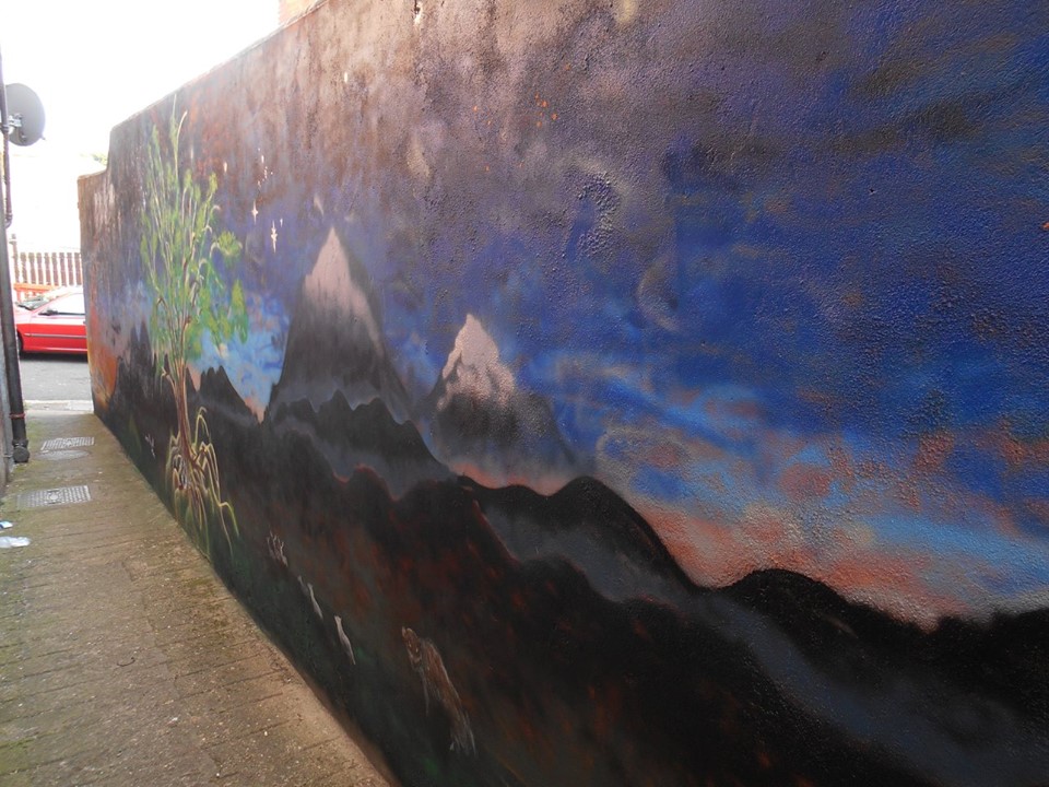
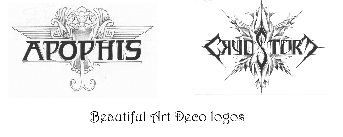
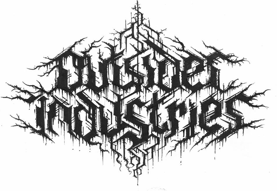
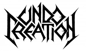
he new logos is a real travel through time and dimension. So there is a timeline, beginning with really primitive logos I have created. A band called Gau, which means ‘night’ in Basque, this logo is very prehistoric, almost as if it was drawn by dinosaurs. With these very prehistoric plants around, no crows, no wolves. Very prehistoric, almost reptilian, taken from a time there was no mammals, no birds, there were just reptiles and primitive insects; trilobites, and ammonites. And in fact I live in Exeter, by the Jurassic coast, so you can send yourself spinning on a time travel of 200 millions years. So we go from these very simplistic logos, like Undo Creation from Georgia, up to the most sophisticated logos; art deco, or futuristic logos, like I did for Outsider Industries. Or Haunted, an Italian project.

outsider

It seems like, although drawing logos still isn’t your ‘day job’, it’s definitely your main focus…

C.S: “I’m trying to keep myself at the age of 45, forever doing logos. The main reason is being single; all the time being single, so I can concentrate 100% on my logos because this is what gives me happiness. I have never been married, never had children; my first child is that book, Lord of the Logos. And that child is growing all the time, it has been in many hands, and it’s being appreciated by people who have never been listening to metal. Lord of the Logos is really only focussing on what inspires me; it’s photographs and logos. And there are some medieval aspects, but mostly it’s nature. All the photos have been taken by myself, and the logos are all my own work and it reflects the places that have inspired me. It includes many parts of Devon, Dartmoor, Southampton, Oregon, California, south of France, Belgium. Quite a lot of places that I have visited. And last year there was also the release of the compendium, Logos from Hell by Mark Riddick, and I’ve got something like 200 of my works in there; no other artist had 200 logos collected in one compendium book. The book is very heavy.

LOGOS_FROM_HELL_Cover

Collecting works into books creates a great  reference work for graphic artists, but does it inspire you to look back at your old stuff?

CS: “I have been at the moment making a complete retrospective and over the next while… I have been looking to post on Facebook for the first time logos that I did from 1992 to 1999. So a real retrospective that includes some logos like a band called Eternity of Darkness that I did in 1992, something like that; that was a UK band. And Stone Circle. We’re talking about very, very old stuff from the 90s…

What were the logos that first got your attention? In the 70s there were some classics like Kiss…

Yeah; the original [Paul Stanley designed] Kiss logo with the SS style lettering; it’s just exactly the kind of logo that got me as a kid. I started listening to Kiss in 1977. I also loved bands like The Cure. I remember going to see them when I was 12 and it was like going to enter a completely forbidden country. When I went in ’82 it was all the ‘post-punks’ but when I saw them again in ’87, that was the time of all the Goths. There were just loads of Goths; the people you just couldn’t see in the daytime. You just couldn’t see these people outside of some special place like Camden. In Camden you could see all these illuminated people with a vivid imagination; and I am one of them, I definitely consider myself as an illuminated eccentric with a vivid imagination.

 At this point do you have any idea how many logos you’ve done?

It would be easily a good ten thousand. And there are quite a lot of logos that I unfortunately parted with the originals. Because in many cases I’d be drawing on the go and just hand the drawings over to the client. Like a band from Italy called Deathraid, who were a little bit in the vein of the oh-so-legendary Necrodeath…

…brief interlude as we discuss Necrodeath’s Into the Macabre and Christophe reveals that, however wide his tastes and artistic ambitions, his roots are most definitely in the underground metal scene of his youth:

CS: “Into the Macabre very memorable, it’s very simplistic, its raw. It’s got that vibe. The songs are just basically keeping you on your toes. It’s a great blend of thrash, speed metal with that slight black metal edge, but at the same time it’s very insane, it’s very haunting. It’s the kind of album if you hear it once you will remember it for the rest of your life.”

Well, it was recorded before all the genre boundaries were really established…

CS: “Yes, it was just straight from hell metal. And that was what I adored.”

Last year, Christophe’s iconic Emperor logo became, for the first time, a source of something other than pride, when it became the basis for some joke Christmas jumper designs posted online by the Foo Fighters; which still rankles, evidently…

CS: That drove me absolutely ballistic. And I could have sued them, but I had a much nicer idea. I came up with a Foo Fighters logo designed by myself, which has a black metal vibe, but with the FF of Foo Fighters and elements of the Foo Fighters logo but had a black metal, but still readable, Emperor-esque inspiration, without being a barbaric cut-paste like this pathetic Foo Fighters Emperor-esque logo which had been done on a computer.

foo

A lot of people brought it to my attention and there was much going on on my Facebook wall that I finally said I’m gonna ram it down and post the logo. This is how the Foo Fighters logo should be! Woe to the guy who ripped off my Emperor logo and made a right pig’s ear out of it! Of course I had some people who told me I should be honoured. Well! Honoured of having my art being disfigured, desecrated, stolen and mistreated like that? Bollocks. If they really wanted to have an Emperor tribute logo they would have contacted me! They wouldn’t have contacted a lousy, so-called graphic designer, who made this terrible pig’s ear out of it, and on this awful, terrible, shameful Christmas jumper!

So what is  the legal situation with the Emperor logo? Do you have any rights or does the band just own it?

I still have the right to exhibit. I had a massive exhibition; last year started great. I had the Marks of Metal exhibition in Odense in Denmark. There was an encounter between me, who did the Emperor logo and Kristian Wåhlin, Necrolord, who did the Emperor album cover. We actually brought the actual works, and we were there with the works together, making the same kind of statements. We both did these works when we were just Emperor fans, when we were young. I was exactly twenty when I did the Emperor logos, I was still doing my studies and I did it as kind of a hobby. When I did that logo in January 1991, during my first year winter exams, I would never imagine that Emperor would become so big. It wasn’t until 1994 and In the Nightside Eclipse that my name became big. That was when my name spread in the underground and became known among the metallers.

emperor_logo

How do you feel about that logo now? Do you still like it?

Yes, I love it still. It’s become one of the timeless classics. Think about Motorhead, think about  Iron Maiden, think about Abba! Tom Jones, he’s still going on. The Foundations; Build Me Up Buttercup. These are artists and songs I loved and still love. Think of Elvis Presley; these are timeless classics and the Emperor logo is one of those classics. And it’s one of the few logos that is still unaltered after 30 years. And when people meet me they say ‘you’re the Emperor logo guy!’ Of course there lots of  other bands from the 90s whose logos I did; but Emperor is the one that stands out.

Do you feel your focus as an artist has changed much since 1991?

CS: “Well, in the 90s I wouldn’t say that I wanted only true black metal exclusively, but there was no way on earth that I would have been doing the logos for Kim Kardashian and people like that… I do wonder where those will take me…

jamol

Links:

Facebook

Devon Artists Network

Google Plus

Contact: christophe.szpajdel@gmail.com