This article (like several others) came out of a conversation with my friend Paul, and he writes better than I do about 80s horror (and many other things) at Into the Gyre
The 1980s was, famously, the decade when pop culture became corporate, encapsulated in the omnipresent corporate or corporate-style logo. Obviously, both corporations and logos long pre-dated the 80s, but it was in that era that it became an all-encompassing ideal. In the 1960s, the first really modern teenagers* had written the names of their favourite bands on their school books or bags; twenty years later their children were doing much the same thing, only they were painstakingly copying logos from album sleeves or tape inlay cards.
* 1950s teenagers were the first, but they were pioneers; the 60s generation was the first to grow up with the expectation of being teenagers, with all that entailed in terms of pop music and rebellious teenage behaviour
Corporate gloss was everywhere. As a young horror fan in the mid-to-late 1980s, one of the things that made the notorious video nasties of the previous generation (Last House on the Left is possibly the most representative example) seem so alluringly grimy and disreputable was their lack of slickness. 1980s horror franchises – in themselves a symptom of the decade of accelerated capitalism – even ones with their roots in the 70s independent cinema boom like Halloween – had logos. They had mascots like Freddy and Jason and Pinhead, they had rock songs on the soundtrack – they were corporate and – to young teenagers at least – they were cool. There was no way to make a grotty, un-theatrical, special effects-free film like I Spit on Your Grave seem cool. There was an attempt to make a franchise out of the Texas Chain Saw Massacre, but Leatherface wasn’t iconic in quite the way that Jason was, let alone an almost cartoon character like Freddy Krueger. Murderous, inbred yokels in rural Texas might well be scary but they weren’t easily assimilated into glossy hair metal videos.
The publishing world was no different. In the fantasy realm, the hippyish typefaces and sometimes grotesque psychedelic imagery of the great 60s and 70s paperbacks were replaced with foil letters in block type and tastefully elevated landscapes. ‘Tasteful’ is of course a relative term and within a decade, that utterly 80s look – a publishing counterpart to magnolia painted walls and a beige Laura Ashley aesthetic – which married an almost clinical sense of restraint, as if embarrassed by the childishness of elves, wizards and dragons, with bold, business card-style, metallic sans-serif lettering – would seem just as trashy in its way as the more florid 70s fashions had at the time.
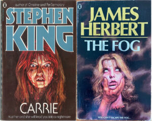
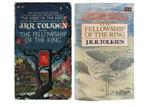
But, unlike fantasy fiction, where the biggest name in the 80s remained the late J.R.R. Tolkien, the horror genre had star writers who transcended the genre and became part of the pop cultural zeitgeist, Most of the ‘big names’ in 80s fantasy, like Terry Brooks and Stephen R Donaldson, were writers whose key works belonged firmly to the post-Tolkien 1970s and never escaped a (very big) fantasy audience. Horror was different. Like the fantasy genre, its biggest names – Stephen King (everywhere) and James Herbert (especially in the UK, though his books sold millions worldwide) – had had their first successes in the first half of the 1970s, but as the 70s evolved into the 80s, both their work itself and the way it was packaged began to align with the spirit of the age.
The fanbase for horror broadened until the big horror novels became the big airport novels and big supermarket novels and the basis for successful Hollywood movies. The books themselves became bigger and more cinematic (but I talked about that here so won’t again) and their design more stylish, until they resembled the movie posters of the time; but with one major difference. There were of course iconic directors in the 80s, but even the biggest of them – Steven Spielberg, say, or Martin Scorcese – naturally didn’t dominate the posters for their films the way that Stephen King or James Herbert did on their books. In that respect, the authors were more like a combination of director and star actor, but whereas the blockbuster actors – Stallone or Arnold Schwarzenegger or even Tom Cruise were only one element, albeit a dominant one, in their star vehicles, with the books you knew that whatever you got would the real, unadulterated author, unless you happened to be a fan of Virginia (“VC”) Andrews, but she was a special case back then.

The extent to which it was the superstar authors, rather than the books themselves, that were the selling point, can be seen in their evolving covers. After a decade of disparate designs and variable artwork, often not especially horror-centric, publishers like New English Library, Futura and Star began treating books by horror authors as franchises, each with their own logo and aesthetic. Stephen King and James Herbert, to stick with the big two, demonstrate contrasting, but very 80s horror alternatives.
James Herbert – who, with a background in advertising and art direction, took a direct interest in how his novels were packaged – went with the 80s version of ‘classy’ as epitomised by mid-priced boxes of chocolates; a restrained palette dominated by either black or white, with lettering in gold or silver foil. They were eye-catching, moody and, to a teenager, adult looking.

Stephen King’s UK publishers (including Herbert’s publisher N.E.L. – but frustratingly, including several others; keeping one truly consistent image annoyingly out of reach) clearly realised that the selling point – the brand, in the parlance of the times – was King himself. To that end, the actual cover illustrations and even the prominence of the novels’ titles, took up less and less space, while the author’s name was treated to something like the logo of a metal band, and was big enough to be spotted across a crowded newsagent or bookshop. Sometimes the author’s name was in foil, sometimes it was embossed, but for at least a few years the covers of his main series of novels – as with James Herbert’s – had the uniformity of a corporate identity.

Where the genre’s biggest stars and their publishers led, others followed. All of the big names of 80s horror tended to follow either the King or the Herbert approach. After wildly variable and sometimes lamentable 70s editions, Ramsey Campbell’s books took on the sleek, Herbertian image. American blockbuster authors like Dean R Koontz and Peter Straub’s books tended to follow the King blueprint.

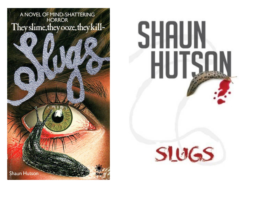
Gore authors had a kind of niche of their own. The early books of the UK’s most notorious horror author of the era, Shaun Hutson, played down the author’s name in favour of a gaudy movie poster look with the titles in a distinctive ‘slug trail’ font – and his US counterpart Richard Laymon’s works were very similarly packaged (the covers above both look like they could be the work of Danny Flynn, mentioned here, though I haven’t checked). As the sales of both authors increased during the boom years of the 80s, their packaging became – like their work – relatively more sophisticated. In the UK, Sphere mimicked the classy Herbert look for Hutson’s later 80s novels like Assassin and Victims, with the author’s name (embossed, in foil) becoming more of a focal point, while Laymon’s name became almost as logo-like as Stephen King’s.
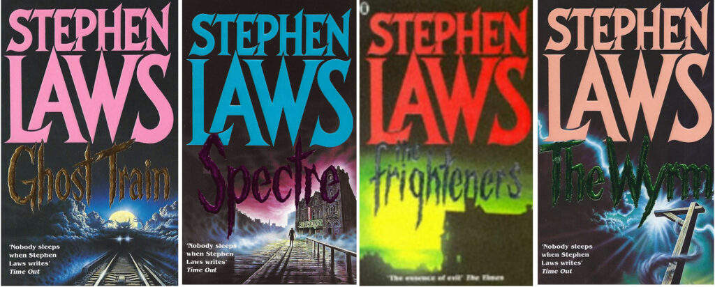
Laymon was far from alone in this. The brand-like identity of Stephen King, and the sheer volume of his sales, meant that the classic ‘logo’ look of his books was highly influential, to put it mildly. The range of King-influenced cover art ranges from the definitely ‘post-King’ 80s covers of authors like John Farris and Rex Miller, to the frankly imitative NEL covers for Stephen Laws, whose 80s books bring to mind the legal convention of the theoretical “Moron in a hurry” cited in cases of trademark infringement. Said moron would not necessarily have a bad time if they accidentally bought a Stephen Laws novel, any more than someone accidentally buying something that looked like Coca-Cola would find themselves with an undrinkable alternative – but they would quickly know they weren’t reading Stephen King.
In almost all respects, Clive Barker was the outsider in the world of 80s horror – most definitely of it, but not defined by it. His debut novel The Damnation Game was initially packaged as typical, mid-80s horror stodge but it graduated, as his reputation grew, to Stephen King style packaging, even as Sphere Books simultaneously took the bold step of publishing his Books of Blood short story collections with Barker’s own fantastical (and in come cases gory) paintings on the covers, immediately putting the author in a dangerous-looking category of his own.
Clive Barker’s books appropriately looked both more graphic and more outlandish than the usual blockbuster horror authors’ works. From then until the end of the horror boom (which died around 1990-’91) his work coexisted in the two camps of mainstream and (for want of a better world) alternative horror. The packaging of the 1989 first edition of his short novel Cabal (filmed as Nightbreed) is pure, commercial 80s design; it looks more like a movie poster than the actual Nightbreed movie poster and is complete with logo-like title and gold foil for the author’s name. But around the same time, his dark fantasy masterpiece Weaveworld featured a more imaginative, sophisticated style, taking its lead from the Books of Blood. Weaveworld had a more formal design sense that was flexible enough to be applied to the rest of Barker’s oeuvre, so that when the horror bubble burst and everything 80s suddenly looked as cringingly tacky and dated as mullets and shoulder pads, Barker’s brand alone among his horror peers easily made the transition into the new decade.

From 1990 until at least until the turn of the millennium, Stephen King’s publishers experimented with everything from tasteful minimalism to gaudy dayglo colours, the only constant being the prominence of the author’s name on the covers. The sense of immediate brand recognition dissolved around the time of The Dark Half and has never been quite as strong since, and an 80s Stephen King collection still has a satisfyingly coherent look that isn’t matched by later editions. James Herbert mostly stuck with the ‘classy’ look of his late 80s books but with a sense of diminishing returns as the titles and cover images became less confrontational and the whole look less fashionable.
In the 90s, much of what had been packaged as full-blooded horror tended to be given more of a fashionable ‘urban thriller’ look, just as in cinema, the Freddy and Jason franchises limped to an ignoble (if temporary) end, while Hannibal Lecter emerged as a supposedly less cheesy horror villain. Horror movies were boring and passé, and when they were revived half a decade later they would be drenched in irony, allowing movies like Scream and its imitators to peddle the same tired, threadbare ideas that had killed the genre one more time, under the guise of a clever joke. Nobody wanted hair metal on their soundtracks anymore. It was a new age.