7.6 billion mirrors – the value of art

Aged 20/1586
James 6/By Grace of God King of Scotland

Was it a cold morning in Edinburgh in 1586 when James VI, only twenty years old, very aware of his status as a divinely-appointed monarch, but with already a lifetime’s experience of human nature and earthly politics, sat in front of Adrian Vanson to be painted? Was he nervous? His watchful eyes suggest not, but his position, though finally secure, probably didn’t feel very stable; just three years earlier he had been imprisoned by those ruling in his name, and this year, although he signed a treaty of mutual defence with England against the possibility of a Catholic invasion, his mother who he had succeeded, remained in England, alive and imprisoned. Was Vanson nervous? Or was it just another job? The King wasn’t always noted for his good temper, but the artist, who had come to Scotland from the Netherlands via London (where he had an uncle) already knew James, and had first painted some pictures for the young King in 1581, before his imprisonment and, in happier circumstances, the year before this portrait, had painted a more glamorous and light-hearted portrait of the King to be taken abroad and shown to prospective suitors. But this picture, sombre, stern even, is about power; James 6th by the grace of God King of Scotland. When we look at this painting, at this sulky looking young man, we are making some kind of connection, looking through the eyes, albeit via the hand, of a Dutch man who died around 420 years ago. The painting – even if by the standards by which art is usually judged, it’s ‘not great’ – has a personal value, one human being, recorded by another, as well as a cultural one. It tells us something about fashions, lifestyles, the way a king could be depicted in that country, in that period (for all his divinity he is not an iconic figure), class structures, religion – but what is it “worth”? What is any work of art worth?
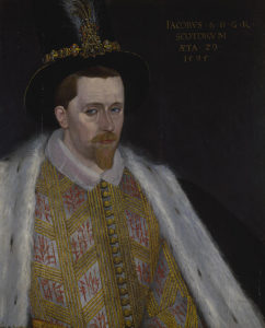
James again, when both he and the artist were a long 9 years older

Leaving aside metaphorical, metaphysical or aphoristic answers, or going into a much more long winded but possibly worthwhile conversation about what art is (I’m going to say it’s a deliberate act of creation, but even that is arguable), let’s assume we know what art is. Googling ‘art definition’ initially brings up five presumably definitive and certainly iconic pictures, the Mona Lisa, The Starry Night (both as famous as their creators, pretty much), Les Demoiselles d’Avignon (whose creator – Picasso – is more famous than the painting), The (or rather Leonardo’s) Last Supper and A Sunday Afternoon on the Island of La Grand Jatte, which I think is probably more famous as an image than a title, and the image is more famous than its creator Seurat.
What are these paintings worth? I’m sure facts and figures are available, but this is not – despite the age of some of the paintings, about intrinsic worth; I imagine there is a basic going rate for an early 16th century Italian renaissance portrait on panel (and so forth), but that has little to do at this point with the price of the Mona Lisa. The painting would be just as good (or just as whatever you think it is) if the artist was unknown, but the value has – and always has had – a lot to do with Leonardo da Vinci and the perception of him as more than just someone who painted good portraits
.

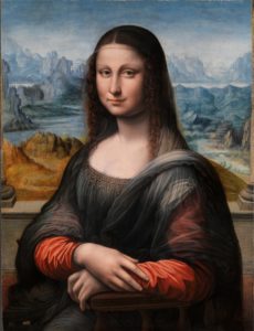
a (but not “the”) Mona Lisa, an early copy probably by one of Leonardo’s apprentices

Separating the art from the artist is always a difficult and controversial subject, but should really be easier in the visual arts that almost any other field. Yes, artists have their own ‘voice’ or visual language, but that is not the same as reading their actual words, or hearing their actual voice; and yet – because, I guess, of market forces, artists are routinely known and valued above and beyond their works and those works – even their doodles and fragments – are valued accordingly. A scrawled caricature in a margin by Leonardo (or Picasso) can be “worth” many times what a highly finished, technically brilliant oil painting by an unknown artist is. This disconnect happens because although art history is human history, “the art world” as it has existed since at least the 19th century is more like horse racing – take away the money and what you have is a far smaller number of people who are genuinely interested in how fast a horse can run.
Which is fine – but the question of what a painting (for instance) is “worth” has become the way art is engaged with popularly; somehow art, unlike sport, has never earned its own daily segment on the news and really it only appears there when the sums it raises are enormous (Leonardo’s Salvator Mundi), the sums lost are enormous (theft, fires, vandalism), or it’s part of a story that’s interesting in itself (Nazi art hoards, previously undiscovered ‘masterpieces’ etc). But the veneration of artists above art – now at the very peculiar stage at which a painting “after” (that is, not by, and possibly not even from the same era as) a famous ‘old master’ can be worth a far higher sum than a genuine painting by a lesser known ‘old master’ – masks the true value of art, which may be cultural, but is ultimately always personal
.
Even without any knowledge of the King James or his life, we are able, if we can see –  just by being human –  to make certain assumptions about the kind of person he was, and what he may have been thinking or feeling on that day in 1586. This kind of empathy is an act of the imagination; if we are mind-reading it is ultimately our own mind we are reading – but no more so than when we meet eyes with a stranger on the street or on a train. And if looking at Vanson’s King James is – because we can find out these facts – a connection with both an immigrant living in what must have in many ways been an unfamiliar country, and with a young man who had recently attained some kind of power, not only over his own life, but over a country, at the cost of his mother, then what of a painting like the Mona Lisa? It is, regardless of how compromised it has become by fame, monetary value and endless theorising, a link with the mind and ideas – and hand – of Leonardo and a kind of communication with the sitter herself. She was probably Lisa Gioconda, she may have already been dead, but although I stand by all of the above, what I seem to have suggested is that a painting is a kind of code to be broken or a museum to be explored and unpacked. These things enrich our understanding of or connection with a painting, but they don’t make it. What makes art so fascinating – but also why it doesn’t have five minutes on the news every night – is because it’s so individual. It’s (VERY) possible to not care in the slightest about the outcome of, say a rugby or football match, but the final score is the final score, regardless of how anyone feels about the quality of the game or the skill of the players. It would not be satisfactory somehow to have a football match where no points were awarded and the outcome of the game depended on how you feel about it. But in art it is completely respectable – and I don’t think wrong – to say, (To paraphrase the great surrealist painter Leonora Carrington); if you really want to know what the Mona Lisa’s smile means, think about how it makes you feel.
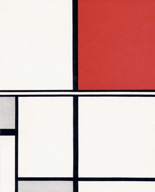
Composition in White, Black, Red and Grey (1932) by Marlow Moss

This might seem like reducing art to the level of ‘human interest’, but what else is there? The choice of figurative paintings with a possible narrative element is a matter of taste and makes the human element unavoidable. But if we feel intense emotion when looking at a Mark Rothko painting, a sense of peace and calm from a Mondrian, Marlow Moss or Hans Arp picture, or exhilaration in front of a Peter Lanyon work, the fact remains that ‘we feel’ (or ‘we don’t feel’) is the common denominator. Viewers through the ages who have detected echoes of divine order and harmony in the works of Piero Della Francesa or Fra Angelico have only definitely detected them with any certainty within their own perceptions, which is not to say that they aren’t feeling something the artist himself felt. There’s a philosophical, ‘tree falling in the woods’ point here; is Van Gogh’s ‘Sunflowers’ a work of emotional and artistic intensity after the gallery lights go out? Or is it more like a kind of magic spell or booby trap, triggered only when a spectator is there to observe it?

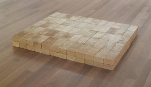
That said, figurative art, especially portraiture, is – however many layers of information are contained in it – relatively easy to ‘understand’ on a basic level; ie if we can see, we can see what it is. It is the understanding and appreciation that remains entirely individual and subjective. Conceptual art – shockingly still around in much the same forms as it has been since the 60s – is, despite its apparently interpretation-inviting name, less transparent. This means that, unlike something we instantly recognise, it’s – initially at least – only as powerful as its visual impact. And in fact, whereas familiarity invites interpretation in traditional art, it tends to – on a popular level at least – repel it in conceptual art. The controversy surrounding classic media frenzy conceptual pieces like Carl Andre’s pile of bricks, or Tracy Emin’s unmade bed is because everyone knows exactly what a pile of bricks, or a sleeping bag or a bed is, and they don’t feel the need or desire to think further about it and if they do they feel – no doubt wrongly – that they are putting more thought into it than the artist did.
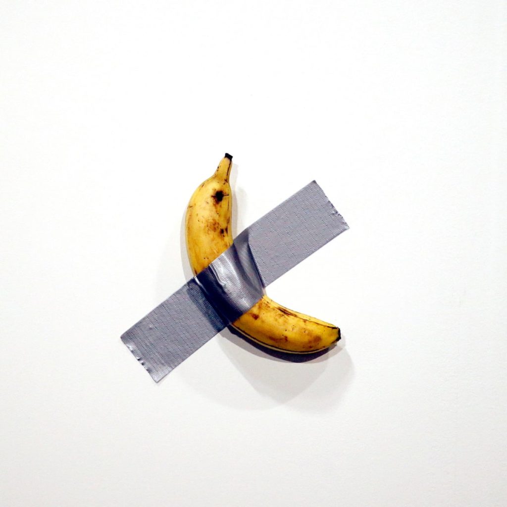
Comedian (2019) by Maurizio Cattelan
Carl Andre – Equivalent V (1966-69)

That is the ‘philistine’ response and it’s easy to have sympathy with; personally, I don’t mind wondering what a conceptual work means, but if I get no kind of emotional or cerebral response from looking at it in the first place then I’d rather the artist had just written their ideas down. This is me and my deficiency though – if Maurizio Cattelan put his heart and soul into taping that banana to the wall – or even if he just enjoyed doing it – who am I or anyone else to devalue that? And if whoever paid that much money for it is getting some similar experience, or just the satisfaction of being the owner of the most expensive banana in the world – then that’s hard to argue with too.

Portrait of an unknown woman by an unknown artist c.1725

I don’t think it devalues art – quite the opposite – to think of it as a form of communication between individuals, even if as mentioned above, it is really communication with the one person you will ever know with any certainty – yourself. What I seem to be saying (which I may not entirely agree with) is that art is a mirror. Take this beautiful painting from around 1725 by an unknown artist of an unknown lady. To me, this is a real connection with this unknowable person – but again, only as unknowable as any face that passes you in the street never to be seen again – she was a real person, sitting in a room, around 300 years ago, probably wearing something she liked or that told the world how she wanted to be seen, being painted by someone – and by 1725 it could have been a man or a woman – with whom they may have been engaging, impatient, chatty… We can only guess and extrapolate from the picture. That extrapolation will be different every time depending on the viewer and their own knowledge, not just of history, but of people and experience. If 7.6 billion people look at the picture it becomes in essence 7.6 billion pictures, 7.6 billion mirrors.

That is not to say that the picture is ‘better’ than Cattelan’s banana. If I came across the banana taped to a wall anywhere except an art fair would I see it as art? In a way yes, in the sense that it is literally artificial – not the fruit itself, but its location would clearly be a deliberate, human act and not – as a nail in a wall might be – something that could feasibly have a purely utilitarian meaning. It would be puzzling – far more so in fact that in an art fair where the (surely expected by the artist) first reaction of most non-art world people would surely be the eye-rolling ‘so this is ‘art’ is it?’ Whether it would be intriguing, or thought-provoking seems less likely, except insofar as provoking thoughts like ‘who put that banana there and why?’ Which I guess is perfectly valid – and in its own way a genuine connection of the viewer and artists’ minds, though not something that would probably take up much brain space after the initial wondering. But then, many – even most, people (whether or not they would approve of it as art vs the banana) might just as well look at the woman in her fine dress 300 years ago, or the young King James, and pass on without even wondering anything at all.

a true state – cut and paste and the art of collage (Edinburgh, summer 2019)

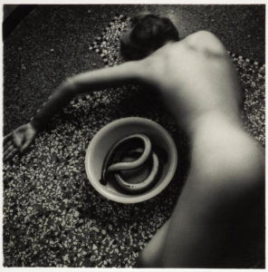
Francesca Woodman, Untitled (1977)

2019 has, in many ways, not been a good year so far. But this summer, the National Galleries of Scotland had (well, has; they are still on) three particularly outstanding exhibitions that brought a bit of light and intelligence to a period of more-than-usual stupidity. At the National Gallery itself, there was the excellent, eye opening and brain-frying Bridget Riley exhibition (closes 22nd September), at the National Portrait Gallery the superb Self Evidence (closes 20th October) in which Francesca Woodman’s tiny, intimate, self-enclosed photographs vibrate balefully in their little corner, overshadowing (for me) the also (but in an entirely different way) intimate and at times frankly challenging monumental works of Robert Mapplethorpe* and, to a lesser extent, the brilliant but (I guess appropriately) don’t-quite-fit-in Diane Arbus portraits of the lives of people marginalised and made invisible by mainstream culture.

*though the Mapplethorpe pictures were the ones that moved me the least, they did provide the priceless spectacle of parents hurrying their curious kids past the notorious 1978 Self Portrait With Whip. They had been warned!

But for me, the highlight of the National Galleries’ summer programme is Cut and Paste: 400 years of Collage at Modern Two (closes 27th October).

Thanks to its inclusive definition of collage (which covers photomontage, traditional collage, plus bits of decoupage, pressed plant samples and even quilting) as well as its historical scope, the exhibition manages to be both focused and wide-ranging, and also (I found) surprisingly moving. What collage does, or at least amplifies – perhaps paradoxically given its use of found/ready-made materials – is that aspect of art that disappears most quickly in reproduction; the hand of the artist. This is art not only as a reflection/projection of culture but one that includes material culture itself.* There is, sometimes regardless of the picture/object, a poignant quality that comes from the materials used, in a way that doesn’t happen with paint, unless you are the kind of conservator who can isolate pigments used to specific periods (I’m not, unfortunately).

*I don’t think this is just pretentious bullshit; but you never know

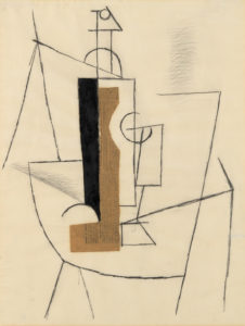
Pablo Picasso, Bottle and Glass on a Table (1912)

I’m getting ahead of myself here, but a seminal collage that makes an appearance in the exhibition, Pablo Picasso’s Bottle and Glass on a Table (1912) is a classic/typical Picasso cubist/spatial experiment, but the use of newspaper – a very specific, dateable piece of ephemera (from Le Journal, 3 December 1912) – gives the work, instantly and inherently, a dimension largely absent in conventional painting. The feeling that the collage is both artwork and artefact; literally as well as figuratively multi-layered, makes a case for collage as a distinct and special art form, a feeling echoed by the Scottish artist Eduardo Paolozzi (represented by some outstanding works in the exibition), for whom the form offered clarification, where formal art training raised problems and questions: “Unlike the world of school where the universe was systematised in a certain order, the reassembly of this disparate material reflected a true state, both autobiographic and dynamic.” (quoted in the exhibition catalogue,  p. 126)

So anyway; the exhibition is arranged chronologically, in the usual Modern Two layout; in various rooms, up the stairs, through the corridors etc, always I think a layout that makes for an engaging, surprising way of looking at art. Partly deliberately (there were too many people in the first room), I went around the exhibition in reverse chronological order and in retrospect that seems like a good decision. This meant that the exhibition opened with the Chapman Brothers’ The Disasters of Everyday Life (2017), a spectacular-looking wall-like object consisting of 80 of Goya’s horrific etchings, The Disasters of War, with of course added bits and pieces, sometimes powerful, sometimes deliberately absurd, I think (though I’d have to go through again the other way) it serves better as a kind of abstract for what is to follow than it would as a conclusion, where peering at a lot of small images might have seemed a bit anticlimactic.
I’m not going to mention every picture in the show, though I can’t think of anything that doesn’t deserve a mention. The first thing to have a major impact for me was Lucy Williams’ 2015 Crescent House, as much a piece of model making as a collage, a strange, small scale (just under a metre long) recreation of a bit of postwar architecture, but simplified and made more colourful, giving it a feeling of harmony almost like a kind of 3D Mondrian.

Lucy Williams – Crescent House (2015)
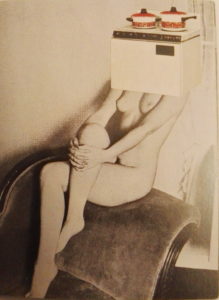
Linder – Pretty Girl (1977)

Crescent House captures something of the intended optimism of the postwar new town planning that’s most often associated now with neglect and urban decay. I don’t know if it’s a generational thing (Williams is around my age), but for me there was something powerfully bittersweet about the feeling of an abandoned, never-quite-attained future, heightened by the realness of the work as an object.

The aesthetic of Crescent House – though that is far lighter in tone – makes me think of the late 70s work of Linder (Sterling), another exhibition highlight. Although similar in its reference points to the pop art collages of Richard Hamilton a couple of decades before (sadly his iconic 1956 collage Just What Is It That Makes Today’s Homes So Different, So Appealing is not in the exhibition, though they do have a nice work by him, Desk from 1964), the feel of Linder’s work is far darker (it makes me think of the confrontational industrial work of Throbbing Gristle and COUM Transmissions around the same period) and the satire more pointed. Works like her Pretty Girl series(1977) exemplify a particular approach to collage. Using the detritus of everyday life; magazines, posters, advertising, it became a way of embodying in the art a criticism of the culture that it’s a reaction to as well as a product of. It’s a feminist criticism of the objectification of women that uses already depersonalised women (part of the problem) and merges them with actual ‘objects of desire’ from a patriarchal culture that above all else believes in commodification for its own benefit.

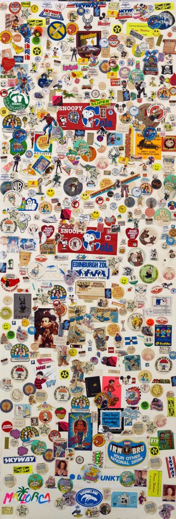
Craig W. Lowe, Bedroom Cupboard door covered with stickers, 1987-1997

Thanks to the exhibition’s open-minded and inclusive approach, there are some unexpected revelations (but aren’t all revelations unexpected? I mean, that’s obvious). While Craig W. Lowe’s bedroom cupboard door covered in stickers c. 1987-1997) may appeal most as nostalgia, the inclusion of Jamie Reid‘s original Sex Pistols Never Mind The Bollocks cover collage (1977; copyrighted image so I’d better not share) opens realms of not-previously-considered information (at least to me) about one’s record collection. Firstly, the collage is black and white, and secondly, it isn’t just a picture or a ‘file’, it’s an actual thing. Like, presumably all album cover art (and book cover art etc) before the digital age, the NMTB cover in all its yellow and pink (or pink and green) glory, taken for granted forever, is not a picture, it’s a photograph of a picture. In its final form it’s been overlaid with colours, but that object there on the wall in Edinburgh is the thing itself. A strange feeling, like looking at the inscription on a ten pound note and considering that it is a representation of something, rather than ten actual pounds.

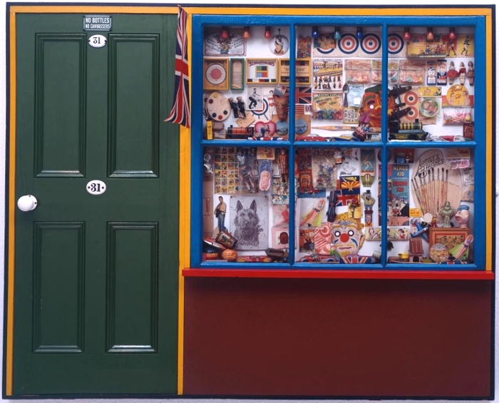
The Sex Pistols cover primes the viewer (at least the viewer going through the exhibition backwards) for the various bits of Peter Blake’s Sgt Pepper’s Lonely Hearts Club Band cover that are on show – and, great though they are (and I like Sgt Pepper quite a bit more than I like Never Mind The Bollocks), without that priming, the Beatles items wouldn’t have the same impact; perhaps because the cover itself is clearly a photograph of objects and cut-outs and seeing them is very cool but not really revelatory, the whole is too familiar and iconic to give the frisson of a moment captured. In fact, Blake’s superb, possibly slightly twee The Toy Shop (1962) is a far more vivid time capsule; clearly pointing to Sgt Pepper, its a conglomeration of bits and bobs familiar to children of the 60s – but also to children of later generations as belonging to the same family as the bits & bobs of their own youth (in my case, comics, football stickers, sweets, TV tie-in toys (He-Man et al), but also the odd antiquated throwbacks that still existed, like bows and arrows and balsa wood or polystyrene gliders which came with a weighted plastic propeller so they flew when thrown – do they still make those?). It’s hard to imagine that there will be a generation that can’t relate to The Toy Shop at all, however virtual entertainment becomes, kids will always like stickers.

Peter Blake – The Toy Shop (1962)

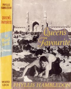
But Blake’s pop art nostalgia – powerful though that is – is one of the few purely positive and joyous post-war works in the show. More typical are the mischievous collage book covers made by Joe Orton and his partner and eventual murderer Kenneth Halliwell. These were put on library books and returned to the library – an act that eventually cost them a six month prison sentence – and they exemplify the sense of the significant, perhaps subversive and illogical accident that drew the surrealists to collage a few generations earlier.

Kenneth Halliwell & Joe Orton – collage on library book cover (c.1960-2)

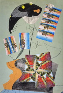
For the surrealists, collage was almost a manifestation of the galvanising quotation from Lautréamont’s Les Chants de Maldoror (1869) where a boy could be described as being “as beautiful as a chance meeting on a dissecting table of a sewing machine and an umbrella.” This aspect of surrealism is brilliantly captured in Max Ernst’s gothic ‘collage novels’ (one of the most exciting inclusions in the show is an unpublished picture from his 1934 collage novel Une semaine de bonté) as well as in beautiful works by Toyen and some of the collaborative exquisite corpse collages made by André Breton, Jacqueline Lamba and Yves Tanguy, where each artist could only see their own part of the work until it was complete. Again, what I hadn’t really anticipated was the difference it makes seeing these items in real life – for example, I had seen and liked (and own a postcard of) Roland Penrose’s untitled 1937 postcard collage, but seeing it, life size, and looking at the actual real postcards stuck to it, was a weirdly moving experience. But why? It’s something about the immediacy and associations of familiar things, the thought perhaps of Roland Penrose actually going into a newsagent and buying the postcards one day in 1937. Why that should be more moving than an artist using paint I don’t know, except that, like the scrapbooks owned by Tristan Tzara (very exciting to see) and the paper cutouts by Matisse (which until now I’ve never been a fan of) it brings the whole process of making art into an immediate, almost tangible one.

Roland Penrose – Untitled (1937)

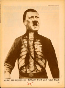
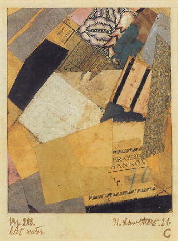
The work of the Dadaists (Hannah Höch was the main reason I wanted to see the show) is less self-consciously unconscious (well, that makes no sense) than the surrealist works, but the element of satire and sometimes bitter humour – especially in John Heartfield’s iconic anti-Nazi photomontages – make them the spiritual ancestors of the works of artists like Carolee Schneemann and Nancy Spero in the 1960s as well as Linder and even Terry Gilliam in the 70s. Highlights for me were the selection of works by Kurt Schwitters, whose own version of Dada, Merz, even had a collage-like genesis, the word itself apparently derived from a fragment of text relating to a banking firm (Kommerz und Privatbank). The fact that the word Merz also has echoes in the words schwerz (pain) and ausmerzen (to weed out or discard) adds to the sense that this was a movement (if you can call one person a movement) for which collage wasn’t an entertaining diversion, but a central idea. The cumulation of meanings and associations in works like Merz 229: Heet Water (1921) makes these small works with their train tickets, textiles, playing cards – pretty much anything that could be cut up and stuck down – powerfully evocative, as well as decorative in themselves.

John Heartfield – Adolf the Superman – swallows gold and spouts junk (1932)
Kurt Schwitters – Merz 229: Heet Water (1921)


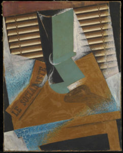
The section on the birth of modernist collage features a group of Picasso works including the the aforementioned Bottle and Glass on a Table, which form year zero of modernist collage, alongside works by peers including Braque (who may actually be the first modernist collage-maker) and Juan Gris (whose The Sunblind, 1914 is a highlight) and then the ripples spreading outwards from that explosive group of works, including the Russian constructivists and suprematists, the Italian Futurists and even the Bloomsbury group in the UK; I was very impressed to come across a painting by Vanessa Bell (Portrait of Molly MacCarthy, 1914-5) that didn’t immediately wilt into insignificance when surrounded by the big names of European modernism.

Juan Gris – The Sunblind (1914)

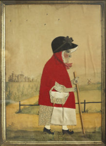
It seems obvious to say that collage is comparatively egalitarian insofar as you don’t need to be able to draw or paint to do it – and it’s true that works by generally non-visual artists like Breton and Joe Orton have a similar energy and atmosphere as those by more conventional artists, but it’s also noticeable that, pre-modernism, although the idea of collage existed and there was sometimes that same element of playfulness, the work is more notable for its skill and ingenuity – especially in the Victorian photomontages – than for any disruptive or ironic qualities. But collage being what it is, it’s here that the sense mentioned earlier of the collage as actual material culture comes into play again, sometimes – especially for me in the small character pieces by George Smart from the early 19th century – powerfully so. Somehow, these little watercolour paintings adorned with carefully cut out and arranged pieces of paper and fabric (irresistibly reminiscent to me of the ‘fuzzy felt’ sets I played with as a child) bring us closer to the artist than just paint on canvas would do.

This is perhaps art history as human interest and association rather than as aesthetics (this is especially true in the case of the Victorian scraps and scrapbooks, perhaps because the ready-made nature of the scraps themselves makes the objects feel less like the works of an artist and more like a hobby; nothing wrong with that, but as the sort of things you see in auctions and junk shops they have the aura of being ephemera, rather than using ephemera to make something else; a false distinction perhaps), but for me this exhibition brings those two aspects of art – the human/historical and the aesthetic/technical together in a deep and very satisfying way.
I have no real criticisms of the exhibition; it is thought provoking, beautiful to look at and put together with care and imagination. It might have been nice to have had something by some of the other artists most strongly associated with collage, like Romare Bearden and Wangechi Mutu; but if an exhibition leaves you wanting more that can’t be a bad thing.

***POSTSCRIPT***

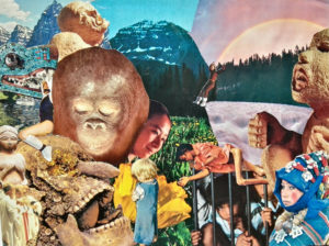
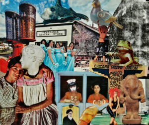
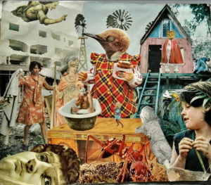
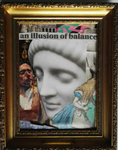
Since I mentioned the anyone-can-do-it aspect of collage, I might as well mention that I went through a phase, especially in my student days of making collages, and while they are nothing special, they do have a kind of diary-esque subtext which has only really become apparent over time. Since it’s my website and no-one can stop me, here are a couple of examples, plus a more recent one.

untitled collage, c. 1998?
untitled collage c. 1998-9


untitled collage, 2019
untitled collage, late 90s

A continuous chain of little inventions; art in Edinburgh summer 2018


Probably as much as I love any art movement, I love German Expressionism; most of all the artists of Die Brücke (I wrote at length about them here) and their (initially) optimistic quest to forge a new, forward-looking art which was distinctively German, drawing on native traditions (woodcuts, landscape etc), but also attempted to peel away the layers of staleness built up by decades, or even centuries of academicism, to reveal living art beneath. The art of Paula Modersohn-Becker, too, who was doing something similar in Worpeswede, is important to me too, but I also love the more anguished, personal kind of Expressionism that was reflected in the famous Expressionism of German silent cinema (see also Kirchner’s later works, and – not “German Expressionism” per se, but still German and expressionistic, early Dix and Grosz, Max Beckmann, Käthe Kollwitz).

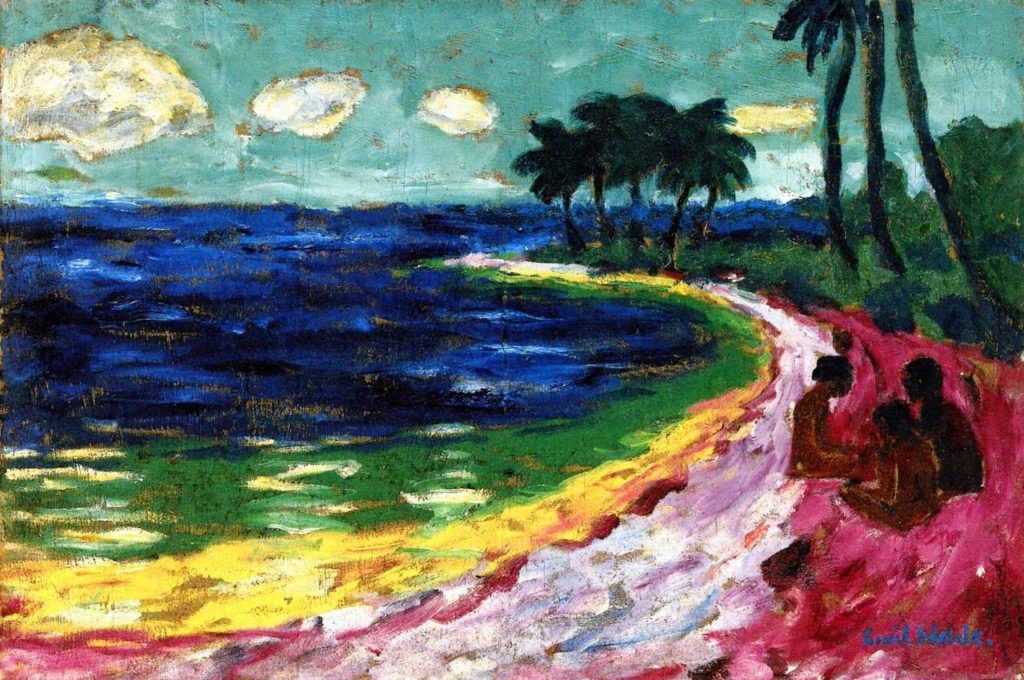
Emil Nolde – Bay (1914)

So, even though Emil Nolde (1867-1956) is perhaps my least favourite of the major German Expressionist painters, and even though I had lots of qualms about it (see here), I was excited to see the Scottish National Gallery of Modern Art’s exhibition Colour Is Life. And it really is good.


In comparison with the much younger artists of Die Brücke, which he joined for a year in 1906* Nolde’s art is just as vivid, but less vibrant (if that makes sense); his colours tend towards the bilious and acidic and his style, though ‘free’, often seems – even in landscapes – more frenzied and less harmonious than the works of the rest of the group. His deeply felt religious paintings, especially – and there is a really remarkable group of them in the exhibition – have an intense, anguished, alienated quality that is more like Munch atmospherically than it is his German contemporaries. It’s among his figurative (but not religious) works that my favourite painting of the exhibition, an enigmatic and slightly double portrait (that I can’t find online), which is smoother in surface texture than the religious pictures and imbued with an oddly menacing atmosphere.

*at which point Nolde was 39 and the group’s founders were in their early to mid twenties

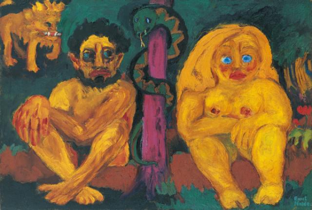
Emil Nolde – Paradise Lost (1921)

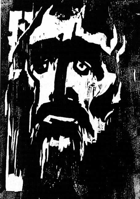
I’m glad to say that although I felt like the information at the exhibition tended to downplay his vociferous Nazism a little, it at least acknowledged it – and although it is nowhere explicit in his art, there are some uncomfortably anti-Semitic-caricature-like faces in his paintings of people, including in some of the religious works. But whether I would think that if I didn’t know he was (extremely) anti-Semitic, I can’t say. Interestingly, for an exhibition called Colour Is Life, by far the most powerful works to me were Nolde’s woodcuts (including arguably his most famous work, The Prophet of 1912), where his compositions are remarkable for their economy and stark intensity.

Emil Nolde – The Prophet (1912)

Interestingly (perhaps not coincidentally?) the majority of Nolde’s most impressive work seems to have been done by the mid-1920s, but there is also a selection of his ‘unpainted pictures’ in the exhibition. These are little watercolours, incredibly vivid in their colours, which were made in secret during the period when his work was condemned/forbidden by the Nazi government which Nolde had, however, not only welcomed, but effectively campaigned for since the early 30s. Incidentally, around the time that Nolde was signing the Aufrufs der Kulturscha (1934) which supported Hitler as Fuhrer and joining the National Socialist Association of Northern Schleswig, Ernst Ludwig Kirchner, one of the founders of Die Brücke, was writing “Here we have been hearing terrible rumours about torture of the Jews, but it’s all surely untrue…There is a war in the air. In the museums, the hard-won cultural achievements of the last 20 years are being destroyed, and yet the reason why we founded the Brücke was to encourage truly German art, made in Germany. And now it is supposed to be un-German. Dear God. It does upset me.”*

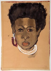
Head of a South Seas Islands woman (1914)

This was more than just the symptom of a generation gap between different artists; it’s at the heart of why Nolde’s art is, despite surface similarities, so different from that of the artists of Die Brücke; Expressionism is (obviously) about expressing; and yes, Kirchner and co expressed their anxieties, but their vision – at least at the time the group was at its most cohesive – was an optimistic one, accepting other influences as much as it rejected the status quo. To the 21st century, the way they were influenced by the art of other cultures, to simplify and brighten their own work can be uncomfortable; it has something of the ‘noble savage’ myth about it and their assumptions about the freedom and ‘naturalness’ of the tribal cultures whose work they studied in ethnographic museums were made from a viewpoint that now seems colonial and ignorant. But – the point of their own work is that it uses these forms and elements to describe something that is whole, natural and above all universal – the ‘otherness’ of the figures Nolde drew and painted on his trip to the South Seas (and even of his incredibly bold landscapes) just before WW1 is inescapable. His drawings of the people he encountered aren’t caricatures; they are brilliantly observed, but they are themselves ‘ethnographic’ in a way that Kirchner and co’s art strove not to be; Nolde is seeing and recording, not absorbing.

* Kirchner, quoted in Kirchner Museum Davos Biography Ernst Ludwig Kirchner by EW Kornfield, & CE Stauffer (1992)

Still; the Nazi government didn’t care about this distinction, and the exhibition text tells us that Nolde had more paintings shown in the condemnatory Entartete Kunst (‘degenerate art’) exhibition than any other artist, which would be a cause for some schadenfreude if not for the fact that, after petitioning the government (he was on civil if not familiar terms with charming people like Goebbels and Baldur von Schirach) he was informed in late 1941 that any work he undertook should be presented before government officials before any kind of public showing, which is of course harsh and limiting by any normal standards, but surprisingly mild compared to what they were doing to other artists. But, as Nolde must surely have realised, for all their cultural protectionism and promotion of what they considered to be artistically wholesome and correct ideas, the Nazis really weren’t interested in art as art at all.

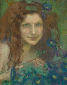
Julie Wolfthorn – Witch of the Woods (1899)

For some not very pleasant perspective, since I can; Nolde was prevented from making a living from his art for a few years, and had works confiscated (which he did eventually get back however), meanwhile his contemporary, Julie Wolfthorn (only three years older than he was), whose figurative, traditional, slightly folkloric art has at least an equal right to be seen as definitively German (or, far more right, to the anti-modernist authorities of the time), was, as a Jew, too dangerous to exist, and was murdered in 1942, at the age of 78, by the regime which Nolde did his best to be accepted by.


So yes, a beautifully curated and mounted exhibition; but one which leaves a slightly bitter taste.

Toyen – Message of the Forest (1936)

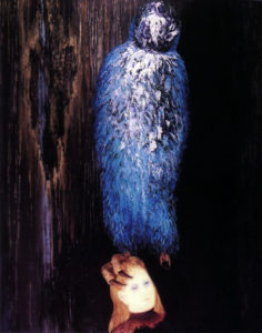
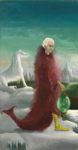
So,  that’s what I paid to see (and it is absolutely worth the price of admission), but in fact the bitterness faded quickly; aside from owning a Kirchner painting that is for me everything that Nolde’s work isn’t, the National Gallery of Modern Art (Modern Two) hosts a permanent (and free) exhibition Surrealism and the Marvellous, which was already great, but has been enhanced hugely by the acquisition of Toyen’s superbly enigmatic The Message of the Forest (1939) and Leonora Carrington’s diminutive but haunting (and at the same time kind of funny) 1939 portrait of Max Ernst, Bird Superior (1939).


Leonora Carrington – Bird Superior (Portrait of Max Ernst), 1939

I could spend (and I think have spent) hours in this room; even longer now, as the archive adjoining it is hosting Club Dada: Berlin and Beyond, a really exciting collection of books, pamphlets, photos etc (and a small Max Ernst painting) that focuses mainly on Berlin Dada but also has some great items from the original Zurich group. Much as one wants to pore over these artefacts, I don’t even mind too much that the books etc are in glass cases since my German is minimal and I can’t read French at all.


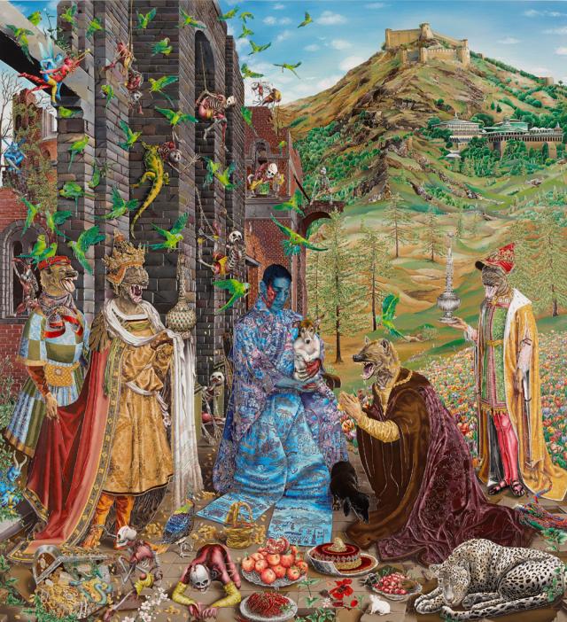
Raqib Shaw – The Adoration (after Jan Gossaert), 2015/6 © the artist

Over in Modern One, I nearly didn’t look at the (also free) exhibition Raqib Shaw: Reinventing the Old Masters, partly because part of me doesn’t really want them to be reinvented, and because I didn’t know Shaw’s work, and also because it was up the stairs and I’d been walking around for hours. But I’m glad I did; what a fantastic show! I can’t imagine anyone not being impressed by Shaw’s work, even if it’s not their cup of tea. The paintings (too simple a description; his huge panels are painted in shimmering enamels, but embellished with a kind of cloisonné effect, incorporating jewels, glitter, all kinds of things) are brilliantly drawn and dazzling in their richness and detail (and a bit over the top, which is part of the charm). Although the compositions of the pictures in this exhibition are inspired by ‘old master’ paintings (one of which is one of my all-time favourite pictures, Lucas Cranach’s enigmatic Allegory of Melancholy (1528), displayed alongside Shaw’s painting), the familiarity only makes the extravagant fantasy of Shaw’s works all the more dreamlike and affecting.

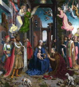
Jan Gossart – The Adoration of the Kings (1510/15)

I think we (no, I don’t know who I mean by ‘we’) are used to seeing and accepting things like Biblical scenes or Greek myths presented through the filter of the Italian (or Northern) renaissance, and this is similar but different. With the old masters we (them again) see familiar (or what were once familiar) scenes  presented in a kind of fancy dress of anachronistic costumes/settings etc which were initially intended to heighten the relatable-to realism of the works, but which now add another layer of meaning and cultural baggage. With Shaw’s work, the ghosts of both the original meaning and the original treatment are seen as if through the eyes of someone from another, much more effervescent dimension. The dislocating, hallucinatory blend of familiar (and it isn’t just the source material that’s familiar; Shaw’s use of dazzling, opulent colours and ornate textures is, despite the fantastical elements, quintessentially Indian, to my western eyes anyway) and strange is exhilarating and strangely poignant.* To take my favourite picture; neither Cranach’s or Shaw’s Allegory of Melancholy is sombre exactly; but despite the centuries and world views that separate them, the same delicately wistful atmosphere pervades both pictures. It’s an impressive exhibition.

So, the moral of this is; go to the Scottish National Gallery of Modern Art in Edinburgh if you get the chance. Oh, and the National Gallery of non-modern art too – aside from having an incredible permanent collection, they currently have a Rembrandt – who doesn’t like Rembrandt? – exhibition and have put a fantastic Jenny Saville painting (Aleppo) among the old masters in a way that works amazingly well and was gathering crowds of (especially young) people when I was there.

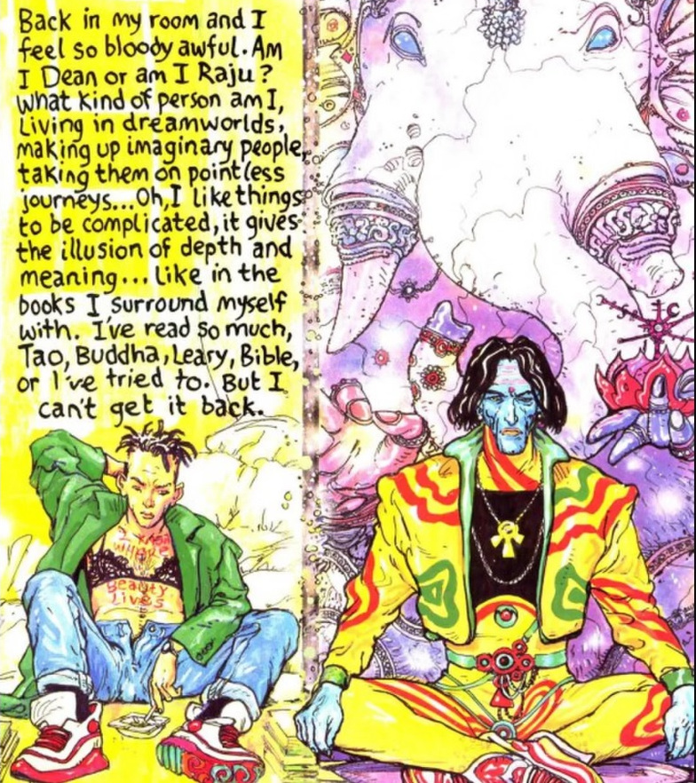
*Perhaps an obscure (and certainly a geeky) comparison; looking at Raqib Shaw’s pictures reminded me of reading Brendan McCarthy & Pete Milligan’s similarly post modern/immersive/multicultural/hallucinogenic comic strip Rogan Gosh in the 2000AD spinoff Revolver.

Brendan McCarthy & Peter Milligan, Rogan Gosh (1990)