dancing about architecture: the non-art and non-science of music reviews

On the rare occasions that anyone asks me anything about my writing, it’s usually about music reviews. The consensus seems to be that a good review (I don’t mean a positive one) should either be ‘listen to the music and say if it’s good or bad’, or ‘listen to the music and describe it so that other people can decide whether it’s their cup of tea, but keep your opinion out of it’. As it happens, I’ve given this subject a lot of thought, not only because I write a lot of reviews, but I also because I read a lot of reviews, and some of my favourite writers (Charles Shaar Murray is the classic example) manage to make me enjoy reading about music even when it’s music that I either already know I don’t like, or that I can be fairly certain from reading about it that I won’t like. Because reading a good article about music is first and foremost ‘reading a good article’.

Anyway, over the course of pondering music reviews I have come to several (possibly erroneous) conclusions:

* “star ratings” HAVE TO BE relative and all stars don’t have the same value. For instance, one might give a lesser album by a great artist 3 stars, but those are not the same 3 stars one would give a surprisingly okay album by a generally crappy artist.

* Musical taste is, as everyone knows, entirely subjective, but reviewing (for me at least) has to try be a balance between objective and subjective; just listening to something and saying what you think of it is also valid of course.

* Objective factors alone (see fun pie chart below) can never make an otherwise bad album good, but subjective factors can.

* ‘Classic’ albums make a nonsense of all other rules.

Let’s examine in more detail, with graphs! (are pie charts graphs?):

Objective factors:
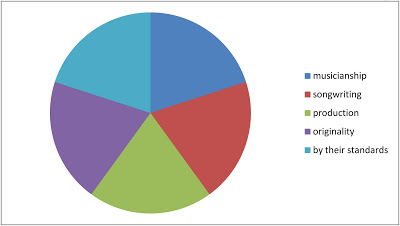
factors that objectively might contribute to the quality of an album

Objective factors (see fun pie chart) are really only very important when the reviewer doesn’t like the music: when you love a song, whether or not the people performing it are technically talented musicians/pitch perfect singers etc is entirely irrelevant.

But, when an album or song (or movie, book etc) is dull or just blatantly abysmal, some comfort (or conversely, some outrage and annoyance) can be gained from the knowledge that at least the participants were good at the technical aspects of what they were doing, even if they are ultimately using those skills for evil.

Subjective Factors:
the true gauge of how highly you rate a piece of music; not a very helpful chart though

Although there are many subjective factors that may be relevant; nostalgia for the artist/period, personal associations, all of these really amount to either you like it or you don’t; simple but not necessarily straightforward.

The positive subjective feeling ‘I like it!’ can override all else, so that an album which is badly played, unoriginal, poorly recorded and awful even by the artist’s own standards can receive a favourable review (though the reviewer will hopefully want to point out those things)

Meanwhile the negative subjective feeling ‘I don’t like it’ can’t help but affect a review, but should hopefully be tempered by technical concerns if (an important point) the reviewer feels like being charitable. They may not.

Ideally, to me a review should be something like 50% objective / 50% subjective (as in the examples somewhere below) but in practice it rarely happens.

“Classic” status:

The reviewing of reissued classics can be awkward, as ‘classic’ status in a sense negates reviewing altogether; it is completely separate from all other concerns, therefore said classic status can affect ratings just because the album is iconic and everyone knows it. Reviews of new editions of acknowledged classics usual become either a review of what’s new (remastered sound, extra tracks etc) or a debunking of the classic status itself; which as far as I know has never toppled a classic album from its pedestal yet.

Classic album status is normally determined by popularity as much as any critical factors, but popularity itself shouldn’t play a part in the reviewer’s verdict; just because 30,000,000 people are cloth-eared faeces-consumers, it doesn’t mean the reviewer should respect their opinion, but they should probably acknowledge it, even if incredulously. Sometimes or often, classic status is attained for cultural, rather than (or as well as) musical reasons*, and it should be remembered that albums (is this still true in 2020? I don’t know) are as much a ‘cultural artefact’ (in the sense of being a mirror and/or record of their times) as cinema, TV, magazines or any other zeitgeist-capturing phenomenon.

* in their very different ways, Sgt Pepper’s Lonely Hearts Club Band, Thriller and The Spice Girls’ Spice were all as much ‘cultural phenomena’ as collections of songs
another pointless chart

SO ANYWAY; how does this all work? Some examples:

I once offended a Tina Turner fan with an ambivalent review of the 30th anniversary edition of Ms Turner’s 1984 opus Private Dancer.

As a breakdown (of ‘out of 10’s, for simplicity) it would look something like this:

TINA TURNER: PRIVATE DANCER (3OTH ANNIVERSARY EDITION)

Objective factors
* musicianship – 9/10 – hard to fault the adaptability or technical skill of her band
* songwriting – 6/10 – in terms of catchy, verse-chorus-verse efficiency & memorableness these are perfectly good songs, if a bit cheesy & shallow & therefore a waste of Tina Turner
* production – 9/10 – no expense was spared in making the album sound good in its extremely shiny, 80s way
* originality – 0/10 – as an album designed to make TT into a successful 80s artist, it wasn’t really supposed to be original, so hard to actually fault it in that respect
* by the standards of the artist – 2/10 – in the 60s/70s Tina Turner made some great, emotionally forceful, musically adventurous and just great records. In 1984 she didn’t.

Overall: 26/50 = 5.2/10

Subjective Factors

* I don’t like it: 1/10 (but not 0, because Tina Turner is a legend and it would be wrong to deny that somehow)

Overall 5.2/10 + 1/10 = 6.2/20 = 3.1/10 = 1.55/5 (round up rather than down, out of respect for Tina) = 2 stars

and in fact I did give the album two stars, though I didn’t actually do any of the calculations above; but it’s pleasing to find out that the instinctive two stars is justified by fake science.

by way of contrast, a favourite that seems to be an acquired taste at best:

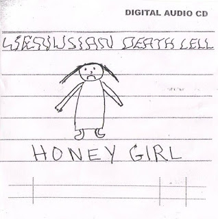
VENUSIAN DEATH CELL: HONEY GIRL (2014)
Objective factors
* musicianship – 1/10 – David Vora’s guitar playing is not very good, plus the guitar is out of tune anyway, and his drumming is oddly rhythm-free
* songwriting – 2/10 – the songs on Honey Girl are not really songs, they may be improvised, they don’t have actual tunes as such
* production – 0/10 – David pressed ‘record’ on his tape recorder
* originality – 10/10 – Vora doesn’t sound like anyone else, his songs are mostly not about things other people sing about
* by the standards of the artist – 9/10 – I like all of Venusian Death Cell’s albums, they are mostly kind of interchangeable, but Honey Girl is one of the better ones (chosen here over the equally great Abandonned Race only because of the uncanny similarities between the cover art of Honey Girl and Private Dancer).

Overall: 22/50 = 4.4/10

Subjective Factors

* I like it: 9/10 (but not 10, because if encouraged too much David Vora might give up and rest on his laurels. Though if he did that I’d like to “curate” a box set of his works)

Overall 4.4/10 + 9/10 = 13.4/20 = 6.7/10 = 3.35/5 (round up rather than down, out of sheer fandom) = 4 stars

And in fact I did give Honey Girl four stars, but I’ve yet to hear of anyone else who likes it. Which is of course fuel for the reviewer’s elitist snobbery; win/win

Star Ratings


I’ve used scoring systems above, but the writers I like best rarely use scores or ‘star ratings’. I don’t think anybody (artists least of all) really likes star ratings or scores because they immediately cause problems; if, for instance, I give the Beach Boys’s Pet Sounds four stars (and the critical consensus says you have to; also, I do love it), then what do I give Wild Honey or Sunflower, two Beach Boys albums that are probably demonstrably ‘less good’, but which I still like more? But at the same time, I suppose scores are handy, especially for people who want to know if something is worth buying but don’t want an essay about it – and who trust the reviewer. The best ‘score’ system I’ve ever seen is in the early 2000s (but may still be going?) fanzine Kentucky Fried Afterbirth, in which the genius who writes the whole thing, Grey,  gives albums ratings out of ten ‘cups of tea’ for how much they are or aren’t his cup of tea; This may be the fairest way of grading a subjective art form that there can possibly be.

Critical Consensus

I mentioned the critical consensus above, and there are times when it seems that music critics seem to all think the same thing, which is how come there’s so much crossover between books like 1000 Albums You Must Hear Before You Die (I always feel like there’s an implied threat in those titles) and The Top 100 Albums of the Sixties etc. I’m not sure exactly how this works, because like most people I know who love music, my favourite albums and songs aren’t always (or even usually) the most highly regarded ones. My favourite Beatles album isn’t the ‘best’ one (Revolver, seems to be the consensus now); Songs in the Key of Life is the Stevie Wonder album, but it’s probably my third or fourth favourite Stevie Wonder album; I agree that Bruce Dickinson is a metal icon but I kind of prefer Iron Maiden with Paul Di’anno (granted PD wouldn’t be as good as Bruce at things like Rime of the Ancient Mariner but it’s less often mentioned that Bruce is definitely not as good at singing Wrathchild etc as Paul was.) Much as I genuinely love The Velvet Underground and Nico, I genuinely love the critically un-acclaimed Loaded just as much; there are so many examples of this that the idea of an actual critical consensus that means anything seems like nonsense.

I’m content to like it even if you don’t

I’ve been writing music reviews for many years now, but my own involvement with ‘the consensus’ is rare and the only solid example I can think of is a negative one. I thought – and I still think – that Land, the fourth album by Faroese progressive metal band Týr, is the best thing they’ve ever done. I gave it a good review, not realising that the critical tide was turning against the band, and, for whatever reason (fun to speculate but lack of space is as likely as anything), my positive review never appeared in print. It wouldn’t have made any real difference to the band or to the album’s reception in general, but it did make me feel differently about albums that are notoriously bad (or good). Who is deciding these things? I’m a music critic and I’m not. And although I – like, I think everyone – take reviews with a pinch of salt anyway (someone else liking something is a strange criteria for getting it, when you think about it), I have to admit if I hadn’t had to listen to Land (which I still listen to every now & then, over a decade later), I wouldn’t have been in a hurry to check out the album after reading again and again that it was dull and boring.

Throughout this whole article the elephant in the room is that, at this point, the whole system of reviewing is out of date. You can almost always just listen to pretty much anything for free and decided yourself whether you like it, rather than acting on someone else’s opinion of it. But in a way that makes the writing more important; again, like most people, I often check things out and stop listening at the intro, or half way through the first song if I just don’t like it – except when I’m reviewing. Reviewers have to listen to the whole thing, they have to think about it and say something relevant or contextual or entertaining.* And if the reviewer is a good writer (Lester Bangs is the most famous example, though I prefer Jon Savage or the aforementioned CSM and various nowadays people), their thoughts will entertain you even if the music ultimately doesn’t.


*worth a footnote as an exception which proves the rule is a notorious Charles Shaar Murray one-word review for the Lee Hazlewood album Poet, Fool or Bum: “Bum.”

a true state – cut and paste and the art of collage (Edinburgh, summer 2019)

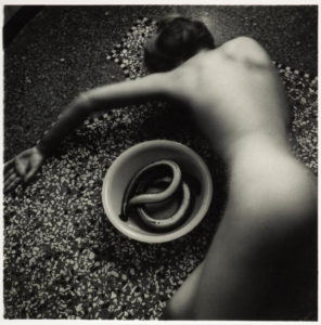
Francesca Woodman, Untitled (1977)

2019 has, in many ways, not been a good year so far. But this summer, the National Galleries of Scotland had (well, has; they are still on) three particularly outstanding exhibitions that brought a bit of light and intelligence to a period of more-than-usual stupidity. At the National Gallery itself, there was the excellent, eye opening and brain-frying Bridget Riley exhibition (closes 22nd September), at the National Portrait Gallery the superb Self Evidence (closes 20th October) in which Francesca Woodman’s tiny, intimate, self-enclosed photographs vibrate balefully in their little corner, overshadowing (for me) the also (but in an entirely different way) intimate and at times frankly challenging monumental works of Robert Mapplethorpe* and, to a lesser extent, the brilliant but (I guess appropriately) don’t-quite-fit-in Diane Arbus portraits of the lives of people marginalised and made invisible by mainstream culture.

*though the Mapplethorpe pictures were the ones that moved me the least, they did provide the priceless spectacle of parents hurrying their curious kids past the notorious 1978 Self Portrait With Whip. They had been warned!

But for me, the highlight of the National Galleries’ summer programme is Cut and Paste: 400 years of Collage at Modern Two (closes 27th October).

Thanks to its inclusive definition of collage (which covers photomontage, traditional collage, plus bits of decoupage, pressed plant samples and even quilting) as well as its historical scope, the exhibition manages to be both focused and wide-ranging, and also (I found) surprisingly moving. What collage does, or at least amplifies – perhaps paradoxically given its use of found/ready-made materials – is that aspect of art that disappears most quickly in reproduction; the hand of the artist. This is art not only as a reflection/projection of culture but one that includes material culture itself.* There is, sometimes regardless of the picture/object, a poignant quality that comes from the materials used, in a way that doesn’t happen with paint, unless you are the kind of conservator who can isolate pigments used to specific periods (I’m not, unfortunately).

*I don’t think this is just pretentious bullshit; but you never know

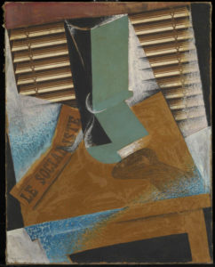
Pablo Picasso, Bottle and Glass on a Table (1912)

I’m getting ahead of myself here, but a seminal collage that makes an appearance in the exhibition, Pablo Picasso’s Bottle and Glass on a Table (1912) is a classic/typical Picasso cubist/spatial experiment, but the use of newspaper – a very specific, dateable piece of ephemera (from Le Journal, 3 December 1912) – gives the work, instantly and inherently, a dimension largely absent in conventional painting. The feeling that the collage is both artwork and artefact; literally as well as figuratively multi-layered, makes a case for collage as a distinct and special art form, a feeling echoed by the Scottish artist Eduardo Paolozzi (represented by some outstanding works in the exibition), for whom the form offered clarification, where formal art training raised problems and questions: “Unlike the world of school where the universe was systematised in a certain order, the reassembly of this disparate material reflected a true state, both autobiographic and dynamic.” (quoted in the exhibition catalogue,  p. 126)

So anyway; the exhibition is arranged chronologically, in the usual Modern Two layout; in various rooms, up the stairs, through the corridors etc, always I think a layout that makes for an engaging, surprising way of looking at art. Partly deliberately (there were too many people in the first room), I went around the exhibition in reverse chronological order and in retrospect that seems like a good decision. This meant that the exhibition opened with the Chapman Brothers’ The Disasters of Everyday Life (2017), a spectacular-looking wall-like object consisting of 80 of Goya’s horrific etchings, The Disasters of War, with of course added bits and pieces, sometimes powerful, sometimes deliberately absurd, I think (though I’d have to go through again the other way) it serves better as a kind of abstract for what is to follow than it would as a conclusion, where peering at a lot of small images might have seemed a bit anticlimactic.
I’m not going to mention every picture in the show, though I can’t think of anything that doesn’t deserve a mention. The first thing to have a major impact for me was Lucy Williams’ 2015 Crescent House, as much a piece of model making as a collage, a strange, small scale (just under a metre long) recreation of a bit of postwar architecture, but simplified and made more colourful, giving it a feeling of harmony almost like a kind of 3D Mondrian.

Lucy Williams – Crescent House (2015)
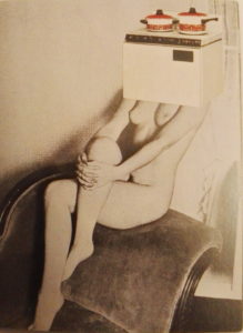
Linder – Pretty Girl (1977)

Crescent House captures something of the intended optimism of the postwar new town planning that’s most often associated now with neglect and urban decay. I don’t know if it’s a generational thing (Williams is around my age), but for me there was something powerfully bittersweet about the feeling of an abandoned, never-quite-attained future, heightened by the realness of the work as an object.

The aesthetic of Crescent House – though that is far lighter in tone – makes me think of the late 70s work of Linder (Sterling), another exhibition highlight. Although similar in its reference points to the pop art collages of Richard Hamilton a couple of decades before (sadly his iconic 1956 collage Just What Is It That Makes Today’s Homes So Different, So Appealing is not in the exhibition, though they do have a nice work by him, Desk from 1964), the feel of Linder’s work is far darker (it makes me think of the confrontational industrial work of Throbbing Gristle and COUM Transmissions around the same period) and the satire more pointed. Works like her Pretty Girl series(1977) exemplify a particular approach to collage. Using the detritus of everyday life; magazines, posters, advertising, it became a way of embodying in the art a criticism of the culture that it’s a reaction to as well as a product of. It’s a feminist criticism of the objectification of women that uses already depersonalised women (part of the problem) and merges them with actual ‘objects of desire’ from a patriarchal culture that above all else believes in commodification for its own benefit.

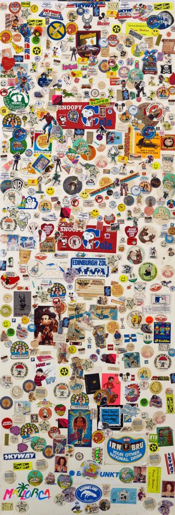
Craig W. Lowe, Bedroom Cupboard door covered with stickers, 1987-1997

Thanks to the exhibition’s open-minded and inclusive approach, there are some unexpected revelations (but aren’t all revelations unexpected? I mean, that’s obvious). While Craig W. Lowe’s bedroom cupboard door covered in stickers c. 1987-1997) may appeal most as nostalgia, the inclusion of Jamie Reid‘s original Sex Pistols Never Mind The Bollocks cover collage (1977; copyrighted image so I’d better not share) opens realms of not-previously-considered information (at least to me) about one’s record collection. Firstly, the collage is black and white, and secondly, it isn’t just a picture or a ‘file’, it’s an actual thing. Like, presumably all album cover art (and book cover art etc) before the digital age, the NMTB cover in all its yellow and pink (or pink and green) glory, taken for granted forever, is not a picture, it’s a photograph of a picture. In its final form it’s been overlaid with colours, but that object there on the wall in Edinburgh is the thing itself. A strange feeling, like looking at the inscription on a ten pound note and considering that it is a representation of something, rather than ten actual pounds.

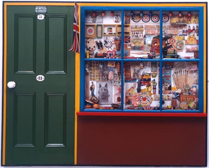
The Sex Pistols cover primes the viewer (at least the viewer going through the exhibition backwards) for the various bits of Peter Blake’s Sgt Pepper’s Lonely Hearts Club Band cover that are on show – and, great though they are (and I like Sgt Pepper quite a bit more than I like Never Mind The Bollocks), without that priming, the Beatles items wouldn’t have the same impact; perhaps because the cover itself is clearly a photograph of objects and cut-outs and seeing them is very cool but not really revelatory, the whole is too familiar and iconic to give the frisson of a moment captured. In fact, Blake’s superb, possibly slightly twee The Toy Shop (1962) is a far more vivid time capsule; clearly pointing to Sgt Pepper, its a conglomeration of bits and bobs familiar to children of the 60s – but also to children of later generations as belonging to the same family as the bits & bobs of their own youth (in my case, comics, football stickers, sweets, TV tie-in toys (He-Man et al), but also the odd antiquated throwbacks that still existed, like bows and arrows and balsa wood or polystyrene gliders which came with a weighted plastic propeller so they flew when thrown – do they still make those?). It’s hard to imagine that there will be a generation that can’t relate to The Toy Shop at all, however virtual entertainment becomes, kids will always like stickers.

Peter Blake – The Toy Shop (1962)

But Blake’s pop art nostalgia – powerful though that is – is one of the few purely positive and joyous post-war works in the show. More typical are the mischievous collage book covers made by Joe Orton and his partner and eventual murderer Kenneth Halliwell. These were put on library books and returned to the library – an act that eventually cost them a six month prison sentence – and they exemplify the sense of the significant, perhaps subversive and illogical accident that drew the surrealists to collage a few generations earlier.

Kenneth Halliwell & Joe Orton – collage on library book cover (c.1960-2)

For the surrealists, collage was almost a manifestation of the galvanising quotation from Lautréamont’s Les Chants de Maldoror (1869) where a boy could be described as being “as beautiful as a chance meeting on a dissecting table of a sewing machine and an umbrella.” This aspect of surrealism is brilliantly captured in Max Ernst’s gothic ‘collage novels’ (one of the most exciting inclusions in the show is an unpublished picture from his 1934 collage novel Une semaine de bonté) as well as in beautiful works by Toyen and some of the collaborative exquisite corpse collages made by André Breton, Jacqueline Lamba and Yves Tanguy, where each artist could only see their own part of the work until it was complete. Again, what I hadn’t really anticipated was the difference it makes seeing these items in real life – for example, I had seen and liked (and own a postcard of) Roland Penrose’s untitled 1937 postcard collage, but seeing it, life size, and looking at the actual real postcards stuck to it, was a weirdly moving experience. But why? It’s something about the immediacy and associations of familiar things, the thought perhaps of Roland Penrose actually going into a newsagent and buying the postcards one day in 1937. Why that should be more moving than an artist using paint I don’t know, except that, like the scrapbooks owned by Tristan Tzara (very exciting to see) and the paper cutouts by Matisse (which until now I’ve never been a fan of) it brings the whole process of making art into an immediate, almost tangible one.

Roland Penrose – Untitled (1937)

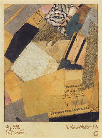
The work of the Dadaists (Hannah Höch was the main reason I wanted to see the show) is less self-consciously unconscious (well, that makes no sense) than the surrealist works, but the element of satire and sometimes bitter humour – especially in John Heartfield’s iconic anti-Nazi photomontages – make them the spiritual ancestors of the works of artists like Carolee Schneemann and Nancy Spero in the 1960s as well as Linder and even Terry Gilliam in the 70s. Highlights for me were the selection of works by Kurt Schwitters, whose own version of Dada, Merz, even had a collage-like genesis, the word itself apparently derived from a fragment of text relating to a banking firm (Kommerz und Privatbank). The fact that the word Merz also has echoes in the words schwerz (pain) and ausmerzen (to weed out or discard) adds to the sense that this was a movement (if you can call one person a movement) for which collage wasn’t an entertaining diversion, but a central idea. The cumulation of meanings and associations in works like Merz 229: Heet Water (1921) makes these small works with their train tickets, textiles, playing cards – pretty much anything that could be cut up and stuck down – powerfully evocative, as well as decorative in themselves.

John Heartfield – Adolf the Superman – swallows gold and spouts junk (1932)
Kurt Schwitters – Merz 229: Heet Water (1921)


The section on the birth of modernist collage features a group of Picasso works including the the aforementioned Bottle and Glass on a Table, which form year zero of modernist collage, alongside works by peers including Braque (who may actually be the first modernist collage-maker) and Juan Gris (whose The Sunblind, 1914 is a highlight) and then the ripples spreading outwards from that explosive group of works, including the Russian constructivists and suprematists, the Italian Futurists and even the Bloomsbury group in the UK; I was very impressed to come across a painting by Vanessa Bell (Portrait of Molly MacCarthy, 1914-5) that didn’t immediately wilt into insignificance when surrounded by the big names of European modernism.

Juan Gris – The Sunblind (1914)

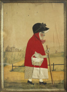
It seems obvious to say that collage is comparatively egalitarian insofar as you don’t need to be able to draw or paint to do it – and it’s true that works by generally non-visual artists like Breton and Joe Orton have a similar energy and atmosphere as those by more conventional artists, but it’s also noticeable that, pre-modernism, although the idea of collage existed and there was sometimes that same element of playfulness, the work is more notable for its skill and ingenuity – especially in the Victorian photomontages – than for any disruptive or ironic qualities. But collage being what it is, it’s here that the sense mentioned earlier of the collage as actual material culture comes into play again, sometimes – especially for me in the small character pieces by George Smart from the early 19th century – powerfully so. Somehow, these little watercolour paintings adorned with carefully cut out and arranged pieces of paper and fabric (irresistibly reminiscent to me of the ‘fuzzy felt’ sets I played with as a child) bring us closer to the artist than just paint on canvas would do.

This is perhaps art history as human interest and association rather than as aesthetics (this is especially true in the case of the Victorian scraps and scrapbooks, perhaps because the ready-made nature of the scraps themselves makes the objects feel less like the works of an artist and more like a hobby; nothing wrong with that, but as the sort of things you see in auctions and junk shops they have the aura of being ephemera, rather than using ephemera to make something else; a false distinction perhaps), but for me this exhibition brings those two aspects of art – the human/historical and the aesthetic/technical together in a deep and very satisfying way.
I have no real criticisms of the exhibition; it is thought provoking, beautiful to look at and put together with care and imagination. It might have been nice to have had something by some of the other artists most strongly associated with collage, like Romare Bearden and Wangechi Mutu; but if an exhibition leaves you wanting more that can’t be a bad thing.

***POSTSCRIPT***

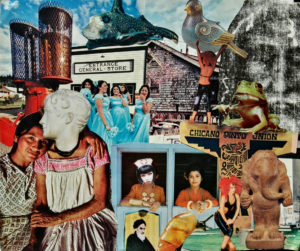
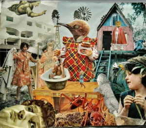
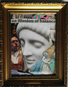
Since I mentioned the anyone-can-do-it aspect of collage, I might as well mention that I went through a phase, especially in my student days of making collages, and while they are nothing special, they do have a kind of diary-esque subtext which has only really become apparent over time. Since it’s my website and no-one can stop me, here are a couple of examples, plus a more recent one.

untitled collage, c. 1998?
untitled collage c. 1998-9


untitled collage, 2019
untitled collage, late 90s