Firstly, the title comes from this short essay by one of my favourite historical figures, Rosa Luxemburg; it’s worth a read.
If anything demonstrates that half of the human race is in need of a special day to celebrate their achievements and raise awareness of the challenges they face, it’s the ongoing existence and high profile of International Women’s Day. I’m not here just to criticise it, so bear with me.
In a way it seems deeply patronising (not an accidental use of the word) that it even exists, since the celebration of IWD is in itself a sign that the patriarchy is in obnoxiously good health. Seems paradoxical, but look at the contrast between not just the profile of, but the nature of IWD, compared to International Men’s Day, which contrary to the belief of the frothing-at-the-mouth men on the misogynist fringe does exist (19 November), highlights the background that it exists against.
International Women’s Day commemorates the (ongoing) fight for Women’s rights, raises awareness of issues surrounding gender inequality and is a celebration of the achievements of women throughout the ages. International Men’s Day raises awareness of issues like suicide, self-harm, violence, homelessness etc; it’s a good thing, but it’s a much smaller and very different thing. Both international days are – necessarily – framed in the same way. The bad things that women have faced and continue to face – violent death, mutilation, violence, political, religious and social disenfranchisement – are the product of societies where women have been and in many ways continue to be second class citizens; the power structures they struggle with and against are overwhelmingly male and male-dominated. The problems that Men’s day raises, likewise come from men’s struggles to exist within that same socio-political/religious framework. The fact that I’ve spent half a paragraph about Women’s Day writing about Men’s Day is ironic but it’s also systemic.
Does that mean that IWD is a bad thing? Clearly not. There are women who, for a variety of reasons choose to denounce or simply opt out of the whole idea of it – as is their right – but the position of women has not improved so much over the past quarter century that the inequalities are merely historical, as seemed possible to envision around the end of the 1980s. And while the achievements of women in almost every field are acknowledged more now than ever, they are, depending on which sphere they take place in, often still seen as special cases; ‘women artists,’ ‘female plumbers’ etc, whereas terms from my childhood like ‘male nurse’ seem comically inappropriate (which isn’t to say that some people don’t still use them; but usually men, and for reactionary reasons).
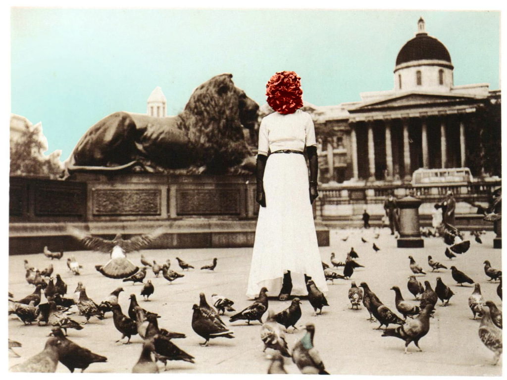
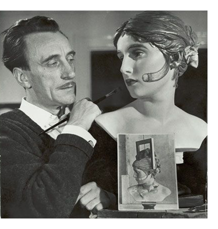
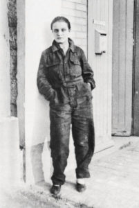
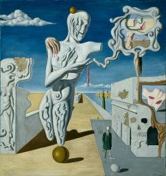
There’s also a valid argument that celebrating womens/mens days simply reinforces a binary that is merely a symptom of the old-fashioned, patriarchal system. It’s kind of undeniable; the name alone, International Women’s Day supposes “women” as a monolith. One of my favourite artists is the Surrealist Claude Cahun (born Lucie Schwob), whose work is often (by me, too) promoted as part of IWD celebrations of female artists, despite the artist’s unambiguous statement from Disavowals (1928) that “Neuter is the only gender that always suits me.” To ignore someone’s own personal identity in order to celebrate something about themselves that they specifically denied feels like a strange kind of tribute.
Nonetheless, nobody, not even Claude Cahun, denied that women do exist and that they have been and are (okay some people do loudly deny this bit) oppressed and subject to systemic inequalities.
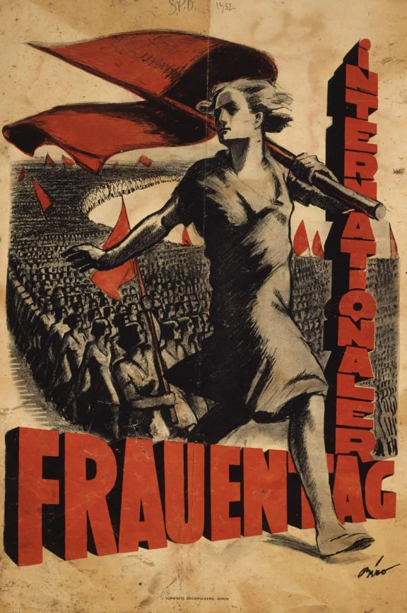
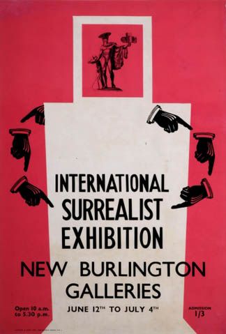
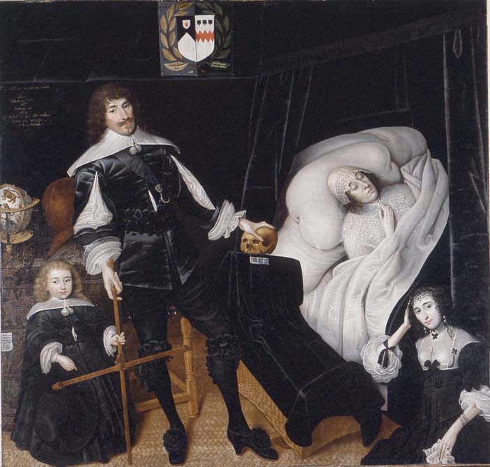
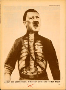
What’s often overlooked now too is that International Women’s Day was historically – though not consistently – a socialist celebration. See here for an excellent exploration of its radical origins. Working Women’s Day – the date 8th March was chosen by Lenin, fact fans – was originally tied to issues of Workers’ Rights and the fight for equality more widely, but even in the Soviet Union the image softened over the years until eventually it – ironically – came to celebrate women in traditional roles (mothers, wives) rather than revolutionary ones. Which is lame; but it’s easy to see why that link has eroded. The struggle for Women’s liberation was initially, and throughout its radical period in the 60s and 70s seen as analogous to the working class struggle – where women occupied a kind of working class, that is subordinate, position even within the working class. The gradual (but of course never total) amelioration of the rights of workers made aspects of the radicalism of the past feel dated and possibly unnecessary, though that is less true than it sometimes seems. Also, not all women were or are working class anyway, and class distinctions of that kind are not universal in every society in the world, but women’s marginalisation almost is.
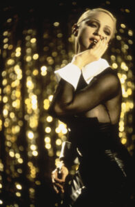
Plus, people and perceptions change. My mother was a working class ‘Women’s Lib,’ Spare Rib-reading feminist of the 60s/70s, but although her views on Women’s liberation never really changed, from the 80s onwards she became puritanical in a way that now seems, to her children’s generation, a bit sexist, oddly. For example, she couldn’t see someone like Madonna (the popular entertainer, not the mother of Christ) and her ilk, however apparently empowered, as anything other than a manifestation of the retrograde desires of men, and she would probably have agreed with Morrissey that make-up is a lie, or even gone further to suggest that it’s a lie established by the patriarchy to keep women in their place. It’s a point of view, I suppose; but it’s also one that polices the image that women choose to project for themselves and so seems fundamentally anti-progressive, though I understand the logic of it.
Similarly, there are people who bemoan the loss of the ‘Class War’ aspect IWD, which I again understand, because I do think capitalism & patriarchy are bad and harmful to humanity in general and women in particular. But as a ‘working class’ male I also kind of reject it. Identifying with the system that labels you seems fundamentally unhelpful to me. I am ‘working class’ because that is the caste system established by a capitalist power structure, just as I would have been ‘peasant class’ centuries ago in a feudal society. Embracing that class identity seems far less attractive than altering society until its labels have no meaning anymore.
A fairer version of capitalism may not be the ultimate aim, but it would at least be a good thing. Marx’s ideal – I have a lot of time and affection for Marx, but I think he was often wrong, or at least that 21st century problems do not call for 19th century solutions – that inequality reaches crisis point so that revolution becomes a necessity feels to me very much like the apocalyptic thinking of those who want to immerse the world in war to bring about the second coming of Christ. The problem is – as we see, now, with war – that people, perhaps even generations of people, have to actually live their whole lives during that ‘crisis point’ which can continue, depending on the strength of the overarching system, almost indefinitely. Misery now, reward later is the self-serving bullshit the Christian church8 has been selling for 2000 years, I don’t think society is improved by adopting a well-meaning socialist version of it. Surely the life of even a single person is more important than the fulfilment of an ideology? Agree to disagree perhaps.
Which again has taken this away from International Women’s Day. When one is talking about half of the human race any kind of generalisation is bound to be wrong, but solidarity with people who are forced to struggle for equality as human beings within systems designed to keep them in a subordinate role never is.
It may be – especially in the social media age – that celebrations like International Women’s Day come under the banner of Bread and Circuses that the satirist Juvenal noted Imperial Rome offered to the people in lieu of the political power they held in the days of the old Republic. So should we get rid of them? No, would be my answer – quite the opposite, we should expand on them, turn them into actual holidays, raise awareness of every grievance that people have under a grossly unequal political system. If the ruling class of the Capitalist/Tech Oligarchy are offering circuses (where is the bread though?) to placate the people and keep them docile, then the very least their subjects can do to exert their will is to take over the circuses and to remake them in their own image, loud and unignorable.
Ah well, never mind, maybe soon there will be an International Humans Day where the (male) technocratic overlords agree to turn off AI for a day or something to show false solidarity with the rest of us. I won’t hold my breath though.
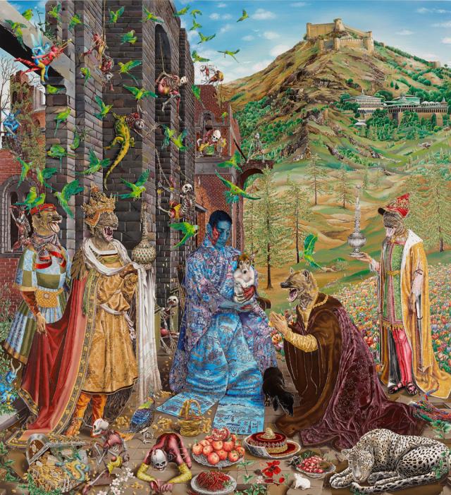
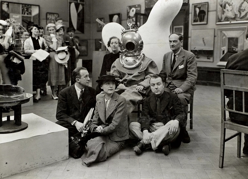
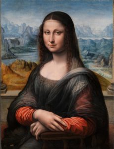
To end on something more positive, I’ve evangelised elsewhere about art history as a subject (here’s my one-line reason why everyone should study it; Art History is not just about the past, it encompasses everything that’s important about the present; politics, religion, gender, philosophy, personal, national and local identity – and studying the subject and freeing it from its historical assumptions and biases only makes it deeper and richer; plus you get to study fascinating, powerful and beautiful products of the human mind and body, too). Over the past decade or so the place of female artists within that history – and the profiles of individual women artists – has been explored more than ever before so that, although we are not yet at a point where women artists and male artists (and neither) just become ‘artists’ it’s no longer as unthinkable as that would have been when I studied art history 20 years ago.
On a less exulted note, when I first started posting things on Instagram around a decade ago, books like Jennifer Higgie’s The Mirror and the Palette, Katie Hessel’s The Story of Art Without Men (2022), Eiderdown Books’ superb Modern Women Artists series, Phaidon’s Great Women Artists (2019) and (my favourite) Lauren Elkin’s Art Monsters (2023) didn’t yet exist.
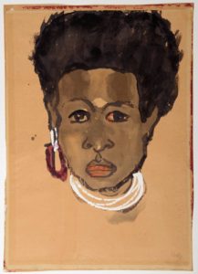
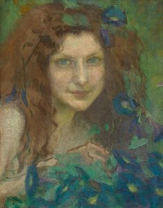
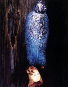
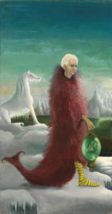
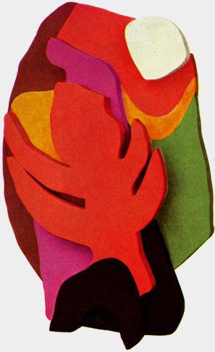
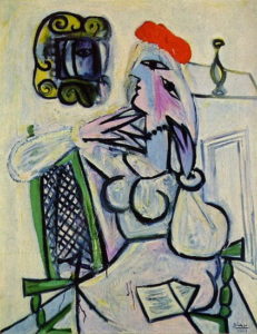
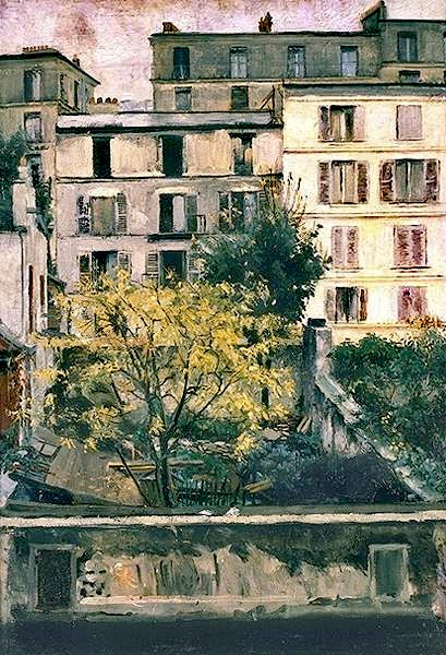
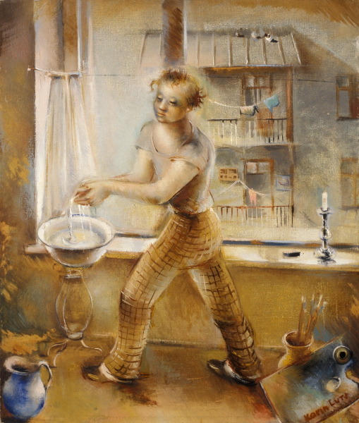
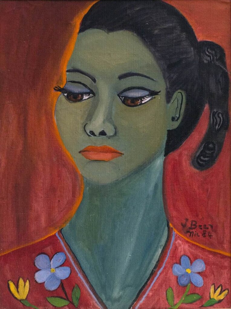
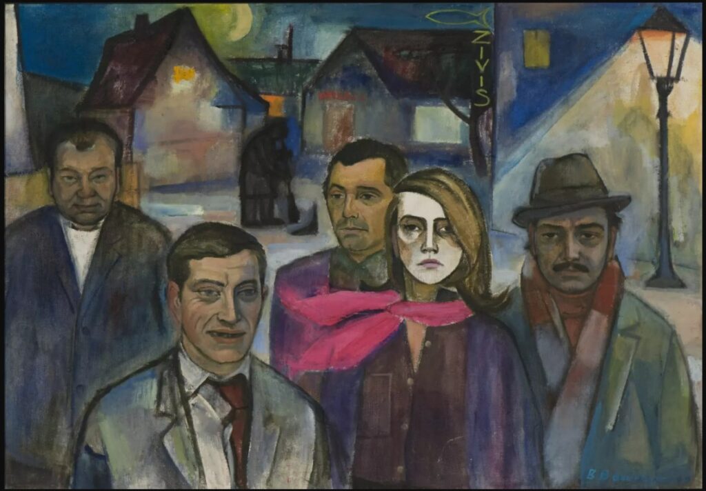
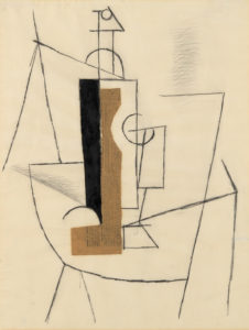
Some of my favourite artists – Jenny Saville, Hannah Höch, Gabriele Münter– were women and, like most female artists they made works that on one level transcend gender, as I think all great art does, but were also formed from an unmistakably female point of view (just as I would say Picasso’s art is unmistakably male). Female artists were, in short, making art that only female artists could make, (I’d actually go further and say that all great artists regardless of gender make art that only that individual can make, but that doesn’t change the basic point).
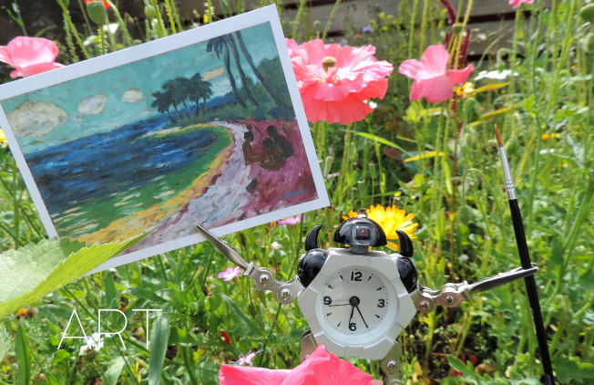
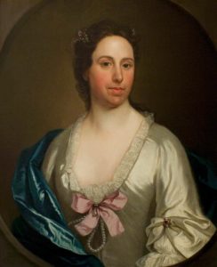
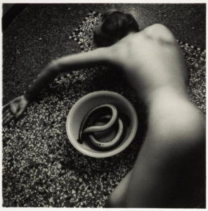
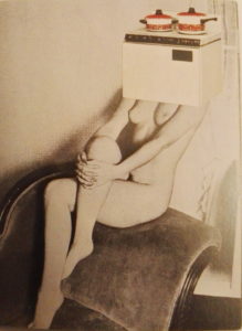
I found, and it’s still true, about art in general and not only – though especially – by women, that the more you look, the more you find and so when I started regularly posting art by female artists, most of whom were new to me, I began keeping a kind of database of artists and their birthdays. So here it is, in simplified form. There are many, many omissions (especially of sculptors – not so much my thing – and contemporary artists, whose birthdays are often not so easy to find) and it will always be a work in progress, but I think it’s worth sharing here anyway (and in birthday order, so you can see if you share your birthday with a fantastic artist; why not?) Happy International Women’s Day!.
JANUARY
Selma Gubin born 01-Jan 1905
Rita Kernn-Larsen born 01-Jan 1904
Lynette Yiadom-Boakye born 01-Jan 1977
Selma Plawneek-des Coudres born 02-Jan 1883
Slava Raskaj born 02-Jan 1877
Sylvi Kunnas born 03-Jan 1903
Maruja Mallo born 05-Jan 1902
Margaret Modlin born 05-Jan 1927
Madame Yevonde born 05-Jan 1893
Ruth Gikow born 06-Jan 1915
Sanja Ivekovic born 06-Jan 1949
Franciska Clausen born 07-Jan 1899
Fahrelnissa Zeid born 07-Jan 1901
Wanda von Debschitz-Kunowski born 08-Jan 1870
Alida Jantina Pott born 08-Jan 1888
Julie Wolfthorn born 08-Jan 1864
Tina Bauer-Pezellen born 09-Jan 1897
Annemarie Heinrich born 09-Jan 1912
Maxa Nordau born 10-Jan 1897
Nora Heysen born 11-Jan 1911
Marcia Marcus born 11-Jan 1928
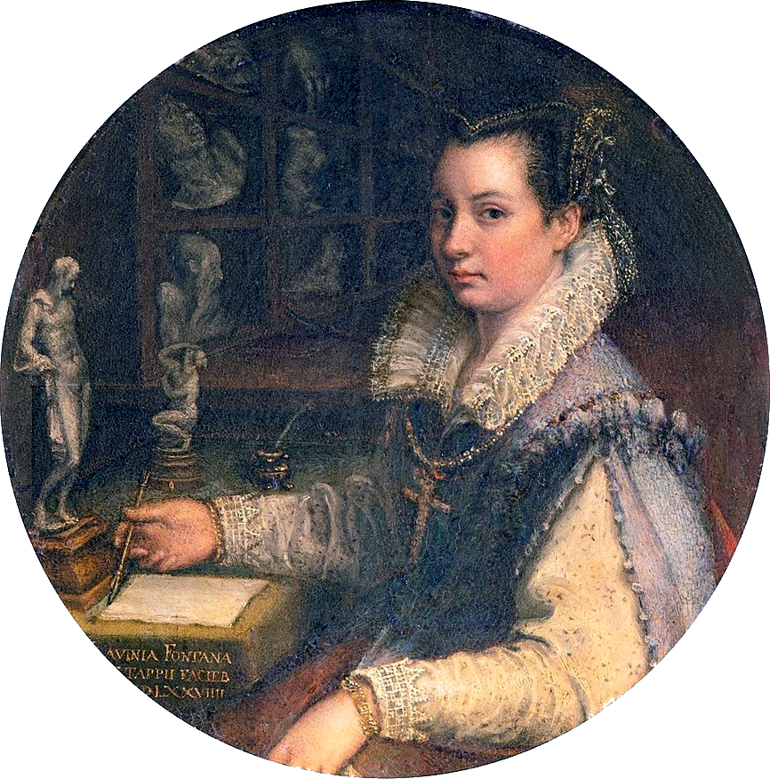
Rosalba Carriera born 12-Jan 1673
Hannah Hirsch-Pauli born 13-Jan 1864
Lilla Cabot Perry born 13-Jan 1848
Alice Pike Barney born 14-Jan 1857
Berthe Morisot born 14-Jan 1841
Eve Sonneman born 14-Jan 1946
Louise Blair Daura born 15-Jan 1905
Sabine Lepsius born 15-Jan 1864
Gerta Overbeck born 16-Jan 1898
Teddy Røwde born 16-Jan 1911
Alexandra Ekster born 18-Jan 1882
Cindy Sherman born 19-Jan 1954
Marianne Stokes born 19-Jan 1855
Sophie Tauber-Arp born 19-Jan 1889
Leyly Matine-Daftary born 19-Jan 1937
Maxine Albro born 20-Jan 1893
Hertha Spielberg born 21-Jan 1890
Annemarie Jacob born 22-Jan 1891
Kiki Kogelnik born 22-Jan 1935
Maria Luiko born 25-Jan 1904
Emilie von Hallavanya born 26-Jan 1874
Katarzyna Kobro born 26-Jan 1898
Yva (Else Ernestine Neulander-Simon) born 26-Jan 1900
Jeanne Selmersheim-Desgrange born 27-Jan 1877
Maria Tlusty born 27-Jan 1901
Bertha Muller born 28-Jan 1848
Alice Neel born 28-Jan 1900
Elisabeth Büchsel born 29-Jan 1867
Anna Susanna Fries born 30-Jan 1827
Teresa Feoderovna Ries born 30-Jan 1874
Amrita Sher-Gil born 30-Jan 1913
Masa Feszty born 31-Jan 1894
Elena Liessner-Blomberg born 31-Jan 1897
Cornelia Macintyre Foley born 31-Jan 1909
FEBRUARY
Doris Lee born 01-Feb 1905
Kris Torne born 01-Feb 1867
Sybil Atteck born 03-Feb 1911
Helen Forbes born 03-Feb 1891
Henriette Petit born 03-Feb 1894
Katherine Read born 03-Feb 1723
Georgina de Albuquerque born 04-Feb 1885
Marthe Hirt born 04-Feb 1890
Minna Köhler-Roeber born 04-Feb 1883
Ksenia Boguslavskaya born 05-Feb 1892
Jeanne Bieruma Oosting born 05-Feb 1898
Dorothea Maetzel-Johannsen born 06-Feb 1886
Arte Topalian born 06-Feb 1906
Kaete Lassen born 07-Feb 1880
Paula Modersohn-Becker born 08-Feb 1876
Anita Ree born 09-Feb 1885
Celia Calderon born 10-Feb 1921
Eva Frankfurther born 10-Feb 1930
Dorte Clara Wolff (Dodo) born 10-Feb 1907
Annelise Kretschmer born 11-Feb 1903
Léa Lafugie born 11-Feb 1890
Kate Diehn-Bitt born 12-Feb 1900
Marie Vassilieff born 12-Feb 1884
Marta Hegemann born 14-Feb 1894
Marie Vorobieff (Marevna) born 14-Feb 1892
Dora de la Torre born 14-Feb 1924
Mary Adshead born 15-Feb 1904
Grethe Jurgens born 15-Feb 1899
Gertrude Abercrombie born 17-Feb 1909
Greta Hällfors-Sipilä born 19-Feb 1899
Hazel Janicki born 19-Feb 1918
Gabriele Munter born 19-Feb 1877
Else Berg born 19-Feb 1877
Maria von Heider-Schweinitz born 20-Feb 1894
Lía Correa Morales born 20-Feb 1893
Grace Carpenter Hudson born 21-Feb 1865
Delhy Tejero born 22-Feb 1904
Gundula Schulze Eldowy born 23-Feb 1954
Martha Cunz born 24-Feb 1876
Alice Bailly born 25-Feb 1872
Broncia Koller-Pinnell born 25-Feb 1863
Hilde Hamann born 26-Feb 1898
Alexandra Povorina born 26-Feb 1885
Annie Swynnerton born 26-Feb 1844
Teresa Condeminas i Soler born 27-Feb 1905
Eva-Maria Bergmann born 28-Feb 1941
Julia Thecla born 28-Feb 1896
MARCH
Marcelle Cahn born 01-Mar 1895
Erika Streit born 01-Mar 1910
Lola Cueto born 02-Mar 1897
Agda Holst born 02-Mar 1886
Judith Alpi born 03-Mar 1893
Gussy Hippold-Ahnert born 03-Mar 1910
Anne Ratkowski born 03-Mar 1903
Ellen Emmet Rand born 04-Mar 1875
Charmion Von Wiegand born 04-Mar 1896
Gertrude Fehr born 05-Mar 1895
Clara Ledesma Terrazas born 05-Mar 1924
Maria Blanchard born 06-Mar 1881
Pauline Boty born 06-Mar 1938
Maria Uhden born 06-Mar 1892
Marisa Roesset Velasco born 06-Mar 1904
Aenne Biermann born 08-Mar 1898
Constance Mayer born 09-Mar 1774
Annalize Pilasik born 10-Mar 1903
Rita Angus born 12-Mar 1908
Zofia Atteslander born 12-Mar 1874
Elaine De Kooning born 12-Mar 1918
Marie Eberhard born 12-Mar 1897
Idelle Weber born 12-Mar 1932
Lizzy Ansingh born 13-Mar 1875
Andree Bosquet born 13-Mar 1900
Diane Arbus born 14-Mar 1923
Annemarie von Jakimow-Kruse born 14-Mar 1889
Maria Slavona born 14-Mar 1865
Mary Pratt born 15-Mar 1935
Gerda Wegener born 15-Mar 1886
Maria Austria born 19-Mar 1915
Marie Ellenrieder born 20-Mar 1791
Renee Sintenis born 20-Mar 1888
Alix Ayme born 21-Mar 1894
Greta Kempton born 22-Mar 1901
Lea Grundig born 23-Mar 1906
Marie Howet born 24-Mar 1897
Charley Toorop born 24-Mar 1891
Petrona Viera born 24-Mar 1895
Therese Debains born 25-Mar 1897
Johanna Kampmann-Freund born 25-Mar 1888
Käthe Loewenthal born 27-Mar 1878
Elga Sesemann born 28-Mar 1922
Dora Carrington born 29-Mar 1893
Cecile Walton born 29-Mar 1891
Helene Riedel born 30-Mar 1901
APRIL
Gertrude Bohnert born 02-Apr 1908
Emilie Charmy born 02-Apr 1878
Stella Snead born 02-Apr 1910
Hermine Aichenegg born 03-Apr 1915
Francesca woodman born 03-Apr 1958
Constance Marie Charpentier born 04-Apr 1767
Ruth Smith born 05-Apr 1913
Leonora Carrington born 06-Apr 1917
Jeanne Hebuterne born 06-Apr 1898
Kata Kalivoda born 06-Apr 1877
Hilde Rubinstein born 07-Apr 1904
Lilly Steiner born 07-Apr 1884
Annemirl Bauer born 10-Apr 1939
Gunvor Gronvik born 10-Apr 1912
Frances Foy born 11-Apr 1890
Adélaïde Labille-Guiard born 11-Apr 1749
Maggie Laubser born 14-Apr 1886
Olga Boznanska born 15-Apr 1865
Elizabeth Catlett born 15-Apr 1915
Princess Elisabeth Vilma Lwoff-Parlaghy born 15-Apr 1863
Laura Alma-Tadema born 16-Apr 1852
Inji Efflatoun born 16-Apr 1924
Charlotte Salomon born 16-Apr 1917
Hermine David born 19-Apr 1886
Eva Gonzales born 19-Apr 1849
Dod Procter born 21-Apr 1890
Raquel Forner born 22-Apr 1902
Ottilie Roederstein born 22-Apr 1859
Lee Miller born 23-Apr 1907
Christine Bacheler Nisbet born 24-Apr 1902
Lyubov Popova born 24-Apr 1889
Bridget Riley born 24-Apr 1931
Mary Brandt (Perez) born 25-Apr 1917
Mela Muter born 26-Apr 1876
Doro Ording born 26-Apr 1901
Nathalie Kraemer born 28-Apr 1891
Else Fischer-Hansen born 29-Apr 1905
Mainie Jellett born 29-Apr 1897
Karin Luts born 29-Apr 1904
Ruth Meier born 29-Apr 1888
Juana Romani born 30-Apr 1867
Thea Schleusner born 30-Apr 1879
Joronn Sitje born 30-Apr 1897
MAY
Cecilia Beaux born 01-May 1855
Romaine Brooks born 01-May 1874
Elsa Thoresen born 01-May 1906
Eva Aeppli born 02-May 1925
Peggy Bacon born 02-May 1895
Chinwe Chukwuogo-Roy born 02-May 1952
Brigitte Fugmann born 03-May 1948
Stina Forssell born 03-May 1906
Geta Bratescu born 04-May 1926
Sylvia Pankhurst born 05-May 1882
Celeste Woss y Gil born 05-May 1891
Lucie Citti Ferreira born 06-May 1911
Suzy Freylinghuysen born 07-May 1911
Marion Gilmore born 07-May 1909
Dore Meyer-Vax born 08-May 1908
Felicita Pauluka born 08-May 1925
Paula Gans born 09-May 1883
Stanislawa de Karlowska born 09-May 1876
Hanna Klose-Greger born 09-May 1892
Grete Stern born 09-May 1904
Frida Konstantin born 10-May 1884
Helene von Taussig born 10-May 1879
Eva Schulze Knabe born 11-May 1907
Ilske Schwimmer born 11-May 1915
Monika Brachmann born 12-May 1944
Paula Lauenstein born 12-May 1898
Charlotte Wankel born 12-May 1888
Sara Afonso/Affonso born 13-May 1899
Louise Seidler born 15-May 1786
Stella Bowen born 16-May 1893
Tamara de Lempicka born 16-May 1898
Laura Wheeler Waring born 16-May 1887
Bele Bachem born 17-May 1916
June Beer born 17-May 1935
Martha Bernstein born 17-May 1874
Kati Horna born 19-May 1912
Clara von Rappard born 19-May 1857
Ellen Auerbach born 20-May 1906
Lily Furedi born 20-May 1896
Margret Hofheinz-Döring born 20-May 1910
Maria Hiller-Foell born 21-May 1880
Marisol Escobar born 22-May 1930
Erszebet Korb born 22-May 1889
Julia Diaz born 23-May 1917
Charlotte Berend-Corinth born 25-May 1880
Anita Magsaysay-Ho born 25-May 1914
Vally Wieselthier born 25-May 1895
Fanny Harlfinger-Zakucka born 26-May 1873
Amelie Lundahl born -May 1850
Heidi Vogel born 27-May 1951
Anna De Weert born 27-May 1867
Anna-Eva Bergman born 29-May 1909
Marlow Moss born 29-May 1889
Vanessa Bell born 30-May 1879
Audrey Flack born 30-May 1931
Magdalena Mira Mena born 30-May 1859
Carmen Herrera born 31-May 1915
Mireya Lafuente born 31-May 1905
Hilla von Rebay born 31-May 1890
JUNE
Vera Nilsson born 01-Jun 1888
Lotte B Prechner born 01-Jun 1877
Greta Gerell born 02-Jun 1898
Louise Amans born 05-Jun 1850
Winifred Knights born 05-Jun 1899
Biruta Baumane born 06-Jun 1922
Ricarda Jacobi born 07-Jun 1923
Laura Rodig born 07-Jun 1901
Alice Rahon born 08-Jun 1904
Montserrat Gudiol born 09-Jun 1933
Oda Krohg born 11-Jun 1860
Priscilla Warren Roberts born 13-Jun 1916
Pan Yuliang born 14-Jun 1895
Agnes Tait born 14-Jun 1894
Erna Lincke born 15-Jun 1899
Edith Meyer von Kamptz born 15-Jun 1884
Fritzi Brod born 16-Jun 1900
Henriette Browne born 16-Jun 1829
Irma Lang-Scheer born 17-Jun 1901
Margarete Kubicka born 20-Jun 1891
Emilia Bertole born 21-Jun 1896
Gwen John born 22-Jun 1876
Wangechi Mutu born 22-Jun 1972
Hilde Rakebrand born 22-Jun 1901
Olga Rozanowa born 22-Jun 1886
Madge Tennent born 22-Jun 1889
Lilo Raymond born 23-Jun 1922
Elena Shegal born 23-Jun 1924
Meraud Guinness born 24-Jun 1904
Helen Lundeberg born 24-Jun 1908
Alice Frey born 25-Jun 1895
Kay Sage born 25-Jun 1898
Vilma Eckl born 26-Jun 1892
Coba Ritsema born 26-Jun 1876
Helene Perdriat born 27-Jun 1889
Catherine Yarrow born 27-Jun 1904
Ali Goubitz born 28-Jun 1904
Florence Henri born 28-Jun 1893
Nan Youngman born 28-Jun 1906
Hannelore Neumann-Tachilzik born 29-Jun 1939
JULY
Herminia Arrate born 01-Jul 1896
Elizabeth Lochrie born 01-Jul 1890
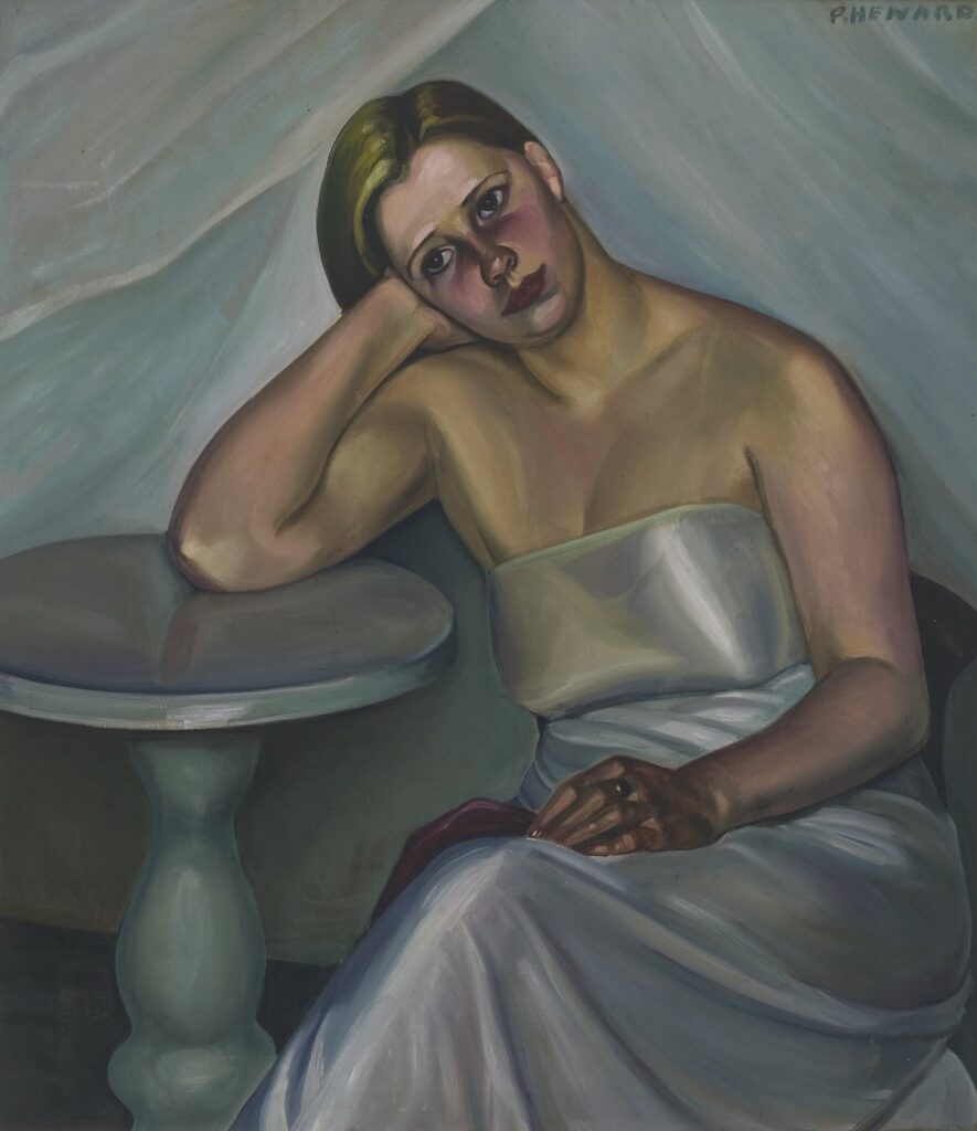
Prudence Heward born 02-Jul 1896
Lydia Mei born 02-Jul 1896
Rahel Szalit-Marcus born 02-Jul 1894
Georgina Klitgaard born 03-Jul 1893
Petra Flemming born 06-Jul 1944
Frida Kahlo born 06-Jul 1907
Unica Zurn born 06-Jul 1916
Artemisia Gentileschi born 08-Jul 1593
Kathe Kollwitz born 08-Jul 1867
Carmen Mondragon (Nahui Olin) born 08-Jul 1894
Maria Tupper Hunneus born 09-Jul 1893
Helene Schjerfbeck born 10-Jul 1862
Luise Kornsand born 11-Jul 1876
Bertina Lopes born 11-Jul 1924
Ruth Starr Rose born 12-Jul 1887
Honore Desmond Sharrer born 12-Jul 1920
Helene Arnau born 13-Jul 1870
Alice Brasse-Forstmann born 13-Jul 1903
Elena Huerta Muzquiz born 15-Jul 1908
Giselle Kuster born 15-Jul 1911
Berenice Abbott born 17-Jul 1898
Marie Petiet born 20-Jul 1854
Marta Astfalck-Vietz born 21-Jul 1901
Greta Freist born 21-Jul 1904
Maral Rahmanzadeh born 23-Jul 1916
Anna Dorothea Therbusch born 23-Jul 1721
Wanda Wulz born 25-Jul 1903
Alba Calderon (de Gil) born 27-Jul 1908
Nelly van Doesburg born 27-Jul 1899
Sofia Bassi born 28-Jul 1913
Mathilda Rotkirch born 28-Jul 1813
Anna Stainer-Knittel born 28-Jul 1841
Grace Pailthorpe born 29-Jul 1883
Bettina Shaw-Lawrence born 29-Jul 1921
Friedl Dicker-Brandeis born 30-Jul 1898
Maria Szantho born 31-Jul 1897
Doris Zinkeisen born 31-Jul 1897
AUGUST
Rachel Baes born 01-Aug 1912
Ida Gerhardi born 02-Aug 1862
Gretel Haas-Gerber born 02-Aug 1903
Maria Wiik born 03-Aug 1853
Laura Knight born 04-Aug 1877
Hedda Sterne born 04-Aug 1910
Edith Dettmann born 04-Aug 1898
Margit Graber born 05-Aug 1895
Irene Rice Pereira born 05-Aug 1902
Macena Barton born 07-Aug 1901
Maria Caspar-Filser born 07-Aug 1878
Lili Orszag born 08-Aug 1926
Tove Jansson born 09-Aug 1914
Eliane de Meuse born 09-Aug 1899
Cornelia Paczka-Wagner born 09-Aug 1864
Rogi Andre born 10-Aug 1900
Margret Bilger born 12-Aug 1904
Marianne Fieglhuber-Gutscher born 12-Aug 1889
Nola Hatterman born 12-Aug 1899
Ernestine von Kirchsberg born 12-Aug 1857
Helene Roth born 12-Aug 1887
Gluck (Hannah Gluckstein) born 13-Aug 1895
Xenia Cage born 15-Aug 1913
Marie Goth born 15-Aug 1887
Zsuzsi Robos born 15-Aug 1929
Tamara Natalie Madden born 16-Aug 1975
Käthe Ephraim Marcus born 16-Aug 1892
Gunnvor Advocaat born 17-Aug 1912
Gudrun Petersdorff born 17-Aug 1955
Anna Ancher born 18-Aug 1859
Kyra Markham born 18-Aug 1891
Florine Stettheimer born 19-Aug 1871
Lette Valeska born 20-Aug 1885
Hedwig Holtz-Sommer born 22-Aug 1901
Agnes Lawrence Pelton born 22-Aug 1881
Ebba Carstensen born 23-Aug 1885
Agnes Cleve born 23-Aug 1876
Hannah Frank born 23-Aug 1908
Mariette Lydis born 24-Aug 1887
Henriette Paula Häberlin born 25-Aug 1882
Dorothea Tanning born 25-Aug 1910
Fanny Rabel born 27-Aug 1922
Olga Costa born 28-Aug 1913
Else Lohmann born 29-Aug 1897
Sughra Rababi born 29-Aug 1922
Martha Schrag born 29-Aug 1870
Anna Zinkeisen born 29-Aug 1901
Siri Deckert born 30-Aug 1888
Leonor Fini born 30-Aug 1907
Amy Sherald born 30-Aug 1973
Ida Kerkovius born 31-Aug 1879
SEPTEMBER
Adriana Bisi Fabbri born 01-Sep 1881
Mario Miguel Mollari 01-Sep 1930
Hilda Rix Nicholas born 01-Sep 1884
Augusta Roszmann born 01-Sep 1859
Mina Carlson-Bredberg born 02-Sep 1857
Else Meidner born 02-Sep 1901
Elin Danielson-Gambogi born 03-Sep 1861
Helene Funke born 03-Sep 1869
Lis Bertram-Ehmsen born 05-Sep 1897
Piti (Francis) Bartolozzi born 06-Sep 1908
Marie-Gabrielle Capet born 06-Sep 1761
Rosa Rolanda born 06-Sep 1896
Hanna Bekker vom Rath born 07-Sep 1893
Maria Lassnig born 08-Sep 1919
Mimi Parent born 08-Sep 1924
Anna Walinska born 08-Sep 1906
Aurora Reyes Flores born 09-Sep 1908
Consuelo Remedios González del Bianco born 10-Sep 1911
Marianne von Werefkin born 10-Sep 1860
Bona di Mandiargues born 12-Sep 1926
Nan Goldin born 12-Sep 1953
Lili Pancu born 13-Sep 1908
Eva Cederström born 15-Sep 1909
Hope Gangloff born 15-Sep 1974
Rosalie Gwathmey born 15-Sep 1908
Cordelia Urueta Sierra born 16-Sep 1908
Alla Horska born 18-Sep 1929
Maud Sulter born 19-Sep 1960
Hilda Belcher born 20-Sep 1881
Denise Bellon born 20-Sep 1902
Genevieve Springston Lynch born 20-Sep 1891
Else Hagen born 21-Sep 1914
Toyen born 21-Sep 1902
Anne Winterer born 21-Sep 1894
Hansl Bock born 22-Sep 1893
Irena Rüther-Rabinowicz born 22-Sep 1900
Esphyr Slobodkina born 22-Sep 1908
Suzanne Van Damme born 22-Sep 1901
Suzanne Valadon born 23-Sep 1865
Maina-Miriam Munsky born 24-Sep 1943
Tilsa Tsuchiya 24-Sep 1928
Marguerite Zorach born 25-Sep 1887
Suzi Gablik born 26-Sep 1934
Arcangela Paladini born 29-Sep 1596
OCTOBER
Marianne Brandt born 01-Oct 1893
Alice Prin (Kiki de Montparnasse) born 02-Oct 1901
Elisabeth Sophie Cheron born 03-Oct 1648
Kathleen Walne born 03-Oct 1915
Ester Ellqvist born 04-Oct 1880
Ellen Thesleff born 05-Oct 1869
Graciela Aranis born 06-Oct 1908
Meret Oppenheim born 06-Oct 1913
Nina Arbore born 08-Oct 1889
Elise Ransonnet-Villez born 08-Oct 1843
Faith Ringgold born 08-Oct 1930
Louise Rösler born -Oct 1907
Ithell Colquhoun born 09-Oct 1906
Zelia Salgado born 10-Oct 1904
Linda Kogel born 11-Oct 1861
Grete Csaki-Copony born 12-Oct 1893
Paula Deppe born 12-Oct 1886
Nadezhda Petrovic born 12-Oct 1873
Ruth Bernhard born 14-Oct 1905
Vilma Vrbova born 14-Oct 1905
Minna Citron born 15-Oct 1896
Lilly Hildebrandt born 16-Oct 1887
Elisabeth Chaplin born 17-Oct 1890
Cata Dujšin-Ribar born 17-Oct 1897
Agnes van den Brandeler born 18-Oct 1918
Jeanne Mandello born 18-Oct 1907
Bettina von Arnim born 19-Oct 1940
Jacqueline Marval born 19-Oct 1866
Ottilie Reylaender born 19-Oct 1882
Else-Christie Kielland born 20-Oct 1903
Gustava Engels von Veith born 20-Oct 1879
Penny Slinger born 21-Oct 1947
Lygia Clark born 23-Oct 1920
Rina Lazo (Wasem) born 23-Oct 1923
Marie-Louise von Motesiczky born 24-Oct 1906
Claude Cahun born 25-Oct 1894
Katalin Ladik born 25-Oct 1942
Ruth Light Braun born 26-Oct 1906 2003 oa
Marthe Donas born 26-Oct 1885 1967 oa
Bep Rietveld born 26-Oct 1913 1999 oa
Blanche-Augustine Camus born 27-Oct 1884
Julie Hagen-Schwarz born 27-Oct 1824
Sigrid Hjerten born 27-Oct 1885
Mary Moser born 27-Oct 1744
Paraskeva Clark born 28-Oct 1898
Bertha Müller born 28-Oct 1848
Alice Lex-Nerlinger born 29-Oct 1893
Louise Abbema born 30-Oct 1853
Maria Izquierdo born 30-Oct 1902
Angelika Kauffmann born 30-Oct 1741
Erna Schmidt-Carroll born 30-Oct 1896
Marie-Laure de Noailles born 31-Oct 1902
Marie Laurencin born 31-Oct 1883
Jóhanna Kristín Yngvadóttir born 31-Oct 1953
NOVEMBER
Hannah Hoch born 01-Nov 1889
Hedwig Woermann born 01-Nov 1879
Venny Soldan-Brofeldt born 02-Nov 1863
Lois Mailou Jones born 03-Nov 1905
Lilias Torrance Newton born 03-Nov 1896
Charlotte Buresova born 04-Nov 1904
Elena Luksch-Makowsky born 04-Nov 1878
Milena Pavlovic-Barili born 05-Nov 1909
Ann Brockman born 06-Nov 1899
Elsa Haensgen-Dingkuhn born 07-Nov 1898
Sonja Kovačić – Tajčević born 07-Nov 1894
Angeles Santos Torroella born 07-Nov 1911
Elizabeth Sparhawk-Jones born 08-Nov 1885
Emmy Bridgwater born 10-Nov 1906 1999 oa
Lisette Model born 10-Nov 1901
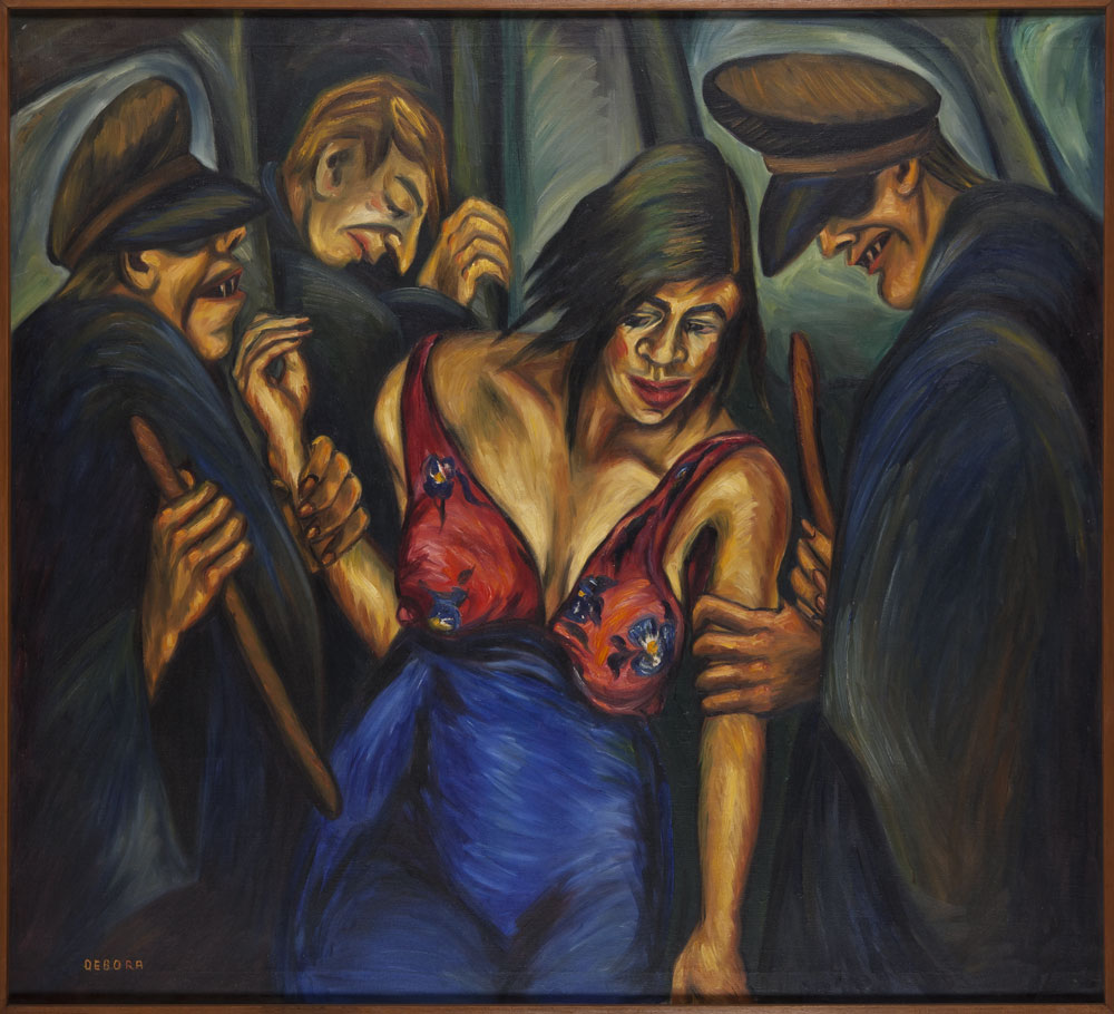
Debora Arango born 11-Nov 1907
Carry Hess born 11-Nov 1889
Magda Langenstraß-Uhlig born 11-Nov 1888
Mary Kessell born 13-Nov 1914
Ekaterina Savova-Nenova born 13-Nov 1901
Sonia Delaunay born 14-Nov 1885
Julie Manet born 14-Nov 1878
Tina Blau born 15-Nov 1845
Miriam Schapiro born 15-Nov 1923
Elisa Counis born 16-Nov 1812
Katharina Sieverding born 16-Nov 1944
Louise Dahl-Wolfe born 19-Nov 1895
Lily Harmon born 19-Nov 1912
Marianne Breslauer born 20-Nov 1909
Angelika Hoerle born 20-Nov 1899
Germaine Krull born 20-Nov 1897
Elisabeth Jerichau-Baumann born 21-Nov 1819
Jeanne Mammen born 21-Nov 1890
Dora Maar born 22-Nov 1907
Bridget Bate Tichenor born 22-Nov 1917
Else Hertzer born 24-Nov 1884
Mary Foote born 25-Nov 1872
Sara Shamma born 26-Nov 1975
Audrey Buller born 27-Nov 1902
Gretchen Wohlwill born 27-Nov 1878
Mabel Alvarez born 28-Nov 1891
Hedwig Marquardt born 28-Nov 1884
Else Wex-Cleemann born 29-Nov 1890
Fridel Dethleffs-Edelmann born 30-Nov 1899
DECEMBER
Eileen Agar born 01-Dec 1899
Jenny Mucchi-Wiegemann born 01-Dec 1895
Emilie Mediz-Pelikan born 02-Dec 1861
Marion Adnams born 03-Dec 1898
Dorte Helm born 03-Dec 1898
Grace English born 04-Dec 1891
Elfriede Lohse-Wächtler born 04-Dec 1899
Louise Catherine Breslau born 06-Dec 1856
Margaret Brundage born 09-Dec 1900
Louise de Hem born 10-Dec 1866
Zinaida Serebriakova born 10-Dec 1884
Olga Terri born 10-Dec 1916
Irène Zurkinden born 11-Dec 1909
Alison Watt born 11-Dec 1965 alive
Ragnhild Keyser born 12-Dec 1889
Emily Carr born 13-Dec 1871
Alice Sommer born 13-Dec 1898
Aino Bach born 14-Dec 1901
Remedios Varo born 16-Dec 1908
Bertha Wegmann born 16-Dec 1846
Suze Robertson born 17-Dec 1855
Jane Graverol born 18-Dec 1905
Ewa Kierska born 18-Dec 1923
Lucie Cousturier born 19-Dec 1876
Therese Schwartze born 20-Dec 1851
Trude Fleischmann born 22-Dec 1895
Margit Anna born 23-Dec 1913
Luvena Buchanan Vysekal born 23-Dec 1873
Alma del Banco born 24-Dec 1862
Sigrid Maria Schauman born 24-Dec 1877
Dorothy Johnstone born 25-Dec 1892
Ragnhild Kaarbo born 26-Dec 1889
Stella Steyne born 26-Dec 1907
Augusta von Zitzewitz born 26-Dec 1880
Annott (Jacobi) born 27-Dec 1894
Aisha Galimbaeva born 29-Dec 1917
Adela ber Vukić born 30-Dec 1888
Lucile Blanch born 31-Dec 1895
Beatrice Mandelman born 31-Dec 1912
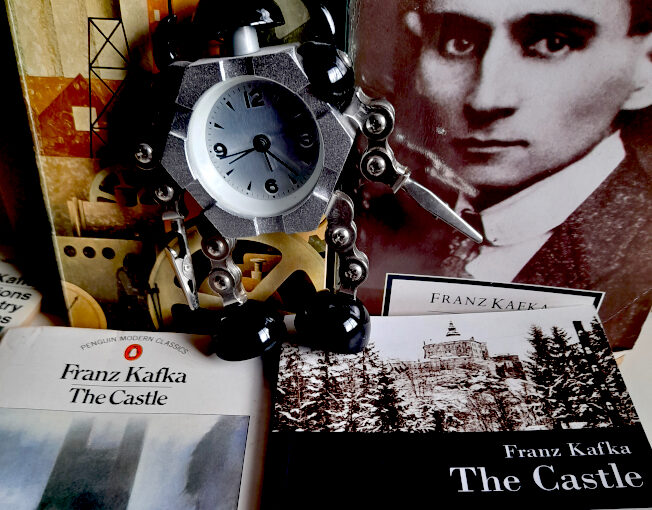
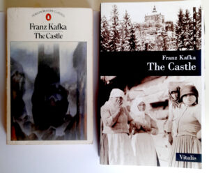
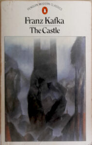 Lots there to be curious about, but let’s stick to Kafka for now. My old Penguin paperback of The Castle, which features two chapters not included in the original 1930 UK edition (which were separately translated by Eithne Wilkins & Ernst Kaiser), is from of my least favourite stylistic phase of the Penguin Modern Classics series. At that point in the early 80s, the spines of the books, in a nostalgic nod to the classic early days of Penguin, were orange and white, while the covers were white with (mostly) modernist paintings chosen to more-or-less fit the books. The Castle does have a nice cover illustration, by Elizabeth Pyle, but otherwise the design is a little drab. The book is 298 pages of fairly but not unreadably small print. The Vitalis edition is far more stylish and the cover artwork uses a beautifully evocative photograph of (Bohemian?) “Peasant women” from 1918 and a photograph of Friedland (or Frýdlant) castle in Czechia. The type looks around the same size as the Penguin edition, but though the book is slightly bigger than the Penguin, it has 382 pages.
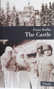 Even allowing for the fact that the Vitalis Castle includes nice, dark, moody and scratchy illustrations by Karel Hruška, it’s a noticeably longer book, and the reason for that is revealed in the two quotes at the top of the page. The Muirs’ prose – like Edwin Muir’s own poetry, which is worth checking out – is terse and spare, but also flexible and evocative. It’s the “voice” that Kafka has had for me since I was a teenager. It also has the benefit – or at least I think it’s a benefit, more later – of having been translated close to Kafka’s own time. When that first British edition of The Castle was published and Edwin Muir wrote in his introduction “Franz Kafka’s name, as far as I can discover, is almost unknown to English readers,” he was talking about an author who had only been dead for six years, and the book itself had only been in print in Kafka’s own language for four years.
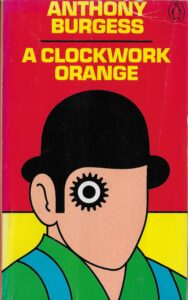 Burgess’s A Clockwork Orange is one of my all-time favourite novels – it’s also the product, very obviously, of someone who could speak and think, fluently, in a lot of languages. Ten is the number he usually gave, ‘with bits and pieces of others’. Burgess created the book’s slang, Nadsat, in order to write about ‘the youth’ in a way that didn’t date like real slang and it definitely worked. Rightly, I think, Burgess didn’t want a glossary of Nadsat terms in the book. Some publishers have added one anyway, but the book works far better if the reader just immerses themselves in the narrator’s voice and his disorienting world. But Burgess was only human, and in perhaps the novel’s weakest moment (because it takes us out of that world) he couldn’t resist pointing out that the language his young narrator Alex speaks isn’t just whimsy on the part of the author:

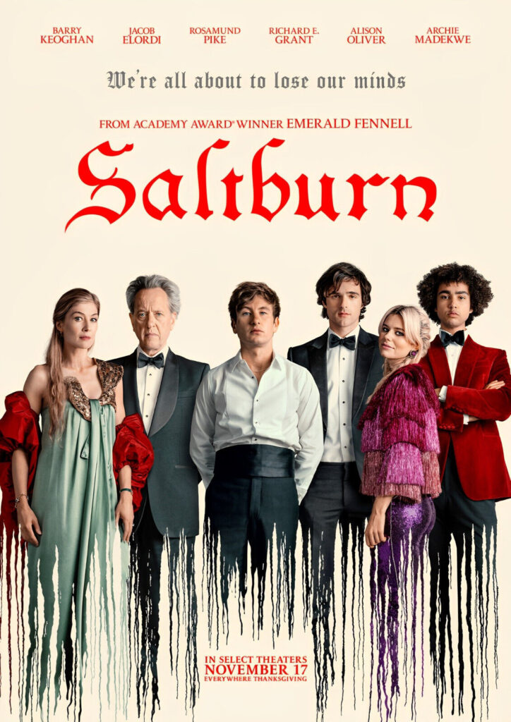 2023 was the usual mixed bag of things; I didn’t see any of the big movies of
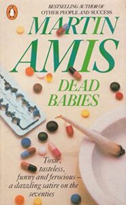 the year yet. I have watched half of Saltburn, which so far makes me think of the early books of Martin Amis, especially Dead Babies (1975) and Success (1978) – partly because I read them again after he died last year. They are both still good/nasty/funny, especially Success, but whereas I find that having no likeable characters in a book is one thing, and doesn’t stop the book from being entertaining, watching unlikeable characters in a film is different – more like spending time with actual unlikeable people, perhaps because – especially in a film like Saltburn – you can only guess at their motivations and inner life. So, the second half of Saltburn remains unwatched – but I liked it enough that I will watch it.


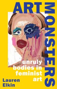 I read lots of good books in 2023 – I started keeping a list but forgot about it at some point – but the two that stand out in my memory as my favourites are both non-fiction. Lauren Elkin’s Art Monsters: Unruly Bodies in Feminist Art is completely engrossing and full of exciting ways of really looking at pictures. I wrote at length about Elena Kostyuchenko’s I Love Russia
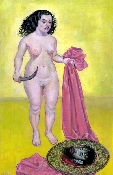
 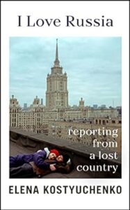 It’s no great surprise to me that my favourite books of the year would be – like much of my favourite art – by women. Though I think the individual voice is crucial in all of the arts, individuals don’t grow in a vacuum and because female (and, more widely, non-male) voices and viewpoints have always been overlooked, excluded, marginalised and/or patronised, women and those outside of the standard, traditional male authority figures more generally, tend to have more interesting and insightful perspectives than the ‘industry standard’ artist or commentator does. The first time that thought really struck me was when I was a student, reading about Berlin Dada and finding that Hannah Höch was obviously a much more interesting and articulate artist than (though I love his work too) her partner Raoul Hausmann, but that Hausmann had always occupied a position of authority and a reputation as an innovator, where she had little-to-none. And the more you look the more you see examples of the same thing. In fact, because women occupied – and in many ways still occupy – more culturally precarious positions than men, that position informs their work – thinking for example of artists like Leonora Carrington, Kay Sage or – a bigger name now – Frida Kahlo – giving it layers of meaning inaccessible to – because unexperienced by – their male peers.
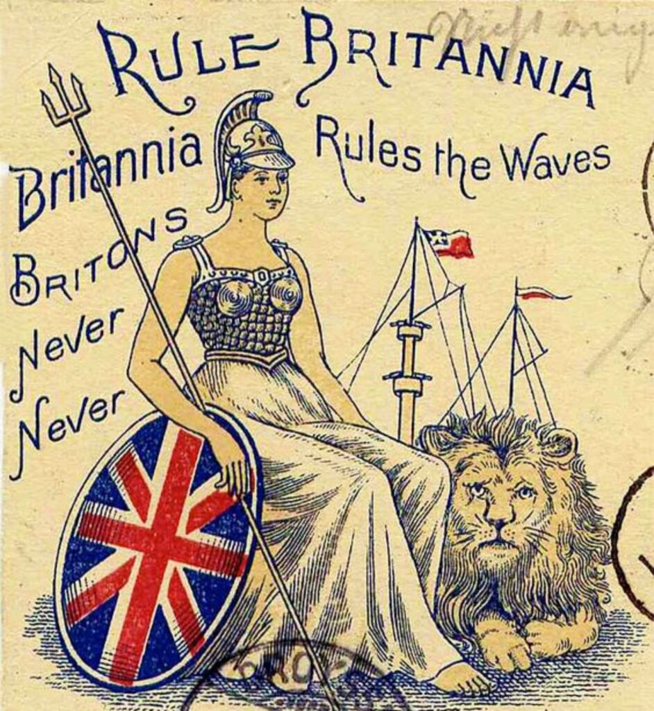 If that backlash comes, it will be from the academic equivalent of those figures who, in 2023 continued to dominate the cultural landscape. These are conservative (even if theoretically radical) people who pride themselves on their superior rational, unsentimental and “common sense” outlook, but whose views tend to have a surprising amount in common with some of the more wayward religious cults. Subscribing to shallowly Darwinist ideas, but only insofar as they reinforce one’s own prejudices and somehow never feeling the need to follow them to their logical conclusions is not new, but it’s very now. Underlying ideas like the ‘survival of the fittest’, which then leads to the more malevolent idea of discouraging the “weak” in society by abolishing any kind of social structure that might support them is classic conservatism in an almost 19th century way, but somehow it’s not surprising to see these views gaining traction in the discourse of the apparently futuristic world of technology. In more that one way, these kinds of traditionalist, rigidly binary political and social philosophies work exactly like religious cults, with their apparently arbitrary cut off points for when it was that progress peaked/halted and civilisation turned bad. That point varies; but to believe things were once good but are now bad must always be problematic, because when, by any objective standards, was everything good, or were even most things good? For a certain class of British politician that point seems to have been World War Two, which kind of requires one to ignore actual World War Two. But the whole of history is infected by this kind of thinking – hence strange, disingenuous debates about how bad/how normal Empite, colonialism or slavery were; incidentially, you don’t even need to read the words of abolitionists or slaves themselves (though both would be good to read) to gain a perspective of whether or not slavery was considered ‘normal’ or bad by the standards of the time. Just look at the lyrics to Britain’s most celebratory, triumphalist song of the 18th century, Rule Britannia. James Thomson didn’t write “Britons never, never, never shall be slaves; though there’s nothing inherently wrong with slavery.” They knew it was something shameful, something to be dreaded, even while celebrating it.


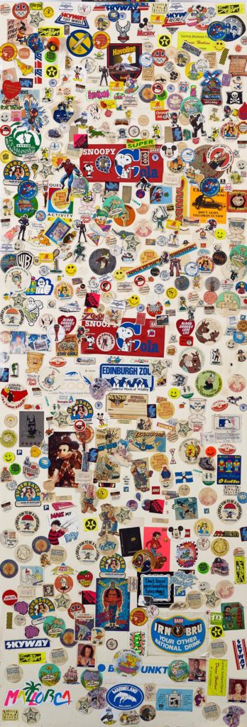
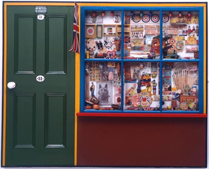
 This is perhaps art history as human interest and association rather than as aesthetics (this is especially true in the case of the Victorian scraps and scrapbooks, perhaps because the ready-made nature of the scraps themselves makes the objects feel less like the works of an artist and more like a hobby; nothing wrong with that, but as the sort of things you see in auctions and junk shops they have the aura of being ephemera, rather than using ephemera to make something else; a false distinction perhaps), but for me this exhibition brings those two aspects of art – the human/historical and the aesthetic/technical together in a deep and very satisfying way.