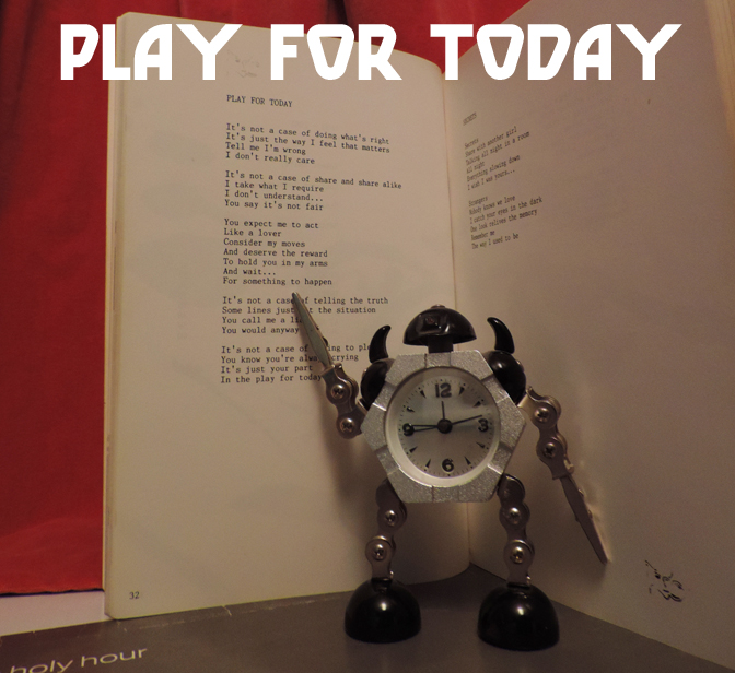
It’s Halloween next week; and what better time to write a few words about the parallel universe of outsider music? ‘Outsider music’ is one of those nebulous but still quite useful terms that litter the language of music. Like “singer-songwriter”, it doesn’t really denote a specific style, genre or sound, but also like “singer-songwriter”, it conjures a specific image, or set of images; the lonely, perhaps crazily talented, perhaps technically inept, perhaps emotionally unstable or mentally ill musician or songwriter who definitely has something unique to communicate; but not something that the majority of listeners will want to hear, and therefore not something that the mainstream (or even non-mainstream but still commercial) music industry thinks it can sell, at least initially.
The (relatively speaking) successful outsider artist garners an inevitably niche/selective/small fanbase over time (the definition of a ‘cult following’) and these fans are drawn to their music for a variety of reasons; various hues of sheer curiosity, amusement, a genuine love of the outré qualities of the artist’s work, or just a recognition that, however it has expressed itself, there is a genuine talent at work, albeit one working outside of the usual boundaries of popular music and/or taste. Every now and then an outsider artist even becomes genuinely successful and achieves ‘insider’ status (I just made that up; Christ knows what ‘insider music’ would be), but mostly even the successes; Syd Barrett, Captain Beefheart, Daniel Johnston, Tiny Tim – end up inhabiting a kind of twilight zone version of fame that is far removed from the experience of the mainstream artist. People usually discover their work because of its notoriety; by chance, or by reputation, but rarely because it’s played in public spaces, on the radio or on MTV (or Spotify, for that matter).
It’s notable too, that outsider artists are rarely made famous in the first instance by the public (honourable exception; Tiny Tim, but it seems fairly likely that the public at the time saw him – not surprisingly – as a comedy novelty act, rather than the genuinely peculiar character he seems to have been.) Mostly, it is musicians, followed by critics, who initially recognise the appeal of outsider artists; probably because on the whole they tend to listen more closely to a greater volume/quantity of music than most people and are therefore attuned to listen for something different, whereas those within the talent-spotting wing of the music industry also hear lots of music but have, by and large, been listening for something similar to whatever is successful at the time, or at least something saleable. In a few cases (mostly those already mentioned, but also, far more shockingly, Jandek; a fascinating artist whose massive body of work is surely one of the most forbiddingly bleak and uncommercial in the ‘singer-songwriter’ sphere) the musicians enjoy some critical acclaim and are invited to come in from the cold, to play some shows and gently erode their mystique. In becoming something more than outsiders, but something far less than mainstream celebrities, the classic outsider artist loses something of their appeal, perhaps because entertaining (or ‘entertaining’) a real audience, made up of fans and interested parties leads to a significantly different kind of music from communicating with oneself or, at best an imaginary and perhaps ideal audience. It’s basically the same process that happens with any artist when they exchange whatever their lives and inspirations were, for the life and experiences of a successful musician.
Naturally, there isn’t a vast amount of literature on outsider music; or demand for a vast amount 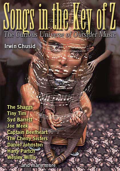 of literature on outsider music, but for a highly readable and well-researched overview, Irwin Chusid’s Songs in the Key of Z, The Curious Universe of Outsider Music (Chicago Review Press, 2000) (and the associated compilation album) is still pretty unbeatable (although the old RE/Search books ‘Incredibly Strange Music’ vols 1 & 2 from the early 90s are also packed with great stuff, not all ‘outsider’, but all worth a look).
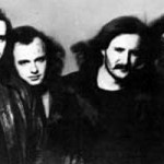
Not appearing in any those pages though, is one of my favourite purveyors of outsider music, the one-man (David Vora) Irish band Venusian Death Cell. I’m slightly reluctant to write about VDC because (a) I have only heard a fraction of his music and (b) labelling someone as an ‘outsider artist’ feels a bit harsh in a way. Theoretically (and perhaps actually at some point, judging by his extensive bio below) some kind of metal band, there is no metal to be heard on any of the VDC albums I own, perhaps because (judging by sound alone) it’s difficult to approximate heavy metal with one guitar, no distortion/effects pedals, a small drum kit, a four-track recorder and one man working everything, and also hard to be metal-to-the-max when singing about soya desserts or ‘actor Ian McCulloch’ and when one’s cover art – though on its own terms highly evocative and suited to the music – is not quite up to the standard of the archetypical Derek Riggs style metal album cover.
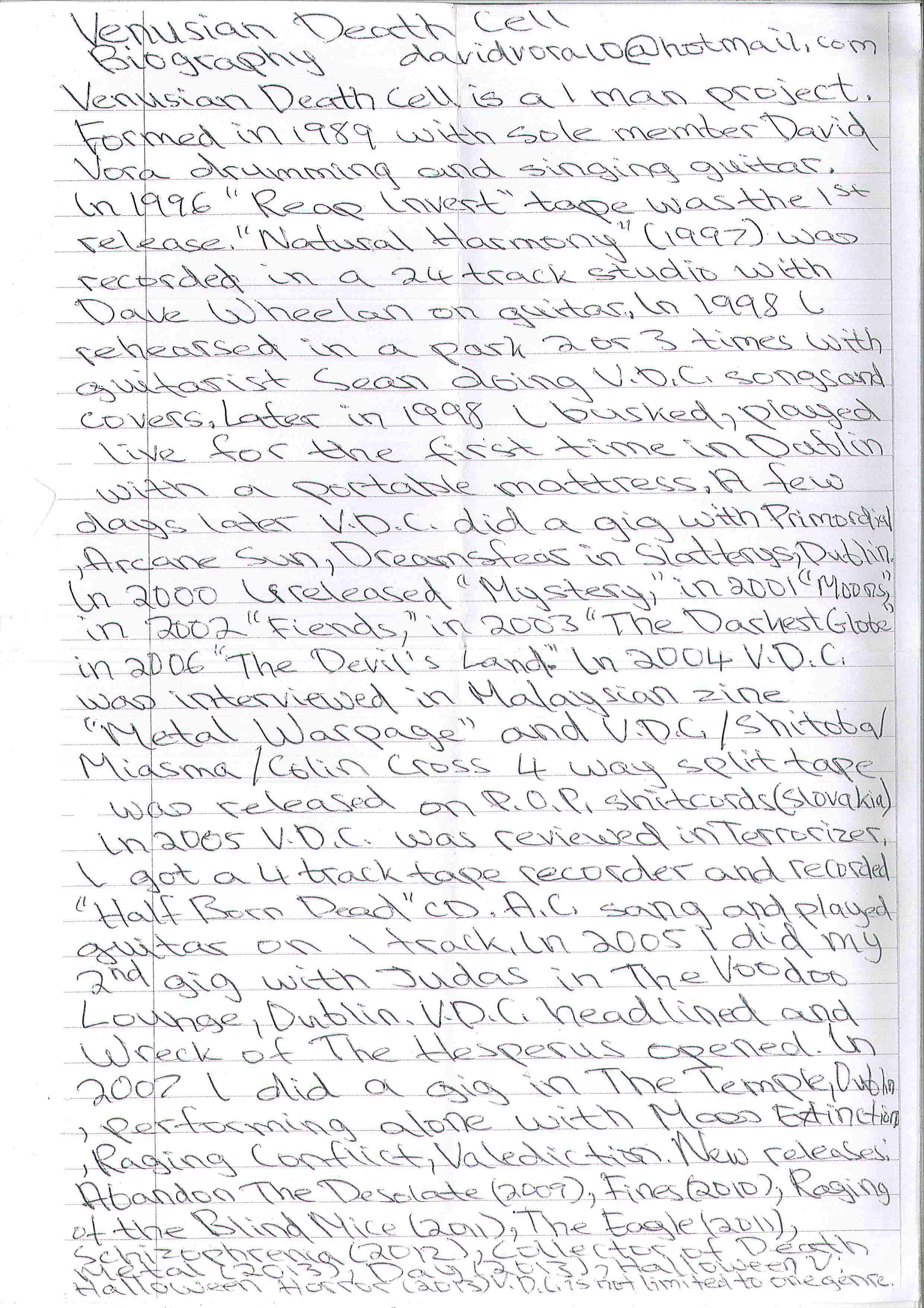
So, the appeal of VDC – in the albums I have – is mainly not its metallic or heavy element. Sonically, the artist Vora’s music most resembles is the aforementioned Jandek , but – and it’s a crucial part of the appeal of outsider music generally – the personality/atmosphere and themes imbued in Venusian Death Cell’s work are entirely unique. Whereas Jandek’s work was/is lo-fi as music but mysteriously professional (or at least not hand-made) in its presentation (back in the early 80s he was putting out vinyl albums with picture sleeves just like (well, not just like) any small indie band on an actual label, Vora’s is unashamedly home-made, distributed on CD-Rs with photocopied artwork and lyrics. He is also a more accessible person, insofar as his own name, address and email address appear on the album inlays, while Jandek works through the austerely impersonal facade of the quasi-corporate ‘Corwood Industries’.
The VDC discography as far as I can make it out is below, it may not be complete and titles of the measly few albums I own are in bold. I will get more of them eventually. Some names may be wrong; I got them from the bio above and they aren’t all easy to read.
p a r t i a l d i s c o g r a p h y
1996 – Reap Invert (tape)
1997 – Natural Harmony (professional 24-track studio recording!)
2000 – Mystery
2001 – Moods(?)
2002 – Fiends
2003 – The Darkest Globe
2004 – VDC/Shitoba?/Miasma/Colin Cross (4-way split tape, P.O.P. Shitcords)
2005 – Half Born Dead
2006 – The Devil’s Land
2009 – Abandon The Desolate
2010 – Fines?
2011 – Raging of the Blind Mice
2011 – The Eagle
2012 – Schizophrenia
2013 – Collector of Death Metal
2013 – Day
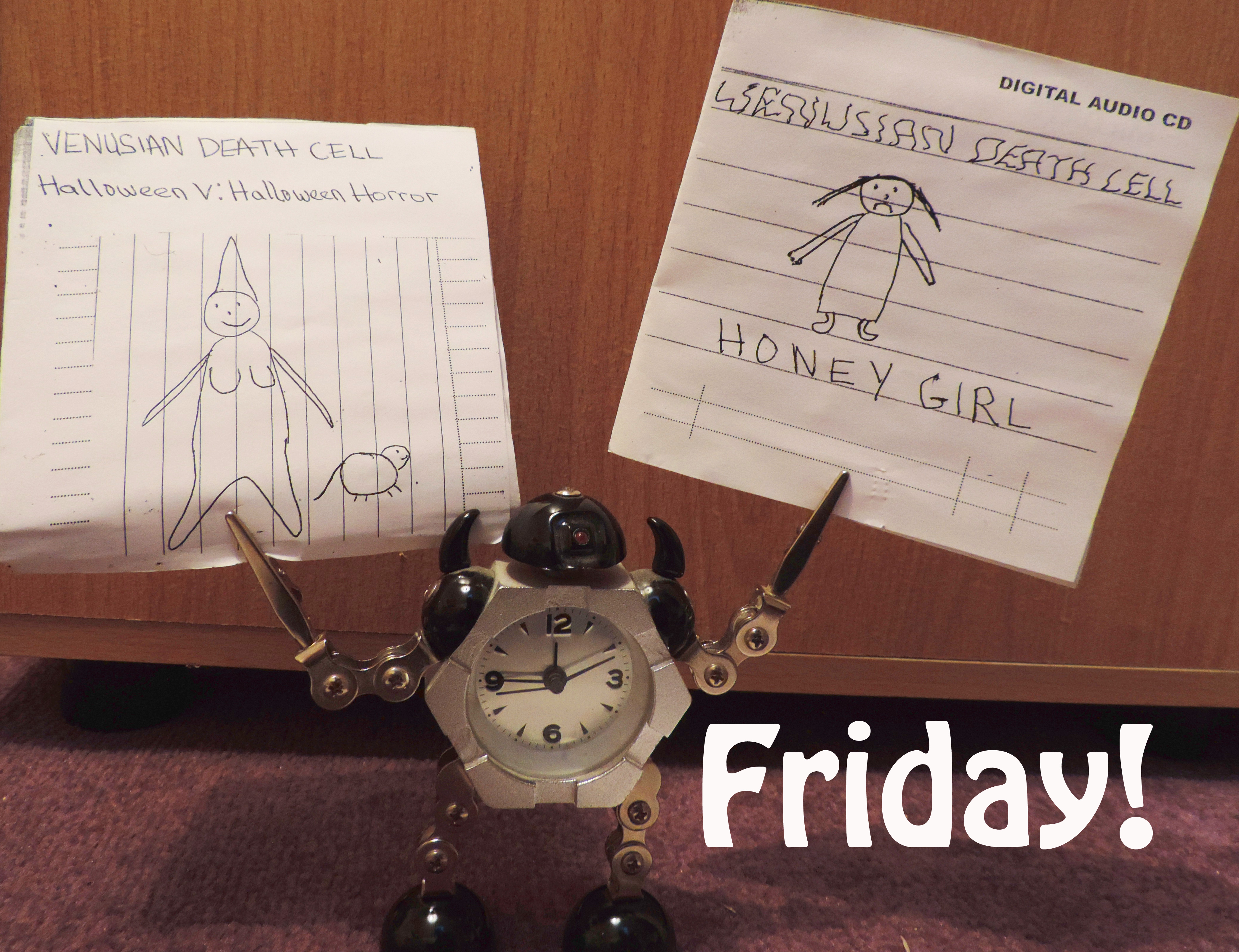
2013 – Halloween V: Halloween Horror
Halloween V was my introduction to Venusian Death Cell and is possibly my favourite of the three I have. It’s definitely the least aggressive-sounding, more like a one-man version of The Shaggs than the metal I expected, despite the imagery and songs with titles like ‘Lucifer’, Cold Cancer’ and ‘Zombie Flesh Eaters’ (full lyric below, just because). It also has some oddly wistful, quite affecting songs like the haiku-esque ‘For You’ – “You are depression/Breaking free/Now Happiness/You were alone/Now you’re happy/Lovely for you.”
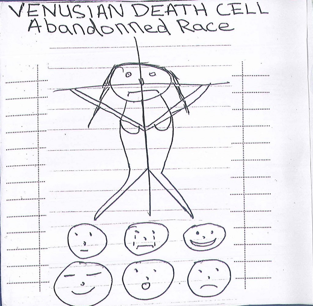
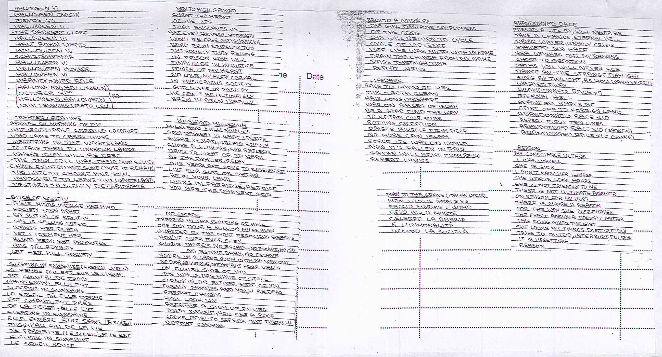
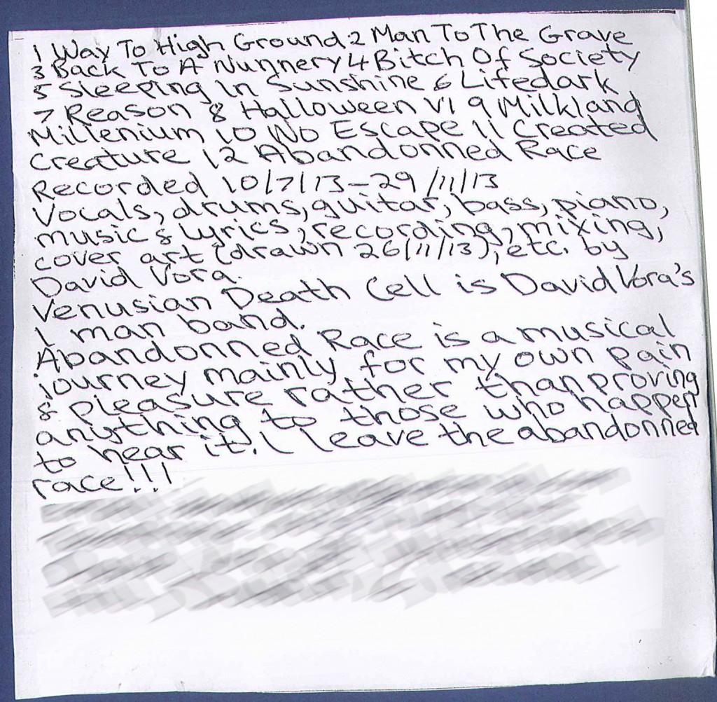
2013 – Abandonned Race (sic)
Far more chaotic and noisy, mainly because it has far more and louder percussion and therefore more shouted vocals, Abandonned Race is also a far less happy experience than Halloween V, but as good in its way. Topics are bizarrely wide-ranging, from religion, black metal and relationships to mental health and soya products (‘Milkland Millennium’)
2014 – Honey Girl
The most recent of the VDC albums I’ve heard, Honey Girl is also the shortest (8 songs in approx ten minutes) and is very much in the mould of Abandonned Race; sonically slightly harsher than Halloween V, it’s a bracing blend of performance poetry, crude proto-noise-metal and therapy; the lyrics are preoccupied with what were presumably Vora’s circumstances at the time:
“Heavy drugs, weight gain/Strange happenings/Psychosis and madness” – Psychotic
Terrible paranoid fear/affecting my happiness/eating my mental health…” – Terrible Fear
Despite the explicit unhappiness, Honey Girl isn’t the harrowing experience one might expect. Vora’s art is cathartic, rather than suffocating, and the cheerful note on the back of Honey Girl‘s booklet – “Honey Girl is a labour of love! Thanks for listening, hope you enjoyed!” captures the feeling of the music; in unloading his woes, somehow Vora doesn’t dump them on the listener. And that, at least partly, is the appeal of the not-very-musical music and apparently random subject matter of Venusian Death Cult. The seeming lack of any kind of artifice is, given the sophistication of most popular music, very appealing. What Irwin Chusid refers to as “the outsider sine qua non of earnestness” is present everywhere in Vora’s music. When he writes in the sleevenote to Abandonned Race, “Abandonned Race is a musical journey mainly for my own pain & pleasure rather than proving anything to those who happen to hear it.” it rings absolutely true. And this is not a kind of quasi-childlike ‘innocence’; Vora’s lyrics may not be written in the usual rock music language, but they are highly sophisticated, albeit in a matter of fact way:
Romancy – 1871 Lunacy Act in Ireland/Governs consent issues – /100% capacity to decide or none/Court makes all decisions about your life/(Criminal Law Act 1993)/Offense to have intercourse with mentally impaired/outside marriage (Halloween V: Halloween Horror) The explanatory note after the lyrics reads; “Lyrics are about those with extra support needs and their relationships”.
There are also forays into both Irish-language and French-language lyrics; which mean nothing to me, alas, but again underline that this is not a naive talent, just an unorthodox one. Whatever the language, VDC’s songs are mostly not all that easy (for me) to relate to; Vora’s preoccupations are not necessarily shared by everyone, or very many people at all – but that doesn’t make them less engaging. In fact, it’s the feeling that the listener is getting a glimpse into the normally private world of another human being – a sometimes troubled mind in all its seemingly unedited variety, brought to you by the medium of (nearly) music, that makes hearing Venusian Death Cell – and outsider music generally – such a refreshing experience. In the universe of Venusian Death Cell, with its seemingly random connections, weird logic and strangely semi-familiar landscapes, you (or at least I) and your everyday world are the outsider. It’s an interesting sensation.
Zombie Flesh Eaters
Ian McCulloch stars in films/Zombie Flesh Eaters, Zombie Holocaust and Contamination
Chorus: Zombie Flesh Eaters x 3
Daughter goes to find father/With Ian, the journalist/Zombie adventures on an island
Repeat Chorus
Video…nasties/Eye…gouged/Shark and zombie fight
Repeat Chorus
Notes: Lyrics are about the film Zombie Flesh Eaters, video nasties and the actor Ian McCulloch


 7. Bessie Smith – The Complete Recordings, Vol 1 (Columbia/Legacy)

 rushin’s beautiful Once and Domenicano, Frank Zappa & the Mothers of Invention’s Burnt Weenie Sandwich and Uncle Meat, The Beau Brummels (who are never quite as good as I want them to be – ie not as good as The Lovin’ Spoonful) but have some really good songs, Kenny Drew & Niels-Henning Ørsted Pedersen’s Duo, Bessie Smith, a really interesting album called Stations by
 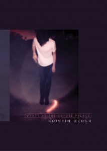 I haven’t started making an actual list yet, but it’s that time of year when some albums have firmly earned their place in the AOTY list and others are looking likely. It would be nice if Prophets of Rage released an album, but oh well. I’ve no idea how long the list will be, but I can say at this point that it will certainly include Bowie’s Blackstar, Iggy Pop/Tarwater/Alva Noto’s Leaves of Grass (not really an album but I’ll make an exception), Darkher’s Realms, Emma Ruth Rundle’s Marked For Death and Kristin Hersh’s amazing new book/double album Wyatt at the Coyote Palace.
 typically ‘heroic fantasy’/swords and sorcery in their stories and action:
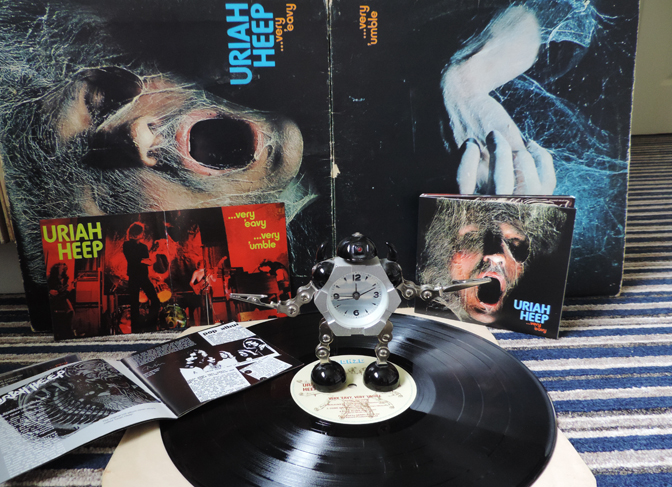
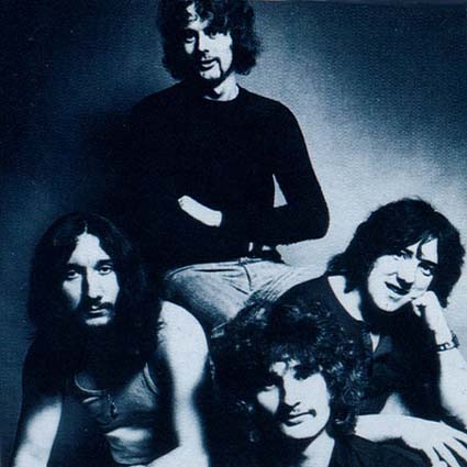

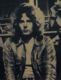
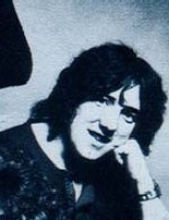

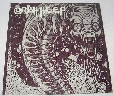
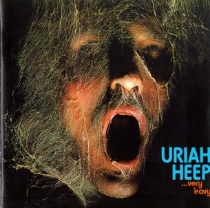 As if all this wasn’t enough, the album is housed in one of the great rock sleeves of the era: a fallen warrior (David Byron in fact) covered in cobwebs, the darkness surrounding him only broken by the (superbly-fonted) logo and title. The gatefold features a photo of the band onstage.
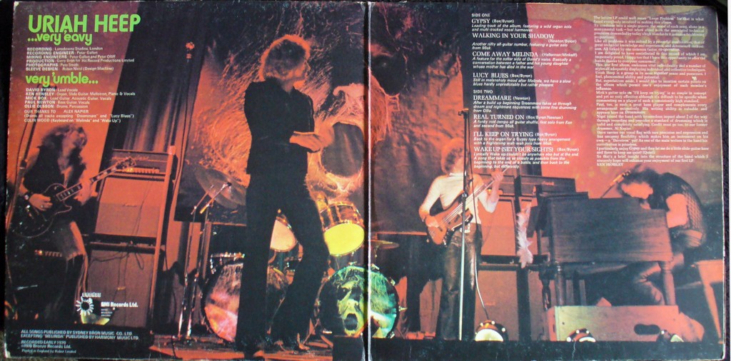
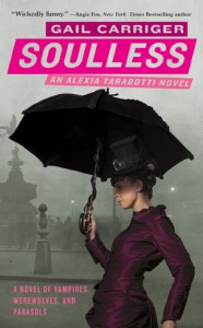 Soulless wasn’t Dawson’s Creek with vampires; the supernatural characters were, as with most modern/post-modern fiction, given a similar complexity to their human counterparts, but Carriger goes further, weaving the supernatural/natural worlds together in an ingenious yet extremely logical and historically-informed way. Part of what makes this so successful is that she placed her characters in a parallel version of the Victorian era, creating a society where vampires and werewolves, without sacrificing their predatory nature, exist alongside their mortal contemporaries as yet more finely nuanced layers in the already-complicated social hierarchy of Victorian Britain. If the Victorian era represents the height of the British preoccupation with social class and proper manners, these become even more crucial in Carriger’s world, where the correct way to interact with social superiors/inferiors includes people, possibly on both sides, whose politeness is the only thing preventing them from drinking your blood/eating you.


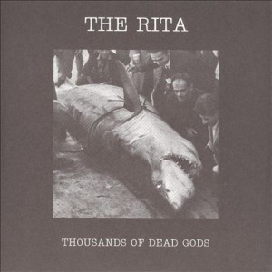 Thousands of Dead Gods (2006) by The Rita many times without ever getting used to it. This makes the noise endlessly surprising, alienating or boring, depending on one’s mood. The sense of noise as abstract is reinforced by its context-lessness; typically the artwork for a Merzbow album is as enigmatic and unrevealing as the album within, and occasionally every bit as flatly un-evocative (not a criticism!) as the Merzbow sound itself. Cultural identifiers in pure noise are also minimalist in the extreme; the race, nationality or gender of noise artists tends to be known only insofar as the artist wishes it to be so.
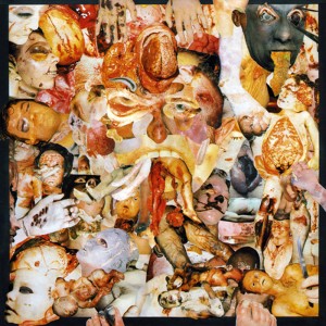 Back in the 80s, this kind of music had an outsider/snob appeal even within the metal genre. 80s metal (on the whole) strove for clarity and precision; Carcass (emerging from an anarcho-crust/punk background) pushed the boundaries of musical extremity and taste (using the notorious collages of medical photos for their artwork, rather than relatively cuddly horror mascots like Iron Maiden’s Eddie) beyond what the standard fan of Iron Maiden, W.A.S.P., Metallica or even Slayer might find acceptable. To say that death metal is relatively lighthearted is slightly misleading – Carcass’ early music was informed by a radical vegetarian disgust with all things meat-based in quite a serious way – but as a subgenre of a popular youth-focussed music it lacks the gravitas of the kind of music which made the late 70s a darker place to have ears.
 every bit as evocative of the 1970s as glam or disco, but the way it embodies its era, its brutalist architecture and grey/brown/beige ambience, combats any possible sense of nostalgia. Although it’s easy to say why it’s interesting, liking Throbbing Gristle (as many have done and continue to do) is much harder to explain. The appeal of TG; in effect the appeal of being made to feel uneasy or disgusted, is an odd way to be entertained. On the surface you could say the same about the horror genre in cinema and literature, but Throbbing Gristle’s effect is utterly different from straightforward horror-as-entertainment, feeling (to me anyway) more analogous to the JG Ballard of The Atrocity Exhibition or Crash than to Stephen King, perhaps because like Ballard, TG’s work had more to do with documenting than it did with entertaining. Although there was undoubtedly an element of confrontation in TGs music (especially in a live setting), as with pure noise, confrontation
  isn’t the focal point that it becomes in the power electronics of groups like Whitehouse and Sutcliffe Jügend who (to some extent) followed on from the early British industrial scene. There is also a more straightforwardly ‘horror noise’ sub-subgenre including bands like Abruptum and the aforementioned Gnaw Their Tongues, whose aim seems to be to engender (with, it must be said, varying degrees of success) extreme anxiety in the listener; significantly different from the almost abstract quality of pure (if harsh) noise artists like Merzbow, easier to understand, but also easier to dismiss as sensationalism.
 Across all of the arts there are ‘so bad it’s good’ works that appeal on the ironic level of kitsch. These are completely subjective and therefore a bit of a minefield; at what point does listening to something that you personally think is so awful that it’s funny become just listening to it; and is there any difference anyway? Did my teenage self and friends have a different experience listening to an old Shakin’ Stevens tape ‘for a laugh’ than “Shaky”’s actual fans did or do? Well, yes, presumably; they probably don’t laugh as much. Still; it’s all ‘listening with pleasure’ and not only is it subjective, but it’s all about timing. The awfulness of music is as much about the zeitgeist as the popularity of music is; hard to imagine now, but there was a time in the late 80s when listening to Abba (or The Carpenters for that matter) could be enjoyed as revelling in tacky 70s awfulness; but since the early 90s they have been revered by the once-embarrassed media as a great band after all.
 This category takes it for granted that unhappiness is a form of unpleasantness that is most often avoided; which may not be strictly true – or obviously isn’t, given the endless popularity of tragedies, murder mysteries etc. Still, it’s a basic human truth (I hope) that most people would rather be happy than sad. Most of the time that is; historically, music was most often written for occasions; sad music was required for a funeral, just as weddings demanded happy music. Tudor and baroque music often had mythological, narrative or literary inspiration which dictated the mood of the works. For a court composer to make a cheerful-sounding funeral dirge or a comic opera from a tragic mythological story would be perverse at best and bad workmanship at worst.