the end of all songs

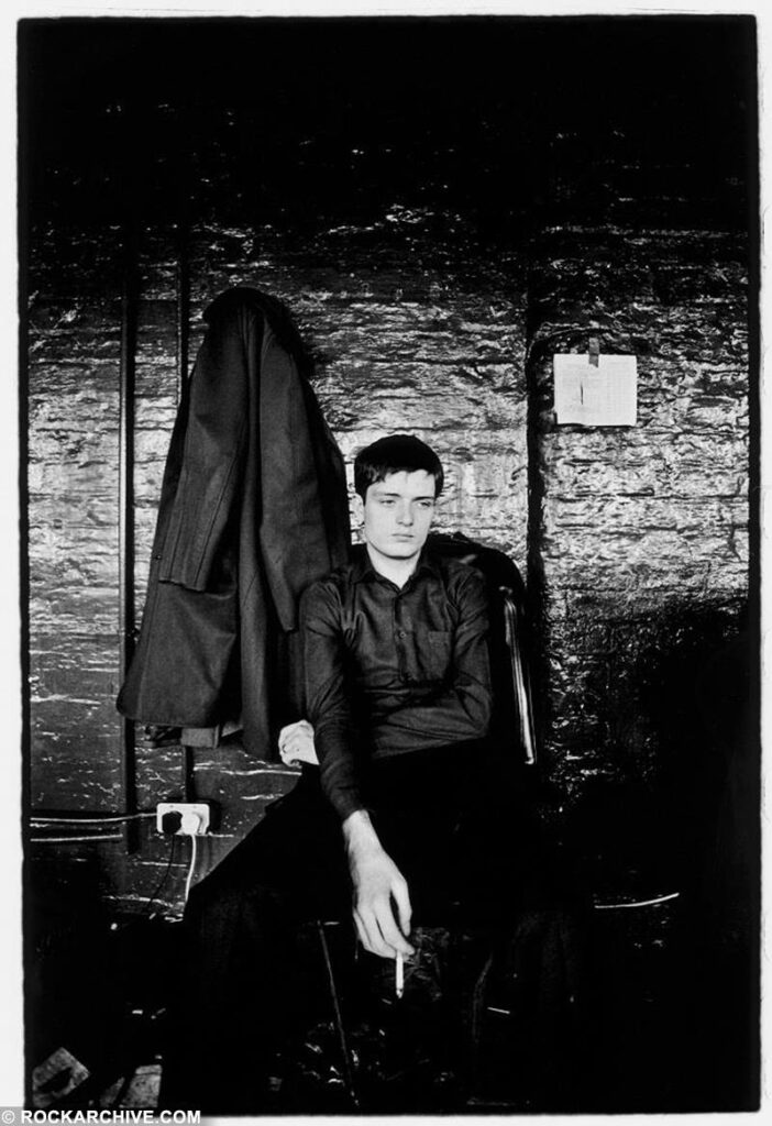
A question occurred to me while watching a documentary about Joy Division ; is there any better ending to a song than Ian Curtis bellowing FEELING FEELING FEELING FEELING FEELING FEELING FEEEEEELING! as the music clatters to a halt at the end of “Disorder”? Lyrically, despite its explosiveness, it isn’t cathartic, but in a musical way it is – for the listener at least – because until that point, the tempo has been too fast and the lyrics too complex for Curtis’s voice to do whatever the deep, melancholy equivalent of ‘taking flight’ is. There’s an underappreciated art to ending songs and it’s not something that even great bands do infallibly or that all great songs feature. Not all songs need to end with a crescendo or flourish, and very few songs benefit from just grinding to a halt or being cut off mid-flow, but the sense of completeness when a song (especially a relatively short song) ends perfectly is one of the things that makes you want to hear it again.

Ian Curtis in 1979 by Kevin Cummins

“Decades,” the final song on Closer, the final Joy Division album, is one of relatively few songs (given their vast number) where fading out at the end doesn’t seem like a cop out. There’s nothing wrong with fading out a song, but often it just feels like an easy option taken in order to dodge the question of how to end a song properly. Which is fine, except in live performances, where it’s difficult to satisfactorily replicate a fade-out. Partly that’s because of the practicality of it – does the band all try to play more quietly? Do they just get the sound person to turn down the volume, which works, unless you’re close to the stage, which, in that situation is sub-optimal, since hearing the unamplified sounds from the stage (drums clattering, guitars plinking etc) is kind of a mood-killer? And if so, when do they all stop? There’s also the awkwardness of the audience reaction; the crowd might start cheering/jeering before the song is actually finished, or they might not start until someone in the band indicates that that the song is definitely over, which is also not ideal. Basically, it feels artificial – but obviously it has the appeal of being simple – haven’t thought of a proper ending for you song? Just keep playing and fade it out afterwards. But Closer needed to fade into silence and it does.

Another musical ending this week – a seriously clunky segue this but bear with me – was the death of Ozzy Osbourne, a week after what was explicitly intended to be his final performance, a different kind of ending and a very unusual one in the music world where ‘farewell’ tours can become an annual occurrence and no split is too acrimonious to be healed by the prospect of bigger and bigger sums of money.

Ozzy Osbourne in 1974 by Mick Rock

On paper, any kinship between Ozzy and Joy Division seems unlikely to say the least, but the ears say otherwise. Regardless of the punk roots of Joy Division, the only real precursor to a song like “New Dawn Fades” from their 1979 debut album Unknown Pleasures is Black Sabbath. And it’s not only the oppressively doomladen atmosphere, though that’s important; Bernard Sumner’s opening guitar melody is remarkably like Tony Iommi’s melodic solo from “War Pigs” – a classic song, incidentally, which has one of the worst endings of any great song ever written. Presumably, Black Sabbath had no idea how to end it and so did something worse than a fade out; speeding it up until it ends with a comical squeak. Oh well. But anyway, there are many moments, especially on Unknown Pleasures, where Joy Division sound like a cross between Black Sabbath and the Doors, although I’m sure neither of those things were in the minds of Peter Hook, Bernard Sumner, Stephen Morris and Ian Curtis, any more than they were in the consciousness of the music journalists who lauded the band in ’79, who mostly tended to see punk as year zero, the new beginning from which the influence of anything pretentious or overblown had been erased.

That basic idea was one I also accepted without much thought as a teenage indie fan in the early 90s when Joy Division – by then defunct for a decade – became one of my favourite bands. With the honourable, weekly music paper-approved exception of the Velvet Underground, I was dubious about anything old or anything that I considered overtly commercial. Without giving it much thought I just assumed that mentality came from my reading of Melody Maker and the NME. I had definitely accepted their pre-Britpop genealogy of cool rock music that essentially began with the Velvet Underground and then continued via punk and post-punk into 80s indie guitar music, most of which existed firmly outside of the mainstream of the UK top 40. But reflecting on Ozzy on the news of his death, it seems my snobbery has older roots.

“Mad Housewife”-era Ozzy, c.1986

I don’t remember when I first heard Ozzy Osbourne’s name, but I do remember when I first heard his music. It was 1988 and I was about a year away from growing out of metal, but still immersed in it for the time being. Within metal itself I had fairly wide taste and my favourite bands included many of the biggest metal bands of the era; Iron Maiden, Metallica, Guns ‘n’ Roses, Helloween, Megadeth, Suicidal Tendencies, Queensrÿche, Slayer, Anthrax, plus many more. At that point I mostly discovered music via magazines (especially Metal Forces) and my friends. In addition to my modest collection of records and tapes I had many more cassettes that had been made for me by friends and I spent a good bit of my spare time making tapes for them; it was fun. And so; Ozzy. A friend had taped a couple of albums for me on a C90 cassette (the odd pairing, it seems now, of Mötley Crüe’s Girls, Girls Girls and Slayer’s Reign in Blood) and filled up the rest of the tape with random metal songs, among them “Foaming at the Mouth” by Rigor Mortis, “The Brave” by Metal Church, “Screamin’ in the Night” by Krokus and Ozzy’s latest single, “Miracle Man”. I pretty much hated it. I thought Ozzy’s voice was unbearably nasal and awful and the production really harsh and tinny (that was probably just the tape though).

Memorex C90s were pretty dependable
Teenage metal fans were obliged to like Elvira in 1989

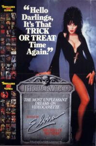
By then, I knew who Ozzy was, and was aware of his bat-biting notoriety, though that definitely seemed to be a bigger deal in the USA than it was in the UK (or at least in my corner of rural Scotland). At some point just a little later, Cassandra Peterson, or more accurately Elvira, Mistress of the Dark presented a short series of metal-related shows for the BBC. One episode included Penelope Spheeris’ fantastic documentary The Decline of Western Civilization Part II: The Metal Years, which includes one of my favourite Ozzy interviews, but also concert footage of Ozzy during his ‘mad housewife’ era when his image seemed to be based on Jackie Collins’s style at the time. I love that era of Ozzy now, but at the time I thought it was laughably awful. It must have been around that time that I also became aware of Ozzy’s history with Black Sabbath, who I only knew in their then-current incarnation with Tony Martin, which again I now love but at the time thought irremediably middle aged and boring. The fact that Ozzy’s Black Sabbath was from the 70s meant that I pretty much dismissed them without needing to hear them. When Elvira showed a classic early Led Zeppelin concert in black and white I also found that tiresomely old and dull, especially in comparison with the Napalm Death concert she presented. It’s hard to relate to now, but in the 80s, for me – and I think for most people I knew of my age – the 70s was cheesy, embarrassing and possibly funny, but with no redeeming features. Actually, that’s how the 80s were for a good part of the 90s too; changed days.

Again, like most of the metal fans I knew, I loved metal, but I mostly didn’t like rock. Metal meant precision, virtuosity, heaviness and speed. Rock (to this kind of metal fan) was simplistic, old-fashioned and (worse) commercial. Oddly, I never thought to include the very glam-oriented hair metal bands I liked in the rock camp; which I can now see is where they really belonged. I loved bands like Poison, Faster Pussycat and Pretty Boy Floyd, despite the fact that their very obvious ambition was to be famous and that they wrote schmaltzy ballads. I made the same exception, mysteriously, for Guns ‘n’ Roses, who I loved. But I thought of them as metal, not rock.

Cliff Burton rocking like it’s 1974 (c.1986)

It was a distinction that my parents’ generation seemed simply not to understand. To them and their friends if you liked Metallica wasn’t that basically the same as liking Meat Loaf? But I was of the generation for whom, from the earliest days of primary school, the idea of being seen in flared trousers was the stuff of nightmares. That horror of the era we were born in was hard to let go of., which is no doubt partly why the legacy of punk was easy to embrace later. In 1988, when I first heard them, Metallica instantly became one of my favourite bands and …And Justice For All one of my favourite albums. A crucial part of that was that the band, as I first knew them, looked cool to me. When, probably later that year, I first heard Ride the Lightning and Master of Puppets I loved those too, but the sight of the great Cliff Burton (RIP) in his denim bellbottoms with his middle-parted hair and little moustache, looking like he should have been in Status Quo circa 1974 was extremely cringe-inducing; that was not cool. Not in Scotland in 1988 anyway.

It took a while for that attitude to change. One of the gateway albums that led young teen me away from heavy metal and towards the indie/alternative world was Faith No More’s The Real Thing, which included a cover of “War Pigs.” And at that time the song still felt old fashioned and less good than the rest of the album to me. It was only after a few years of hardcore indie snobbery that my attitude really changed. As my adolescence got to the more painfully introspective stage I stopped listening to metal, having been introduced to things like the Pixies and Ride and simultaneously discovering slightly older music like The Smiths, The Cure, Joy Division and the Jesus & Mary Chain. The part of me that still liked loud and heavy guitars didn’t care so much about precision anymore and so alongside the typical UK indie stuff, I also liked grunge for a while, mainly Mudhoney, Tad and Nirvana, but especially grunge-adjacent weirdness like the Butthole Surfers and Sonic Youth. That would seem to provide an obvious bridge to the hard rock of the 70s, since virtually all grunge-oriented bands referenced Sabbath and Kiss, but no.

a book that shaped my taste in the 90s

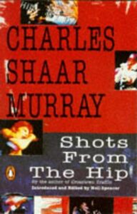
In fact, what happened was that in the Britpop era, I loved 70s-influenced bands like Pulp and Suede (I was never a fan of Blur or Oasis) and as Britpop became dull I started to get into the older music that Britpop referenced. At first it was mostly Bowie and Lou Reed, but after reading  Shots From the Hip (referenced a million times on this website) by Charles Shaar Murray, I broadened my horizons to include 70s glam in general (Roxy Music, Eno, Jobriath, Raw Power-era Stooges, but also the bubblegum stuff) and other things that Murray mentioned, whether positively or disparagingly. The latter seems odd but I’ve discovered lots of things I like that way. And suddenly, Ozzy was inescapable (though less so than he is this week).

I bought the Charles Shaar Murray book because Bowie was featured heavily in it; but he also wrote about Black Sabbath. I bought a book by the great photographer Mick Rock, because he had photographed Bowie and Lou Reed and Iggy and John Cale; but who should be in there but Ozzy, looking uncharacteristically thoughtful. I bought old 70s music annuals from glam and tail end of glam era; Fab 208 maybe – because they had Bowie and Mott the Hoople and Pilot and whatnot in them, but inside there was also mention of Black Sabbat. I remember a paragraph about their then-forthcoming compilation We Sold Our Souls for Rock ‘n’ Roll being especially intriguing.

Birmingham in the 1970s by Peter Trulock

Anyway, one thing led to another and I spent a large chunk of the late 90s and early 2000s immersing myself in the music of the 1970s. At first it was primarily glam, but then all kinds of rock, pop, soul, funk etc. At some point it started including bands that I’d long been aware of and never liked; like Led Zeppelin, Kiss – and Black Sabbath. The first Black Sabbath album I owned was Sabotage, bought for 50 pence in a charity shop. The texture of the sleeve was, interestingly, the same texture as my LP of Joy Division’s Unknown Pleasures, but the imagery was a little less classy, thanks to Bill Ward’s checked underpants being visible through his red tights; oh well. Ozzy sounded pretty much as I remembered from “Miracle Man,” but primed by Charles Shaar Murray’s description of Ozzy [caterwauling] about something or other in a locked basement and with a more sympathetic production and – crucially – the far more bare and elemental sound of Black Sabbath, so unappealing just a few years earlier, he sounded right. And then, when I heard the earliest Black Sabbath albums, Black Sabbath and Paranoid, both from 1970, one of the things they reminded me of, most unexpectedly, was Joy Division.
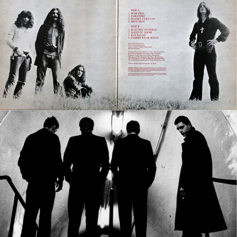
Black Sabbath in 1970 by Keef, Joy Division in 1979 by Anton Corbijn

Yes, the whole aura is different, Sabbath were surly and aggressive where Joy Division were solemn and withdrawn, but there’s something about the simplicity of the sound. Geezer and Hooky’s basses took up as much space as Tony and Bernard’s guitars. Bill Ward, like Stephen Morris, was a drummer who brought a strong dance/funk element into the band’s rock music without any sense of incongruity. Ozzy and Ian Curtis are worlds apart as vocalists, but both have a despairing intensity that makes them stand out, even within their respective genres. 
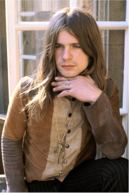
Both bands were from the grim, grey, hopeless industrial 1970s north of England, but whereas Joy Division were definitively a product of Manchester, with all the gritty coolness that conferred upon them, Sabbath were solidly of Birmingham, with all of the perceived oafishness and lack of credibility that entailed in the music press at least. Both singers were self-destructive too, but the same year that Ian Curtis tragically ended his life, Ozzy was reflecting on his self-destructive behaviour in “Suicide Solution”* and starting his life anew, launching a solo career which, against all expectations, made him an even bigger star and ultimately the icon who is being mourned today, far more widely than I’m sure he would ever have imagined. It was a good ending.

*Ozzy was always a far more thoughtful lyricist than he’s given credit for; I can’t think of any other artist from the aggressively cocky 80s hair metal scene who would have written the glumly confessional anthem “Secret Loser” from Ozzy’s 1986 album The Ultimate Sin

Hulme, Manchester in the 1970s, by David Chadwick

Because I’m a nerd, and not just a music nerd, writing this piece made me think of Michael Moorcock’s elegiac sci-fi/fantasy novel novel, The End of All Songs, published in 1976, the year that Ian Curtis, Peter Hook and Bernard Sumner met at a Sex Pistols concert in the Lesser Free Trade Hall in Manchester, the year that Black Sabbath released their seventh album, Technical Ecstasy, generally agreed to be the one where the cracks started to show in the Ozzy-led lineup but one of my favourites. Moorcock took the title of his novel from a poem by the Victorian writer Ernest Dowson, which feels appropriate to end with, since fading out is kind of a hassle, text-wise.

With pale, indifferent eyes, we sit and wait
For the drop’d curtain and the closing gate:
This is the end of all the songs man sings.
Ernest Dowson, Dregs (1899)

An Illuminated Eccentric; the art of Christophe Szpajdel

 Christophe

What do black/death metal band Book of Belial and Kim Kardashian have in common? Aside from a desire to spread evil and darkness, the answer is that both have had their names immortalised by the iconic logo designer Christophe Szpajdel. Although inextricably linked to the extreme metal underground by his classic works for a vast array of bands, Szpajdel is first and foremost a great artist and designer and his work now has an audience far beyond the metal subculture to which he still undeniably belongs.

bookardashian

Szpajdel has been drawing bespoke logos since 1987, his big break coming in the early 90s with the classic and hugely influential logo for Norwegian black metal legends Emperor. Since then his work has helped to define the aesthetic style of underground metal, but also become well-known in its own right, being featured in exhibitions and books, including his own volume, Lord of the Logos.

 It’s typical of the UK that, despite being based in Exeter (and having been a UK resident for the past fifteen years), Szpajdel’s work receives far greater acclaim and coverage elsewhere in the world; a real shame, and a situation which will hopefully be remedied as his reputation continues to expand both within and outside of the metal realm.

In conversation, Christophe is funny and informative and has a passion for drawing and, especially, logo design (his own and that of others) which shines through everything he says. It’s worth pointing out too, that in a time when useable graphics have arguably never been easier to come by, he remains committed to the art of imaginative, hand-drawn, pencil and ink images; unique works which have the feel that only comes from manual labour and contemplation.

impiety

Anyway, enough introduction; here’s the man himself – What are you looking forward to in 2016?

CS: This year I have lined up a few exhibitions, I have a possible show in Manchester for March-April at the Gallery Grim and another possibly in London. But I have had quite a long list of exhibitions in the past, so what is more exciting to look forward to is in June, when I have my first proper workshop, which is going to happen in Vancouver, Canada. That workshop is going to be together with [photographer] Peter Beste. This is something really to look forward to. I had a talk earlier today about an exhibition in Romania, in the Carpathian mountains. Last year I had a very successful last-minute impromptu exhibition in Japan. I’m actually looking forward to having a much bigger exhibition there, because that last exhibition became something of a timebomb. It filled the venue, they literally squeezed in, and I had three hours of non-stop autographs. All these Japanese people were taking selfies with me, which is something I have never seen like this before. In the UK, selfies are a big habit; in Japan, selfies are an absolute obsession.  It’s the same with queuing. Here in the UK, everyone is used to queuing, the Japanese have turned queuing into an art form. So last year was a giant leap in my artistic career.”

As mentioned in my intro, Christophe’s name is known worldwide in metal circles, but although his love for and knowledge of metal music is obvious, his real passion is for designing logos, not simply recycling past glories.bruno

CS: Yes, there is always metal, but this year I have made a new experience, I have done some pop culture logos. I drew for Calvin Harris and Bruno Mars, and Kim Kardashian, and Katie Price, Wayne Rooney (laughs).  Also Maverick Sabre –  you know; really popular artists, because I have the will to have my work exposed to a calvhar
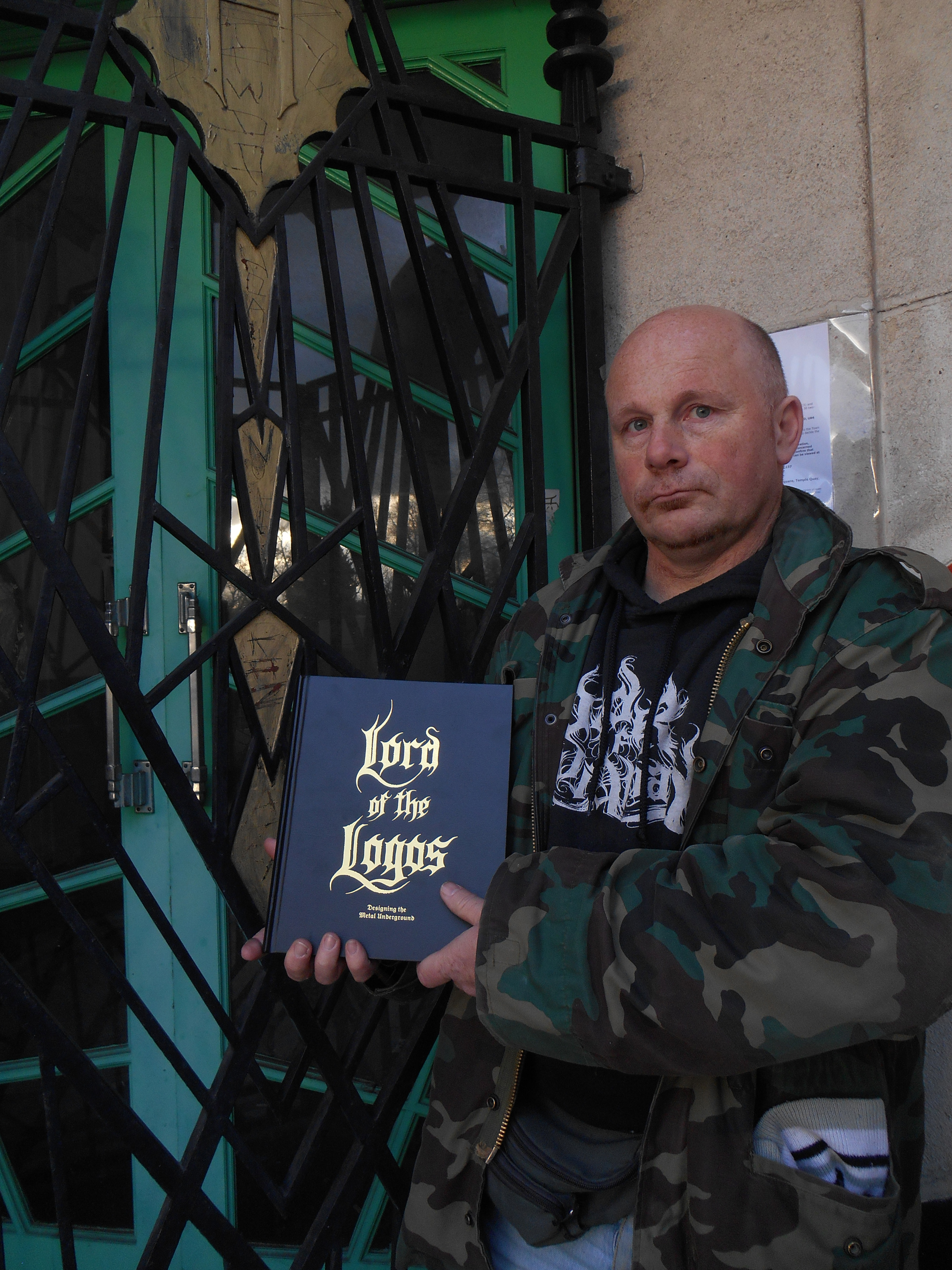
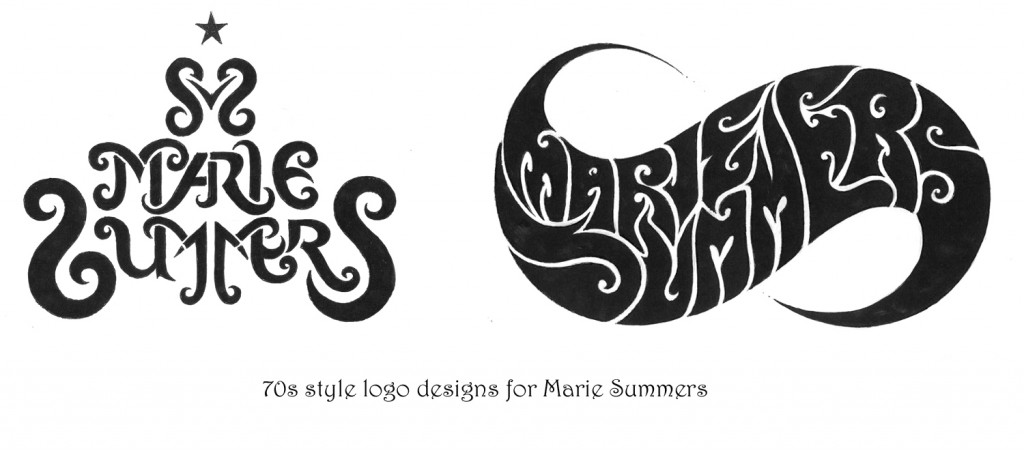
much bigger public. And at the moment I’ve been thinking about, just for fun, working on a Beyoncé logo, because she is so much talked about.  So there’s this whole series of pop culture logos, I did EastEnders, Coronation Street, Emmerdale, Shortland Street. So I had some real fun exploring the mainstream. But the metal public is always the most receptive to my work. It’s my public, it’s the one who collects my work. A lot of people who see my work who haven’t been acquainted with the metal scene say that it’s not something they would be going for. Or that it’s nice but it’s grim.

coronat

There was a time when the extreme metal underground was essentially a DIY business at all levels, but its growth, aided by that of the internet over the last two decades has taken your local extreme band from demos, fanzines and tape trading, to small indie labels, to world tours and ‘Norwegian Grammys’, with the concomitant rise of the oxymoron that is ‘big’ underground bands. No genre demonstrates this better than black metal; and it should be noted that the high profile black metal image that has evolved is in part due to the instantly recognisable work of Christophe Szpajdel himself. Classic 90s logos like his ones for Emperor and Moonspell set a style which is still widely imitated 30 years on.

emperor

As the world has changed, Szpajdel has changed with it, but although he puts in full-time hours designing logos, he still doesn’t rely on his art for his income, which means his work is, by the standard of graphic designers with his profile and pedigree, almost ludicrously inexpensive.

WOLVES LOGO

CS: “The cost varies, but really I am aiming for a fee of one hundred US dollars. Anybody who contacts me first must be prepared to pay my fee. This year I am also looking to introduce an hourly rate. I discussed this with some artists in Devon who saw my work, and they told me ‘you really need to concentrate on a contract. Send the client a contract that stipulates that there is $100 initial fee for the first draft; but the first draft includes a finalised logo. If they then want further drafts then you absolutely need to introduce an hourly rate.’ So I am working out those details soon.

old graves landscape

Bands who contact me now for a logo for free, I say ‘if you want a logo then I want to see the 50% deposit. And when I see the deposit in my PayPal account I will then start working on the logos. If I don’t have the deposit then I’m not going to make a move.’

So is the logo done just for fun, or out of enthusiasm for the subject now a thing of the past?

CS: No, because times like now [January], when it’s been quite quiet over the festive period so, I sometimes just dish out a logo to someone, to people who support my work, just to experiment and to exercise my freedom. There’s a woman called Natalie Corless who has posted a lot on my Facebook wall that she likes my logos so I did her an impromptu logo and she loved it. And so she posted and promoted my album on her timeline and she got me some clients! And this was a person who randomly added me on Facebook. And at the end of the day, she liked my work and she got me five clients, who paid $100 each. So these kind of random people who add me on facebook, they’re not as random as you might think.

Do you forsee a time when you will live from just doing your artwork?

CS: Well, I would love to. But since I’ve started charging professionally, I have observed a steep drop of the amount of clients who commission a logo from me. There are lots of other artists, for example Chris Horst, or Gragoth from Luciferium War Graphics. They offer packages. Chris Horst for example specialises in logos, but for $50 he does logos that include drafts, revisions, work on the computer, digitised, vectorised, coloured, all that; for just $50. Gragoth from Luciferium War Graphics, he is offering for $300, a complete package. Like it has album covers, banners, ad banners, website, myspace layouts, reverb nation layouts, logo, all inclusive for $300. And he is having a lot of success.

maries copy

But my work’s selling point is it is unique; it is absolutely handmade. I work in collaboration with some graphic designers to digitise my logos. Because now that I charge $100, my clients expect work exactly, precisely, rigorously, to their expectations. They expect the logo to be vectorised, digitised, they expect it in different formats; .PNG, .AI, Vector file, .RAR, .PDF, .GIF files, all the different formats.”

mavsab

One would think that, as Christophe is now (and has been since the 90s) a well-known name, that bands would request a logo in his trademark style (or one of them), but surprisingly this isn’t always the case…

CS: When I used to do logos in my own style they all got rejected. Now I listen to what the clients want. When they pay the deposit I would like the band to discuss exactly what they are looking for. And actually I want them to send me examples by other artists and not mine, so I can avoid repeating myself. I’m also in very close contact and have been doing quite a lot of collaborative works with a guy called Raoul Mazzero from Italy. He is an absolute genius. He actually helped me how to create outstanding logos, and how to solve the symmetry problems. He’s been a huge help, and we’re looking at a possible Italian show too.”

Is symmetry something you aim for in general?

CS: I actually have an automatic impulse to create symmetrical logos, but I have also done quite a lot of asymmetrical logos. But symmetrical logos are just natural to me. I find a symmetrical logo to be more outstanding, and to be more balanced.

xvarhnah

So what is a good logo to you?

CS: I think the readability of a logo is essential. A logo has to be readable, even in a small format. And I try to convince my clients and my customers that a logo needs to be readable. Not to be overly decorated, especially if it is going to be displayed very small on a poster or on the corner of a CD. On most of the logos I produce I am aiming for readability. And if the client wants a completely unreadable logo I am simply saying ‘why don’t we opt for several designs? Why don’t we think about doing a logo which is made of letters only, which is readable and then a more limited logo for t-shirts that can go more unreadable?'”

carrion

Do you have any interest in doing cover designs etc as well as the logos?

CS: No.  I’ve tried to do it and it doesn’t really come well. I found out that doing album covers is not my speciality. However, I did work last year on a mural in Exeter. This is something I wanted to experience. I love working outside, especially in the summer months. In the winter, I essentially work in my studio. But in the summer I’m working a lot outside.

murial

The mural is a rare Christophe Szpajdel work, not only because of the scale, but the use of colour.

mural

CS: “In my logos I do everything in black and white.  However, there are a few exceptions. For the 2014 Remembrance Day I did a logo with red poppies on it. [since this interview took place, Christophe also designed the beautiful memorial logo for David Bowie below also) Sometimes I like to share my thoughts through an artwork, like a logo. I find that logos come to me a lot better, it’s my vocation as an artist. I find that I prefer to put my hand into one pot, rather than to try to put my hand into a lot of pots.”

remembow

Although Christophe is known for his black and death metal logos, it would be a mistake to regard these as being in one single style; beginning in the 90s with the bold, spiky logos such as the classic designs for Emperor et al, but he also pioneered the naturalistic, organic, ‘spreading roots’ style logos now extremely widespread in the genre (I have chosen his logo for Grim as both a perfect example and a personal favourite) and latterly has turned to increasingly bold, primitive designs.

GRIM LOGO

He has also experimented with various alphabets and styles, a favourite of mine being his masterful and atmospheric Art Nouveau and Art Deco inspired designs.

artsnoovos

decos copy

CS: “I like to do Art Nouveau logos, Art Nouveau logos give fantastic ways for using the space, using space between the letters, rather than pure black metal old school logos, which generally look crumpled. And I think that these usual kinds of logos actually reduce the chance for a band to become well known. Sometimes it’s an ultra-radical kind of orthodox black metal band who wants only to release ten copies of their demo or something, but unfortunately I prefer a logo to be standing out, to be readable. It has to be readable at first sight, but at the same time it has to be outstanding. it has to be kick-ass and memorable, not just a bunch of letters put together, but a logo.

Is creating a simple logo easier or more difficult than complicated one?

CS: “When it’s a complicated and sophisticated logo I mostly get it right the first time. If it’s a simple logo, that is where the client will challenge me. Because in a simple logo, that’s when any imperfection will be seen. And the client will be the first to see it. And this is what I really love; logos to be incredibly easy to recognise straight ahead. [note; the logos Christophe lists here are not his own designs] Think about Gojira; I love that logo. It’s simple, it’s clear, and even if you see it very small, you recognise straight away; that is Gojira and no other band. Think about a band like Tool. They have a perfect logo because it stands out, it’s unique, and it’s appropriate. Or logos like Anthrax; it’s modern, it’s thrash, it’s simple, it’s distinctive, it’s unique. Same, think about the logo of Helloween; or the logo of Malice. Think about Bathory!”

Or indeed Emperor…

CS: “You see, when I did Emperor, they had a sort of logo they used with upside down crosses, and it was too black metal, I thought they needed something simple, and imperious. And I got it right first time. You know, you throw your first dart and you get it right in the centre of the target. Bam! Like that. It’s a logo which is at the same time simple, distinctive, useable in any size, which works in any size and format.”

And of course you now have your own logo…

CS: “Yes, I have the Lord of the Logos, which is my trademark, which is my book.”

lord logo book

It’s a beautiful book, have you plans for more?

CS: “Well, Lord of the Logos, is still available, it’s still sellng. I’m looking to release a second volume, which has a working  title of Ancient Modernism later this year. The title comes from a whole concept I’ve developed . The concept in tundo creation
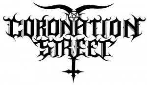
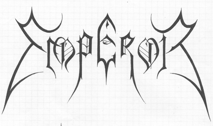
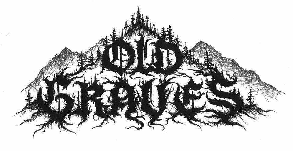
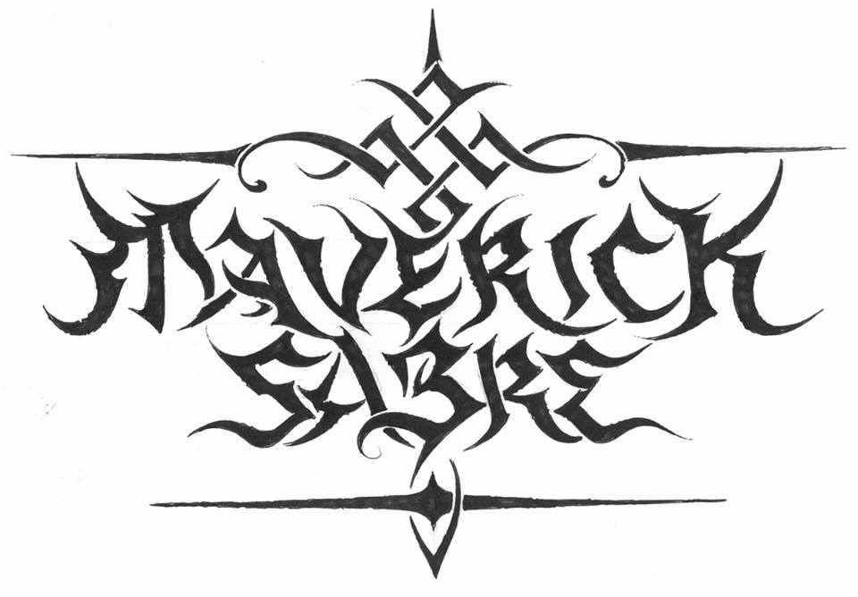
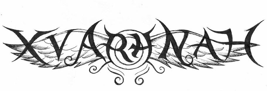
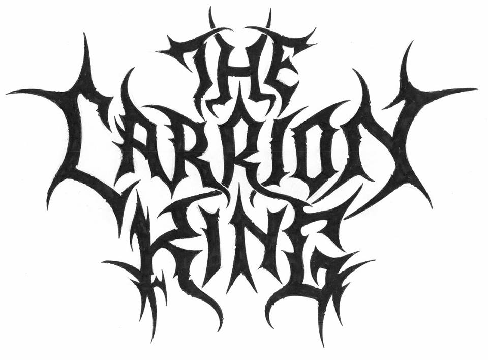
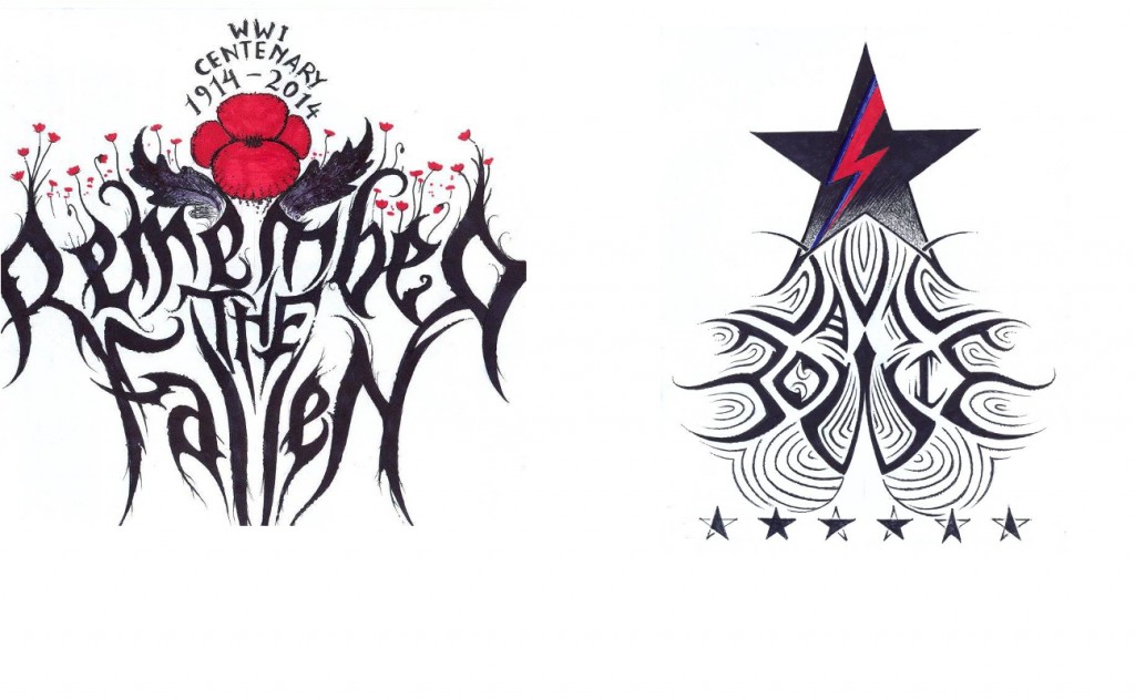
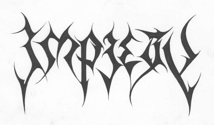
he new logos is a real travel through time and dimension. So there is a timeline, beginning with really primitive logos I have created. A band called Gau, which means ‘night’ in Basque, this logo is very prehistoric, almost as if it was drawn by dinosaurs. With these very prehistoric plants around, no crows, no wolves. Very prehistoric, almost reptilian, taken from a time there was no mammals, no birds, there were just reptiles and primitive insects; trilobites, and ammonites. And in fact I live in Exeter, by the Jurassic coast, so you can send yourself spinning on a time travel of 200 millions years. So we go from these very simplistic logos, like Undo Creation from Georgia, up to the most sophisticated logos; art deco, or futuristic logos, like I did for Outsider Industries. Or Haunted, an Italian project.

outsider

It seems like, although drawing logos still isn’t your ‘day job’, it’s definitely your main focus…

C.S: “I’m trying to keep myself at the age of 45, forever doing logos. The main reason is being single; all the time being single, so I can concentrate 100% on my logos because this is what gives me happiness. I have never been married, never had children; my first child is that book, Lord of the Logos. And that child is growing all the time, it has been in many hands, and it’s being appreciated by people who have never been listening to metal. Lord of the Logos is really only focussing on what inspires me; it’s photographs and logos. And there are some medieval aspects, but mostly it’s nature. All the photos have been taken by myself, and the logos are all my own work and it reflects the places that have inspired me. It includes many parts of Devon, Dartmoor, Southampton, Oregon, California, south of France, Belgium. Quite a lot of places that I have visited. And last year there was also the release of the compendium, Logos from Hell by Mark Riddick, and I’ve got something like 200 of my works in there; no other artist had 200 logos collected in one compendium book. The book is very heavy.

LOGOS_FROM_HELL_Cover

Collecting works into books creates a great  reference work for graphic artists, but does it inspire you to look back at your old stuff?

CS: “I have been at the moment making a complete retrospective and over the next while… I have been looking to post on Facebook for the first time logos that I did from 1992 to 1999. So a real retrospective that includes some logos like a band called Eternity of Darkness that I did in 1992, something like that; that was a UK band. And Stone Circle. We’re talking about very, very old stuff from the 90s…

What were the logos that first got your attention? In the 70s there were some classics like Kiss…

Yeah; the original [Paul Stanley designed] Kiss logo with the SS style lettering; it’s just exactly the kind of logo that got me as a kid. I started listening to Kiss in 1977. I also loved bands like The Cure. I remember going to see them when I was 12 and it was like going to enter a completely forbidden country. When I went in ’82 it was all the ‘post-punks’ but when I saw them again in ’87, that was the time of all the Goths. There were just loads of Goths; the people you just couldn’t see in the daytime. You just couldn’t see these people outside of some special place like Camden. In Camden you could see all these illuminated people with a vivid imagination; and I am one of them, I definitely consider myself as an illuminated eccentric with a vivid imagination.

 At this point do you have any idea how many logos you’ve done?

It would be easily a good ten thousand. And there are quite a lot of logos that I unfortunately parted with the originals. Because in many cases I’d be drawing on the go and just hand the drawings over to the client. Like a band from Italy called Deathraid, who were a little bit in the vein of the oh-so-legendary Necrodeath…

…brief interlude as we discuss Necrodeath’s Into the Macabre and Christophe reveals that, however wide his tastes and artistic ambitions, his roots are most definitely in the underground metal scene of his youth:

CS: “Into the Macabre very memorable, it’s very simplistic, its raw. It’s got that vibe. The songs are just basically keeping you on your toes. It’s a great blend of thrash, speed metal with that slight black metal edge, but at the same time it’s very insane, it’s very haunting. It’s the kind of album if you hear it once you will remember it for the rest of your life.”

Well, it was recorded before all the genre boundaries were really established…

CS: “Yes, it was just straight from hell metal. And that was what I adored.”

Last year, Christophe’s iconic Emperor logo became, for the first time, a source of something other than pride, when it became the basis for some joke Christmas jumper designs posted online by the Foo Fighters; which still rankles, evidently…

CS: That drove me absolutely ballistic. And I could have sued them, but I had a much nicer idea. I came up with a Foo Fighters logo designed by myself, which has a black metal vibe, but with the FF of Foo Fighters and elements of the Foo Fighters logo but had a black metal, but still readable, Emperor-esque inspiration, without being a barbaric cut-paste like this pathetic Foo Fighters Emperor-esque logo which had been done on a computer.

foo

A lot of people brought it to my attention and there was much going on on my Facebook wall that I finally said I’m gonna ram it down and post the logo. This is how the Foo Fighters logo should be! Woe to the guy who ripped off my Emperor logo and made a right pig’s ear out of it! Of course I had some people who told me I should be honoured. Well! Honoured of having my art being disfigured, desecrated, stolen and mistreated like that? Bollocks. If they really wanted to have an Emperor tribute logo they would have contacted me! They wouldn’t have contacted a lousy, so-called graphic designer, who made this terrible pig’s ear out of it, and on this awful, terrible, shameful Christmas jumper!

So what is  the legal situation with the Emperor logo? Do you have any rights or does the band just own it?

I still have the right to exhibit. I had a massive exhibition; last year started great. I had the Marks of Metal exhibition in Odense in Denmark. There was an encounter between me, who did the Emperor logo and Kristian Wåhlin, Necrolord, who did the Emperor album cover. We actually brought the actual works, and we were there with the works together, making the same kind of statements. We both did these works when we were just Emperor fans, when we were young. I was exactly twenty when I did the Emperor logos, I was still doing my studies and I did it as kind of a hobby. When I did that logo in January 1991, during my first year winter exams, I would never imagine that Emperor would become so big. It wasn’t until 1994 and In the Nightside Eclipse that my name became big. That was when my name spread in the underground and became known among the metallers.

emperor_logo

How do you feel about that logo now? Do you still like it?

Yes, I love it still. It’s become one of the timeless classics. Think about Motorhead, think about  Iron Maiden, think about Abba! Tom Jones, he’s still going on. The Foundations; Build Me Up Buttercup. These are artists and songs I loved and still love. Think of Elvis Presley; these are timeless classics and the Emperor logo is one of those classics. And it’s one of the few logos that is still unaltered after 30 years. And when people meet me they say ‘you’re the Emperor logo guy!’ Of course there lots of  other bands from the 90s whose logos I did; but Emperor is the one that stands out.

Do you feel your focus as an artist has changed much since 1991?

CS: “Well, in the 90s I wouldn’t say that I wanted only true black metal exclusively, but there was no way on earth that I would have been doing the logos for Kim Kardashian and people like that… I do wonder where those will take me…

jamol

Links:

Facebook

Devon Artists Network

Google Plus

Contact: christophe.szpajdel@gmail.com