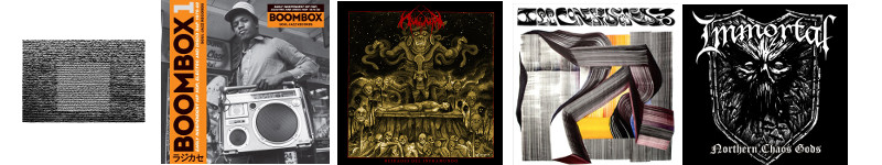
What a shock; I haven’t even slightly kept up with weekly (or even monthly) updates on here and now we’re in July already. Everything in the world seems so grim that it’s hard to actually do anything at all so I shall fall back on music. Instead of the (not very) usual playlists and so forth here’s a kind of 6-month catch up/review or “summer summary” or some kind of alliterative roundup of my musical intake of 2018 so far.
These aren’t necessarily going to be in my ‘albums of the year’ in December (always assuming there is a December this year), but here’s a selection of things that I think are definitely worth checking out from the last 6 months:
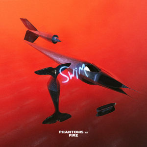
Firstly, and most unexpectedly -I really didn’t expect to spend months listening to atmospheric, oddly queasy/wheezy electronica – this is just a fantastic album:
I don’t really have enough knowledge to give a rundown of what Swim is for fans of*, but to me the album has an extremely evocative atmosphere, though what exactly it evokes is hard to say. It has something of the retro-futuristic feel of Vangelis’ Blade Runner soundtrack, if it was spinning on a dusty turntable with a wobbly motor in a dimly lit room; not that the tempos are as wonky – or the music as formless – as that description suggests. Somehow though, its blend of warmth, melancholy and forlorn familiarity has made it the perfect soundtrack to our current dystopian age.
Facts that you might want to know: Phantoms vs Fire is Thiago C. Desant, a Brazilian composer and graphic designer living in Italy. An extended (and just as good but not better) version of Swim is available here and you can also buy his excellent prints from the Phantoms vs Fire website.
* Press release says Tycho, Com Truise, Youandewan, Bonobo, Philip Glass, Japan, Mike Oldfield, if that helps
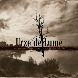
For the last couple of months a great source of brilliant music has been the Portuguese dark folk label Equilibrium Music. One of the label’s key releases of recent times has been the great Urze de Lume album As Árvores Estão Secas e Não Têm Folhas; and it really is beautiful.
Earthy, elemental (though not primitive) folk that reminds me equally of Sangre de Muerdago and Wardruna (without sounding much like either one of them), the album is simultaneously soothing and invigorating, if that is possible.
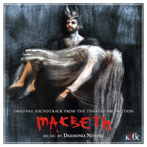
It has been overtaken for me though by the Equilibrium release I least expected to like, namely:
This amazing album is actually the soundtrack for a Greek theatrical production of (obviously) Shakespeare’s Macbeth by the ancient Greek/neoclassical/neofolk duo Daemonia Nymphae. As you might expect, it makes for a very strange and eerily archaic dreamlike vision of dark age Scotland viewed (or heard) through a prism of ancient Greek ‘world music’. I love it, even if/especially because the bagpipey bits (there aren’t many) are weirdly alien.
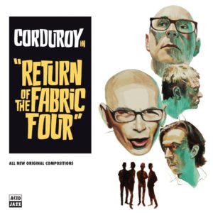
This year has seen the very welcome return of the Acid Jazz legends Corduroy with their new and same-as-it-ever-was album Return of the Fabric Four.
Same as it ever was c. 1992-4 that is, as the album is far closer to the mostly instrumental sound of Dad Man Cat and (especially) High Havoc than the more pop-song-focussed The New You! etc. It’s a really nice collage of camp, kitsch cleverness. And good tunes, naturally.
A couple of outstanding metal releases so far this year are:
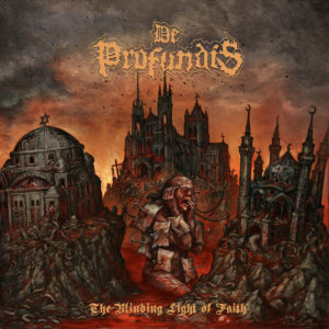
I am (as I think most people probably are!) quite fussy about death metal, but without being retro in any kind of self-conscious way, De Profundis make music that would sit happily in the late 80s/early 90s death metal scene. The Blinding Light of Faith is an album that can hold its own in the company of any of the big names of death metal; superb, intelligent musicianship and songwriting – it’s a seriously impressive album.
80s veteran(s) Lizzy Borden (both a singer and a band) seem always to suffer from being mis-pigeonholed, whether as a glam band (he/they did have the image), Twisted Sister clones (ditto), or some kind of Alice Cooper-esque horror-metal act (partly the name, partly the image innit), but if you listen back to the best of the band’s 80s work, especially Love You To Pieces, they were really a classic metal band, more Iron Maiden-meets-W.A.S.P. than Motley Crue. On the new album Lizzy himself takes centre stage, singing better than he ever has – no mean feat – and playing all the guitars on what is a very song-based album. It’s not very heavy – more a kind of homage to bands like Cheap Trick and Queen than the early 80s Lizzy Borden sound. But it’s really good if you like that kind of thing, and it’s great to hear Lizzy really going for it after a couple of slightly patchy, compromised-sounding, ‘not bad’ records.
Away from metal, this is a really interesting, good album if you like – well, what? “Film soundtrack music” isn’t really a genre, is it, but that’s what Fire Behind The Curtain makes me think of. I’ve seen it described as neoclassical and minimalist too, but neither of those feels quite right to me. It’s a beautifully cohesive-yet-eclectic collection of mostly-instrumental pieces vary from haunting and bleakly forbidding atmospheres to warm and embracing melodies.
I can’t really write an awful lot about this album from the always-dependable I Heart Noise label, as I’ve only just started listening to it really; but so far I love it. It makes me think of Lou Reed, or Alan Vega covering John Lennon’s Plastic Ono Band album; sparse, forlorn, world-weary and a little bit sleazy.
What else? Lots of other good things; oh – Grid of Points by Grouper is great, but I forgot about it until just now. I was a bit underwhelmed by the new Immortal and Marduk records, though they are both pretty solid. I really liked the new albums by Tunjum and Uada, there’s a great Souljazz compilation of old hip-hop etc, I’ve been quite impressed by the recent Ill Considered album though I haven’t gotten used to it yet and… well, I’ll come back if there’s anything great I’ve forgotten!
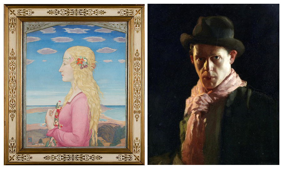
2017, like most years but somehow more so, was filled with unpleasant things, events and people. For me though, one of the more pleasant features of the year was that I made the effort to visit art galleries more often than previously, in particular to see the superb exhibitions held by the National Galleries of Scotland; after missing Modern Scottish Women in 2016, I was determined to see Beyond Caravaggio at the National Gallery and especially True to Life – British Realist Painting in the 1920s and 1930s at the National Gallery of Modern Art. Both of these exhibitions were excellent, but I am writing mainly about the latter. As curator Patrick Elliott was clearly aware (see also the essay What Sort Of Truth? British Painting Between The Wars by Sacha Llewellyn in the excellent exhibition catalogue), ‘realism’ is not a simple thing to define, and indeed it seems strange that (for example) the peculiar and highly artificial painting of Maxwell Armfield and the shockingly immediate work of David Jagger should be considered the same kind of art.
‘Pacific Portrait’ (1929) by Maxwell Armfield (left) and ‘The Conscientious Objector’ (1917) by David Jagger (right)
If ‘Realist’ at first seems a pretty simple and unambiguous description, the fact that many of the artists (Dod Procter, Meredith Frampton, Gluck, Glyn Philpott) and paintings discussed in the exhibition catalogue also appear, equally convincingly, in Edward Lucie-Smith’s book Art Deco Painting (Phaidon, 1990) demonstrates just what a subjective term it really is. What the word seems to denote in the context of this exhibition is something like ‘representational rather than abstract’, which admittedly is an extremely unwieldy and far too wide term.
In the period in which the art of the exhibition was produced (the title says the 1920s and 1930s, but a few earlier and later works were included, so roughly from the years of World War One up to the first half of World War Two), the word realism tended to have mainly negative connotations; for which see Billy Bunter author Frank Richards’ famous 1940 reply to George Orwell’s article Boys’ Weeklies; “They go grubbing in the sewers for their realism, and refuse to believe in the grass and flowers above ground – which nevertheless, are equally real!” This was and still is an aspect of a wider conception of realism that Orwell himself attacked occasionally in its more extreme political forms. Today, ‘realpolitik’ is used as a term of criticism, but in fact almost all political or social ‘realism’, even when respectable, is basically an excuse for people or governments not to act compassionately when it becomes unprofitable to do so. People who term themselves realists rather than optimists or pessimists tend (in my experience) to lean more towards the latter, but with an added smug quality as befits someone who is never surprised when bad things happen. While the artists of True To Life presumably held beliefs and opinions on a wide range of issues, these are by and large absent from their work as collected here. This is not the 1920s of the General Strike or the 30s of the Depression and The Road To Wigan Pier, let alone the 20s and 30s of Lenin, Mussolini and HItler, or perhaps more to the point, of Picasso, Matisse, or Dadaists and Surrealists.
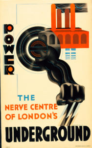
Edward McKnight Kauffer – poster for the London Underground (1930)
Nevertheless, from the delicate figure studies of Dod Procter to James Cowie’s pastoral portraits, it is a window onto certain aspects of British art and life between the wars. Also, the painters’ rejection of the vocabulary of avant garde modernism should be seen in the context of the time; while abstract or semi-abstract art had been at the cutting edge of modernism in the years just prior to and during World War One, not only had the innovators of that era moved on (why not look at my article about Wyndham Lewis in the 20s here?), but the angular, dynamic language of modernism had infiltrated mainstream culture to the point that institutions as staid as the Royal Mail were using designers like John Armstrong and Pat Keely to give the Post Office a modern identity, while Edward McKnight Kauffer and others did similar work for the London Underground and, outside of the UK, fascist Italy, Hitler’s Germany and the Soviet Union all utilised versions of modernist design to establish new national identities. In that sense, the idiosyncratic, apparently old-fashioned and above all individualistic styles adopted by British artists outside of the more radical movements can be seen as, if not revolutionary, then at least stubbornly dedicated to their own visions.
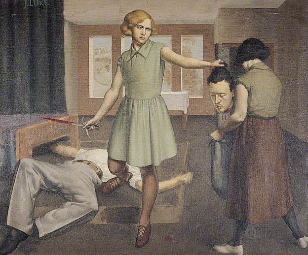
Although it may seem paradoxical or incompatible, the ‘realism’ of these artists is founded to some extent on escapism and idealism; but maybe that is truer of realism in a wider sense than at first seems to be the case. The definitive artistic form of realism (if we think of everyday life as ‘real’ – but I don’t really want to get into philosophical questions here as I’d like to finish this article at some point) nowadays is probably something like instagram, or on a slightly grander level, the documentary film, but the very nature of documenting reality – whether in film, photographs, painting or in writing – is necessarily selective, and in being so, tends towards some kind of commentary (and/or judgement) on its subject. One of the nice things about the True To Life exhibition was that both the grime-and-hardship/warts-and-all and the grass-and-flowers aspects of realism were represented – albeit mostly in a perhaps fairly superficial way. There was very little evidence of the documentary as protest – perhaps because, by the end of WW1, photography had become the obvious tool for this kind of work. That said, social commentary of a sort was present in Thomas Nash & Stanley Spencer’s idiosyncratic recasting of some of the Renaissance’s favourite religious scenes such as the Crucifixion & the Last Judgement in ‘modern dress’ and modern settings (and slightly generic ‘modernist’ styles). This use of realism was not uninventive, but was in essence just another way of looking back at the ‘old masters’; revisiting the groundbreaking realism pioneered in the 14th century. More interesting, (to me) was John Luke’s strange 1929 modern-dress version of one of the baroque era’s favourite Old Testament scenes, Judith and Holofernes, in which the story of the beheading of an Assyrian general is made even more unsettling by having a strangely surreal Agatha Christie/Enid Blyton aura.
John Luke – Judith & Holofernes (1929)
Much as in Edward Lucie-Smith’s Art Deco Painting, the unifying factor in the exhibition’s disparate works was less a matter of style/school or subject than it was atmosphere; the paintings, as different as they are, belong definitively to the period between the wars, in much the same way as the very different works of Evelyn Waugh and Christopher Isherwood did (according to me, here).
If the term ‘realist’ in painting suggests the artist as eye (kind of an analog to (again) Christopher Isherwood’s fictionalised realism; “I am a camera”), the eye of the artist/writer is necessarily as individual as the brain it is connected to. For example, one might assume that realism and idealism were opposites, but there is a strong classicising element among some of the artists in the exhibition – but even then, individual artists seem to have reached a kind of classical serenity and monumentality via different routes.
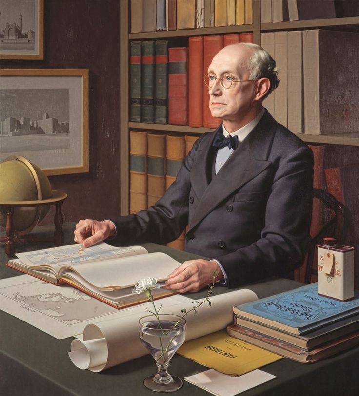
Meredith Frampton – Sir Charles Grant Robertson (1941)
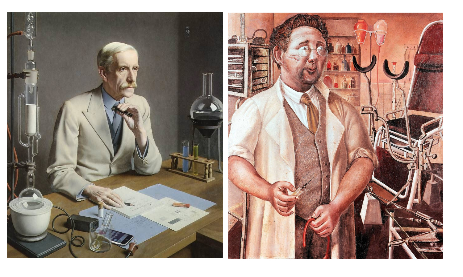
One of the stars of the exhibition for me was the portrait painter (George Vernon) Meredith Frampton (1894-1984). Frampton’s art was in some ways the most ‘realistic’ art in the exhibition, in the sense of being (by far) the most illusionistic and quasi-photographic. In a way, portraits like the stunning Sir Charles Grant Robertson (1941) are less ‘realist’ than than they are ‘corporealist’ – their accumulation of painstakingly rendered detail being in some ways closer to taxidermy than to the realism of a snapshot. In their almost eerie stillness, his portrayals of professional men surrounded by the accoutrements of their work, (another excellent example is Sir Frederick GowlandHopkins (1938, below) seem – despite the maximalist inclusiveness of the painting – closer to the carefully composed minimalism of a photographer like Lilo Raymond than to a more or less contemporary realist (or ‘objectivist’) painting like Otto Dix’s theoretically similar portrait of urologist Dr Hans Koch (1921). And yet, for all of their modern realism, both artists looked to the past; for Dix – who had experimented with Expressionist styles earlier in his career, the aim of the modern realist painter was to tackle the breadth and the often-unrecorded detail of modern life with the – to him – unimprovable techniques of the old masters. For Frampton, the source of his style is less the realistic tradition of the Northern Renaissance than it is the monumental, but still ‘realistic’ neoclassicism of Ingres.
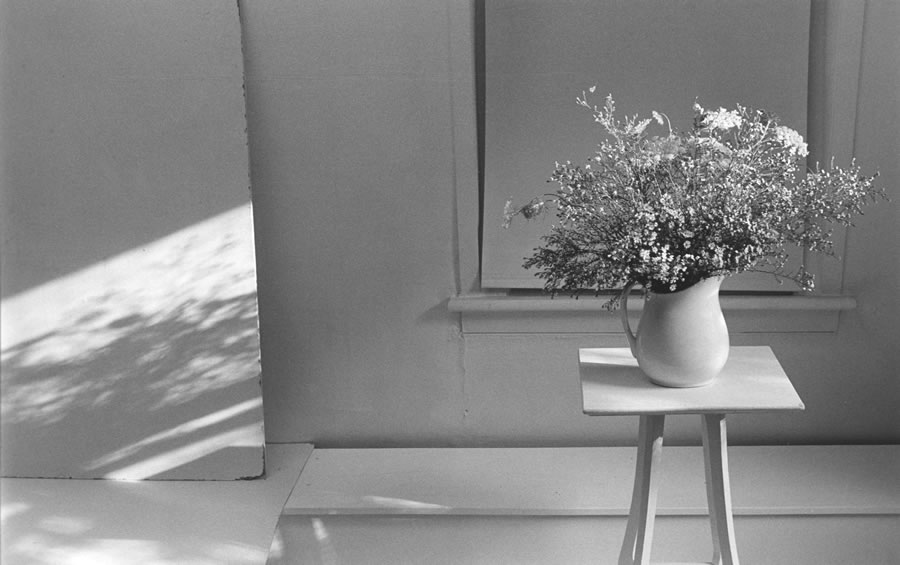
Meredith Frampton – Sr Frederick Gowland Hopkins (1938) and Otto Dix – Dr Hans Koch (1921)Lilo Raymond – Wild Flowers (1992)
The more usual classical influence on British art of the period was the modernist route via Picasso and cubism; in the case of painters like the ex-Vorticists William Roberts and Edward Wadsworth (also Edward Burra, whose expressionistic 1930 painting The Snack Bar was included in the exhibition), the angularity of Vorticism became a kind of stylistic shorthand that marked out their otherwise fairly conventional/traditional art as ‘modern’. Several other artists in the exhibition, such as Gladys Hynes and James Walker Tucker seem to have used modernist stylistic traits in the same way; to heighten the clarity and monumental qualities of their work; a kind of ‘realism’ as simplified solidity and a classicism that couldn’t be easily written off as old fashioned.
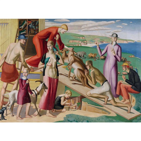
Gladys Hynes – Noah’s Ark (1919)Gerald Leslie Brockhurst – By the Hills (1939)
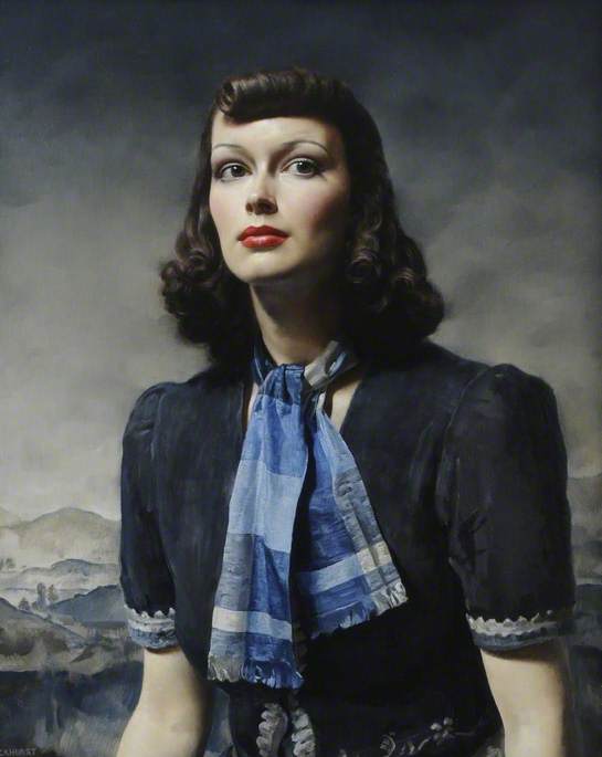
For society portrait painters like Gerald Leslie Brockhurst and Sir Herbert James Gunn, realism – if explicitly not ‘gritty’ realism – was a necessary part of their trade. The glamour and drama of portraits like Brockhurst’s By the Hills (1939) is what made the artist in demand for fashionable sitters, but their effect – despite relying on a similar sense of heightened photo-realism for their success – is almost the opposite of Frampton’s still life approach. This kind of art was, despite its use of traditional techniques (and even, in the case of By The Hills, a Renaissance-influenced landscape in the background) resolutely of its ‘modern’ age, referencing Hollywood and the world of contemporary fashion, but not really any of the ideas that had affected the visual arts since the mid 1800s.
The same is true of the slightly creepy empty street scenes of Algernon Newton; despite their passing resemblance to the post-impressionist work of Maurice Utrillo, these brilliantly realised townscapes are depictions of the modern world, but not interpretations of it. While the artist captures the melancholy charm of the slightly shabby suburbs he painted, their spirit is more like restrained romanticism, rather than being invested with the revolutionary sense of psychogeography that the proto-surrealist works of Giorgio de Chirico had pioneered two decades earlier. That said, because of the role of artist – not just as a ‘camera’, but also as processor and interpreter of experience – his paintings are something more than a documentary photograph of an empty street.
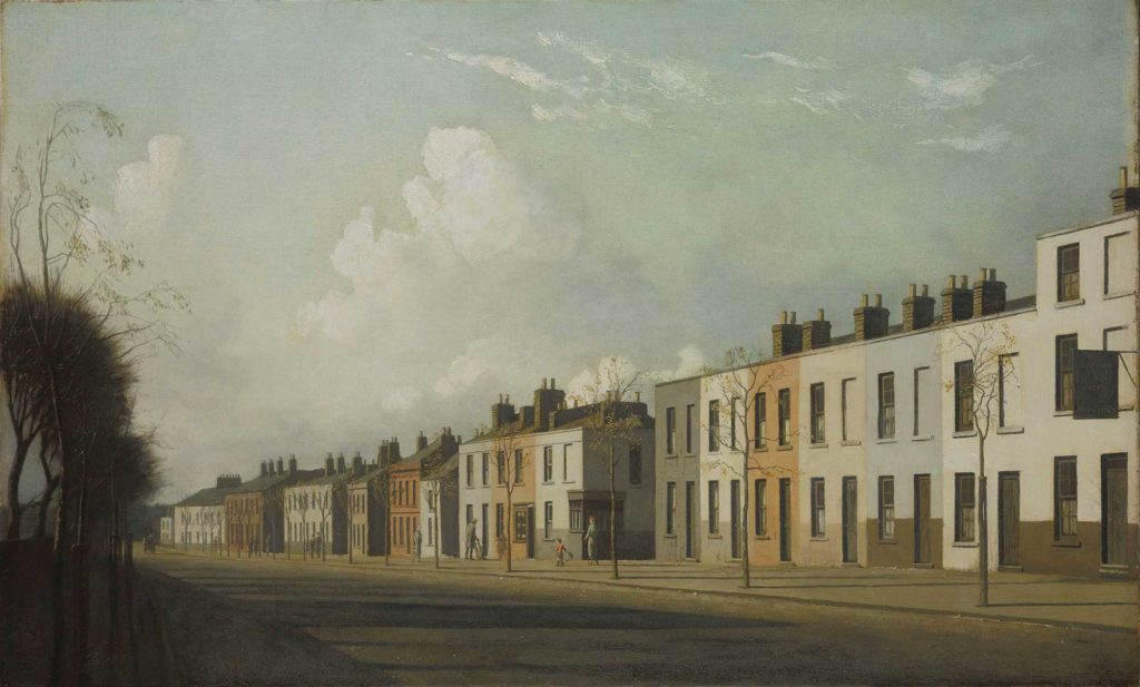
Algernon Newton – The Outskirts of Cheltenham (1932)
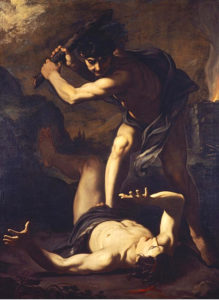
Pietro Novelli – ‘Cain Killing Abel’ (1625)
In fact, what True To Life highlights, is the extent to which the vast majority of art, until fairly recently, had as its aim something that could be called realism; the National Gallery’s Beyond Caravaggio exhibition likewise showed Caravaggio and the artists of the late 16th/early 17th century trying to make their art – both in religious/mythical and modern genre paintings – more immediate & vivid through a kind of dramatic heightened realism. Impressionism broke away from the staid, schematised world of academic painting to capture something closer to the experience of both the artist and viewer, Expressionists tried to infuse their works with the feeling of events as experienced, Futurists tried to capture the violence of the 20th century where traditional techniques tended to distance it… And in that sense, much of the work labelled ‘realist’ in this exhibition works for us now in a way that it possibly didn’t at the time; to a modern audience the work in True to Life is almost all imbued with a between-the-wars ‘period’ quality that seems to capture the zeitgeist of that troubled era, even while sidestepping most of the troubles themselves.
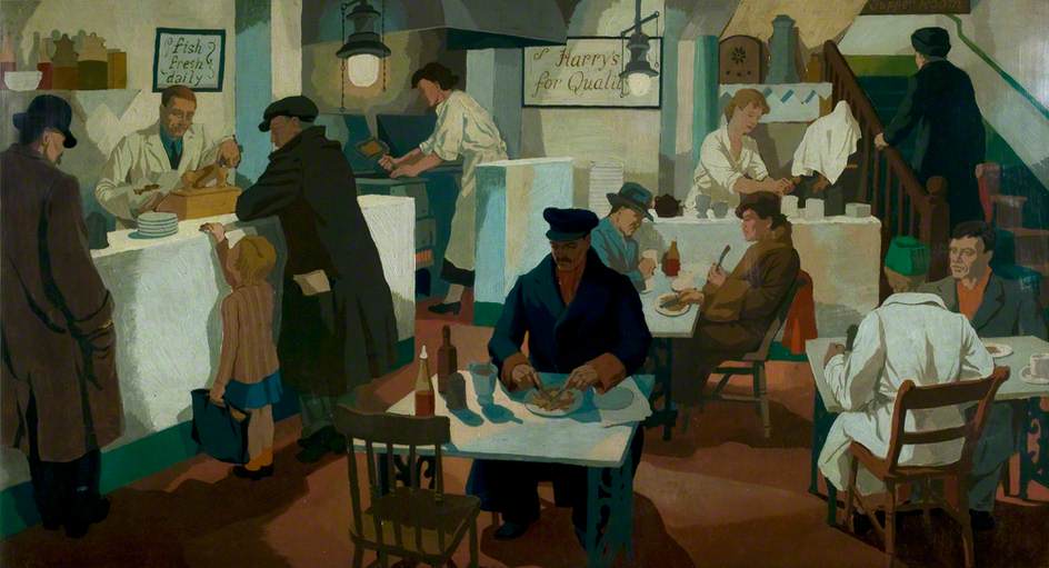
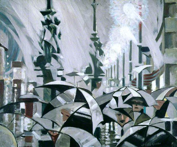
It is with that last point that the artists – without doubting the depth of feeling they put into their work – mainly succeeded in recording (limited aspects of the) reality of their era in a relatively superficial way. As an example, Clifford Rowe’s The Fried Fish Shop (1936) depicts what the interior and clientele of a fried fish shop of the 30s presumably looked like; as such it has sociological and historical value, as well as being a fine, faintly modernist painting. On the other hand, a slightly earlier and in some ways comparable painting like the Vorticist-inspired Rain On Princes Street (1913) by Stanley Cursiter (it’s quite surprising that none of Cursiter’s fashionable work of the 20s & 30s was included in the exhibition), despite its fractured, faceted and in that sense ‘unrealistic’ modernist appearance, not only captures in its stylised way a glimpse of late Edwardian metropolitan life, but also the feeling – still the same over a hundred years later – of being on Edinburgh’s Princes Street on a busy, rainy day. So in the end I suppose which painting deserves to be called ‘realist’ is as subjective as reality itself.

 I am (as I think most people probably are!) quite fussy about death metal, but without being retro in any kind of self-conscious way, De Profundis make music that would sit happily in the late 80s/early 90s death metal scene. The Blinding Light of Faith is an album that can hold its own in the company of any of the big names of death metal; superb, intelligent musicianship and songwriting – it’s a seriously impressive album.
 80s veteran(s) Lizzy Borden (both a singer and a band) seem always to suffer from being mis-pigeonholed, whether as a glam band (he/they did have the image), Twisted Sister clones (ditto), or some kind of Alice Cooper-esque horror-metal act (partly the name, partly the image innit), but if you listen back to the best of the band’s 80s work, especially Love You To Pieces, they were really a classic metal band, more Iron Maiden-meets-W.A.S.P. than Motley Crue. On the new album Lizzy himself takes centre stage, singing better than he ever has – no mean feat – and playing all the guitars on what is a very song-based album. It’s not very heavy – more a kind of homage to bands like Cheap Trick and Queen than the early 80s Lizzy Borden sound. But it’s really good if you like that kind of thing, and it’s great to hear Lizzy really going for it after a couple of slightly patchy, compromised-sounding, ‘not bad’ records.
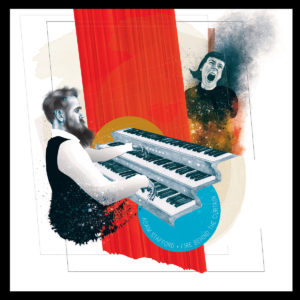 Away from metal, this is a really interesting, good album if you like – well, what? “Film soundtrack music” isn’t really a genre, is it, but that’s what Fire Behind The Curtain makes me think of. I’ve seen it described as neoclassical and minimalist too, but neither of those feels quite right to me. It’s a beautifully cohesive-yet-eclectic collection of mostly-instrumental pieces vary from haunting and bleakly forbidding atmospheres to warm and embracing melodies.
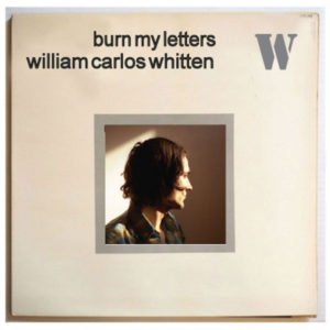 I can’t really write an awful lot about this album from the always-dependable I Heart Noise label, as I’ve only just started listening to it really; but so far I love it. It makes me think of Lou Reed, or Alan Vega covering John Lennon’s Plastic Ono Band album; sparse, forlorn, world-weary and a little bit sleazy.